Chapter 4. Webdev 101
This chapter introduces the core web-development knowledge you will need to understand the web pages you scrape for data and to structure those you want to deliver as the skeleton of your JavaScripted visualizations. As youâll see, a little knowledge goes a long way in modern webdev, particularly when your focus is building self-contained visualizations and not entire websites (see âSingle-Page Appsâ for more details).
The usual caveats apply: this chapter is part reference, part tutorial. There will probably be stuff here you know already, so feel free to skip over it and get to the new material.
The Big Picture
The humble web page, the basic building block of the World Wide Web (WWW)âthat fraction of the internet consumed by humansââis constructed from files of various types. Apart from the multimedia files (images, videos, sound, etc.), the key elements are textual, consisting of Hypertext Markup Language (HTML), Cascading Style Sheets (CSS), and JavaScript. These three, along with any necessary data files, are delivered using the Hypertext Transfer Protocol (HTTP) and used to build the page you see and interact with in your browser window, which is described by the Document Object Model (DOM), a hierarchical tree off which your content hangs. A basic understanding of how these elements interact is vital to building modern web visualizations, and the aim of this chapter is to get you quickly up to speed.
Web development is a big field, and the aim here is not to turn you into a full-fledged web developer. I assume you want to limit the amount of webdev you have to do as much as possible, focusing only on that fraction necessary to build a modern visualization. In order to build the sort of visualizations showcased at d3js.org, published in the New York Times, or incorporated in basic interactive data dashboards, you actually need surprisingly little webdev fu. The result of your labors should be easy to add to a larger website by someone dedicated to that job. In the case of small, personal websites, itâs easy enough to incorporate the visualization yourself.
Single-Page Apps
Single-page applications (SPAs) are web applications (or whole sites) that are dynamically assembled using JavaScript, often building upon a lightweight HTML backbone and CSS styles that can be applied dynamically using class and ID attributes. Many modern data visualizations fit this description, including the Nobel Prize visualization this book builds toward.
Often self-contained, the SPAâs root folder can be easily incorporated in an existing website or stand alone, requiring only an HTTP server such as Apache or NGINX.
Thinking of our data visualizations in terms of SPAs removes a lot of the cognitive overhead from the webdev aspect of JavaScript visualizations, allowing us to focus on programming challenges. The skills required to put the visualization on the web are still fairly basic and quickly amortized. Often it will be someone elseâs job.
Tooling Up
As youâll see, the webdev needed to make modern data visualizations requires no more than a decent text editor, modern browser, and a terminal (Figure 4-1). Iâll cover what I see as the minimal requirements for a webdev-ready editor and nonessential but nice-to-have features.
My browser development tools of choice are Chromeâs web-developer kit, freely available on all platforms. It has a lot of tab-delineated functionality, the following of which Iâll cover in this chapter:
-
The Elements tab, which allows you to explore the structure of a web page, its HTML content, CSS styles, and DOM presentation
-
The Sources tab, where most of your JavaScript debugging will take place
Youâll need a terminal for output, starting your local web server, and maybe sketching ideas with the IPython interpreter. These days I tend to use browser-based Jupyter notebooks as my Python dataviz sketchpadâone of the key advantages being that the session persists in the form of a notebook (.ipynb) file, which you can use to restart the session at later dates. You also get to iteratively explore your data with embedded charts. Weâll be putting this to good use in Part III.
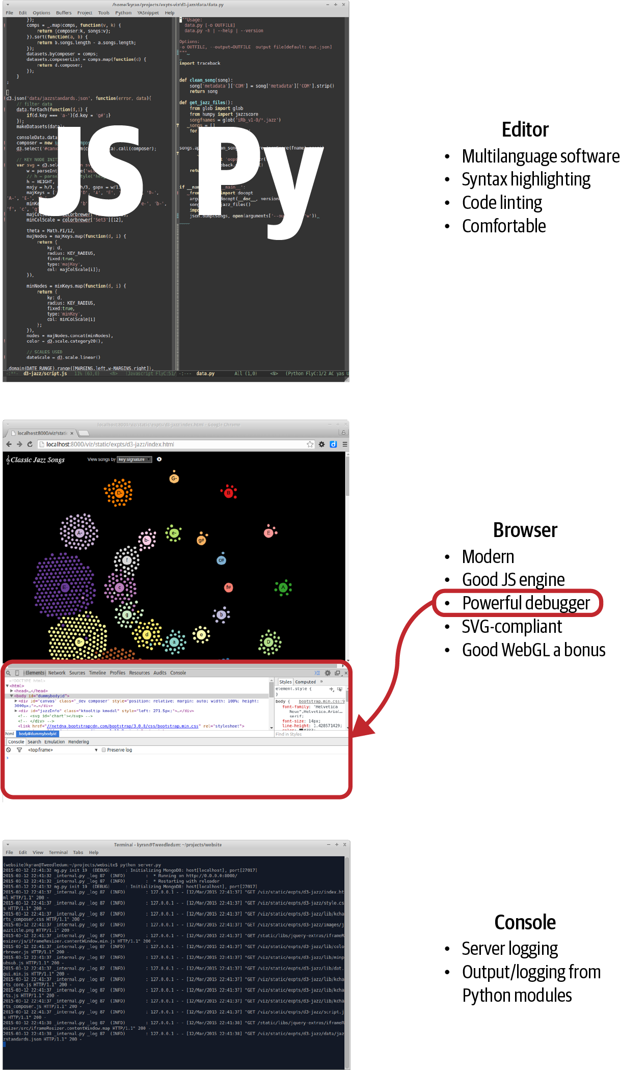
Figure 4-1. Primary webdev tools
Before dealing with what you do need, letâs deal with a few things you donât need when setting out, laying a couple of myths to rest on the way.
The Myth of IDEs, Frameworks, and Tools
There is a common assumption among the prospective JavaScripter that to program for the web requires a complex toolset, primarily an Intelligent Development Environment (IDE), as used by enterpriseââand otherââcoders everywhere. This is potentially expensive and presents another learning curve. The good news is that you can create professional-level web dataviz with nothing more than a decent text editor. In fact, until you start dealing with modern JavaScript frameworks (and I would hold off on that while you get your webdev legs) an IDE doesnât provide much advantage, while usually being less performant. More good news is that the free as in beer lightweight Visual Studio Code IDE (VSCode) has become the de facto standard for web development. If you already use VSCode or want a few more bells and whistles, itâs a good workhorse for following this book.
There is also a common myth that one cannot be productive in JavaScript without using a framework of some kind.1 At the moment, a number of these frameworks are vying for control of the JS ecosystem, most sponsored by the various huge companies that created them. These frameworks come and go at a dizzying rate, and my advice for anyone starting out in JavaScript is to ignore them entirely while you develop your core skills. Use small, targeted libraries, such as those in the jQuery ecosystem or Underscoreâs functional programming extensions, and see how far you can get before needing a my way or the highway framework. Only lock yourself into a framework to meet a clear and present need, not because the current JS groupthink is raving about how great it is.2 Another important consideration is that D3, the prime web dataviz library, doesnât really play well with any of the bigger frameworks I know, particularly the ones that want control over the DOM. Making D3 framework-compliant is an advanced skill.
Another thing youâll find if you hang around webdev forums, Reddit lists, and Stack Overflow is a huge range of tools constantly clamoring for attention. There are JS+CSS minifiers and watchers to automatically detect file changes and reload web pages during development, among others. While a few of these have their place, in my experience there are a lot of flaky tools that probably cost more time in hair-tearing than they gain in productivity. To reiterate, you can be very productive without these things and should only reach for one to scratch an urgent itch. Some are keepers, but very few are even remotely essential for data visualization work.
A Text-Editing Workhorse
First and foremost among your webdev tools is a text editor that you are comfortable with and which can, at the very least, do syntax highlighting for multiple languagesââin our case, HTML, CSS, JavaScript, and Python. You can get away with a plain, nonhighlighting editor, but in the long run it will prove to be a pain. Things like syntax highlighting, code linting, intelligent indentation, and the like remove a huge cognitive load from the process of programming, so much so that I see their absence as a limiting factor. These are my minimal requirements for a text editor:
-
Syntax highlighting for all languages you use
-
Configurable indentation levels and types for languages (e.g., Python 4 soft tabs, JavaScript 2 soft tabs)
-
Multiple windows/panes/tabs to allow easy navigation around your codebase
-
A decent code linter (see Figure 4-2)
If you are using a relatively advanced text editor, all the above should come as standard with the exception of code linting, which may require a bit of configuration.
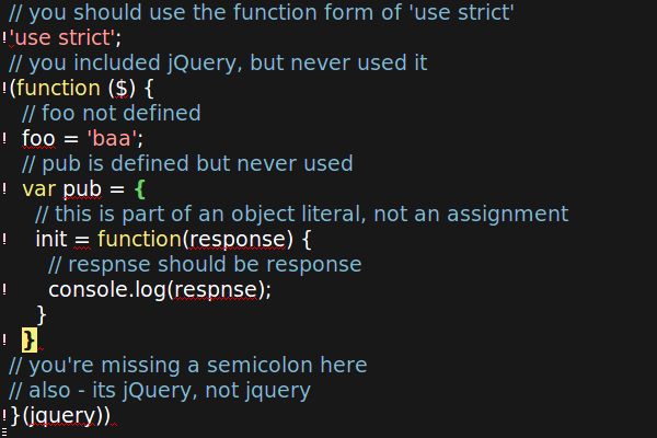
Figure 4-2. A running code linter analyzes the JavaScript continuously, highlighting syntax errors in red and adding an ! to the left of the offending line
Browser with Development Tools
One of the reasons a full-fledged IDE is less vital in modern webdev is that the best place to do debugging is in the web browser itself, and such is the pace of change there that any IDE attempting to emulate that context will have its work cut out for it. On top of this, modern web browsers have evolved a powerful set of debugging and development tools. The best among these is Chrome DevTools, which offers a huge amount of functionality, from sophisticated (certainly to a Pythonista) debugging (parametric breakpoints, variable watches, etc.) to memory and processor optimization profiling, device emulation (want to know what your web page looks like on a smartphone or tablet?), and a whole lot more. Chrome DevTools is my debugger of choice and will be used in this book. Like everything covered, itâs free to use.
Building a Web Page
There are four elements to a typical web visualization:
-
An HTML skeleton, with placeholders for our programmatic visualization
-
Cascading Style Sheets (CSS), which define the look and feel (e.g., border widths, colors, font sizes, placement of content blocks)
-
JavaScript to build the visualization
-
Data to be transformed
The first three of these are just text files, created using our favorite editor and delivered to the browser by the web server (see Chapter 12). Letâs examine each in turn.
Serving Pages with HTTP
The delivery of the HTML, CSS, and JS files that are used to make a particular web page (and any related data files, multimedia, etc.) is negotiated between a server and browser using the Hypertext Transfer Protocol. HTTP provides a number of methods, the most commonly used being GET, which requests a web resource, retrieving data from the server if all goes well or throwing an error if it doesnât. Weâll be using GET, along with Pythonâs requests module, to scrape some web page content in Chapter 6.
To negotiate the browser-generated HTTP requests, youâll need a server. In development, you can run a little server locally using Pythonâs built-in web server (one of the batteries included), part of the http module. You start the server at the command line, with an optional port number (default 8000), like this:
$ python -m http.server 8080
Serving HTTP on 0.0.0.0 port 8080 (http://0.0.0.0:8080/) ...
This server is now serving content locally on port 8080. You can access the site it is serving by going to the URL http://localhost:8080 in your browser.
The http.server module is a nice thing to have and OK for demos and the like, but it lacks a lot of basic functionality. For this reason, as weâll see in Part IV, itâs better to master the use of a proper development (and production) server like Flask (this bookâs server of choice).
The DOM
The HTML files you send through HTTP are converted at the browser end into a Document Object Model, or DOM, which can in turn be adapted by JavaScript because this programmatic DOM is the basis of dataviz libraries like D3. The DOM is a tree structure, represented by hierarchical nodes, the top node being the main web page or document.
Essentially, the HTML you write or generate with a template is converted by the browser into a tree hierarchy of nodes, each one representing an HTML element. The top node is called the Document Object, and all other nodes descend in a parent-child fashion. Programmatically manipulating the DOM is at the heart of such libraries as jQuery and the mighty D3, so itâs vital to have a good mental model of whatâs going on. A great way to get the feel for the DOM is to use a web tool such as Chrome DevTools (my recommended toolset) to inspect branches of the tree.
Whatever you see rendered on the web page, the bookkeeping of the objectâs state (displayed or hidden, matrix transform, etc.) is being done with the DOM. D3âs powerful innovation was to attach data directly to the DOM and use it to drive visual changes (Data-Driven Documents).
The HTML Skeleton
A typical web visualization uses an HTML skeleton, and builds the visualization on top of it using JavaScript.
HTML is the language used to describe the content of a web page. It was first proposed by physicist Tim Berners-Lee in 1980 while he was working at the CERN particle accelerator complex in Switzerland. It uses tags such as <div>, <img>, and <h> to structure the content of the page, while CSS is used to define the look and feel.3 The advent of HTML5 has reduced the boilerplate considerably, but the essence has remained essentially unchanged over those thirty years.
Fully specced HTML used to involve a lot of rather confusing header tags, but with HTML5 some thought was put into a more user-friendly minimalism. This is pretty much the minimal requirement for a starting template:4
<!DOCTYPE html><metacharset="utf-8"><body><!-- page content --></body>
So we need only declare the document HTML, our character set 8-bit Unicode, and a <body> tag below which to add our page content. This is a big improvement on the bookkeeping required before and provides a very low threshold to entry as far as creating the documents that will be turned into web pages goes. Note the comment tag form: <!-- comment -->.
More realistically, we would probably want to add some CSS and JavaScript. You can add both directly to an HTML document by using the <style> and <script> tags like this:
<!DOCTYPE html><metacharset="utf-8"><style>/* CSS */</style><body><!-- page content --><script>// JavaScript...</script></body>
This single-page HTML form is often used in examples such as the visualizations at d3js.org. Itâs convenient to have a single page to deal with when demonstrating code or keeping track of files, but generally Iâd suggest separating the HTML, CSS, and JavaScript elements into separate files. The big win here, apart from easier navigation as the codebase gets larger, is that you can take full advantage of your editorâs specific language enhancements such as solid syntax highlighting and code linting (essentially syntax checking on the fly). While some editors and libraries claim to deal with embedded CSS and JavaScript, I havenât found an adequate one.
To use CSS and JavaScript files, we just include them in the HTML using <link> and <script> tags like this:
<!DOCTYPE html><metacharset="utf-8"><linkrel="stylesheet"href="style.css"/><body><!-- page content --><scripttype="text/javascript"src="script.js"></script></body>
Marking Up Content
Visualizations often use a small subset of the available HTML tags, usually building the page programmatically by attaching elements to the DOM tree.
The most common tag is the <div>, marking a block of content. <div>s can contain other <div>s, allowing for a tree hierarchy, the branches of which are used during element selection and to propagate user interface (UI) events such as mouse clicks. Hereâs a simple <div> hierarchy:
<divid="my-chart-wrapper"class="chart-holder dev"><divid="my-chart"class="bar chart">this is a placeholder, with parent #my-chart-wrapper</div></div>
Note the use of id and class attributes. These are used when youâre selecting DOM elements and to apply CSS styles. IDs are unique identifiers; each element should have only one and there should be only one occurrence of any particular ID per page. The class can be applied to multiple elements, allowing bulk selection, and each element can have multiple classes.
For textual content, the main tags are <p>, <h*>, and <br>. Youâll be using these a lot. This code produces Figure 4-3:
<h2>A Level-2 Header</h2><p>A paragraph of body text with a line break here..</br>and a second paragraph...</p>
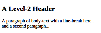
Figure 4-3. An h2 header and text
Header tags are reverse-ordered by size from the largest <h1>.
<div>, <h*>, and <p> are what is known as block elements. They normally begin and end with a new line. The other class of tag is inline elements, which display without line breaks. Images <img>, hyperlinks <a>, and table cells <td> are among these, which include the <span> tag for inline text:
<divid="inline-examples"><imgsrc="path/to/image.png"id="prettypic"><p>This is a<ahref="link-url">link</a>to<spanclass="url">link-url</span></p></div>

Note that we donât need a closing tag for images.

The span and link are continuous in the text.
Other useful tags include lists, ordered <ol> and unordered <ul>:
<divstyle="display: flex; gap: 50px"><div><h3>Ordered (ol) list</h3><ol><li>First Item</li><li>Second Item</li></ol></div><div><h3>Unordered (ul) list</h3><ul><li>First Item</li><li>Second Item</li></ul></div></div>
Here we apply a CSS style directly (inline) on the
divtag. See âPositioning and Sizing Containers with Flexâ for an introduction to theflexdisplay property.
Figure 4-4 shows the rendered lists.
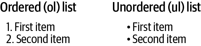
Figure 4-4. HTML lists
HTML also has a dedicated <table> tag, useful if you want to present raw data in your visualization. This HTML produces the header and row in Figure 4-5:
<tableid="chart-data"><tr><th>Name</th><th>Category</th><th>Country</th></tr><tr><td>Albert Einstein</td><td>Physics</td><td>Switzerland</td></tr></table>
The header row
The first row of data

Figure 4-5. An HTML table
When you are making web visualizations, the most often used of the previous tags are the textual tags, which provide instructions, information boxes, and so on. But the meat of our JavaScript efforts will probably be devoted to building DOM branches rooted on the Scalable Vector Graphics (SVG) <svg> and <canvas> tags. On most modern browsers, the <canvas> tag also supports a 3D WebGL context, allowing OpenGL visualizations to be embedded in the page.5
Weâll deal with SVG, the focus of this book and the format used by the mighty D3 library, in âScalable Vector Graphicsâ. Now letâs look at how we add style to our content blocks.
CSS
CSS, short for Cascading Style Sheets, is a language for describing the look and feel of a web page. Though you can hardcode style attributes into your HTML, itâs generally considered bad practice.6 Itâs much better to label your tag with an id or class and use that to apply styles in the stylesheet.
The key word in CSS is cascading. CSS follows a precedence rule so that in the case of a clash, the latest style overrides earlier ones. This means the order of inclusion for sheets is important. Usually, you want your stylesheet to be loaded last so that you can override both the browser defaults and styles defined by any libraries you are using.
Figure 4-6 shows how CSS is used to apply styles to the HTML elements. First, you select the element using hashes (#) to indicate a unique ID and dots (.) to select members of a class. You then define one or more property/value pairs. Note that the font-family property can be a list of fallbacks, in order of preference. Here we want the browser default font-family of serif (capped strokes) to be replaced with the more modern sans-serif, with Helvetica Neue as our first choice.
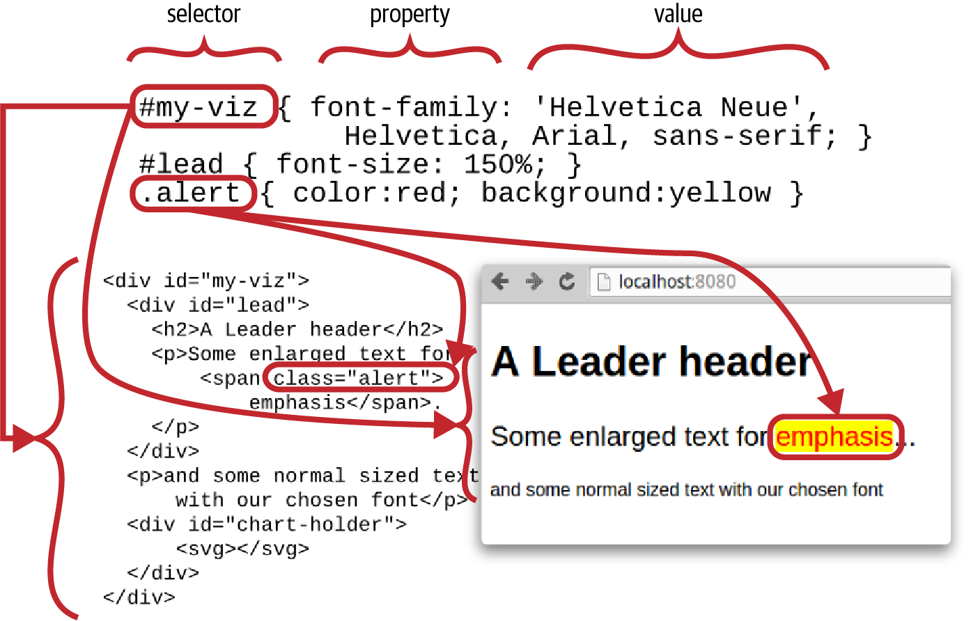
Figure 4-6. Styling the page with CSS
Understanding CSS precedence rules is key to successfully applying styles. In a nutshell, the order is:
-
!importantafter CSS property trumps all. -
The more specific the better (i.e., IDs override classes).
-
The order of declaration: last declaration wins, subject to 1 and 2.
So, for example, say we have a <span> of class alert:
<spanclass="alert"id="special-alert">something to be alerted to</span>
Putting the following in our style.css file will make the alert text red and bold:
.alert{font-weight:bold;color:red}
If we then add this to the style.css, the ID color black will override the class color red, while the class font-weight remains bold:
#special-alert{background:yellow;color:black}
To enforce the color red for alerts, we can use the !important directive:7
.alert{font-weight:bold;color:red!important}
If we then add another stylesheet, style2.css, after style.css:
<linkrel="stylesheet"href="style.css"type="text/css"/><linkrel="stylesheet"href="style2.css"type="text/css"/>
with style2.css containing the following:
.alert{font-weight:normal}
then the font-weight of the alert will be reverted to normal because the new class style was declared last.
JavaScript
JavaScript is the only browser-based programming language, with an interpreter included in all modern browsers. In order to do anything remotely advanced (and that includes all modern web visualizations), you should have a JavaScript grounding. TypeScript is a superset of JavaScript that provides strong typing and is currently gaining a lot of traction. TypeScript compiles to and presupposes competence in JavaScript.
99% of all coded web visualization examples, the ones you should aim to be learning from, are in JavaScript, and voguish alternatives have a way of fading with time. In essence, good competence in (if not mastery of) JavaScript is a prerequisite for interesting web visualizations.
The good news for Pythonistas is that JavaScript is actually quite a nice language once youâve tamed a few of its more awkward quirks.8 As I showed in Chapter 2, JavaScript and Python have a lot in common and itâs usually easy to translate from one to the other.
Data
The data needed to fuel your web visualization will be provided by the web server as static files (e.g., JSON or CSV files) or dynamically through some kind of web API (e.g., RESTful APIs), usually retrieving the data server-side from a database. Weâll be covering all these forms in Part IV.
Although a lot of data used to be delivered in XML form, modern web visualization is predominantly about JSON and, to a lesser extent, CSV or TSV files.
JSON (short for JavaScript Object Notation) is the de facto web visualization data standard and I recommend you learn to love it. It obviously plays very nicely with JavaScript, but its structure will also be familiar to Pythonistas. As we saw in âJSONâ, reading and writing JSON data with Python is a snap. Hereâs a little example of some JSON data:
{"firstName":"Groucho","lastName":"Marx","siblings":["Harpo","Chico","Gummo","Zeppo"],"nationality":"American","yearOfBirth":1890}
Chrome DevTools
The arms race in JavaScript engines in recent years, which has produced huge increases in performance, has been matched by an increasingly sophisticated range of development tools built into the various browsers. Firefoxâs Firebug led the pack for a while but Chrome DevTools have surpassed it, and are adding functionality all the time. Thereâs now a huge amount you can do with Chromeâs tabbed tools, but here Iâll introduce the two most useful tabs, the HTML+CSS-focused Elements and the JavaScript-focused Sources. Both of these work in complement to Chromeâs developer console, demonstrated in âJavaScriptâ.
The Elements Tab
To access the Elements tab, select More ToolsâDeveloper Tools from the righthand options menu or use the Ctrl-Shift-I keyboard shortcut (Cmd-Option-I in Mac).
Figure 4-7 shows the Elements tab at work. You can select DOM elements on the page by using the lefthand magnifying glass and see their HTML branch in the left panel. The right panel allows you to see CSS styles applied to the element and look at any event listeners that are attached or DOM properties.
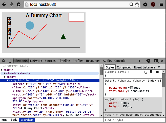
Figure 4-7. Chrome DevTools Elements tab
One really cool feature of the Elements tab is that you can interactively change element styling for both CSS styles and attributes.9 This is a great way to refine the look and feel of your data visualizations.
Chromeâs Elements tab provides a great way to explore the structure of a page, finding out how the different elements are positioned. This is good way to get your head around positioning content blocks with the position and float properties. Seeing how the pros apply CSS styles is a really good way to up your game and learn some useful tricks.
The Sources Tab
The Sources tab allows you to see any JavaScript included in the page. Figure 4-8 shows the tab at work. In the lefthand panel, you can select a script or an HTML file with embedded <script> tagged JavaScript. As shown, you can place a breakpoint in the code, load the page, and, on break, see the call stack and any scoped or global variables. These breakpoints are parametric, so you can set conditions for them to trigger, which is handy if you want to catch and step through a particular configuration. On break, you have the standard to step in, out, and over functions, and so on.
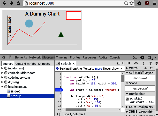
Figure 4-8. Chrome DevTools Sources tab
The Sources tab is a fantastic resource and greatly reduces the need for console logging10 when trying to debug JavaScript. In fact, where JS debugging was once a major pain point, it is now almost a pleasure.
Other Tools
Thereâs a huge amount of functionality in those Chrome DevTools tabs, and they are being updated almost daily. You can do memory and CPU timelines and profiling, monitor your network downloads, and test out your pages for different form factors. But youâll spend the large majority of your time as a data visualizer in the Elements and Sources tabs.
A Basic Page with Placeholders
Now that we have covered the major elements of a web page, letâs put them together. Most web visualizations start off as HTML and CSS skeletons, with placeholder elements ready to be fleshed out with a little JavaScript plus data (see âSingle-Page Appsâ).
Weâll first need our HTML skeleton, using the code in Example 4-1. This consists of a tree of <div> content blocks defining three chart elements: a header, main, and sidebar section. Weâll save this file as index.html.
Example 4-1. The file index.html, our HTML skeleton
<!DOCTYPE html><metacharset="utf-8"><linkrel="stylesheet"href="style.css"type="text/css"/><body><divid="chart-holder"class="dev"><divid="header"><h2>A Catchy Title Coming Soon...</h2><p>Some body text describing what this visualization is all about and why you should care.</p></div><divid="chart-components"><divid="main">A placeholder for the main chart.</div><divid="sidebar"><p>Some useful information about the chart, probably changing with user interaction.</p></div></div></div><scriptsrc="script.js"></script></body>
Now that we have our HTML skeleton, we want to style it using some CSS. This will use the classes and IDs of our content blocks to adjust size, position, background color, etc. To apply our CSS, in Example 4-1 we import a style.css file, shown in Example 4-2.
Example 4-2. The style.css file, providing our CSS styling
body{background:#ccc;font-family:Sans-serif;}div.dev{border:solid1pxred;}div.devdiv{border:dashed1pxgreen;}div#chart-holder{width:600px;background:white;margin:auto;font-size:16px;}div#chart-components{height:400px;position:relative;}div#main,div#sidebar{position:absolute;}div#main{width:75%;height:100%;background:#eee;}div#sidebar{right:0;width:25%;height:100%;}
This
devclass is a handy way to see the border of any visual blocks, which is useful for visualization work.Makes
chart-componentsthe relative parent.
Makes the
mainandsidebarpositions relative tochart-components.
Positions this block flush with the right wall of
chart-components.
We use absolute positioning of the main and sidebar chart elements (Example 4-2). There are various ways to position the content blocks with CSS, but absolute positioning gives you explicit control over their placement, which is a must if you want to get the look just right.
After specifying the size of the chart-components container, the main and sidebar child elements are sized and positioned using percentages of their parent. This means any changes to the size of chart-components will be reflected in its children.
With our HTML and CSS defined, we can examine the skeleton by firing up Pythonâs single-line HTTP server in the project directory containing the index.html and style.css files defined in Examples 4-1 and 4-2, like so:
$ python -m http.server8000Serving HTTP on0.0.0.0 port8000...
Figure 4-9 shows the resulting page with the Elements tab open, displaying the pageâs DOM tree.
The chartâs content blocks are now positioned and sized correctly, ready for JavaScript to add some engaging content.
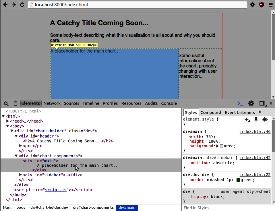
Figure 4-9. Building a basic web page
Positioning and Sizing Containers with Flex
Historically positioning and sizing content (usually <div> containers) with CSS was somewhat of a dark art. It didnât help that there were a lot of cross-browser incompatibilities and disagreements about what constituted padding or margins. But even allowing for that, the CSS properties used seemed pretty ad-hoc. Often achieving what seems to be a perfectly reasonable positioning or sizing ambition turned out to involve arcane CSS knowledge, hidden in the deep recesses of a Stack Overflow thread. One example being centering a div in the horizontal and vertical.11 This has all changed with the advent of the CSS flex-box, which uses some powerful new CSS properties to provide almost all the sizing and positioning youâll ever need.
Flex-boxes arenât quite one CSS property to rule them allâthe absolute positioning demonstrated in the previous section still has its place, particularly with data visualizationsâbut they are a collection of very powerful properties which, more often than not, represent the simplest, and sometimes the only, way to achieve a particular placing/sizing mission. Effects that used to require CSS expertise are now well within the grasp of a relative newbie and the icing on the cake is that flex-boxes play really well with variable screen ratiosâthe power of the flex. With that in mind, letâs see what can be done with the basic set of flex properties.
First, weâll use a little HTML to create a container div with three child divs (boxes). The child boxes will be of class box with an ID to enable specific CSS to be applied:
<divclass="container"id="top-container"><divclass="box"id="box1">box 1</div><divclass="box"id="box2">box 2</div><divclass="box"id="box3">box 3</div></div>
The initial CSS gives the container a red border, width, and height (600x400). The boxes are 100 pixels wide and high (80 pixels plus 10 pixels padding) and have a green border. A novel CSS property is the containerâs display: flex, which establishes a flex display context. The result of this can be seen in Figure 4-10 (display: flex), which shows the boxes presented in a row rather than the default column, where each box occupies its own row:
.container{display:flex;width:600px;height:400px;border:2pxsolidred;}.box{border:2pxsolidgreen;font-size:28px;padding:10px;width:80px;height:80px;}
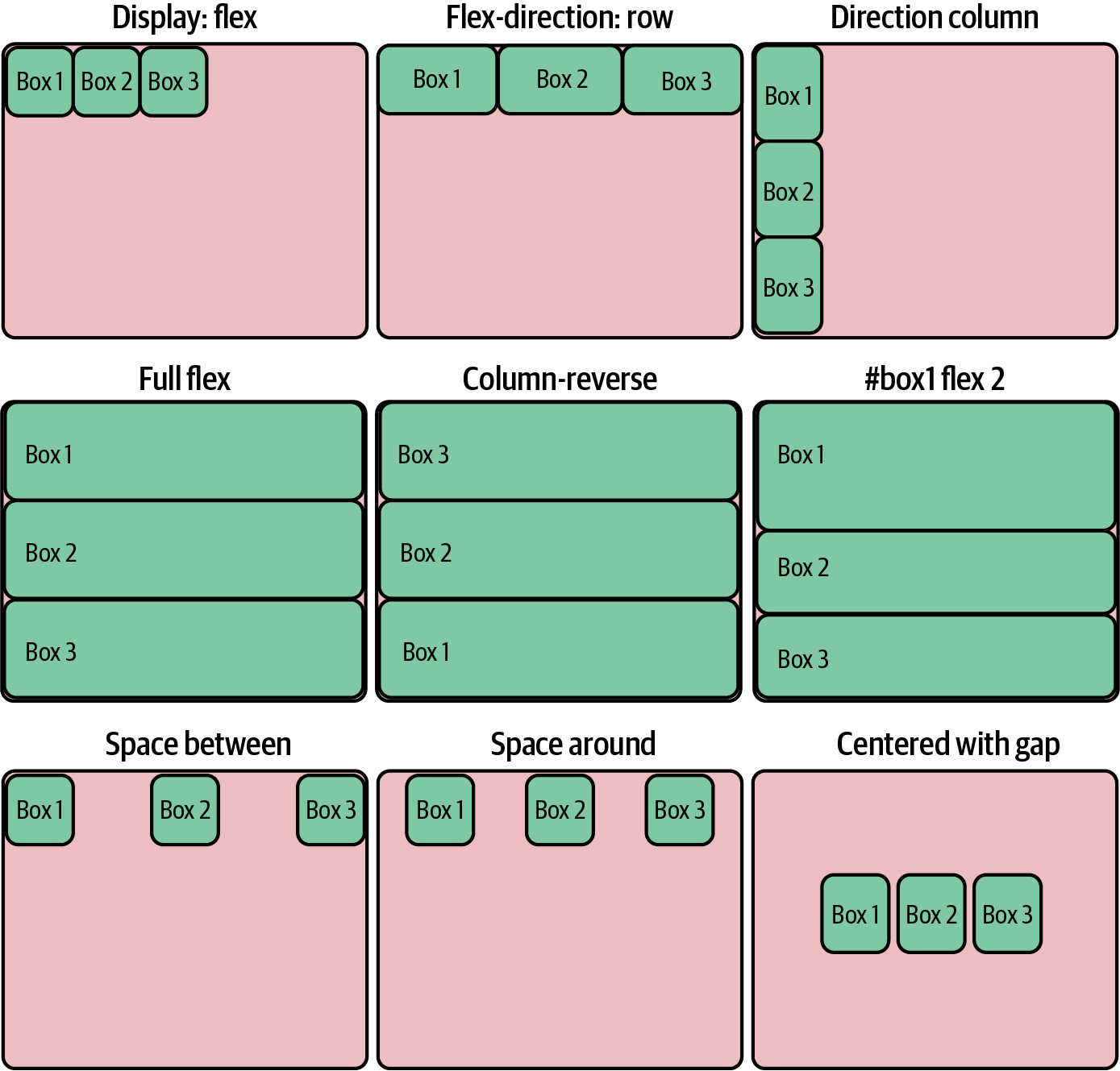
Figure 4-10. Positioning and sizing with flex-boxes
Flex displays respond to children with the flex property by expanding their size to fit the available space. If we make the boxes flexible, they respond by expanding to fill the container row. Figure 4-10 (flex-direction: row) shows the result. Note that the flex property overrides the boxesâ width property, allowing them to expand:
.box{/* ... */flex:1;}
The flex-direction property is row by default. By setting it to column, the boxes are placed in a column and the height property is overridden to allow them to expand to fit the containerâs height. Figure 4-10 (direction column) shows the result:
.container{/* ... */flex-direction:column;}
Removing or commenting out the width and height properties from the boxes makes them fully flexible, able to expand in the horizontal and vertical, producing Figure 4-10 (full flex):
.box{/* ... *//* width: 80px;height: 80px; */flex:1;}
If you want to reverse the order of the flex-boxes, there are a row-reverse and column-reverse flex-direction. Figure 4-10 (column reverse) shows the result of reversing the columns:
.container{/* ... */flex-direction:column-reverse;}
The value of the boxesâ flex property represents a sizing weight. Initially all the boxes have a weight of one, which makes them of equal size. If we give the first box a weight of two, it will occupy half (2 / (1 + 1 + 2)) the available space in the row or column direction specified. Figure 4-10 (#box1 flex 2) shows the result of increasing box1âs flex value:
#box1{flex:2;}
If we return the 100-pixel height and width (including padding) constraints to the boxes and remove their flex property, we can demonstrate the power of flex display positioning. Weâll also need to remove the flex directive from box1:
.box{width:80px;height:80px;/* flex: 1; */}#box1{/* flex: 2; */}
With fixed-size content, flex displays have a number of properties that allow precise placement of the content. This sort of manipulation used to involve all manner of tricky CSS hacks. First, letâs distribute the boxes evenly in their container, using row-based spacing. The magic property is justify-content with the value space-between; Figure 4-10 (space between) shows the result:
.container{/* ... */flex-direction:row;justify-content:space-between;}
There is a space-around complement to space-between, which spaces the content by adding equal padding to left and right. Figure 4-10 (space around) shows the result:
.container{/* ... */justify-content:space-around;}
By combining the justify-content and align-items properties, we can achieve the holy grail of CSS positioning, centering the content in the vertical and the horizontal. Weâll add a gap of 20 pixels between the boxes using the flex displayâs gap property:
.container{/* ... */gap:20px;justify-content:center;align-items:center;}
Figure 4-10 (centered with gap) shows our content sitting squarely in the middle of its container.
Another great thing about the flex display is that it is fully recursive. divs can both have a display flex property and be flex content. This makes achieving complex content layouts a breeze. Letâs see a little demonstration of nested flex-boxes, to make the point clear.
Weâll first use some HTML to build a nested tree of boxes (including the main container box). Weâll give each box and container an ID and class:
<divclass="main-container"><divclass="container"id="top-container"><divclass="box"id="box1">box 1</div><divclass="box"id="box2">box 2</div></div><divclass="container"id="middle-container"><divclass="box"id="box3">box 3</div></div><divclass="container"id="bottom-container"><divclass="box"id="box4">box 4</div><divclass="box"id="box5"><divclass="box"id="box6">box 6</div><divclass="box"id="box7">box 7</div></div></div></div>
The following CSS gives the main container a height of 800 pixels (it will fill the available width by default), a flex display, and a flex-direction of column, making it stack its flex content.
There are three containers to be stacked, which are both flexible and provide a flex display for their content. The boxes have a red border and are fully flexible (no width or height specified). By default all boxes have a flex weight of one.
The middle container has a fixed width box (width 66%) and uses justify-content: center to center it.
The bottom container has a flex value of 2, making it twice the height of its siblings. It has two boxes of equal weight, one of which (box 5) contains two boxes that are stacked (flex-direction: column). The fairly complex layout (see Figure 4-11) is achieved with impressively little CSS and is easily adapted by changing a few flex display properties:
.main-container{height:800px;padding:10px;border:2pxsolidgreen;display:flex;flex-direction:column;}.container{flex:1;display:flex;}.box{flex:1;border:2pxsolidred;padding:10px;font-size:30px;}#middle-container{justify-content:center;}#box3{width:66%;flex:initial;}#bottom-container{flex:2;}#box5{display:flex;flex-direction:column;}
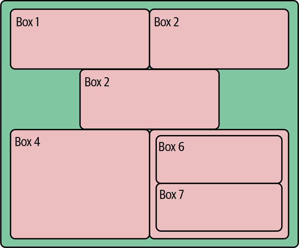
Figure 4-11. Nested flex-boxes
Flex-boxes provide a very powerful sizing and positioning context for your HTML content that responds to container size and can be easily adapted. If you want your content in a column rather than a row, then a single property change makes it so. For more precise positioning and sizing control there is the CSS grid layout, but I would recommend focusing your initial energies on the flex displayâit represents the best return on your learning investment in CSS right now. For further examples, see the CSS-Tricks article on flex-boxes and this handy cheat sheet.
Filling the Placeholders with Content
With our content blocks defined in HTML and positioned with CSS, a modern data visualization uses JavaScript to construct its interactive charts, menus, tables, and the like. There are many ways to create visual content (aside from image or multimedia tags) in your modern browser, the main ones being:
-
Scalable Vector Graphics (SVG) using special HTML tags
-
Drawing to a 2D
canvascontext -
Drawing to a 3D
canvasWebGL context, allowing a subset of OpenGL commands -
Using modern CSS to create animations, graphic primitives, and more
Because SVG is the language of choice for D3, in many ways the biggest JavaScript dataviz library, many of the cool web data visualizations you have seen, such as those by the New York Times, are built using it. Broadly speaking, unless you anticipate having lots (>1,000) of moving elements in your visualization or need to use a specific canvas-based library, SVG is probably the way to go.
By using vectors instead of pixels to express its primitives, SVG will generally produce cleaner graphics that respond smoothly to scaling operations. Itâs also much better at handling text, a crucial consideration for many visualizations. Another key advantage of SVG is that user interaction (e.g., mouse hovering or clicking) is native to the browser, being part of the standard DOM event handling.12 A final point in its favor is that because the graphic components are built on the DOM, you can inspect and adapt them using your browserâs development tools (see âChrome DevToolsâ). This can make debugging and refining your visualizations much easier than trying to find errors in the canvasâs relatively black box.
canvas graphics contexts come into their own when you need to move beyond simple graphic primitives like circles and lines, such as when incorporating images like PNGs and JPGs. canvas is usually considerably more performant than SVG, so anything with lots of moving elements13 is better off rendered to a canvas. If you want to be really ambitious or move beyond 2D graphics, you can even unleash the awesome power of modern graphics cards by using a special form of canvas context, the OpenGL-based WebGL context. Just bear in mind that what would be simple user interaction with SVG (e.g., clicking on a visual element) often has to be derived from mouse coordinates manually, which adds a tricky layer of complexity.
The Nobel Prize data visualization realized at the end of this bookâs toolchain is built primarily with D3, so SVG graphics are the focus of this book. Being comfortable with SVG is fundamental to modern web-based dataviz, so letâs explore a little primer.
Scalable Vector Graphics
All SVG creations start with an <svg> root tag. All graphical elements, such as circles and lines, and groups thereof, are defined on this branch of the DOM tree. Example 4-3 shows a little SVG context weâll use in upcoming demonstrations, a light-gray rectangle with ID chart. We also include the D3 library, loaded from d3js.org and a script.js JavaScript file in the project folder.
Example 4-3. A basic SVG context
<!DOCTYPE html><metacharset="utf-8"><!-- A few CSS style rules --><style>svg#chart{background:lightgray;}</style><svgid="chart"width="300"height="225"></svg><!-- Third-party libraries and our JS script. --><scriptsrc="http://d3js.org/d3.v7.min.js"></script><scriptsrc="script.js"></script>
Now that weâve got our little SVG canvas in place, letâs start doing some drawing.
The <g> Element
We can group shapes within our <svg> element by using the group <g> element. As weâll see in âWorking with Groupsâ, shapes contained in a group can be manipulated together, including changing their position, scale, or opacity.
Circles
Creating SVG visualizations, from the humblest little static bar chart to full-fledged interactive, geographic masterpieces, involves putting together elements from a fairly small set of graphical primitives such as lines, circles, and the very powerful paths. Each of these elements will have its own DOM tag, which will update as it changes.14 For example, its x and y attributes will change to reflect any translations within its <svg> or group (<g>) context.
Letâs add a circle to our <svg> context to demonstrate:
<svgid="chart"width="300"height="225"><circler="15"cx="100"cy="50"></circle></svg>
With a little CSS to provide the circleâs fill color:
#chartcircle{fill:lightblue}
This produces Figure 4-12. Note that the y coordinate is measured from the top of the <svg> '#chart' container, a common graphic convention.
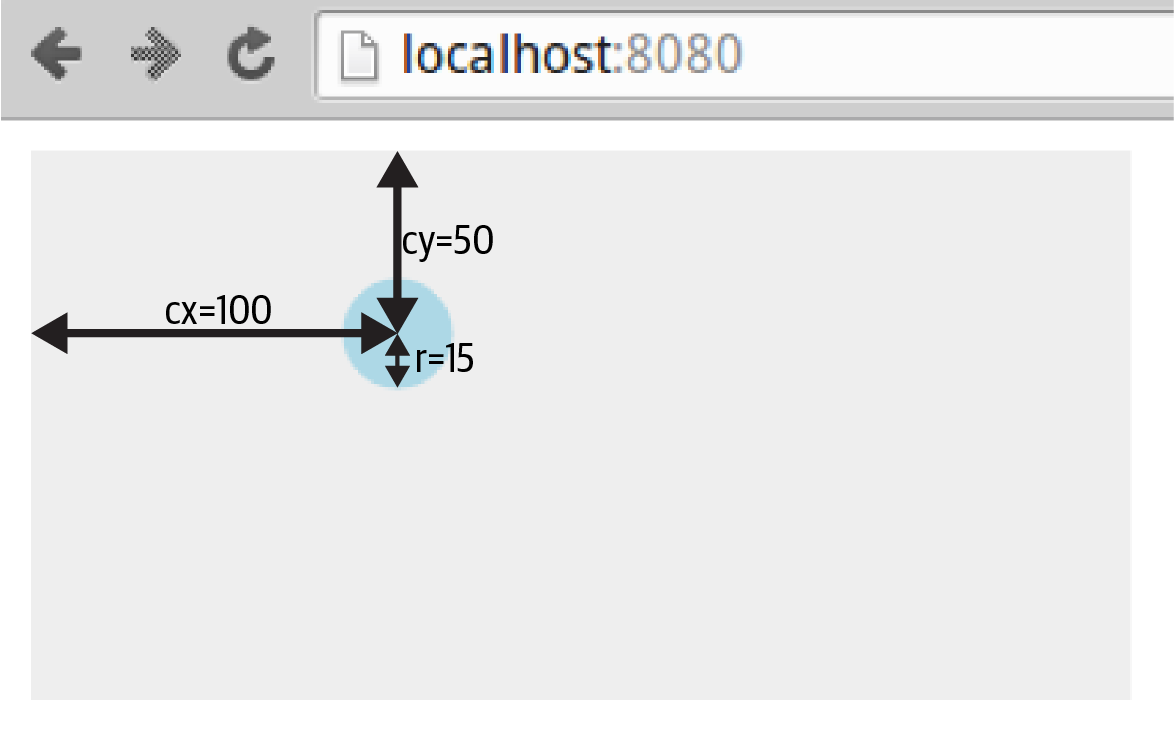
Figure 4-12. An SVG circle
Now letâs see how we go about applying styles to SVG elements.
Applying CSS Styles
The circle in Figure 4-12 is fill-colored light blue using CSS styling rules:
#chartcircle{fill:lightblue}
In modern browsers, you can set most visual SVG styles using CSS, including fill, stroke, stroke-width, and opacity. So if we wanted a thick, semitransparent green line (with ID total) we could use the following CSS:
#chartline#total{stroke:green;stroke-width:3px;opacity:0.5;}
You can also set the styles as attributes of the tags, though CSS is generally preferable:
<svg><circler="15"cx="100"cy="50"fill="lightblue"></circle></svg>
Tip
Which SVG features can be set by CSS and which canât is a source of some confusion and plenty of gotchas. The SVG spec distinguishes between element properties and attributes, the former being more likely to be found among the valid CSS styles. You can investigate the valid CSS properties using Chromeâs Elements tab and its autocomplete. Also, be prepared for some surprises. For example, SVG text is colored by the fill, not color, property.
For fill and stroke, there are various color conventions you can use:
-
Named HTML colors, such as lightblue
-
Using HTML hex codes (#RRGGBB); for example, white is #FFFFFF
-
RGB values; for example, red = rgb(255, 0, 0)
-
RGBA values, where A is an alpha channel (0â1); for example, half-transparent blue is rgba(0, 0, 255, 0.5)
In addition to adjusting the colorâs alpha channel with RGBA, you can fade the SVG elements using their opacity property. Opacity is used a lot in D3 animations.
Stroke width is measured in pixels by default but can use points.
Lines, Rectangles, and Polygons
Weâll add a few more elements to our chart to produce Figure 4-13.
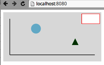
Figure 4-13. Adding a few elements to our dummy chart
First, weâll add a couple of simple axis lines to our chart, using the <line> tag. Line positions are defined by a start coordinate (x1, y1) and an end one (x2, y2):
<svg><linex1="20"y1="20"x2="20"y2="130"></line><linex1="20"y1="130"x2="280"y2="130"></line></svg>
Weâll also add a dummy legend box in the top-right corner using an SVG rectangle. Rectangles are defined by x and y coordinates relative to their parent container, and a width and height:
<svg><rectx="240"y="5"width="55"height="30"></rect></svg>
You can create irregular polygons using the <polygon> tag, which takes a list of coordinate pairs. Letâs make a triangle marker in the bottom right of our chart:
<svg><polygonpoints="210,100, 230,100, 220,80"></polygon></svg>
Weâll style the elements with a little CSS:
#chartcircle{fill:lightblue}#chartline{stroke:#555555;stroke-width:2}#chartrect{stroke:red;fill:white}#chartpolygon{fill:green}
Now that weâve got a few graphical primitives in place, letâs see how we add some text to our dummy chart.
Text
One of the key strengths of SVG over the rasterized canvas context is how it handles text. Vector-based text tends to look a lot clearer than its pixelated counterparts and benefits from smooth scaling too. You can also adjust stroke and fill properties, just like any SVG element.
Letâs add a bit of text to our dummy chart: a title and labeled y-axis (see Figure 4-14).
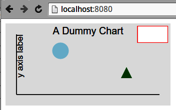
Figure 4-14. Some SVG text
We place text using x and y coordinates. One important property is the text-anchor, which stipulates where the text is placed relative to its x position. The options are start, middle, and end; start is the default.
We can use the text-anchor property to center our chart title. We set the x coordinates at half the chart width and then set the text-anchor to middle:
<svg><textid="title"text-anchor="middle"x="150"y="20">A Dummy Chart</text></svg>
As with all SVG primitives, we can apply scaling and rotation transforms to our text. To label our y-axis, weâll need to rotate the text to the vertical (Example 4-4). By convention, rotations are clockwise by degree, so weâll want a counterclockwise, â90 degree rotation. By default rotations are around the (0,0) point of the elementâs container (<svg> or group <g>). We want to rotate our text around its own position, so first translate the rotation point using the extra arguments to the rotate function. We also want to first set the text-anchor to the end of the y axis label string to rotate about its endpoint.
Example 4-4. Rotating text
<svg><textx="20"y="20"transform="rotate(-90,20,20)"text-anchor="end"dy="0.71em">y axis label</text></svg>
In Example 4-4, we make use of the textâs dy attribute, which, along with dx, can be used to make fine adjustments to the textâs position. In this case, we want to lower it so that when rotated counterclockwise it will be to the right of the y-axis.
SVG text elements can also be styled with CSS. Here we set the font-family of the chart to sans-serif and the font-size to 16px, using the title ID to make that a little bigger:
#chart{background:#eee;font-family:sans-serif;}#charttext{font-size:16px}#charttext#title{font-size:18px}
Note that the text elements inherit font-family and font-size from the chartâs CSS; you donât have to specify a text element.
Paths
Paths are the most complicated and powerful SVG element, enabling the creation of multiline, multicurve component paths that can be closed and filled, creating pretty much any shape you want. A simple example is adding a little chart line to our dummy chart to produce Figure 4-15.
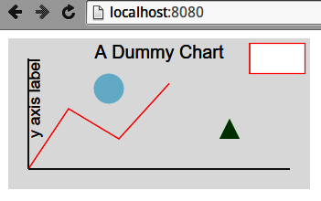
Figure 4-15. A red line path from the chart axis
The red path in Figure 4-15 is produced by the following SVG:
<svg><pathd="M20 130L60 70L110 100L160 45"></path></svg>
The pathâs d attribute specifies the series of operations needed to make the red line. Letâs break it down:
-
âM20 130â: move to coordinate (20, 130)
-
âL60 70â: draw a line to (60, 70)
-
âL110 100â: draw a line to (110, 100)
-
âL160 45â: draw a line to (160, 45)
You can imagine d as a set of instructions to a pen to move to a point, with M raising the pen from the canvas.
A little CSS styling is needed. Note that the fill is set to none; otherwise, to create a fill area, the path would be closed, drawing a line from its end to beginning points, and any enclosed areas filled in with the default color black:
#chartpath{stroke:red;fill:none}
As well as the moveto 'M' and lineto 'L', the path has a number of other commands to draw arcs, Bézier curves, and the like. SVG arcs and curves are commonly used in dataviz work, with many of D3âs libraries making use of them.15 Figure 4-16 shows some SVG elliptical arcs created by the following code:
<svgid="chart"width="300"height="150"><pathd="M40 40 A30 400 0 180 80 A50 50 0 0 1 160 80 A30 30 0 0 1 190 80 "></svg>
Having moved to position (40, 40), draw an elliptical arc with x-radius 30, y-radius 40, and endpoint (80, 80).
The first flag (0) sets the x axis rotation, in this case the conventional zero. See the Mozilla developer site for a visual demonstration. The last two flags (0, 1) are
large-arc-flag, specifying which arc of the ellipse to use, andsweep-flag, which specifies which of the two possible ellipses defined by start and endpoints to use.
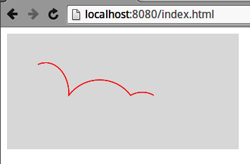
Figure 4-16. Some SVG elliptical arcs
The key flags used in the elliptical arc (large-arc-flag and sweep-flag) are, like most things geometric, better demonstrated than described. Figure 4-17 shows the effect of changing the flags for the same relative beginning and endpoints, like so:
<svgid="chart"width="300"height="150"><pathd="M40 80A30 40 0 0 1 80 80A30 40 0 0 0 120 80A30 40 0 1 0 160 80A30 40 0 1 1 200 80"></svg>
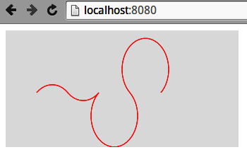
Figure 4-17. Changing the elliptic-arc flags
As well as lines and arcs, the path element offers a number of Bézier curves, including quadratic, cubic, and compounds of the two. With a little work, these can create any line path you want. Thereâs a nice run-through on SitePoint with good illustrations.
For the definitive list of path elements and their arguments, go to the World Wide Web Consortium (W3C) source. And for a nice round-up, see Jakob Jenkovâs introduction.
Scaling and Rotating
As befits their vector nature, all SVG elements can be transformed by geometric operations. The most commonly used are rotate, translate, and scale, but you can also apply skewing using skewX and skewY or use the powerful, multipurpose matrix transform.
Letâs demonstrate the most popular transforms, using a set of identical rectangles. The transformed rectangles in Figure 4-18 are achieved like so:
<svgid="chart"width="300"height="150"><rectwidth="20"height="40"transform="translate(60, 55)"fill="blue"/><rectwidth="20"height="40"transform="translate(120, 55),rotate(45)"fill="blue"/><rectwidth="20"height="40"transform="translate(180, 55),scale(0.5)"fill="blue"/><rectwidth="20"height="40"transform="translate(240, 55),rotate(45),scale(0.5)"fill="blue"/></svg>
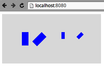
Figure 4-18. Some SVG transforms: rotate(45), scale(0.5), scale(0.5), then rotate(45)
Note
The order in which transforms are applied is important. A rotation of 45 degrees clockwise followed by a translation along the x-axis will see the element moved southeasterly, whereas the reverse operation moves it to the left and then rotates it.
Working with Groups
Often when you are constructing a visualization, itâs helpful to group the visual elements. A couple of particular uses are:
-
When you require local coordinate schemes (e.g., if you have a text label for an icon and you want to specify its position relative to the icon, not the whole
<svg>canvas). -
If you want to apply a scaling and/or rotation transformation to a subset of the visual elements.
SVG has a group <g> tag for this, which you can think of as a mini canvas within the <svg> canvas. Groups can contain groups, allowing for very flexible geometric mappings.16
Example 4-5 groups shapes in the center of the canvas, producing Figure 4-19. Note that the position of circle, rect, and path elements is relative to the translated group.
Example 4-5. Grouping SVG shapes
<svgid="chart"width="300"height="150"><gid="shapes"transform="translate(150,75)"><circlecx="50"cy="0"r="25"fill="red"/><rectx="30"y="10"width="40"height="20"fill="blue"/><pathd="M-20 -10L50 -10L10 60Z"fill="green"/><circler="10"fill="yellow"></g></svg>
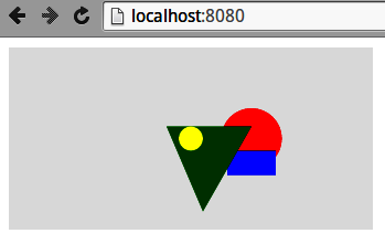
Figure 4-19. Grouping shapes with SVG <g>` tag
If we now apply a transform to the group, all shapes within it will be affected. Figure 4-20 shows the result of scaling Figure 4-19 by a factor of 0.75 and then rotating it 90 degrees, which we achieve by adapting the transform attribute, like so:
<svgid="chart"width="300"height="150"><gid="shapes",transform="translate(150,75),scale(0.5),rotate(90)">...</svg>
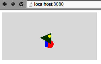
Figure 4-20. Transforming an SVG group
Layering and Transparency
The order in which the SVG elements are added to the DOM tree is important, with later elements taking precedence, layering over others. In Figure 4-19, for example, the triangle path obscures the red circle and blue rectangle and is in turn obscured by the yellow circle.
Manipulating the DOM ordering is an important part of JavaScripted dataviz (e.g., D3âs insert method allows you to place an SVG element before an existing one).
Element transparency can be manipulated using the alpha channel of rgba(R,G,B,A) colors or the more convenient opacity property. Both can be set using CSS. For overlaid elements, opacity is cumulative, as demonstrated by the color triangle in Figure 4-21, produced by the following SVG:
<style>#chartcircle{opacity:0.33}</style><svgid="chart"width="300"height="150"><gtransform="translate(150, 75)"><circlecx="0"cy="-20"r="30"fill="red"/><circlecx="17.3"cy="10"r="30"fill="green"/><circlecx="-17.3"cy="10"r="30"fill="blue"/></g></svg>
The SVG elements demonstrated here were handcoded in HTML, but in data visualization work they are almost always added programmatically. Thus the basic D3 workflow is to add SVG elements to a visualization, using data files to specify their attributes and properties.
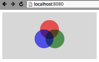
Figure 4-21. Manipulating opacity with SVG
JavaScripted SVG
The fact that SVG graphics are described by DOM tags has a number of advantages over a black box such as the <canvas> context. For example, it allows nonprogrammers to create or adapt graphics and is a boon for debugging.
In web dataviz, pretty much all your SVG elements will be created with JavaScript, through a library such as D3. You can inspect the results of this scripting using the browserâs Elements tab (see âChrome DevToolsâ), which is a great way to refine and debug your work (e.g., nailing an annoying visual glitch).
As a little taster for things to come, letâs use D3 to scatter a few red circles on an SVG canvas. The dimensions of the canvas and circles are contained in a data object sent to a chartCircles function.
We use a little HTML placeholder for the <svg> element:
<!DOCTYPE html><metacharset="utf-8"><style>#chart{background:lightgray;}#chartcircle{fill:red}</style><body><svgid="chart"></svg><scriptsrc="http://d3js.org/d3.v7.min.js"></script><scriptsrc="script.js"></script></body>
With our placeholder SVG chart element in place, a little D3 in the script.js file is used to turn some data into the scattered circles (see Figure 4-22):
// script.jsvarchartCircles=function(data){varchart=d3.select('#chart');// Set the chart height and width from datachart.attr('height',data.height).attr('width',data.width);// Create some circles using the datachart.selectAll('circle').data(data.circles).enter().append('circle').attr('cx',function(d){returnd.x}).attr('cy',d=>d.y).attr('r',d=>d.r);};vardata={width:300,height:150,circles:[{'x':50,'y':30,'r':20},{'x':70,'y':80,'r':10},{'x':160,'y':60,'r':10},{'x':200,'y':100,'r':5},]};chartCircles(data);
This is the modern shorthand arrow-based anonymous function, equivalent to the long form on the previous line. D3 makes use of a lot of these for accessing the properties of bound data objects, so this new syntax is a big win.
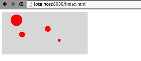
Figure 4-22. D3-generated circles
Weâll see exactly how D3 works its magic in Chapter 17. For now, letâs summarize what weâve learned in this chapter.
Summary
This chapter provided a basic set of modern web-development skills for the budding data visualizer. It showed how the various elements of a web page (HTML, CSS stylesheets, JavaScript, and media files) are delivered by HTTP and, on being received by the browser, combined to become the web page the user sees. We saw how content blocks are described, using HTML tags such as div and p, and then styled and positioned using CSS. We also covered Chromeâs Elements and Sources tabs, which are the key browser development tools. Finally we had a little primer in SVG, the language in which most modern web data visualizations are expressed. These skills will be extended when our toolchain reaches its D3 visualization and new ones will be introduced in context.
1 There are some interesting alternatives to full-blown frameworks currently generating a buzz, such as Alpine.js and htmx, which play well with Python web servers like Django and Flask.
2 I bear the scars so you donât have to.
3 You can code style in HTML tags using the style attribute, but itâs generally bad practice. Itâs better to use classes and ids defined in CSS.
4 As demonstrated by Mike Bostock, with a hat-tip to Paul Irish.
5 OpenGL (Open Graphics Language) and its web counterpart WebGL are cross-platform APIs for rendering 2D and 3D vector graphics (see the Wikipedia page for details).
6 This is not the same as programmatically setting styles, which is a hugely powerful technique that allows styles to adapt to user interaction.
7 This is generally considered bad practice and is usually an indication of poorly structured CSS. Use with extreme caution, as it can make life very difficult for code developers.
8 These are succinctly discussed in Douglas Crockfordâs famously short JavaScript: The Good Parts (OâReilly).
9 Being able to play with attributes is particularly useful when trying to get Scalable Vector Graphics (SVG) to work.
10 Logging is a great way of tracking data flow through your app. I recommend you adopt a consistent approach here.
11 Hereâs a thread showing the many and varied solutions to the problem, none of which could be called elegant.
12 With a canvas graphic context, you generally have to contrive your own event handling.
13 This number changes with time and the browser in question, but as a rough rule of thumb, SVG often starts to strain in the low thousands.
14 You should be able to use your browserâs development tools to see the tag attributes updating in real time.
15 Mike Bostockâs chord diagram is a nice example, and uses D3âs chord function.
16 For example, a body group can contain an arm group, which can contain a hand group, which can contain finger elements.
Get Data Visualization with Python and JavaScript, 2nd Edition now with the O’Reilly learning platform.
O’Reilly members experience books, live events, courses curated by job role, and more from O’Reilly and nearly 200 top publishers.

