Chapter 4. Automating Data Exploration and Editing
Most of this book shows you how AI can do something new that could not have been done before, whether that is identifying key features and anomalies, building a machine learning model, or applying Azure AI Services to your data. This chapter, however, is about how AI can automate aspects of the data exploration and editing process. The first half of the chapter reviews the built-in AI components of Power Query Editor that automate data preprocessing steps. The second half explores the AI tools and features that help speed up the process of interpreting information and generating reports. Together, these automation features of Power BI allow the analyst to spend less time on tedious tasks and free up more time for more thoughtful work.
The Transformational Power of Automation
As a reader of this book, you are likely the kind of person who is excited to see advances in the technological landscape. The opposite kind of person, someone who rejects new technology, is often called a Luddite. But did you know this was the name of a labor movement in northern England in the early 1800s? The original Luddites were skilled textile workers who would break into factories and destroy the new looms that were competing with their labor. Their sabotage was serious enough that Parliament passed the Frame-Breaking Act in 1812, making such crimes punishable by death.1 Notably, for the Luddites, it was never about being against technology per se—they were just trying to protect their livelihoods.
But not all progress is bad for all people. Sometimes automation substitutes for skills, work, or people, and other times it can serve as a complement. For example, you may have a job title that did not exist 20 years ago and was only made possible by recent advances in data collection and analysis. Two MIT researchers, Erik Brynjolfsson and Andrew McAfee, describe how modern innovations benefit some people but not everyone:
Technological progress is going to leave behind some people, perhaps even a lot of people, as it races ahead. As we’ll demonstrate, there’s never been a better time to be a worker with special skills or the right education, because these people can use technology to create and capture value. However, there’s never been a worse time to be a worker with only “ordinary” skills and abilities to offer, because computers, robots, and other digital technologies are acquiring these skills and abilities at an extraordinary rate.2
The same concept of disruptive technology applies to organizations as well. Take the example of how the introduction of automated teller machines (ATMs) changed the way bank branches operated.3 This new technology allowed a branch bank to operate with one-third fewer workers; however, this made it cheaper for banks to open more locations. The net effect was that more tellers were hired. The ATMs also changed the kind of work done at the branches: they reduced the number of cash-handling tasks performed, allowing tellers to spend more time building customer relationships and selling other financial products.
Many companies have the choice of either embracing disruptive technology or becoming the victim of it. AI has already transformed society, business, and our own lives and shows no sign of stopping as it advances the technological frontier. So what’s next? In 2018, the CEO of Google, Sundar Pichai, gave an answer: “I think of [AI] as something more profound than electricity or fire.” This bold proclamation, in part, is because AI is a general purpose technology—that is, a type of technology that has broad applications across various products and industries. Electricity, as mentioned by Pichai, is also a general purpose technology. By itself, electricity is not able to do much, but it set the stage for a wide series of inventions: factories with electrical machines allowed for more precise control in manufacturing, incandescent illumination affordably extended days, and the refrigerator, the television, and (eventually) the personal computer revolutionized home life. AI will likewise change how we live and how we work by opening up a new era of technological development.
Surviving (and Thriving with) Automation
The only constant in business is change, so it is important for individuals and organizations to navigate the changing technological landscape. Automation can dramatically change how work is done, but those who embrace it will fare much better than those who ignore automation. Let’s discuss ways you and your company can best prepare for development in automation.
How a data analyst can prepare
- Embrace broad learning.
Studying a wide variety of topics makes you better able to pursue a specific field that is taking off (or step away from a field that is declining) due to automation. Generalists also tend to be more innovative and can succeed in a given field by utilizing a multidisciplinary mindset.
- Embrace narrow learning.
Another approach is to earn a degree or certification in a discipline that has dependable future demand. Quantitative and technical disciplines are still a good bet in the Age of AI. Note that this approach is not mutually exclusive with learning broadly; one can do both.
- Become a domain expert.
It’s also important to learn the ins and outs of a business and the industry in which it operates. If a domain expert is in a role that can be automated away, they are more likely than other employees to be able to fulfill some other role within the same business.
- Specialize in automation.
If you can’t beat ’em, join ’em! Automation can make some jobs obsolete but, in the process, will create new jobs. Recent advances in large language models will increase demand for machine learning engineers to train such models as well as prompt engineers trained in asking the best questions to produce high-quality outputs.
- Enter an un-automatable role.
Pursue a specialty within data and analytics that cannot be automated (or at least is harder to automate). Consider fields like data governance, privacy, or ethics.
- Strengthen your data storytelling.
Automation in Power BI makes it easier and faster to transform, analyze, and visualize data, increasing the number of reports generated. This in turn will make data storytellers more valuable, as they can create narratives from data and uncover new questions to ask.
- Exercise those soft skills.
Humans will still want to work with other humans, and it’s difficult to receive empathy from an algorithm. If AI becomes ubiquitous, then successful managers will be those with high emotional intelligence.
How a data-driven organization can prepare
- Invest in professional development.
Dedicate meaningful time and resources to your employees’ learning, especially in areas that complement advances in AI.
- Embrace a growth mindset.
Promote a forward-thinking culture that strives to grow. This includes organizing your company in a way that makes it nimble enough to pivot in response to changing technologies and allows it to support execution on that growth.
- Restructure job roles.
Be willing to move employees around within an organization if new forms of automation allow a team to operate with a smaller headcount. Also consider what new roles could better leverage the latest technology.
- Prioritize delighting your customer.
If widespread automation is turning your previously differentiated product or service into a commodity, then you will have to find a way to stand out against rising competition. One way to do this is by taking a customer-first approach with personalization and superior service.
- Explore new market opportunities.
Just as the internet led to the development of ecommerce, advances in AI and automation will allow for the creation of new products, markets, and industries.
- Emphasize creativity and innovation.
Double down on aspects of your business that cannot be automated, such as human creativity and innovation.
- Build the automation.
Don’t passively wait for the future to happen; make it happen by leading the development of automation within your product or service.
AI Automation in Power BI
Business intelligence platforms as a whole are not easily automated because they do not perform just one task; rather, they are a suite of tools performing many functions. Additionally, BI dashboards are often used for data exploration where there is not always a clear objective or outcome to optimize. We can instead look at different components of a BI platform and see which parts are best suited for automation.
Consider the business intelligence cycle shown in Figure 4-1. Start the cycle at the upper right, where an analyst identifies a business problem. They next define a data model that will allow them to solve the business problem or answer a specific question. Next, they must gather data from within the organization that will allow them to build the specified data model. These first three steps, shown on the right in blue (darker gray in the print edition), are not good candidates for automation. There is no computer program that will tell you the most pressing problem at a company, what data is required to address that problem, or where the data can be accessed. These steps must be done by a human.
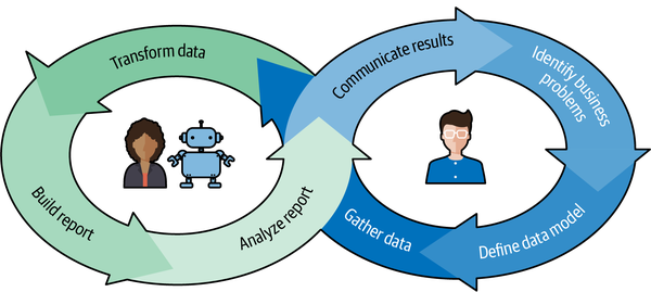
Figure 4-1. The business intelligence cycle
After the analyst has gathered the data, they transform the data to build a data model. Next, they use that processed data to build a report with summary data and/or data visualizations. The analyst will then analyze the report to solve the business problem or answer the question. These three steps, shown on the left in green (lighter gray in the print edition), have elements that can be automated to some degree. This means there are real opportunities for a data analyst to partner with some AI-based automation tools to speed up certain tasks or help with decision making.
For example, within Power BI there are many automated data transformation tools in Power Query that utilize AI, including get data from web by example, add column from examples, data profiling, table generation, and fuzzy matching. Additionally, there are automated report-building tools, such as Q&A and report creation. Also in Power BI, you have the report-analyzing features with built-in automation, like smart narrative and quick insights visualizations.
The last step of the business intelligence cycle is for the data analyst to communicate results to their organization. As seen in Figure 4-1, this is also represented in blue (darker gray in print edition) since it is not a good candidate for automation. The cycle returns to the initial step because business intelligence involves an iterative process of discovery.
AI in Power Query
Note
This book assumes the reader is already familiar with the fundamentals of Power BI and therefore knows that Power Query is where a developer can connect to one or more data sources and then transform the data into a desired format. If, however, you need to catch up or have a refresher, check out this Power Query overview.
The next round of AI-based automation features within Power BI are part of Power Query. These tools leverage AI to more quickly perform a variety of data manipulations. This is beneficial for the data analyst because no one goes into their line of work saying, “I want to spend my career cleaning data.” Indeed, some of the most underrated applications of AI involve dull or tedious tasks.
This is also important at the organizational level, where companies using AI have a clear advantage over those who are not. Recent developments in large language models, such as ChatGPT, discussed in Chapter 7, show how a new technology can increase an employee’s capacity by essentially giving everyone their own personal assistant. Similarly, there are AI tools in Power BI that empower individuals to quickly complete mundane tasks.
In this section, we will review six such time-saving features that can make your job easier or unlock a new dataset for analysis. They include get data from web by example (web scraping), add column from examples, data profiling, table generation (from text, CSV, JSON, web API, or Excel), and fuzzy matching.
Get Data from Web by Example
Sometimes we know about the existence of some data of interest, but it is in a format that is not readily accessible. For example, one relatively common quip describes PDFs as “where data goes to die” due to their immutable design. Web pages are another such instance: incredible quantities of information live on them, but their format is optimized for browsing and not for large-scale data sharing.
This is where web scraping comes in. Web scraping is the automated process of extracting information from web pages. It parses the underlying hypertext markup language (HTML) of a website and stores it for later use. If you are using the Firefox or Chrome browser, then you can view a page’s HTML by right-clicking on the page and selecting Inspect Figure 4-2 shows the underlying HTML on a page of O’Reilly resources. After clicking Inspect, you can go to the right-side panel and navigate through some drop-down sections to reveal the stored text that populates the page.
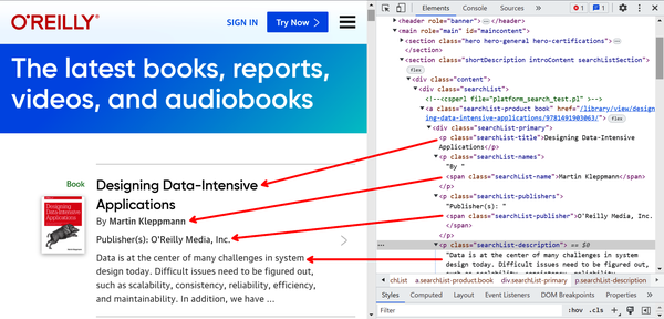
Figure 4-2. Revealing the underlying HTML of a web page
Power BI gives the option to load a web page and extract the HTML into a data table. The user provides a few examples of the desired output, and Power BI uses AI to automatically predict all of the desired entries from the website.
In our experience, AI is pretty good at identifying the pattern of HTML extraction after two or three examples but does not improve much after that. If you are not getting good results, try these tips:
-
Check your previous entries for typos.
-
Make sure you select an entry from the dropdown after typing the first few characters.
-
Check if there is extra text at the end of an entry by double-clicking and using the right arrow key.
-
Start over from the beginning.
-
Try scraping a larger section than you initially wanted (e.g., in Demo 1, we extract “By [author name]” because extracting the author name alone was not consistently working).
Demo 4-1: Get Data from Web by Example
Let’s walk through an example of web scraping with get data from web by example. Open a new Power BI report and select the “drop-down arrow” from “Get data.” Then click Web, as shown in Figure 4-3.
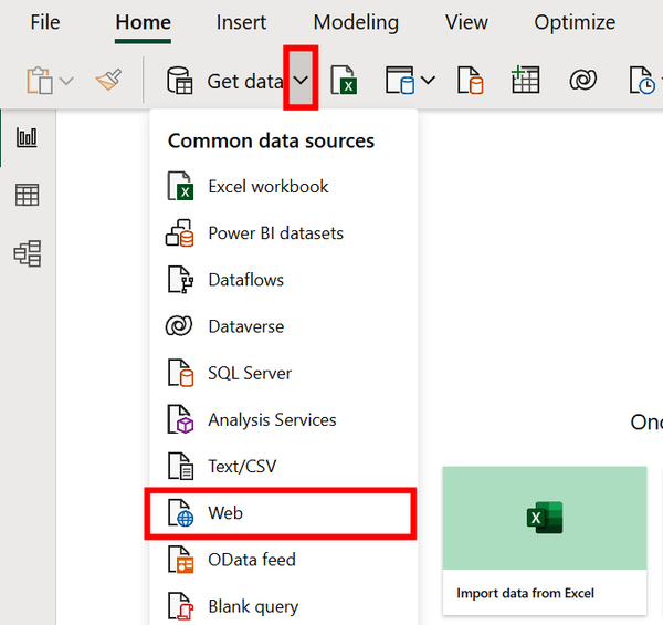
Figure 4-3. Getting data from a web source
Under URL, paste this:
- https://web.archive.org/web/20231120092630/https://www.oreilly.com/products/books-videos.html
Then, click OK (Figure 4-4). This will open a web page that lists O’Reilly products.
If asked which level to apply these settings to, select the full URL from the drop down and select Connect (not pictured). It may take a full minute to connect.
This opens the Navigator window, which provides several options for displaying the underlying data of the web page. By selecting Web View, you can see the original website as if you had opened it in a browser (Figure 4-5). Or you can select Table View and HTML Code to see the code that generates the page (Figure 4-6). Alternatively, you can click Table View and the Table 1 box to reveal a suggested table generated from the page’s HTML (Figure 4-7).
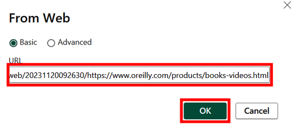
Figure 4-4. Telling Power BI which website you want to scrape
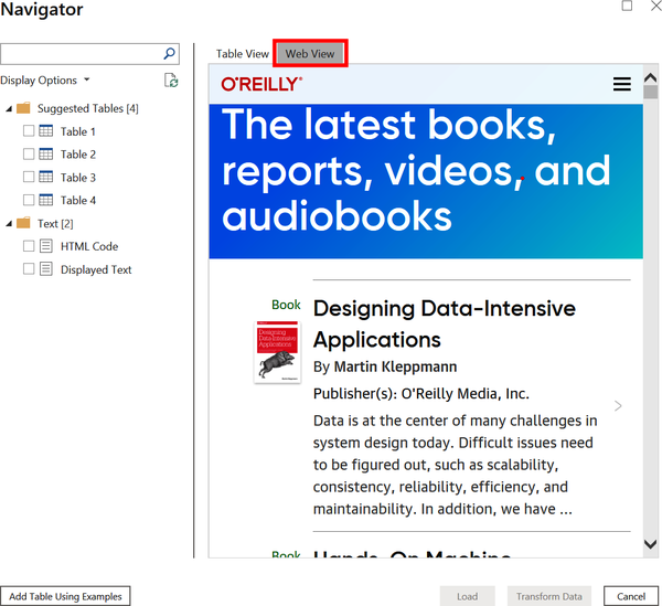
Figure 4-5. A rendered version of the website
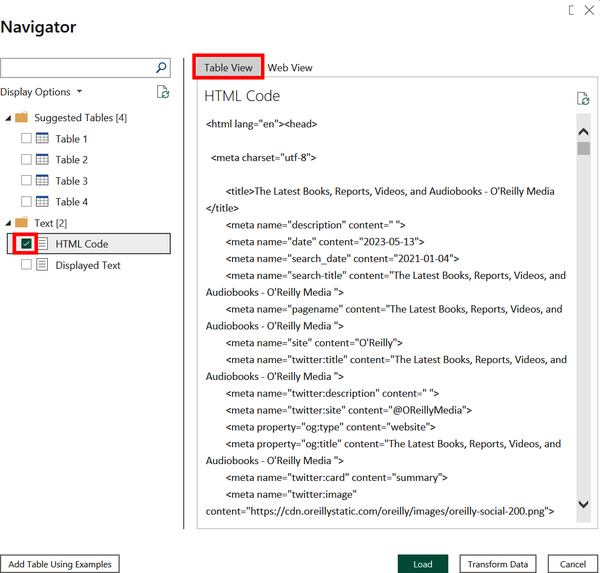
Figure 4-6. Displaying the website’s HTML
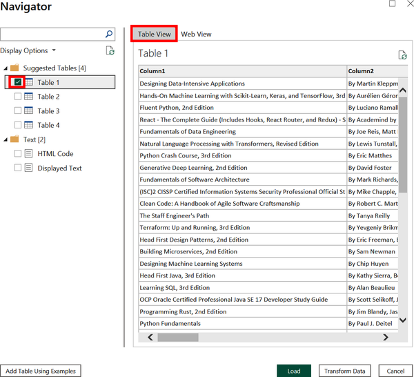
Figure 4-7. One of four suggested tables with data pulled from the website’s source code
Instead of using one of the suggested tables, try building your own. Click Add Table Using Examples in the bottom-left corner. This opens a new window, shown in Figure 4-8.
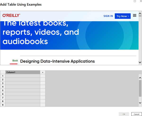
Figure 4-8. Beginning to build a table from a web page
The top box of the window displays the rendered web page, and the bottom box is where we will begin filling in the example data we wish to extract. Next, scroll down in the top box to reveal the first book. Then in the bottom box, name the headers Title, Authors, Publisher, and Description. Now input the information from the first book by adding the title, author, publisher, and book description (Figure 4-9). Include “By” before the author name (e.g., “By Martin Kleppmann”) to help the AI find what you are looking for. We will shorten this later.
Note
We find that it is best to begin typing an entry and then select the option that automatically fills in the correct input. This reduces the chance of an unnoticed typo confusing the AI into making predictions based on what you wrote and not what you meant.
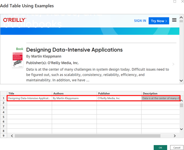
Figure 4-9. Inputting information from the first book to create a table
Now scroll down in the first box to reveal the second book on the list. Input the title, author (including “By”), publisher, and description, remembering to begin typing and then select the option from the list. Your window should now look like Figure 4-10.
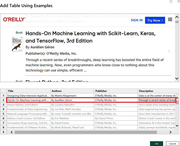
Figure 4-10. Adding a second example from the web page
Notice in Figure 4-10 that after two rows of examples, the AI in get data from web by example has populated the rest of the table. It uses gray text to indicate it is making a prediction. If you are not getting the same results, be sure to check out the tips for using web scraping immediately before this section.
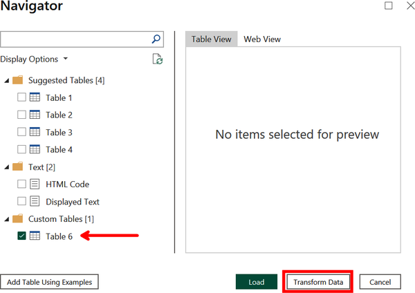
When ready, click OK to continue. This will display the Navigator window, as shown in Figure 4-11. The results from the HTML extraction appear on the lefthand side as Table 6. Now we want to modify the list of authors using add column from examples, so click Transform Data. We will pick up from here in Demo 4-2.
Add Column from Examples
Here is another tool in the automation toolkit that empowers an analyst to quickly transform data. Add column from examples prompts a user to give sample inputs to show the AI what they want a new column to look like. Then an algorithm attempts to identify the Power Query M formula that produces the same results.
Note
We assume the reader already has a foundational knowledge of the Power Query Formula Language (referred to simply as M and discussed briefly in Chapter 1) that underlies all of Power BI’s queries. We will not be working directly with M code in this book, but for those who want an overview or refresher, check out the Power Query M Introduction.
What’s interesting here is that the AI model is predicting an intermediary step (the M formula), and we are evaluating the prediction based on how the final step (generating a new column) appears. Although there is no documentation stating how the add column from examples feature works, this is a similar function within large language models like ChatGPT where a user can give one or few prompts and the algorithm will generate an output as if it is “learning” in real time. See Chapter 7 for more details on that topic.
You can use add column from examples to combine, extract, transform, or enhance data into a new column of your choosing. The best situation for using this feature is if you already know the desired transformation exists within Power BI (either as in M expression or within the UI); however, it is also useful for testing out different manipulations to explore what is possible.
From our experience, we find that the AI is good at generating a new column based on two or three examples but does not improve much after that. If you are not getting good results, try out these tips:
-
Check your previous entries for typos.
-
Correct predictions that are incorrect.
-
Provide examples that cover a breadth of examples.
-
If all else fails, start over from the beginning.
Demo 4-2: Add Column from Examples
Let’s go through an example of generating a new column from a dataset using examples. This picks up from Demo 4-1, where we scraped data of resources from the O’Reilly website. It is a natural follow-up because HTML extraction sometimes collects data that is not precisely what we want.
Open Power Query Editor if it is not already opened. Select the Authors column and then click the Add Column tab (Figure 4-12). Now select Column From Examples and from the dropdown choose From Selection. This means you are generating a new column based on information found in the Authors column.

Figure 4-12. Finding the Add Column from Examples tool in Power Query Editor
The window will change, adding a new Column1, as shown in Figure 4-13. This is where you can add examples of the formatted data you want from Authors.

Figure 4-13. A new column before examples are added
Rename the column Authors2 and add the first example of Martin Kleppmann without the preceding “By.” As you can see in Figure 4-14, from just one example the AI has predicted all entries are the list of authors without “By.” Also note the predicted M formula appearing at the top for how the new column is generated. It states, From the Authors column, take all text coming after the first whitespace.

Figure 4-14. The predicted entries in gray based on just one input example
We also want to replace all commas from the lists of authors with semicolons. Let’s skip ahead a few rows and replace those two authors with Joe Reis; Matt Housley. Now in Figure 4-15, we can see that all of the authors in a list are separated by a semicolon. The corresponding M formula for generating the column also appears above.

Figure 4-15. Adding a second example that replaces the comma with a semicolon
Click OK to complete the column generation. We will pick up from here in Demo 4-3, where we will see how to profile our new dataset.
Data Profiling
As you are transforming your data with Power Query Editor, at any point you are able to take a pause and review a profile of the data in its current state. Data Profiling allows you to catch errors and even automatically suggests specific transformations to assist with your query. These transformations include keeping, removing, replacing, filtering by, grouping by, and copying values.
Specifically, there are three features within Power Query Editor that make up a data profile:
- Column quality
This feature breaks down the share of entries in each column that are either valid, an error, or empty.
- Column distribution
This feature displays a frequency distribution of values within each column.
- Column profile
This feature shows descriptive statistics for each column as well as a more detailed frequency distribution.
Possibly the largest benefit of data profiling is the built-in suggestions about which transformation the analyst should consider based on the state of the data. For example, if a column includes empty values, hovering over the Column quality section will reveal an AI-powered recommendation (indicated with a light bulb icon) to remove those empty values.
There is no complicated deep learning algorithm powering this feature. Instead, this example reminds us that any algorithm replicating human intelligence still fits under the umbrella of artificial intelligence. We decided to include this feature in the book because it aligns with the chapter on automation and utilizes decision making by suggesting transformations.
Demo 4-3: Data Profiling
We pick up the data transformation that is a continuation of Demo 4-1 and Demo 4-2. Open Power Query Editor if it is not already open. Navigate to the View tab and check the “Column quality” box within the Data Preview section (Figure 4-16). This reveals new information under the column headers that profiles the share of data in each column that is either valid, an error, or empty. In this example, we see that our dataset is complete because each column has 100% of the data identified as “Valid.”
You can also hover over this new section to reveal a pop-up. When you click on the ellipsis at the bottom-right of that pop-up, a dropdown lists some quick actions you can take based on the quality of the data. This is a good example of how Power BI allows you to quickly make data transformations with the assistance of AI.
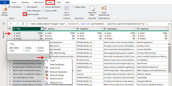
Figure 4-16. Profiling column quality using a shortcut to possible actions
Unselect Column quality and select “Column distribution” instead. This reveals a new section on the frequency distribution of values within each column, as shown in Figure 4-17. This shows that there are three authors with two books under their names. Hovering over the Authors section invokes a pop-up with a clickable suggested action to Remove Duplicates.
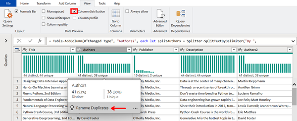
Figure 4-17. Profiling column distributions with a suggested action
Finally, we will learn the last automated way to profile our data. Unselect Column distribution and select “Column profile.” Nothing will appear until a column is selected, so click on the Publisher column to reveal a new section at the bottom. On the left side are summary statistics for the column, and on the right is the value distribution. Figure 4-18 shows that O’Reilly is the most common publisher in this dataset, which makes sense given that we scraped the list of resources from O’Reilly’s website.
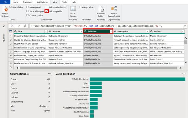
Figure 4-18. Automated column profile showing a distribution of values and summary statistics
Next, hover over the horizontal O’Reilly Media, Inc. bar to show the precise share of items published by the company (54% in this example). The pop-up also includes clickable suggested actions that will filter rows based on whether or not they have O’Reilly Media, Inc. as the publisher. Additionally, the ellipsis in the pop-up reveal more handy filtering options (Figure 4-19).
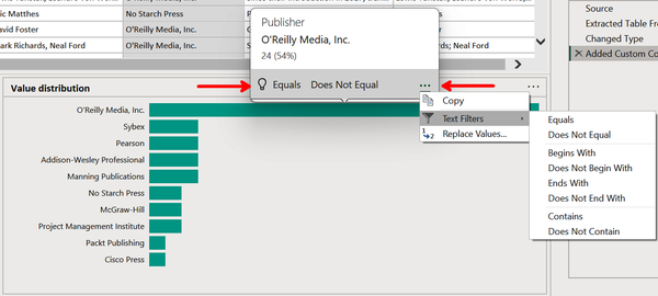
Figure 4-19. Additional actions for filtering the data
Table Generation
Another feature within Power Query that utilizes built-in AI is Table Generation. This is where Power BI is able to identify a table from either (1) a file type that is not natively a table structure or (2) a table-based file type with poorly organized data.
For the first situation, Power BI is able to automatically generate a table from nested data types, such as JSON and responses from web-based APIs. Figure 4-20 shows an example of nested data from a JSON file. Generating tables from data in this format is a real time-saver for data analysts, especially when integrating Power BI with APIs.
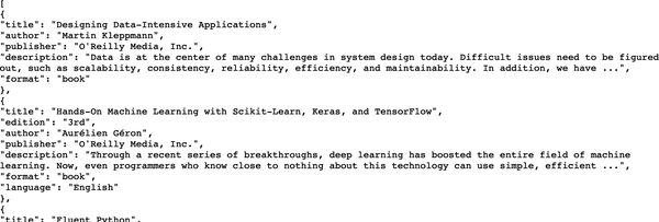
Figure 4-20. A JSON file showing the first two items from the O’Reilly web page
The second category of file types that Power BI can use to generate tables includes Microsoft Excel, CSVs, and text files. Excel files, like JSON files, are automatically generated into a table, even if the data is messy and not perfectly formatted as a table. CSVs and text files have even more flexibility for the data analyst; Power BI generates a table based on several examples in a way nearly identical to that of get data from web by example and add column from examples.
From our experience, we find that the AI is rather sensitive to the quality of the data from which a user is providing examples. Like the other “by example” functions of Power Query, the AI prediction is not likely to improve after more than three examples. If you are not getting good results, try out these tips:
-
Check your previous entries for typos.
-
Correct predictions that are wrong.
-
Provide a breadth of examples.
-
Extract longer entries (these can always be transformed after the table is loaded).
-
If all else fails, start over from the beginning.
Demo 4-4: Table Generation
The best way to understand how the table generation features work is by seeing them in action. Here we will begin with a new demo; however, we will use the data from the previous demos in this chapter about resources from O’Reilly Media’s website. Although the table generation functionality works with JSON, web API, Excel, CSV, and text file types, here we will only demonstrate it with CSV and JSON.
Our first step is to import the CSV file we’ll work with. Begin by clicking the “Get data drop-down arrow” and selecting Web, as previously shown in Figure 4-3.
Then under URL, copy the sample dataset hosted on this book’s GitHub page. Click OK (Figure 4-4).
This will open up a preview of the data. As you can see in Figure 4-21, there are some empty rows, a note about the price data being randomly generated, and the prices themselves combined in a column with the resource format. We want to extract a table using examples, so click the aptly named Extract Table Using Examples button.
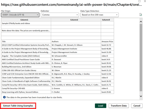
Figure 4-21. Extracting a table from a CSV file using examples
Next, you will want to make the window fullscreen and widen the first column to give more room for working. In the place of Column1, make Title the header of the first column. Then begin typing the name of the first example until the full name, (ISC)2 CISSP Certified Information Systems Security Professional Official Study Guide, 9th Edition, appears, as shown in Figure 4-22. Select it.
Recall that when giving examples, it is best to select an item from a dropdown instead of typing it out or copy-pasting the entry. This ensures that the actual value from the data is identified.
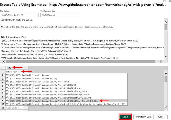
Figure 4-22. Adding the first entry of an example row
As you can see in Figure 4-23, the algorithm has already (correctly!) made predictions about the remaining titles in the CSV. The entries are gray to indicate they are merely predictions. Move on to the next column and replace Column1 with Author. Then begin typing the name of the authors until M. Chapple, J. M. Stewart, D. Gibson appears. Select it.

Figure 4-23. Adding the second entry of an example row
Repeat this by going to the next column, replacing Column1 with Price, searching for 32.72, and selecting it from the list (Figure 4-24). Press Enter when done.

Figure 4-24. Adding the third entry of an example row
We see in Figure 4-25 that the top displayed rows of the raw CSV files correspond to the formatted rows of gray text. Just from this one example, the algorithm has correctly predicted what the rest of the table should look like. Click Load.
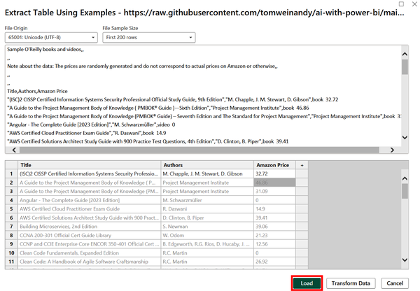
Figure 4-25. After just one example, the algorithm correctly predicted the remaining table rows
We will now move to a second example, this time with the file type JSON made from nested data. We already showed what this data looks like in its raw format in Figure 4-20, located at the beginning of this section. You can see two resources defined as a dictionary with pairs of entries representing a key (e.g., “title”) and an associated value (e.g., “Designing Data-Intensive Applications”).
As we did in Figure 4-3, click the “Get data drop-down” icon and select Web. Then, just like we did in Figure 4-4, paste our JSON file under URL. Click OK.
Power BI recognizes that we have added a JSON file and automatically converts it to a table format within Power Query Editor. Looking at Figure 4-26, you can see that the new table created from the JSON file (oreilly2) is listed on the lefthand side below the previous table based on the CSV file (oreilly).

Figure 4-26. A JSON file automatically converted to a table, listed as one of two tables
We will pick up with this example later in Demo 4-5, where we will showcase a merge using fuzzy matching. But for now, take a moment to save the file, selecting Apply if prompted.
Fuzzy Matching
What is your name? Stop reading now and answer the question, preferably aloud.
Did you use a nickname or your legal name? Did you mention a middle name or initial? How about your last name(s)? What about any titles, honorifics, or suffixes? To a computer, each of these names is different. For example, "Thomas J. Weinandy" = "Tom Weinandy" will return False because those two strings (i.e., text data) do not match.
Now imagine a business has two datasets that each share a column of shipping addresses but lack the proper join keys. If the addresses in the two columns are slightly different, they cannot be joined through traditional means. This is where fuzzy matching enters the picture. Fuzzy matching, or fuzzy logic, is a statistical method for calculating a similarity score between two strings, and if the score passes a defined threshold, joining them. The similarities are based on factors such as character substitutions, deletions, and insertions.
Fuzzy matching is built into Power BI as part of Power Query Editor, allowing a user to combine datasets with similar columns of strings. It includes several configuration options, including:
- Similarity threshold
-
An optional parameter indicating how similar two strings need to be in order to match. A value of 0.0 will cause all values to match, and a value of 1.0 will join only perfect matches. The value is 0.8 by default.
- Ignore case
-
This parameter indicates whether matches should be case-insensitive (e.g., internet is matched with Internet). Case is ignored by default.
- Match by combining text parts
-
When this is selected (the default), spaces are ignored in matching; if this is unchecked, then spaces are considered.
- Maximum number of matches
-
This option returns either all matches (default) or a specified number of matches. For example, a value of 1 means that each row will return exactly one match.
- Transformation table
-
This option specifies whether there is a third, bridge table that allows for matches across a wider mapping. For example, a transformation table could contain country names with two-letter ISO country codes.
Demo 4-5: Fuzzy Matching
This demo picks up from where we were at the end of Demo 4-4. Open up Power Query Editor if it is not already open. On the Home ribbon, click the “Merge Queries drop-down arrow.” Then select “Merge Queries as New” (Figure 4-27).

Figure 4-27. Accessing query merging with fuzzy matching
Now a new Merge window opens. The first table should already be populated with the oreilly query, but in the second table, select the “oreilly2” query from the dropdown. You now need to select which column(s) these two tables will be joined on. In this case, you want to merge according to the title and author of the resources. Select Title and Author in the first query (using the Ctrl key for multi-selection) and “title” and “author” in the second query. Make sure the column numbers 1 and 2 correspond to each other, as shown in Figure 4-28, where Title and title are both 1 and Author and author are both 2.
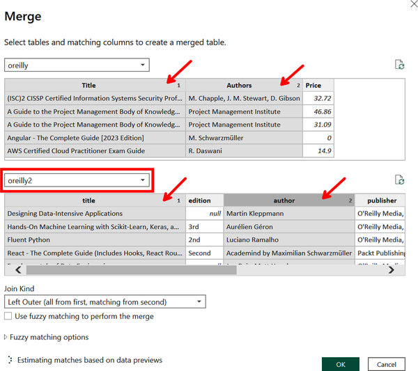
Figure 4-28. Selecting columns within queries to merge
After you select the columns from both tables, a pop-up window will appear warning you of privacy concerns related to the two datasets being merged. Since there are no privacy concerns with this data, check Ignore Privacy Levels and click Save to continue (Figure 4-29).
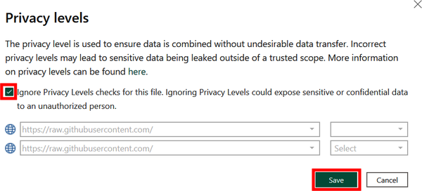
Figure 4-29. Confirming there are no privacy concerns in this case
At the bottom of the Merge window are additional options for what kind of merge we would like to perform. Select Full Outer from the dropdown to include all data. You also want to check “Use fuzzy matching to perform the merge.” From here, you’ll get a glimpse of how many matches occur according to the default similarity threshold for fuzzy matching of 0.8. As indicated by the arrow in Figure 4-30, only 12 out of 50 rows match.

Figure 4-30. Performing an outer join with fuzzy matching
We want to improve the match rate of our data, even at the risk of creating more false positives. Click “Fuzzy matching options” to reveal additional ways to modify the join. Then, as shown in Figure 4-31, add 0.5 to “Similarity threshold” to allow for more matches. Once this is done, the message at the bottom of the window shows that all 50 rows out of 50 match at these settings. Click OK.

Figure 4-31. Setting a lower similarity threshold to increase the number of matches
We now have a combined query, called Table1, visible in Power Query Editor. The second query is currently shown as a column of tables. To expand this, select the split icon to the right of “oreilly2,” as shown in Figure 4-32. Make sure Expand is selected and click OK.
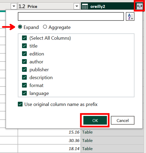
Figure 4-32. Expanding the second query in the merged table
If you look at the bottom-left corner of the window, you will see that the table has 10 columns and 54 rows. The 10 columns are good, because this means the merge was successful; however, the row count indicates that we now have 4 more rows than the 50 in each original table. To find out which rows are false positive matches, drag the Title column to the immediate left of the “oreilly2.title” column. Widen both of these columns until the edition is revealed, as shown in Figure 4-33.

Figure 4-33. Comparing titles to discover duplicate records after the match
Note
When using fuzzy matching in Power BI, it is often better to match too many rows than too few rows because you can always remove the false positive matches. This, however, is not practical at larger scales. The trade-off of costs and benefits between having too few matches or too many matches will depend on the particulars of each use case.
Since four records is a small enough overlap, we can manually search for the rows we wish to remove and filter them out using an index column. To create one, select the Add Column ribbon, click on the “Index Column dropdown,” and select From 0 (Figure 4-34).
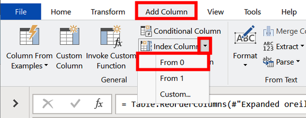
Figure 4-34. Adding an index column with base 0
Now drag the new Index column to the immediate left of the Title column, as shown in Figure 4-35. By comparing the two title columns, we identify the four resources with incongruent editions. Since these are all titles listed twice, we can safely drop them from our data model.

Figure 4-35. Identifying the mismatched rows to remove
To remove the rows, click the Index dropdown. Then unselect 1, 3, 11, and 15. Click OK (Figure 4-36).
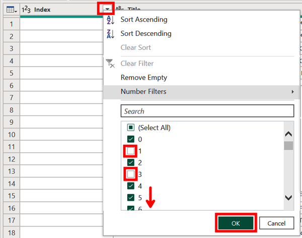
Figure 4-36. Using an index column to remove the mismatched rows
Now, as shown in Figure 4-37, we are left with the same 50 rows as in our original datasets. We thus conclude our demo on fuzzy matching. You are welcome to save the report, selecting Close & Apply if prompted.

Figure 4-37. The result of successfully merging two tables with fuzzy matching
This ends the section on how to use the AI-based automation tools within Power Query to better and more quickly transform your data. Now, we’ll move on to look at ways in which AI can assist with report generation and data analysis.
Intelligent Data Exploration
One of the most impactful elements of Power BI is how rapidly it empowers a user to go from raw data to new insights. AI-based automation within Power BI takes this one step further by allowing for quick data exploration and report creation through a variety of tools. These tools leverage the power of AI to build rapid prototypes and insights but leave the developer to decide which is worth keeping.
The role of the human here is less that of a programmer and more akin to a museum curator who is building a narrative around a business situation with data. AI can make your work easier, but it does not tell you the right questions to ask or which answers are most meaningful. The algorithms can, however, complement the skills of a person who knows how to integrate their work with the AI.
This brings us back to the business intelligence cycle of Figure 4-1, where previously in the chapter we discussed the role of automation in data transformations. Now the rest of the chapter will consider how AI-based automation can support report building and analysis. We will highlight three features here: quick insights, report creation, and smart narrative. The Q&A visual could appropriately be included in this section, since it enables an end user to ask questions from the data to quickly generate visuals. However, we discussed Q&A in Chapter 3 and so will leave it to the reader to return there if interested.
Warning
In November 2023, Microsoft announced the public preview of Copilot, a generative AI tool embedded in the Power BI service that can analyze data and create reports with a chat-based interface. This is a fast-changing feature, so we suggest searching online for the latest capabilities of Copilot in the Power BI service and Power BI Desktop. In the meantime, the rest of this chapter focuses on the tools for intelligent data exploration that are generally available at the time of writing.
Quick Insights
Quick insights automatically scans a dataset and performs a variety of analyses on pairs of variables within that dataset to uncover interesting patterns and relationships. This assists a user looking to better understand the dataset, identify an insight they might not have considered, quickly build a dashboard, come up with ideas to incorporate into a report, or simply get unstuck from being overwhelmed by a new dataset.
Note
Using quick insights functionality on an entire dataset is possible on the browser-based Power BI service but not on Power BI Desktop, meaning it requires a Pro or Premium license. You can still use insights on a specific visual on Power BI Desktop, as discussed in Chapter 3. Quick insights is only available for data uploaded to Power BI and not DirectQuery or streaming data.
Quick insights performs many different automated analyses on your dataset. The following lists break them down by data types.
For numeric and categorical data:
- Numeric outliers
-
One or more numeric data points meaningfully differ from others if sliced by a single category.
- Category outliers
-
One or two categories have a disproportionately higher share of values than other categories.
- Correlation
-
Multiple numeric data points within a category share a positive or negative relationship.
- Low variance
-
Numeric data points are close to the mean across a category.
- Majority factors
-
A majority of a total is from a single category.
For time series data:
- Time series outliers
-
There are values that unexpectedly change at a point in time.
- Trends in time series
-
There is a positive or negative trend over time.
- Change points in time series
-
There are multiple meaningful changes in a trend.
- Seasonality in times series
-
There is a cyclical pattern that persists over time.
- Steady share
-
There is low variance (mentioned above) holding steady over time.
You are ready to begin exploring quick insights and saving time in the process. If, however, you run into issues, try these tips for organizing your data to get better results:
-
Hide unimportant or duplicate columns in your dataset to exclude them from quick insights.
-
Use a mix of numeric, categorical, and time series data.
-
If you receive an error message saying your data is not statistically significant, it may be because your dataset is too simple, lacks sufficient data, or does not include numeric data or dates.
Demo 4-6: Quick Insights
Now we get to see quick insights in action. This demo uses data concerning taxis in New York City. We will use quick insights for an entire dataset, which means this demo must be performed on the browser-based Power BI service and will require a Pro or Premium subscription. Reference “Premium, Pro, and Free Power BI” for details and information on how to sign up for a free trial.
First, download this completed report about New York City taxis and save it locally. Then go to the Power BI service and sign in.
We want a space to keep all of our assets together for this demonstration and the others in this chapter. On the lefthand side, select Workspaces and either go to “My workspace” or create a new one by selecting “New workspace” and following the prompts to set that up. This demo will use the workspace AI Demos (Figure 4-38).
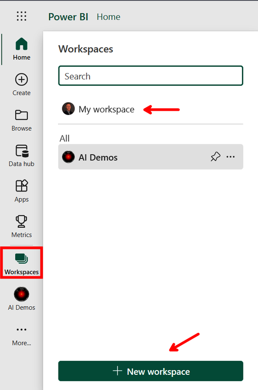
Figure 4-38. Going to your home workspace or creating a new one
From here, click on Upload and select Browse (Figure 4-39).
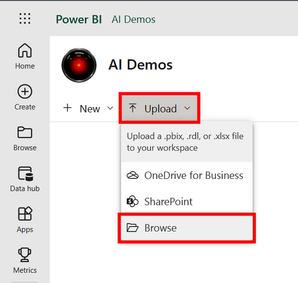
Figure 4-39. Uploading a Power BI report saved locally
Find the taxi report that you’ve downloaded from GitHub named TimeSeriesComplete and click Open (Figure 4-40).
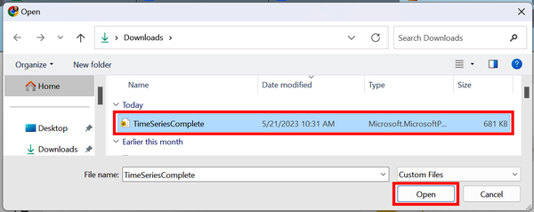
Figure 4-40. Selecting the Power BI report
Now you will see the Power BI report saved in your workspace along with the underlying dataset. Click the ellipsis icon that corresponds to the dataset (where the arrow is pointing in Figure 4-41, under the drop-down menu) and then select “Get quick insights.” Finally, click “View insights” (not pictured).
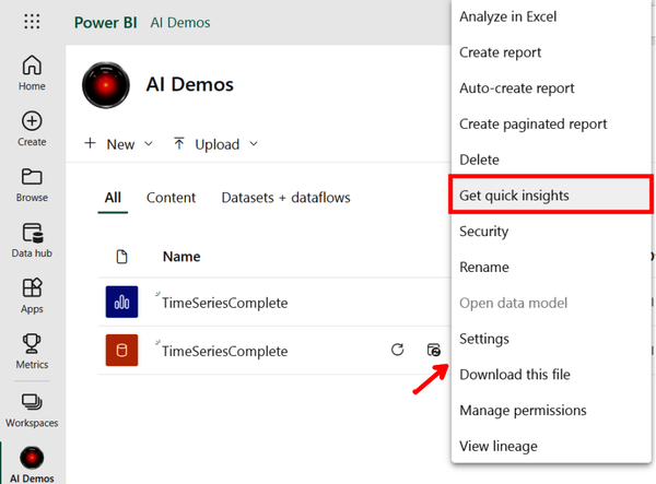
Figure 4-41. Accessing quick insights from a dataset
You can now review the entire list of insight cards, like the one pictured in Figure 4-42. Each card includes a visual along with an explanation of why the potential insight was identified as such. This insight card pictured here found day 359 (i.e., Christmas) was an outlier for the number of taxi trips taken on a particular day.
You can use the expand icon at the top-right corner to enter a focus mode with a larger version of the visual. You can also select the pin icon to pin the insight card to a dashboard of relevant insights.
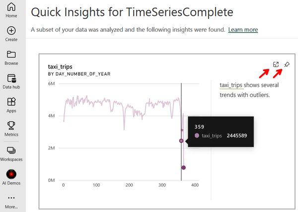
Figure 4-42. An insight card highlighting the number of taxi trips taken on Day 359 with the options to enlarge or pin to a dashboard
Let’s explore some more examples of interesting findings, shown in Figure 4-43. The left insight card points out how the daily number of taxi trips includes both seasonality and an overall downward trend. The right insight card shows a positive correlation between daily tip amounts and daily total amounts spent on taxi trips.

Figure 4-43. Cards generated from quick insights showing, respectively, the trend in taxi trips and the correlation of total fares and tip amounts
We continue to explore the wide variety of insights with the two examples in Figure 4-44. The left card shows that snowfall in New York City is highest in the months of January and February. The right card identifies two days of the year that were outliers for the amount of precipitation received.

Figure 4-44. Cards generated from quick insights showing, respectively, snowfall by month and outlier days for precipitation
Not all of the findings from quick insights are meaningful or even interesting, and that is OK. This tool is meant to be used in concert with someone who knows the use case or has the right judgment to determine which insight cards are relevant.
Report Creation
We have made it to our penultimate profile of an automation feature in Power BI: report creation. Report creation automatically generates a fully developed Power BI report from a given dataset. This is consistent with the theme of AI tools that empower humans to more effectively and efficiently work through the business intelligence cycle.
Report creation is similar to quick insights in that it also must be done on the Power BI service, and accordingly, requires a Pro or Premium license. The two functions are also similar in that both take just a few clicks to create after a dataset is loaded into a workspace. There are differences, however; let’s explore them by diving directly into a demonstration of how report creation works.
Demo 4-7: Report Creation
We pick up from the previous demo that generated insight cards from data on daily taxi trips in New York City. You do not need to have completed Demo 4-6 to follow this one; however, we will skip the steps on loading this Power BI report into a workspace. Refer back to Demo 4-6 if you need guidance.
Once the report is loaded into a workspace in the Power BI service, locate the TimeSeriesComplete dataset (shown in Figure 4-45 within a workspace entitled “AI Demos”). Click the ellipsis icon and select “Auto-create report” from the list.
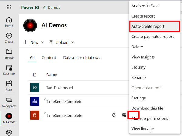
Figure 4-45. Auto-creating a Power BI report from a dataset
Note
There is another way to auto-create a report if you already have the desired dataset saved in the Data Hub. As Figure 4-45 shows, on the lefthand side of the Power BI Service, you can click the Create icon and then select “Pick a published dataset,” choose a dataset within the Data Hub, and click “Auto-create report.”
And violá, your report is made! This, unfortunately, does not mean you are done. The algorithm that generates the report attempts to identify which variables and visuals are most meaningful; however, it still requires someone to ensure it meets the business needs and to customize it accordingly.
For example, look at Figure 4-46, acknowledging that your results may be slightly different. Maybe we are not interested in the daily share of trips that go to the airport or the total passenger count. Some values displayed are also meaningless, such as “Sum of day_number_of_year by day_name” and “Sum of avg_wind_speed by day_name.” Let’s make a few changes.
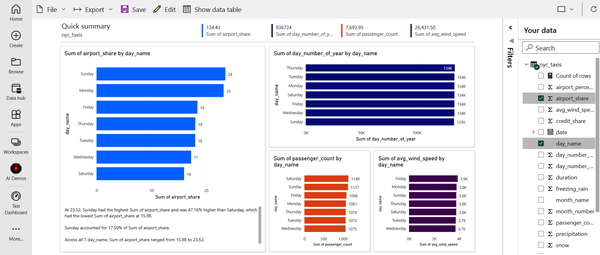
Figure 4-46. An automatically created report
First, we want to swap out the variables used in the report. Unselect all current variables and select credit_share, date, and tip_amount. This should match what you see in Figure 4-47.
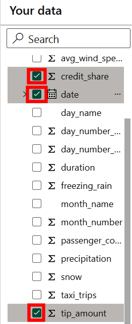
Figure 4-47. Changing the report to include the selected variables
Next, change the numeric variables to be averages, not sums. On tip_amount, click the ellipsis icon and select Average. Repeat this for credit_share. The report should now show the same data labels as in Figure 4-48; however, the visuals may be slightly different in your version.
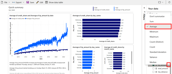
Figure 4-48. The same auto-generated report as in Figure 4-46 but with newly selected variables
Now the report is looking better! The bar charts on the right show some of the day-of-week and month-of-year differences in average daily tip amounts given to taxi drivers as well as how often passengers pay with a credit card.
The line plot on the left also tells an intriguing story. The darker line shows how the daily share of payments by credit card have been increasing over time and approaching 100%. The lighter line shows how the average daily amount tipped also has been increasing over time. The correlation between the two is actually just an artifact of the data, since tips from cash payments are not recorded (affecting the average). This means that people are not necessarily tipping more over time; however, around 2022 it does appear that the growth in tipping seems to outpace the growth in the rate of credit card use.
Note
Did you notice the text in the bottom-left corner of the report in Figure 4-48? That is the smart narrative visual and the topic of the next section.
If you wish to make further changes to the visuals, simply hover over a visual and select the “Personalize this visual” icon (Figure 4-49).

Figure 4-49. Further personalizing a visual
Save your work when done. If you would like to continue editing the report in Power BI Desktop, at the top-left click File and then “Download this file” (not pictured).
Smart Narrative
Recall from Chapter 3 that the Q&A features allow a user to ask a question of the data by taking text as an input and producing a visual as an output. In that regard, smart narrative is simply a reverse version of Q&A. Smart narrative searches through visuals on a report and produces a text summary from the data.
Smart narrative can be used in Power BI Desktop or the Power BI service and can be applied in three ways:
-
As a text box summarizing all of the visuals on a report
-
As a text box summarizing a single visual
-
As an icon on a visual that, when clicked, reveals a text summary of the visual
Figure 4-50 shows how to access the smart narrative feature through the icon in the Visualizations pane. Selecting the icon will provide a summary of all visuals in the report. In this case, the smart text appeared at the bottom of the canvas as three insights.
Note
Figure 4-50 shows the Power BI report on taxi trips in New York City used in Demo 4-6 (see Figure 4-41). Return to that demo for download instructions if you wish to follow along.
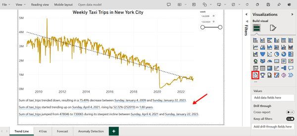
Figure 4-50. Using smart narrative to describe an entire report
To create a smart narrative of an individual visual, all you have to do is right-click the visual and select Summarize.
Warning
If you do not see the Summarize option for a visual, make sure you have edit access and are in edit mode.
Finally, you can add a smart narrative icon to a visual by selecting the visual, going to “Format visual” > General > Header icons > Icons and then toggling on “Smart narrative,” as shown in Figure 4-51.

Figure 4-51. Adding a smart narrative icon to a visual
Not only does the smart narrative feature describe visuals when created, but it also automatically updates when slicers and filters are applied. Take the smart narrative in Figure 4-50 as an example. If a user changes the date range using the filter at the top-right, then the text will change in real time to new insights specific to data within the specified date range.
Additionally, a user is able to format the text as they see fit and even add their own text or values. Figure 4-52 shows the text “Cumulative Trips” and indicates how to add a dynamic value. A dynamic value is a field or measure tied to your data and displayed as regular text but updated with changes to the report.

Figure 4-52. Adding a dynamic value to the smart narrative visual
Next, a prompt allows a user to search for a custom value. Figure 4-53 shows how the input “Sum of taxi trip” successfully identifies “taxi trip” as a dynamic value, as indicated by the blue line underneath. This value can also be further formatted, such as adding a comma. Click Save.
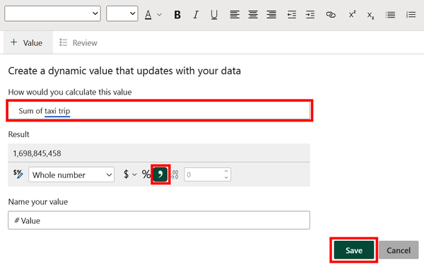
Figure 4-53. Defining a dynamic value from the data
You can see the resulting dynamic value in Figure 4-54, where smart narrative states there were nearly 1.7 billion taxi trips during the selected time period.

Figure 4-54. A dynamic value with custom formatting
Summary
We reviewed how to use the AI-based features in Power BI that help automate the process of transforming data as well as building and analyzing reports. These tools speed up your ability to go from business questions to answers, making you a more productive analyst. We also discussed the aspects of the business intelligence cycle that are not easily automated, at least in the near future.
Hopefully you are able to learn important skills that can help future-proof your job or organization. AI is already transforming the way we work, and the pace of disruption does not appear to be slowing. We believe that you should be less concerned about AI replacing your job and more concerned that you will be replaced by an analyst who better harnesses the power of AI.
Reading this book is a step in the right direction for becoming that AI-fluent developer and strengthening your work quality as well as your job security. As Elbert Hubbard said, “One machine can do the work of fifty ordinary men. No machine can do the work of one extraordinary man.” So leverage the power of AI to become extraordinary and help your organization achieve the same, because the algorithms are not going anywhere. I, for one, welcome our new AI coworkers.
1 Richard Conniff, “What the Luddites Really Fought Against”, Smithsonian Magazine, March 2021.
2 Erik Brynjolfsson and Andrew McAfee, The Second Machine Age: Work, Progress, and Prosperity in a Time of Brilliant Technologies (New York: W. W. Norton & Company, 2014), 11.
3 James Bessen, “Toil and Technology: Innovative Technology Is Displacing Workers to New Jobs Rather Than Replacing Them Entirely”, Finance & Development 52, no. 1 (2015): 16.
Get Artificial Intelligence with Microsoft Power BI now with the O’Reilly learning platform.
O’Reilly members experience books, live events, courses curated by job role, and more from O’Reilly and nearly 200 top publishers.
