Chapter 1. Introduction to Salesforce Reporting
Most Salesforce users start with the ability to create and run reports and to run dashboards, and can take advantage of both reports and dashboards via browser or on mobile devices. This leaves it up to your imagination and business savvy to determine what to build and for whom. In this chapter, I will introduce you to Salesforce’s reporting tools and take you through department-specific use cases for reporting in Salesforce to help you get started.
Reports and Dashboards Overview
Within Salesforce there are three tabs that are useful in reporting. They are Reports, Dashboards, and Analytics, as seen in Figure 1-1. The Reports and Dashboards tabs are more commonly seen, each organizing their respective items in folders and giving users who have permission the ability to create and edit them. The Analytics tab is newer, and may be used in place of the other two to provide access to report and dashboard functionality.
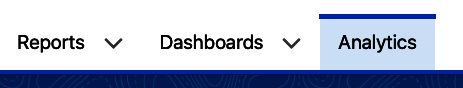
Figure 1-1. Three reporting tabs
Reports Tab
The Reports tab shows you a list of all existing reports in your system that are shared with you. Each report has a name, a folder, and details such as who created the report and when. As you can see in Figure 1-2, the tab offers a simple filter mechanism by categories related to reports, folders, and favorites on the left. There is a report search across the top and buttons for creating new reports and folders on the right. To run a report, you click on its name. Each time you run a report, the data in the report is refreshed.
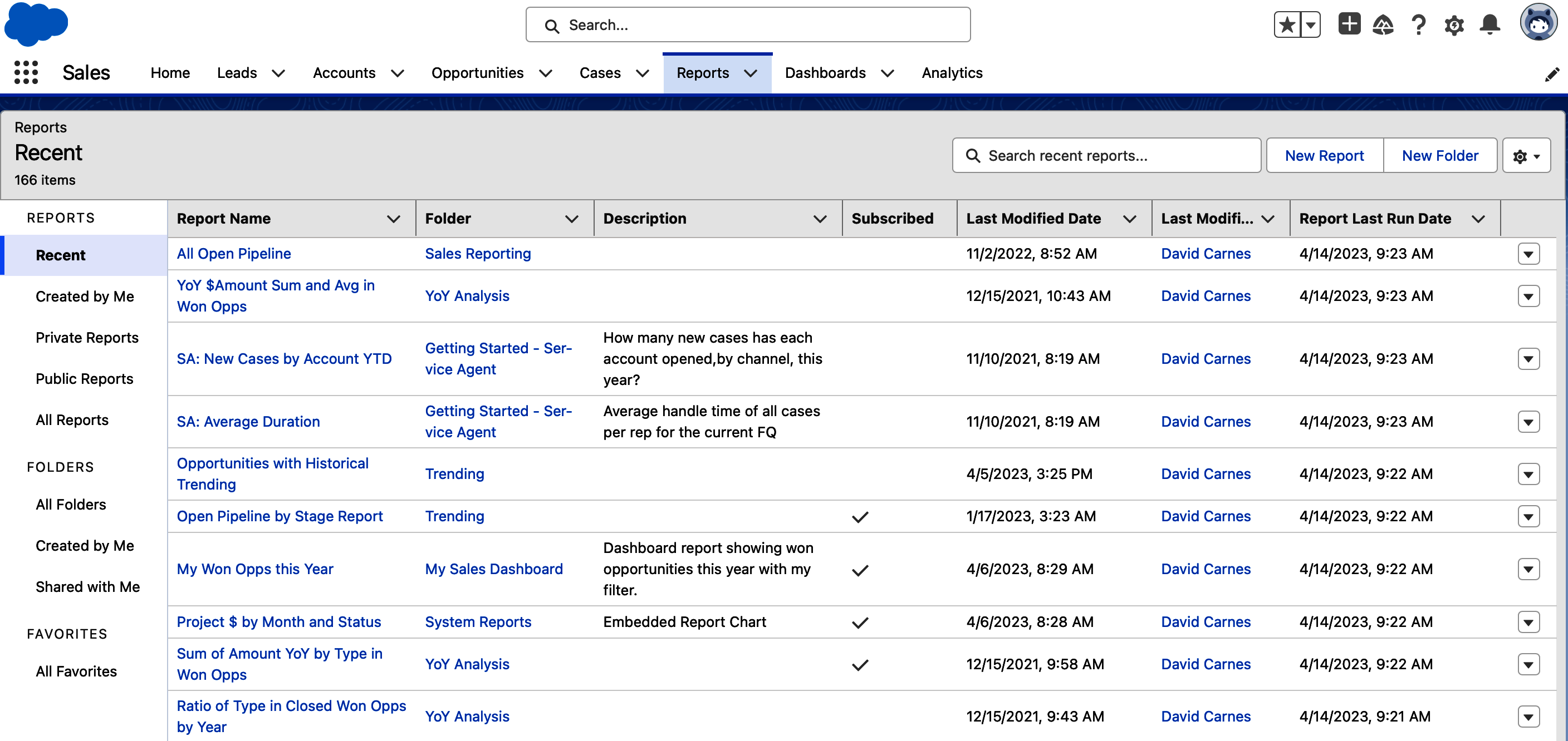
Figure 1-2. Reports tab
Dashboards Tab
The Dashboards tab shows you all dashboards in your system that are shared with you. These might be department-specific dashboards, ones created for individual users, or ones set up for your executive team. In Figure 1-3, you can see a list of dashboards, with information about each and the folder it is stored in. The list of dashboards you see may be very different than the list of dashboards a colleague sees, as access to them is controlled by the folders they are stored in. To run a dashboard, you click on its name. Unlike reports, when you run a dashboard, the data displayed will likely not be updated until you click the Refresh button. More on that in Chapter 6.
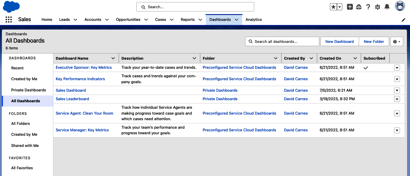
Figure 1-3. Dashboards tab
Analytics Tab
The Analytics tab provides consolidated access to reports and dashboards and their folders with a more user-friendly interface and powerful search capabilities. This tab is newer within Salesforce, and some organizations have yet to embrace using it. Figure 1-4 shows the default Home screen on the Analytics tab, with Browse, Favorites, and Collections categories in the lefthand menu, its powerful search in the top center, and more specific lists in the For You and My Analytics sections through the center. The search tool includes additional filters, allowing you to search for reports created by a particular user, or created or modified within a specific date range. Collections allow you to create and share curated sets of reports and dashboards such as “Year End Planning.” To run a report or dashboard from the Analytics tab, click on its title.
Tip
You can simplify your system by offering users the Analytics tab instead of the Report and Dashboard tabs, especially for users who only run reports and dashboards, and don’t create or manage them. Your system administrator controls which tabs users are able to see in Salesforce and which apps the tabs appear in by default.
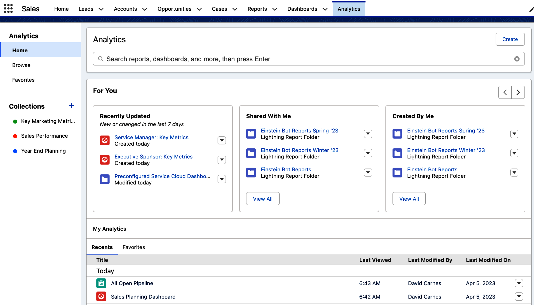
Figure 1-4. Analytics tab
Reports
Reports provide an easy way to query current data in your system and display the results in rows and columns, with optional groupings, summary columns, formulas, and charts. You choose the columns of information that you want to appear and whether you want to see the detail rows or a collapsed summary. You can use them to quickly see a list of all cases closed last month or look at the current state of your sales pipeline.
Reports can be used to answer a single question about your data, provide insights about an area of your business, or to run an entire team. They allow you to choose an area in your system to focus on, filter to see only specific records, and organize the resulting information to help drive understanding and decisions.
Let’s say you are the director of sales and want to see how your team is doing. With a report, you can have that information at your fingertips. Figure 1-5 shows an example of a sales report on current quarter sales. At the top of the report, you see grand totals of the number of records and the sum of the amount of won opportunities. You can see that the data in this report is grouped by opportunity owner, with subtotals below each grouping. The report creator made this report a summary report by grouping the report on opportunity owner. They added columns to this report to show relevant sales information such as the opportunity name, stage, and amount. End users running this report can leverage the buttons at the top right to modify and rerun the report, and if they wish, save their own version of the report for later use.
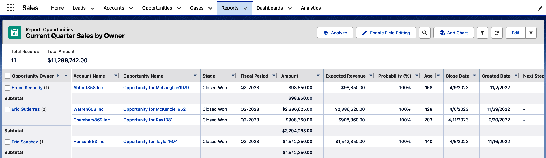
Figure 1-5. Current Quarter Sales report
Reports can be created by any user in your system by using a simple but powerful report editor. There are four report formats to choose from, allowing you to tailor the content of your report to your business needs. You’ll learn about creating reports and the four types of report formats in Chapter 4.
Figure 1-6 shows another report using the Summary format. In this example, you can see all open cases in the system, grouped by owner. The report’s groupings are collapsed, hiding the details to make it easier to see the subtotals and totals without seeing all the underlying records in the report.
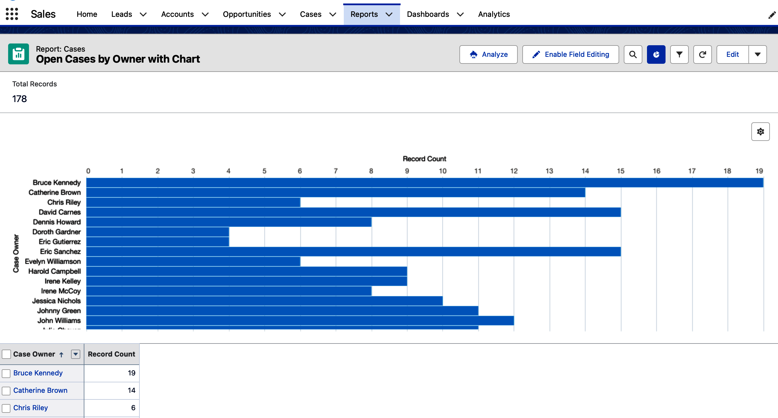
Figure 1-6. Open Cases by Owner with Chart report
There are a few interesting things you can do with reports that have been created and saved in your system. You can embed them into page layouts, as seen in Figure 1-7. You can also use saved reports to feed dashboard components, as you’ll learn next.
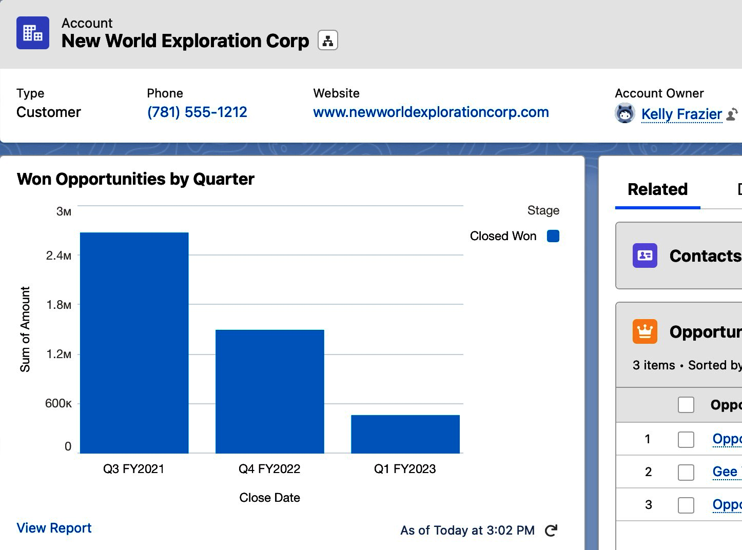
Figure 1-7. Embedded report chart in a page layout
Dashboards
Dashboards are collections of charts and tables that summarize data in your system visually, often created for a particular department or type of analysis. They are made up of components, each of which are sourced by a single report in your system. It is common to have groups of similar types of data combined into a single dashboard for a user or team to view.
Figure 1-8 shows a support dashboard called My Support KPIs, which can be used by individual users or their managers to look at that individual user’s case load and metrics. This is part of a free dashboard pack called the Preconfigured Service Cloud Dashboards. There are controls on each dashboard component allowing you to expand the size of the chart, drill down to its underlying report, or download the component.
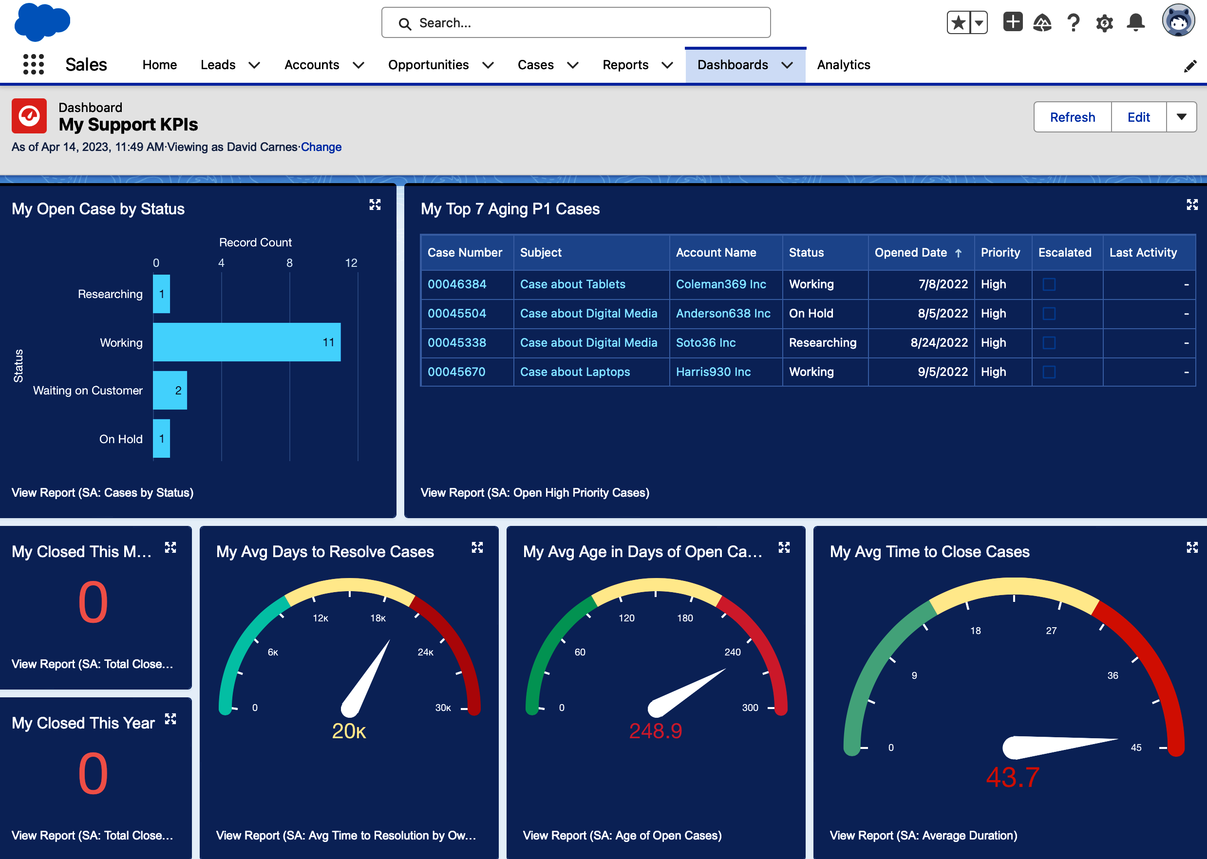
Figure 1-8. My Support KPIs dashboard
Tip
There are sets of free sample dashboards available on Salesforce’s AppExchange. Your system administrator can download and install these samples, which can be modified to suit your organization’s needs.
Dashboards are created using a simple drag-and-drop editor. When adding a component, you are asked to select a source report and then given the option to choose the component’s type. Once a component is selected, you can adjust its many properties to tailor the resulting component to your needs. Dashboards are saved in folders that control who can see them.
Dashboards are commonly embedded into home pages for users to see when they first log in to the system. These might be thin panels with very specific information for individual users, or a full dashboard used to run a team. Figure 1-9 shows an example of an individual sales user’s dashboard that appears at the top of their home page. This allows sales users to see a summary of their key metrics at least once each day. A system administrator or someone with dashboard creation permissions would create this dashboard, and then a system administrator would embed it within the sales users’ home page.
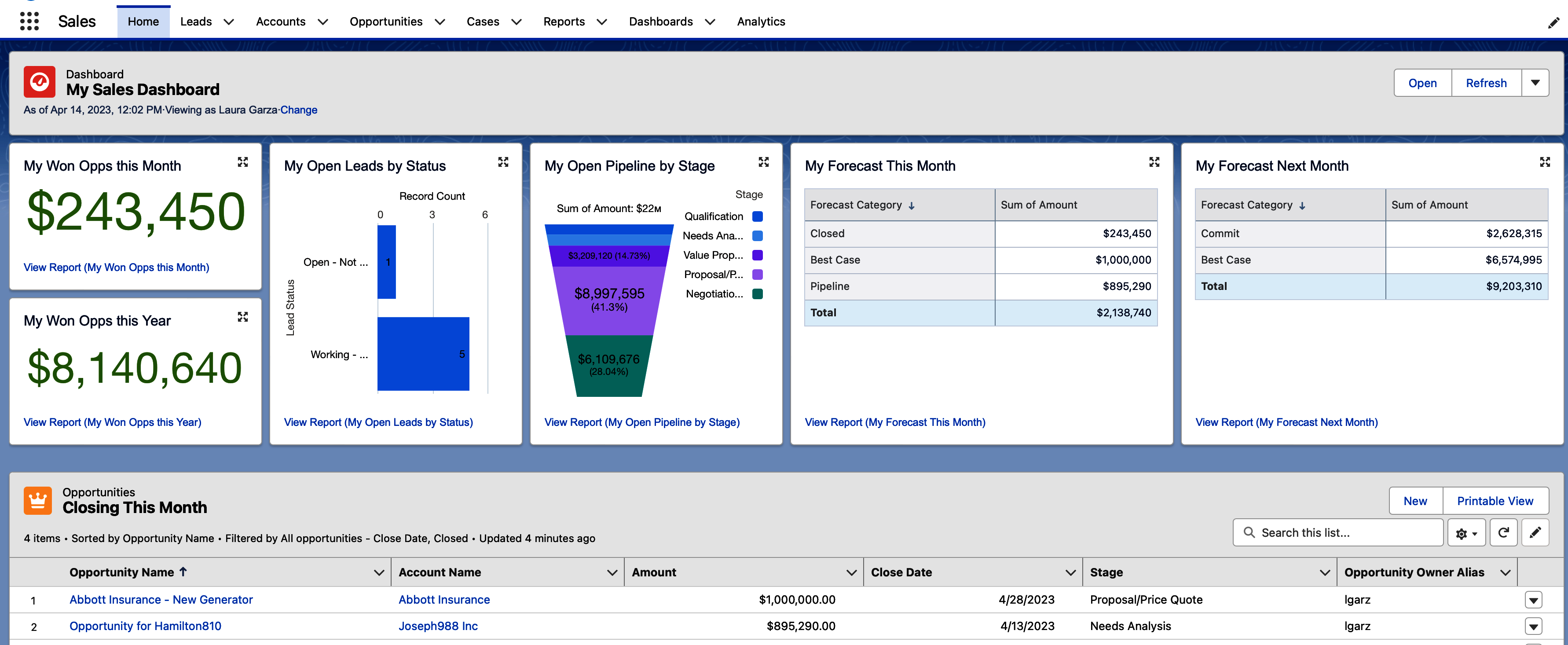
Figure 1-9. My Sales Dashboard in Home page
Use Cases for Reporting
Nearly all Salesforce users end up running reports and dashboards from time to time. A subset of users are power users, running their businesses, teams, and individual work on summary data and charts daily. Others may be more casual users, perhaps not even realizing that they are using reports and dashboards that are embedded into the screens they are viewing to do their jobs. The combination of business savvy and creativity goes a long way in Salesforce reporting. In this section, you’ll read examples of use cases for reporting.
Tip
There are 75 or so sample reports available to use in Salesforce Classic. You can switch to Classic, run a report, and use the Save As button to create a clone of any samples, which you can then use in Salesforce’s Lightning user interface.
Leadership
It comes as no big surprise that reports and dashboards in Salesforce are often utilized by leadership in an organization. Their needs run across departments and may include specific types of reporting such as trending, ratios, and escalations. Leadership teams often rely heavily upon dashboards to track summary information about the business. This could include a set of dashboards offering key performance indicators (KPIs) or other types of analysis critical to running the business. Figure 1-10 shows the top row of a dashboard called Executive Sponsor: Key Metrics that comes included in the free Preconfigured Service Cloud Dashboards pack on the AppExchange. In it you can see a gauge showing the high number of open cases, a donut showing the ratio of priorities on open cases, and a zero for unassigned cases.
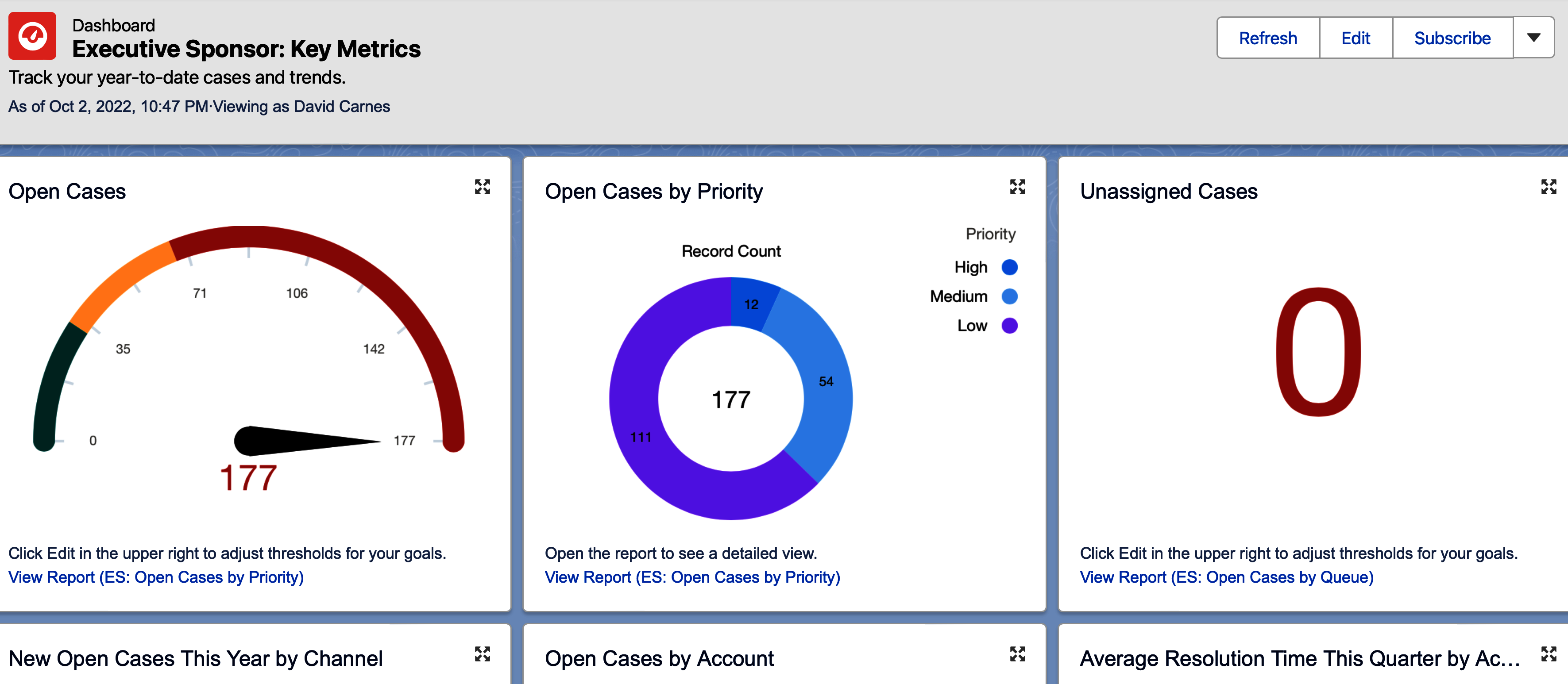
Figure 1-10. Leadership dashboard
Tip
Ideally, key metrics that the leadership team uses to run the business are also used by each department so that the organization is aligned in measuring and managing what is most important. For example, if the XYZ sales ratio is critical for management to run the business, you should have the same metric appear on the sales team’s dashboard and where applicable on individual sales reps’ dashboards so that everyone knows their contribution to that key metric.
Sales
Sales teams can make great use of reports and dashboards to manage their operations. Examples of individual reports might include a current quarter forecast, year-to-date sales, or sales pipeline by region. A VP of Sales might leverage a dashboard detailing sales KPIs, while their head of sales operations may want to conduct win/loss analysis or more closely monitor individual opportunities. Sales managers need reports and dashboards to run their teams, and individual sales reps to monitor their own performance.
Figure 1-11 is an example of a useful report for a head of sales wanting to understand what gaps their individual sales reps have in their opportunity pipelines. This is an example of a matrix report format, which is grouped by the report creator by key fields both vertically and horizontally. Matrix reports are great for seeing a bird’s-eye view of data. Conditional formatting is used here to highlight specific data, in this case where there are gaps in each sales rep’s pipelines.
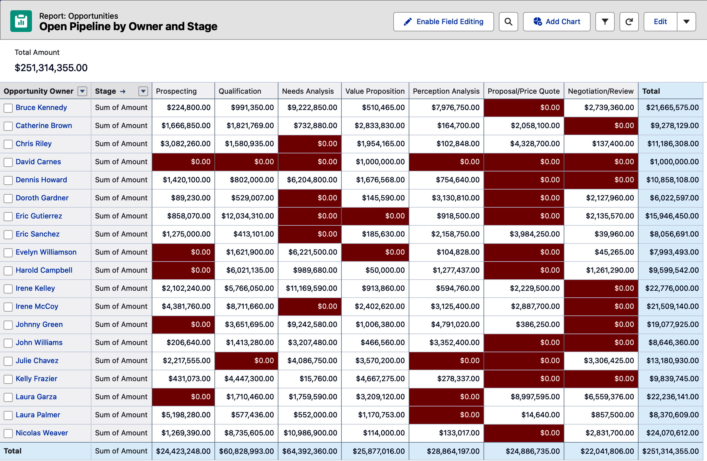
Figure 1-11. Open Pipeline by Owner and Stage report
Marketing
Marketing teams generally have many systems in their organization’s go-to-market tech stack, so their reporting needs often extend outside of Salesforce. Within the system, it is common to track campaign effectiveness and the demand that is generated in the form of leads. You can create reports that show the lead-to-conversion ratio and campaign effectiveness, for example. Marketers also want to keep track of what their sales counterparts have done with the leads generated for them.
Figure 1-12 shows a list of sample campaign-related reports that are only available within Salesforce Classic. Notable in this list is the Campaign Call Down report, which combines lead and contact data with their associated campaign, allowing you to see everyone tied to a campaign.
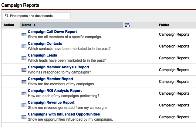
Figure 1-12. Sample Marketing Campaign reports in Salesforce Classic
Marketers might also take advantage of the Leads with Converted Lead Information report type to create reports that show the progress that the sales team is making with leads that have been generated. Figure 1-13 shows such a report, with its unique combination of Lead, Contact, Account, and Opportunity fields.
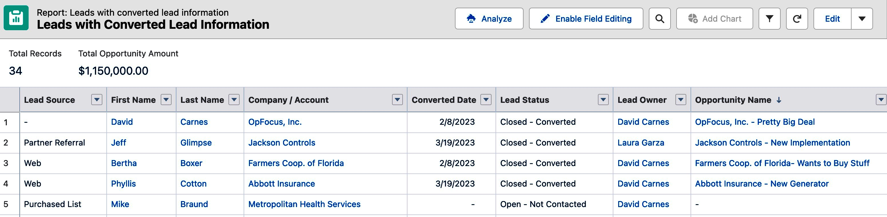
Figure 1-13. Leads with Converted Lead Information report
Services
Teams using Salesforce Service Cloud functionality can also meet their reporting needs using reports and dashboards. When reporting on support cases, in particular, you’ll note their many picklist fields make them very dashboardable! Service teams can create reports that show the agent case workload by status, case aging, and case origin trends, for example. It is common to see multiple dashboards in use for overall support KPIs, team performance, and individual agent workloads.
Figure 1-14 shows a chart added to the top of an Open Cases by Owner and Status report. This is a common way to track agent workload and their progress toward completing the cases they are assigned. Salesforce reports provide eight types of charts that can be added to your reports to fit your business needs.
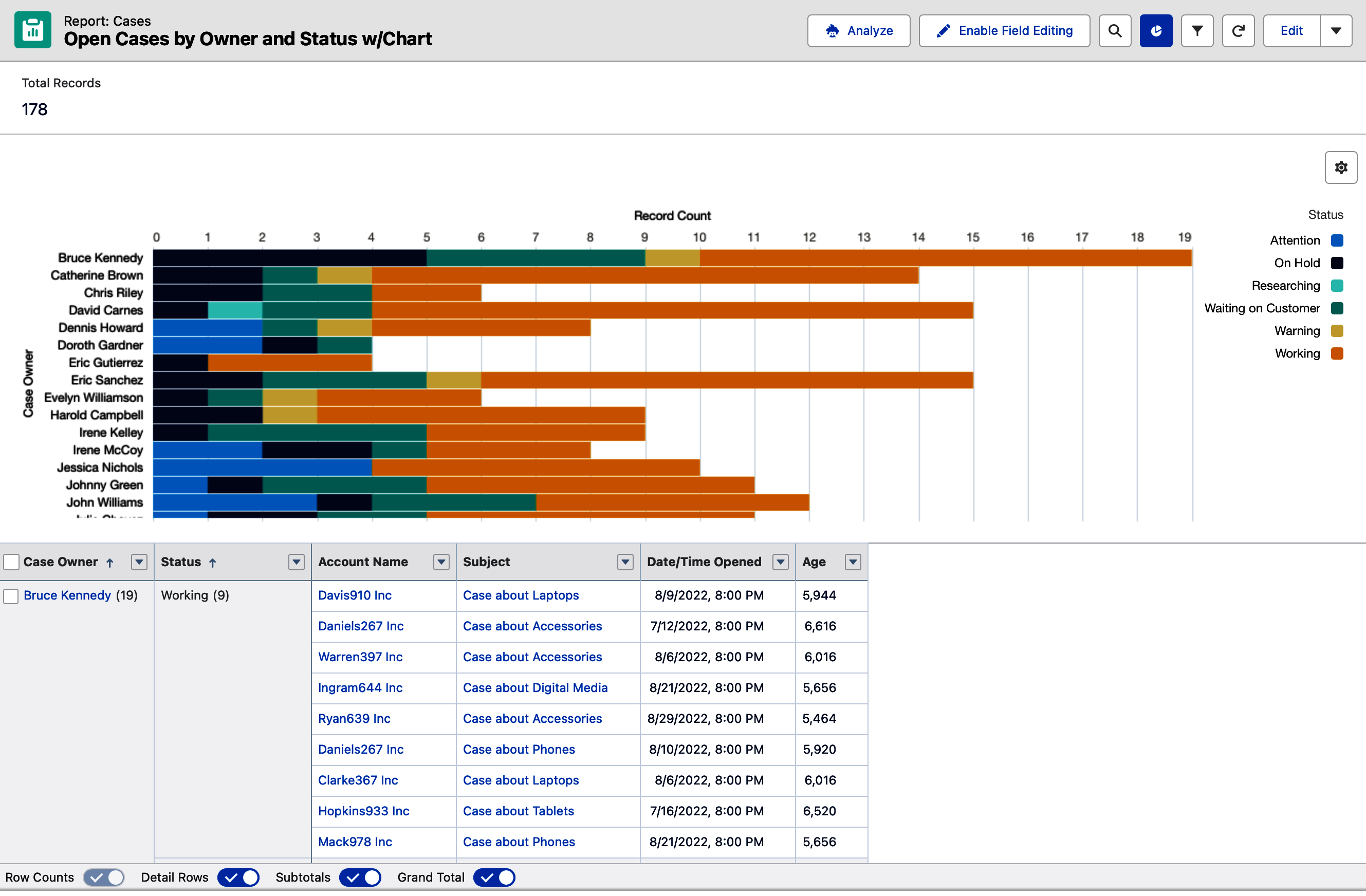
Figure 1-14. Open Cases by Owner and Status report chart
Reports and Dashboards Versus BI Tools
Although this book is focused on Salesforce reports and dashboards, it is helpful to understand the limits of their capabilities, and where business intelligence (BI) tools take over. The reach of Salesforce reports and dashboards extends only to the data that is stored within that same Salesforce instance. This is a big limitation when leadership teams look to report across departments on data that is stored in other systems and databases. BI tools are often introduced to provide enterprise-level analysis for leadership teams needing to understand data across systems, regions, and departments.
As you’ll learn in this book, reports and dashboards offer a set of tools that solve specific needs in reporting. Many organizations are able to run their businesses using Salesforce reports and dashboards. Individual users, whose main body of work is tracked within Salesforce, such as leads, opportunities, cases, and so on, can also be served by Salesforce’s native reporting tools.
BI tools range much further than reports and dashboards in their support of querying and combining data sources, analyzing the data, providing predictive capabilities, and visually representing the data. Put another way, BI tools are far more sophisticated in what they can do than Salesforce reports and dashboards.
Salesforce currently offers two BI tools, Tableau and CRM Analytics. Tableau is a very powerful analytics tool that can be used independently of Salesforce. While its analytics can be surfaced in Salesforce, the vast majority of its use is outside of the system. CRM Analytics provides its users with the ability to explore and surface data from directly within Salesforce. CRM Analytics is a much lighter tool than Tableau, with fewer analysts that know how to use it, though it is more tightly embedded into Salesforce than Tableau.
There are many other excellent choices of BI tools on the market. Even with a BI tool in place, most companies still take advantage of Salesforce reports and dashboards. BI tool licenses can be costly, and so their licenses are often reserved for upper management, if used at all. This leaves reports and dashboards as the primary reporting tools for most Salesforce users. Given their ease of use and access, reports and dashboards serve most Salesforce users very well.
Conclusion
Reports and dashboards support the needs of all levels of users in your system across the various departments that use Salesforce. They can be accessed directly on their respective tabs, searched for and run on the Analytics tab, or embedded within page layouts. While there are no sample reports or dashboards in Salesforce’s Lightning user interface, there are free examples that you can find and leverage as starting points in your system.
In the next chapter, you’ll learn what additional permissions are needed to build dashboards and to take full advantage of reporting functionality in Salesforce.
Get Mastering Salesforce Reports and Dashboards now with the O’Reilly learning platform.
O’Reilly members experience books, live events, courses curated by job role, and more from O’Reilly and nearly 200 top publishers.

