Chapter 4. Creating Reports
Reports are remarkably useful for gathering and presenting information, and you can create them to show information stored within Salesforce. For example, you could create a quick report to check on the current numbers in your system. You could also create a more complex report with an analysis of a particular area of your business to be used by management. There are many possibilities for you to explore. In this chapter, you’ll walk through how to build a report and go through the various options.
In a nutshell, when you create a new report, you will be asked to select a data foundation for the report, called a report type, which locks you into reporting on a specific set of objects and fields. From there you are brought into the report builder, where the magic happens in a simple interface where you can click and drag and drop to create a report. In this chapter, you’ll learn each of the steps to create reports in your system.
Create a New Report
There are two ways to start creating a new report in Salesforce. Your first option is to click the New Report button at the top right corner of the Reports tab, shown in Figure 4-1.
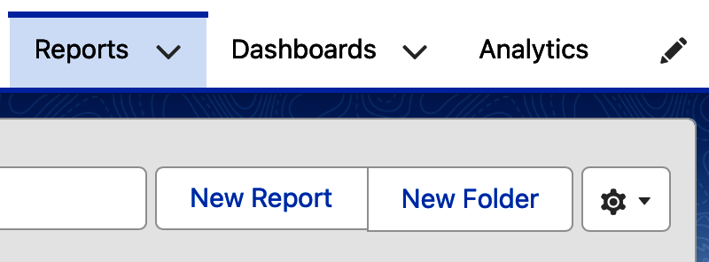
Figure 4-1. New Report button
If your company uses the Analytics tab, discussed in Chapter 9, you could start a new report by clicking the Create button at the top right of the tab. Figure 4-2 shows the Create button clicked to reveal three options, including to create a report.
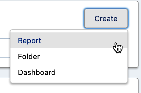
Figure 4-2. Analytics tab Create Report
Tip
By default all users have the ability to create reports in Salesforce. If the buttons to create reports are not visible, these permissions have been disabled on your profile. Your system administrator controls what permissions are assigned to users through profiles and permission sets.
Regardless of which route you take to create a report, the next step involves selecting a report type.
Selecting a Report Type
After you start a new report, you will be brought to the Select a Report Type screen, shown in Figure 4-3, and asked to select which data foundation, or report type, to use as the basis for your report. The report type defines the underlying objects that will be available in your new report’s dataset and how the objects are connected. There are about 75 standard report types, in addition to any custom report types that your system administrator has created for the users in your system. Selecting your report type is the most important decision you will need to make in this process because you will not be able to change it after this point. Consider the reporting goal you have in mind, and the data, such as objects and fields, that will be required to achieve it. So, choose wisely.
Tip
If you are unable to see a custom report type that someone mentioned has been created for you, it may mean that the custom report type is not “Deployed.” It may still be set to the default status “In Development,” which limits its visibility to system administrators and those with the Manage Custom Report Types profile permission.
To the left of the Select a Report Type screen, you’ll see a list of report type categories. By default, the Recently Used category will be selected. This is especially useful if you’ve created many reports before or you use the same ones each time. However, if you are new to reporting, you won’t see any report types to select. You might instead select the category All or one of the specific categories of report types below it. The context of the search feature on this screen is driven by the category you select.
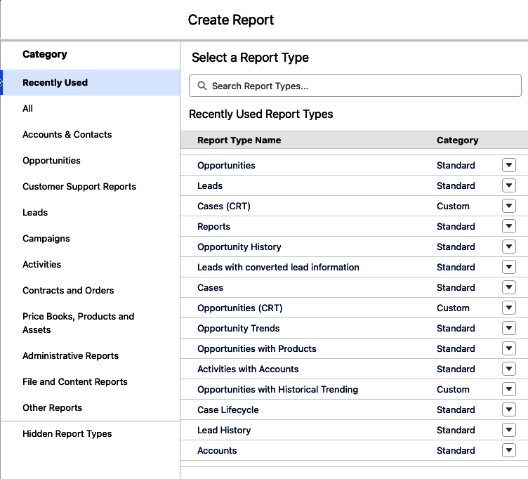
Figure 4-3. Select a Report Type screen
Tip
If you need to search for a particular report type, to give you the widest range of the search, select the category All or one of the other specific categories before you start your search.
In Salesforce’s Unlimited Edition, at the top right of the Select a Report Type screen, is a special filter that can be used to refine your search by indicating up to 20 objects or fields you are interested in building your report on. In Figure 4-4, you can see that the Filter button has been clicked and two Opportunity object fields have been added to filter on report types that include those fields. This filter capability is useful for those unfamiliar with the custom report types in your system. On this screen, you can choose to search by objects or fields, and then click the Apply button.
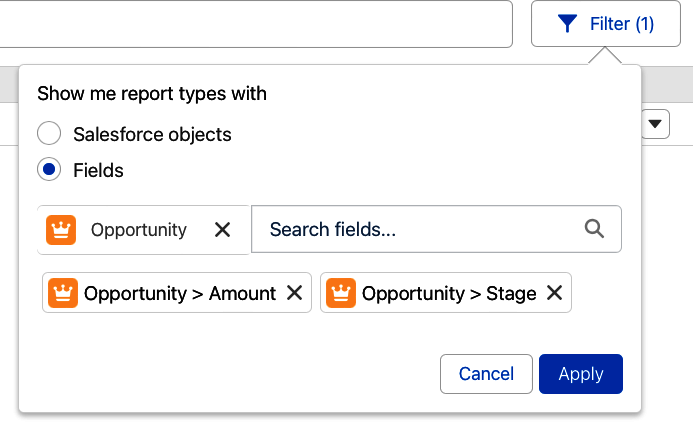
Figure 4-4. Select a Report Type filter in Unlimited Edition
Tip
Your knowledge of report types goes a long way in your ability to be an effective report writer in Salesforce. Learn as much as you can about the standard report types and make use of custom report types, which are discussed later in this book.
To learn more about any report type in the list, you can click on its name or on the action menu pulldown to the right and select Details. Figure 4-5 shows a report type selected and its details appearing over on the right. The left arrow shows you how you can click on a report type name to open up the details. The two arrows on the right show how you can use the action menu to view the same details.
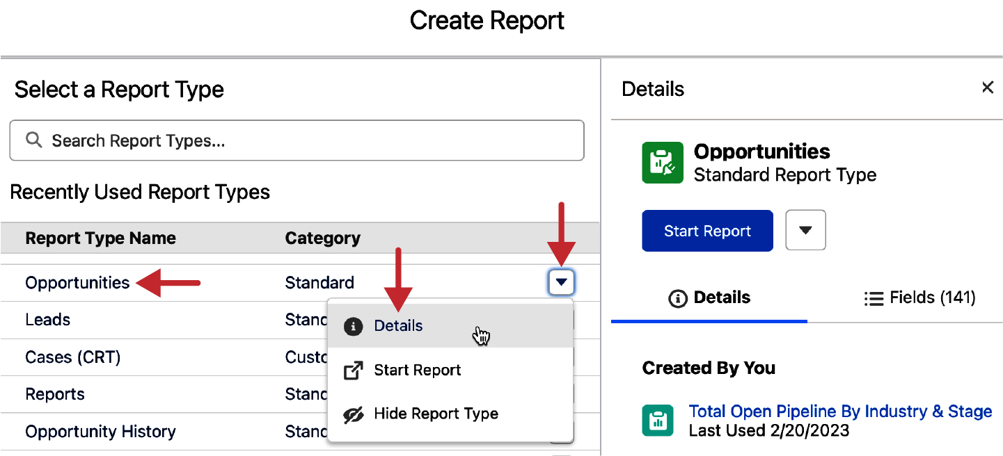
Figure 4-5. Showing the report type details
The Report Type Details panel offers a convenient way to learn about each report type. Figure 4-6 shows that you can see reports created by you and created by others using this report type. You can also see a list of objects that are involved in the report type.
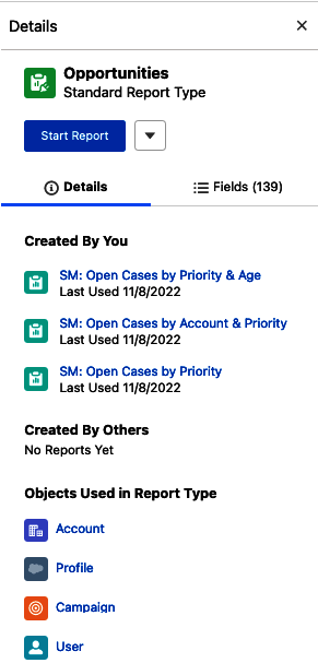
Figure 4-6. Report Type Details panel
There is a separate subtab available on the same Details panel where you can see a list of all fields available on the report type. Figure 4-7 shows this tab, with a simple search mechanism above the list of all fields. This provides a great way to learn about potentially useful report types before you commit to creating a report with them.
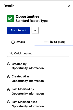
Figure 4-7. Report Type Details Fields tab
One final useful indicator on the Report Type Details screen appears for custom report types. In the Objects Used in Report Type section of the Details panel, for custom report types you can see the type of join between the objects. Figure 4-8 shows the details for a custom report type called Accounts with or without Opportunities. It shows a Venn diagram of the intersection between these two objects, and by hovering over the circle with the “i”, you can see that this report type is built on a “Left Join” along with a quick description of what that means.
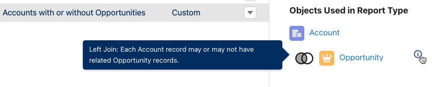
Figure 4-8. Objects used in Report Type
Tip
There are two kinds of joins supported in custom report types in Salesforce: Inner Joins and Left Joins. You will learn more about using these joins when creating report types in Chapter 10.
Once you’ve selected a report type to use, the next step is to click the Start Report button. There are two ways to access this button, as shown in Figure 4-9. You can click on the action menu to the right of the report type in the list and select Start Report, as shown by the left two arrows. You can also click on the Start Report button from the Details panel, as shown by the right arrow. From here you will be brought into the report editor to start designing your report. Once a report is started, it is no longer possible to change its report type.
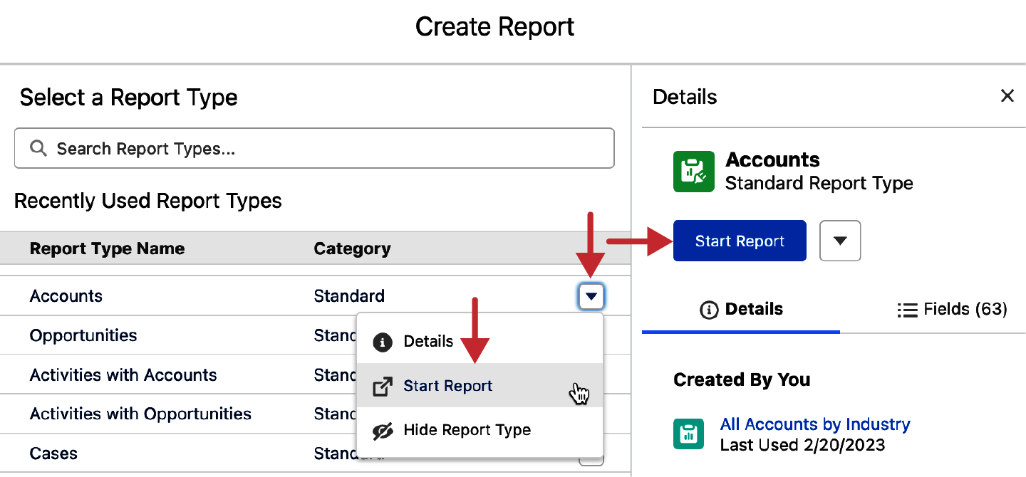
Figure 4-9. Start Report button
Report Builder
The report builder is where you will do the majority of the work to build a report.
It can be helpful to think of the report builder as having four main regions of controls that you use when building reports. Figure 4-10 shows the four regions on a new report built on the Opportunity report type with annotations to mark each region. In the first region, in the top left of the report builder, you can see Outline and Filter tabs, along with a small control in the top left called Fields. The center of the report builder, shown by number two, is the Preview pane, which has a toggle to allow you to turn on or off the preview-updating as you build your reports. The third section has useful controls for editing and saving your report. Along the bottom is the fourth region, where toggles and a conditional formatting tool may appear while you build your report.
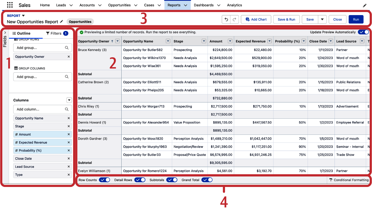
Figure 4-10. Report builder regions
Outline Tab
When creating a report, you’ll often want to get to work adding and removing columns. Each report type has a number of columns as default, including ones you aren’t interested in seeing. Beyond this, horizontal real estate is precious in reporting, and you’ll want to display only columns that relate to the purpose on the report. Adding and removing them can be done in a few ways, and is mainly done using the Outline tab. The Outline tab, as shown in Figure 4-11, gives us the ability to add and remove groups to our report in the Groups section at the top, and below that, the ability to add, move, and rearrange columns in the Columns section at the bottom. Note the last two fields shown are a slightly different color, with a # symbol before each name. These are summary columns, which if clicked, allow you to add subtotals for those columns in the form of sum, average, max, min, and median.
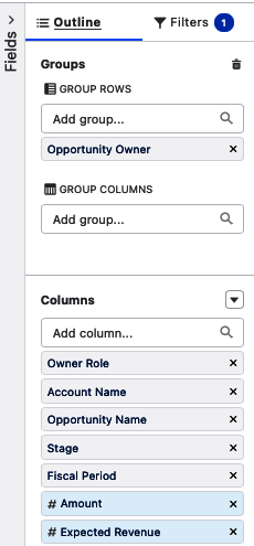
Figure 4-11. Outline tab
To add a grouping, start typing in the name of the field you want to group the report’s rows by in the Add Group search box. Alternatively, you can drag a field from the Columns section up and drop it just below the Group Rows Add Group search box. Figure 4-12 shows the Opportunity Owner column that has been dragged up to group the report’s rows.
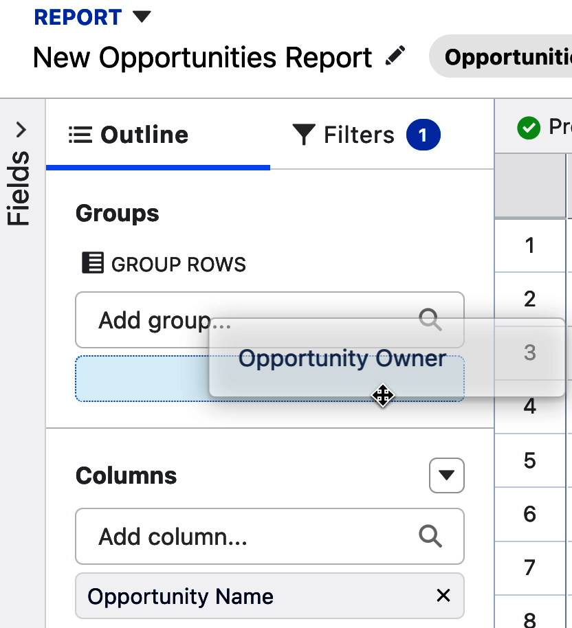
Figure 4-12. Drag to add a grouping
You have the ability to add up to three groupings on report rows. Grouping a report by rows makes the report into what is called a Summary Report format. After adding your first grouping on rows, you also have the ability to group by up to two columns, making the report into a Matrix Report format. Later in the chapter, you’ll learn about each of the four report formats.
Below the Outline tab, there is the list of columns that currently appear on the report. You can add a column by starting to type in the name of a column you know you want to add to the report. Clicking in the Add Column field will also show you a list of all fields available in the report type, which you can scroll through to add your desired field. Figure 4-13 shows adding the Fiscal Year column to the report by selecting it from the Add Column list. Once selected from this list, the field will be added to the bottom of the list of columns, making it the right-most column appearing on the report.
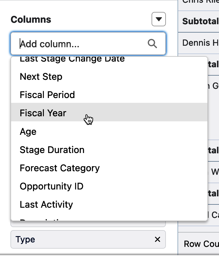
Figure 4-13. Adding a column
To remove columns from the report, you can click on the X to the right of the desired column. Figure 4-14 shows the X next to the Owner Role column, which will take it off the report. If you make a mistake removing a column, you can add it back using the procedure previously described.
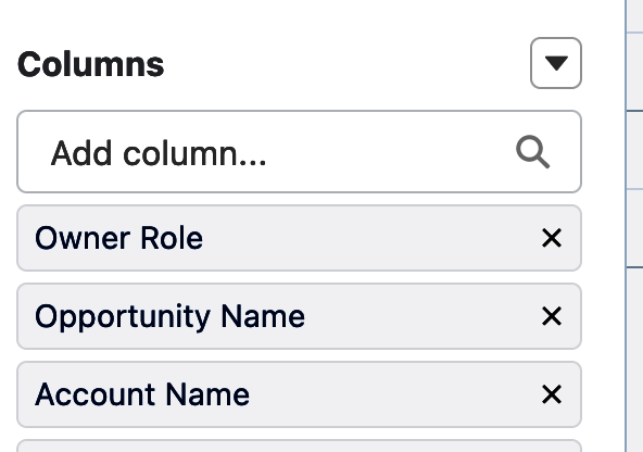
Figure 4-14. Removing a column
To the right of the word “Columns” is an action menu offering up to four actions. Figure 4-15 shows that we can currently add a bucket column, a summary formula, a row-level formula, or we can remove all columns. You’ll see what bucket columns can do in a moment, and learn all about formulas in the next chapter. In the meantime, the Remove All Columns action can be handy for quickly wiping the slate clean of all columns, allowing you to add others you may want.
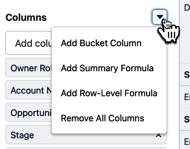
Figure 4-15. Columns action menu
Bucket columns
Bucket columns allow you to create ad hoc groupings in your reports, based on numeric, picklist, and text columns. They allow you to categorize report records based on criteria that you come up with, and then sort, filter, and group by the new bucket columns as needed. You can create up to five bucket columns per report. Each bucket column can group records into up to 20 buckets.
A nice example of a bucket column uses the Industry field on the Account object as its source. There are 32 values that come standard in this column in Salesforce. What if you wanted to group them into just three groupings, such as Core, Emerging, and Other in a new column called Market Category? Figure 4-16 shows the screen that appears when you select Add Bucket Column in the columns action menu. Notice that a default column is set, which we will want to change to Industry for our example.
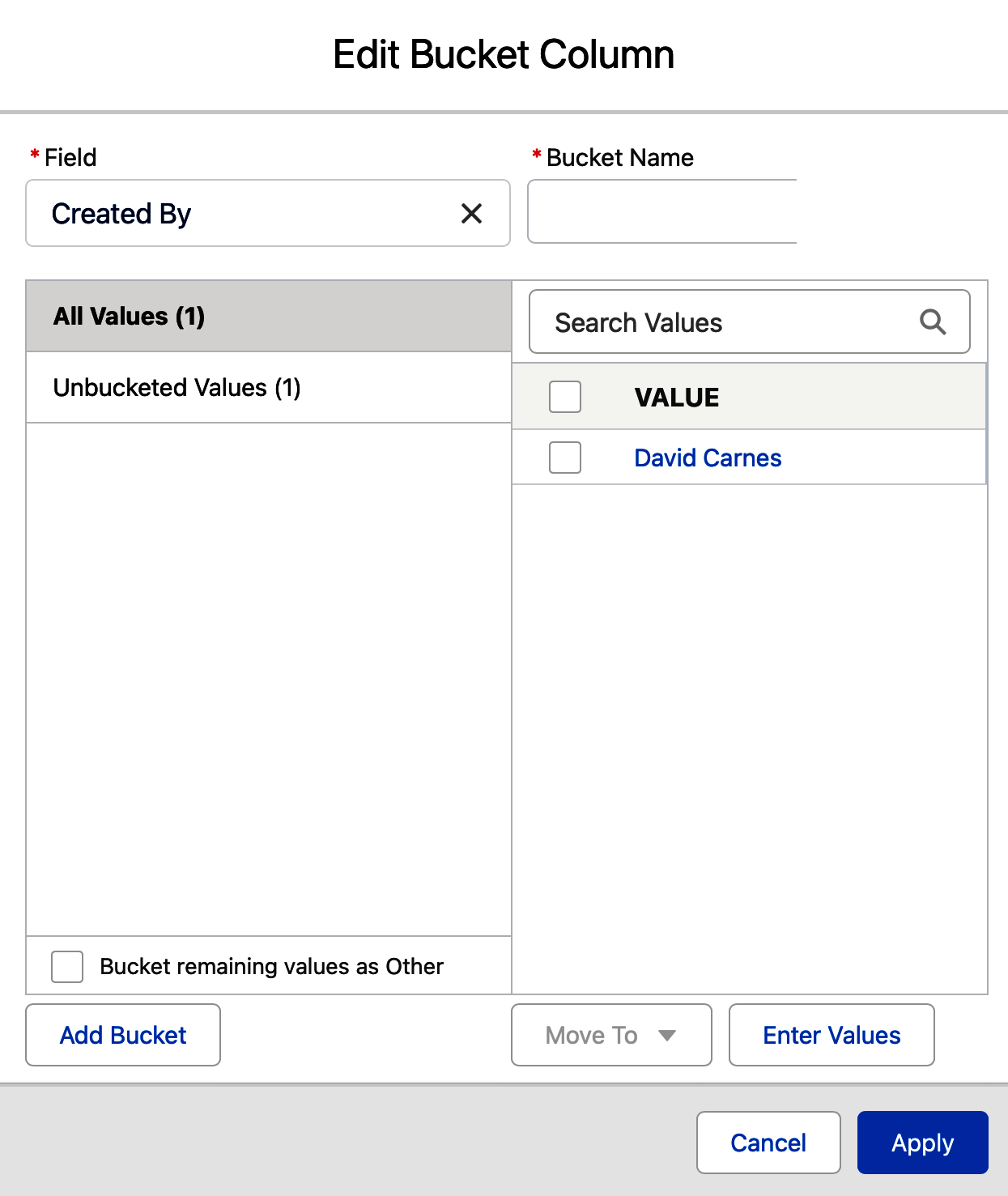
Figure 4-16. Edit Bucket Column
With the Industry field selected, and a name given to the bucket column, we can assign the picklist field values to buckets that we create. Figure 4-17 shows that one bucket has been created, out of a possible 20, called Core. Additional picklist values have been ticked, and the Move To button at the bottom of the Edit Bucket Column screen has been clicked, allowing you to add the newly checked items to Core, to the pile of Unbucketed Values, or to a New Bucket, which you will label in the subsequent screen as Emerging.
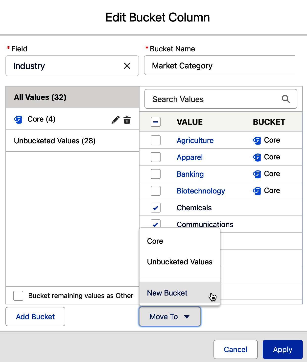
Figure 4-17. Editing a bucket column
When working with text and picklists, there is a handy checkbox that allows you to “Bucket remaining values as Other.” Figure 4-18 shows the box checked.
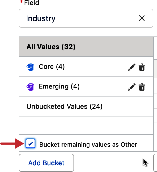
Figure 4-18. “Bucket remaining values as Other” screen
Once you click the Apply button, your new bucket column will be added as the rightmost column on your report. Figure 4-19 shows this example added to a report to collapse our 32 Industry column values into these 3 simple buckets.
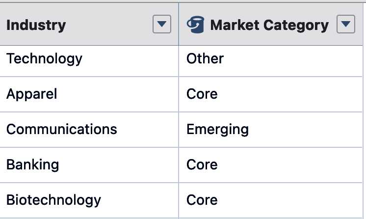
Figure 4-19. Bucket column output
Tip
There is nothing preventing you from being creative with your bucket names. You could even use emojis. Doing this adds instant color to your reports. You can then sort, filter, and group on the bucketed emojis just like you would any other text.
With numeric fields that feed a bucket column, you are asked to set less-than-or-equal-to and greater-than ranges. You can also add up to 20 total thresholds to assign those records into up to 20 buckets by clicking the Add button in between each existing threshold. Figure 4-20 shows a bucket column created on the Amount field on an Opportunity report, with buckets created for “Tiny,” “Just Right,” and “Huge” opportunities.
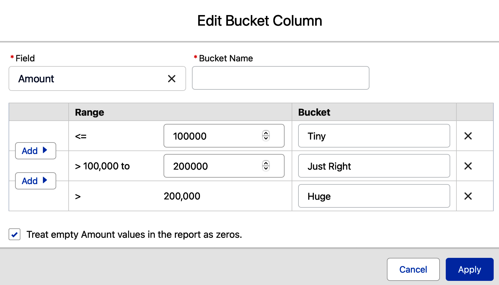
Figure 4-20. Numeric bucket columns
Show Fields Pane
Just to the left of the Outline Tab is the control to open the Show Fields pane. It is a useful tool that is easy to miss within the busy report builder. This tool is optional when building reports, but it can be valuable especially if you are not familiar with what columns are available to the report type you selected. It is also helpful in that it indicates each field’s data type. To use the Show Fields pane, click on the > symbol next to the word “Fields” marked by the arrow in Figure 4-21.
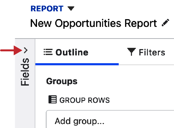
Figure 4-21. Show Fields carrot
The Show Fields pane, as seen in Figure 4-22, gives us a searchable, scrollable, and collapsible list of all fields available in the selected report type. It indicates each field’s data type as text, numeric, checkbox, date, or picklist with an icon to the left of each field name. To add one of the fields as a column on the report from the Show Fields pane, you have two options. You can double-click on it to add it as the left-most column on your report. You can also drag and drop the column to your desired location in between two columns in the Preview pane to the right.
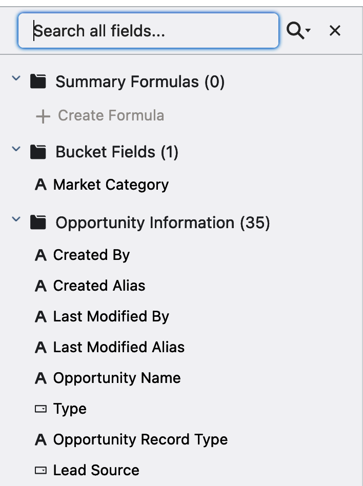
Figure 4-22. Show Fields pane
Tip
There could be thousands of fields available in the report type you’ve chosen to create a report on. If you are unfamiliar with the report type you are using, it can be helpful to scroll through the list of fields in the Show Fields pane to get to know what is available. The fields are organized into folders that typically correspond to their objects and whether they are standard or custom. Collapsing folders can be helpful to hide fields that aren’t relevant to you at that moment.
By clicking on the magnifying glass and starting to type the name of a desired field, you will see a list of matching fields appear below. In Figure 4-23, you can see a search started by typing in the first few letters of the word “name.” Those same letters are highlighted in the resulting fields below. If you click the magnifying glass icon, the search feature also lets you navigate fields by selecting their data type, which filters that list to show only matching data types below. This can be helpful because you may not know a field’s name but know that the field you are looking for is a checkbox.
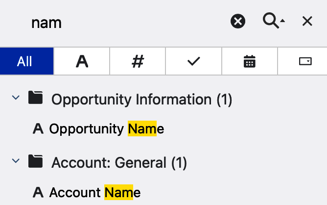
Figure 4-23. Show Fields pane search
Filters Tab
The Filters tab is where you can add, remove, or adjust filters in your reports. Immediately to the right of the tab, you might see a blue circle with a number in it. That number indicates how many filters are currently restricting records in the report. If there are no filters restricting records, the blue circle doesn’t appear. Figure 4-24 shows a circle with the number one in it, and below that the Filter tab, where you can add additional filters or adjust the existing ones. The list of standard filters differs for each report type.
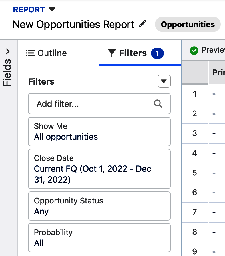
Figure 4-24. Filters tab
Tip
When starting new reports, keep an eye out for the blue circle and the number within. Many of the standard report types have one or more unwanted filters set every time you start a new report. These filters are easy to adjust, but may prevent you from seeing the data you are interested in until changed.
To modify a standard filter, click on it. Figure 4-25 shows changing this Opportunity report’s standard filter on the Close Date field from its default of the current fiscal quarter to the range of All Time. This essentially removes the filter on Close Date by showing opportunities with any date in that field. By clicking on the Close Date filter, a window appears to the right, allowing us to select a predefined date range or to customize by hard-coding the dates we want.
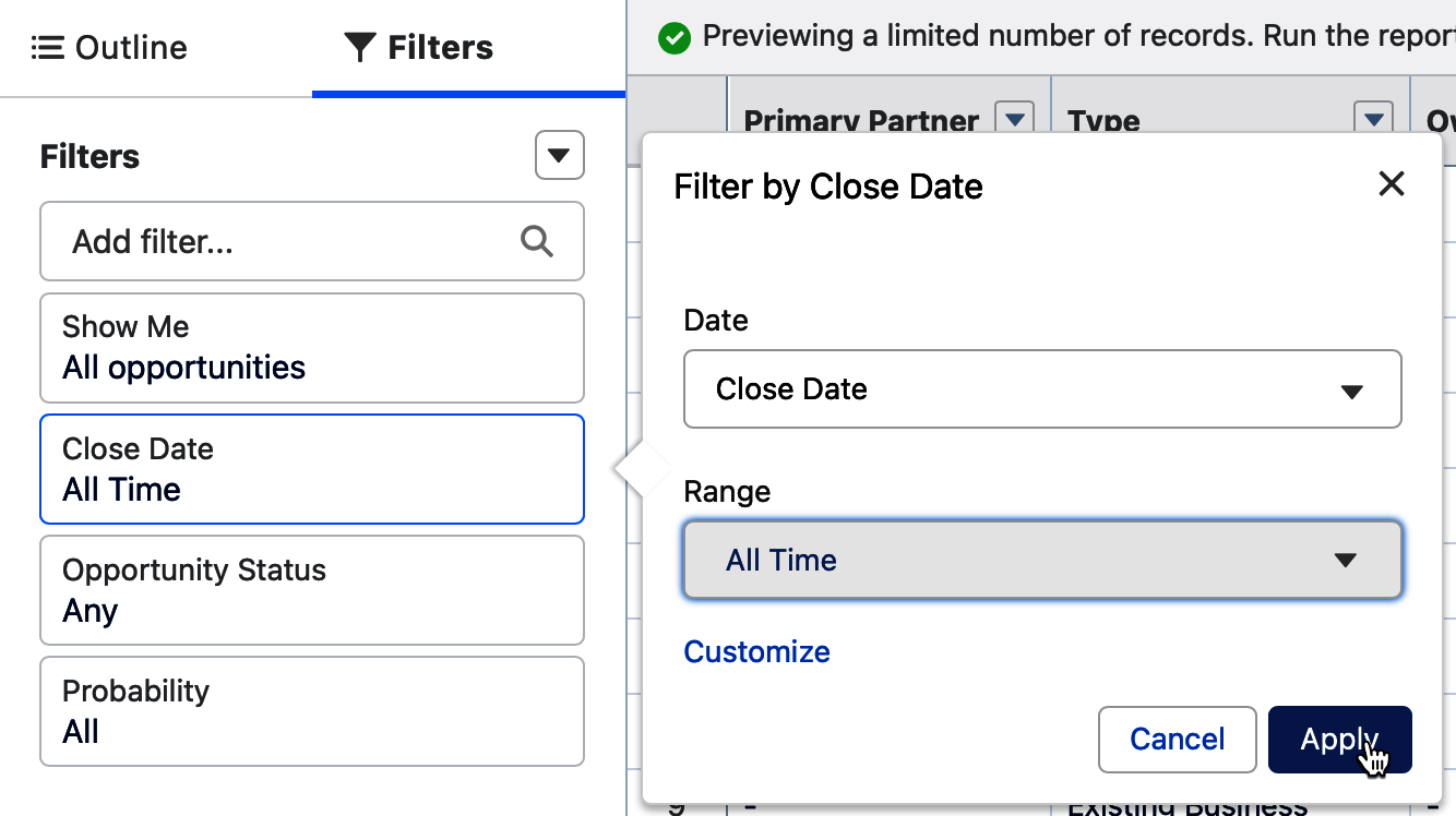
Figure 4-25. Editing a standard filter
Tip
A rookie mistake when working with filters is to forget to click the Apply button when adding or editing a filter. If you forget and click somewhere else, the Filter Edit window goes away, but your changes are not saved.
Depending on the report type used to create a report, you may see two, three, or four standard filters available to use. It is worth exploring each report type’s standard filters to see which have special features you can take advantage of in reporting. In Figure 4-26, you can see the Show Me filter selected on a report based on the Opportunities report type. By default, it allows you to filter by My Opportunities, My Team’s Opportunities, and All Opportunities. When the Opportunity Teams or Enterprise Territory Management features are enabled in your system, the list of filter options grows even longer. When the All Opportunities filter is applied, you can further filter opportunities shown in the report by an opportunity owner role and even further by a specific opportunity owner in the Narrow by Person field as needed.
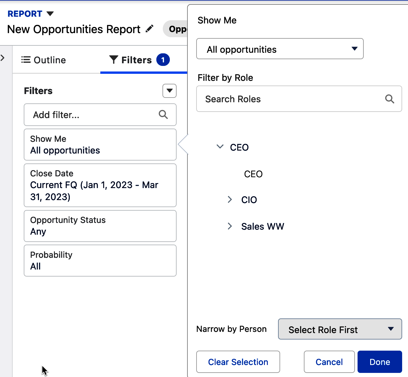
Figure 4-26. Special standard filters
The standard filters on each new report are useful up until a point, and after that you will need to make use of advanced filters. Add new filters to your report by typing in a field name within the “Add filter” window, selecting the appropriate field, and then specifying the operator and value you want to filter on. Figure 4-27 shows adding a filter on the Opportunity field Type, which is a picklist. To the right of the new filter appears a window that allows us to adjust the operator and select one or more values for it.
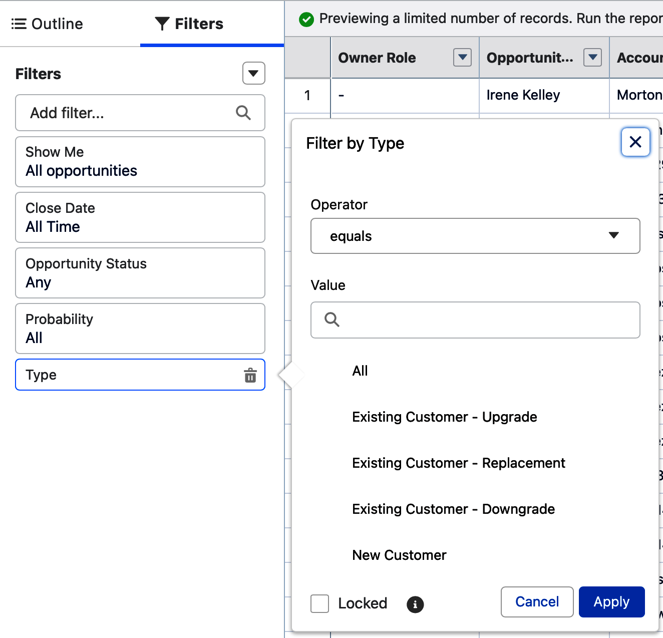
Figure 4-27. Adding an advanced filter
Tip
Be sure to scroll down on the list of available operators. Many new report writers miss out on using the Contains, Does Not Contain, and Starts With operators because they don’t scroll down to see all the operator choices.
The Locked checkbox at the bottom of each advanced filter will, when checked, prevent users from adjusting the filter when running the saved report. Figure 4-28 shows the box checked on a filter and also the help text that appears when hovering over the “i” in the circle next to it.
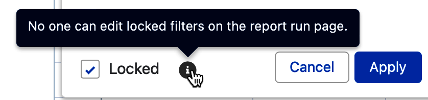
Figure 4-28. Locked checkbox on advanced filters
You can add up to 20 advanced filters to any report. When you add them, assume that they are all connected by an “and.” This means that they will all be enforced when filtering your report data. As report writers, we often need more flexibility than that, which is where filter logic comes in. This powerful filtering feature is found in other places in Salesforce, allowing us to use parentheses, “and,” “or,” and “not” to set up the exact combination of filters needed to achieve a particular report’s filtering goals. When you first start working on a report’s filters, prior to adding advanced filters, the Add Filter Logic option in the action menu to the top right of the Filters tab will be grayed out, as in Figure 4-29.
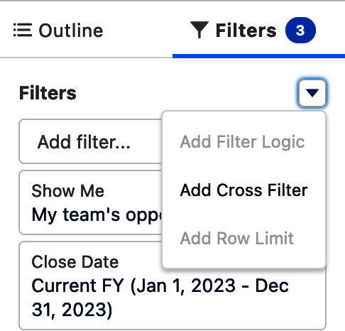
Figure 4-29. Add Filter Logic grayed out
As soon as you add your second advanced filter, the Add Filter Logic option will no longer be grayed out and will be usable in the action menu at the top right of the Filters tab. Once you select it, the Edit Filter Logic pane will appear. Salesforce has added reference numbers to the left of each filter and written the word “AND” in an editable box between the numbers representing each filter. In Figure 4-30, you can see a simple example where the Industry field filter has been assigned “1” and the Billing State field filter has been assigned “2.” By using the Edit Filter Logic pane, the “AND” has been changed to an “OR” in between the numbers 1 and 2. This means that data matching either of the underlying advanced filters will be returned by the report. When you work on a report with many filters, filter logic helps you meet your complex filtering needs.
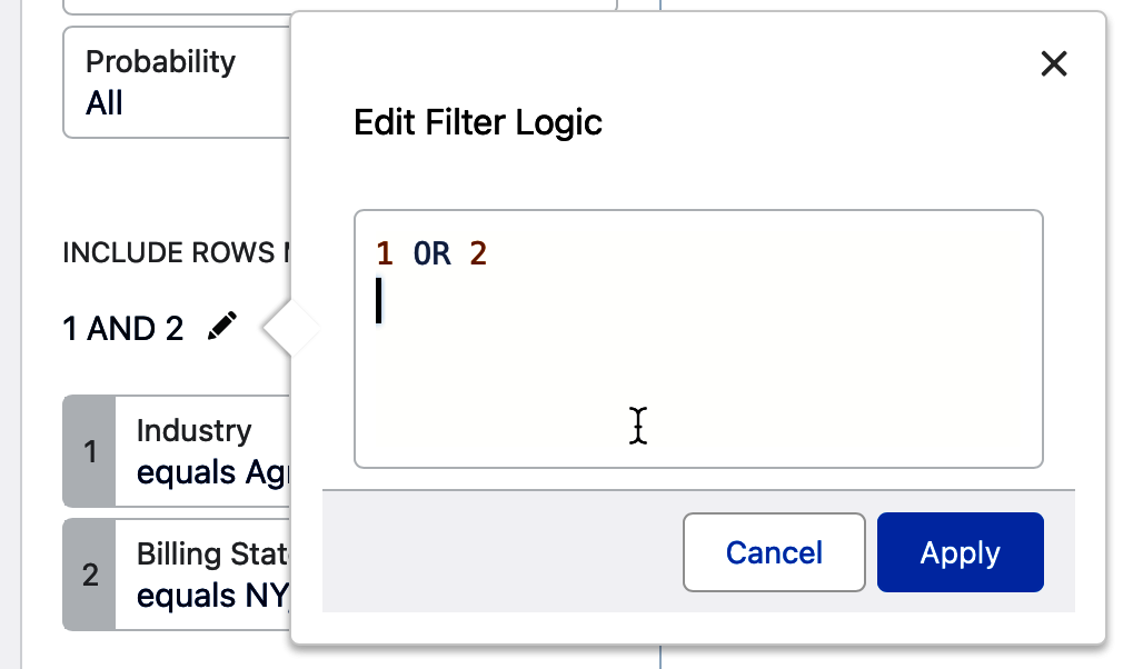
Figure 4-30. Edit Filter Logic pane
Tip
It is easiest to first add all the advanced filters you want to a report and then circle back to add the filter logic that fine-tunes them.
Cross filters
Another type of powerful filter that is available in reports, cross filters, is often avoided because it seems complicated. Cross filters allow you to filter a parent object, such as accounts, whether or not there are any child objects, such as contracts, cases, or opportunities. With a little understanding of your Salesforce instance’s data model, you can make great use of cross filters in your reporting as each report can support up to three cross filters. Figure 4-31 shows that you can add a cross filter by using the pull-down action menu to the right of Filters.
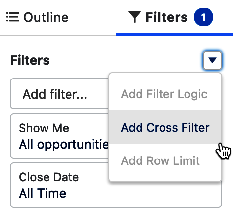
Figure 4-31. Add a cross filter
Once you’ve selected the Add Cross Filter action, the Edit Filter pane will appear. Figure 4-32 shows that you can specify the object from your report type, such as Opportunity, decide whether you want the report to pull records with or without the child object, and choose the child object. The list of available child objects for the selected object in the Show Me picklist will depend on the data model in your Salesforce instance. In this example, the filter will only show opportunities that do not have associated products.
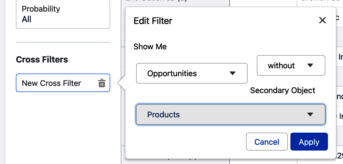
Figure 4-32. Editing a cross filter
Not only can you have up to three cross filters per report, but you can also filter each of the cross filters. Once you have added a cross filter, you can further refine it by adding a field subfilter to it. Figure 4-33 shows adjusting a cross filter so that it shows accounts without cases where the Escalated field is set to True.
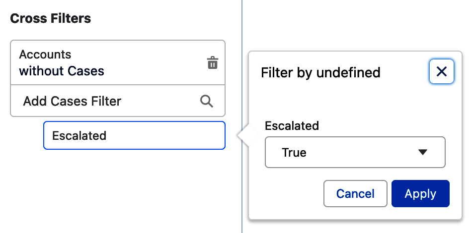
Figure 4-33. Cross filter subfilter
Row limit filters
Row limit filters are not new to Salesforce reports, though they were more recently added to reports in the Lightning user interface. They allow you to restrict the report output to a specific number of records, between 1 and 99, while ignoring the rest in the dataset. They are perfect for displaying a top 10 list of largest deals ever, or a list of the top 5 most expensive campaigns, for example. To use them, you need to have an ungrouped report that has at least one column sorted; otherwise, the option in the filter menu is grayed out. Figure 4-34 shows the Add Row Limit filter option grayed out.
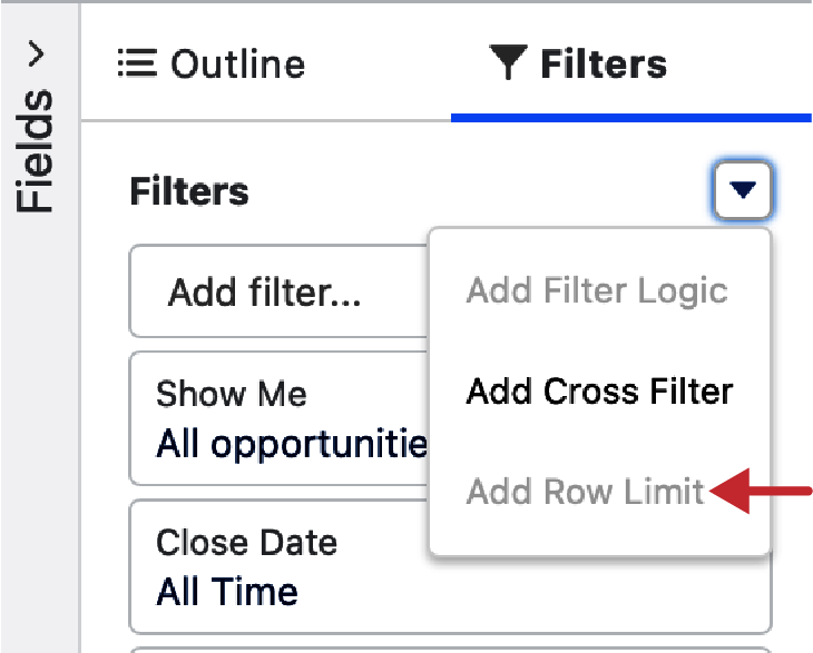
Figure 4-34. Add Row Limit grayed out
With an ungrouped report, and with at least one column sorted, the row limit filter option becomes available. Figure 4-35 shows what this looks like in the report builder.
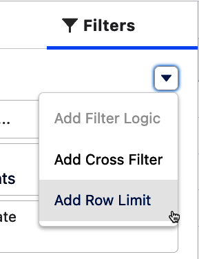
Figure 4-35. Add Row Limit filter
Once added, the default number of rows in a row limit filter is 10 as seen in Figure 4-36. You can adjust this by entering any number between 1 and 99 here and clicking the Apply button.
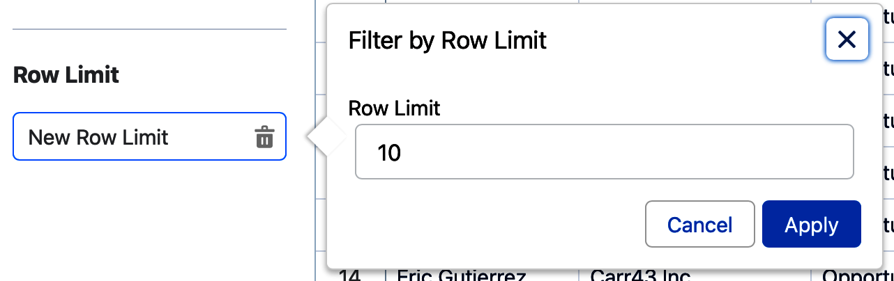
Figure 4-36. Filter by Row Limit
Tip
It is helpful to users to indicate that records have been limited by a row filter in the name of the report, such as “Top Five Performing Campaigns This Year” or “Ten Oldest Open Cases.”
Personalized filters
Salesforce offers another special type of filter that only applies to fields that “look up” to the user object. Examples of standard fields include ones such as Created By and Last Modified By. You likely have custom fields in your system where this filter becomes especially valuable, such as Executive Sponsor. These filters are called personalized filters because they provide a dynamic way to run a report filtered by the user who is running the report. The arrow in Figure 4-37 shows that when filtering on a field that looks up to the user object, the “Use relative value” link appears.
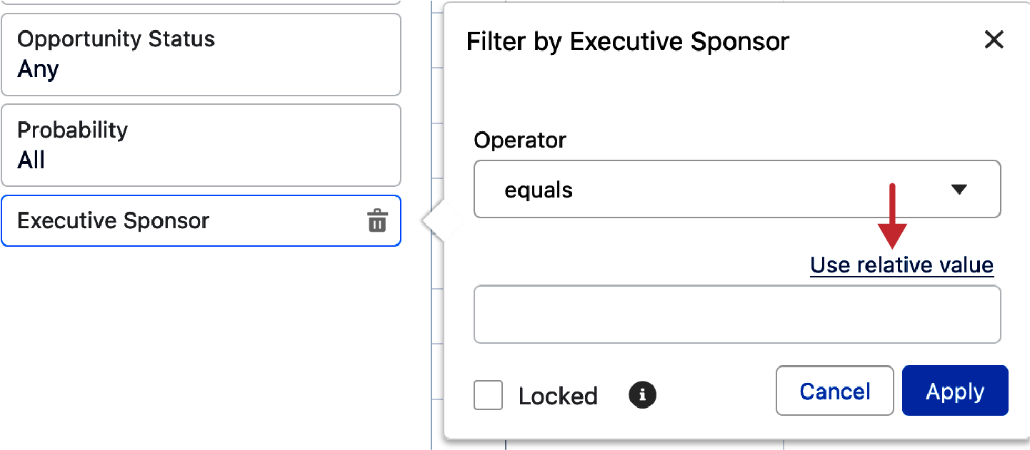
Figure 4-37. Personalized filter: Use Relative Value
When clicked, the “Use relative value” link inserts “$USER” into the filter, as seen in Figure 4-38. Once applied, this will create a “my filter” on this field, showing the person running the report only records where they are the user populated in the field.
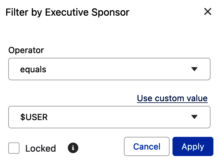
Figure 4-38. Relative value in a personalized filter
Relative date filters
A powerful way to zero in on your desired report data becomes available when filtering your reports on fields of Date and Date/Time data types. Relative date filters allow you to dynamically include or exclude records based on dynamic date ranges indicated by phrases such as “THIS QUARTER,” “YESTERDAY,” or “7 WEEKS AGO.” Any variation of capitalization when using relative date filters is acceptable. The arrow in Figure 4-39 shows the link “Use relative date,” which appears when filtering on a Date field.
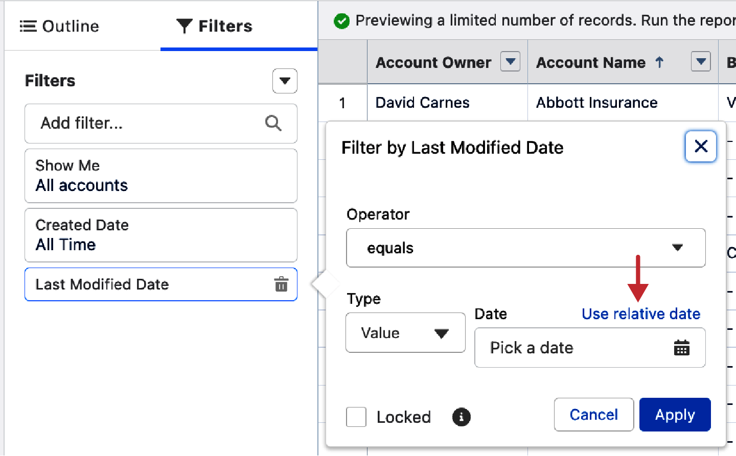
Figure 4-39. Use Relative Date filter
Tip
There is a document entitled “Relative Date Filter Reference” in Salesforce Help that lists out all of the relative date values you can use in filters. These are very useful across Salesforce, be it in report filters, dashboard filters, list views, and so on.
Clicking on the “Use relative date” link reveals a Relative Date box where you can type in the relative date value you want to use to filter the report. Figure 4-40 shows that the operator is set to “equals” and the Relative Date is “THIS WEEK.”
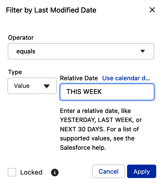
Figure 4-40. Relative Date filter example
Tip
When first using relative date values, it is best to stick with “equals” or “not equal to” as the operator. Unexpected results can occur with these dynamic date ranges when trying out the variations of “less than” or “greater than” as operators.
Preview Pane
The second big region in the report builder is the Preview pane. By default, the Preview pane does not refresh itself to update the report preview unless you toggle on the Update Preview Automatically switch. Figure 4-41 shows the toggle turned on, meaning that the preview will update itself as you make each change to the report in the report builder.
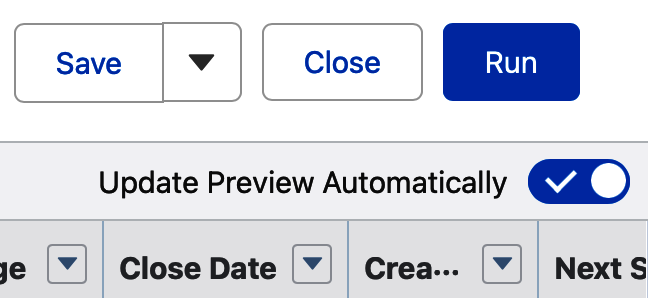
Figure 4-41. Update Preview Automatically screen
Warning
Please do not make business decisions based solely on the data in the Preview pane. In most cases, the pane shows just a small subset of the data that will appear when the report is run. It is intended to serve as a way to give you a sense of what the report will look like.
Within the Preview pane, you will see the columns that have been selected to appear in your report. To the right of each column is an action menu pulldown that gives you a set of controls related to that column. Figure 4-42 shows the action menu for the Account Name column. You can sort ascending or descending. You can group rows or columns by this field. You can create a bucket column with Bucket This Column. You can show the count of unique items appearing in this column by selecting Show Unique Count. Finally, you can move the column left or right in the column order, or remove the column entirely, using this menu.
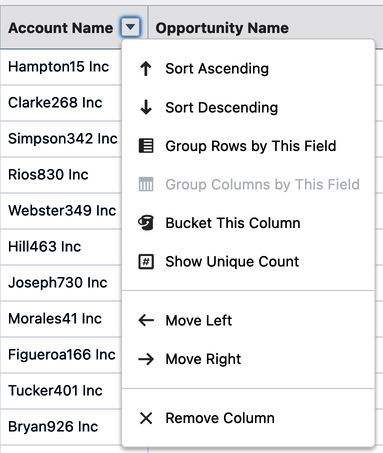
Figure 4-42. Column header action menu
For columns that can be summed, such as the Amount column on an Opportunity report, there is an option to summarize that column using sum, average, max, min, or median. For grouped columns, there are additional options to control how the grouping is handled. For example, when you group a report by dates, such as by the Close Date on an Opportunity report, the default grouping is by day. Unless your business is very transactional, this is almost never what you want. Figure 4-43 shows how to use the action menu to change Group Date By to Calendar Quarter. The top left arrow shows engaging the action menu. The center arrow selecting Group Date By reveals a list of options, and the bottom arrow shows the current selection of Calendar Quarter.
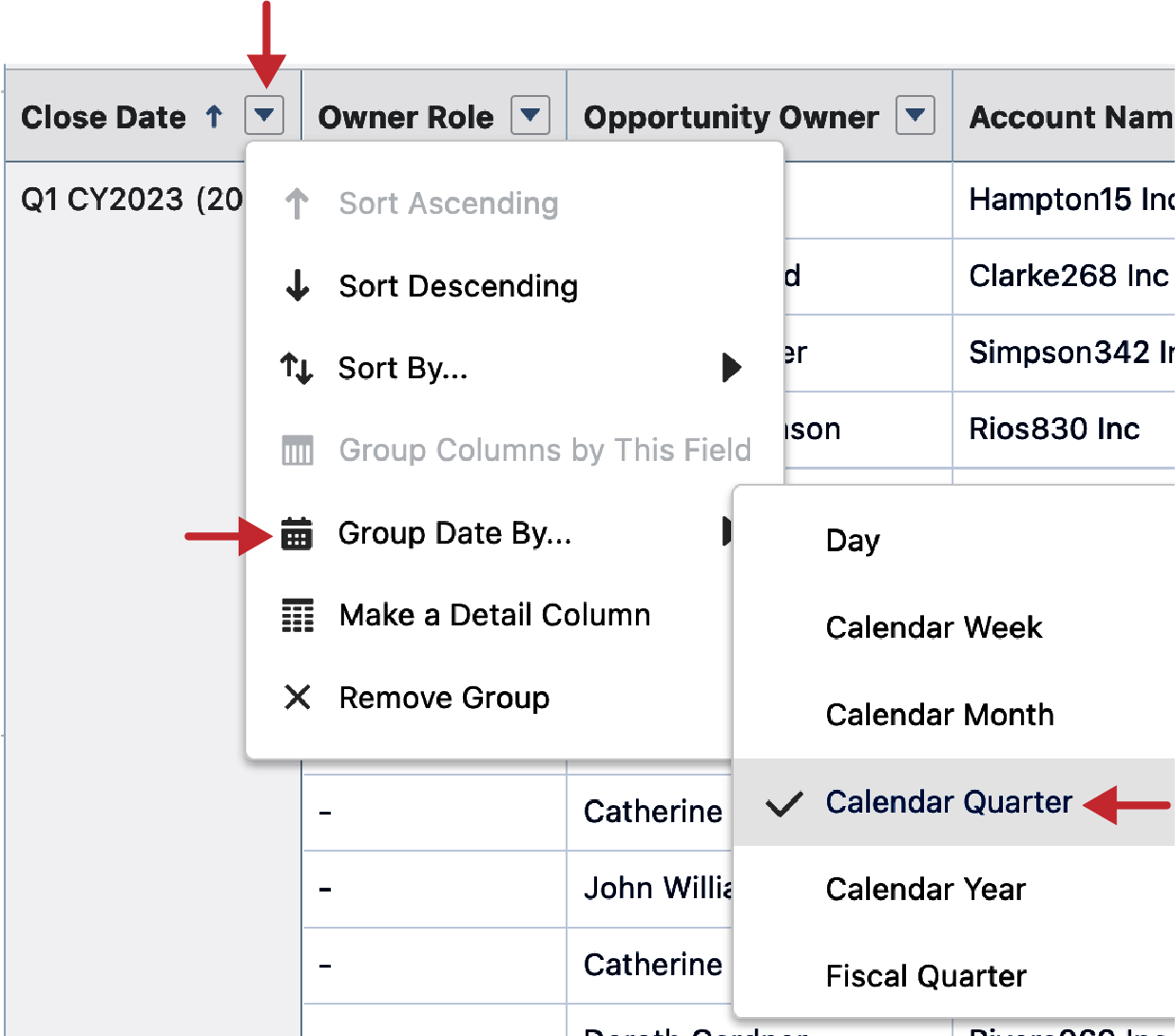
Figure 4-43. Group Date By
Clicking on any of the column headers once will sort the report by that column ascending. Clicking it a second time will sort the report by that column descending. Figure 4-44 shows the up arrow that appears next to the column name once it has been sorted ascending.
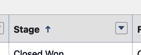
Figure 4-44. Column sort order
Report Controls
Across the top of the report builder is a set of controls related to the report you are working on. All new reports are given a default name based on the report type you have chosen. Figure 4-45 shows the top left corner of the report builder, where you can see the default label given to your new report, with a pencil to the right. Clicking on the pencil allows you to rename the report. To the right of the pencil, you can see the word “Opportunities” in a gray oval. This is the report type that the report is based on. Up above the report label is the word “Report” with a black triangle next to it. We will use that triangle a bit later in this chapter to change the report format to a joined report.

Figure 4-45. Relabel report
Across the top, to the right corner of the report builder, there is an additional set of controls. There are Undo and Redo buttons, which work in your current editing session, tracking more than 25 recent changes that you can go back or forward to. Figure 4-46 shows these two buttons and the text that appears when you hover over the Undo button. The Redo button to the right is grayed out because no changes have been undone in this editing session.
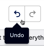
Figure 4-46. Undo and Redo buttons
To the right of the Undo and Redo buttons is the Add Chart button, as seen in Figure 4-47. This button is grayed out until at least one grouping is added to the report. Next to it is the Save & Run button, which does exactly those two steps. The Save button has either one or two choices, depending on whether you’ve already saved the report. Clicking it shows the choices Save As and Properties. Save As will let you create a clone of the report by just giving it a new name. Properties will allow you to update the report’s name, description, and assigned folder. If you’ve made changes to the report and click the Close button, you will be asked if you want to save the changes or discard them. The Run button will run your report as is. It is not necessary to save a report before running it.
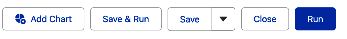
Figure 4-47. Report buttons
Tip
The Save As feature is useful when you are creating, editing, or running a report and want to create another version of it. All settings from the original will be brought over to the new copy, and you just need to give it a new name and folder location to save it in.
When first using the Save & Run or Save buttons, you will be given the chance to change the report name, add a description, and specify the folder you want to save the report in. Figure 4-48 shows the Save Report screen. When first saving a new report and adjusting the Report Name field, click anywhere else on the screen and the Report Unique Name field will be autopopulated. All reports have to have a unique name in your Salesforce instance. The Report Description is an optional field, but a useful one to help orient your report users to the purpose and structure of the report. Note that the default folder for every new report is the report creator’s Private Reports folder. Items in the Private Reports folder can only be seen by the person who saved the report. To change the folder, or create a new one, click on the Select Folder button before you click Save.
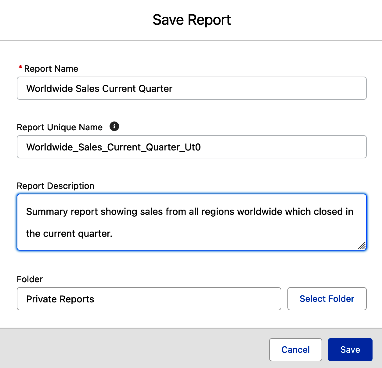
Figure 4-48. Save Report screen
On the Select Folder screen, you can navigate into a folder and, if desired, into its subfolders to select the best folder in which to store your saved report. Figure 4-49 shows this screen and the Sales Reports folder as selected. Also available in the bottom left of this screen is the New Folder button, allowing you to create a new folder as part of the save process for the new report. Once you have selected the folder you want, click the Select Folder button to finish the save.
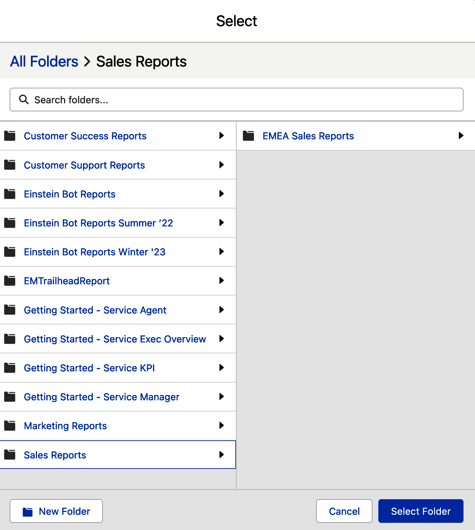
Figure 4-49. Select Folder screen
Tip
If you create a new folder in this way, remember to go into that folder to review and, if needed, adjust the report sharing to allow others to view, edit, or manage reports in the folder. The worst thing is creating an incredible new report, storing it in a new folder, and no one being able to see the report.
Charts
As you saw in the last chapter, you can add a chart when you run a report. You can also add charts when editing a report in the report builder. Figure 4-50 shows an arrow pointing to the icon for the Add Chart button once it has been clicked on a report that has been grouped. The default chart shown is a horizontal bar, which can be changed by clicking on the small gear, as shown by the right arrow, and selecting one of the other seven chart types. Below the Display As choices, there are chart properties, such as the chart title, the axes, and others, which you can update.
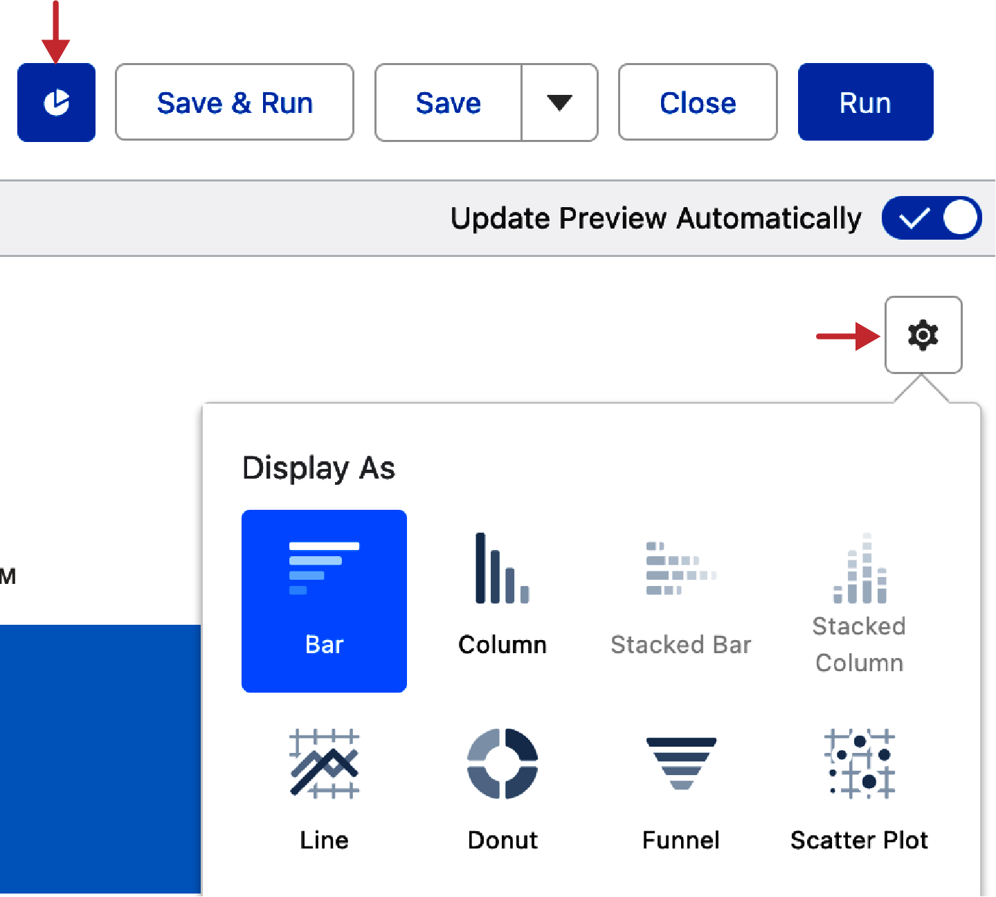
Figure 4-50. Add Chart button and Display As screen
Toggles
The fourth region of the report builder is the set of toggles that appear across the bottom once a report has been grouped. Figure 4-51 shows the default position of these toggles, all set to display row counts, detail rows, subtotals, and the grand total. (Another toggle, Stacked Summaries, is shown on matrix reports. See the Matrix section later in this chapter to learn more.) Row Counts reveals or hides the number of records in each grouping. Detail Rows will collapse or expand the entire report, showing only subtotals and the grand total. Subtotals will hide or reveal the subtotals on the report based on its groupings. Grand Total will hide or reveal the report’s grand total. Also shown is the Conditional Formatting button, which appears with the first grouping and first summarized column.
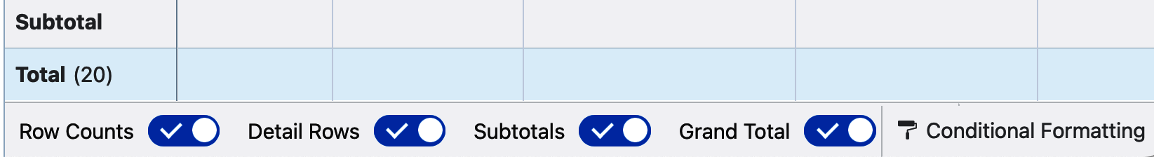
Figure 4-51. Toggles and Conditional Formatting
Tip
A Salesforce report that is run will show up to the first two thousand rows in the browser. Looking at that many records would involve a lot of scrolling. In many cases, it is helpful to collapse reports by toggling off Detail Rows to allow anyone using your report to focus on the summary data. A report with Detail Rows toggled off will show subtotals based on your report groupings along with the report’s grand total.
Conditional formatting
Conditional formatting allows you to add color to your report’s summed numerical columns, highlighting numbers based on criteria you specify. These can be standard columns on which you have chosen to sum, average, max, min, or median, or summary formulas that you have written on the report. You can add conditional formatting on up to five columns in each report.
Tip
Conditional formatting does not apply to individual records, only grouped summaries. If you need to conditionally highlight anomalies in individual records, you can use a row-level formula and show colorful emojis as output.
Clicking the Conditional Formatting button will open the Conditional Formatting Rules screen. This shows the list of formatting rules already created on this report. Figure 4-52 shows this screen without any rules added yet. Clicking the Add Conditional Formatting Rule button will allow you to add a new rule.
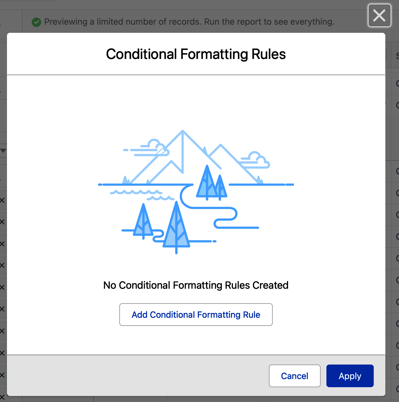
Figure 4-52. Conditional Formatting Rules
Clicking Add Conditional Formatting Rule will take you to a window that lets you set thresholds that correspond to the background colors to the right. Figure 4-53 shows a new rule based on the Sum of the Amount column, with thresholds set for less than or equal to 250,000, greater than 250,000 up to 500,000, and greater than 500,000. The default colors are red, yellow (orange), and green, though they each can easily be changed to one of millions of colors by clicking on the corresponding color box.
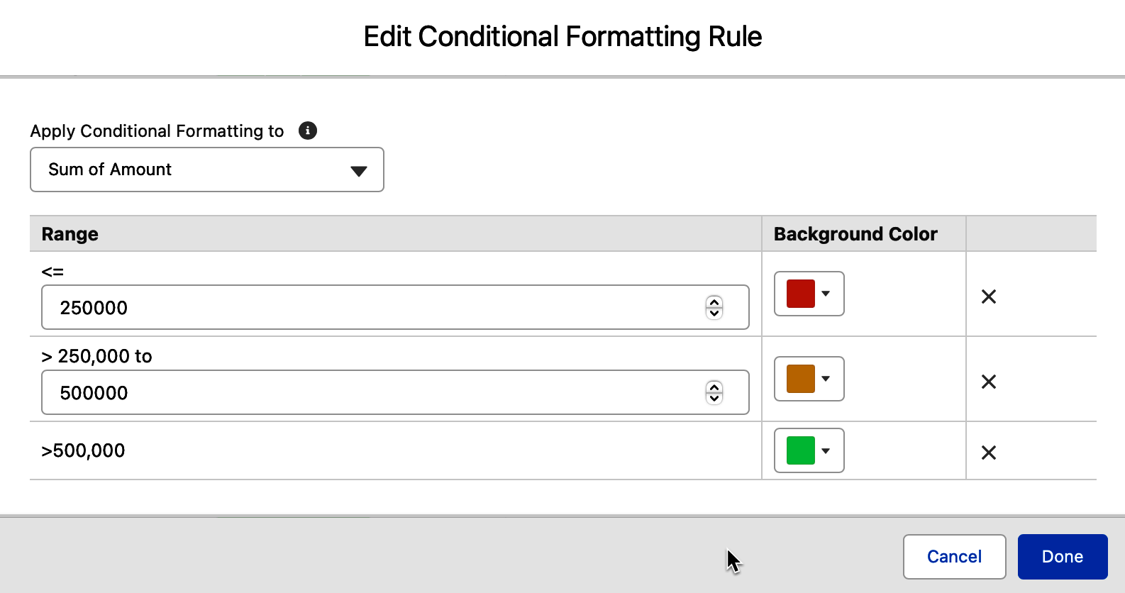
Figure 4-53. Add New Conditional Formatting Rule
Tip
A powerful technique when using conditional formatting is to drop the number of colors shown from three to two, and then set one of those two remaining to display no color. Sometimes three or even two colors in the background of a column’s results is just too much color on the report. This technique allows you to highlight just one threshold that you want on the summary column, and show just one color.
Figure 4-54 shows the newly saved rule on the Sum of the Amount column. To edit this rule, click the pencil icon to the right. To remove it, click on the trash can icon. By clicking the Apply button, this new formatting rule will be displayed on the report.
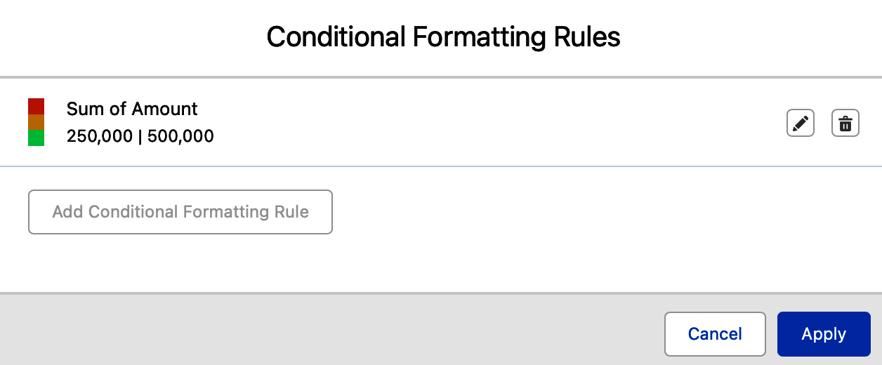
Figure 4-54. Saved Conditional Formatting Rule
Once saved, the conditional highlighting is applied to the summary column. The font changes from black to white, and the entire background of the cell becomes the formatting color specified. Figure 4-55 shows an Opportunity report grouped by calendar quarter and owner with the Sum of Amount formatted.
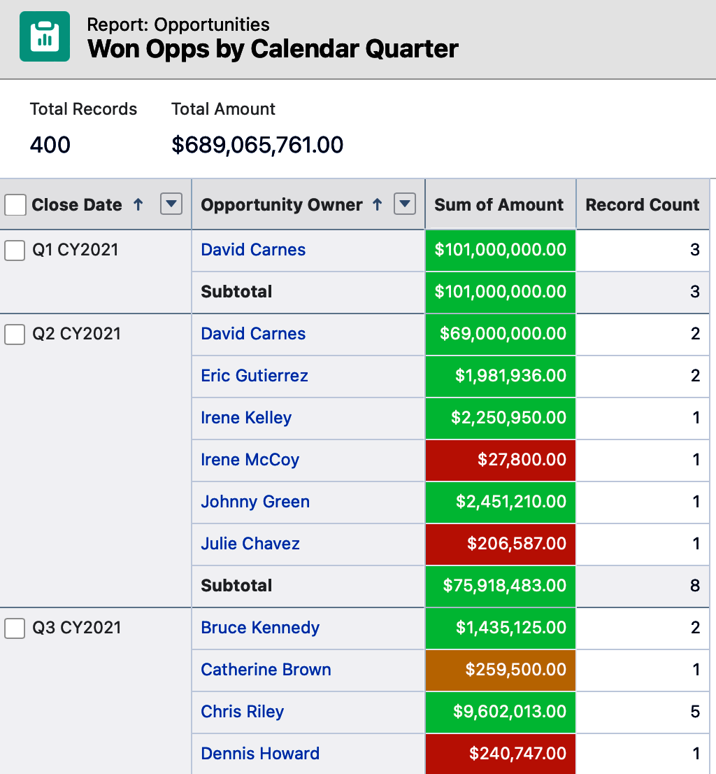
Figure 4-55. Conditional formatting in action
Report Formats
One final thing to know when creating reports in Salesforce is the set of four report formats that are available. These formats provide the structure of the report and are largely driven by the presence or lack of groupings in your data.
Tabular
A tabular report is an ungrouped report. These are excellent for lists of information, such as a call list or an address list you might want to give a fulfillment vendor to send out holiday gifts to clients. Figure 4-56 shows a report-created listing of all reports in the system. This is an excellent example of a tabular report you might want to create to help manage the cleanup of the Reports tab. Once run, you might immediately export it to Excel to review and make notes.
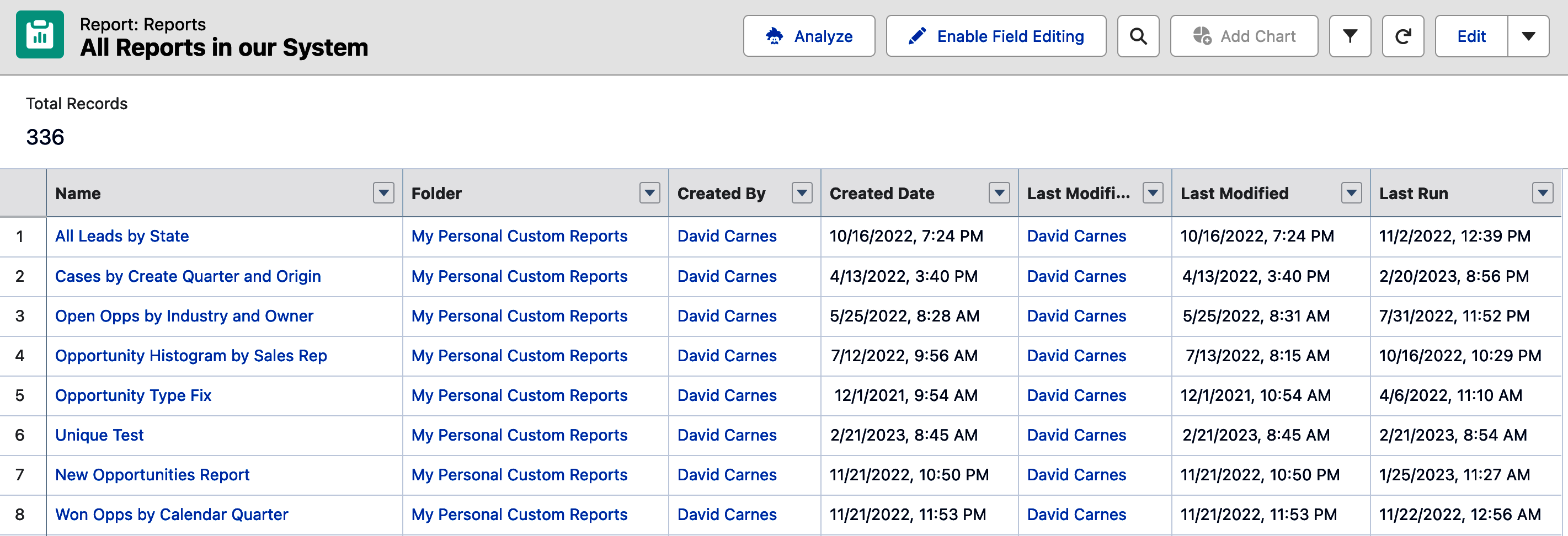
Figure 4-56. Tabular report example
Summary
Summary reports are reports in which rows are grouped. In a summary report, you can group rows up to three times. As mentioned earlier in this chapter, once a report is first made into a summary report by adding the report’s first grouping, a number of options become available. Figure 4-57 shows the list of all accounts in a system grouped by the Account Owner and Type fields. This report also has Detail Rows toggled off to collapse the results to just show the groupings and the record counts.
Tip
If you are not sure which report format to select in a given situation, it generally doesn’t hurt to start with a summary report. In many reporting situations, you want to see information grouped along with subtotals for those groupings.
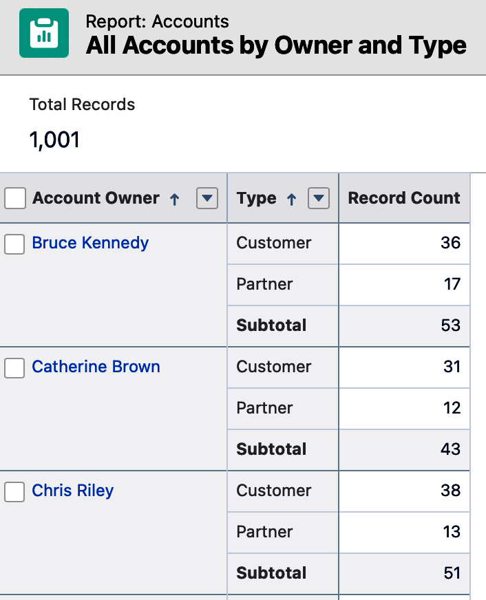
Figure 4-57. Summary report example
Matrix
Matrix reports allow you to group vertically (rows) up to two times and horizontally (columns) up to two times. A nice example of a use case for a matrix report is when you create a bird’s-eye view of your open opportunity pipeline, grouped by owner vertically and by stage horizontally. Figure 4-58 shows the start of this example. As soon as your first row grouping is added, the Group Columns section appears. Once you’ve added row and column groupings, a new control appears to the left of the trash can that allows you to flip the row and column orientation. The trash can quickly deletes all groupings.
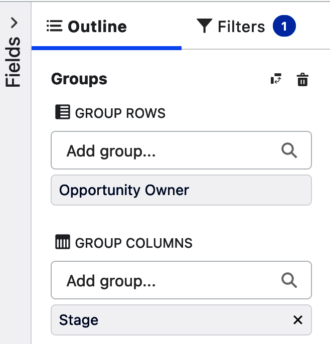
Figure 4-58. Grouping rows and columns
With Row Counts toggled off, and the Amount fields summed, this matrix report shows a compact set of information about the health of each sales owner’s open pipeline. Figure 4-59 shows the sum of the amount each owner has in each sales stage. When a matrix report is run, clicking on any one of the cells will filter the record set below the matrix to just that cell.
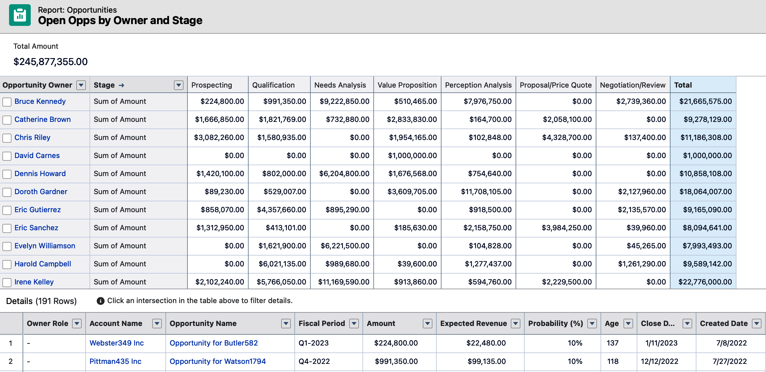
Figure 4-59. Matrix report example
Tip
Matrix reports are generally unreadable if the detail rows are shown. There is just too much data to look at. Most often these reports are displayed with Detail Rows toggled off, which collapses the report to the grouping level.
When creating a matrix report, an additional toggle switch appears at the bottom of the report. This toggle is called Stacked Summaries, and can be seen in Figure 4-60. This feature comes into play once your report has multiple summed columns.
Figure 4-60. Stacked Summaries toggle
Stacked summaries, by default, appear one on top of the other. You can adjust them to appear side by side by turning off the toggle. Figure 4-61 shows the report becoming taller with three summary columns stacked for each grouping.
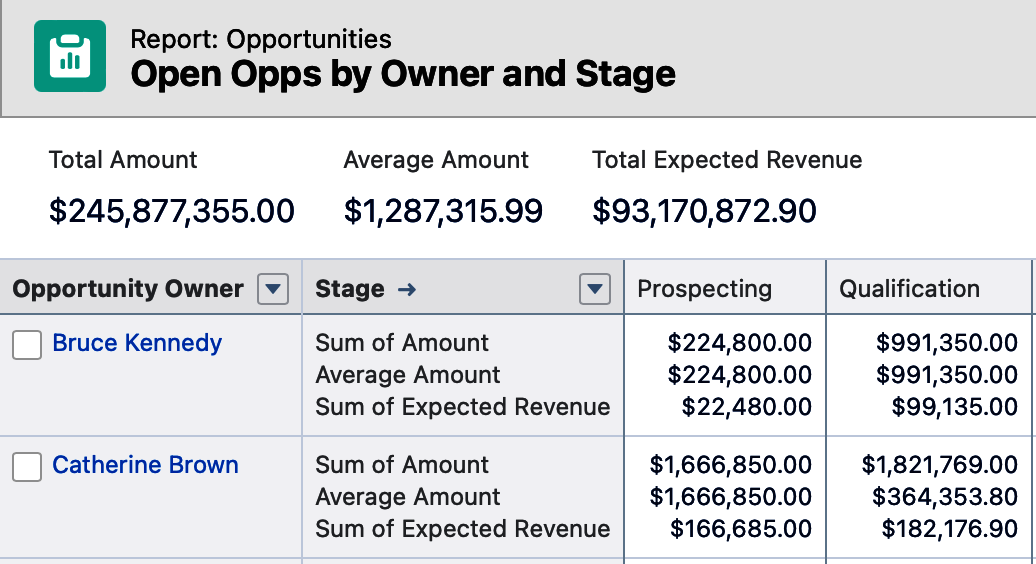
Figure 4-61. Matrix report with stacked summaries
The same matrix report will look quite different with Stacked Summaries turned off. It will be shorter and much wider because the summary columns will be displayed side by side for each column grouping. Figure 4-62 shows the very different orientation and look of the same report as shown in Figure 4-61 with Stacked Summaries turned off.
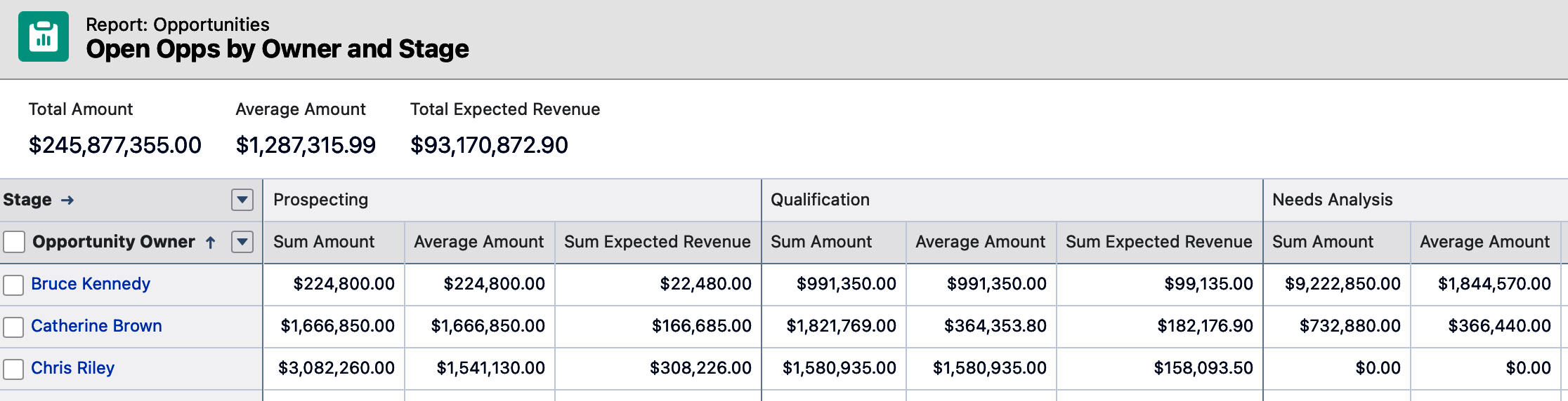
Figure 4-62. Matrix report without stacked summaries
Tip
Where possible, try to avoid creating reports where users will have to scroll left and right to read the report output. This can happen when you turn off Stacked Summaries. Scrolling up and down through report results is acceptable to most users, but the user experience when scrolling horizontally is less appealing.
Joined Reports
The fourth and final report format is joined reports, which allow you to combine up to five separate reports into one report. This is done by changing the report to be a joined report, and then adding new report blocks for each report you want to include. The key to making this work is to have a common element across each of the report blocks that group the joined report.
A classic example of a joined report is to combine a report showing all won opportunities by account, with another showing all open opportunities by account with another block showing all open high-priority cases. In the following steps, you’ll learn how to create this joined report.
Change a report into a joined report by using the dropdown in the top left corner of the report. As shown in Figure 4-63, click the black triangle next to the word “Report” in the top left corner of the report builder. Once clicked, select the option for Joined Report and click Apply. The initial report is created using the Opportunity report type.
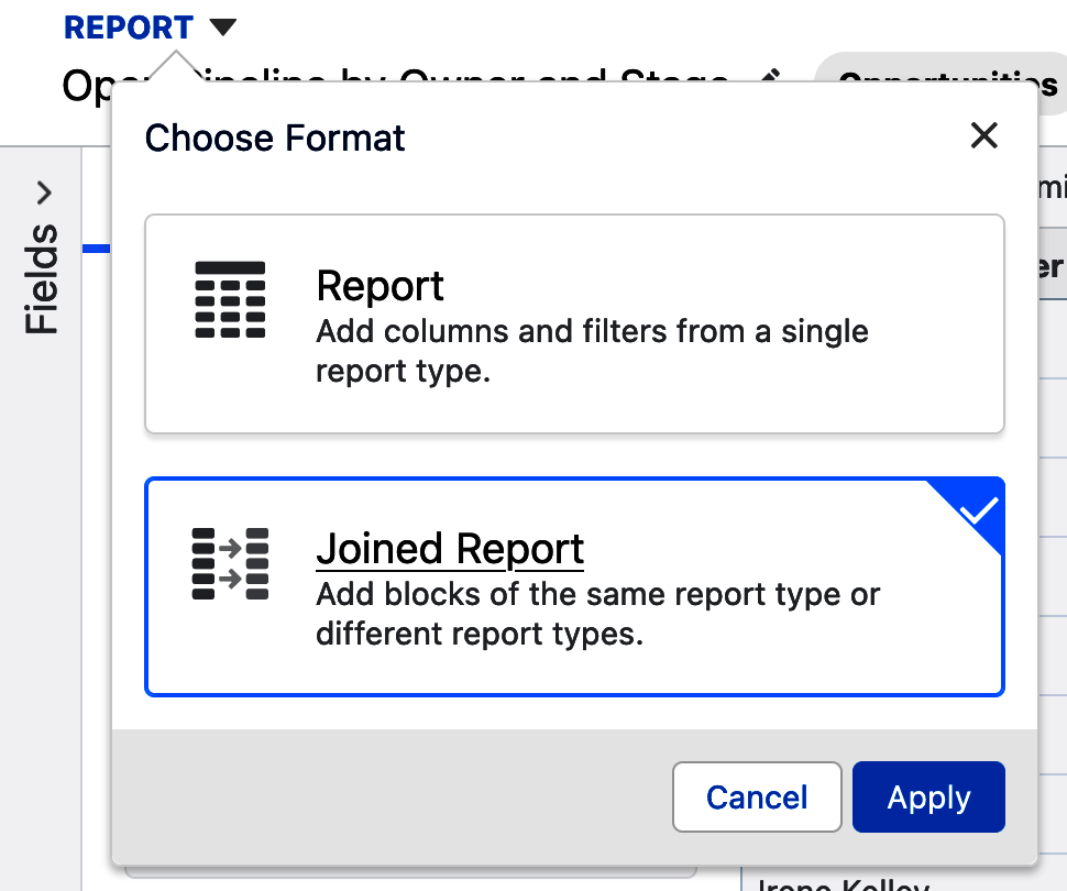
Figure 4-63. Creating a joined report
As seen in Figure 4-64, a new button appears immediately to the right entitled “Add Block,” which is how you will add additional report blocks to the joined report. Report blocks are self-contained reports, with columns, filters, and formulas. Before adding a second report block, it helps to relabel the current block by clicking on the pencil to the right of the label in the Preview pane and changing its name. In this case, you might relabel it to “Won Opps,” and sum and average the Amount column. Note in this example that the columns for this block have been relabeled “Won Opps” as well. The same is true for the filters for this block on the Filters tab.
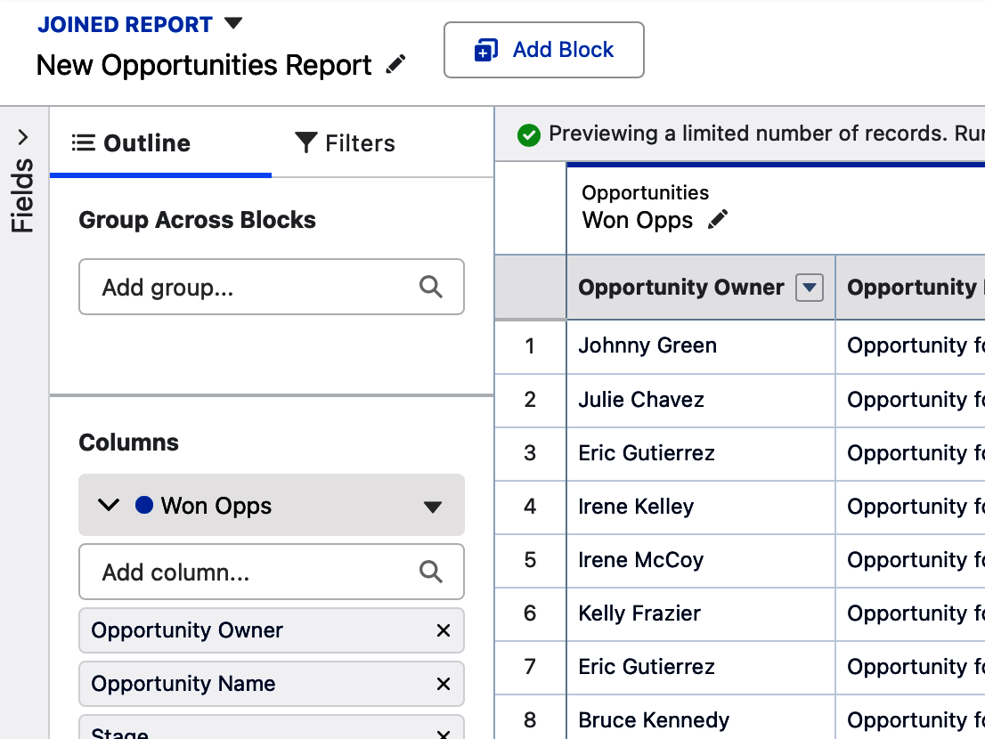
Figure 4-64. First steps in creating a joined report
Tip
There are some limitations to what report types can be added as a block on a joined report. In Salesforce Help there is a list of standard report types that can’t be added to joined reports. There are also some report types that are not compatible with each other based on their objects and joins. When you try to add an offending report type, a red error message will warn you that it isn’t compatible to be added as a block.
Let’s take this example a bit further by adding a second report block. Click the Add Block button at the top of the report. This button will ask you to select another report type to add to this same report, just like you do when you create new reports. This is shown in Figure 4-65, where you can see the “Include default columns” checkbox and the Add Block button. When adding each new block, you can reuse the same report type or select another one. In this case, you will select the same Opportunities report type and make adjustments to its columns and filters to show all open opportunities.
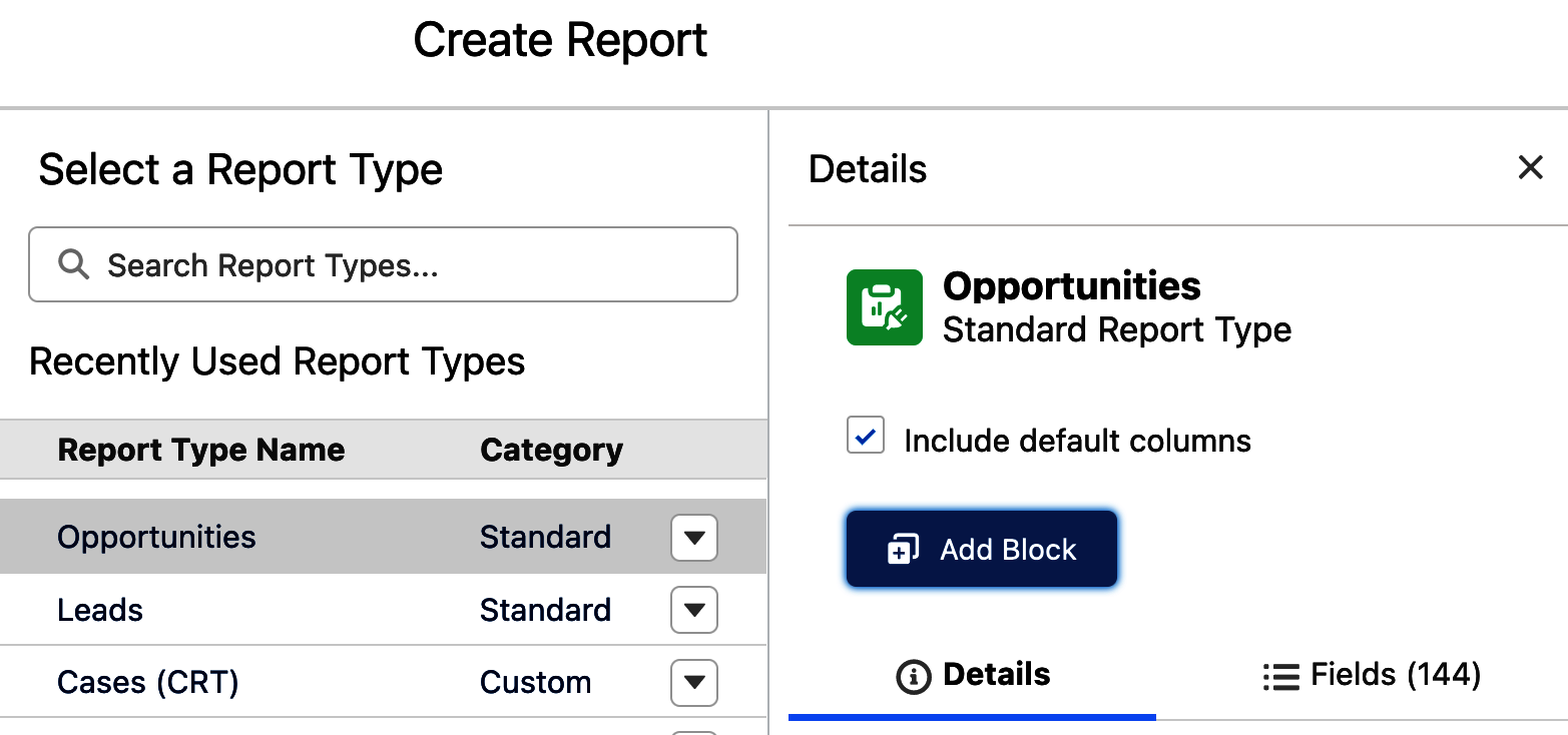
Figure 4-65. Adding a block to a joined report
Tip
Joined reports become very busy quickly. When adding additional blocks, consider unchecking the checkbox “Include default columns.” This allows you to start the new block without the clutter of the default columns from the report type you selected, and add only the ones you want.
For each block, as needed, you will want to repeat the steps of relabeling the block, adjusting the filters, adjusting the columns, and adding any summary columns. Then you will want to add a grouping that spans across all the blocks in your joined report, as shown in Figure 4-66. When the grouping on Account Name is added, you will want to toggle off the detail rows to simplify the final appearance of the report and make the report run faster.
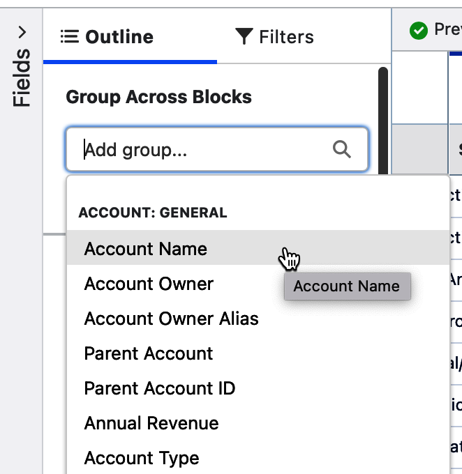
Figure 4-66. Grouping a joined report across blocks
Note
Joined reports include records expansively. In a joined report, the groups with records across all blocks (“the intersection”) are shown, and also the groups with records in any block (“the union”).
Joined reports support a number of innovative ways to view data in your system. While this example, as seen in Figure 4-67, shows data from Opportunities, Accounts, and Cases in the same report, much like a scorecard, you could also be creative and show the same report type block over and over. As you’ll see in the next chapter, joined reports have their own special type of formula available, the cross block formula.
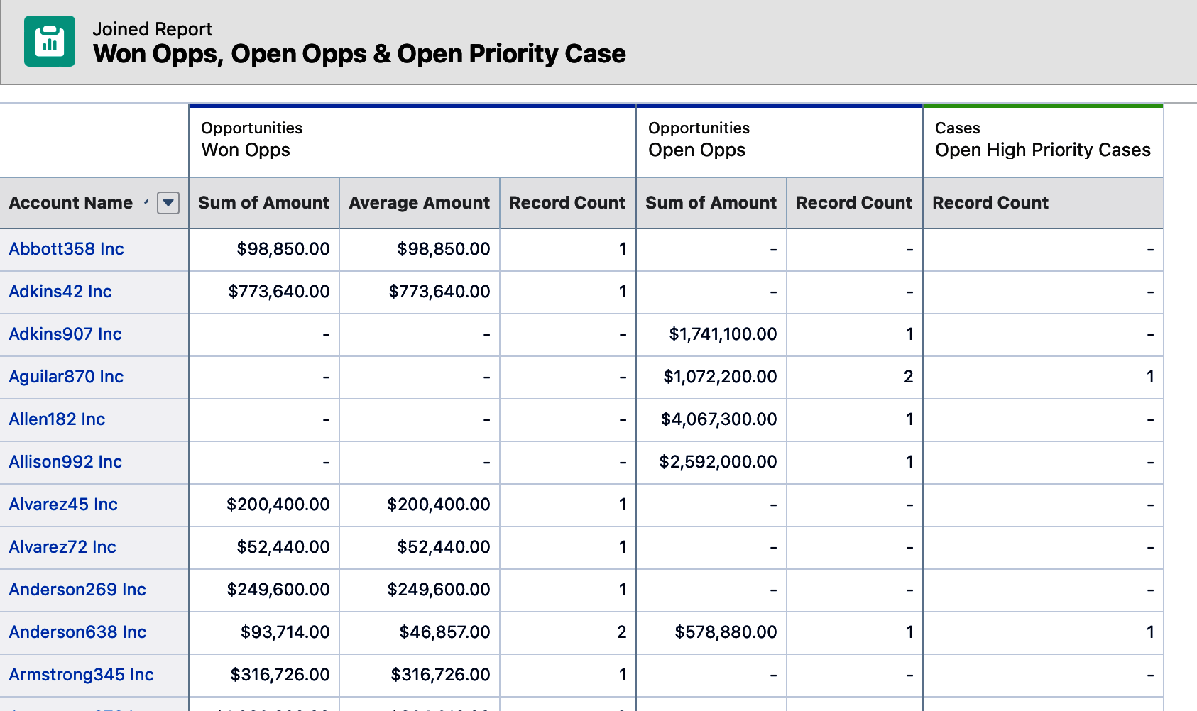
Figure 4-67. Joined report example
Conclusion
This chapter stepped through the ways to start creating a new report and the significance of selecting the right report type for the task at hand. It introduced the report builder and its many controls that help streamline report creation, and it described the options for filtering your report to get at the data you want. By understanding the common use cases for the four report formats, you will expand your reporting repertoire considerably.
The next chapter is focused on incorporating formulas into your reports. Formula writing is a skill set that, much like in Microsoft Excel, will extend your range as a report writer.
Get Mastering Salesforce Reports and Dashboards now with the O’Reilly learning platform.
O’Reilly members experience books, live events, courses curated by job role, and more from O’Reilly and nearly 200 top publishers.

