Chapter 6. Timeline Charts
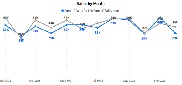
In Chapters 3, 4, and 5, we have already acquainted ourselves with classic visualizations for rating and structure. Now let’s move on to dynamics: analyzing changes in a metric over time. For this purpose we are accustomed to using line charts. They are made up of points with coordinates (x, y) that are connected by a line. In Figure 6-1, you can see a chart with two measures—actual and planned sales by month.

Figure 6-1. Line chart for two measures
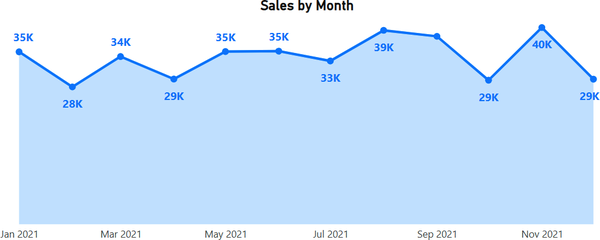
It may happen that we don’t have planned values, and we are displaying only the actual values, evaluating their dynamics. In this case, a semitransparent fill under the line will look good (Figure 6-2). Technically, this is another Power BI visual—the area chart—but it functions similarly to the line chart.

Figure 6-2. Area chart for a single measure
In this chapter, we will guide you on how to fine-tune these visuals to achieve a pixel-perfect view and introduce you to features unique to line charts.
Furthermore, when we say “line chart,” we mean the full family of visuals that can be used with a time axis:
Line chart
Area chart, stacked area chart
Combined chart: line + stacked column, line + clustered column
Ribbon chart
Column chart also joins this family when we add the date to the x-axis. We will ...
Get Data Visualization with Microsoft Power BI now with the O’Reilly learning platform.
O’Reilly members experience books, live events, courses curated by job role, and more from O’Reilly and nearly 200 top publishers.

