Chapter 5. Treemap
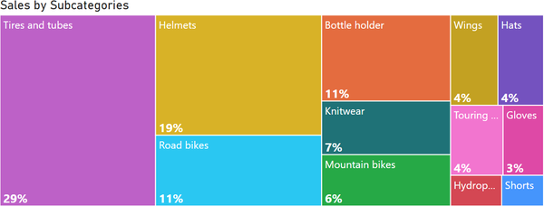
Treemap is a visualization type used to display hierarchical data in a more structured way than pie or donut charts. In a treemap, rectangles are used instead of sectors. A treemap utilizes space more efficiently and accommodates a larger number of elements. The treemap in Figure 5-1 illustrates the sales structure by subcategories.

Figure 5-1. Treemap for one level of category
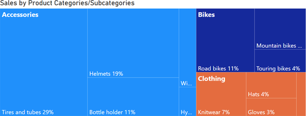
But what does this have to do with trees? Originally, this visualization method was applied to hierarchical, tree-structured data. Each branch of this “logic tree” is represented by a rectangle, which is then divided into smaller rectangles to represent subbranches. At the end of the previous chapter, we recommended not filling in the Details field for a pie chart because it overloaded the chart with information, as shown in Figure 4-9. However, a treemap is better suited for such data. In Figure 5-2, you can see that approximately two-thirds of the sales are related to accessories, and it provides insights into the share of each subcategory.

Figure 5-2. Treemap for hierarchy
The proportions of the rectangles (height and width) are automatically determined based on the size of the chart area. Some elements may end up as squares, while others may be stretched horizontally or vertically. ...
Get Data Visualization with Microsoft Power BI now with the O’Reilly learning platform.
O’Reilly members experience books, live events, courses curated by job role, and more from O’Reilly and nearly 200 top publishers.

