Chapter 4. 2×2 Designs
Some years ago, when I was starting my career in data science, a consulting firm came to the office and started sketching these extremely simplified views of our business. My immediate reaction was to dismiss these sketches as a trick in their sales-driven bag. Today I embrace them for communication and storytelling purposes, as well as useful aids to simplify a complex business.
I believe that a natural growth path in data science (DS) is to go from making things overly complex to doing smart simplification. By smart I mean what Einstein expressed when saying you should aim at making “everything as simple as possible, but not simpler.” The beauty of this quote is that it shows how difficult it is to achieve this. In this chapter, I’ll make a case for using a tool designed for the specific purpose of simplifying a complex world.
The Case for Simplification
You may find it ironic that I make a case for simplification in the age of big data, computational power, and sophisticated predictive algorithms. These tools allow you to navigate the ever-increasing volumes of data and thus have undoubtedly improved data scientists’ productivity, but they don’t really simplify the world or the business.
Let’s stop for a second on this last thought: if more data means more complexity, then data scientists are now definitely capable of making sense of more complexity. Nonetheless, the fact that you can make projections of high-dimensional data onto lower-dimensional scores does not mean you have a better understanding of how things work.
There are many cases one can make for simplification, from the aesthetic to the more functional and pragmatic. For the data scientist, simplification helps their understanding and framing of what’s most important when starting a project. Moreover, it’s a great communication tool. As Richard Feynman said, “If you cannot explain something in simple terms, you don’t understand it.” On the technical side, it’s quite common to apply Occam’s razor to choose the simplest model that has a given predictive performance.
What’s a 2×2 Design?
Figure 4-1 shows a typical design. As this last word suggests, you play an active role in deciding which features to concentrate on, which of course vary, depending on the use case.
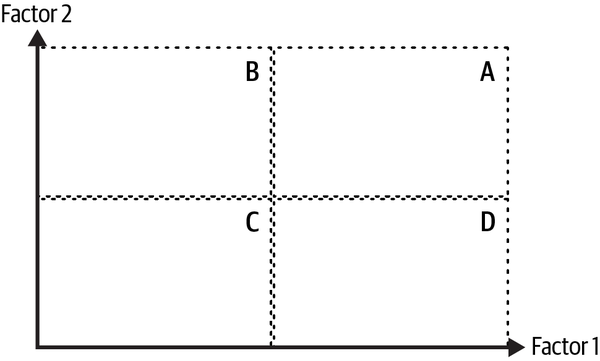
Figure 4-1. A typical 2×2 design
Note how I’ve simplified the world by concentrating only on two factors or features that I believe are relevant for the task at hand. Factors 1 and 2 vary across the horizontal and vertical axis, respectively. Moreover, I’ve discretized a possibly continuous world by setting some threshold levels that are represented by dashed vertical and horizontal lines, dividing the world into four quadrants:
- A
-
Users with high factors 1 and 2
- B
-
Users with low factor 1 and high factor 2
- C
-
Users with low factors 1 and 2
- D
-
Users with high factor 1 and low factor 2
Depending on the use case, I can play around with these thresholds.
In experimental designs, these factors usually correspond to different treatments in the test, such as the color and message used in a banner, or price and frequency of communication. The first example deals with discrete factors, and the latter with continuous features. Needless to say, with discrete factors you lose the sense of ordering explicit in the diagram.
Ideally, every other relevant factor should remain constant. This more general scientific principle allows you to single out the impact of these two factors on the metric of interest. In Chapter 10 I will come back to this line of reasoning, but for now note that this partialling out is crucial in your attempt to simplify the world: by changing one factor at a time, with everything else fixed, you can gain some insight into each factor’s role.
In statistical 2×2 designs, this partialling out is guaranteed by using a proper randomization scheme that makes participants in each treatment and control ex ante equal on average. This somewhat cryptic phrase means that before the test, treatment and control groups don’t differ too much, on average.
These designs are well known by statistical practitioners, and the topic is usually covered when studying analysis of variance (ANOVA). The objective here is to see if there are differences in the means of an outcome metric across groups. Treatments are often discrete, but the design allows for continuous treatments by conveniently setting thresholds.
This same setting can be used in nonexperimental scenarios. The typical example used by consulting firms is to segment the customer base using only two features that may or may not be behavioral. I’ve commonly used it when I can decompose a metric in a multiplicative way (like the decomposition seen in Chapter 2).
For instance, take unit price and transactionality. Quadrant A represents customers that are willing to pay high unit prices and transact a lot (yielding high average revenue per user). Note that here I cannot guarantee that everything else remains constant, as in the experimental setting. Nonetheless, it still allows me to focus on, and only on, the two features that I care about.
I’ll now show some examples.
Example: Test a Model and a New Feature
A typical scenario where I use the 2×2 framework is when I want to simultaneously test a new model and the effectiveness of a lever. Testing the lever is commonly done without this framework, just by having two randomized groups: one receives the baseline (control), and the other gets the new lever (treatment). When the experiment is finished, I run the typical statistical testing suite on the differences in means. The 2×2 design expands on this idea by allowing you to also test the performance of your model.
Figure 4-2 shows the 2×2 design. On the horizontal axis I have the probability score (in this example, coming from a classification model). The vertical axis shows whether I’ve turned on or off the lever considered for the test: lever on means that you display the new alternative to some users, and off means that the baseline lever is active.
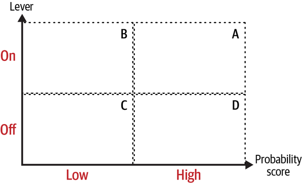
Figure 4-2. 2×2 test of a model and a lever
Note how the 2×2 design works here: you treat those users in groups A and B in the diagram, and the control group is composed of groups C and D. Variation in both dimensions allows you to do some testing of the lever and the model.
To get a real sense of the benefits of the design, imagine that you want to do a cross-selling campaign. For this, you trained an ML classification model that predicts who will accept an offer or not. If the model is predictive, high probability scores should have high true positive rates.
You want to test it using a new communication campaign that makes salient the benefits of buying the new product (“customers who use the new heart rate monitor feature on their smartwatch increase their running performance by 15%”). Let’s also assume that the baseline campaign solely provided information on the new feature (“our new smartwatch includes state-of-the art monitoring for runners”). The metric for success is conversion rate (CR), measured as .
The hypotheses to be tested are as follows:
- Monotonicity
-
Higher probability scores have higher conversion rates: and
- Effectiveness
-
The new communication lever is more effective than the baseline: and
The reason I expect is that some users make a purchase organically, without the need of having a communication displayed. If the model is predictive (in a true positive sense), the conversion rates should also be increasing with the score.
Similarly, I expect because I’m targeting users with a low probability of making a purchase, according to the model. It’s true that great communication campaigns might convert some of these low-intentionality users, but I see no reason to expect the impact of the communication lever to be statistically significant.
To set up the experiment you must bring in statistical size and power considerations, where sample size and minimum detectable effects are critical. Usually, you don’t have large enough samples, so an option is to just settle for having a good design for the lever (as in a classic A/B test framework), and a suboptimal design for your model. In this case, you may only have casual evidence of the model’s performance. I’ve found this to be enough in most cases, but if you can go all in and have a good design for both factors, please do so. After the experiment is run, you can then test these hypotheses and get some evidence of model performance in real-life settings and the impact of a lever.
Example: Understanding User Behavior
I started discussing 2×2 statistical designs because thanks to the power of randomization, you control for other factors that may impact the metric of interest. Other use cases for the 2×2 framework generally lack this very nice property. Nonetheless, it may still be useful, as I hope this example shows.
Not so long ago I decided to set up a 2×2 framework to understand product-market fit for a specific product. For this, I took two factors that were critical for fit, and focused on quadrant A to single out those users that were doing great on both. I then built an ML classification model where users in group A were labeled with a one, and everyone else was labeled with a zero. The objective was to understand who these users were. In Chapter 13 I’ll show how this can be done in practice, without the 2×2 framework.
In that particular use case, I used customer engagement and unit price. Group A consists of users who are highly engaged and are willing to pay high tickets. Engagement is usually a good proxy for product-market fit, so combining it with a proxy for revenue gave me what may be called profitable fit.
Let me give another example that applies the same logic. Recall that customer lifetime value (LTV) is the present value of a users’ lifetime relationship with the company:
Here, is the revenue at time t, is the probability of surviving from t–1 to t, and is a discount rate. Sometimes, instead of revenue you can use a profit metric that also takes into account some form of costs, but in many companies, especially start-ups, it’s common to use a revenue metric to compute the ratio of LTV to customer acquisition costs (CAC).1
As you can see, LTV can be expressed as the (discounted) inner product of revenue and survival probability streams. Suppose you want to understand what type of users have a high LTV. Who are they? What makes them so special? And most importantly, are there levers to move some users to the top LTV bucket?
Figure 4-3 shows the already familiar setting. On the horizontal axis I have a proxy for survival probability, and revenue is on the vertical axis. Since LTV is the inner product of streams at different time periods, you need to find ways to make both of these one-dimensional. There are several ways to do so, none without their own problems.
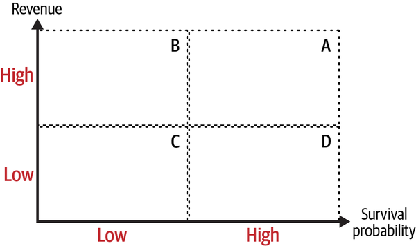
Figure 4-3. LTV in a 2×2 framework
Forgetting about those details for now, you can proceed as I did in the previous example:
-
Label users in group A with ones and everyone else with zeros, and train a classification model that predicts being a quadrant A user.
-
Open the black box and try to learn something about users that have a high probability of being in quadrant A (using the methods presented in Chapter 13).
-
Scoring the complete user base, and using some threshold score, you can calculate the opportunity size for the product.
There are at least two methods to go from streams across time to two dimensions:
- Aggregate.
-
The simplest way is to use an aggregate statistic like average or median survival rates and revenue. Note that aggregation with sums might put at a disadvantage younger cohorts for revenue (for example, a user transacting for 20 months can generate 20× more revenue than a new user).
- Choose an arbitrary period.
-
If you’ve found in the past that the first six months are critical for survival (or revenue), you can just set this and use the corresponding values at that point in time.
Example: Credit Origination and Acceptance
A somewhat different example is the case of correlated outcomes. Take the case of a credit product (such as a credit card). These products are somewhat problematic because of adverse selection (riskier users are more likely to accept an expensive loan offer).
Figure 4-4 shows a somewhat typical scenario. Adverse selection creates the positive correlation, so users who are more likely to accept a loan offer are also more likely to default (A).
The 2×2 design simplifies the decision-making process: which customers should you target?
- Offers in quadrant B.
-
These customers are more likely to accept and to repay the loan. This is the safest move.
- Adjust the thresholds to get more volume.
-
You can also move the threshold definitions for low or high risk of default. This may help you find more volume if scale is of utmost importance. Credit originators commonly do this type of calibration given their risk appetite. The 2×2 design lets you focus on one lever (risk threshold).
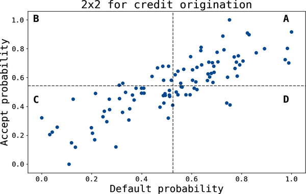
Figure 4-4. 2×2 loan origination example
Example: Prioritizing Your Workflow
A final example that is constantly used by consultants should help you prioritize projects. Here, the two dimensions used are value (of the project to the company) and how much effort is needed to complete it.
The idea is that you should rank competing projects along these two dimensions. In Figure 4-5, you can see that projects x and y are almost as good in terms of value, but x is to be preferred since it takes considerably less effort to complete. Similarly, ranking activities y and z is relatively easy since both require comparable efforts, but the former creates substantially more value. In general, the top left quadrant is where you want most of your projects to live.
As rich as this 2×2 view may be, it has its limitations. For instance, how do you compare projects x and z? In Chapter 5, I present an alternative that can be used more generally to compare and rank any set of projects.
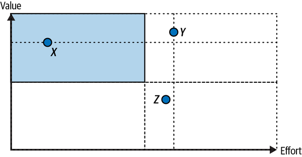
Figure 4-5. Prioritization of effort
Key Takeaways
These are the key takeaways from this chapter:
- Case for simplification
-
The amount of data at your disposal notwithstanding, simplifying the world is necessary if the objective is to improve your understanding of a complex world and business. Moreover, it helps in communicating technical results to the stakeholders and allows you to focus on what appears to be of first-order importance.
- 2×2 diagrams
-
These tools simplify high-dimensional spaces into two-dimensional plots that allow you to focus on specific features or factors that are most relevant to the problem at hand.
- Use Case 1: Testing a model and a lever
-
A common use case is 2×2 statistical designs. One such example is when you want to simultaneously test the effectiveness of a lever and the predictive performance of an ML model. You get crisp hypotheses that can go through the formal statistical testing process. Randomization guarantees that everything else remains constant, on average.
- Use Case 2: Understanding your customers
-
By singling out two specific features, you can use the framework as a starting point for more sophisticated approaches. This chapter described how this framework can be used to understand which users have a high LTV.
- Use Case 3: Correlated features
-
When there are correlated features, the 2×2 framework allows you to simplify the decision-making process. The example I used was loan origination, where offer acceptance depends on the probability of default because of adverse selection.
Further Reading
In my book Analytical Skills for AI and Data Science, I argue that learning to simplify is an essential skill for data scientists. The discussion is way more general than this chapter, and I did not cover 2×2 designs. I also discuss LTV and the design of A/B tests.
The Laws of Simplicity by John Maeda (MIT Press) takes a designer’s point of view on how to achieve simplicity. While it may sound unrelated, I’ve found that somewhat orthogonal points of views have always deepened my understanding of a problem.
2×2 statistical designs can be found in most statistical textbooks where ANOVA is covered. Statistical Methods in Online A/B Testing: Statistics for Data-Driven Business Decisions and Risk Management in E-Commerce by Georgi Zdravkov Georgiev (independently published) has a good discussion of testing with multiple variants and other related topics.
The type of adverse selection used in the loan origination example is covered in any microeconomic textbook discussing information asymmetries. If you do not have an economics background, the technical nitty-gritty might be an overreach. In my opinion, the important part to remember is that users self-select using information about themselves that is not known by the decision-maker, and this creates a lot of problems.
1 Some companies also report the “undiscounted” LTV, so this expression simplifies to the summands on the numerator.
Get Data Science: The Hard Parts now with the O’Reilly learning platform.
O’Reilly members experience books, live events, courses curated by job role, and more from O’Reilly and nearly 200 top publishers.

