Chapter 4. How to Tell a Story with Color
It’s not enough to merely slap data on a piece of paper or a screen these days; it needs to capture the intended audience’s attention, guide them through the story you want to tell, and bring them to the intended conclusion. Here are some quick tips on how to tell a data story with color, which we will expand upon in later chapters.
Keep It Simple
First and foremost, too much of a good thing, even a great thing, can be overwhelming. Data scientist Edward Tufte coined the phrase “data-ink” ratio to describe the amount of ink necessary to put into your data visualization project, and makes the point that excessive amounts of color for the sake of decorative purposes is going to do nothing but be distracting.1 The right amount of ink gets your points across quickly and easily, and moves the reader through the data as easily as they would if they were reading words on a page in a gripping story. The wrong amount of color confuses the person trying to analyze the infographic and can even hide—accidentally—what they are trying to say.
Too many colors and fancy designs might impress your friends and your school-age children, but they are unlikely to do the same for business associates and consumers. You’re not trying to design USA Today’s weather map here; you’re trying to deliver a specific narrative that can either stand alone or that augments text, video, etc.
Charts can make it even worse, because there are even more options, including making things three dimensional for no good reason, using legends to explain complex selections, and toggling text into different colors for no reason whatsoever. Just take a look at the example in Figure 4-1, where we have a 3D bar plot. This chart has several drawbacks, such as being more difficult to find the exact percentages of a bar, green bars are hidden, and for an equivalent value, the green bars in the back appear smaller than blue bars in the front. The chart on the right is easier to interpret after we’ve removed the 3D effect.
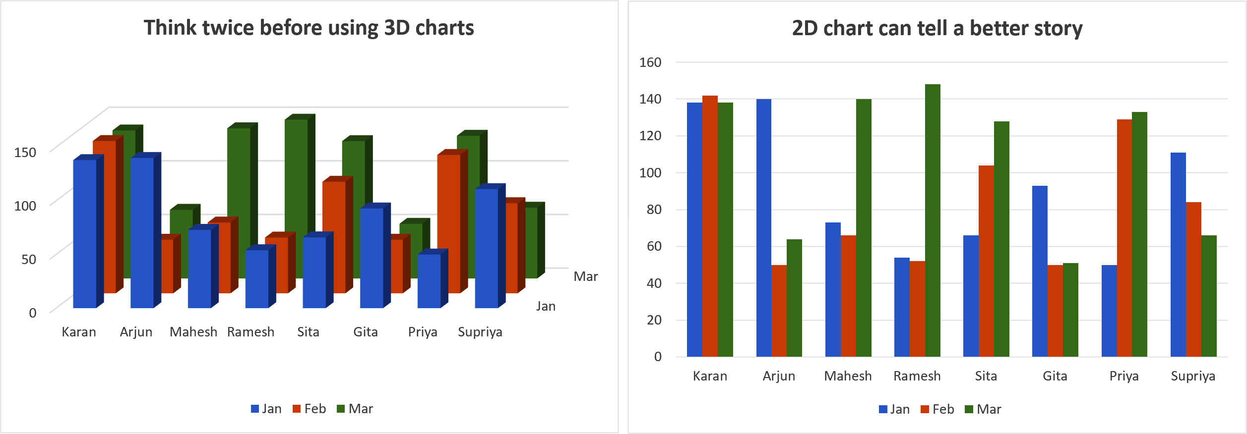
Figure 4-1. Bar chart demonstrating the drawbacks of 3D charts2
Now that we’ve covered some of the pitfalls of using 3D charts, we can see that simple is usually better. Another way to keep things simple is to be intentional about how we treat color legends. Let’s briefly discuss how we can incorporate color legends within a data visualization, to make it easier for our audience. Figure 4-2 shows an example of how we can replace the default settings of a color legend that sits off to the side with and alternative chart that doesn’t require the reader to keep looking back and forth. The “after” image on the right includes the color legend inside of the chart—with the names of the ship modes (standard, same day, etc.) written directly near the end point of the lines, keeping the text color the same as the line color for further simplification.
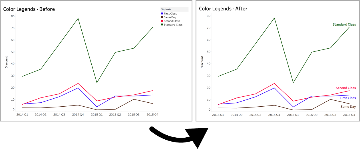
Figure 4-2. Two line graphs: left shows the color legend off to the side and right shows the color legend embedded in the chart
Less ink allows you to gain your audience’s attention easier and guide them to the specific points that are most important. Just like when you write content, you put the most important points first because that’s what you want the reader to focus on. When you have a data visualization, the color acts as the lead magnet—it draws the audience to the most important point of the data; everything else is secondary and should be treated as such.
Data Story Components
Storytelling in any form combines at least three elements:
Characters
Plot
Narrative
For comparison in a data story, you can switch these up to visual representations. The characters are the fields of data to be analyzed, the plot is the insight that comes from that analysis, and the narrative is the style you are using to communicate that insight to the audience. As creators of visual data representation, we have the most control over the narrative—the way we are able to communicate our insights to draw the user in, get our point across, and do so in a trustworthy way that builds credibility.
That’s another danger of the overuse of color. When something starts looking like a cartoon, it’s hard to take it seriously. Color is an easy way to control the style that your data visualization embodies. Good use of color makes insights jump off the page, adds professionalism to your brand, and engages the visuals, even if they are dense, complex topics.
Reduce Color Saturation
One tip to keep an audience focused on your story without overwhelming them is to reduce the saturation of the colors, something we spoke about in Chapter 3. In certain cases, when colors are overly intense, they can take away from the message you are trying to send and create confusion in the story you are telling.
In Figure 4-3, we see the difference between using high saturation and low saturation colors when depicting sales figures across product subcategories.
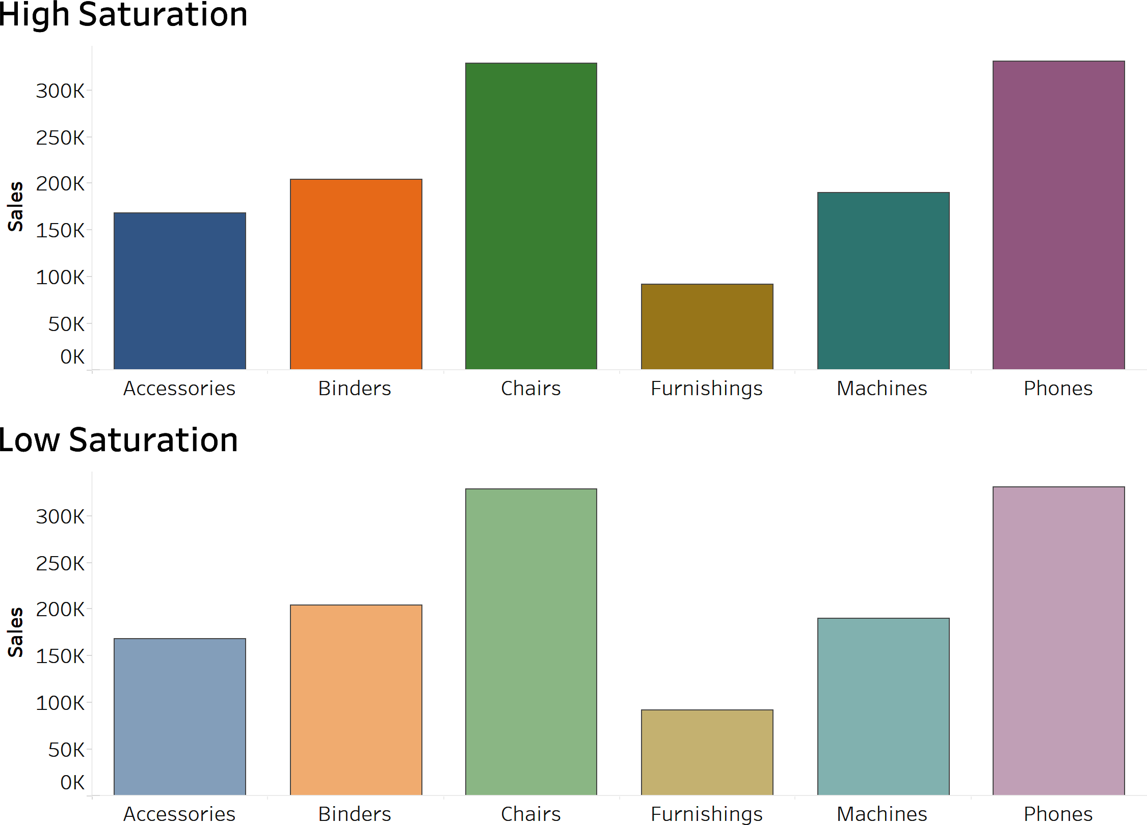
Figure 4-3. Two bar charts illustrating the difference between high and low saturation
As we know from our lessons in primary and secondary colors, and what color psychology is all about, if you have bright yellow or bold red bursting out of a data visualization, it’s going to make the presentation all about that color and could easily distract from everything else. Some of the default colors in standard programs are too intense and wind up distracting from the story.
Dulling the hues by reducing their saturation is an easy way to moderate them. You can also change their opacity to about 75–90% to keep the focus on the data with the colors as highlighters. Opacity is the level of transparency of a figure in data visualization. In our example of color saturation, we reduced the opacity by 50% to reduce the level of color saturation.
When you throw a bunch of really bright colors together, you get a story of competition and distraction. That much boldness is not welcome outside of a shirt for the beach or a scoreboard at a professional sports arena. When the colors are slightly muted, you are getting a more mature, professional feel to the story. For an audience, it can be the difference between having information loudly shouted at you and merely shown to you in an authoritative manner.
Color for Highlighting
When you lower the brightness and intensity, you are reducing the cognitive load that your audience has to bear. If you’re looking to just highlight one particular piece of data, you can stick with the bright stuff, but place it on just the most relevant piece of data while everything else drops back to grayscale. Figure 4-4 provides an example of using one color to highlight a specific item in a data visualization. In our bar chart, we are highlighting the “binders” subcategory by using an orange color for this bar, and using gray for others.
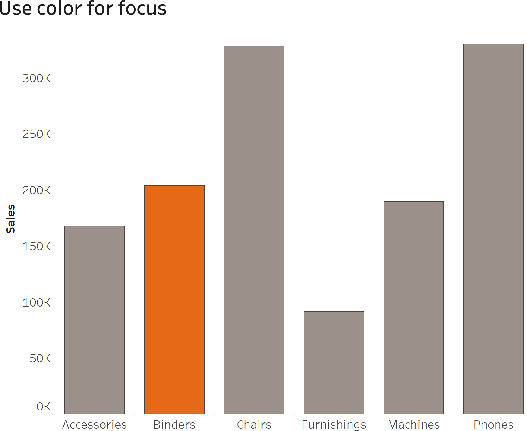
Figure 4-4. Bar chart demonstrating the use of color for focusing your audience on a data point
This allows you to highlight one piece of data and make that the focus of your story without having a myriad of distractions along for the ride.
Color Associations
If you’re using more than one color, be very aware of existing associations that come from colors or pairs of colors as they can send your audience spiraling in the wrong direction to the point where they miss the entire point of the visualization.
As we mentioned earlier, red is a very bold, up-front color that is going to instantly draw your attention in most circumstances. Particularly in the United States, red is also a color that warns of danger and negative things. Red lights and stop signs tell you it’s time to slam on your breaks, and red marks on a test or a performance review indicate that you didn’t do so well, with remedial work likely knocking on your door in the near future (Figure 4-5).
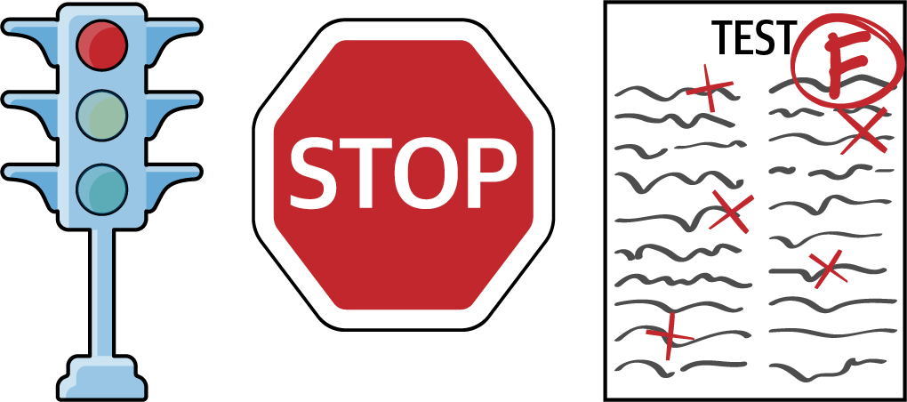
Figure 4-5. Examples of red being used for traffic signals, stop signs, and a failed exam
Similarly, green is usually indicative of positives in society, from its opposition to red in traffic signals to it being the largely accepted color of environmental protection (Figure 4-6).

Figure 4-6. Examples of green being used for traffic signals and environmentally friendly signs
Avoid using red and green unless you are very specifically wanting to attach positive and negative connotations to certain things. In a later section, we’ll also discuss why you should avoid red and green combinations as it relates to the topic of accessibility.
Try an alternative color pair that matches well together like blue and orange to give a different feel to your story. This is great for simplifying complex stories because the colors pair well together, don’t look repetitive, and help the viewer by guiding their eyes. Take a look at Figure 4-7—we are using an orange and blue color combination to show the percent of sales made with first-class and second-class ship modes. The colors are easily distinguishable and do not evoke strong emotions from preexisting associations.
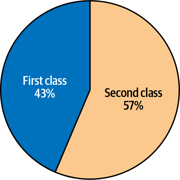
Figure 4-7. Pie chart showing first class versus second class ship modes
You cannot overstate how deeply connected light and color are to emotion.
Power of Gray
When the colors are dull and neutral, they can communicate a sense of uniformity and an aura of calmness. Grays do a great job of mapping out the context of your story so that the more sharp colors highlight what you’re trying to explain. The power of gray comes in handy for all of our supporting details such as the axis, gridlines, and nonessential data that is included for comparative purposes.
By using gray as the primary color in a visualization, we automatically draw our viewers’ eyes to whatever isn’t gray. That way, if we are interested in telling a story about one data point, we can do so quite easily. Take a look at this example where the goal is to highlight the lowest kindergarten vaccination rate for counties in Texas (Terry County) (Figure 4-8).
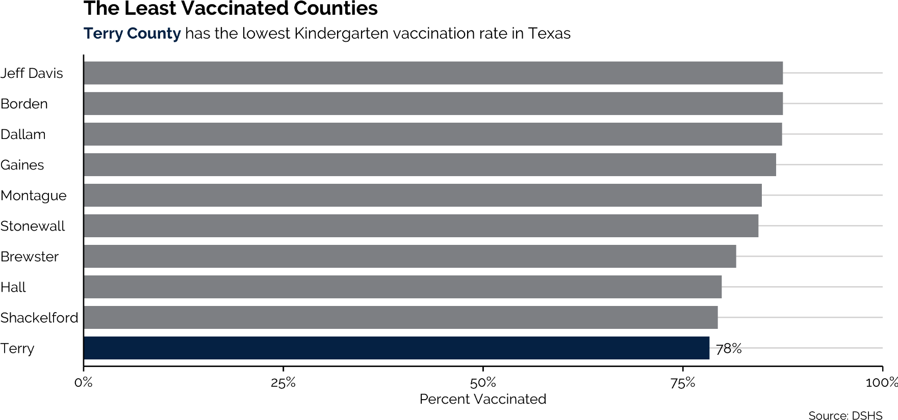
Figure 4-8. Bar chart demonstrating how to use color to focus your audience’s attention3
This visualization leverages the gray fill of every other bar to immediately draw the audience’s eyes to Terry County. Because we used only two colors, we can also highlight text in the subtitle to make the connection even clearer for our audience. Color—if used prudently—makes our visualizations more digestible and more informative.
What do you think would happen if we used a unique bright color for each county? The message would simply get lost amongst all that color (Figure 4-9).
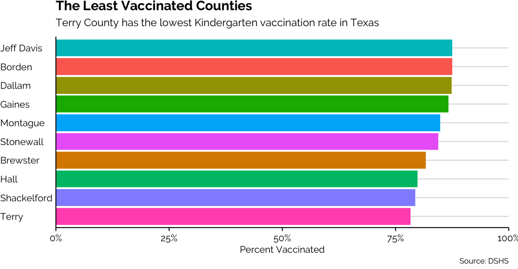
Figure 4-9. Too many colors can confuse your audience4
Color Consistencies
Notice that when you want to repeat an idea in a graphic, using the same color can let your audience know that the same thing is being promoted time and again. Take a look at Figure 4-10, where we have a visualization that shows data for Twitter (represented in blue) and data for Facebook (represented in red). If we used a different color for Twitter in the second graph, our audience would get confused.
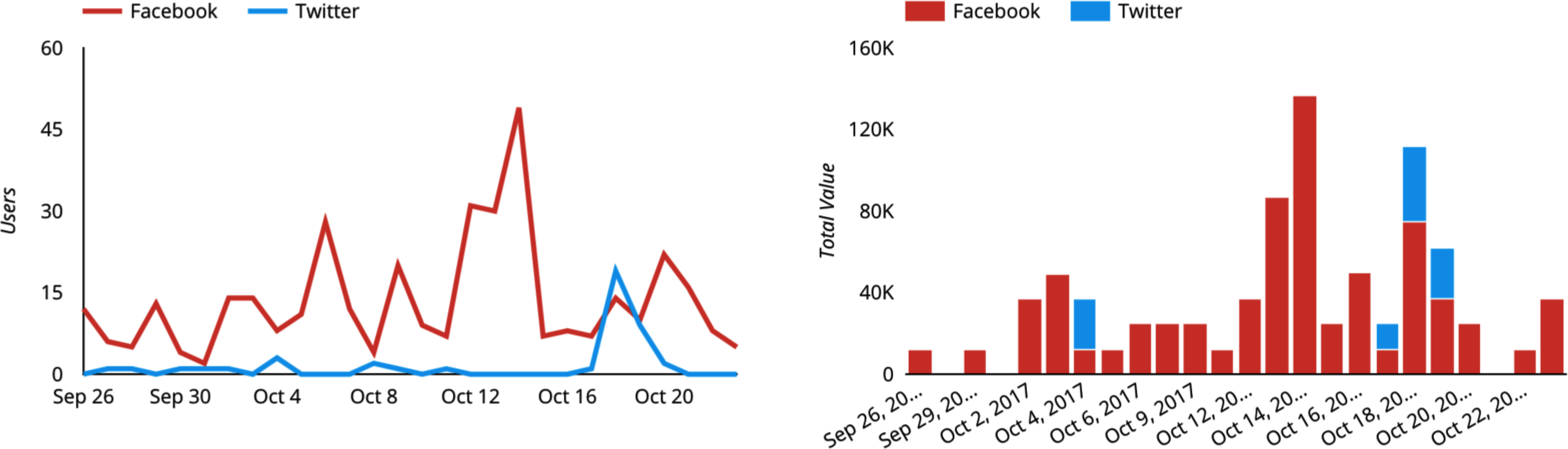
Figure 4-10. Two charts highlighting the importance of using the same color for the same data to ensure consistency5
As a general rule, you should always pick the same color to represent the same thing; be consistent with your color selection and what it represents in your visualizations. Humans naturally perceive color as a pattern, so when they are presented with a color across multiple charts, they will assume it is a representation of the same object or entity.
On the opposite side of things, when the color changes, it lets the audience know that the idea is changing. If you’re comparing a pair of business plans, a pair of presidential candidates, or the trials and travels of a pair of sports teams, a change in color is the perfect way to see “Here’s Point A, juxtaposed to Point B” without using a single wasted word. Our example in Figure 4-11 demonstrates the use of color change to show when the sales values are increasing or decreasing. We use blue to show increases in value and red to represent decreases in value.
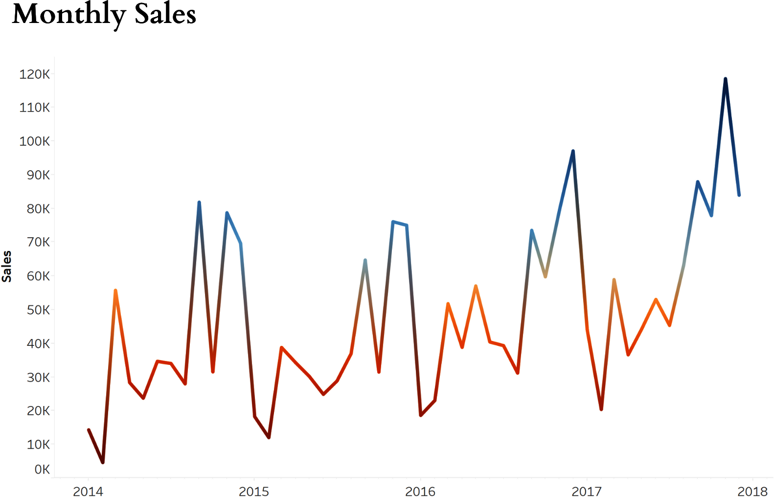
Figure 4-11. Line graph demonstrating the use of color to show when values are increasing or decreasing
Color can carry a story forward without calling attention to itself. It’s similar to descriptive words in a novel that is best known for its characters and its dialogue. The reader doesn’t understand the impact of the color, but it is a huge part of the overall theme.
Summary
The main point to take away from the chapter is that there are specific tactics used in telling stories with data and this includes specific approaches to using color to deliver insights to your readers. Keep your story simple, pay attention to the color saturation levels, use proper color associations, and keep in mind that the human mind will use color as patterns, so ensure there is consistency of colors across charts that discuss similar items.
1 “Edward Tufte,” Wikipedia, https://oreil.ly/sYHbp.
2 Image credit: Yan Holtz, “The Issue with 3D in Data Visualization,” From Data to Viz, last accessed November 7, 2022, https://oreil.ly/TeGI6.
3 Image credit: Connor Rothschild, “Color in Data Visualization: Less How, More Why,” blog post, June 1, 2020, https://oreil.ly/BHtzB.
4 Image credit: Rothschild, “Color in Data Visualization.”
5 Image credit: Benjamin Mangold, “14 Data Visualization Tips You Need to Be Using,” Loves Data (blog), October 24, 2017, https://oreil.ly/6XSIE.
Get ColorWise now with the O’Reilly learning platform.
O’Reilly members experience books, live events, courses curated by job role, and more from O’Reilly and nearly 200 top publishers.

