Chapter 3. Types of Colors Used in Data Visualization
When it comes to data visualization and data storytelling, the types of colors you use are going to make or break your presentation—it’s really just that simple. Colors direct our eye movements and thus command our attention and our brain power. Your color usage can either help or hinder the understanding your intended audience gets from the data you are presenting.
Three Types of Colors
There are three types of colors to understand and utilize in your data visualization process. The type of color palette that you use will depend on several things, including the nature of the data you are preparing to bring to life visually. The three types of colors we will be looking at are sequential, diverging, categorical.
Figure 3-1 provides a glimpse into the various types of colors.
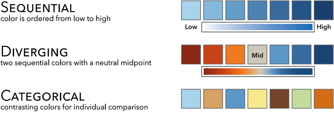
Figure 3-1. Demonstration of three types of colors: sequential, diverging, and categorical1
Let’s break down these three color types and see what circumstances make the most sense for each.
Sequential
Sequential colors have numeric meaning and move from light to dark using a graduation of colors. These ordered values use colors assigned to data values, often based on hue, lightness, or a combination of the two.
Typically, the lower values are associated with lighter colors and the higher values with darker colors. However, this depends ...
Get ColorWise now with the O’Reilly learning platform.
O’Reilly members experience books, live events, courses curated by job role, and more from O’Reilly and nearly 200 top publishers.

