Chapter 5. INTERIOR DECORATING VISTA
In designing Windows Vista, Microsoft had three giant goals. First, beef up Windows’s security. Second, modernize its features. Third, give it a makeover. That last part was especially important; it drove Microsoft nuts that little old Apple, with its five-percent market share, was getting all the raves for the good looks and modern lines of its Macintosh operating system.
Without a doubt, Vista looks a heck of a lot better than previous versions of Windows. And it’s every bit as tweakable as previous versions of Windows. You can turn off the new Aero look, or just selected parts of it. You can change the picture on your desktop. You can bump up the text size or the cursor size for better reading by over-40 eyeballs. As Microsoft might say, “Where do you want to redesign today?”
Aero or Not
If you ask Microsoft, the whole Aero thing (the look and the features) is a key benefit of Vista. Indeed, those glassy surfaces and see-through window edges are, in large part, where Vista got its name and its breathless marketing slogan (“Bring clarity to your world”).
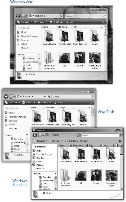
But there’s certain to be someone, somewhere, who doesn’t care for the new look. You can not only change Vista’s color scheme, you can also completely turn off the Aero look and features, if you so desire (Figure 5-1).

Figure 5-1. Most people with fast enough computers use the Aero Glass look. But ...
Get Windows Vista Annoyances now with the O’Reilly learning platform.
O’Reilly members experience books, live events, courses curated by job role, and more from O’Reilly and nearly 200 top publishers.

