Chapter 4. Charting and Alerting
Monitoring doesn’t have to be an all-in proposition. If you only add a measure of error ratio for end-user interactions where you have no monitoring (or only resource monitoring like CPU/memory utilization), you’ve already taken a huge step forward in terms of understanding your software. After all, CPU and memory can look good but a user-facing API is failing 5% of all requests, and failure rate is a much easier idea to communicate between engineering organizations and their business partners.
While Chapters 2 and 3 covered different forms of monitoring instrumentation, here we present the ways we can use that data effectively to promote action via alerting and visualization. This chapter covers three main topics.
First, we should think about what makes for a good visualization of an SLI. We’re only going to show charts from the commonly used Grafana charting and alerting tool, because it is a freely available open source tool that has datasource plug-ins for many different monitoring systems (so learning a little Grafana is a largely transferable skill from one monitoring system to another). Many of the same suggestions apply to charting solutions integrated into vendor products.
Next, we’ll discuss specifics about the measurements that generate the most value and how to visualize and alert on them. Treat these as a checklist of SLIs that you can add incrementally. Incrementalism may even be preferable to implementing them all at once, because by adding an indicator at a time, you can really study and understand what it means in the context of your business and shape it in little ways to generate the most value to you. If I walked into the network operation center of an insurance company, I’d be much more relieved to see only indicators on the error ratio of policy rating and submissions than I would be to see a hundred low-level signals and no measure of business performance.
Taking an incremental approach to introducing alerts is also an important trust-building exercise. Introducing too many alerts too quickly risks overwhelming engineers and leading to “alert fatigue.” You want engineers to feel comfortable subscribing to more alerts, not mute them! This also gives you a bit of time, if you are not already accustomed, to working through the on-call process, and training engineers how to respond to one alert condition at a time helps the team build a reservoir of knowledge about how to address anomalies.
So the focus in this chapter will be providing advice about those SLIs that are as close to business performance (e.g., API failure rate and the response times users see) as possible without being tied to any particular business. To the extent we cover things like heap utilization or file descriptors, they will be a select group of indicators that are most likely to be the direct cause of business performance degradation.
Recreating NASA mission control (Figure 4-1) should not be the end result of a well-monitored distributed system. While arraying screens across a wall and filling them with dashboards may look visually impressive, screens are not actions. They require somebody to be looking at them to respond to a visual indicator of a problem. I think this makes sense when you’re monitoring a single instance of a rocket with exorbitant costs and human lives on the line. Your API requests, of course, don’t have the same per-occurrence importance.

Figure 4-1. This is not a good role model!
Almost every metrics collector will collect more data than you will find useful at any given time. While every metric may have usefulness in some circumstance, plotting every one is not helpful. However, several indicators (e.g., max latency, error ratio, resource utilization) are strong reliability signals for practically every Java microservice (with some tweaks to the alert thresholds). These are the ones we’ll focus on.
Lastly, the market is eager to apply artificial intelligence methods to monitoring data to automate the delivery of insights into your systems without requiring much understanding of alert criteria and key performance indicators. In this chapter, we’ll survey several traditional statistical methods and artificial intelligence methods in the context of application monitoring. You should have a solid understanding of the strength and weakness of each method so that you can cut through the marketing hype and apply the best methods for your needs.
Before going any further, it’s worth considering the breadth of variation in monitoring systems on the market and the impact that has on your decisions for how to instrument code and get data to these systems.
Differences in Monitoring Systems
The point of discussing differences in monitoring systems here is that we are about to see specifics about how to chart and alert with Prometheus. A product like Datadog has a very different query system than Prometheus. Both are useful. More products are going to emerge in the future with capabilities we aren’t yet imagining. Ideally, we want our monitoring instrumentation (what we will put in our applications) to be portable across these monitoring systems with no changes in application code required (other than a new binary dependency and some registry-wide configuration).
There tends to be quite a bit more consistency in the way distributed tracing backend systems receive data than the way metrics systems receive data. Distributed tracing instrumentation libraries may have different propagation formats, requiring a degree of uniformity in the selection of an instrumentation library across the stack, but the data itself is fundamentally similar from backend to backend. This intuitively makes sense because of what the data is: distributed tracing really consists of per-event timing information (contextually stitched together by trace ID).
Metrics systems could potentially represent not only aggregated timing information, but also gauges, counters, histogram data, percentiles, etc. They don’t agree on the way in which this data should be aggregated. They don’t have the same capabilities for performing further aggregation or calculation at query time. There is an inverse relationship between the number of time series a metrics instrumentation library must publish and the query capabilities of a particular metrics backend, as shown in Figure 4-2.
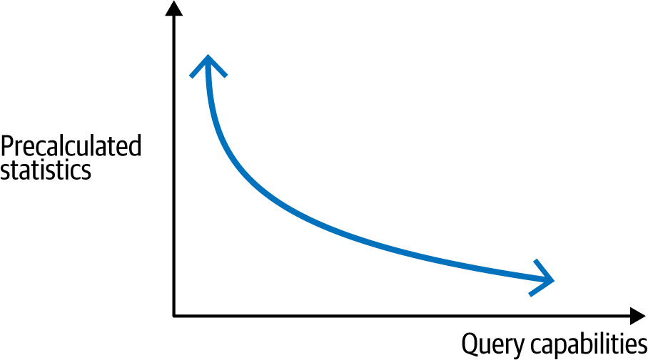
Figure 4-2. Inverse relationship between published time series and query capabilities
So, for example, when Dropwizard Metrics was initially developed, the popular monitoring system was Graphite, which didn’t have rate-calculating functions available in modern monitoring systems like Prometheus. As a result, when publishing a counter, Dropwizard had to publish cumulative count, 1-minute rate, 5-minute rate, 15-minute rate, etc. And because this was inefficient if you never needed to look at a rate, the instrumentation library itself distinguished between @Counted and @Metered. The instrumentation API was designed with the capabilities of its contemporary monitoring systems in mind.
Fast forward to today, and a metrics instrumentation library intending to publish to multiple destination metrics systems needs to be aware of these subtleties. A Micrometer Counter is going to be presented to Graphite in terms of a cumulative count and several moving rates, but to Prometheus only as a cumulative count, because these rates can be computed at query time with a PromQL rate function.
It’s important to the design of the API of any instrumentation library today to not simply lift all concepts found in earlier implementations forward, but to consider the historical context behind why these constructs existed at that time. Figure 4-3 shows where Micrometer has overlap with Dropwizard and Prometheus simple client predecessors, and where it has extended capabilities beyond those of its predecessors. Significantly, some concepts have been left behind, recognizing the evolution in the monitoring space since. In some cases, this difference is subtle. Micrometer incorporates histograms as a feature of a plain Timer (or DistributionSummary). It is often unclear at the point of instrumentation deep in a library where an operation is being timed whether the application incorporating this functionality views this operation as critical enough to warrant the extra expense of shipping histogram data. (So the decision should be left up to the downstream application author rather than the library author.)
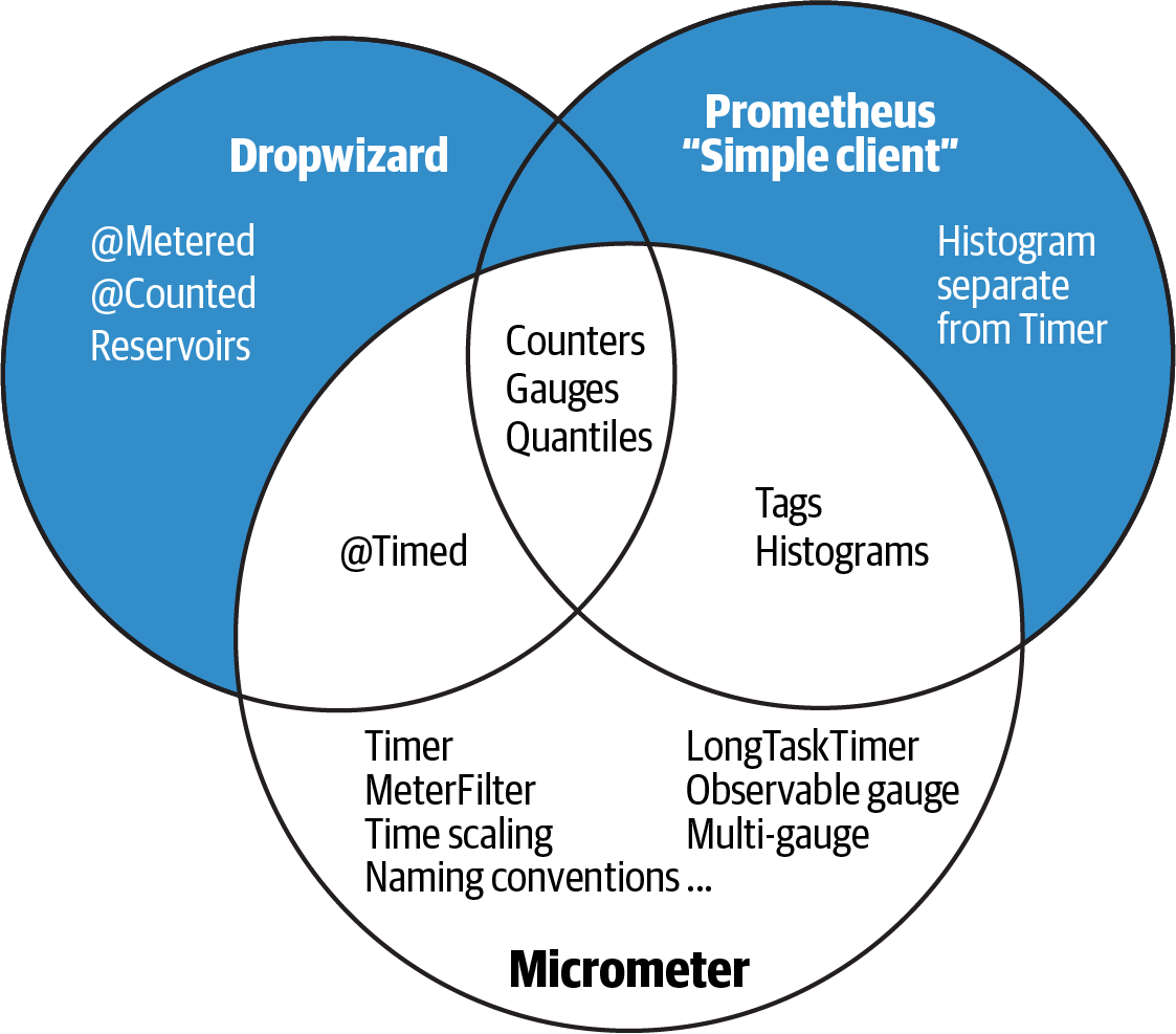
Figure 4-3. Metrics instrumentation capability overlap
Similarly, in the Dropwizard Metrics era, monitoring systems didn’t include query functionality that helped to reason about timing data (no percentile approximations, no latency heatmaps, etc.). So this concept of “don’t gauge something you can count, don’t count something you can time” wasn’t applicable yet. It wasn’t uncommon to add @Counted to a method, where now @Counted is almost never the right choice for a method (which is inherently timeable, and timers always publish with a count as well).
While at the time of this writing OpenTelemetry’s metrics API is still in beta, it hasn’t changed substantially in the last couple years, and it appears the meter primitives won’t do a sufficient job to build usable abstractions for timing and counting. Example 4-1 shows a Micrometer Timer with varying tags, depending on the outcome of an operation (this is the most verbose a timer gets in Micrometer).
Example 4-1. A Micrometer timer with a variable outcome tag
publicclassMyService{MeterRegistryregistry;publicvoidcall(){try(Timer.ResourceSamplet=Timer.resource(registry,"calls").description("calls to something").publishPercentileHistogram().serviceLevelObjectives(Duration.ofSeconds(1)).tags("service","hi")){try{// Do somethingt.tag("outcome","success");}catch(Exceptione){t.tags("outcome","error","exception",e.getClass().getName());}}}}
Even trying to get close to this with the OpenTelemetry metrics API right now is difficult, as shown in Example 4-2. No attempt has been made to record something similar to percentile histograms or SLO boundary counts like in the Micrometer equivalent. That would of course substantially increase the verbosity of this implementation, which is already getting lengthy.
Example 4-2. OpenTelemetry timing with variable outcome tags
publicclassMyService{Metermeter=OpenTelemetry.getMeter("registry");Map<String,AtomicLong>callSum=Map.of("success",newAtomicLong(0),"failure",newAtomicLong(0));publicMyService(){registerCallSum("success");registerCallSum("failure");}privatevoidregisterCallSum(Stringoutcome){meter.doubleSumObserverBuilder("calls.sum").setDescription("calls to something").setConstantLabels(Map.of("service","hi")).build().setCallback(result->result.observe((double)callSum.get(outcome).get()/1e9,"outcome",outcome));}publicvoidcall(){DoubleCounter.BuildercallCounter=meter.doubleCounterBuilder("calls.count").setDescription("calls to something").setConstantLabels(Map.of("service","hi")).setUnit("requests");longstart=System.nanoTime();try{// Do somethingcallCounter.build().add(1,"outcome","success");callSum.get("success").addAndGet(System.nanoTime()-start);}catch(Exceptione){callCounter.build().add(1,"outcome","failure","exception",e.getClass().getName());callSum.get("failure").addAndGet(System.nanoTime()-start);}}}
I believe the problem for OpenTelemetry is an emphasis on polyglot support, which naturally puts pressure on the project to want to define a consistent data structure for meter primitives like the “double sum observer” or “double counter.” The impact on the resulting API forces the end user to compose from lower-level building blocks the constituent parts of a higher-level abstraction like a Micrometer Timer. This not only leads to exceedingly verbose instrumentation code, but also leads to instrumentation that is specific to a particular monitoring system. For example, if we attempt to publish a counter to an older monitoring system like Graphite while we gradually migrate to Prometheus, we need to explicitly calculate per-interval moving rates and ship those too. The “double counter” data structure doesn’t support this. The reverse problem exists as well, the need to include the union of all possibly usable statistics for a “double counter” in the OpenTelemetry data structure to satisfy the widest array of monitoring systems, even though shipping this extra data is pure waste to a modern metrics backend.
As you get into exploring charting and alerting, you may want to experiment with different backends. And making a selection today based on what you know, you may find yourself transitioning with more experience in a year. Make sure your metrics instrumentation permits you to move fluidly between monitoring systems (and even publish to both while you transition).
Before we get into any particular SLIs, let’s first go over what makes for an effective chart.
Effective Visualizations of Service Level Indicators
The recommendations offered here are naturally subjective. I’m going to state a preference for bolder lines and less “ink” on the chart, both of which deviate from Grafana’s defaults. To be honest, I’m a little embarrassed to offer these suggestions, because I don’t want to presume that my aesthetic sense is in some way greater than that of the excellent design team at Grafana.
The stylistic sensibility I will offer is derived from two significant influences over my last few years of work:
- Watching engineers stare and squint at charts
-
I worry when an engineer looks at a chart and squints. I worry especially that the lesson they take from an overly complex visualization is that monitoring itself is complex, and maybe too complex for them. Most of these indicators are really simple when presented correctly. It should feel that way.
- The Visual Display of Quantitative Information
-
For a time, I asked the same question of every member of the rare population of user experience designers I met who focus on operations engineering and developer experience: which book(s) did they find were the greatest influence on them? The Visual Display of Quantitative Information by Edward Tufte (Graphics Press) was always among their answers. One of the ideas most relevant to time series visualization that comes from this book is “data-ink” ratio, specifically to increase it as much as possible. If “ink” (or pixels) on a chart isn’t conveying information, it is conveying complexity. Complexity leads to squinting. Squinting leads to me worrying.
Let’s think then from this perspective that data-ink ratio needs to go up. The specific recommendations that follow change the default styling of Grafana to maximize this ratio.
Styles for Line Width and Shading
Grafana’s default chart contains a 1 px solid line, a 10% transparency fill under the line, and interpolation between time slices. For better readability, increase the solid line width to 2 px and remove the fill. The fill reduces the data-ink ratio of the chart, and the overlapping colors of fills get disorienting with more than a couple lines on a chart. Interpolation is a little misleading, since it implies to a casual observer that the value may have briefly existed at intermediate points along the diagonal between two time slices. The opposite of interpolation is called “step” in Grafana’s options. The chart on the top in Figure 4-4 uses the default options, and the chart on the bottom is adjusted with these recommendations.
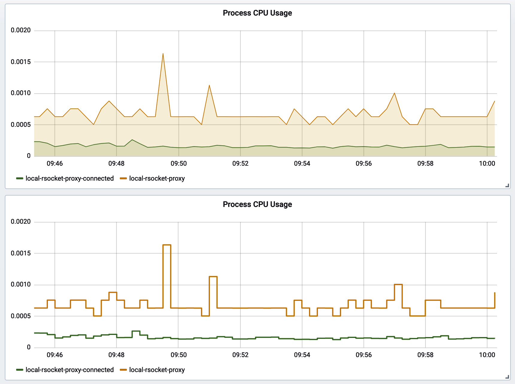
Figure 4-4. Grafana chart style default versus recommended
Change the options in the “Visualization” tab of the chart editor, as shown in Figure 4-5.
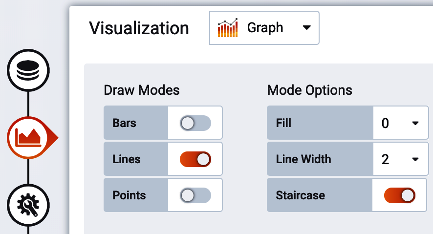
Figure 4-5. Grafana line width options
Errors Versus Successes
Plotting a stacked representation of outcomes (success, error, etc.) is very common for timers, as we’ll see in “Errors”, and shows up in other scenarios as well. When we think of successes and errors as colors, many of us will immediately think of green and red: stoplight colors. Unfortunately, a significant portion of the population has color vision impairments that affect their ability to perceive color differences. For the most common impairements, deuteranopia and protanopia, the difference between green and red is difficult or impossible to distinguish! Those affected by monochromacy cannot distinguish colors at all, only brightness. Because this book is printed monochromatically, we all get to experience this briefly for the stacked chart of errors and successes in Figure 4-6.
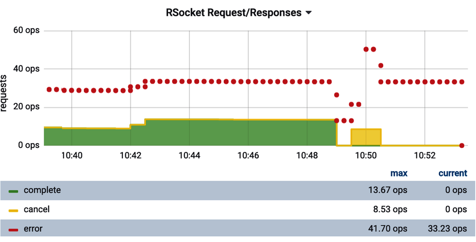
Figure 4-6. Display errors with a different line style for accessibility
We need to provide some sort of visual indicator of errors versus successes other than strictly color. In this case, we’ve chosen to plot “successful” outcomes as stacked lines and the errors above these outcomes as thick points to make them stand out.
Additionally, Grafana doesn’t offer an option to specify the order of time series as they appear in a stacked representation (i.e., “success” on the bottom or top of the stack), even for a limited set of possible values. We can force an ordering of them by selecting each value in a separate query and ordering the queries themselves, as shown in Figure 4-7.
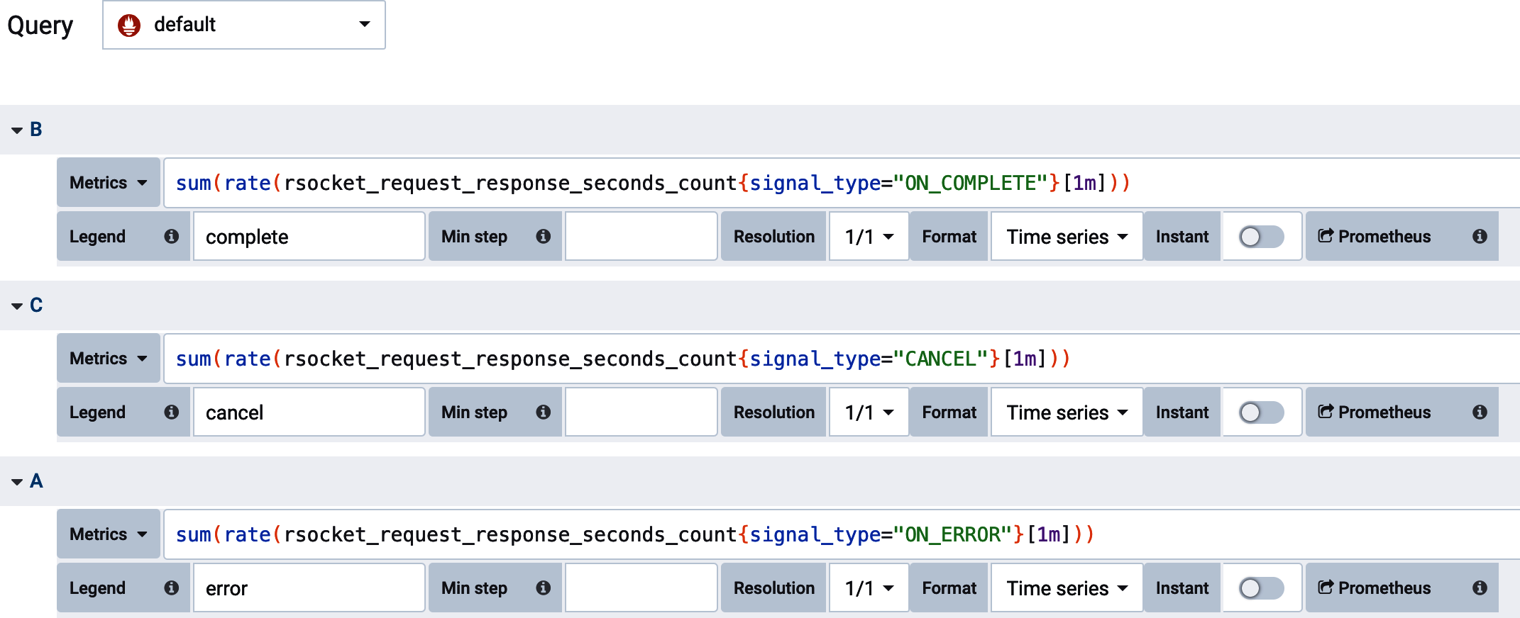
Figure 4-7. Ordering outcomes in a Grafana stack representation
Lastly, we can override the styling of each individual query, as shown in Figure 4-8.
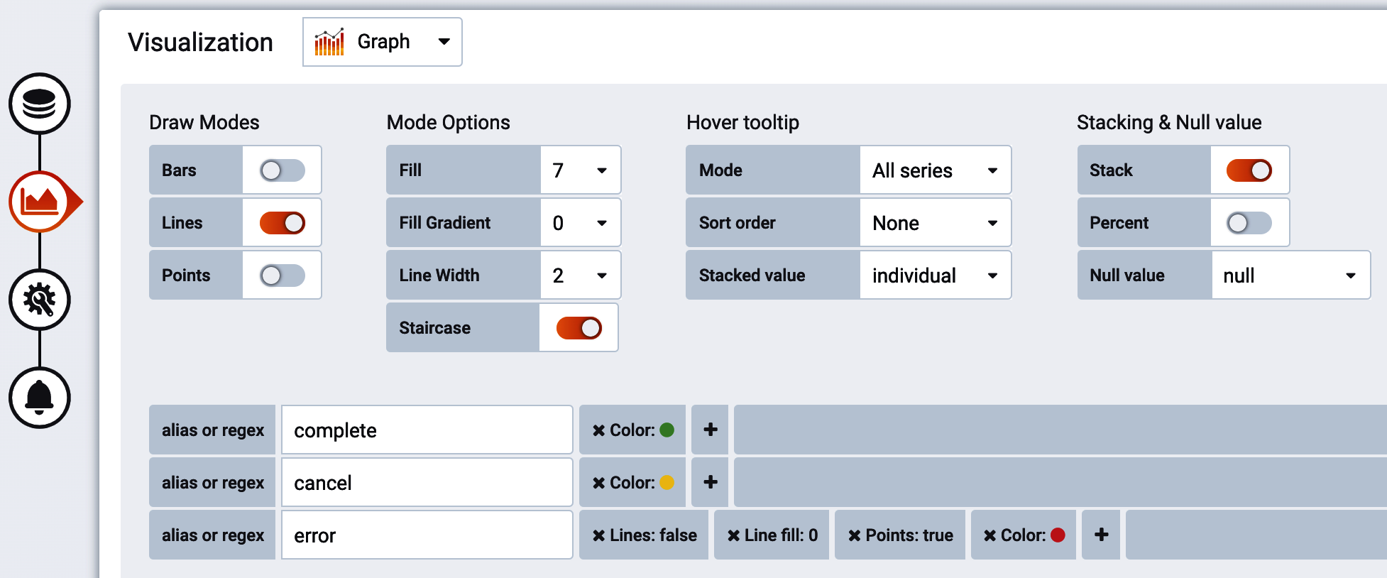
Figure 4-8. Overriding line styles for each outcome
“Top k” Visualizations
In many cases, we want to display some indicator of the “worst” performers by some category. Many monitoring systems offer some sort of query function to select the “top k” time series for some criteria. Selecting “top 3” worst performers doesn’t mean that there will be a maximum of three lines on the chart, however, because this race to the bottom is perpetual, and the worst performers can change over the course of the time interval visualized by the chart. At worst, you are displaying N datapoints on a particular visualization, and there will be 3*N distinct time series displayed! If you draw a vertical line down any part of Figure 4-9 and count the number of unique colors it intersects, it will always be less than or equal to three because this chart was built with a “top 3” query. But there are six items in the legend.
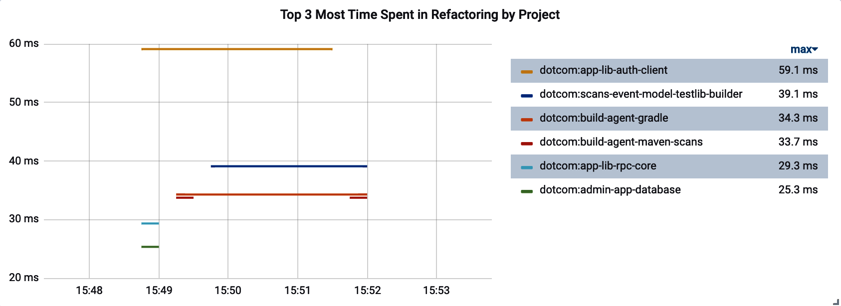
Figure 4-9. Top k visualization with more than k distinct time series
It can get far busier than this very easily. Consider Figure 4-10, which shows the top five longest Gradle build task times over a period of time. Since the set of build tasks running changes rapidly over the time slices shown in this chart, the legend fills up with many more values than simply five.
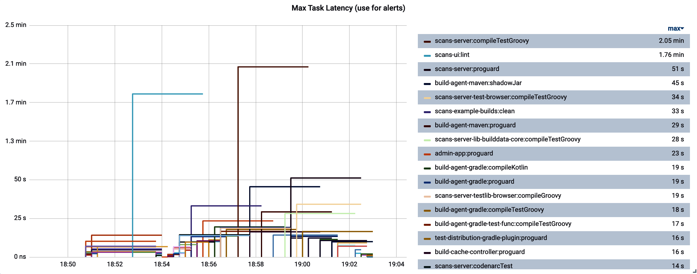
Figure 4-10. Top k can still yield many more items in the legend than k
In such cases, the legend is overwhelmed with labels, to the point where it is illegible. Use the Grafana options to shift the legend to a table on the right, and add a summary statistic like “maximum,” as shown in Figure 4-11. You can then click the summary statistic in the table to sort the legend-as-table by this statistic. Now when we look at the chart, we can quickly see which performers are overall worst for the time range that we are viewing.
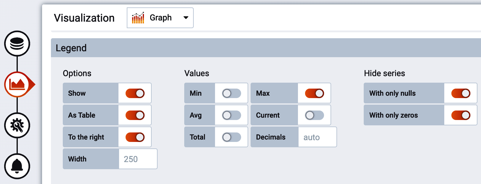
Figure 4-11. Overriding line styles for each outcome
Prometheus Rate Interval Selection
Throughout this chapter, we are going to see Prometheus queries that use range vectors. I highly suggest using range vectors that are at least twice as long as the scrape interval (by default one minute). Otherwise, you risk missing datapoints due to slight variations in scrape timing that may cause adjacent datapoints to be just slightly more than the scrape interval apart. Similarly, if a service is restarted and a datapoint is missing, the rate function will not be able to make a rate during the gap or next datapoint until the interval contains at least two points. Using a higher interval for the rate avoids these problems. Because application startup may be longer than a scrape interval, depending on your application, if it is important to you to totally avoid gaps, you may choose a range vector longer than twice the scrape interval (something in fact closer to whatever application startup plus two intervals would be).
Range vectors are a somewhat unique concept to Prometheus, but the same principle applies in other contexts in other monitoring systems. For example, you’d want to construct a “min over interval” type query to compensate for potential gaps during application restart if you are setting a minimum threshold on an alert.
Gauges
A time series representation of a gauge presents more information about as compactly as an instantaneous gauge. It is just as obvious when a line crosses an alert threshold, and the historical information about the gauge’s prior values provides useful context. As a result, the bottom chart is preferable in Figure 4-12.
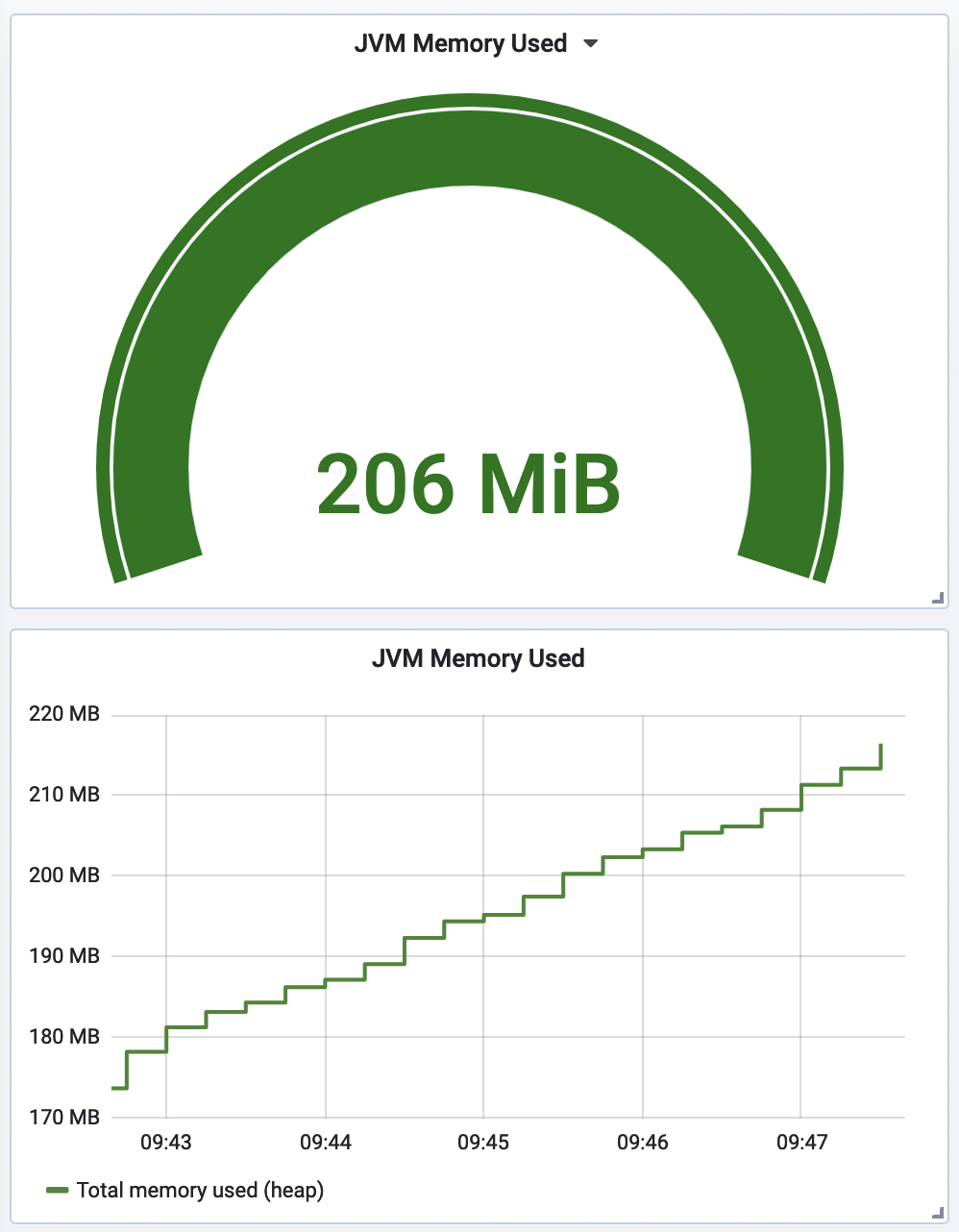
Figure 4-12. Prefer a line chart over an instantaneous gauge
Gauges have a tendency to be spiky. Thread pools can appear to be temporarily near exhaustion and then recover. Queues get full and then empty. Memory utilization in Java is especially tricky to alert on since short-term allocations can quickly appear to fill up a significant portion of allocated space only for garbage collection to sweep away much of the consumption.
One of the most effective methods to limit alert chattiness is to use a rolling count function, the results of which are shown in Figure 4-13. In this way we can define an alert that only fires if a threshold is exceeded more than three times in the last five intervals, or some other combination of frequency and number of lookback intervals. The longer the lookback, the more time will elapse before the alert first fires, so be careful to not look back too far for critical indicators.
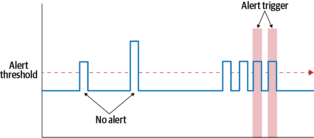
Figure 4-13. Rolling count to limit alert chattiness
Being instantaneous values, gauges are basically just graphed as is on each monitoring system. Counters are a little more nuanced.
Counters
Counters are often tested against a maximum (or less frequently, a minimum) threshold. The need to test against a threshold reinforces the idea that counters should be observed as rates rather than a cumulative statistic, regardless of how the statistic is stored in the monitoring system.
Figure 4-14 shows an HTTP endpoint’s request throughput as a rate (yellow solid line) and also the cumulative count (green dots) of all requests to this endpoint since the application process started. Also, the chart shows a fixed minimum threshold alert (red line and area) of 1,000 requests/second that has been set on this endpoint’s throughput. This threshold makes sense relative to throughput represented as a rate (which in this window varies between 1,500 and 2,000 requests/second). It makes little sense against the cumulative count though, since the cumulative count is effectively a measure of both the rate of throughput and the longevity of the process. The longevity of the process is irrelevant to this alert.
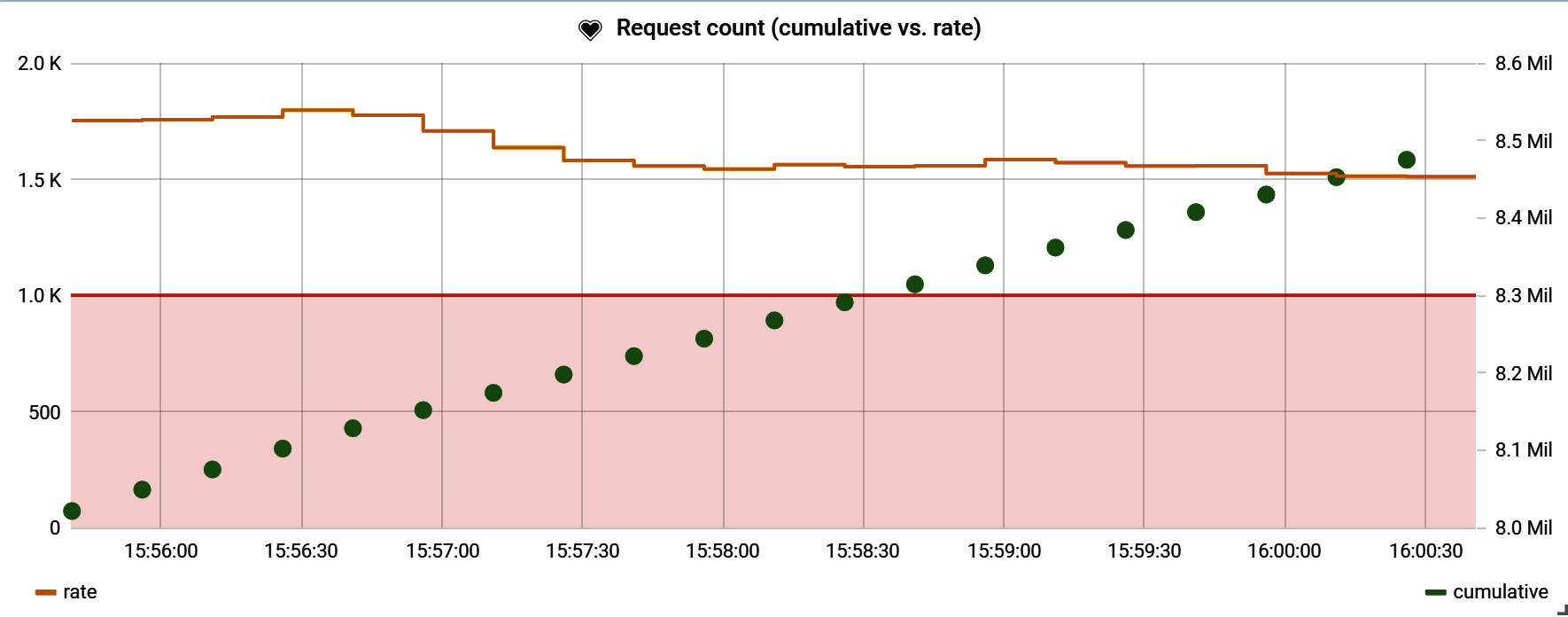
Figure 4-14. A counter with a minimum alert threshold on rate, with cumulative count displayed as well
Sometimes a fixed threshold is difficult to determine a priori. Also, the rate at which an event is occurring may fluctuate periodically based on something like peak and off-peak business hours. This is especially common with a throughput measure like requests/second, as seen in Figure 4-15. If we set a fixed threshold on this service to detect when traffic was suddenly not reaching the service (a minimum threshold), we would have to set it somewhere below 40 RPS, the minimum throughput this service sees. Suppose the minimum threshold is set at 30 RPS. This alert fires when traffic drops below 75% of the expected value during off-peak hours, but only when traffic drops below 10% of the expected value during peak hours! The alert threshold is not equally valuable during all periods.
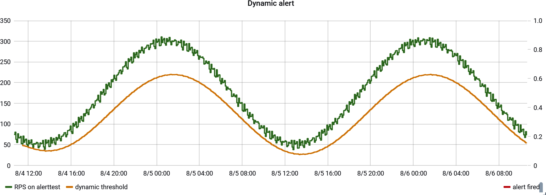
Figure 4-15. A service with periodic increases in traffic based on the time of day
In these cases, consider framing an alert in terms of finding sharp increases or decreases in rate. A good general approach to this, seen in Figure 4-16, is to take the counter rate, apply a smoothing function to it, and multiply the smoothing function by some factor (85% in the example). Because the smoothing function naturally takes at least a little time to respond to a sudden change in the rate, a test to ensure that the counter rate doesn’t fall below the smoothed line detects sudden change without having to know what the expected rate is at all. A much more detailed explanation of statistical methods for smoothing for dynamic alerting is presented in “Building Alerts Using Forecasting Methods”.
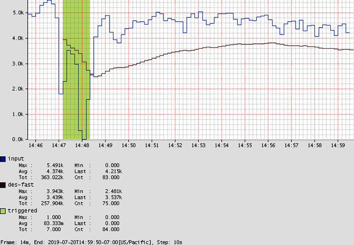
Figure 4-16. A counter with a double-exponentially smoothed threshold, forming a dynamic alert threshold
It is Micrometer’s responsibility to ship the data to your monitoring system of choice in such a way that you can draw a rate representation of a counter in your chart. In the case of Atlas, counters are already shipped in a rate-normalized way, so a query for a counter already returns a rate value that can be directly plotted, as shown in Example 4-3.
Example 4-3. Atlas counters are already a rate, so selecting them charts a rate
name,cache.gets,:eq,
Other monitoring systems expect cumulative values to be shipped to the monitoring system and include some sort of rate function for use at query time. Example 4-4 would display roughly the same rate line as the Atlas equivalent, depending on what you select as the range vector (the time period in the []).
Example 4-4. Prometheus counters are cumulative, so we need to explicitly convert them to a rate
rate(cache_gets[2m])
There is one problem with the Prometheus rate function: when new tag values are added rapidly inside a chart’s time domain, the Prometheus rate function can generate a NaN value as opposed to a zero. In Figure 4-17, we are charting Gradle build task throughput over time. Since in this window, build tasks are uniquely described by project and task name, and once a task is complete it isn’t incremented again, several new time series are coming into existence inside of the time domain we’ve selected for the chart.
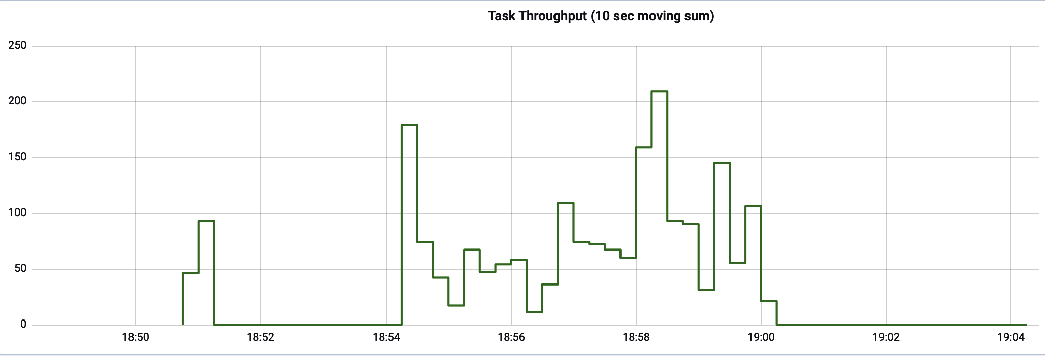
Figure 4-17. Zero-filling Prometheus counter rates when new tag values are coming into existence inside the time domain
The query in Example 4-5 shows the method we can use to zero-fill the gaps.
Example 4-5. The query to zero-filling Prometheus counter rates
sum(gradle_task_seconds_count) by (gradle_root_project_name) -
(
  sum(gradle_task_seconds_count offset 10s) by (gradle_root_project_name) > 0 or
  (
    (sum(gradle_task_seconds_count) by (gradle_root_project_name)) * 0
  )
)
How to chart counters varies a bit from monitoring system to monitoring system. Sometimes we have to explicitly create rates, and sometimes counters are stored as rates up front. Timers have even more options.
Timers
A Timer Micrometer meter generates a variety of different time series with one operation. Wrapping a block of code with a timer (timer.record(() -> { ... })) is enough to collect data on throughput through this block, maximum latency (decaying over time), the total sum of latency, and optionally other distribution statistics like histograms, percentiles, and SLO boundaries.
On dashboards, latency is the most important to view, because it is most directly tied to user experience. After all, users care mostly about the performance of their individual requests. They care little to nothing about the total throughput the system is capable of, except indirectly to the extent that at a certain throughput level their response time is affected.
Secondarily, throughput can be included if there is an expectation of a certain shape to traffic (which may be periodic based on business hours, customer time zones, etc.). For example, a sharp decline in throughput during an expected peak period can be a strong indicator of a systemic problem where traffic that should be reaching the system is not.
For many cases, it is best to set alerts on maximum latency (in this case meaning maximum observed for each interval) and use high-percentile approximations like the 99th percentile for comparative analysis (see “Automated Canary Analysis”).
Set Timer Alerts on Maximum Latency
It is exceedingly common in Java applications for maximum timings to be an order of magnitude worse than the 99th percentile. It is best to set your alerts on maximum latency.
I didn’t discover the importance of even measuring maximum latency until after I left Netflix and was introduced to a compelling argument by Gil Tene for alerting on maximum latency. He makes a particularly visceral point about worst case, drawing an analogy to pacemaker performance and emphasizing that “‘your heart will keep beating 99.9% of the time’ is not reassuring.” Always a sucker for a well-reasoned argument, I added maximum latency as a key statistic shipped by Micrometer Timer and DistributionSummary implementations just in time for the SpringOne conference in 2017. There I met a former colleague from Netflix and sheepishly suggested this new idea, conscious of the fact that Netflix wasn’t actually monitoring max latency. He immediately laughed off the idea and left for a talk, leaving me a bit deflated. A short while later, I got a message from him with the chart shown in Figure 4-18, showing max latency an order of magnitude worse than P99 on a key internal Netflix service (which he had gone and added max to as a quick experiment to test this hypothesis).

Figure 4-18. Max versus P99 in a Netflix logging service (in nanoseconds)
Even more amazing, Netflix had recently undergone an architectural shift that made P99 a little bit better but made max substantially worse! It’s easy to argue it was actually worse off for having made the change. I cherish the memory of this interaction because it is such an acute illustration of how every organization has something it can learn from another: in this case a highly sophisticated monitoring culture at Netflix learned a trick from Domo which in turn learned it from Azul Systems.
In Figure 4-19, we see the order-of-magnitude difference between maximum and 99th percentile. Response latency tends to be tightly packed around the 99th percentile with at least one separate grouping near the maximum reflective of garbage collection, VM pauses, etc.
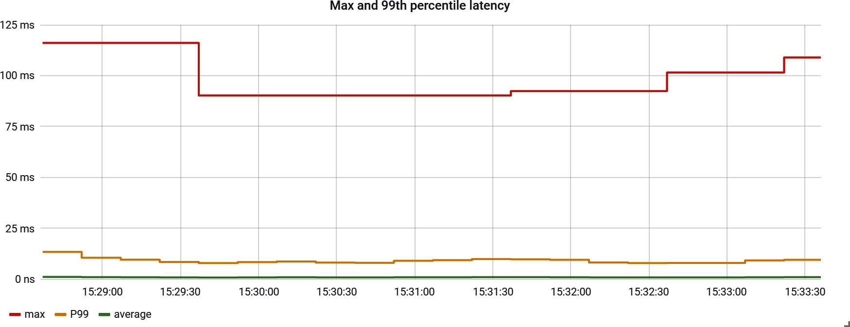
Figure 4-19. Maximum versus P99 latency
In Figure 4-20, a real-world service is exhibiting the characteristic that the average floats above the 99th percentile because requests are so densely packed around the 99th.
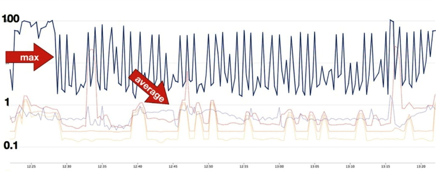
Figure 4-20. Average versus P99 latency
As insignificant as this top 1% may seem, real users are affected by these latencies, so it is important to recognize where that boundary is and compensate for it where needed. One recognized approach to limiting the effect of the top 1% is a client-side load-balancing strategy called hedge requests (see “Hedge Requests”).
Setting an alert on max latency is key (we’ll talk more about why in “Latency”). But once an engineer has been alerted to a problem, the dashboard that they use to start understanding the problem doesn’t necessarily need to have this indicator on it. It would be far more useful to see the distribution of latencies as a heatmap (as shown in Figure 4-21), which would include a nonzero bucket where the max is that caused the alert, to see how significant the problem is relative to the normative request coming through the system at that time. In a heatmap visualization, each vertical column represents a histogram (refer to “Histograms” for a definition) at a particular time slice. The colored boxes represent the frequency of latencies that are in a range of times defined on the y-axis. So the normative latency an end user is experiencing should look “hot” and outliers look cooler.

Figure 4-21. A timer heatmap
Are most requests failing close to the max value, or are there just one or a few stray outliers? The answer to this question likely affects how quickly an alerted engineer escalates the issue and brings others in to help. There’s no need to plot both the max and heatmap on a diagnostic dashboard, as shown in Figure 4-22. Just include the heatmap.
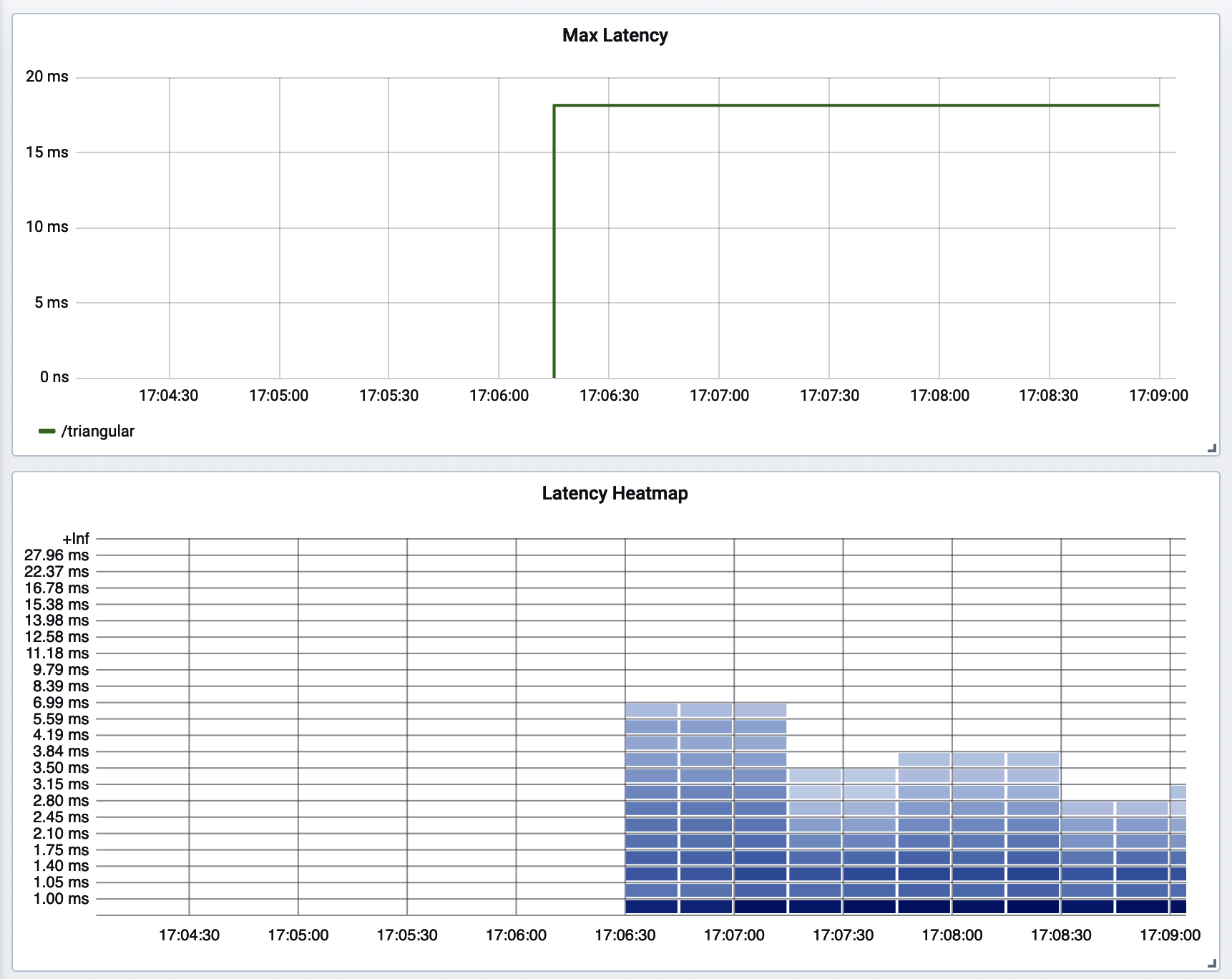
Figure 4-22. Max latency versus heatmap of latency distribution
The latency heatmap is also expensive to draw, since it involves retrieving potentially dozens or hundreds of buckets (which are individual time series in the monitoring system) for each time slice on the chart, for a total that often amounts to thousands of time series. This reinforces the idea that there’s no reason to have this chart auto-updating on a prominent display somewhere hanging on a wall. Allow the alerting system to do its job and view the dashboard as needed to limit the load on the monitoring system.
The toolbox of useful representations has now grown to the point that a word of caution is necessary.
When to Stop Creating Dashboards
I visited with a former colleague of mine, now VP of operations at Datadog, in 2019. He lamented that, ironically, a lack of healthy moderation in dashboards built by customers is one of the key capacity problems confronting Datadog. Imagine legions of computer screens and TV displays arrayed around the world, each automatically refreshing at prescribed intervals a series of charts that look nice. I found this to be such a fascinating business problem, because clearly lots of TV displays showing Datadog branding improve the visibility and stickiness of the product while simultaneously producing an operational nightmare for a SaaS.
I’ve always found the “mission control” dashboard view a bit of a curiosity. After all, what is it about a chart that visually indicates to me a problem? If it’s a sharp spike, a deep trough, or simply a value that has crept above all reasonable expectation, then an alert threshold can be created to define where that point of unacceptability is, and the metric can be monitored automatically (and around the clock).
As an on-call engineer, it’s nice to receive an alert with an instantaneous visualization of the indicator (or a link to one). Ultimately, when we open alerts, we want to dig for information to discover a root cause (or sometimes determine that the alert isn’t worth paying attention to). If the alert links to a dashboard, ideally that dashboard is configured in such a way as to allow immediate dimensional explosion or exploration. In other words, the TV display dashboard treats humans as a sort of low-attention span, notoriously unreliable alerting system.
The visualizations useful for alerting may not be useful to include on a dashboard at all, and not all charts on a dashboard are possible to build alerts on. For example, Figure 4-22 shows two representations of the same timer: a decaying max and a heatmap. The alerting system is going to watch max, but when an engineer is alerted to the anomalous condition, it’s much more useful to see the distribution of latencies around that time to know how severe the impact was (and the max should be captured in a latency bucket that’s visible on the heatmap).
However, be careful about how you construct these queries! If you look closely you will see that there is no latency around 15 ms on the heatmap. The Prometheus range vector in this case was too close to the scrape interval, and the resulting momentary gap in the chart that is invisible hides the 15 ms latency! Since Micrometer decays max, we still see it on the max chart.
Heatmaps are also much more computationally expensive to render than a simple max line. For one chart this is fine, but add up this cost across many individual displays across business units in a large organization and this can be taxing on the monitoring system itself.
Charts aren’t a substitute for alerts. Focus first on delivering them as alerts to the right people when they stray from acceptable levels rather than rushing to set up monitors.
Tip
A human constantly watching a monitor is just an expensive alerting system polling visually for unacceptable levels.
Alerts should be delivered to on-call personnel in such a way that they can quickly jump to a dashboard and start drilling down on the failing metric dimensionally to reason about where the problem is.
Not every alert or violation of an SLO needs be treated as a stop-the-world emergency.
Service Level Indicators for Every Java Microservice
Now that we have a sense of how to visually present SLIs on charts, we will turn our focus to the indicators you can add. They are presented in approximately the order of importance. So if you are following the incrementalist approach to adding charts and alerts, implement these in sequence.
Errors
When timing a block of code it’s useful to differentiate between successful and unsuccessful operations for two reasons.
First, we can directly use the ratio of unsuccessful to total timings as a measure of the frequency of errors occurring in the system.
Also, successful and unsuccessful outcomes can have radically different response times, depending on the failure mode. For example, a NullPointerException resulting from making a bad assumption about the presence of some data in request input can fail early in a request handler. It then doesn’t get far enough to call other downstream services, interact with the database, etc., where the majority of time is spent when a request is successful. In this case, unsuccessful requests that fail in this way will skew our perspective on the latency of the system. Latency will in fact appear better than it actually is! On the other hand, a request handler that makes a blocking downstream request to another microservice that is under duress and for which the response ultimately times out may exhibit a much higher-than-normal latency (something close to the timeout on the HTTP client making the call). By not segregating errors, we present an overly pessimistic view of the latency of our system.
Status tags (recall “Naming Metrics”) should be added to timing instrumentation in most cases on two levels.
- Status
-
A tag that provides a detailed error code, exception name, or some other specific indicator of the failure mode
- Outcome
-
A tag that provides a more course-grained error category that separates success, user-caused error, and service-caused error
When writing alerts, rather than trying to select a tag by matching a status code pattern (e.g., using Prometheus’s not-regex tag selector for status !~"2.."), it is preferable to perform an exact match on the outcome tag (outcome="SERVER_ERROR"). By selecting “not 2xx,” we are grouping server errors, like the common HTTP 500 Internal Server Error, with errors caused by the user, like HTTP 400 Bad Request or HTTP 403 Forbidden. A high rate of HTTP 400s may indicate that you recently released code that contained an accidental backward incompatibility in an API, or it could indicate that a new end user (e.g., some other upstream microservice) is trying to onboard onto using your service and hasn’t gotten the payload right yet.
Panera Faced Chatty Alerts Not Distinguishing Client from Server Errors
Panera Bread, Inc., faced an overly chatty alert from an anomaly detector implemented by its monitoring system vendor for HTTP errors. It caused several email alerts in one day because a single user provided the wrong password five times. Engineers discovered that the anomaly detector didn’t differentiate between client and server error ratio! Alerts on client error ratio might be nice for intrusion detection, but the threshold would be much higher than server error ratio (and certainly higher than five errors in a short period of time).
An HTTP 500 basically always is your fault as a service owner and needs attention. At best, an HTTP 500 shines a spotlight on where more up-front validation could have instead yielded a useful HTTP 400 back to the end user. I think “HTTP 500—Internal Server Error” is too passive. Something like “HTTP 500—Sorry, It’s My Fault” feels better.
When you are writing your own timers, a common pattern involves using a Timer sample and deferring the determination of tags until it’s known whether the request will succeed or fail, as in Example 4-6. The sample holds the state of the time that the operation started for you.
Example 4-6. Determining an error and outcome tag dynamically based on the result of an operation
Timer.Samplesample=Timer.start();try{// Some operation that might fail...sample.stop(registry.timer("my.operation",Tags.of("exception","none","outcome","success")));}catch(Exceptione){sample.stop(registry.timer("my.operation",Tags.of("exception",e.getClass().getName(),"outcome","failure")));}

Some monitoring systems like Prometheus expect a consistent set of tag keys to appear on metrics with the same name. So even though there is no exception here, we should tag it with some placeholder value like “none” to mirror what tags are present in the failure cases as well.

Perhaps you have a way of better cataloging the failure conditions and can provide a more descriptive tag value here, but even adding the exception class name can go a long way toward understanding what kinds of failures there are.
NullPointerExceptionis a very different type of exception than a poorly handled connection timeout on a call to a downstream service. When error ratio spikes, it’s useful to be able to drill down on the exception name to get a brief glimpse at what the error is. From this exception name, you can hop over to your debuggability observability tools like logs and search for occurrences of the exception name around the time of the alert condition.
Be Careful with Class.getSimpleName(), etc., as a Tag Value
Be aware of the fact that Class.getSimpleName() and Class.getCanonicalName() can return null or empty values, for example in the case of anonymous class instances. If you use one of them as a tag value, at least null/empty check the value and fall back on Class.getName().
For HTTP request metrics, for example, Spring Boot automatically tags http.server.requests with a status tag indicating the HTTP status code and an outcome tag that is one of SUCCESS, CLIENT_ERROR, or SERVER_ERROR.
Based on this tag, it is possible to plot the error rate per interval. Error rate is difficult to establish an alert threshold for, because it can fluctuate wildly under the same failure conditions, depending on how much traffic is coming through the system.
For Atlas, use the :and operator to select only SERVER_ERROR outcomes, as shown in Example 4-7.
Example 4-7. Error rate of HTTP server requests in Atlas
# don't do this because it fluctuates with throughput!
name,http.server.requests,:eq,
outcome,SERVER_ERROR,:eq,
:and,
uri,$ENDPOINT,:eq,:cq
For Prometheus, use a tag selector, as shown in Example 4-8.
Example 4-8. Error rate of HTTP server requests in Prometheus
# don't do this because it fluctuates with throughput!
sum(
  rate(
    http_server_requests_seconds_count{outcome="SERVER_ERROR", uri="$ENDPOINT"}[2m]
  )
)
If every 10th request fails, and 100 requests/second are coming through the system, then the error rate is 10 failures/second. If 1,000 requests/second are coming through the system, the error rate climbs to 100 failures/second! In both cases, the error ratio relative to throughput is 10%. This error ratio normalizes the rate and is easy to set a fixed threshold for. In Figure 4-23, the error ratio hovers around 10–15% in spite of the fact that throughput, and therefore error rate, spikes.
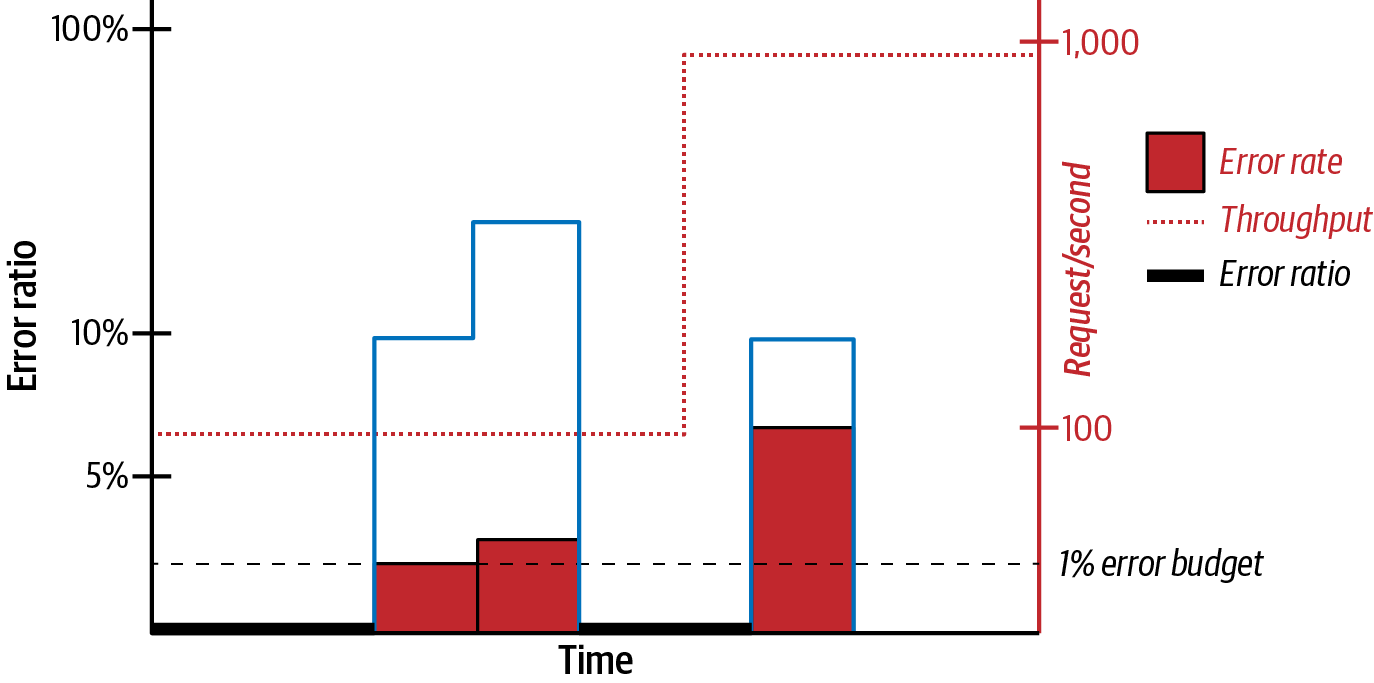
Figure 4-23. Error ratio versus error rate
The coarse-grained outcome tag is used to construct queries that represent the error ratio of the timed operation. In the case of http.server.requests, this is the ratio of SERVER_ERROR to the total number of requests.
For Atlas, use the :div function to divide SERVER_ERROR outcomes by the total count of all requests, as shown in Example 4-9.
Example 4-9. Error ratio of HTTP server requests in Atlas
name,http.server.requests,:eq,
:dup,
outcome,SERVER_ERROR,:eq,
:div,
uri,$ENDPOINT,:eq,:cq
For Prometheus, use the / operator similarly, as in Example 4-10.
Example 4-10. Error ratio of HTTP server requests in Prometheus
sum(
  rate(
    http_server_requests_seconds_count{outcome="SERVER_ERROR", uri="$ENDPOINT"}[2m]
  )
) /
sum(
  rate(
    http_server_requests_seconds_count{uri="$ENDPOINT"}[2m]
  )
)
Error Rate Is Better Than Error Ratio for Low-Throughput Services
In general, prefer error ratio to error rate, unless the endpoint has a very low throughput. In this case, even a small difference in errors can lead to wild shifts in the error ratio. It is more appropriate in these situations to pick a fixed error rate threshold.
Error rate and ratio are just one view of a timer. Latency is the other essential view.
Latency
Alert on maximum latency (in this case meaning maximum observed for each interval), and use high-percentile approximations like the 99th percentile for comparative analysis, as shown in “Automated Canary Analysis”. Popular Java web frameworks, as part of their “white box” (see “Black Box Versus White Box Monitoring”) autoconfiguration of metrics, offer instrumentation of inbound and outbound requests with rich tags. I’ll present details of Spring Boot’s automatic instrumentation of requests, but most other popular Java web frameworks have done something very similar with Micrometer.
Server (inbound) requests
Spring Boot autoconfigures a timer metric called http.server.requests for both blocking and reactive REST endpoints. If the latency of a particular endpoint(s) is a key indicator of the performance of an application and it will also be used for comparative analysis, then add the management.metrics.distribution.percentiles-histogram.http.server.requests=true property to your application.properties to export percentile histograms from your application. To be more fine-grained about enabling percentile histograms for a particular set of API endpoints, you can add the @Timed annotation in Spring Boot, like in Example 4-11.
Example 4-11. Using @Timed to add histograms to just a single endpoint
@Timed(histogram=true)@GetMapping("/api/something")SomethinggetSomething(){...}
Alternatively, you can add a MeterFilter that responds to a tag, as shown in Example 4-12.
Example 4-12. A MeterFilter that adds percentile histograms for certain endpoints
@BeanMeterFilterhistogramsForSomethingEndpoints(){returnnewMeterFilter(){@OverridepublicDistributionStatisticConfigconfigure(Meter.Idid,DistributionStatisticConfigconfig){if(id.getName().equals("http.server.requests")&&id.getTag("uri").startsWith("/api/something")){returnDistributionStatisticConfig.builder().percentilesHistogram(true).build().merge(config);}returnconfig;}};}
For Atlas, Example 4-13 shows how to compare max latency against some predetermined threshold.
Example 4-13. Atlas max API latency
name,http.server.requests,:eq,
statistic,max,:eq,
:and,
$THRESHOLD,
:gt
For Prometheus, Example 4-14 is a simple comparison.
Example 4-14. Prometheus max API latency
http_server_requests_seconds_max > $THRESHOLD
The tags that are added to http.server.requests are customizable. For the blocking Spring WebMVC model, use a WebMvcTagsProvider. For example, we could extract information about the browser and its version from the “User-Agent” request header, as shown in Example 4-15. This sample uses the MIT-licensed Browscap library to extract browser information from the user-agent header.
For Spring WebFlux (the nonblocking reactive model), configure a WebFluxTagsProvider similarly, as in Example 4-16.
Note that the http.server.requests timer only begins timing a request once it is being processed by the service. If the request thread pool is routinely at capacity, requests from users are sitting in the thread pool waiting to be handled, and this elapse of time is very real to the user waiting for a response. The missing information in http.server.requests is one example of a larger problem first described by Gil Tene called coordinated omission (see “Coordinated Omission”), which comes in several other forms.
It is also useful to monitor latency from the perspective of the caller (client). In this case, by client I generally mean service-to-service callers and not human consumers to your API gateway or first service interaction. A service’s view of its own latency doesn’t include the effects of network delays or thread pool contention (e.g., Tomcat’s request thread pool or the thread pool of a proxy like Nginx).
Client (outbound) requests
Spring Boot also autoconfigures a timer metric called http.client.requests for both blocking and reactive outbound calls. This allows you to instead (or also) monitor a service’s latency from the perspective of all of its callers, provided they each make the same conclusion about what the name of the called service is. Figure 4-24 shows three service instances calling the same service.
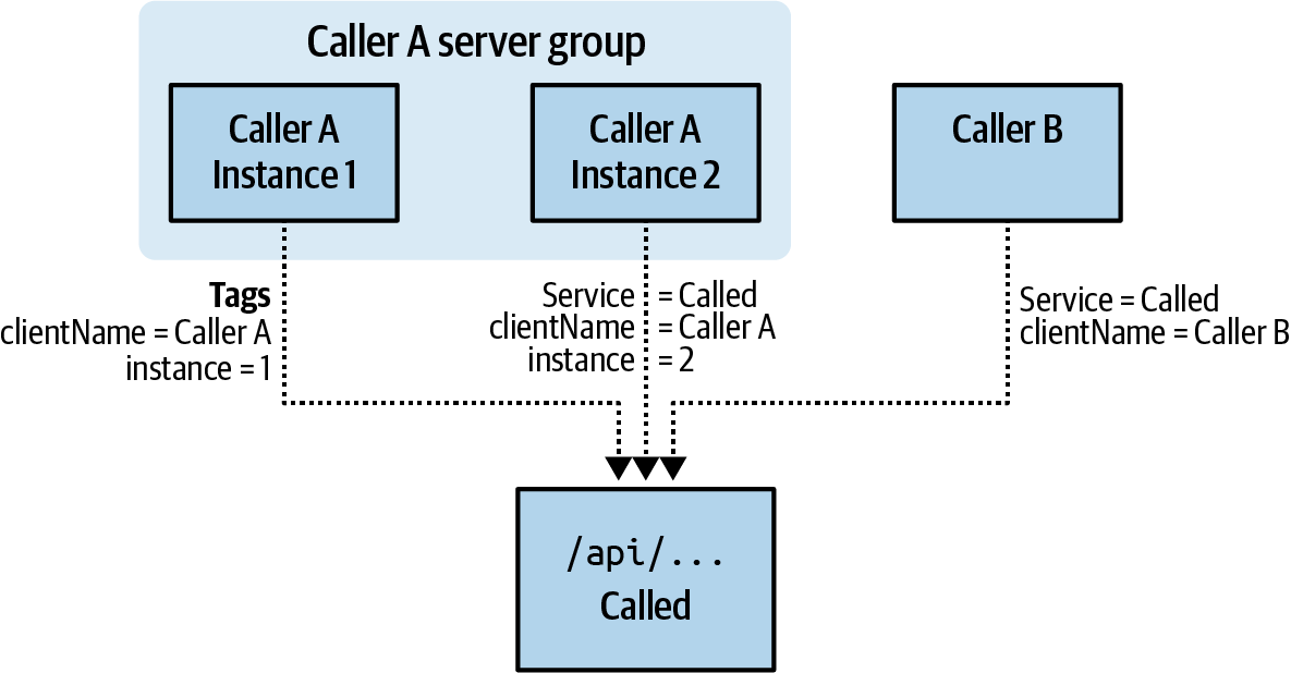
Figure 4-24. HTTP client metrics from multiple callers
We can identify the performance of a particular endpoint for the called service by selecting on the uri and serviceName tags. By aggregating over all other tags, we see the performance of the endpoint across all callers. Dimensionally drilling down by the clientName tag would show the service’s performance from just that client’s perspective. Even if the called service processes every request in the same amount of time, the client perspective could vary (e.g., if one client is deployed in a different zone or region). Where there is the possibility for this variance between clients, you can use something like Prometheus’s topk query to compare against an alert threshold so that the totality of the experience of an endpoint’s performance for all clients doesn’t wash away the outlier for some particular client, as shown in Example 4-17.
Example 4-17. Max outbound request latency by client name
topk(
  1,
  sum(
    rate(
      http_client_requests_seconds_max{serviceName="CALLED", uri="/api/..."}[2m]
    )
  ) by (clientName)
) > $THRESHOLD
To autoconfigure HTTP client instrumentation for Spring’s RestTemplate (blocking) and WebClient (nonblocking) interfaces, you do need to treat path variables and request parameters a certain way. Specifically, you have to let the implementations do path variable and request parameter substitution for you rather than using string concatenation or a similar technique to construct a path, as shown in Example 4-18.
Example 4-18. Allowing RestTemplate to handle path variable substitution
@RestControllerpublicclassCustomerController{privatefinalRestTemplateclient;publicCustomerController(RestTemplateclient){this.client=client;}@GetMapping("/customers")publicCustomerfindCustomer(@RequestParamStringq){StringcustomerId;// ... Look up customer ID according to 'q'returnclient.getForEntity("http://customerService/customer/{id}?detail={detail}",Customer.class,customerId,"no-address");}}...@ConfigurationpublicclassRestTemplateConfiguration{@BeanRestTemplateBuilderrestTemplateBuilder(){returnnewRestTemplateBuilder().addAdditionalInterceptors(..).build();}}

Sounds nefarious?

To take advantage of Spring Boot’s autoconfiguration of
RestTemplatemetrics, ensure that you are creating any custom bean wirings forRestTemplateBuilderand notRestTemplate(and note that Spring also provides aRestTemplateBuilderfor you automatically with the defaults via autoconfiguration). Spring Boot attaches an additional metrics interceptor to any such beans that it finds. Once theRestTemplateis created, it is too late for this configuration to take place.
The idea is that the uri tag should still contain the requested path with path variables pre-substitution so that you can reason about the total number and latency of requests going to that endpoint regardless of what particular values were being looked up. Also, this is essential to controlling the total number of tags that the http.client.requests metrics contains. Allowing unbounded growth in unique tags would eventually overwhelm the monitoring system (or get really expensive for you if the monitoring system vendor charges by time series).
The equivalent for the nonblocking WebClient is shown in Example 4-19.
Example 4-19. Allowing WebClient to handle path variable substitution
@RestControllerpublicclassCustomerController{privatefinalWebClientclient;publicCustomerController(WebClientclient){this.client=client;}@GetMapping("/customers")publicMono<Customer>findCustomer(@RequestParamStringq){Mono<String>customerId;// ... Look up customer ID according to 'q', hopefully in a non-blocking wayreturncustomerId.flatMap(id->webClient.get().uri("http://customerService/customer/{id}?detail={detail}",id,"no-address").retrieve().bodyToMono(Customer.class));}}...@ConfigurationpublicclassWebClientConfiguration{@BeanWebClient.BuilderwebClientBuilder(){returnWebClient.builder();}}

Sounds nefarious?

Make sure you are creating bean wirings for
WebClient.Builderand notWebClient. Spring Boot attaches an additional metricsWebClientCustomizerto the builder, not the completedWebClientinstance.
While the default set of tags that Spring Boot adds to client metrics is reasonably complete, it is customizable. It is especially common to tag metrics with the value of some request header (or response header). Be sure when you add tag customizations that the total number of possible tag values is well bounded. You shouldn’t add tags for things like unique customer ID (when you can have more than maybe 1,000 customers), a randomly generated request ID, etc. Remember, the purpose of metrics is to get an idea of aggregate performance, not the performance of some individual request.
As a slightly different example than the one we used in http.server.requests tag customization earlier, we could additionally tag the retrievals of customers by their subscription level, where subscription level is a response header on the retrieval of a customer by ID. By doing so, we could chart the latency and error ratio of the retrieval of premium customers versus basic customers separately. Perhaps the business places a higher level of expectation on the reliability or performance of requests to premium customers, manifesting in a tighter service level agreement based on this custom tag.
To customize tags for RestTemplate, add your own @Bean RestTemplateExchangeTagsProvider, as shown in Example 4-20.

Beware that
response.getHeaders().get("subscription")can potentially returnnull! So whether we usegetorgetFirst, we need tonullcheck somehow.
To customize tags for WebClient, add your own @Bean WebClientExchangeTagsProvider, as shown in Example 4-21.
To this point we’ve focused on latency and errors. Now let’s consider a common saturation measurement related to memory consumption.
Garbage Collection Pause Times
Garbage collection (GC) pauses often delay the delivery of a response to a user request, and they can be a bellwether of an impending “out of memory” application failure. There are a few ways we can look at this indicator.
Max pause time
Set a fixed alert threshold on the maximum GC pause time you find acceptable (knowing that a GC pause directly contributes to end-user response time as well), potentially selecting different thresholds for minor and major GC types. Plot the max from the jvm.gc.pause timer to set your thresholds, as shown in Figure 4-25. A heatmap of pause times may also be interesting if your application undergoes frequent pauses and you want to understand what typical behavior looks like over time.
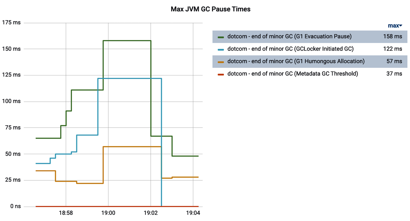
Figure 4-25. Max garbage collection pause times
Proportion of time spent in garbage collection
Since jvm.gc.pause is a timer, we can look at its sum independently. Specifically, we can add the increases in this sum over an interval of time and divide it by the interval to determine what proportion of the time the CPU is engaged in doing garbage collection. And since our Java process does nothing else during these times, when a significant enough proportion of time is spent in GC, an alert is warranted. Example 4-22 shows the Prometheus query for this technique.
Example 4-22. Prometheus query for time spent in garbage collection by cause
sum(sum_over_time(
sum(increase(jvm_gc_pause_seconds_sum[2m])[1m:]
) ) / 60

Sums over all the individual causes, like “end of minor GC.”

The total time spent in an individual cause in the last minute.

This is the first time we’ve seen a Prometheus subquery. It allows us to treat the operation on the two indicators as a range vector for input into
sum_over_time.
Since
jvm_gc_pause_seconds_sumhas a unit of seconds (and therefore so do the sums) and we’ve summed over a 1-minute period, divide by 60 seconds to arrive at a percentage in the range [0, 1] of the time we’ve spent in GC in the last minute.
This technique is flexible. You can use a tag to select particular GC causes and evaluate, for example, only the proportion of time spent in major GC events. Or, like we’ve done here, you can simply sum over all the causes and reason about overall GC time in a given interval. More than likely, you’re going to find that if you do separate these sums by cause, minor GC events don’t contribute that significantly to the proportion of time spent in GC. The app being monitored in Figure 4-26 was undergoing minor collections every minute and, unsurprisingly, it still only spent 0.0182% of its time in GC-related activities.
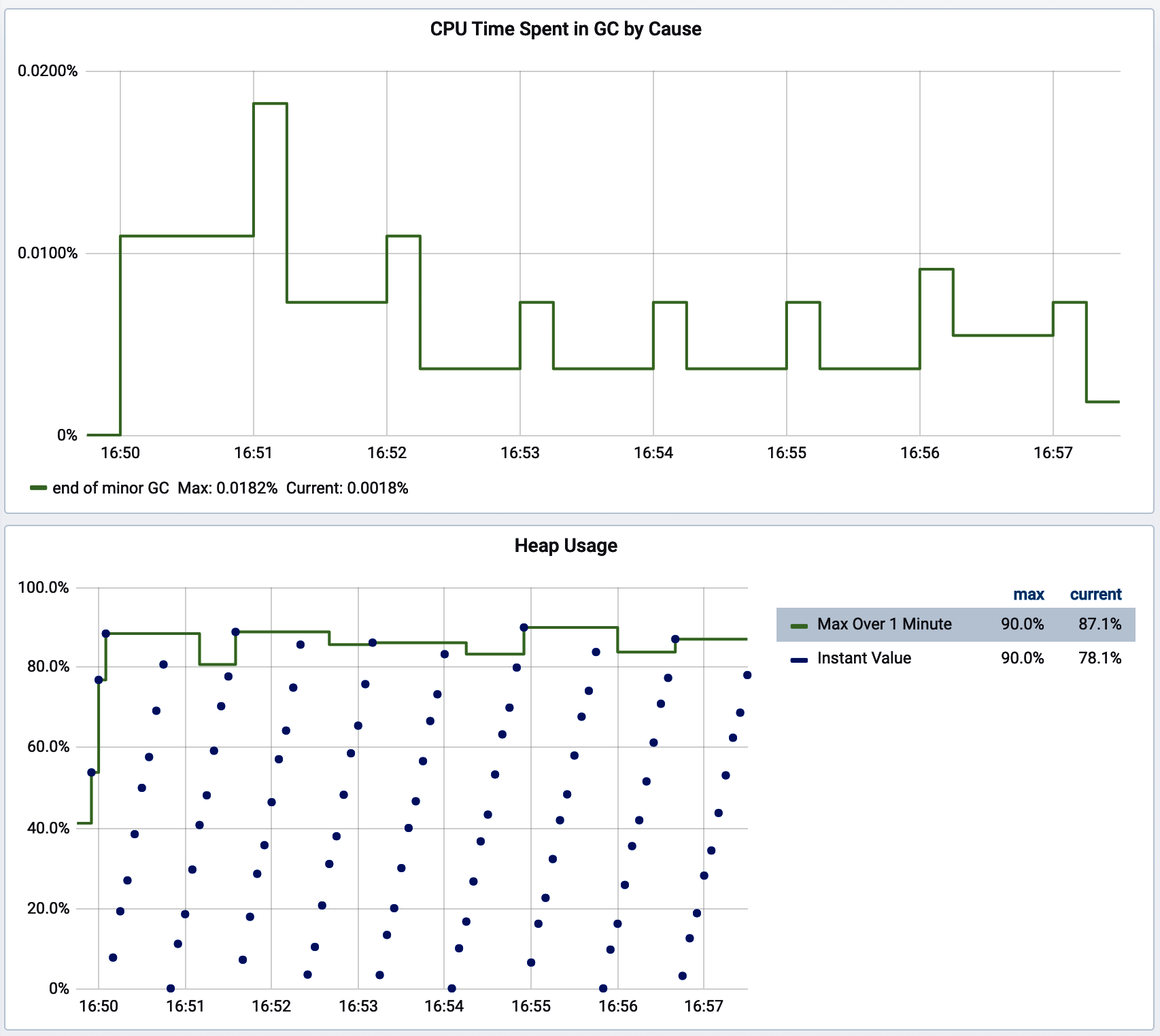
Figure 4-26. The proportion of time spent in minor GC events
If you aren’t using a monitoring system that provides aggregation functions like sum_over_time, Micrometer provides a meter binder called JvmHeapPressureMetrics, shown in Example 4-23, that precomputes this GC overhead and ships a gauge called jvm.gc.overhead that is a percentage in the range [0, 1] that you can then set a fixed threshold alert against. In a Spring Boot app, you can simply add an instance of JvmHeapPressureMetrics as a @Bean and it will be bound to your meter registries automatically.
The presence of any humongous allocation
In addition to choosing one of the above forms for monitoring time spent in GC, it’s also a good idea to set an alert on the presence of humongous allocation that GC causes in the G1 collector, because it indicates that somewhere in your code you are allocating an object >50% of the total size of the Eden space! More than likely, there is a way to refactor the application to avoid such an allocation by chunking or streaming data. A humongous allocation could occur while doing something like parsing an input or retrieving an object from a datastore that is not yet as big as the application could theoretically see, and a larger object very well could bring the application down.
For this, specifically, you are looking for a nonzero count for jvm.gc.pause where the cause tag is equal to G1 Humongous Allocation.
Way back in “Monitoring for Availability”, we mentioned that saturation metrics are usually preferable to utilization metrics when you have a choice between the two. This is certainly true of memory consumption. The views of time spent in garbage collection as a measure of memory resource problems are easier to get right. There are some interesting things we can do with utilization measurements, too, if we’re careful.
Heap Utilization
The Java heap is separated into several pools with each pool having a defined size. Java object instances are created in heap space. The most important parts of the heap are as follows:
- Eden space (young generation)
-
All new objects are allocated here. A minor garbage collection event occurs when this space is filled.
- Survivor space
-
When a minor garbage collection occurs, any live objects (that demonstrably still have references and therefore cannot be collected) are copied to the survivor space. Objects that reach the survivor space have their age incremented, and after an age threshold is met, are promoted to old generation. Promotion may happen prematurely if the survivor space cannot hold all of the live objects in young generation (objects skip the survivor space and go straight to old generation). This last fact will be key in how we measure dangerous levels of allocation pressure.
- Old generation
-
This is where long-surviving objects are stored. When objects are stored in the Eden space, an age for that object is set; and when it reaches that age, the object is moved to old generation.
Fundamentally, we want to know when one or more of these spaces is getting and staying too “full.” This is a tricky thing to monitor because JVM garbage collection by design kicks in as spaces get full. So having a space fill up isn’t itself an indicator of a problem. What is concerning is when it stays full.
Micrometer’s JvmMemoryMetrics meter binder automatically collects JVM memory pool usage, along with the current total maximum heap size (since this can increase and decrease at runtime). Most Java web frameworks automatically configure this binder.
Several metrics are plotted in Figure 4-27. The most straightforward idea for how to measure heap pressure is to use a simple fixed threshold, such as a percentage of total heap consumed. As we can see, the fixed threshold alert will fire far too frequently. The earliest alert is triggered at 11:44, well before it is apparent that a memory leak is present in this application. Even though the heap temporarily exceeds the percentage-of-total-heap threshold we have set, garbage collection events routinely bring total consumption back under the threshold.
In Figure 4-27:
-
The solid vertical bars together are a stack graph of memory consumption by space.
-
The thin line around the 30.0 M level is the maximum heap space allowed. Notice how this fluctuates as the JVM attempts to pick the right value between initial heap size (
-Xms) and max heap size (-Xmx) for the process. -
The bold line around 24.0 M level represents a fixed percentage of this maximum allowed memory. This is the threshold. It is a fixed threshold relative to the max, but dynamic in the sense that it is a percentage of the max which itself can fluctuate.
-
The lighter bars represent points where actual heap utilization (the top of the stack graph) exceeds the threshold. This is the “alert condition.”
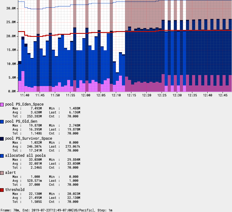
Figure 4-27. An alert on memory utilization with a fixed threshold
So this simple fixed threshold won’t work. There are better options available, depending on the capabilities of your target monitoring system.
Rolling count occurrences of heap space filling up
By using a feature like the rolling count function in Atlas, we can alert only when the heap exceeds the threshold—say, three out of the five prior intervals—indicating that in spite of the garbage collector’s best effort, heap consumption continues to be a problem (see Figure 4-28).
Unfortunately, not many monitoring systems have a function like Atlas’s rolling count. Prometheus can do something like this with its count_over_time operation, but it is tricky to get a similar “three out of five” dynamic.
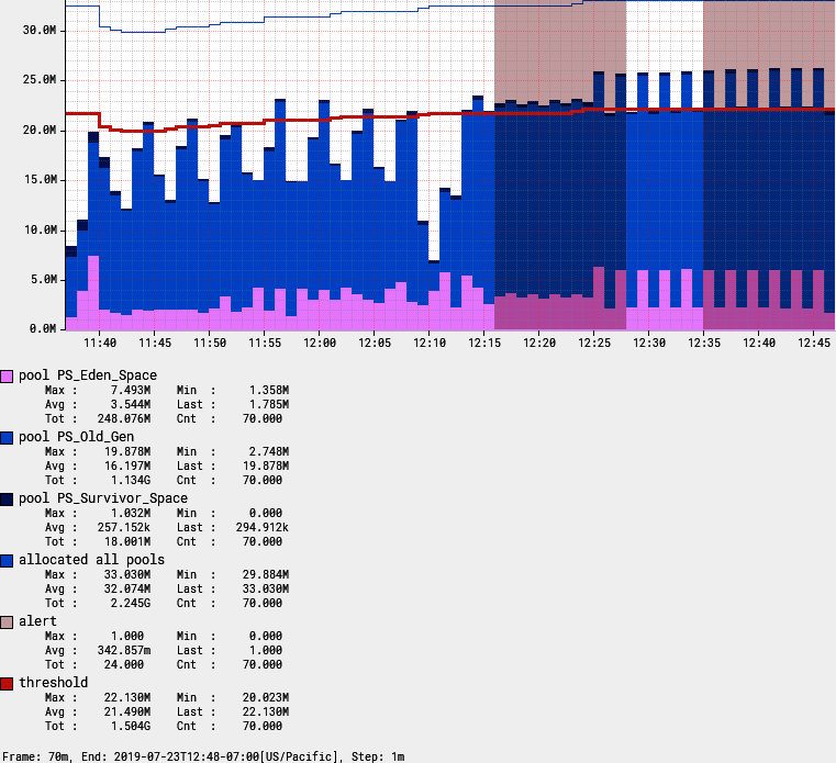
Figure 4-28. Using rolling count to limit alert chattiness
There is an alternative approach that also works well.
Low pool memory after collection
Micrometer’s JvmHeapPressureMetrics adds a gauge jvm.memory.usage.after.gc for the percentage of Old Generation heap used after the last garbage collection event.
jvm.memory.usage.after.gc is a percentage expressed in the range [0, 1]. When it is high (a good starting alert threshold is greater than 90%), garbage collection isn’t able to sweep up much garbage. So long-term pause events which occur when Old Generation is swept can be expected to occur frequently, and frequent long-term pauses both significantly degrade the performance of the app and ultimately lead to OutOfMemoryException fatal errors.
A subtle variation on measuring low pool memory after collection is also effective.
Low total memory
This technique involves mixing indicators from heap usage and garbage collection activity. A problem is indicated when they both exceed a threshold:
jvm.gc.overhead> 50%-
Notice that this is a lower alert threshold than suggested in “Garbage Collection Pause Times” for the same indicator (where we suggested 90%). We can be more aggressive about this indicator because we are pairing it with a utilization indicator.
jvm.memory.used/jvm.memory.max> 90% at any time in the last 5 minutes-
Now we have an idea that GC overhead is going up because one or more of the pools keep filling up. You could constrain this to just the Old Generation pool as well if your app generates a lot of short-term garbage under normal circumstances.
The alert criteria for the GC overhead indicator is a simple test against the gauge value.
The query for total memory usage is a little less obvious. The Prometheus query is shown in Example 4-24.
Example 4-24. Prometheus query for maximum memory used in the last five minutes
max_over_time(
  (
    jvm_memory_used_bytes{id="G1 Old Gen"} /
    jvm_memory_committed_bytes{id="G1 Old Gen"}
  )[5m:]
)
To understand better what max_over_time does, Figure 4-29 shows the total amount of Eden space (jvm.memory.used{id="G1 Eden Space"} in this case) consumed at several points in time (the dots) and the result of applying a one-minute max_over_time query to the same query (the solid line). It is a moving maximum window over a prescribed interval.
As long as heap usage is going up (and hasn’t been below the current value in the lookback window), the max_over_time tracks it exactly. Once a garbage collection event happens, the current view of usage drops and max_over_time “sticks” at the higher value for the lookback window.
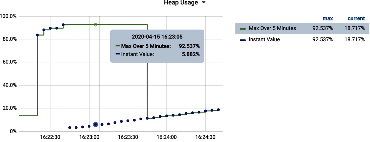
Figure 4-29. Prometheus max_over_time looking at max Eden space used in a one-minute lookback
This is also the first time we’ve considered an alert that is based on more than one condition. Alerting systems generally allow for the boolean combination of multiple criteria. In Figure 4-30, assuming that the jvm.gc.overhead indicator represents Query A and the usage indicator represents Query B, an alert can be configured in Grafana on both together.
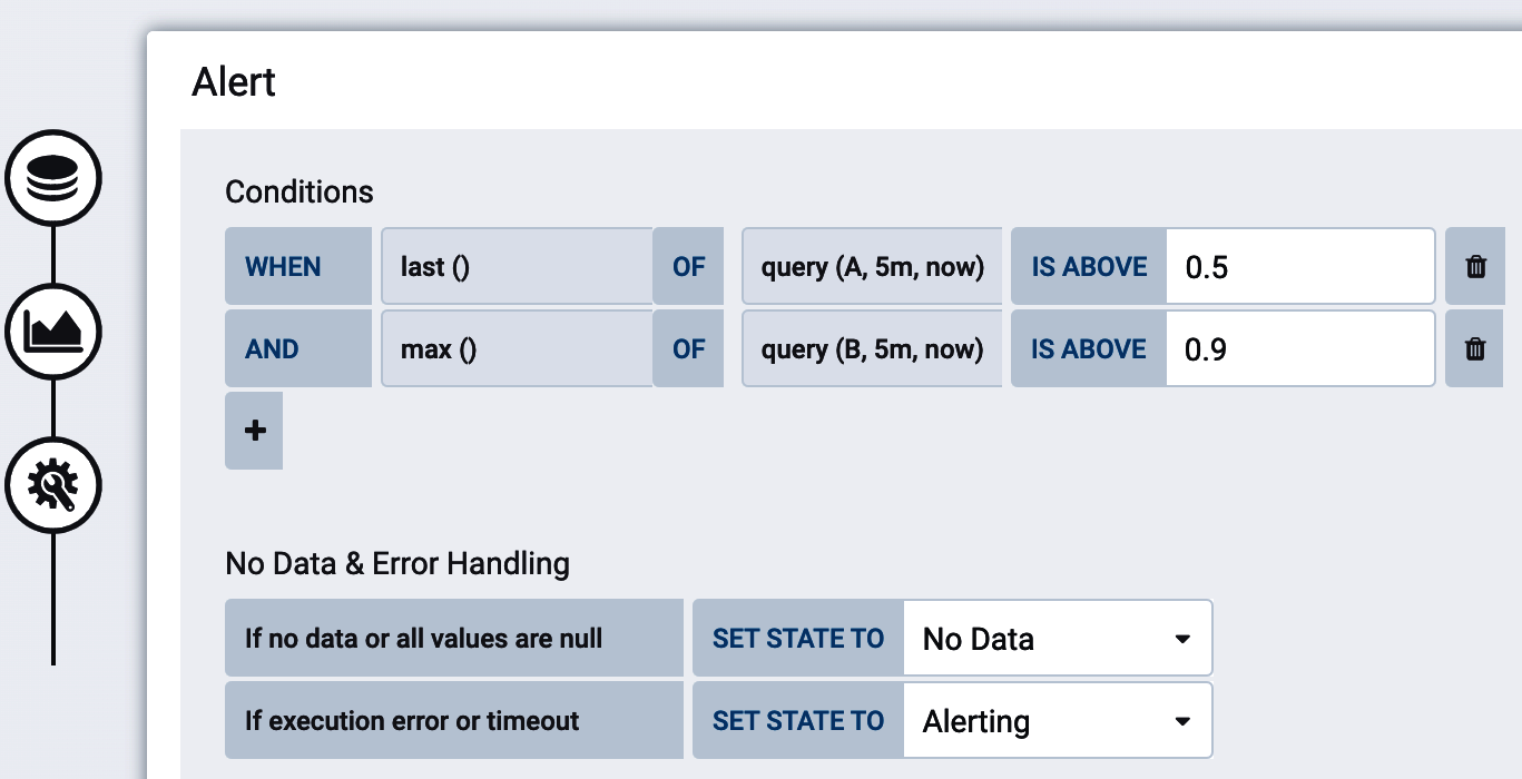
Figure 4-30. Configuring a Grafana alert based on two indicators for low total memory
Another common utilization measurement is CPU, which doesn’t have an easy saturation analog.
CPU Utilization
CPU usage is a common utilization alert to set, but unfortunately it is difficult to establish a general rule for what is a healthy amount of CPU because of the different programming models described below—this will have to be determined for each application, depending on its characteristics.
For example, a typical Java microservice running on Tomcat and serving requests using a blocking servlet model will typically consume available threads in the Tomcat thread pool well before overutilizing the CPU. In these types of applications, high memory saturation is far more common (e.g., lots of excess garbage created in the handling of each request or large request/response bodies).
A Java microservice running on Netty and using a reactive programming model all the way down will accept a much higher throughput per instance, and so CPU utilization tends to be much higher. In fact, better saturating available CPU resources is commonly cited as an advantage of the reactive programming model!
On Some Platforms, Consider CPU and Memory Utilization Together Before Resizing Instances
A common feature of platform as a service is the simplification of instance sizing down to the amount of CPU or memory you desire with the other variable growing proportionally as you move up sizes. In the case of Cloud Foundry, this proportionality between CPU and memory was decided at a time when a blocking model of request handling like Tomcat was almost universal. As noted, CPU tends to be underused in this model. I once consulted at a company that had adopted a nonblocking reactive model for its application, and noticing that memory was significantly underutilized, I downsized the company’s Cloud Foundry instances to not consume as much memory. But CPU is allocated to instances on this platform proportionally to how much memory is requested. By picking a lower memory requirement, the company also inadvertently starved its reactive app of the CPU it would otherwise have so efficiently saturated!
Micrometer exports two key metrics for CPU monitoring, which are listed in Table 4-1. Both of these metrics are reported from Java’s operating system MXBean (ManagementFactory.getOperatingSystemMXBean()).
| Metric | Type | Description |
|---|---|---|
system.cpu.usage |
Gauge |
The recent CPU usage for the whole system |
process.cpu.usage |
Gauge |
The recent CPY usage for the Java virtual machine process |
For the most common case in the enterprise where an application is serving requests via a blocking servlet model, testing against a fixed threshold of 80% is reasonable. Reactive applications will need to be tested empirically to determine their appropriate saturation point.
For Atlas, use the :gt function, as shown in Example 4-25.
Example 4-25. Atlas CPU alert threshold
name,process.cpu.usage,:eq,
0.8,
:gt
For Prometheus, Example 4-26 is just a comparison expression.
Example 4-26. Prometheus CPU alert threshold
process_cpu_usage > 0.8
Process CPU usage should be plotted as a percentage (where the monitoring system should expect an input in the range 0–1 to appropriately draw the y-axis). Take note of the y-axis in Figure 4-31 for what this should look like.
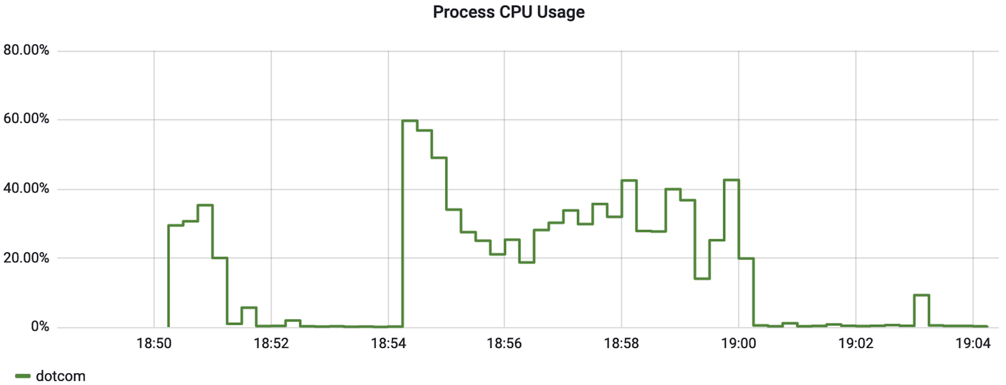
Figure 4-31. Process CPU usage as a percentage
In Grafana, “percent” is one of the units selectable in the “Visualization” tab. Make sure to select the option for “percent (0.0-1.0),” as shown in Figure 4-32.
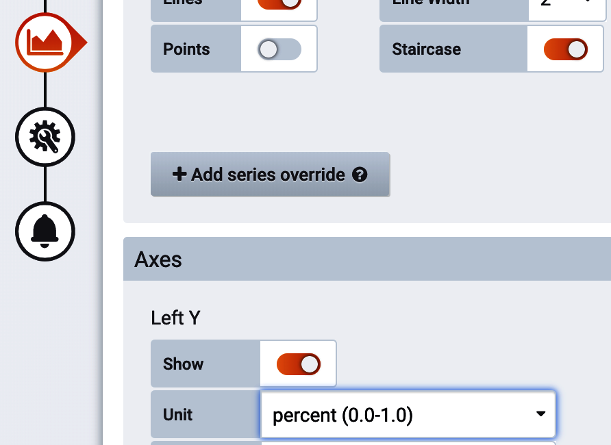
Figure 4-32. Grafana percent unit
There is one more resource-based indicator you should measure on every application related to file descriptors.
File Descriptors
The “ulimits” Unix feature limits how many resources a single user can use, including concurrently open file descriptors. File descriptors are not just consumed for file access, but also for network connections, database connections, etc.
You can view your shell’s current ulimits with ulimit -a. The output is shown in Example 4-27. On many operating systems 1,024 is the default limit for open file descriptors. Scenarios like each service request requiring access to read or write a file where the number of concurrent threads can exceed the operating system limit are vulnerable to this issue. Throughput in the thousands of simultaneous requests is not unreasonable for a modern microservice, especially a nonblocking one.
Example 4-27. Output of ulimit -a in a Unix shell
$ ulimit -a ... open files (-n) 1024... cpu time (seconds, -t) unlimited max user processes (-u) 63796 virtual memory (kbytes, -v) unlimited
This problem isn’t necessarily common, but the impact of reaching the file descriptor limit can be fatal, causing the application to stop responding entirely, depending on how file descriptors are used. Unlike an out-of-memory error or fatal exception, often the application will simply block but appear to be in service still, so this problem is especially pernicious. Because monitoring file descriptor utilization is so cheap, alert on this on every application. Applications using common techniques and web frameworks will probably never exceed 5% file descriptor utilization (and sometimes much lower); but when a problem sneaks in, it is trouble.
Experiencing the File Descriptor Problem While Writing This Book
I’ve known for some time to monitor this, but never actually experienced a problem myself until writing this book. A Go build step involved in building Grafana from source repeatedly hung, never completing. Evidently the Go dependency resolution mechanism doesn’t carefully limit the number of open file descriptors!
An application which may have sockets open to hundreds of callers, HTTP connections to downstream services, connections open to datasources, and data files open could hit the limit of file descriptors. When a process runs out of file descriptors, it tends not to end well. You may see errors in logs like Example 4-28 and Example 4-29.
Example 4-28. Tomcat exhausted file descriptors accepting a new HTTP connection
java.net.SocketException: Too many open files
  at java.net.PlainSocketImpl.socketAccept(Native Method)
  at java.net.AbstractPlainSocketImpl.accept(AbstractPlainSocketImpl.java:398)
Example 4-29. Java failing to open a file when file descriptors are exhausted
java.io.FileNotFoundException: /myfile (Too many open files)
  at java.io.FileInputStream.open(Native Method)
Micrometer reports two metrics shown in Table 4-2 to alert you to a file descriptor problem in your applications.
| Metric | Type | Description |
|---|---|---|
process.max.fds |
Gauge |
Maximum allowable open file descriptors, correspondng to |
process.open.fds |
Gauge |
Number of open file descriptors |
Typically, open file descriptors should remain below the maximum, so a test against a fixed threshold like 80% is a good indicator of an impending problem. This alert should be set on every application, as file limits are a universally applicable hard limit that will take your application out of service.
For Atlas, use the :div and :gt functions, as shown in Example 4-30.
Example 4-30. Atlas file descriptor alert threshold
name,process.open.fds,:eq,
name,process.max.fds,:eq,
:div,
0.8,
:gt
For Prometheus, Example 4-31 looks even simpler.
Example 4-31. Prometheus file descriptor alert threshold
process_open_fds / process_max_fds > 0.8
At this point, we’ve covered the signals that are applicable to most every Java microservice. The ones that follow are commonly useful, but not as ubiquitous.
Suspicious Traffic
One other simple indicator that can be derived from metrics like http.server.requests involves watching the occurrence of unusual status codes. A rapid succession of HTTP 403 Forbidden (and similar) or HTTP 404 Not Found may indicate an intrusion attempt.
Unlike plotting errors, monitor total occurrences of a suspicious status code as a rate and not a ratio relative to total throughput. It’s probably safe to say that 10,000 HTTP 403s per second is equally suspicious if the system normally processes 15,000 requests per second or 15 million requests per second, so don’t let overall throughput hide the anomaly.
The Atlas query in Example 4-32, is similar to the error rate query we discussed earlier, but looks at the status tag for more granularity than the outcome tag.
Example 4-32. Suspicious 403s in HTTP server requests in Atlas
name,http.server.requests,:eq,
status,403,:eq,
:and,
uri,$ENDPOINT,:eq,:cq
Use the Prometheus rate function to achieve the same result in Prometheus, as in Example 4-33.
Example 4-33. Suspicious 403s in HTTP server requests in Prometheus
sum(
  rate(
    http_server_requests_seconds_count{status="403", uri="$ENDPOINT"}[2m]
  )
)
The next indicator is specialized to a particular kind of application but is still common enough to include.
Batch Runs or Other Long-Running Tasks
One of the biggest risks of any long-running task is that it runs for significantly longer than expected. Earlier in my career, I was routinely on call for production deployments, which were always performed after a series of midnight batch runs. Under normal circumstances, the batch sequence should have completed maybe at 1:00 a.m. The deployment schedule was built around this assumption. So a network administrator manually uploading the deployed artifact (this is before Chapter 5) needed to be at a computer ready to perform the task at 1:00 a.m. As the representative of the product’s engineering team, I needed to be ready to perform a brief smoke test at approximately 1:15 a.m. and be available to help remediate any issues that arose. At this time, I lived in a rural area without internet access, so I traveled along a state highway toward a population center until I could get a reliable enough cell signal to tether to my phone and connect to the VPN. When the batch processes didn’t complete in a reasonable amount of time, I sometimes spent hours sitting in my car on some country road waiting for them to complete. On days when production deployments weren’t happening, perhaps nobody knew that the batch cycle failed until the next business day.
If we wrap a long-running task in a Micrometer Timer, we won’t know that the SLO has been exceeded until the task actually completes. So if the task was supposed to take no more than 1 hour, but it actually runs for 16 hours, then we won’t see this appear on a monitoring chart until the first publishing interval after 16 hours when the sample is recorded to the timer.
To monitor long-running tasks, it is better to look at the running time of in-flight or active tasks. LongTaskTimer performs this kind of measurement. We can add this kind of timing to a potentially long-running task, as in Example 4-34.
Example 4-34. An annotation-based long task timer for a scheduled operation
@Timed(name="policy.renewal.batch",longTask=true)@Scheduled(fixedRateString="P1D")voidrenewPolicies(){// Bill and renew insurance policies that are beginning new terms today}
Long task timers ship several distribution statistics: active task count, the maximum in-flight request duration, the sum of all in-flight request durations, and optionally percentile and histogram information about in-flight requests.
For Atlas, test against our expectation of one hour in nanoseconds, as shown in Example 4-35.
Example 4-35. Atlas long task timer maximum alert threshold
name,policy.renewal.batch.max,:eq, 3.6e12,:gt
For Prometheus, Example 4-36 is tested against one hour in seconds.
Example 4-36. Prometheus long task timer maximum alert threshold
policy_renewal_batch_max_seconds > 3600
We’ve seen some examples of effective indicators to look at, and at this point hopefully you have one or more of them plotted on a dashboard and can see some meaningful insights. Next we turn to how to automate alerting when these indicators go awry so that you don’t have to watch your dashboards all the time to know when something isn’t right.
Building Alerts Using Forecasting Methods
Fixed alert thresholds are often difficult to determine a priori, and since system performance is subject to drift over time, can be something that continually needs to be retuned. If performance over time tends to decline (but in such a way that the decline is still within acceptable levels), then a fixed alert threshold can easily become too chatty. If performance tends to improve, then the threshold is no longer as reliable of a measure of expected performance unless it is tuned.
Machine learning is the subject of a lot of hype that the monitoring system will automatically determine alert thresholds, but it hasn’t produced the promised results. For time series data, simpler classical statistical methods are still incredibly powerful. Surprisingly, the paper by S. Makridakis et al., “Statistical and Machine Learning Forecasting Methods: Concerns and Ways Forward”, shows that statistical methods have a lower prediction error (as shown in Figure 4-33) than machine learning methods do.
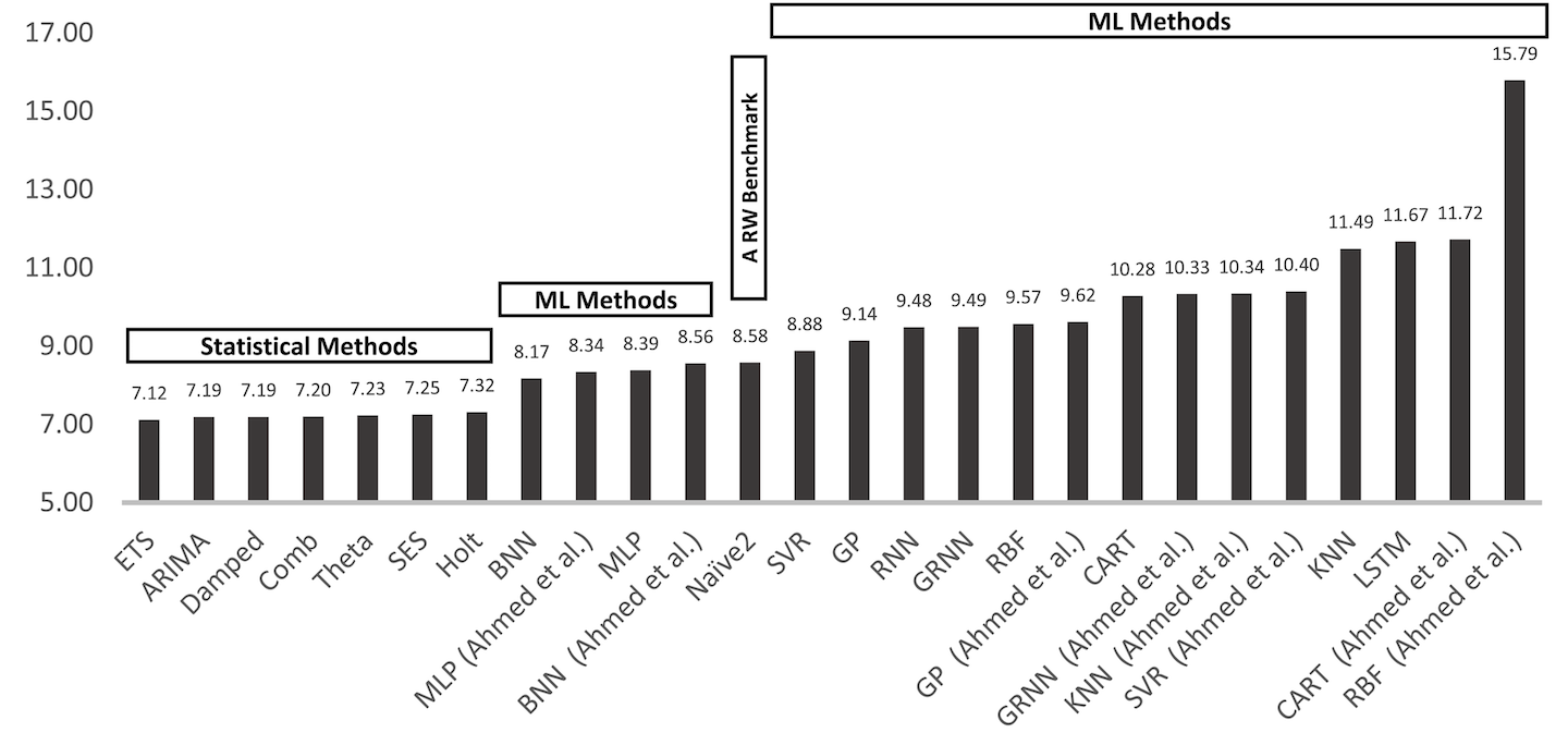
Figure 4-33. One-step forecasting error of statistical versus machine learning techniques
Let’s cover a few of these statistical methods, starting with the least predictive naive method, which can be used with any monitoring system. Later approaches have less universal support from monitoring systems since their math is complicated enough to require built-in query functions.
Naive Method
The naive method is a simple heuristic that predicts the next value based on the last observed value:
A dynamic alert threshold can be determined with the naive method by multiplying a time series offset by some factor. Then we can test whether the true line ever drops below (or exceeds if the multiplier is greater than one) the forecast line. For example, if the true line is a measure of throughput through a system, a sudden substantial drop in throughput may indicate an outage.
The alert criteria for Atlas is then whenever the query in Example 4-37 returns 1. The query is designed against Atlas’s test dataset, so it’s easy for you to test out and try different multipliers to observe the effect.
Example 4-37. Atlas alert criteria for the naive forecasting method
name,requestsPerSecond,:eq, :dup, 0.5,:mul,1m,:offset,
:rot, :lt

The tightness of the threshold is set with this factor.

“Look back” to some prior interval for the forecast.
The effect of the naive method can be seen in Figure 4-34. The multiplicative factor (0.5 in the example query) controls how close to the true value we want to set the threshold and also reduces by the same amount the spikiness of the forecast (i.e., the looser the threshold, the less spiky the forecast). Since the method’s smoothing is proportional to looseness of fit, the alert threshold is still tripped four times in this time window (indicated by the vertical bars in the middle of the chart), even though we’ve allowed for a 50% drift from “normal.”
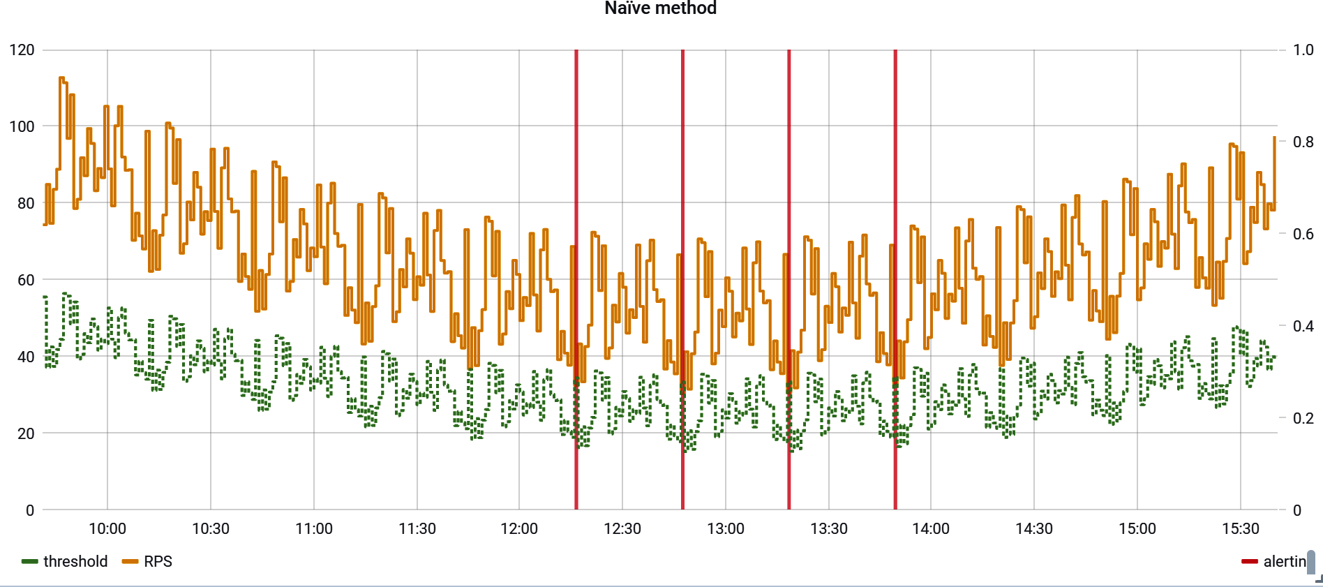
Figure 4-34. Forecasting with the naive method
In order to prevent a chatty alert, we’d have to reduce the tightness of the forecast’s fit to our indicator (in this case a 0.45 multiplier silences the alert for this time window). Of course, doing so also allows for more drift from “normal” before an alert is fired.
Single-Exponential Smoothing
By smoothing the original indicator before multiplying it by some factor, we can fit the threshold closer to the indicator. Single-exponential smoothing is defined by Equation 4-1.
Equation 4-1. Where
is a smoothing parameter. When , all the terms except the first are zeroed and we are left with the naive method. Values less than 1 suggest how important previous samples should be.
Like for the naive method, the alert criteria for Atlas is whenever the query in Example 4-38 returns 1.
Example 4-38. Atlas alert criteria for single-exponential smoothing
alpha,0.2,:set, coefficient,(,alpha,:get,1,alpha,:get,:sub,),:set, name,requestsPerSecond,:eq, :dup,:dup,:dup,:dup,:dup,:dup, 0,:roll,1m,:offset,coefficient,:fcall,0,:pow,:mul,:mul, 1,:roll,2m,:offset,coefficient,:fcall,1,:pow,:mul,:mul, 2,:roll,3m,:offset,coefficient,:fcall,2,:pow,:mul,:mul, 3,:roll,4m,:offset,coefficient,:fcall,3,:pow,:mul,:mul, 4,:roll,5m,:offset,coefficient,:fcall,4,:pow,:mul,:mul, 5,:roll,6m,:offset,coefficient,:fcall,5,:pow,:mul,:mul, :add,:add,:add,:add,:add, 0.83,:mul,:lt,
The summation is a geometric series that converges to 1. For example, for , see Table 4-3.
0 |
0.5 |
0.5 |
1 |
0.25 |
0.75 |
2 |
0.125 |
0.88 |
3 |
0.063 |
0.938 |
4 |
0.031 |
0.969 |
5 |
0.016 |
0.984 |
Since we don’t include all values of T, the smoothed function is effectively already multiplied by a factor equal to the cumulative sum of this geometric series up to the number of terms we have chosen. Figure 4-35 shows summations of one term and two terms in the series relative to the true value (respectively from bottom to top).
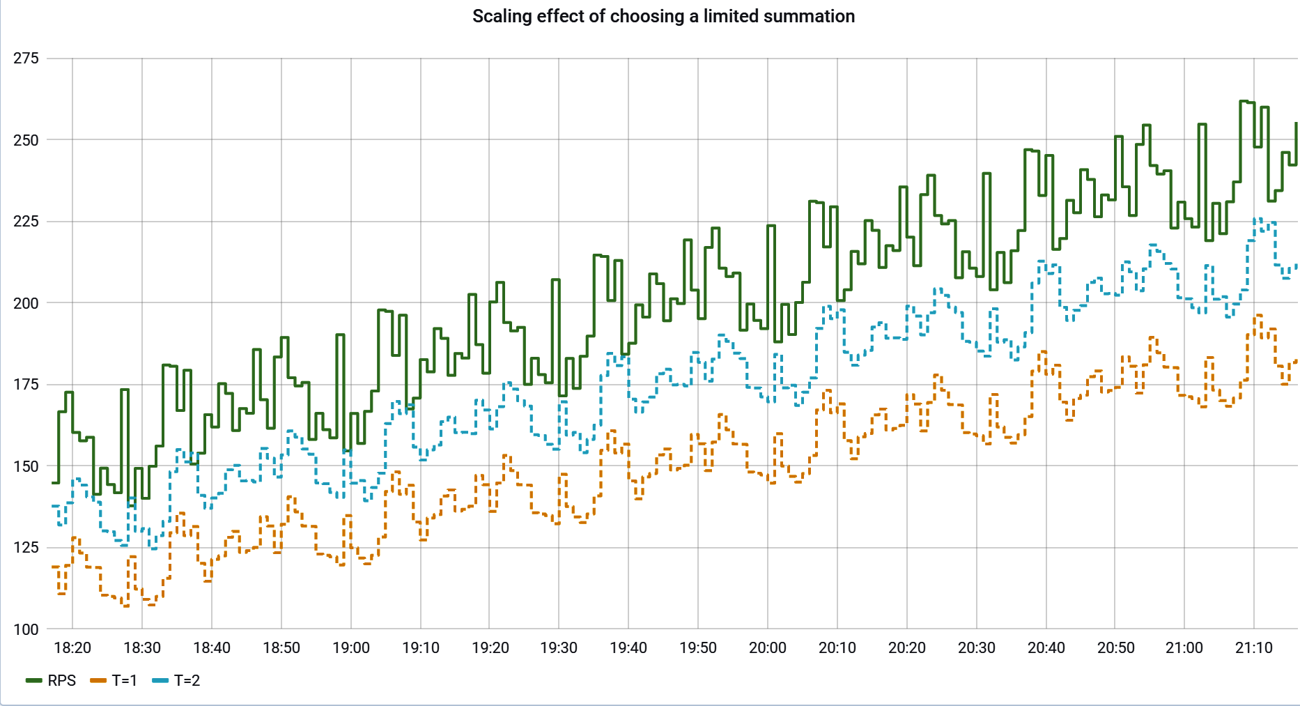
Figure 4-35. Scaling effect of choosing a limited summation
Figure 4-36 shows how different selections of and affect the dynamic threshold, in terms of both how smoothed it is and its approximate scaling factor relative to the true indicator.
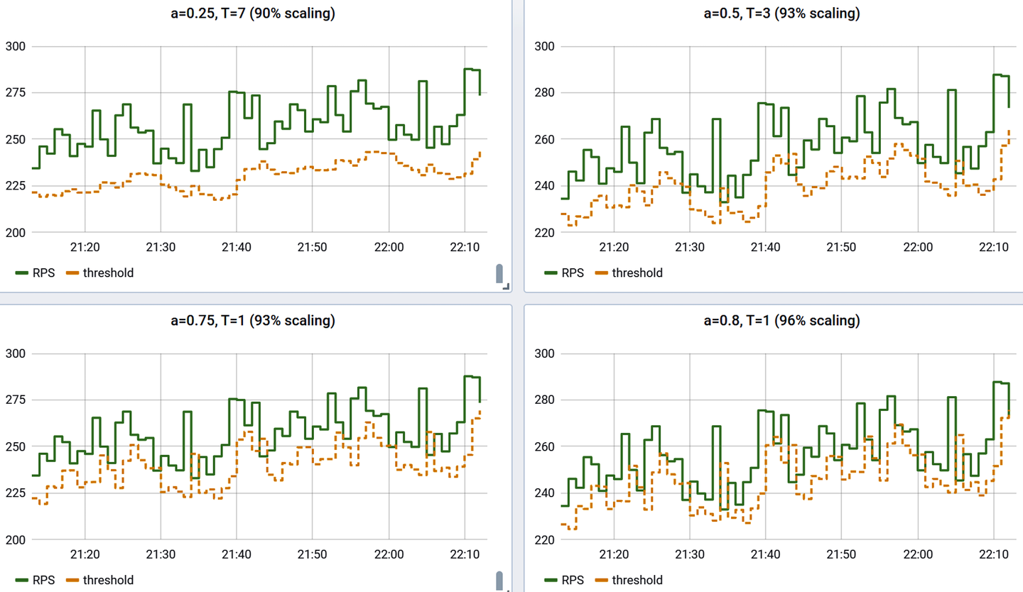
Figure 4-36. Smoothing and scaling effect when choosing different and
Universal Scalability Law
In this section, we are going to shift our mindset entirely from smoothing datapoints that happened in the past (which we used as dynamic alert thresholds) to a technique that allows us to predict what future performance will look like if concurrency/throughput increases beyond current levels, using only a small set of samples of what performance has looked like at already-seen concurrency levels. In this way, we can set predictive alerts as we approach a service-level objective boundary to hopefully head off problems rather than reacting to something already exceeding the boundary. In other words, this technique allows us to test a predicted service-level indicator value against our SLO at a throughput that we haven’t yet experienced.
This technique is based on a mathematical principle known as Little’s Law and the Universal Scalability Law (USL). We’ll keep the mathematical explanation here to a minimum. What little is discussed you can skip past. For more details, Baron Schwartz’s freely available Practical Scalability Analysis with the Universal Scalability Law (VividCortex) is a great reference.
Using Universal Scalability Law in the Delivery Pipeline
In addition to predicting impending SLA violations in production systems, we can use the same telemetry in a delivery pipeline to throw some traffic at a piece of software that doesn’t need to be anywhere close to the maximum traffic it might see in production and predict whether production-level traffic will meet an SLA. And we can do this before deploying a new version of the software to production!
Little’s Law, Equation 4-2, describes the behavior of queues as a relationship between three variables: queue size (), latency (), and throughput (). If the application of queuing theory to SLI predictions seems a little mind-bending, don’t worry (because it is). But for our purposes in predicting an SLI, will represent the concurrency level of requests passing through our system, the throughput, and a latency measure like average or a high-percentile value. Since this is a relationship between three variables, provided any two we can derive the third. Since we care about predicting latency (), we’d need to forecast this in the two dimensions of concurrency () and throughput ().
Equation 4-2. Little’s Law
The Universal Scalability Law, Equation 4-3, allows us instead to project latency in terms of only a single variable: either throughput or concurrency. This equation requires three coefficients, which will be derived and updated from a model maintained by Micrometer based on real observations about the system’s performance to this point. USL defines to be the cost of crosstalk, to be the cost of contention, and to be how fast the system operates under unloaded conditions. The coefficients become fixed values making predictions on latency, throughput, or concurrency dependent on only one of the other three. Micrometer will also publish the values of these coefficients as they change over time, so you can compare the system’s major governing performance characteristics over time.
Equation 4-3. Universal Scalability Law
With a series of substitutions, we get to express in terms of or (see Equation 4-4). Again, don’t think too hard about these relationships, because Micrometer is going to do these calculations for you.
Equation 4-4. Predicted latency as a function of either throughput or concurrency
What we’ll get is a nice two-dimensional projection instead, as shown in Figure 4-37.
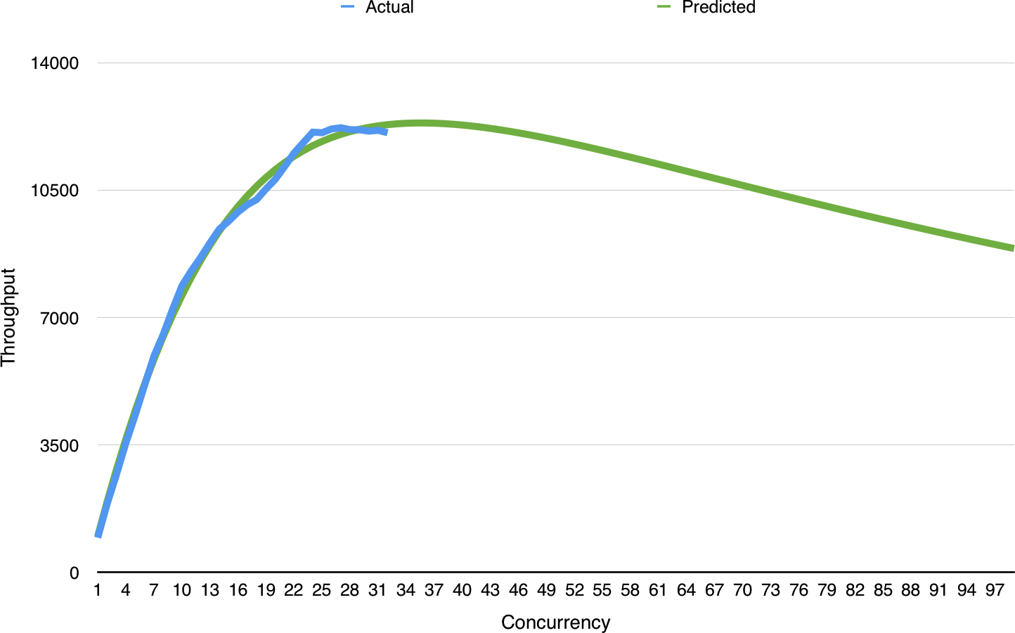
Figure 4-37. USL prediction of latency based on different throughput levels
USL forecasting is a form of “derived” Meter in Micrometer and can be enabled as shown in Example 4-39. Micrometer will publish a set of Gauge meters forming a series of forecasts at various throughput/concurrency levels for each publishing interval. Throughput and concurrency are correlated measurements, so think of them interchangeably from this point on. When you select a related group of timers (which will always have the same name) to publish a forecast for, Micrometer will publish several additional metrics using the common metric name as a prefix:
- timer.name.forecast
-
A series of
Gaugemeters with a tagthroughputorconcurrencybased on the type of independent variable selected. At a certain time interval, plotting these gauges would generate a visualization like Figure 4-37. - timer.name.crosstalk
-
A direct measure of the system’s crosstalk (e.g., fan-out in a distributed system like that described in the paper by S. Cho et al., “Moolle: Fan-out Control for Scalable Distributed Data Stores”).
- timer.name.contention
-
A direct measure of the system’s contention (e.g., locking on relational database tables and in general any other form of lock synchronization).
- timer.name.unloaded.performance
-
Improvements in ideal unloaded performance (e.g., framework performance improvements) can be expected to yield improvements in loaded conditions as well.
Example 4-39. Universal scalability law forecast configuration in Micrometer
UniversalScalabilityLawForecast.builder(registry.find("http.server.requests").tag("uri","/myendpoint").tag("status",s->s.startsWith("2"))).independentVariable(UniversalScalabilityLawForecast.Variable.THROUGHPUT)// In this case, forecast to up to 1,000 requests/second (throughput).maximumForecast(1000).register(registry);

The forecast will be based on the results of a Micrometer meter search for one or more timers with name
http.server.requests(remember, there may be several such timers with different tag values).
We can further limit the set of timers to base the forecast on by only matching on timers that have a specific key-value tag pair.

Like with any search, the tag value can be constrained with a lambda as well. A good example is constraining the forecast to any “2xx” HTTP statuses.

The domain of the
Gaugehistogram will be eitherUniversalScalabilityLawForecast.Variable.CONCURRENCYorUniversalScalabilityLawForecast.Variable.THROUGHPUT, defaulting toTHROUGHPUT.
The latency an application is experiencing at its current throughput in one of these time slices will closely follow the “predicted” latency from the forecast. We can set an alert based on some scaled-up value of whatever the current throughput is to determine if the predicted latency at that scaled-up throughput would still be under our SLO.
In addition to predicting an SLI under increased throughput, the modeled values for crosstalk, contention, and unloaded performance are a strong indicator of where performance improvements can be made in an application. After all, decreases in crosstalk and contention and increases in unloaded performance directly impact the system’s predicted and actual latency under various levels of load.
Summary
This chapter has presented you with the tools you need to start monitoring every Java microservice for availability with signals that are included in Java frameworks like Spring Boot. We’ve also discussed more generally how to alert on and visualize classes of metrics like counters and timers.
Though you should strive for finding ways of measuring microservice availability in terms of business-focused metrics, using these basic signals is a huge step forward over simply looking at box metrics in terms of understanding how your service is performing.
Organizationally, you’ve committed to standing up a dashboarding/alerting tool. We showed Grafana in this chapter. Its open source availability and datasources for a wide array of popular monitoring systems make it a solid choice to build on top of without locking yourself in completely to a particular vendor.
In the next chapter, we’re going to transition to delivery automation, where we’ll see how some of these availability signals are used in making decisions about the fitness of new microservice releases. Effective delivery isn’t strictly about the motion of deploying; it turns monitoring into action.
Get SRE with Java Microservices now with the O’Reilly learning platform.
O’Reilly members experience books, live events, courses curated by job role, and more from O’Reilly and nearly 200 top publishers.

