Chapter 1. Four Key Metrics Unleashed
You’d be forgiven for thinking that Dr. Nicole Forsgren, Jez Humble, and Gene Kim’s groundbreaking book Accelerate (IT Revolution Press, 2018) is both the first and last word on how to transform your software delivery performance, all measured by the simple yet powerful four key metrics.
Having based my transformation work around many of their book’s recommendations, I certainly have no issue with any of its content. But rather than removing the need for anything in even greater detail, I think the book should be discussed and analyzed further to enable the sharing of experiences and the gathering of a community of people practicing architecture who want to improve. I hope that this chapter will contribute to such a discussion.
I have seen, when used in the way described later in the chapter, that the four key metrics—deployment frequency, lead time for changes, change failure rate, and time to restore service—lead to a flowering of learning and allow teams to understand the need for a high-quality, loosely coupled, deliverable, testable, observable, and maintainable architecture. Deployed effectively, the four key metrics can allow you as an architect to loosen your grip on the tiller. Instead of dictating and controlling, you can use the four key metrics to generate conversations with team members and stimulate desire to improve overall software architecture beyond yourself. You can gradually move toward a more testable, coherent and cohesive, modular, fault-tolerant and cloud native, runnable, and observable architecture.
In the sections that follow, I’ll show to get your four key metrics up and running, as well as (more importantly) how you and your software teams can best use the metrics to focus your continuous improvement efforts and track progress. My focus is on the practical aspects of visualizing the mental model of the four key metrics, sourcing the required three raw data points, then calculating and displaying the four metrics. But don’t worry: I’ll also discuss the benefits of architecture that runs in production.
Definition and Instrumentation
Paradigms are the sources of systems. From them, from shared social agreements about the nature of reality, come system goals and information flows, feedbacks, stocks, flows and everything else about systems.
Donella Meadows, Thinking in Systems: A Primer1
The mental model that underpins Accelerate gives rise to the four key metrics. I begin here because this mental model is essential to keep in mind as you read this chapter. In its simplest form, the model is a pipeline (or “flow”) of activities that starts whenever a developer pushes their code changes to version control, and ends when these changes are absorbed into the running system that the teams are working on, delivering a running service to its users. You can see this mental model in Figure 1-1.
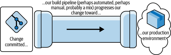
Figure 1-1. The fundamental mental model behind the four key metrics
For clarity, let’s visualize what the four key metrics measure within this model:
- Deployment frequency
- The number of individual changes that make their way out of the end of the pipe over time. These changes might consist of “deployment units”: code, config, or a combination of both, including, for example, a new feature or a bug fix.
- Lead time for changes
- The time a developer’s completed code/config changes take to make their way through the pipeline and out the other end.
Taken together, this first pair measures development throughput. This should not be confused with lean cycle time or lead time, which includes time to write the code, sometimes the clock even starting when the product manager first comes up with the idea for their new feature.
- Change failure rate
- The proportion of changes coming out the pipe that cause a failure in our running service. (The specifics of what defines a “failure” will be covered shortly. For now, just think of failure as something that stops users of your service from getting their tasks done.)
- Time to restore service
- How long it takes, after the service experiences a failure, to become aware of it and deliver the fix that restores the service to users.2
Taken together, this second pair gives an indication of service stability.
The power of these four key metrics is in their combination. If you improve an element of development throughput but degrade service stability in the process, then you’re improving in an unbalanced way and will fail to realize long-term sustainable benefits. The fundamental point is that you keep an eye on all of the four key metrics. Transformations that realize predictable, long-term value are ones that deliver positive impact across the board.
Now that we are clear on where our metrics come from, we can complicate matters by mapping the generic mental model onto your actual delivery process. I’ll spend the next section showing how to perform this “mental refactoring.”
Refactoring Your Mental Model
Defining each metric for your circumstances is essential. As you have most likely guessed, the first two metrics are underpinned by what happens in your CI pipelines, and the second pair require tracking service outages and restoration.
Consider scope carefully as you perform this mental refactoring. Are you looking at all changes for all pieces of software across your organization? Or are you considering those in your program of work alone? Are you including infrastructure changes or just observing those for software and services? All these possibilities are fine, but remember: the scope you consider must be the same for each of the four metrics. If you include infrastructure changes in your lead time and deployment frequency, include outages induced by infrastructure changes, too.
Pipelines as Your First Port of Call
Which pipelines should you be considering? The ones you need are those that listen for code and config changes in a source repository within your target scope, perform various actions as a consequence (such as compilation, automated testing, and packaging), and deploy the results into your production environment. You don’t want to include CI-implemented tasks for things like database backups.
If you only have one code repository served by one end-to-end pipeline (e.g., a monolith stored in a monorepo and deployed directly, and in a single set of activities, to production), then your job here is easy. The model for this is shown in Figure 1-2.
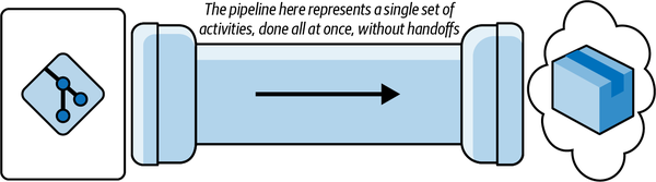
Figure 1-2. The simplest source-control/pipeline/deployment model you’ll find
Unfortunately, while this is exactly the same as our fundamental mental model, I’ve rarely seen this in reality. We’ll most likely have to perform a much broader refactoring of the mental model to reach one that represents your circumstances.
The next easiest to measure and our first significant mental refactor is a collection of these end-to-end pipelines, one per artifact or repository (for example, one per microservice), each of which does all its own work and, again, ends in production (Figure 1-3). If you’re using Azure DevOps, for example, it’s simple to create these.3
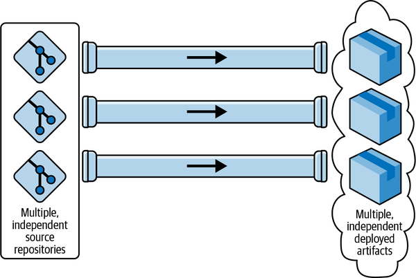
Figure 1-3. The “multiple end-to-end pipelines model” is ideal for microservices
These first two pipeline shapes are most likely similar to what you have, but I’m going to guess that your version of this picture will be slightly more complicated and require one more refactor to be split into a series of subpipelines (Figure 1-4). Let’s consider an example that shows three of these subpipelines, which fit end-to-end to deliver a change to production.
Perhaps the first subpipeline listens for pushes to the repo and undertakes compilation, packaging, and unit and component testing, then publishes to a binary artifact repository. Maybe this is followed by a second, independent subpipeline that deploys this newly published artifact to one or more environments for testing. Possibly a third subpipeline, triggered by something like a CAB process,4 finally deploys the change to production.
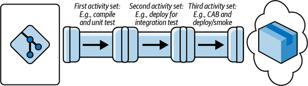
Figure 1-4. The “pipeline made of multiple subpipelines” model, which I encounter frequently
Hopefully you’ve identified your circumstances. But if not, there is a fourth major variety of pipeline, which our final mental-refactoring step will get us to: the multistage fan-in, shown in Figure 1-5. Here we typically find individual subpipelines for the first stage, one per repository, which then “fan in” to a shared subpipeline or set of subpipelines that take the change the rest of the way to production.
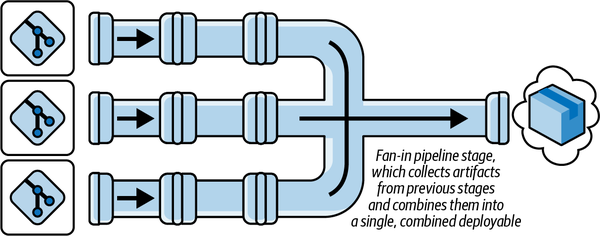
Figure 1-5. The multistage “fan-in pipeline” model
Locating Your Instrumentation Points
As well as having four metrics, we have four instrumentation points. Let’s now move to locating them in our mental model, whatever form yours takes. We’ve focused on pipelines so far because they typically provide two of those points: a commit timestamp and a deployment timestamp. The third and fourth instrumentation points come from the timestamps created when a service degradation is detected and when it is marked as “resolved.” We can now discuss each in detail.
Commit timestamp
Subtleties inevitably arise here when you consider teams’ work practices. Are they branching by feature? Are they doing pull requests? Do they have a mix of different practices? Ideally (as the authors of Accelerate suggest), your clock starts ticking whenever any developer change-set is considered complete and is committed, wherever that might be. If the teams are doing this, beware: this holding of changes on branches not only extends feedback cycles but also adds both overhead and infrastructure requirements to your effort. (I’ll cover those in the next section.)
Because of this complexity, some choose to use the triggering of a pipeline from a merge to main as a proxy trigger point or commit timestamp. I understand that this might sound like admitting defeat in the face of suboptimal practice,5 but if you choose a proxy trigger, I know you will have a guilty conscience (because you know you’re not following standard best practice). Whether we include the extra wait time or not, the metrics will lead to many other benefits for you even if you give yourself a break and start your early sampling when the code hits main. If and when these proxies do turn out to be the source of significant delivery suboptimization, Accelerate has recommendations for you (such as trunk-based development and pair programming),6 which play into your commit timestamp by making the time a change hits main as the time you want to start the timer. By then, you’ll have begun to see the benefits of the metrics and want to improve your capture of them.
Deployment timestamp
With the commit time out of the way, you’ll be pleased to hear that the “stop” of the clock is far simpler: it’s when the pipeline doing the final deployment to production completes. Doesn’t this give those who do manual smoke testing after the fact a break? Yes, but again I’ll leave this to your conscience, and if you really want to include this final activity, you can always put a manual checkpoint at the end of your pipelines, which the QA (or whoever checks deployments) presses once they are satisfied that the deployment was successful.
Complexities arising from multistage and fan-in pipelines
Given these two data sources, you can calculate the information we need from our pipelines, and that is total time to run: the elapsed time between clock start and clock stop. If you have one of the simpler pipeline scenarios we discussed earlier, the ones that do not fan in, then this is relatively easy. Those with one or more end-to-end pipelines have it easiest of all.7
If you are unlucky and have multiple subpipelines (as we saw in Figure 1-4), then you’ll need to perform additional data collection to the change set(s) that were included in a “start” timestamp and in the “deploy” to production. Given this data, you can do some processing to calculate the total time to run for each individual change.
If you run a fan-in design (shown in Figure 1-5), this processing will likely be more involved. Why? As you’ll see in Figure 1-6, you’ll need a way of knowing where the change-deployment number 264 originated (Repo A, Repo B, or Repo C) so you can get the “start” timestamp for the change. If your deployment aggregates a number of changes, then you will need to trace each back individually to get its “start” time.
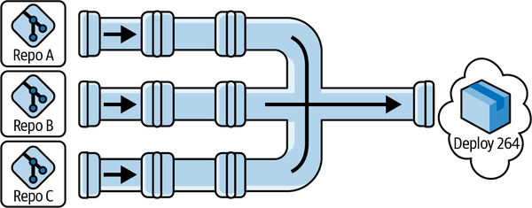
Figure 1-6. Locating your data collection points in the “fan-in pipeline” model variant
Clearly, in all cases, no matter how complicated your pipelines, you only want to count builds that deploy service updates to users. Make sure you only measure these.8
There’s one final point to make about data capture from pipelines before we move on, and that is which pipeline runs to count? Again, Accelerate isn’t explicit on this point, but you only care about the runs that succeed. If a build starts but fails at the compilation step, it will skew your lead times in an artificially positive direction because you will have just added a really quick build in the mix. If you want to game things (and the biggest benefit of the four key metrics is that they’re not gameable, at least not to my knowledge), then you just submit lots of builds you know will break, ideally, really quickly.
Monitoring for service failures
While it is relatively simple to be accurate about measurements around our pipelines, the third and final source of raw information is far more open to interpretation.
The difficulties arise in defining “a failure in production.” If there is a failure but no one spots it, was it even really there? Whenever I have used the four key metrics, I have answered this in the negative. I define “failures in production” as anything that makes a consumer of the service unable, or even disinclined, to stick around to complete the job they were attempting to perform. Cosmetic defects don’t count as service failures, but a “working system” so slow as to cause uncharacteristic user dropout clearly is experiencing a service failure. There is an element of judgment in this, and that’s fine: pick a definition that makes you comfortable and be honest with yourself as you stick to it.
You now need to record service failures, which are our third and final instrumentation point, typically by means of a “change failure” ticket. The opening of this ticket gives you a start time data point for another clock; closing it gives you the corresponding end time. This start and end time, plus the number of tickets, are all the remaining data points you will need. A ticket should be closed when service is restored. This might not correspond to the root cause of the failure being addressed; that’s fine. We’re talking about service stability. Rolling back so you’re online and serving customers is acceptable here.9
But what if you’re not in production? First, haven’t you tried to start moving to continuous deployment yet? You really ought to. But second, this option isn’t available to everyone. It’s suboptimal, but you can still use the four key metrics in these circumstances. To do so, you need to define your “highest environment”: the shared one closest to production into which all teams are delivering. It’s probably called SIT (for system integration), pre-prod, or staging. The key thing is that when you accept your changes, you believe there is no more work required to take your changes on the final step to production.
Given all these considerations, you need to treat this “highest environment” just like you would production. Treat testers and collaborating teams as your “users.” They get to define service failures. Treat the test failures as seriously as you would real failures. It’s not perfect to pretend this environment is production, but it’s better than nothing.
Capture and Calculation
Systems modelers say that we change paradigms by building a model of the system, which takes us outside the system and forces us to see the whole.
Donella Meadows, Thinking in Systems10
Now that you have your definitions, you can start capturing and calculating. While it’s desirable to automate this capture process, it’s perfectly acceptable to do it manually.11 In fact, every time I’ve rolled out the four key metrics, this is where I’ve started, and frequently not only for our initial baseline. You’ll understand in a few paragraphs why it’s fine to capture and calculate manually.
Capturing metrics can be a simple or complex task, depending on the nature of your pipelines. Regardless, the four key metrics will be calculated using four sets of data arising from the four instrumentation points: successful change deployment counts, total times to run the pipeline(s) for each change, counts of change failure tickets, and the length of time change failure tickets are open. These captured data sets alone are not enough to get your metrics; you still need to calculate, so let’s look at each of these in turn:
- Deployment frequency
-
This is a frequency, not a count, and therefore you need the total number of successful deployments within a given time period (I’ve found that a day works well). If you have multiple pipelines, whether you fan-in or not, you’ll want to sum the number of deployments from them all.
With this data, recorded and summed on a daily basis (remember to include the “zero” sums for days with no deploys), it’s simple to get to your first headline metric. Working with the latest daily figure or the figure from the last 24 hours will (in my experience) suffer from too much fluctuation. It works best to display the mean over a longer time period, such as the last 31 days.
- Lead time for changes
- This is the elapsed time for any single change that triggers the start. This can fluctuate, so don’t just report the most recent figure from the latest deployment. If you have multiple (including fan-in) pipelines, this fluctuation will be far greater, because some builds run a lot faster than others due to blocking. You want something a bit more stable that reflects the general state of affairs, as opposed to the latest outlier. Consequently, I usually take each individual lead time measurement and calculate the mean of all of them over the course of a day. The figure to report is the mean of all the lead time measurements over the last 31 days.12
- Change failure rate
This is the proportion of change failure tickets resolved, specifically the number of deployments that gave rise to failures as a fraction of the total number of deployments over the same period. For example, if you had 36 deployments in a day, and within the same day you resolved 2 change failures, that would mean your change failure rate for that day was 2/36, or 5.55555556%.
To get to your reported metric, look at this rate over the same time period: the previous 31 days. That means you sum the number of restored failures over the last 31 days, then divide that by the total number of deployments over the same period.
You’ll notice that there is a leap of faith here. We’re assuming that the failures are distinct and that a single failure is caused by a single deployment. Why? Because in my experience it’s just too hard to tie failures back to individual builds, and in the vast majority of incidents, these two assumptions hold, at least enough to make them worth the loss in fidelity. If you’re in a position to be smarter about this, congratulations!
The sharp-eyed will also note that we’re only talking about resolved failures. Why are we not including failures that are still open? Because we want consistency across all four of our metrics and because time to restore service can only consider resolved failures.13 If we can’t count unresolved failures for one thing, we don’t want to count them for the other. But never fear: we still have the data on open failures, and we don’t hide this, as you’ll see in the sections that follow.
- Time to restore service
-
This is the time a change failure ticket takes to go from being created to being closed. The authors of Accelerate call this mean time to restore service, though in earlier State of DevOps reports, it was just time to restore, and in the METRICS.md file for the Four Keys project from Google, it’s median time to restore. I’ve used both mean and median; the former is sensitive to outliers, and sometimes that’s exactly what you want to see as you learn.
Both mean and median are easy to calculate from your change failure tickets’ time-to-resolution data. Either way, you want to select your inputs across a data range. I usually end up using the last 120 days. Take all the failure resolution times that fell within that period, calculate their mean, and report it for this metric.
This has the potential for another leap of faith: when you raise change failures manually, it’s possible to skew these figures by delaying ticket opening beyond the immediate point of discovery. In all honesty, even if people have the best of intentions, skewing will happen. Yet you’ll still get good enough data to keep an eye on things and drive improvements.
However you capture your data that feeds into these calculations, make sure it all happens out in the open. First, encourage development teams to read up on the four key metrics. There should be nothing secret about your effort.
Second, make all your raw data and calculations available, as well as the calculated headline figures. This becomes important later.
Third, ensure that the definitions you have specifically applied to each metric, and how you are treating those definitions, are available alongside the data itself. This transparency will deepen understanding and heighten engagement.14
Pay attention to this question of access (access to data, calculations, and visualizations), because if your four key metrics aren’t shared with everyone, then you are missing out on their greatest strength.
Display and Understanding
[So] how do you change paradigms?...You keep pointing at the anomalies and failures in the old paradigm. You keep speaking and acting, loudly and with assurance, from the new one.
Donella Meadows, Thinking in Systems15
Whenever I’ve deployed the four key metrics, I’ve typically started with a minimal viable dashboard (MVD),16 which is a grand name for a wiki page with the following:
The current calculated values of each of the four key metrics
The definitions of each metric, and the time periods across which we calculate them
The historical values of the data
I also flag the data sources so everyone can engage with them.
Target Audience
Metrics, like all statistics, tell a story, and stories have audiences. Who is the target audience for the four key metrics? Primarily, the teams delivering the software, the people who will actually make the changes if they want to see the metrics improve.
You therefore want to ensure that wherever and however you choose to display things, it needs to be in a place that is primarily readily accessible to these individuals and groups. The “readily” is important. It needs to be trivially easy to see the metrics and to drill down into them and find out more, typically, those data points that are specific to the services they own.
There are other audiences for the four key metrics, but these are secondary. One secondary audience might be senior management or executive management. It is fine for them to see the metrics, but the metrics need to be rolled up and read-only. If executive management wants to know more detail, then they will come down to the teams to obtain it, and that is exactly what you want to happen.
Ideally, the moment you have your MVD up, you can start work on automating collection and calculation. As I write this, there are various options. Perhaps you will end up using Four Keys from Google, Metrik from Thoughtworks, or various extensions for platforms, such as Azure DevOps. I’ve not used any of them, and while I am certain all are fit for our purpose, I’ll share the benefits of my experience hand-rolling one in the hope it will help you evaluate whether you want to use something off the shelf or invest in the time and effort to make something bespoke.
Visualization
One home-baked effort resulted in the most fully featured dashboard I’ve ever worked with. It was constructed with Microsoft PowerBI (because the client was all in with Azure DevOps). After a bunch of wrestling with dates and times, we captured our raw data, made our calculations, and set about creating our graphs and other visual display elements.
Deployment frequency
For this data, we chose a bar graph (Figure 1-7) with dates on the x-axis and the number of deploys on the y-axis. Each bar represents that day’s total, and we pulled key stats into summary figures.
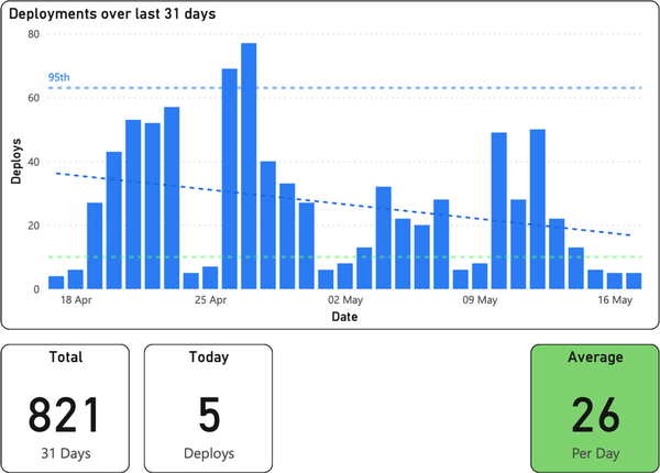
Figure 1-7. Deployment frequency; the bottom right box indicates a “DORA Elite” (DevOps Research and Assessment) level of software delivery performance
Average deployments per day shows the deployment frequency key metric, and we highlighted in our key metrics in green to indicate “Elite” on the Accelerate Elite-Low software delivery performance scale.17 For additional transparency, we showed deploys for the current day and the total number of deploys over the period graphed (31 days). Finally, we plotted the mean, 95th, and overall data trends as dotted lines on the graph.
Lead time for changes
The bar graph in Figure 1-8 shows our lead time for changes data, again with dates on the x-axis and now with the mean of lead time for the given day in the bars along the y-axis.
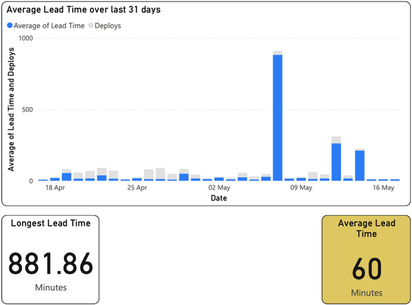
Figure 1-8. Lead time for changes; the bottom right box indicates a “DORA High” level of software delivery performance on the Accelerate rating scale
As before, we highlighted the key metric for the screen, which here was a mean of the lead time over the period shown, and highlighted in our key metrics to indicate “Low” on the Elite-Low performance scale. We also found it useful to highlight our longest individual lead time (see the box on the bottom left).18
We realized we kept asking, “Did we do a lot of deploys on that day?” Rather than add more trend lines, we shadow-plotted the number of deploys (in light gray) alongside the lead times.
Change failure rate
Figure 1-9 shows yet another bar graph for change failure rate, but this metric presents quite differently. As you can see from the y-axis, we typically had either zero failures or a single failure within a given 24-hour period.19 It was thus very clear when we had problems.
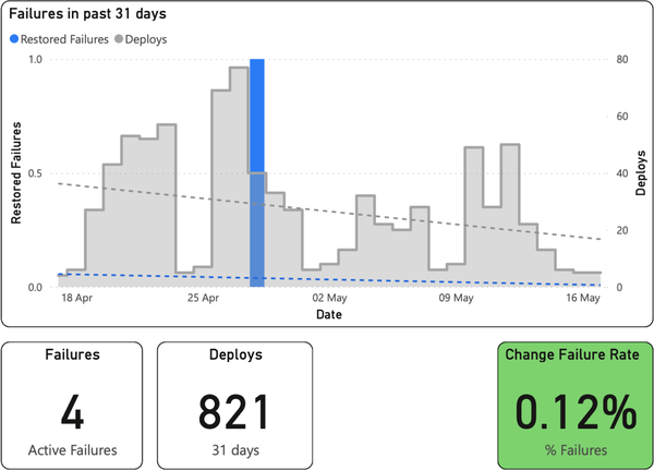
Figure 1-9. Change failure rate; the bottom right box indicates a “DORA Elite” level of software delivery performance on the Accelerate rating scale
Everything on top of this is context. Coplotting the number of deploys lets us quickly answer the question, “Was this perhaps due to a lot of deployment activity that day?”
Finally, as usual at the bottom, you can see our key metric: the number of failures as a percentage of the total deploys in the time period. Accompanying this yet again are some other important stats: the number of active failures and the total number of deploys in the time period shown.
Time to restore service
The presentation of the final metric, time to restore service, is the one we spent most time getting comfortable with—but once we understood and stabilized our deployment frequency and lead times, this metric became our primary focus.20 Yet again, we have a time-series bar graph (Figure 1-10), but now with values plotted over a longer timescale than the others (120 days, for better context) so that we could compare how we were improving against a metric that ought to have a great deal fewer data points. Again, we coplotted the lead time for changes to give some context.
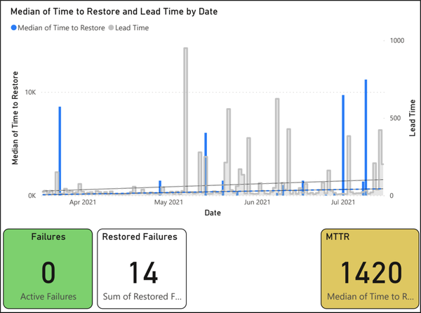
Figure 1-10. Time to restore service; the bottom left box indicates zero open change failures—not a DORA metric, but important to know—and the bottom right box indicates a “DORA High” level of software delivery performance
Finally, as usual at the bottom right, you can see our key metric: the median of all times to restore for restored failures within the given period. Accompanying this are other key stats: the number of active failures and the total number of restored failures in the time period shown.
Front Page
We weren’t done. Our PowerBI report also had a “Four Key Metrics” front page, which comprised the key metric numbers from each individual statistics page as well as the graphs of deployment frequency and lead time. The goal was to give people an idea of the stats in real time, rapidly and accurately. As our focus changed, we might have promoted other graphs.
As I’ve suggested, we’re now in a position to unlock the real power of the four key metrics. Giving the teams access to, and ensuring they understand, these metrics, as well as the model and system that underpin them, is of utmost importance if you are to reap their real benefits. That’s what allows them to discuss, understand, own, and improve the software you deliver.
Discussions and Understanding
There’s nothing physical or expensive or even slow in the process of paradigm change. In a single individual it can happen in a millisecond. All it takes is a click in the mind, a falling of scales from the eyes, a new way of seeing.
Donella Meadows, Thinking in Systems21
How did we end up with these visualizations, extra details, and specific time periods? We iterated, making additions and improvements as required.
Every week we collectively discussed upcoming spikes and architectural decision records (ADRs)22 and looked at the four key metrics. Early on, the conversations were about what each metric meant. Subsequent weeks’ discussions centered on why the numbers were where they lay (e.g., if the numbers were too high or too low, if data was missing, etc.), then on how to improve them. Slowly but surely, team members got used to the four key metrics mental model. Allowing teams to self-serve their data in real time and to view only the data from their pipelines (both of which were made easy by the PowerBI dashboards) helped immensely. So did adding trend lines, which we shortly followed up with the ability to see timescales longer than the default 31 days.
I was amazed at the value of these focused, enlightened, and cross-functional discussions. As an architect, these problems and issues would previously have fallen to me alone to spot, understand, analyze, and remedy. Now, the teams were initiating and driving solutions themselves.
Ownership and Improvement
Whenever teams begin taking ownership, I’ve witnessed, again and again, the following. First come the easiest requests, the ones to modernize processes and ways of working: “Can we change the cadence of releases?” Next, teams begin to care more about quality: “Let’s pull tests left” and “Let’s add more automation.”23 Then come the requests to change the team makeup: “Can we move to cross-functional (or stream-aligned) teams?”
There are always trade-offs, failures, and lessons to learn, but the change will drive itself. You’ll find yourself modifying and adapting your focus and solutions as you increase focus on and better understand the benefits of end-to-end views.
All of these changes rapidly end up in one place: they reveal architectural problems. Perhaps these problems are there in the designs on the whiteboard. Perhaps the whiteboard was fine, but the implementation that ended up in production wasn’t. Either way, you have things you need to solve. Some of these things include coupling that isn’t as loose as you thought; domain boundaries that aren’t quite as crisp as they initially appeared; frameworks that get in the way of teams instead of helping them; modules and infrastructure that are perhaps not as easy to test as you had hoped; or microservices that, when running with real traffic, are impossible to observe. These are problems that you, as the responsible architect, would typically have to deal with.
Conclusion
Now you face a choice. You could continue to go it alone, keep your hands on the tiller, and steer the architectural ship to the best of your ability, alone in command. Or you could take advantage of this flowering within your teams. You could take your hands off the tiller, maybe gradually at first, and use the conversations and motivation the four key metrics unlock to slowly move toward your shared goal: more testable, decoupled, fault-tolerant, cloud native, runnable, and observable architecture.
That’s what places the four key metrics among the most valuable architectural metrics out there. I hope you’ll use them, along with your partners, to codeliver the best architecture you’ve ever seen.
1 Donella Meadows, Thinking in Systems: A Primer, ed. Diana Wright (Chelsea Green Publishing, 2008), p. 162.
2 This need not be a code fix. We’re thinking about service restoration here, so something like an automatic failover is perfectly fine to stop the clock ticking.
3 In fact, it’s the model Microsoft wants you to adopt.
4 CAB stands for “change-advisory board.” The most famous example is the group that meets regularly to approve releases of code and config in the classic book The Phoenix Project (IT Revolution Press, 2018), by Gene Kim, Kevin Behr, and George Spafford.
5 Especially if you have long-lived branches or never-ending pull requests, but I bet you’re aware of those anyway, and they’re not difficult to quantify in isolation either.
6 See the documentation for all you’d ever want to know about trunk-based development. See Extreme Programming for the original definition of pair programming.
7 If this makes you think that having multiple independent pipelines—one per artifact—is a good idea, congratulations: you’ve reminded yourself of one of the key tenets of microservices—independent deployability. If this makes you pine for the monolith, then remember the other benefits microservices bring, some of which we’ll get to at the end of this chapter.
8 The question sometimes arises, “What about infra builds?” I’ve seen those included in “four key metrics” calculations, but I wouldn’t get upset if they weren’t included. As for pipelines triggered by time rather than change? Don’t count them. They won’t result in a deployment because nothing has changed.
9 Again, some will point out that the opening time of a ticket is not the same as the time when the service failure first strikes. Correct. Perhaps you want to tie your monitoring to the creation of these tickets to get around this. If you have the means, congratulations: you are probably in the “fine-tuning” end of four key metrics adoption. Most, at least when they start out, can only dream of this accuracy, and so, given that, it will suffice if you start with manual tickets.
10 Meadows, p. 163.
11 Make sure you’re honest with yourself: collect all the builds you ought to and don’t cherry-pick. Try to be as accurate as possible in your figures, too, and if you guess, estimate your degree of accuracy.
12 Remember! You can’t average an average without introducing issues, so it’s best to avoid it. We do daily totals so we can have a nice, pretty graph behind our metrics, which we’ll get to later.
13 Because unresolved failures, sadly, don’t have “resolved” timestamps.
14 It might even get you a few bug reports on your calculations if you have them wrong—some of my best learnings around the four key metrics have come in this way.
15 Meadows, p. 163.
16 Props to Matthew Skelton and Manuel Pais for their “minimal viable platform” idea, which inspired this.
17 See Figures 2-2 and 2-3 in Accelerate, as well as more up-to-date tables in the latest DORA State of DevOps report.
18 We had a blocked build. It’s not difficult to spot. We also used the word “average” rather than “mean” to make it more approachable.
19 Sometimes we saw multiple failures, but this was very unusual.
20 From experience, I’m willing to wager that this will become your focus too.
21 Meadows, p. 163.
22 The term ADR was first conceived by Michael Nygard.
23 Much to the delight of QAs and operations. I’ve frequently seen QAs use the four key metrics to drive change as much as I have as an architect.
Get Software Architecture Metrics now with the O’Reilly learning platform.
O’Reilly members experience books, live events, courses curated by job role, and more from O’Reilly and nearly 200 top publishers.

