Chapter 1. Introduction to Geospatial Analytics
Are you a geographer, geologist, or computer scientist? Impressive, if you answered yes! Iâm none of those: I am a spatial data analyst, interested in exploring data and integrating location information into data analysis.
Geospatial data is collected everywhere. Appreciating the where in data analyses introduces a new dimension: comprehending the impact of a wider variety of features on a particular observation or outcome. For instance, I spend a lot of professional time examining large open source datasets in public health and health care. Once you become familiar with geocoding and spatial files, not only can you curate insights across multiple domains, but you can also recognize and target areas where profound social and economic gaps exist.
Early in my evolution as a data analyst, I began to realize I had bigger and more complex questions to consider, and I needed more resources. With an eye toward working with United States census data, I enrolled in a course in applied analytics. I had worked in the R programming language, but this course was taught in Python. I made it through, but I discovered a lot in the following months that I wish I had learned along with basic Python. This book is meant to share what I wish Iâd been taught.
What I hope to share here is not the complete coding paradigm of Python, nor is it a Python 101 course. Instead, it is meant to supplement your Python learning by showing you how to write actionable code so that you can learn by doing. The book contains simple examples that explore key concepts in detail. The graphics in earlier chapters will familiarize you with how the maps look and how different tools can render relationships. Later chapters explore the code and various platforms, empowering you to use Python as a resource for answering geospatial questions. If you are looking for flexibility in manipulating data in both open source and proprietary systems, Python may be the missing piece of the puzzle. It is fairly easy to learn and has a variety of libraries for pivoting and reshaping tables, merging data, and generating plots.
Integrating Python into spatial analysis is the focus of this book. Open source platforms like OpenStreetMap (OSM) allow us to zoom in and add attributes. OSMnx is a Python package that lets you download spatial data from OSM and model, project, visualize, and analyze real-world street networks and structures in the landscape in a Jupyter Notebook, independent of any specific application or tool.1 You can download and model walkable, drivable, or bikeable urban networks with a single line of Python code, then easily analyze and visualize them. You can also download and work with other infrastructure types, amenities and points of interest, building footprints, elevation data, street bearings and orientations, speed, and travel times. Chapter 5 of this book offers an opportunity to dig a little deeper into OSM.
Using the principles of spatial data analysis, you can consider challenges at the local, regional, and global levels. These might include the environment, health care, biology, geography, economics, history, engineering, local government, urban planning, and supply chain management, to name a few. Even issues that seem local or regional cross physical and political boundaries, ecological regions, municipalities, and watersheds and possess a spatial component. Since maps are one of the first appreciations we have of data visualization, it makes sense that after interrogating your data you may become curious about location. This chapter will introduce you to some of the broad objectives of spatial data analysis and look at how geospatial information can affect our thinking.
Democratizing Data
The accessibility of open source data tools and massive open online courses (MOOCs) has empowered a new cohort of citizen scientists. Now that the general public has access to location data and geospatial datasets, many people are becoming âdata curious,â regardless of their professional titles or areas of study. Perhaps youâre a bird watcher and youâre interested in a certain species of birdâsay, the blue heron. You might want to access spatial data to learn about its habitat. You might ask research questions like: Where are blue herons nesting? Where do they migrate? Which of their habitats support the most species, and how is this changing over time? You might create maps of your own sightings or other variables of interest.
In addition to personal or professional hobbies, geospatial analysts examine the socioeconomics of neighborhoods and how they change geographically over time. The study of environmental racism seeks to analyze how the built infrastructure can inhibit or influence health outcomes in marginalized communities. Weâll explore this idea a little later, when we generate a data question to explore.
The Map Warper project is an open source collection of historical maps and current locations. The challenge is that older maps contain many errors due to outdated survey technology. The Map Warper project is a map-rectification project: it aims to correct those errors to match todayâs precise maps by searching for modern matching ground control points and warping the image accordingly. These control points are known coordinates spaced within areas of interest utilized as precise known locations. You can use rectified maps to explore development over time in different cities or to reimagine a historical location more accurately. How do investments in infrastructure and industrial development affect neighborhoods over time, for example? Figure 1-1 shows a rectified map. You can browse already rectified maps or assist the New York Public Library by aligning a map yourself. Everyone is welcome to participate!
There are many opportunities for professionals across multiple industries to include location intelligence in their analytics. Location intelligence is actionable information derived from exploring geospatial relationshipsâthat is, formulating data questions and evaluating hypotheses. Since open source tools are welcoming new end users, we need a lexicon that works for people with diverse interests, resources, and learning backgrounds. I want you to be able to explore all of the tools this book discusses.
Although powerful subscription-based applications and tools are available, they are mostly priced as enterprise solutions, not for individual users, which limits access for anyone not affiliated with a large institution. Take GIS software, for example: there are many options, all with pros and cons. Two of the most prominent options are the Aeronautical Reconnaissance Coverage Geographic Information System, now known as ArcGIS, which I discuss in Chapter 6, and Quantum GIS, or QGIS, which is the topic of Chapter 3. In my professional work I use both, but when teaching, I like to give QGIS the main stage because it is truly open source: you donât need to pay for different levels of licensing to access its tools.
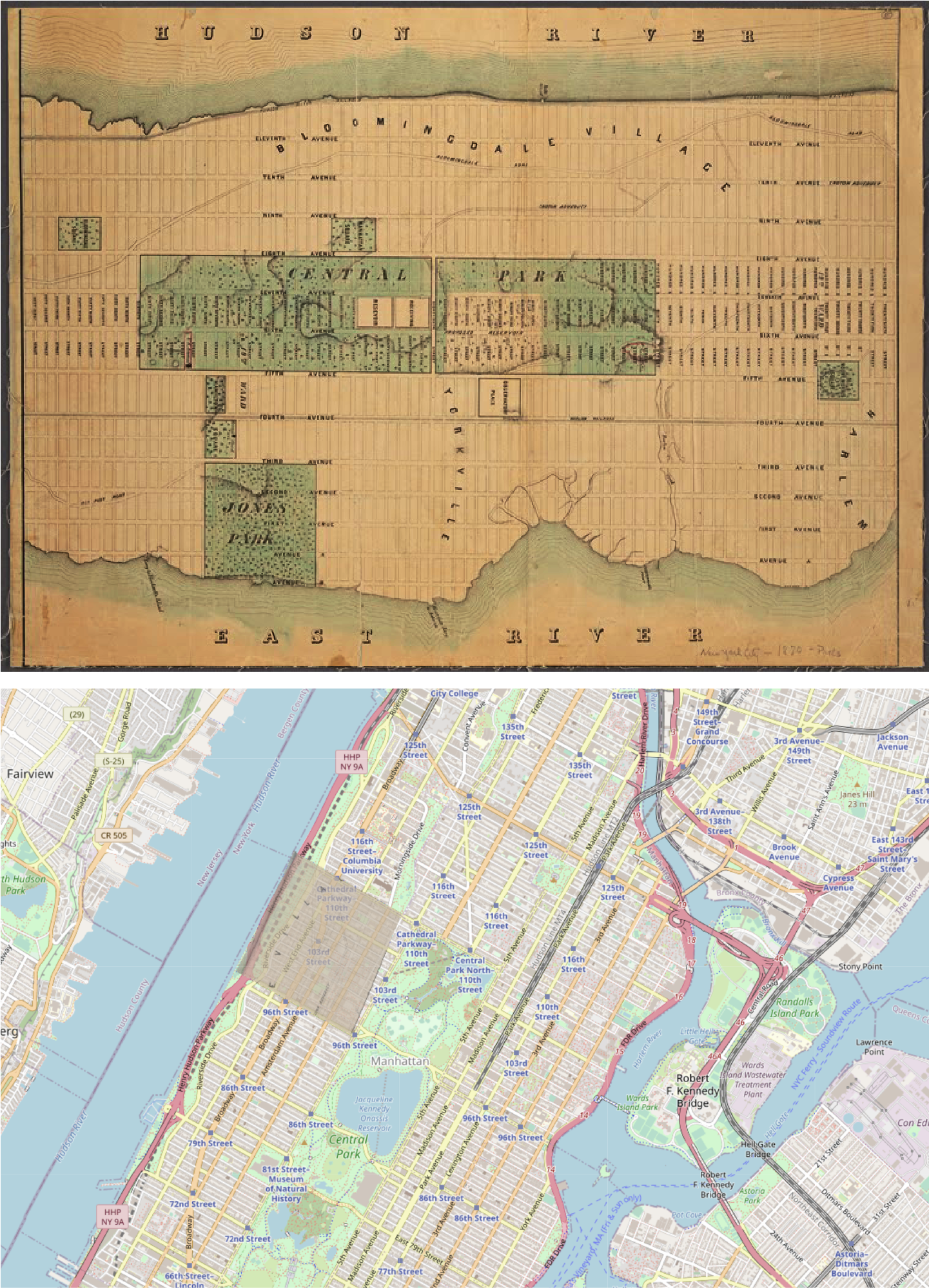
Figure 1-1. A map of Manhattan from 1870 (top) and a rectified map of contemporary Manhattan (bottom)
Warning
I learned the hard way just how expensive subscription-based tools can be. ArcGIS uses a credit system, and when I began using it, I didnât realize that the paid service would kick in automatically when I uploaded a CSV file with location data. Donât make that mistake! QGIS, on the other hand, offers two optionsâboth free.
Asking Data Questions
National census bureaus are a rich source of data, especially about demographics. I generated the map of the United States shown in Figure 1-2 in ArcGIS using US census data: specifically, county-level race variables from the American Community Survey (ACS).2 Publicly available resources like the US Census Bureau provide an application programming interface (API): a data transmission interface that lets anyone retrieve demographic data with a few lines of Python code. You can pull the specific data you want instead of downloading an entire massive dataset.
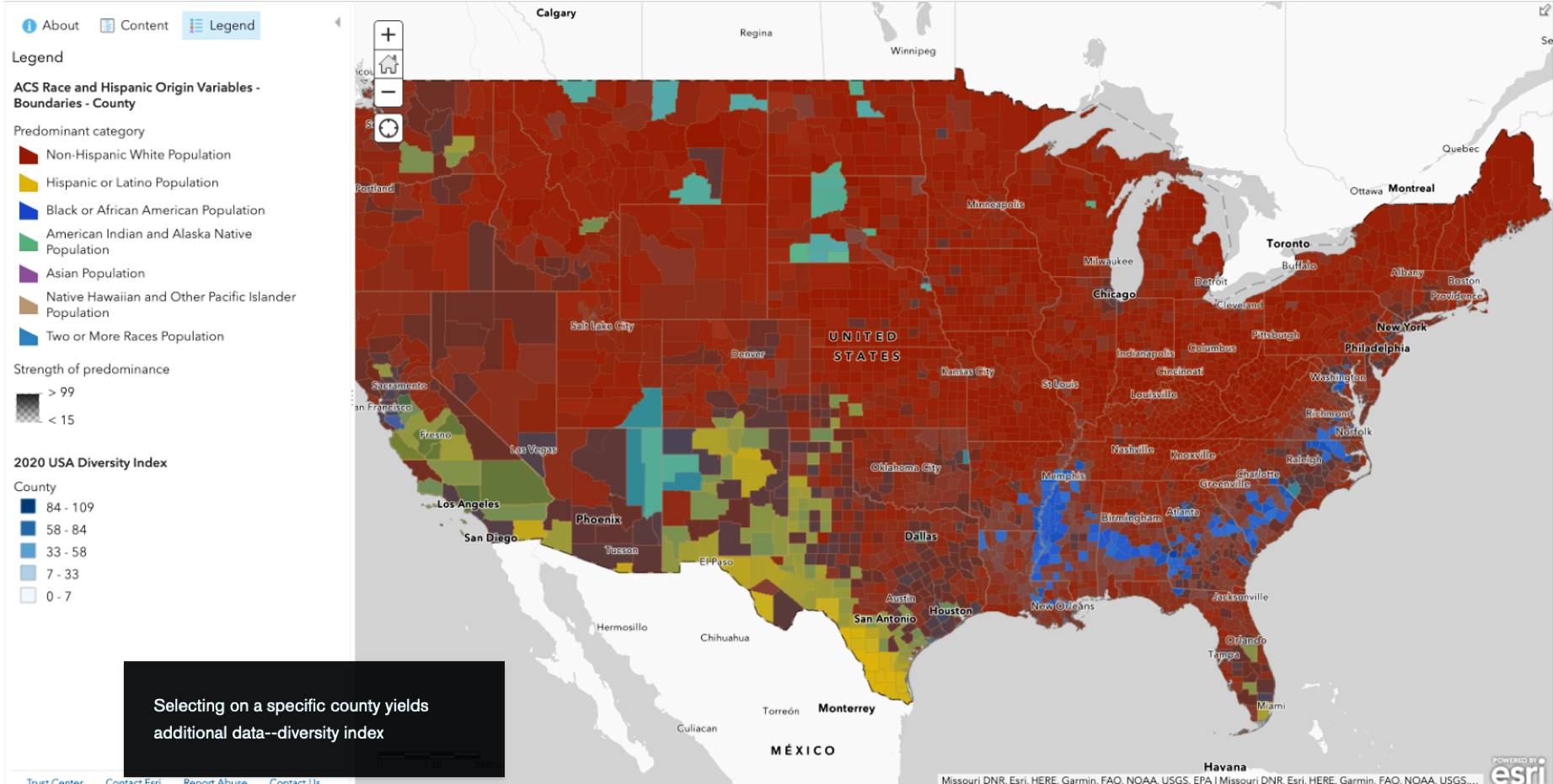
Figure 1-2. An ArcGIS map visualizing county-level race variables in the continental US
The polygons on the map are shaded in different colors corresponding to the racial categories used in the census and show where each group represents the majority of the local population. At first glance you can see clusters of categorical variables, but what else might you want to know? This is where geospatial data becomes so valuable. Can you answer your question with the data you have? You may need to reformulate your question if faced with missing data or resources you are unable to access. What might you determine about these clusters if you also examine other attributes?
You will have the opportunity to add nonspatial data as an additional layer in Chapter 7, when we use the Census Data API to explore US census data. For now, I will give you a hint: the devil is in the detailsâor should I say, the layers. Layers are collections of geographic data you can select based on your specific query. For example, in the layer in Figure 1-2, polygons are shaded based on areas where a certain race is the majority population.
This is a good place to introduce the expression: the defaults should not be the endpoints. The default settings are where you should begin your analysis. What information is summarized in your data that might be best explored with additional granularity? A deeper understanding of GIS will allow you to move away from default settings and create unique and deeper insights.
You will explore how customizing your variable selection specifically for spatial and nonspatial attributes enhances the questions you ask and the insights you gather.
The first rule of spatial data analysis is that any analysis requires a defined question. What do you want to know? Do you have a hypothesis that you want to test? Once you formulate your research question, you can look for data that will help answer it.
When formulating a data question, I like to refer to Toblerâs First Law of Geography: âEverything is related to everything else, but near things are more related than distant things.â3 Applied directly to geospatial concepts, when you think about objects being ânear,â the concept extends to time and space, not simply adjacency. For example, oceanfront homes may experience the direct impact of rising sea levels and intensified storms, but the ensuing flooding can disrupt a much larger region. You have to learn to think of spatial connectivity when thinking about spatial configurations and the ânearnessâ described in connected space.
To be clear, that doesnât mean cherry-picking data to match the answers you want. You need to look at all of the relevant data to shape a hypothesis or generate an insight. In thinking about how to understand race and racism in the US, you might seek to reveal policy gaps, address unmet health needs, or foster empathy. Working backward from your goal, you might use geospatial data to examine how race intersects with place in arenas such as housing, employment, transportation, and education, to name a few. When you become familiar with census data, you begin to understand the heavy lifting race has been asked to accomplish. Thatâs the kind of research that spurred me to integrate geospatial applications like ArcGIS and QGIS into my talks about poverty, racial inequity, structural determinants of health, and a wide variety of emerging questions.
When you rely on spreadsheets or tables without spatial data, you may be missing out on critical insights. Nonspatial data describes how values are distributedâand you can rely on descriptive statistics. But what if you are curious about the impact spatial relationships might have on these values? Static metrics, such as the location of a road or a specific event, as well as dynamic measures like the spread of an infectious disease become more powerful when you integrate them with location intelligence. Spatial analysis examines the relationships between features identified within a geographic boundary.
A Conceptual Framework for Spatial Data Science
Geospatial problems are complex and change over space and time. Â Look no further than current headlines to find examples: racial inequity, climate change, structural determinants of health, criminal justice, water pollution, unsustainable agriculture practices, ocean acidification, poverty, species endangerment and extinction, and economic strife. How does an individualâs location influence their health, well-being, or economic opportunity? You can answer questions like these using GIS, by discovering and showing spatial patterns in phenomena such as the diffusion rates of diseases, patientsâ distances to the nearest hospital, and the locations of roadways, waterways, tree cover, and city walkability.
Spatial thinking includes considerations like proximity, overlap containment, adjacency, ways of measuring geographic space, and how geographical features and phenomena relate to one another. It is part of spatial literacy, a type of literacy that begins with content knowledge and encompasses an understanding of the Earthâs systems, how they interact with the sphere of human influence, and how geographic space is represented. Spatial literacy allows you to use maps and other spatial tools to reason and make key decisions about spatial concepts.4 For example, geometric visualization is a spatial literacy skill that includes calculating distances between features, calculating buffer regions (how far away one feature is from another, for example), and identifying areas or perimeters.Â
The Aspen Global Change Institute identifies six systems of the planet: the atmosphere, cryosphere, hydrosphere, biosphere, geosphere, and anthroposphere (or human presence on Earth). Geospatial data allows us to comprehend the interconnectivity of all these systems, and we can use big dataâlots of dataâto answer well-formulated data questions.
You donât have to become an expert to retain important spatial literacy skills for bigger questions. If you understand at a fundamental level how things work in geospatial data and technology, you are already on your way to constructing more complex ideas. You will learn to formulate a data question and determine actionable steps toward developing your novel application or solution. For tools written with Python, the source code is available, and I encourage you to learn from, modify, extend, and share these and other analysis tools.
Letâs look at an example. The map you see in Figure 1-3 was created as an exploration of economic precarity.
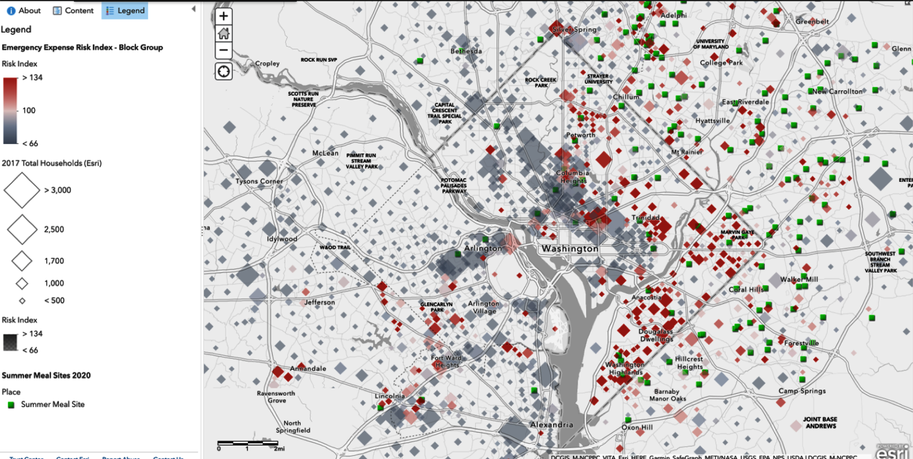
Figure 1-3. Risk Index Summer Meals (ArcGIS) targeting expansion of US Department of Agriculture summer meal programs
The red squares indicate populations in Washington, DC, where the average family could not afford a few hundred dollars to cover an unexpected emergency. These red squares show the families at the most risk for being unable to meet household expenses, and bigger squares reflect a larger number of households. The green squares are sites where, in 2020, the Summer Food Service Program (SFSP) served free meals to low-income children when school was not in session. Do you have any thoughts regarding where SFSP assigned the locations?
Looking at these layers of geospatial data together on the map in Figure 1-3, you can see the relevance of nonspatial data. You would be limited when interpreting tabular data without an understanding of population characteristics, like the size and location of the families affected and how and whether these characteristics influence the risk index.
Geographic information systems analyze data and display real-time geographic information across a wide variety of industries. Although there are similarities between spatial and nonspatial analyses, spatial statistics are developed specifically for use with geographic data. Both are associated with geographic features, but spatial statistics look specifically at geocoded geographical spatial data. That is, they incorporate space (including proximity, area, connectivity, and other spatial relationships) directly into their mathematics. For example, think about the kinds of data that airports generate. There are nonspatial statistics for variables such as region, use (military or civilian/public), and lists of on-time arrivals and departures. There are also spatial components, such as runway elevation and geographical coordinates.
Complex problems are spatial. Where are these problems occurring, and how can we plan for better outcomes in the future?
Map Projections
Our level of comfort in viewing maps belies their complexity. Most maps contain multiple layers of information. We can make interactive maps layering multiple datasets and experiment with how we communicate findings. But we also need to exercise caution. Maps might be familiar, but familiarity isnât the same as accuracy or competency. Projections are a great example.
Planet Earth is not perfectly spherical. That makes sense when you think of the chemical nature of the planet and how the centrifugal force caused by spinning in space tends to push out the middle, resulting in an oblate spheroid shape. Technically, the Earthâs shape is an ellipsoid: its circumference around the poles is shorter than the circumference around the equator, almost like the planet has been squished from top to bottom. When we attempt to map the planetâs surface to create a two-dimensional map, we use a geographic coordinate system (Figure 1-4) with latitude and longitude linesâcalled a graticuleâto project that imperfect sphere, that coordinate system, onto a flat surface. The simplified projections account for complex factors, like how the earthâs gravitational field changes with alterations in topography. We call this the geoid. It is important to be aware that the whole world wonât fit on a piece of paper or a computer screenâat least, not in a visible, easily interpretable manner.
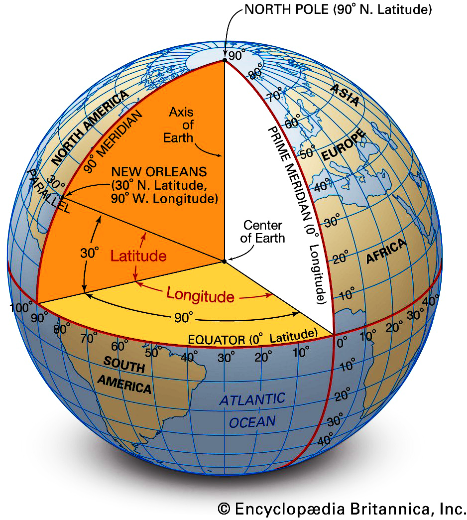
Figure 1-4. Geographic coordinate systems
These different projections include conic, azimuthal, and cylindrical. And if you use OpenStreetMap or Google Maps, youâre familiar with the Web Mercator coordinate system. Each has advantages and disadvantages, including distortions in area, distance, direction, and size. You will be glad to know that we donât need to wrestle with these compromises aloneâsoftware manages much of the complicated math.
Getting to know the variations of these maps (Figure 1-5) will allow you to select the optimal projection for your purposes. You will always have to make compromises and trade-offs, choosing which aspect to optimize and accepting a little bit of distortion in other aspects. The popular Mercator projection (Figure 1-6) is useful for navigation but distorts the areas near the polesâwhich, famously, makes Greenland look enormous. You can see how different the visualizations are in the equal area projections shown in Figure 1-5, but Greenland remains at the appropriate scale in all of them. In the Mercator projection in Figure 1-6, although South America is actually eight times larger than Greenland, they appear to be similar in size.
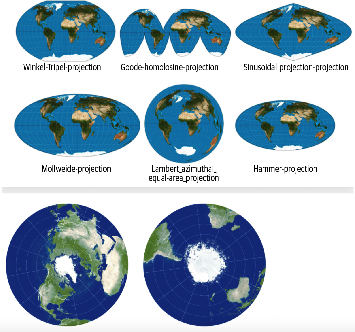
Figure 1-5. Some equal area projections
In my work in population health, area is the most critical aspect. It has to be maintained as accurately as possible on projections. When Iâm mapping percentages or raw numbers on a map, I want to be as impartial as possible; if a small place looks too large compared to other places, thereâs an inherent bias there that affects my interpretation of that map. Iâm going to do my best to look at the projectionâs weaknesses and its strengths and say, âIâm going to choose one that maintains area.â Maps that maintain area are called equal area projections.Â
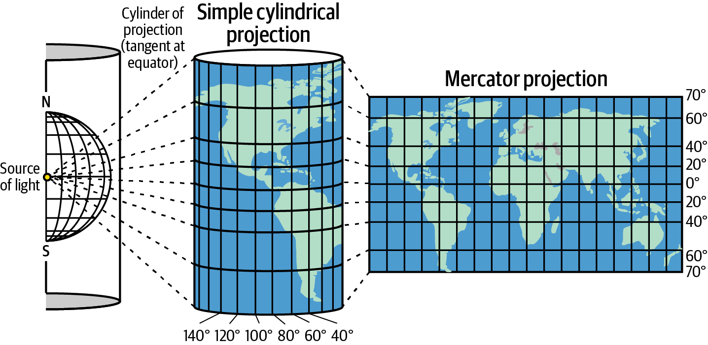
Figure 1-6. Mercator projection
If I ensure that the measures most relevant to my visualization are captured in the coordinate system I select, Iâm most of the way there. Naturally, I would like my values to match the actual values in the real world as closely as possible.
Vector Data: Places as Objects
Before we dig deeper into how to explore vector data in Python, I need to introduce a few concepts that will be useful as we move through the book. Weâll be working with vector data, which uses points, lines, and polygons to communicate data. We will use Python scripts and QGIS integrations to load datasets into a map and examine the structure of the vector data. Iâll also show you how different tools allow you to customize maps with colors and symbols to improve clarity and accuracy.
Figure 1-7 is an ArcGIS rendering of New York Cityâs Central Park and surrounding buildings. You can see that the geometry of each feature is represented as points, lines, or polygons. The geometry of a feature determines how it is rendered: as a point, line, or polygon. Additional information about the features might reveal the type of structure, year built, architectural dimensions, and other attributes accessible in an attribute table.
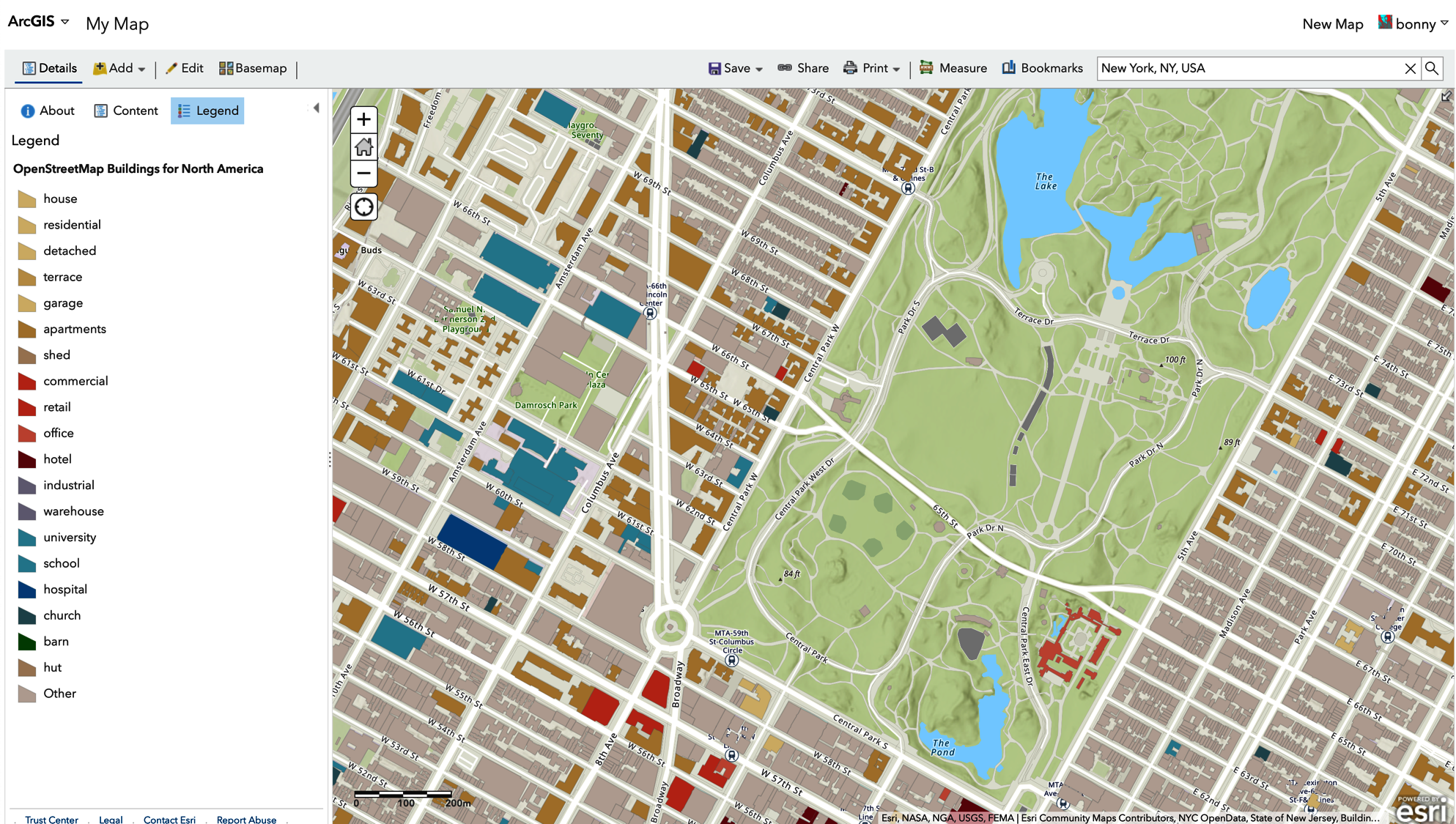
Figure 1-7. ArcGIS rendering of vector data showing building types in New York City, with attribute table
Geographical systems can work with many types of data. You may see a vector data file designated as a shapefile (formatted with the extension .shp) or geodatabase (.gdb). Lidar (light detection and ranging) surveys are collected as vector data but are often created and stored in gridded raster data formats.
Compare the file formats used with word-processing programs like Microsoft Word (.docx) to a simple text file (.txt). The content (the words on the page) might be the same in both files, but the complexity and sophistication are certainly less in the text file. If you wanted to share a piece of writing, why would you choose a text file? What if you wanted the document to be read by everyone regardless of software, or what if you wanted ease of portability or a smaller storage format?
GIS file formats work that way, too: although the content is the same, GIS file formats vary in functionality. Shapefiles do not have a topological or spatial layer, whereas with a geodatabase, such layers are optional. GIS file formats also vary in simplicity, redundancy, error detection, and storage size. Census geographic data uses TIGER/Line extracts, or shapefiles. They are grouped as a set that includes digital files (vector coordinates with an .shp extension), an index (.shx), and dBase attribute data (.dbf).
The most familiar coordinate projection system is longitude and latitude. These coordinates accurately describe where a particular place is on the Earthâs surface. You can be dropped anywhere in the world, and if you have your longitude (X) and latitude (Y), you know your location. This precise location is called a point feature. A point attribute has X and Y values as well, but attributes can be quantitative or qualitative descriptions. The point attribute describes the feature. Optionally, a Z value can be used to represent values in three dimensions, with Z referring to elevation. When location data appears in a spreadsheet, you can use the columns for latitude and longitude to find a point. The air-quality spreadsheet shown in Figure 1-8 includes geographic data (latitude and longitude) and nongeographic data (the air-quality measurement in the value column), allowing a GIS application to add information associated with a particular geographic location.
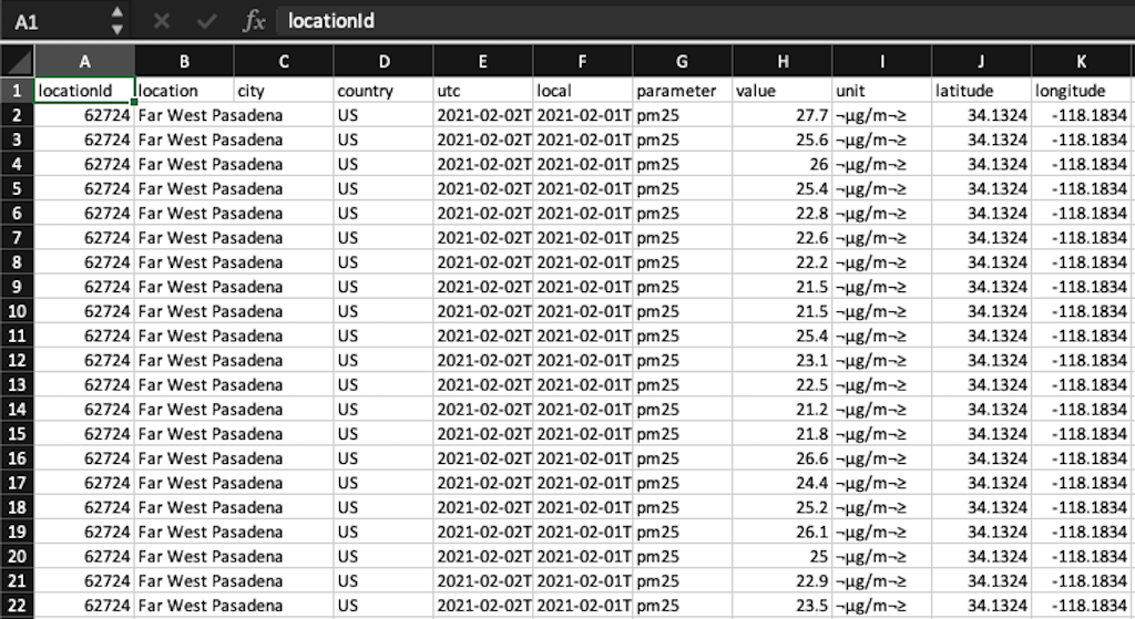
Figure 1-8. A dataset of air-quality measurements that includes spatial and nonspatial data
Raster Data: Understanding Spatial Relationships
Vector data focuses on what is visible in a particular location. There are specific boundaries or areas on a map where data or objects are either present or absent. You wouldnât expect a building, or even a polygonal object representing a city, to exist in every location within a specific boundary.
Raster data, on the other hand, is continuous data that lacks specific boundaries but is present across the entire map view, such as imagery, surface temperatures, and digital elevations. Raster is data displayed as a pixelated image matrix, such as that shown in Figure 1-9, instead of the points, lines, and polygons of vector data. Each pixel corresponds to a specific geographical location. Donât worry if this seems abstract now: both types of data will be easier to visualize once we begin working with them. Perhaps slightly more intuitive, consider surface elevation, precipitation, or surface temperature. You can record these measures at each location included within your study location, regardless of your study view.
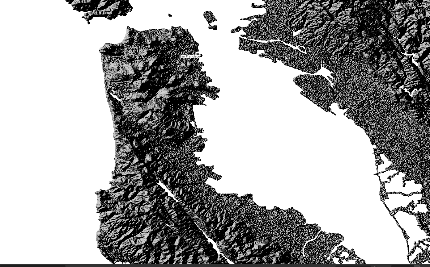
Figure 1-9. San Francisco depicted as a raster (QGIS)
So far, I am simply describing the distribution of points, polygons, or lines within our research location. Raster data is represented as an array of values divided into a grid of cells. The terms cells and pixels describe spatial resolution and are often used interchangeably. The dimension of the cell or pixel represents the area being covered. Spatial data models take these abstract representations of real-world objective and/or field views and explore mathematical relationships to model or predict relationships.
The big differentiator between photos and raster images is that rasters include data on the expanded bands of light wavelengths. This enhanced data, beyond simply red, green, and blue wavelengths, allows machine-learning models to distinguish among a wide variety of objects. This is because different objects reflect infrared light in different ways, yielding additional information in a multispectral image. Many space agencies around the world make data from their Earth observation satellites available freely. These datasets are immensely valuable to scientists, researchers, governments, and businesses.
A hillshade raster, as seen in Figure 1-9, uses light and shadow to create the 3D effect of the area in view.
It is necessary to consider multiple concepts simultaneously when reviewing a systems-level approach to GIS. The smaller components working within a larger system interact dynamically to reveal patterns in the system. Geometric visualization, for example, includes calculating distances between features, calculating buffer regions (how far away one feature is from another, for example), and identifying areas or perimeters. It will simplify our discussion if you think of these topics as parts of a whole. Understanding these introductory concepts will simplify your learning in the following chapters. It is important to begin with a baseline of spatial literacy.
Evaluating and Selecting Datasets
There are many datasets to explore for use in tutorials for learning a new skill, following along in a new application, or even launching your own independent geospatial project. The datasets in this book have been vetted and found workable on a wide variety of applications and workflows.
Before selecting your dataset, you need to evaluate your options. Information about a dataset is called metadata. Often there is also a supplemental data file that describes attributes like field headings. This is called a data dictionary. You can explore an example: the Landsat Data Dictionary, published by the US Geological Survey (USGS).
You can learn a lot by looking through metadata. You might think of metadata as the label on a can of soup: you read it because you want to know what the ingredients are and whether the soup is good for you. Figure 1-10 shows an example of metadata. The most important information youâll want to check should include the geographic area shown, the attributes listed, the map projection the dataset uses, its scale, and whether there is a fee to use it.
I suggest first attempting to follow along with the suggested data resources listed in this book. Once you feel confident, explore datasets related to your interests and see what you can discover.
Figure 1-10. Example of metadata
Summary
The field of geospatial analysis is vast, and Python is an expansive topic about which much has been written. Itâs hard to imagine any single book introducing either of these topics, let alone both, in a complete and authoritative manner. So I wonât attempt to do so in this book; instead, the goal here is to explain important foundational elements and introduce you to open source tools and datasets that you can use to answer geospatial questions.
This chapter presented an overview of important geospatial concepts like coordinate systems, projections, and the two main types of geospatial data: vectors and rasters. You also began to learn how to think spatially, and we finished with an introduction to datasets and how to choose what data to work with. Donât be alarmed if this all seems like a lot! Right now, I just want to launch your curiosity by sharing the possibilities of working with open source geospatial data using Python.Â
1 Boeing, G. 2017. âOSMnx: New Methods for Acquiring, Constructing, Analyzing, and Visualizing Complex Street Networks.â Computers, Environment and Urban Systems 65: 126â139. https://doi.org/10.1016/j.compenvurbsys.2017.05.004.
2 The annual ACS replaced the long form of the decennial census in 2005. It asks a wide variety of questions to identify shifting demographics and gather information about local communities. Geographic census data from around the world is also available for download from the Integrated Public Use Microdata Series (IPUMS). IPUMSâs integration and documentation make it easy to study change, conduct comparative research, merge information across data types, and analyze individuals within family and community context. Its data and services are available free of charge.
3 Tobler, W. 1970. âA Computer Movie Simulating Urban Growth in the Detroit Region.â Economic Geography 46 (Supplement): 234â240. https://doi.org/10.2307/143141.
4 To learn more about spatial literacy, see National Research Council. 2006. Learning to Think Spatially. Washington, DC: The National Academies Press. https://oreil.ly/i3olt.
5 Gott, J. Richard, III, Goldberg, David M., and Vanderbei, Robert J. 2021. âFlat Maps that Improve on the Winkel Tripel.â arXiv preprint arXiv:2102.08176.
Get Python for Geospatial Data Analysis now with the O’Reilly learning platform.
O’Reilly members experience books, live events, courses curated by job role, and more from O’Reilly and nearly 200 top publishers.

