Controls
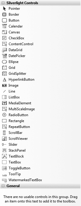
Silverlight 2 had more than two dozen user interface controls in beta, as shown in Figure 7-3.

Figure 7-2. Choosing the application type
Layout of the UI controls is facilitated by three panel controls, which we'll explore in the sections that follow: the Canvas, the StackPanel, and the Grid. The final layout control is the Border control, which can be used to draw a border around one or more controls.
Canvases
The Canvas enables absolute positioning of controls. The default background color for a Canvas is transparent, and the default width and height are 0.
Every visible UI control will describe its position on the Canvas by referring to the Canvas's Left and Top properties (as you'll recall from Chapter 3, these are called attached properties). For example, the Button object might use the attached property Canvas.Left to position itself with respect to the left border of its surrounding Canvas:
<Canvas>
   <Button Canvas.Left="150" Canvas.Top="50"
       Content="I'm Indented!" />
</Canvas>
This will place the button 150 pixels to the right of the left border and 50 pixels down from the top border of the immediately surrounding Canvas, as shown in Figure 7-4.

Figure 7-3. The Control Toolbox
Tip
You may have noticed the apparent paradox that the Canvas defaults to a width and height of 0 x 0 ...
Get Programming .NET 3.5 now with the O’Reilly learning platform.
O’Reilly members experience books, live events, courses curated by job role, and more from O’Reilly and nearly 200 top publishers.

