Chapter 4. Exploratory Data Analysis with R
Pat is a manager in the purchasing department at Big Bonanza Warehouse. His department specializes in the manufacture of tubing for a variety of construction industries, which requires procuring a lot of raw and semi-raw materials. However, Pat has a problem; he receives up to a hundred purchase requisitions per day in SAP, which need approval before becoming purchase orders. It is a burdensome and time-consuming process he would like help streamlining. He decides to ask his IT department and the SAP team if anything can be done to help.
The SAP team has already configured the system to be optimal for the purchase requisition process. When Pat and the SAP team reach out to their colleagues on the data science team, they immediately wonder: “Could we build a model to learn if a purchase requisition is going to be approved?” There is ample data in the SAP system—nearly 10 years of historical data—for which they know all the requisition approvals and rejections. It turns out to be millions of records of labeled data. All those records indicate approval or rejection. Doesn’t this fall into supervised learning? It certainly does!
We introduced four different types of learning models in Chapter 2. Those are:
Supervised
Unsupervised
Semi-supervised
Reinforcement
We are inclined to think that the scenario mentioned here is a supervised one because we have data that is labeled. That is, we have purchase requisitions that have been approved and rejected. We can train a model on this labeled data, therefore it is a supervised scenario. Having identified the type of learning model we are working, the next step is to explore the data.
One of the most vital processes in the data scientist’s workflow is exploratory data analysis (EDA). The data scientist uses this process to explore the data and determine whether it can be modeled, and if so, how. EDA’s goal is to understand the data by summarizing the main characteristics, most often using visualizations. This is the step in the data science process that asks the data scientist to become familiar with the data.
Readers who know SAP well: if you think you’re familiar with your data, go through this exercise. You’ll be surprised how much you learn. There’s a vast difference between knowing the general shape of the relational data and knowing the cleaned, analyzed, and fully modeled results of EDA.
In this chapter we will walk through the EDA process. To make it more understandable, we will go through it in real time. That is, we will not manipulate data to make this lesson easy to write; rather, we’re going to make this as realistic and relatable as possible. We will run into problems along the way, and we will work through them as a real scenario. As shown in Figure 4-1, EDA runs through four main phases: collection, cleansing, analysis, and modeling. Let’s break down each phase briefly before we dive deeper into our scenario.
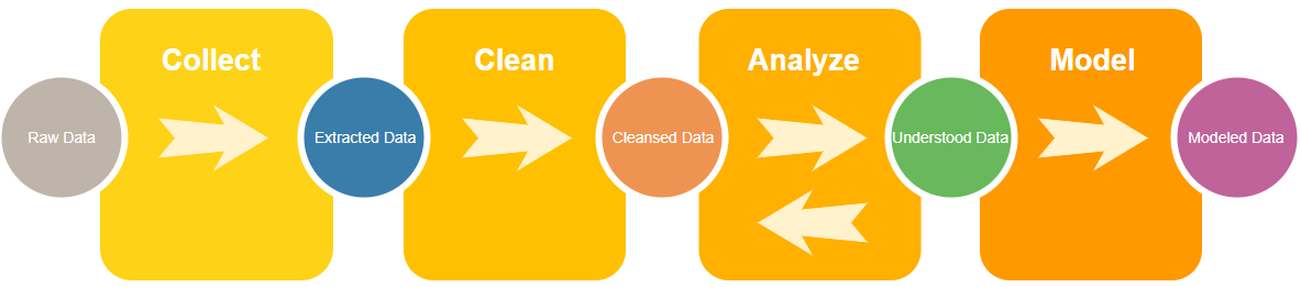
Figure 4-1. Workflow for exploratory data analysis
The Four Phases of EDA
In the Collect Data phase, we start with our source system’s data. It’s important to understand how the source system records data. If, for example, we don’t know what purchase requisitions look like in SAP tables, we can’t pull them out for later analysis.
Once we’ve understood the source data, we choose the methods and tools to get it out and examine it. In this chapter, we use a flat-file extraction from SAP as an intermediate storage, and the R data analysis language as the method to process and play with the data. In EDA that focuses on business scenarios it’s important to iterate on hypotheses quickly. Therefore, choose tools that you are comfortable and familiar with.
If you’re not familiar with any tools yet, fear not! Many options exist for extracting and analyzing. Chapter 3 discusses several alternative SAP data extraction methods and later chapters of this book use many of them. The R language is a favorite among statisticians and data scientists, but Python also has a very strong community. In this book we’ll use examples and tools from both languages.
After successfully extracting the data, we enter the Clean Data phase. The source system’s database, data maintenance rules, and the method we choose to extract can all leave their own unique marks on the data. For example, as we’ll see sometimes a CSV extract can have extra unwanted header rows. Sometimes an API extraction can format numbers in a way incompatible with the analysis tool. It can—and often does—happen that when we extract years’ worth of data the source system’s own internal rules for governing data has changed.
When we clean the data right after extracting, we’re looking for the things that are obviously wrong or inconsistent. In this chapter we use R methods to clean the data whereas you may feel more comfortable in another language. Whatever your approach, our goal for this phase is having the data stripped of obviously bad things.
Having met the goal of removing those bad things, it’s time to proceed to the Analysis phase. This is where we begin to set up hypotheses and explore questions. Since the data is in a state we can trust after cleansing, we can visualize relationships and decide which ones are the strongest and most deserving of further modeling.
In this phase, we will often find ourselves reshaping and reformatting the data. It’s a form of cleansing the data that is not focused on removing bad (or badly formatted) data; rather, it’s focused on taking good data and shaping it so that it can effectively be used in the next phase. The Analysis phase often presents several opportunities for this further reshaping.
The final phase is Modeling. By this phase, we’ve discovered several relationships within the data that are worth pursuing. Our goal here: create a model that allows us to draw insightful conclusions or make evidence-supported predictions. The model ought to be reliable and repeatable. By modeling this purchasing scenario, the SAP team seeks to arm Pat the purchasing manager with information and tools that have an insightful impact on his business processes.
Greg and Paul know this process well, so let’s get started!
Phase 1: Collecting Our Data
An easy way to get data out of SAP is by using the ABAP QuickViewer. This transaction allows the user to view fields of a table or a collection of tables joined together. For the purchase requisition to purchase order scenario we need two tables: EBAN for purchase requisitions and EKPO for purchase order lines. Use transaction code SQVI to start the QuickViewer transaction.
Enter a name for the QuickView (Figure 4-2).
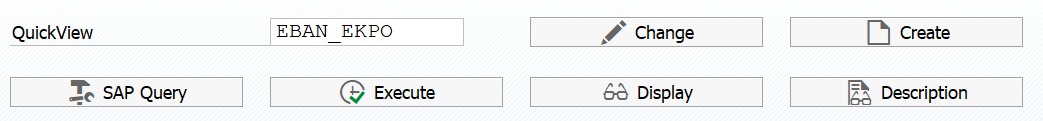
Figure 4-2. QuickView first screen
Click on the Create button and give the QuickView a title (Figure 4-3).
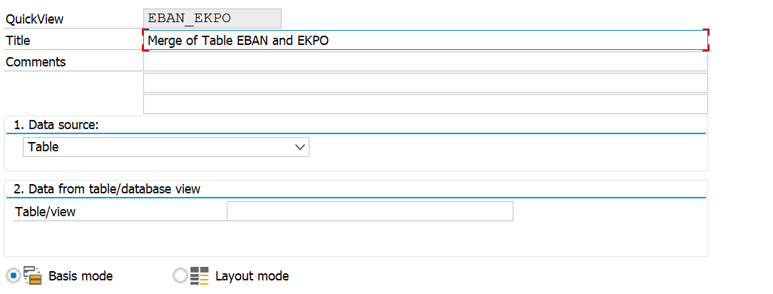
Figure 4-3. QuickView title
Change the “Data source” to “Table join” (Figure 4-4).
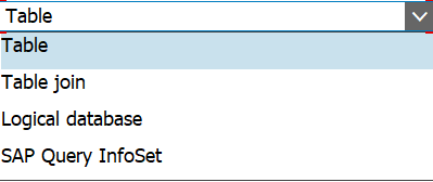
Figure 4-4. QuickView type options
Click on the Enter button, then click on the Insert Table button (indicated in Figure 4-5).
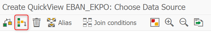
Figure 4-5. QuickView Insert Table button
Enter the name of the first table and click Enter (Figure 4-6).
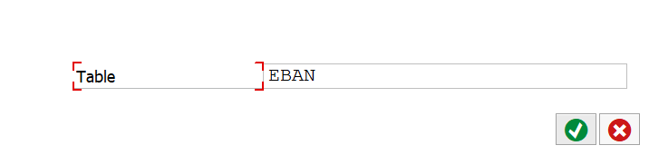
Figure 4-6. First QuickView Table
Repeat the process, click on the Insert Table button, and then click Enter (Figure 4-7).
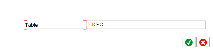
Figure 4-7. Second Quick View Table
The tables will be displayed on the screen with their default relationships determined (Figure 4-8). Always check these relationships to make sure they are what is wanted. In this case, four relationships were determined but only two are needed.
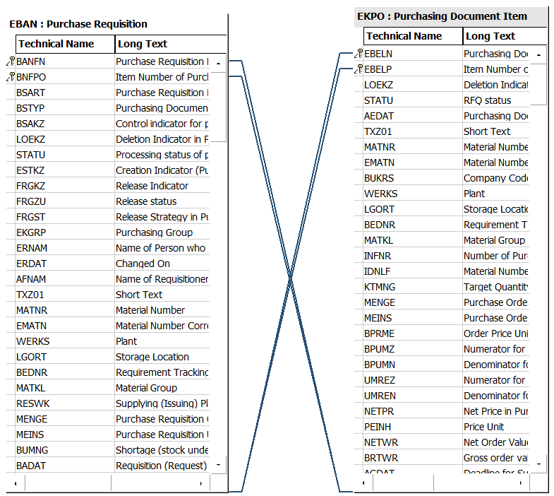
Figure 4-8. QuickView default join properties
Right-click on the links for BANFN and BNFPO and select Delete Link (Figure 4-9).
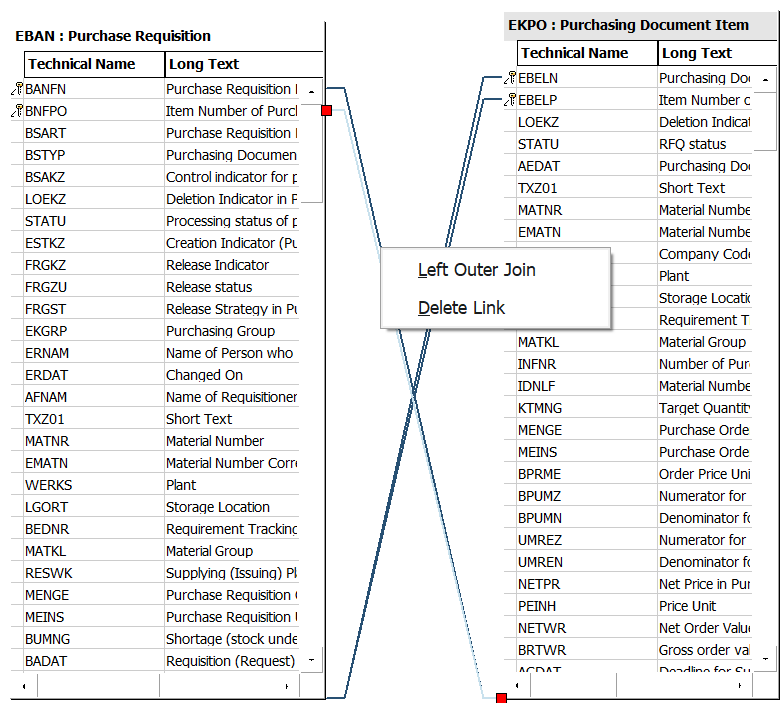
Figure 4-9. Removing a default join in a QuickView
Double-check the remaining two relationships to make sure they are correct. Tables EBAN and EKPO should be linked by EBELN and EBELP (Figure 4-10); these are the purchase order number and the purchase order item.
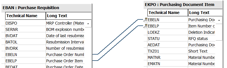
Figure 4-10. Confirming remaining joins in a QuickView
Click on the Back button. The next screen allows for the selection of fields for the report. Open the caret on the left to show all the fields for a table (Figure 4-11).
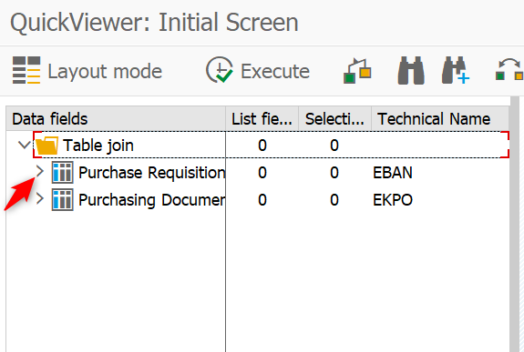
Figure 4-11. QuickViewer open table
Select the fields to be seen in the first column and the selection parameters for the table in the second column (Figure 4-12). Choosing fields as selection parameters enables those fields for filtering the overall results.
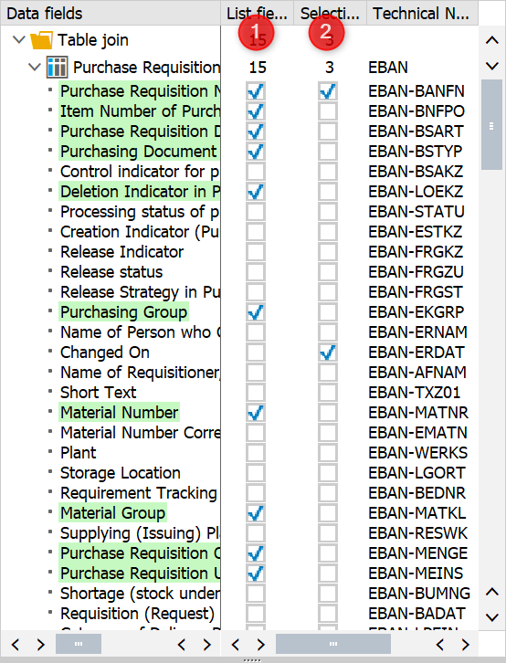
Figure 4-12. Selection and list options for a QuickView
Next, repeat the process for the Purchase Document Item table.
Click on the Execute button to run the report. Because the data may be very large, we made one of the selection criteria the Changed On date. This allows us to narrow the result data. Set the date range and then click on the Execute button. For our example, we will select a small one-month set of data just to see if the results are what we expect. Then we will rerun the report for the full 10 years of data.
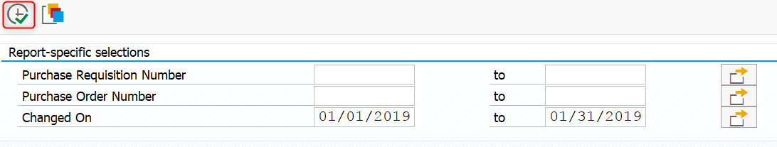
Figure 4-13. QuickView test report
The report is displayed with the fields selected (Figure 4-14).
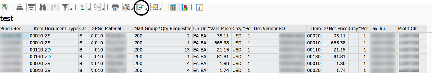
Figure 4-14. QuickView ALV (ABAP List Viewer) report
Click on the Export button (circled in Figure 4-14) and select Spreadsheet.
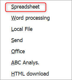
Figure 4-15. QuickView export options
Accept the default setting for Excel and click Enter (Figure 4-16).
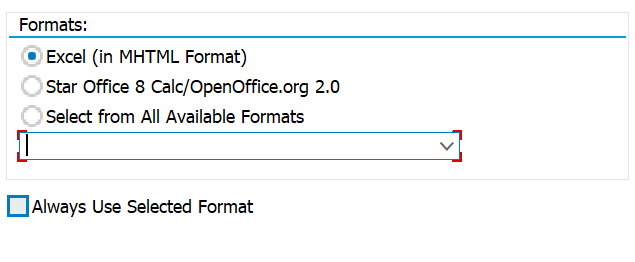
Figure 4-16. QuickView export to xlsx
Format options here will depend on the SAP version, so the screen may look slightly different. Whatever other formats are visible, make sure to choose Excel.
Name the file and save it (Figure 4-17).
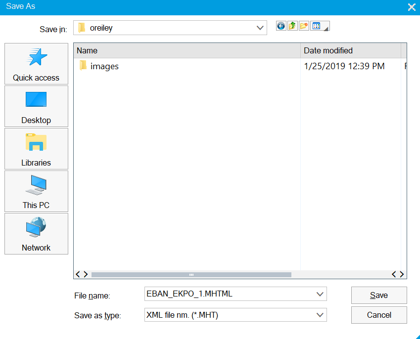
Figure 4-17. QuickView Save As dialog box
Excel will open automatically. Save it as a CSV file so it can easily be loaded into R or Python.
Importing with R
If you have not yet done anything with R or R Studio,1 there are many excellent resources online with step-by-step installation guides. It is no more difficult than installing any other software on your computer. While this book is not intended to be a tutorial in R, we will cover a few of the basics to get you started. Once you have installed R Studio, double-click on the icon in Figure 4-18 to start it.

Figure 4-18. R Studio icon
One of the basic concepts in R is the use of packages. These are collections of functions, data, and compiled code in a well-defined format. They make coding much easier and consistent. You will need to install the necessary packages in order to use them. One of our favorites is tidyverse. There are two ways to install this package. You can do it from the console window in R Studio using the install.packages() function as shown in Figure 4-19. Simply hit Enter, and it will download and install the package for you.
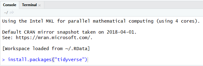
Figure 4-19. Install packages from the console window
The other method of installation is from the menu path Tools → Install Packages as shown in Figure 4-20.
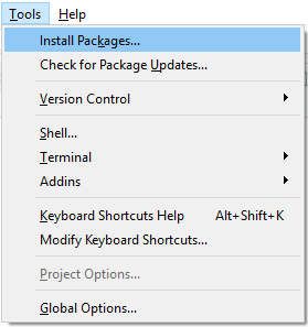
Figure 4-20. Install packages from the menu path
Start typing the package name in the Packages line and then select it from the options, as in Figure 4-21.
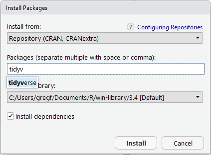
Figure 4-21. Select package from the drop-down options
Finish by clicking on the Install button.
Now that you’ve installed one package, let’s start a new script. Click on the New button and select R Script from the drop-down menu, as in Figure 4-22.
Figure 4-22. Starting a new R Studio script
Now you will have a blank canvas from which to start your data exploration using the R programming language.
Now, let’s get started. It is easy to import data into R or R Studio using the read.csv() function. We read the file with the following settings: header is set to TRUE because we have a header on the file. We do not want the strings set to factors so stringsAsFactors is set to FALSE.
Tip
It often makes sense to set your strings to factors. Factors represent categorical data and can be ordered or unordered. If you plan on manipulating or formatting your data after loading it, most often you will not want them as factors. You can always convert your categorical variables to factors later using the factor() function.
Finally, we want any empty lines or single blank spaces set to NA:
pr<-read.csv("D:/DataScience/Data/prtopo.csv",header=TRUE,stringsAsFactors=FALSE,na.strings=c(""," ","NA"))
Once the data has loaded we can view a snippet of the file using the head command, as shown in Figures 4-23 and 4-24.
head(pr)
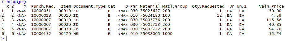
Figure 4-23. Viewing header dataframe in R
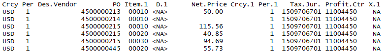
Figure 4-24. Viewing header dataframe in R continued
We can quickly see that some cleanup is in order. The row numbers came in as columns and some formatting problems created some arbitrary columns such as X and X.1. Cleaning them up is our first task.
Phase 2: Cleaning Our Data
Our goal in this phase is to remove or correct the obvious errors within the extraction. By taking the time to clean the data now, we greatly improve the effectiveness of our analysis and modeling steps. Greg and Paul know that cleaning can take up a major portion of the EDA time so they hunker down with R Studio at the ready.
Null Removal
First, we remove all rows where there is no purchase requisition number. This is erroneous data. There may not actually be any rows to remove, but this is a good standard process. Making sure that the key features of the data actually have entries is a good start:
pr<-pr[!(is.na(pr$Purch.Req.)),]
Binary Indicators
Next, the D and the D.1 columns are our deletion or rejection indicators for the purchase requisition. Making that a binary will be a true or false indicator. We can easily do that by making blanks equal to 0 (false) and any other entry equal to 1 (true). Why use a binary and not just put in text as “Rejected” or “Not Rejected”? Keep in mind that you will be visualizing and perhaps modeling this data. Models and visualizations do not do well with categorical variables or text. However, visualizing and modeling 0 and 1 is easy:
pr=within(pr,{deletion=ifelse(is.na(D)&is.na(D.1),0,1)})
Removing Extraneous Columns
Let’s get rid of the worthless and erroneous columns. Why do this? Why not simply ignore those columns? Keeping the data free of extra columns frees up memory for processing. In our current example, this is not truly necessary. However, later if we build a neural network we want to be as efficient as possible. It is simply good practice to have clean and tidy2 data. We create a list of column names and assign them to the “drops”variable. Then we create a new dataframe that is old dataframe with the “drops” excluded:
drops<-c("X.2","X","Un.1","Crcy.1","Per.1","X.1","Purch.Req.","Item","PO","Item.1","D","D.1","Per","Crcy")pr<-pr[,!(names(pr)%in%drops)]
Tip
There are many different types of data structures in R. A dataframe is a table in which each column represents a variable and each row contains values for each column, much like a table in Excel.
Whitespace
A common problem when working with data is whitespace. Whitespace can cause lookup and merge problems later. For instance, you want to merge two dataframes by the column customer. One data frame column has “Smith DrugStore” and the other has “ Smith DrugStore”. Notice the spaces before and after the name in the second dataframe? R will not think that these two customers are the same. These spaces or blanks in the data look like legitimate entries to the program. It is a good idea to remove whitespace and other “invisible” elements early. We can clean that up easily for all columns in the dataframe with the following code:
pr<-data.frame(lapply(pr,trimws),stringsAsFactors=FALSE)
What is that lapply() function doing? Read up on these useful functions to get more out of your R code.
Numbers
Next, we modify the columns that are numeric or integer to have that characteristic. If your column has a numeric value then it should not be stored as a character. This can happen during the loading of data. Simply put, a value of 1 does not equal the value of “1”. Making sure the columns in our dataframe are correctly classified with the right type is another one of the key cleaning steps that will solve potential problems later:
pr$deletion<-as.integer(pr$deletion)pr$Qty.Requested<-as.numeric(pr$Qty.Requested)pr$Valn.Price<-as.numeric(pr$Valn.Price)pr$Net.Price<-as.numeric(pr$Net.Price)
Next, we replace NA values with zeros in the numeric values we just created. NA simply means the value is not present. R will not assume discrete variables such as quantity will have a value of zero if the value is not present. In our circumstance, however, we want the NAs to have a value of zero:
pr[,c("Qty.Requested","Valn.Price","Net.Price")]<-apply(pr[,c("Qty.Requested","Valn.Price","Net.Price")],2,function(x){replace(x,is.na(x),0)})
Finally, we clean up those categorical variables by replacing any blanks with NA. This will come in handy later when looking for missing values...blanks can sometimes look like values in categorical variables, therefore NA is more reliable. We already treated whitespace earlier, but this is another good practice step that will help us to avoid problems later:
pr<-pr%>%mutate(Des.Vendor=na_if(Des.Vendor,""),Un=na_if(Un,""),Material=na_if(Material,""),PGr=na_if(PGr,""),Cat=na_if(Cat,""),Document.Type=na_if(Document.Type,""),Tax.Jur.=na_if(Tax.Jur.,""),Profit.Ctr=na_if(Profit.Ctr,""))
Phase 3: Analyzing Our Data
We’ve cleaned up the data and are now entering the analysis phase. We’ll recall two key goals of this phase: asking deeper questions to form hypotheses, and shaping and formatting the data appropriately for the Modeling phase. Greg and Paul’s cleanup process left them with data in a great position to continue into the Analysis phase.
DataExplorer
Let’s cheat and take some shortcuts. That is part of the glory of all the libraries that R has to offer. Some very quick and easy data exploration can be done using the DataExplorer library.3
Install and include the library using the following R commands:
install.packages("DataExplorer")library(DataExplorer)
Perform a quick visualization of the overall structure of the data (Figure 4-25):
plot_str(pr)
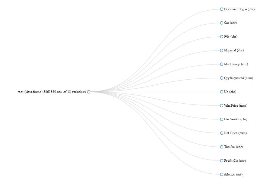
Figure 4-25. Viewing overall structure of data using DataExplorer
We can use the introduce command from the DataExplorer package to get an overview of our data:
introduce(pr)rowscolumnsdiscrete_columnscontinuous_columns33618501394all_missing_columnstotal_missing_valuescomplete_rows003361850total_observationsmemory_usage43704050351294072
We see that we have over three million rows of data with thirteen columns. Nine of them are discrete and four of them are continuous.
It is important to see if any of the columns are missing a lot of data. In general, columns that are largely empty (over 90%) don’t have any value in modeling (Figure 4-26):
plot_missing(pr)
Because of the large number of missing entries for the Des.Vendor field we will remove it:
pr$Des.Vendor=NULL
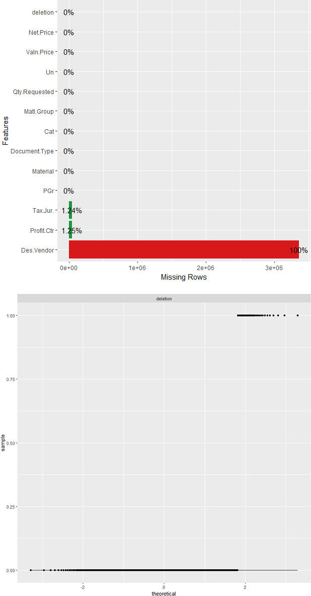
Figure 4-26. Identifying missing or near missing variables with DataExplorer
Discrete Features
Understanding the discrete features4 helps in selecting data that will improve model performance, and removing data that does not. We can plot the distribution of all discrete features quite easily (Figures 4-27 through 4-29):
plot_bar(pr)
Note
Discrete variables with more than 50 entries are excluded.
What we notice right away is that there is a mysterious and obvious erroneous entry. In the distribution for Document Type there is a document type called…“Document Type.” Same with all the other discrete features. Let’s find out where that line is and take a look at it:
pr[which(pr$Document.Type=="Document Type"),]count(pr[which(pr$Document.Type=="Document Type"),])
What we see is a list and count of 49 entries where the document type is “Document Type” and all other columns have the description of the column and not a valid value. It is likely that the extraction from SAP had breaks at certain intervals where there were header rows. It is easy to remove:
pr<-pr[which(pr$Document.Type!="Document Type"),]
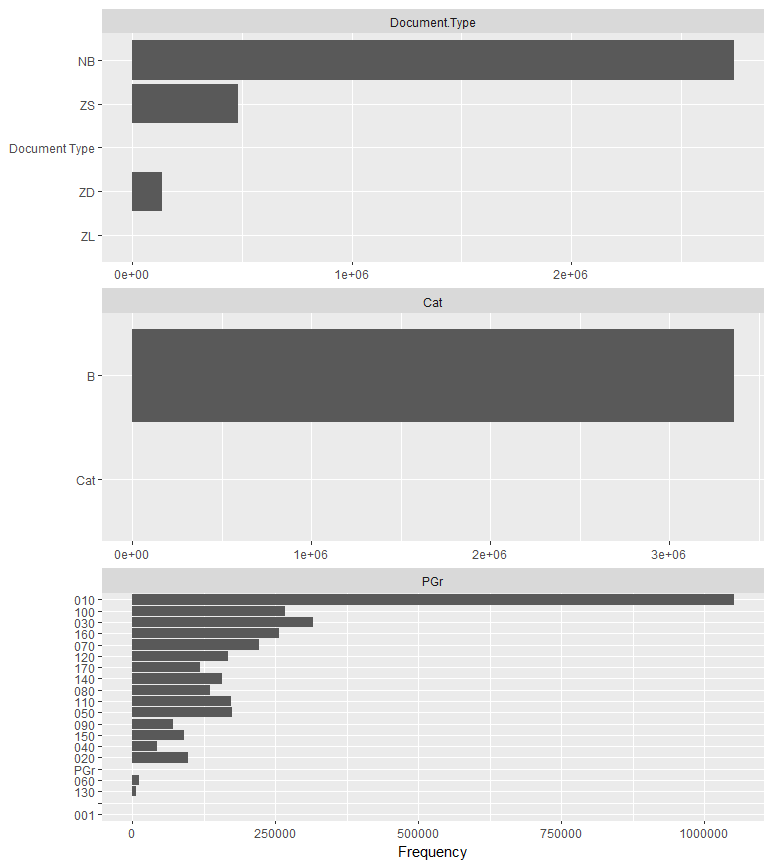
Figure 4-27. Bar charts of discrete features (part I)
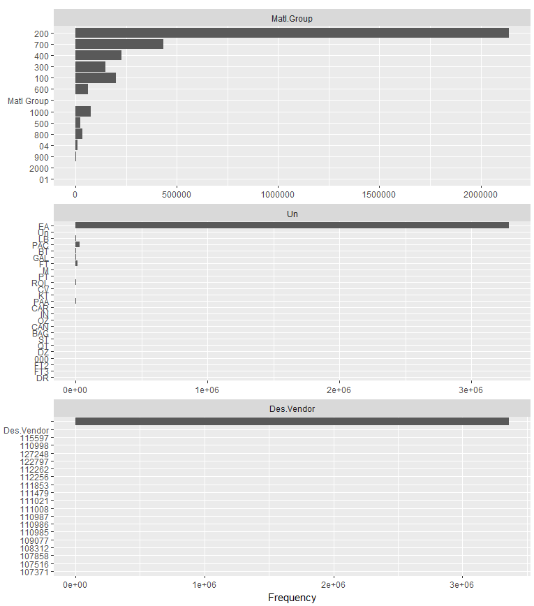
Figure 4-28. Bar charts of discrete features (part II)

Figure 4-29. Bar charts of discrete features (part III)
When we run plot_bar(pr) again we see that these bad rows have been removed.
We also noticed that some of the variables were not plotted. This is because they had more than 50 unique values. If a discrete variable has too many unique values it will be difficult to code for in the model. We can use this bit of code to see the count of unique values in the variable Material:
length(unique(pr$Material))
Wow, we find that we have more than 500,000 unique values. Let’s think about this. Will the material itself make a good feature for the model? We also have a variable Matl.Group, which represents the grouping into which the material belongs. This could be office supplies, IT infrastructure, raw materials, or something similar. This categorization is more meaningful to us than an exact material number. So we’ll remove those material number values as well:
pr$Material=NULL
We also notice from this bar plot that the variable Cat only has one unique value. This variable will have no value in determining the approval or disapproval of a purchase requisition. We’ll delete that variable as well:
pr$Cat=NULL
Continuous Features
Next we want to get to know our numeric/continuous variables, such as Net.Price. Do our continuous variables have a normal bell-shaped distribution? This is helpful in modeling, because machine learning and neural networks prefer distributions that are not skewed left or right. Our suspicions are that the continuous variables are all right skewed. There will be more purchase requisition requests for one or two items than 20 or 30. Let’s see if that suspicion is correct.
Tip
Nature loves a uniform/Gaussian distribution. School grades, rainfall over a number of years or by country, and individual heights and weights all follow a Gaussian distribution. Machine learning and neural networks prefer these distributions. If your data is not Gaussian, it is a good choice to log transform, scale, or normalize the data.
We can see a distribution of the data with a simple histogram plot. Using the DataExplorer package in R makes it easy to plot a histogram of all continuous variables at once (Figure 4-30):
plot_histogram(pr)
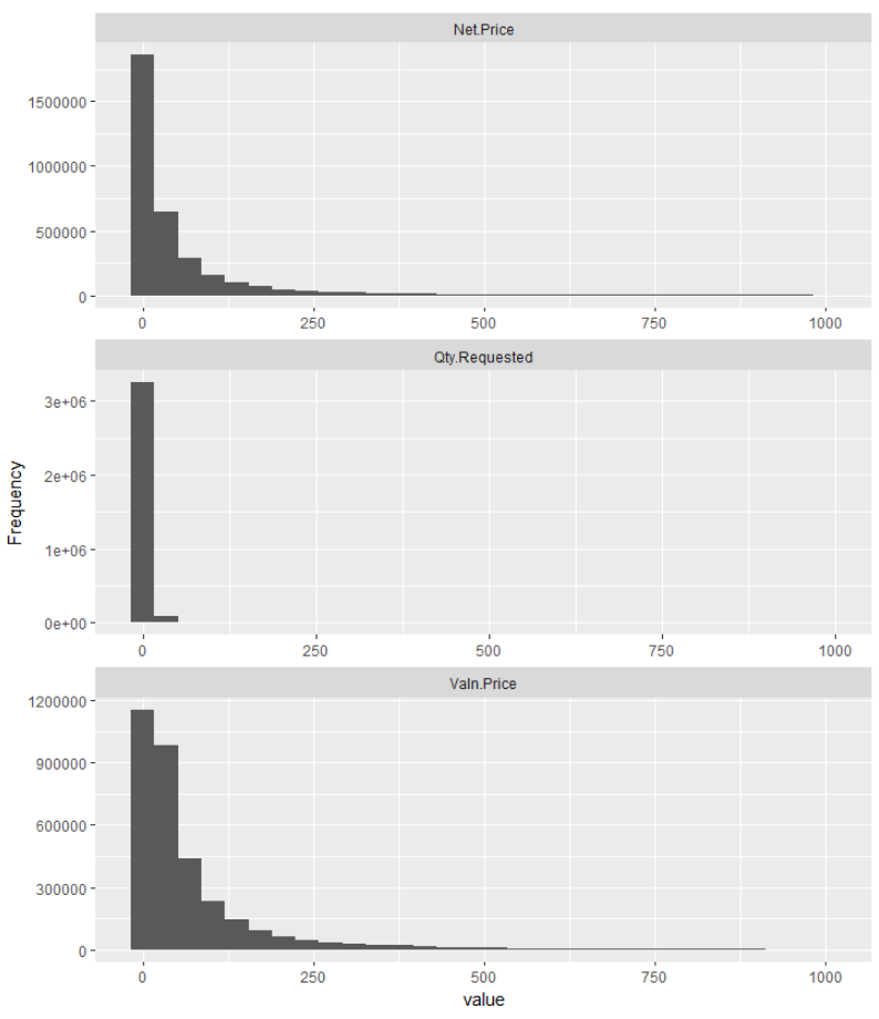
Figure 4-30. Histograms of continuous features
We are only concerned with the histograms for Qty.Requested, Valn.Price, and Net.Price. The deletion column we know is just a binary we created where 1 means the item was rejected (deleted) and 0 means it was not. We quickly see that all histograms are right skewed as we suspected. They have a tail running off to the right. It is important to know this as we may need to perform some standardization or normalization before modeling the data.
Note
Normalization reduces the scale of the data to be in a range from 0 to 1:
Xnormalized = X−Xmin / (Xmax−Xmin)
Standardization reduces the scale of the data to have a mean(μ) of 0 and a standard deviation(σ) of 1:
Xstandardized = X−μ / σ
Another test is the QQ plot (quantile-quantile). This will also show us if our continuous variables have a normal distribution. We know that the distributions were not normally distributed by the histograms. The QQ plot here is for illustration purposes.
A QQ plot will display a diagonal straight line if it is normally distributed. In our observations we can quickly see that these variables are not normally distributed. The QQ plot in DataExplorer (see Figure 4-31 for interesting continuous features, and Figure 4-32 for the deletion flag) by default compares the data to a normal distribution:
plot_qq(pr,sample=1000L)
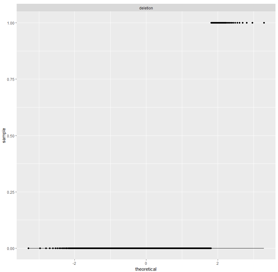
Figure 4-31. QQ plots of continuous features
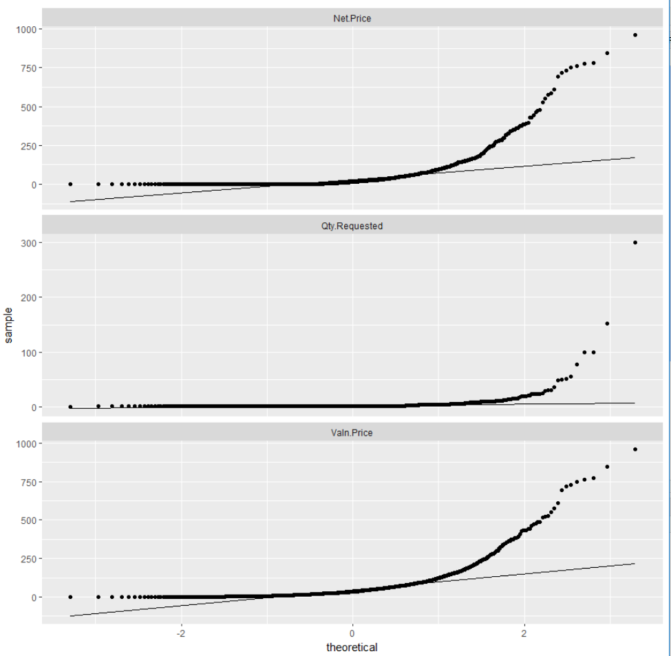
Figure 4-32. QQ plots showing the data is not normally distributed
Phase 4: Modeling Our Data
Now that we’ve familiarized ourselves with the data, it’s time to shape and feed it into a neural network to check whether it can learn if a purchase requisition is approved or rejected. We will be using TensorFlow and Keras in R to do this. Greg and Paul know that the Modeling phase is where value actually gets extracted—if they approach modeling correctly, they know they’ll glean valuable insight unlocked by following through on the Collect, Clean, and Analyze phases.
TensorFlow and Keras
Before we dive deep into our model, we should pause a bit and discuss TensorFlow and Keras. In the data science and machine learning world, they’re two of the most widely used tools.
TensorFlow is an open source software library that, especially since its 1.0.0 release in 2017, has quickly grown into widespread use in numerical computation. While high-performance numerical computation applies across many domains, TensorFlow grew up inside the Google Brain team in their AI focus. That kind of pedigree gives its design high adaptability to machine learning and deep learning tasks.
Even though TensorFlow’s hardest-working code is highly tuned and compiled C++, it provides a great Python and R API for easy consumption. You can program directly using TensorFlow or use Keras. Keras is a higher level API for TensorFlow that is user-friendly, modular, and easy to extend. You can use TensorFlow and Keras on Windows, macOS, Linux, and Android/iOS. The coolest piece of the TensorFlow universe is that Google has even created custom hardware to supercharge TensorFlow performance. Tensor Processing Units (TPUs) were at the heart of the most advanced versions of AlphaGo and AlphaZero, the game-focused AIs that conquered the game of Go—long thought to be decades away from machine mastery.
Core TensorFlow is great for setting up powerful computation in complex data science scenarios. But it’s often helpful for data scientists to model their work at a higher level and abstract away some of the lower-level details.
Enter Keras. It’s extensible enough to run on top of several of the major lower-level ML toolkits, like TensorFlow, Theano, or the Microsoft Cognitive Toolkit. Keras’ design focuses on Pythonic and R user-friendliness in quickly setting up and experimenting on deep neural network models. And as data scientists, we know that quick experiments provide the best results—they allow you to fail fast and move toward being more correct!
Quick pause over. Let’s dive back into the scenario. We will be using TensorFlow and Keras in a bit, but first we’ll use basic R programming.
Training and Testing Split
The first step of the process is to split the data into training and testing sets. This is easy with the library rsample.
tt_split<-initial_split(pr,prop=0.85)trn<-training(tt_split)tst<-testing(tt_split)
Looking in the global environments of R Studio shows there are two new dataframes: TRN for training and TST for testing (Figure 4-33).
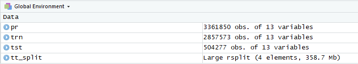
Figure 4-33. View of the training and testing dataframes
Shaping and One-Hot Encoding
We are still in the process of shaping our data for TensorFlow and Keras. We continue with basic R programming in the next steps. The next steps are to shape the data such that it will work well with a neural network. Neural networks, in general, work best on data that is normally distributed. The data that we are feeding into our network needs to be nominal: we can’t feed the categorical variables we find in our purchase requisition data into the model. The network wouldn’t know what to do with something such as “Material Group.” We will convert our categorical data to sparse data using a process called one-hot encoding.5 For instance, the result of a one-hot encoding for the Matl.Group column would look like Figure 4-34.
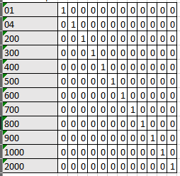
Figure 4-34. Visualization of one-hot encoding
We know that we want to one-hot encode our categorical variables, but what do we want to do with the others, if anything? Consider the Qty.Requested column, and the number of options on a purchase requisition for quantity requested. A purchase requisition for a new vehicle would likely not be more than one. However, the quantity requested for batches of raw materials might be a thousand pounds. This makes us curious, what is the range of values in the Qty.Requested column? We can see that easily with these commands:
max(pr$Qty.Requested)min(pr$Qty.Requested)
We see that the values range from 0 to 986. What? Quantities of zero? How many of them are there?
count(pr[which(pr1$Qty.Requested==0),])
We see that there are 313 rows with a quantity of 0! What could this mean? We are confused about this data, so do we throw it out? Data science is not a vacuum, as much as us coders would like it to be. We have to return to the business with a couple examples of purchase requisitions with quantities of zero and ask them if they know why. If they don’t, then we’ll toss the rows with zero quantities.
We learned something through this process. When Pat is asked about these strange requisitions he says, “Sometimes when I’m not at my computer and someone calls about a purchase requisition that I reject, they zero out the quantity because they don’t have authority to reject the line.” In essence, zero quantity purchase requisitions are rejected purchase requisitions. We have to convert the deletion indicator on these to 1 to indicate they are rejected:
pr=within(pr,{deletion=ifelse(Qty.Requested==0,1,0)})
Now that we’ve properly dealt with zero quantity purchase requisitions we return to the task at hand. The model will not perform optimally on individual variables from 0 to a thousand. Bucketing these order quantities into groups will allow the model to perform better. We will create three buckets of values. We’ve chosen this value rather arbitrarily and can change it later as we test the performance of our model.
Recipes
We’ve decided to one-hot encode our categorical variables and scale and bucket our numeric ones. To do this we will use the recipes library in R. This very convenient library allows us to create “recipes” for our data transformation.
The recipes concept is intuitive: define a recipe that can be used later to apply encodings and processing. The final result can then be applied to machine learning or neural networks.
We’ve already decided what we want to do with our data to prepare it for a network. Let’s go through the code from the recipes package that will make that happen.
First we want to create a recipe object that defines what we are analyzing. In this code we say we want to predict the deletion indicator based on the other features in our data:
library(recipes)recipe_object<-recipe(deletion~Document.Type+PGr+Matl.Group+Qty.Requested+Un+Valn.Price+Tax.Jur.+Profit.Ctr,data=trn)#We could also just use the . like this to indicate all, but the above is done#for clarity. recipe_object <- recipe(deletion ~ ., data = trn)
Note
If you run into memory errors such as “Error: cannot allocate vector of size x.x Gb” you can increase the memory allowed by using the following command (the first two numbers indicate how many gigs you are allocating; in this case, it’s 12):
memory.limit(1210241024*1024)
Our next step is to take that recipe object and apply some ingredients to it. We already stated that we want to put our quantity and price values into three bins. We use the step_discretize function from recipes to do that:
Tip
Some modelers prefer binning and some prefer keeping continuous variables continuous. We bin here to improve performance of our model later.
recipe_object<-recipe_object%>%step_discretize(Qty.Requested,options=list(cuts=3))%>%step_discretize(Valn.Price,options=list(cuts=3))
We wanted to also one-hot encode all of our categorical variables. We could list them out one at a time, or we could use one of the many selectors that come with the recipes package. We use the step_dummy function to perform the encoding and the all_nominal selector to select all of our categorical variables:
recipe_object<-recipe_object%>%step_dummy(all_nominal())
Then we need to scale and center all the values. As mentioned earlier, our data is not Gaussian (normally distributed) and therefore some sort of scaling is in order:
rec_obj<-rec_obj%>%step_center(all_predictors())%>%step_scale(all_predictors())
Tip
There are many normalization methods; in our example, we use min-max feature scaling and standard score.
Notice so far that we’ve not done anything with the recipe. Now we need to prepare the data and apply the recipe to it using the prep command:
recipe_trained<-prep(recipe_object,training=trn,retain=TRUE)
Now we can apply the recipe to any dataset we have. We will start with our training set and also put in a command to exclude the deletion indicator:
x<-bake(rec_obj,new_data=trn)%>%select(-deletion)
Preparing Data for the Neural Network
Now that we are done with our recipe, we need to prepare the data for the neural network.
Tip
Our favorite (and commonly excepted best) technique is to not jump directly into a neural network model. It is best to grow from least to most complex models, set a performance bar, and then try to beat it with ever more increasingly complex models. For instance, we should first try a simple linear regression. Because we are trying to classify approved and not-approved purchase requisitions we may then try classification machine learning techniques such as a support vector machine (SVM) and/or a random forest. Finally, we may come to a neural network. However, for teaching purposes we will go directly to the neural network. There was no a priori knowledge that led to this decision; it is just a teaching example.
First we want to create a vector of the deletion values:
training_vector<-pull(trn,deletion)
If this is your first time using TensorFlow and Keras you will need to install it. It is a little different than regular libraries so we’ll cover the steps here. First you install the package like you would any other package using the following command:
install.packages("tensorflow")
Then, to use TensorFlow you need an additional function call after the library declaration:
library(tensorflow)install_tensorflow()
Finally, it is good process to check and make sure it is working with the common print hello lines below. If you get the “Hello, TensorFlow!"” statement, it’s working:
sess=tf$Session()hello<-tf$constant('Hello, TensorFlow!')sess$run(hello)
Keras installs like any other R library. Let’s create our model in Keras. The first step is to initialize the model, which we will do using the keras_model_sequential() function:
k_model<-keras_model_sequential()
Models consist of layers. The next step is to create those layers.
Our first layer is an input layer. Input layers require the shape of the input. Subsequent layers infer the shape from the first input layer. In our case this is simple, the input shape is the number of columns in our training set ncol(x_trn). We will set the number of units to 18. There are two key decisions to play with while testing your neural network. These are the number of units per layer and the number of layers.
Our next layer is a hidden layer with the same number of inputs. Notice that it is the same as the previous layer but we did not have to specify the shape.
Our third layer is a dropout layer set to 10%. That is, randomly 10% of the neurons in this layer will be dropped.
Tip
Dropout layers control overfitting, which is when a model in a sense has memorized the training data. When this happens, the model does not do well on data it has not seen...kind of defeating the purpose of a neural network. Dropout is used during the training phase and essentially randomly drops out a set of neurons.
Our final layer is the output layer. The number of units is 1 because the result is mutually exclusive. That is, either the purchase requisition is approved or it is not.
Finally, we will compile the model or build it. We need to set three basic compilation settings:
- Optimizer
- The technique by which the weights of the model are adjusted. A very common starting point is the
Adamoptimizer. - Initializer
- The way that the model sets the initial random weights of the layers. There are many options; a common starting point is
uniform. - Activation
- Refer to Chapter 2 for a description of activation functions. Keras has a number of easily available activation functions.
k_model%>%#First hidden layer with 18 units, a uniform kernel initializer,#the relu activation function, and a shape equal to#our "baked" recipe object.layer_dense(units=18,kernel_initializer="uniform",activation="relu",input_shape=ncol(x_trn))%>%#Second hidden layer - same number of layers with#same kernel initializer and activation function.layer_dense(units=18,kernel_initializer="uniform",activation="relu")%>%#Dropoutlayer_dropout(rate=0.1)%>%#Output layer - final layer with one unit and the same initializer#and activation. Good to try sigmoid as an activation here.layer_dense(units=1,kernel_initializer="uniform",activation="relu")%>%#Compile - build the model with the adam optimizer. Perhaps the#most common starting place for the optimizer. Also use the#loss function of binary crossentropy...again, perhaps the most#common starting place. Finally, use accuracy as the metric#for seeing how the model performs.compile(optimizer="adam",loss="binary_crossentropy",metrics=c("accuracy"))
Tip
Setting the parameters of your neural network is as much an art as it is a science. Play with the number of neurons in the layers, the dropout rate, the loss optimizer, and others. This is where you experiment and tune your network to get more accuracy and lower loss.
To take a look at the model, type k_model:
___________________________________________________________________________
 Layer (type)                       Output Shape                    Param #
 =========================================================================
 dense_2 (Dense)                    (None, 18)                      2646
 ___________________________________________________________________________
 dropout_1 (Dropout)                (None, 18)                      0
 ___________________________________________________________________________
 dense_3 (Dense)                    (None, 18)                      342
 ___________________________________________________________________________
 edropout_2 (Dropout)               (None, 18)                      0
 ___________________________________________________________________________
 dense_4 (Dense)                    (None, 1)                       19
 =========================================================================
 Total params: 3,007
 Trainable params: 3,007
 Non-trainable params: 0
 ___________________________________________________________________________
The final step is to fit the model to the data. We use the data that we baked with the recipe, which is the x_trn:
history<-fit(#fit to the model defined aboveobject=k_model,#baked recipex=as.matrix(x_trn),#include the training_vector of deletion indicatorsy=training_vector,#start with a batch size of 100 and vary it to see performancebatch_size=100,#how many times to run through?epochs=5,#no class weights at this time, but something to try#class_weight <- list("0" = 1, "1" = 2)#class_weight = class_weight,validation_split=0.25)
The model displays a log while it is running:
Train on 1450709 samples, validate on 483570 samples
Epoch 1/5
1450709/1450709 [==============================]
- 19s 13us/step - loss: 8.4881e-04 - acc: 0.9999 -
val_loss: 0.0053 - val_acc: 0.9997
Epoch 2/5
1450709/1450709 [==============================]
- 20s 14us/step - loss: 8.3528e-04 - acc: 0.9999 -
val_loss: 0.0062 - val_acc: 0.9997
Epoch 3/5
1450709/1450709 [==============================]
- 19s 13us/step - loss: 8.5323e-04 - acc: 0.9999 -
val_loss: 0.0055 - val_acc: 0.9997
Epoch 4/5
1450709/1450709 [==============================]
- 19s 13us/step - loss: 8.3805e-04 - acc: 0.9999 -
val_loss: 0.0054 - val_acc: 0.9997
Epoch 5/5
1450709/1450709 [==============================]
- 19s 13us/step - loss: 8.2265e-04 - acc: 0.9999 -
val_loss: 0.0058 - val_acc: 0.9997
Results
What we want from our model is for the accuracy to be high and for it to improve over the number of epochs. However, this is not what we see. Note the second graph in Figure 4-35. We see that the accuracy is very high from the start and never improves. The loss function also does not decrease but stays relatively steady.
This tells us that the model did not learn anything. Or rather, it learned something quickly that made it very accurate and quit learning from that point. We can try a number of tuning options, perhaps different optimizers and loss functions. We can also remodel the neural network to have more or less layers. However, let’s think at a higher level for a minute and turn back to the raw data with some questions.
Did we select the right features from SAP from the beginning? Are there any other features that might be helpful?
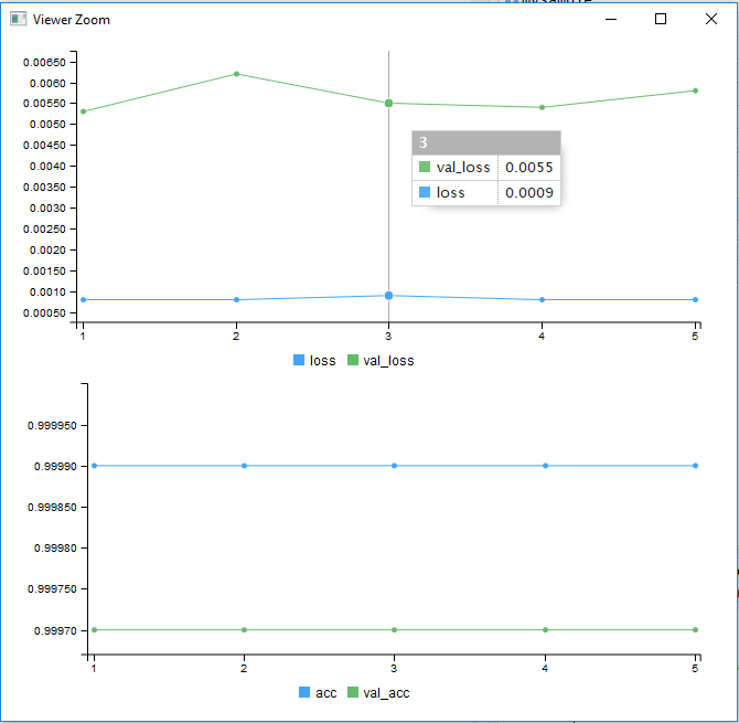
Figure 4-35. Accuracy and loss results from the model learning
Did we make mistakes along the way or did we make assumptions that were incorrect? This requires a review of the process.
Is this data that can be modeled? Not all data is model ready.
After going through these questions we stumble upon this. What if the number of approved purchase requisitions is overwhelming? What if the model just learned to say “Yes” to everything because during training it was nearly always the right answer? If we go back and look at the numbers before any modeling, we see that Pat approves over 99% of all purchase requisitions. We can try different models and different features in our data, but the likely truth to this data exploration saga is that this data cannot be modeled. Or rather it can be modeled, but because of the high number of approvals the model will learn only to approve. It will find it has great accuracy and low loss and therefore on the surface it is a good model.
Summary
Despite the failure to model the purchase requisition data, this example teaches a lot of good lessons. Sometimes data can’t be modeled, it just happens...and it happens a lot. A model that has high accuracy and low loss doesn’t mean it is a good model. Our model had 99% accuracy, which should raise a suspicious eyebrow from the start. But it was a worthless model; it didn’t learn. A common role of a data scientist is to report on findings and to propose next steps. We failed, but we failed fast and can move past it toward the right solution.
It could be argued that Greg and Paul failed Pat. After all, we can’t make any good predictions based on the data we found and explored. But just because we didn’t find a way to predictively model the scenario doesn’t mean we failed. We learned! If data science is truly science, it must admit negative results as well as positive. We didn’t learn to predict purchase requisition behavior, but we did learn that trying to do so wouldn’t be cost effective. We learned that Pat and his colleagues have created solid processes that make the business very disciplined in its purchasing behavior.
In exploratory data analysis, the only failure is failing to learn. The model may not have learned, but the data scientists did. Greg and Paul congratulate themselves with an extra trip to the coffee machine.
In this chapter we have identified a business need, extracted the necessary data from SAP, cleansed the data, explored the data, modeled the data, and drawn conclusions from the results. We discovered that we could not get our model to learn with the current data and surmised this was because the data is highly skewed in favor of approvals. At this point, we are making educated guesses; we could do more.
There are other approaches we could take. For instance, we could augment the data using encoders, which would be beyond the scope of this book. We could weight the variables such that the rejected purchase requisitions have greater value than the accepted ones. In testing this approach, however, the model simply loses all accuracy and fails for an entirely different reason. We could also treat the purchase requisitions that are rejected as anomalies and use a completely different approach. In Chapter 5, we will dig into anomaly detection, which might provide other answers if applied to this data.
We have decided that the final course of action to be taken in our example is not a data approach (much to our chagrin). The business should be informed that because over 99% of all purchase requisitions are approved, the model could not find salient features to determine when a rejection would occur. Without significantly more work, this is likely a dead end. Perhaps there are different IT solutions, such as a phone app that could help Pat do his job more efficiently. The likely solution, however, cannot be found through machine learning and data science.
1 For instructions on how to install R Studio and R, go to https://www.rstudio.com/products/rstudio/download/.
2 We have referenced this before, but we’ll link to it again (it is that good): https://vita.had.co.nz/papers/tidy-data.pdf.
3 Dive deep into DataExplorer using the vignette available at https://cran.r-project.org/web/packages/DataExplorer/vignettes/dataexplorer-intro.html.
4 Remember from Chapter 2 that discrete or categorical features are features with definable boundaries. Think categories such as colors or types of dogs.
5 Sometimes called creating “dummy variables.”
Get Practical Data Science with SAP now with the O’Reilly learning platform.
O’Reilly members experience books, live events, courses curated by job role, and more from O’Reilly and nearly 200 top publishers.

