What's the difference between eating in and eating out, other than someone else does the cooking and clean up? One major difference is how the food is served. Even the simplest restaurant will add some garnish, such as an orange slice or parsley, to a dish. The fancier restaurants can take food presentation to an art form, a process known as plating. They don't do this to be froufrou or in order to charge you an additional 20 bucks. They do so for practical reasons: to heat plates for hot food or cool them for cold; to keep foods that should be separate apart; to add flavor in a controlled manner, such as placing raspberry sauce under a slice of fudge cake.
For the most part, though, the reason that good cooks plate their presentations is to enhance the experience—to ensure that the diner experiences the food with as many senses as possible.
This process of plating can also be applied to photographs. Too often we put a photo into a page and other than a border or drop shadow, we ignore everything else about it and around it. Adding a photo into a story is an opportunity to not only embellish the story, but also to indulge your creativity when preparing the photo.
Thanks to digital cameras and the advances made in technology to manage photos, publishing pictures online has become the new arms race: he or she with the most photos online wins. Sacrificed in that rush to get the pictures online is the enjoyment we can experience taking time with each individual picture.
I live for layers in a photo editor. They're probably the most helpful tool in our editing arsenals.
One use of layers is to create a template image that can be saved and reused multiple times. The template is copied each time it's used, and then pasted into a new layer in the target photo. Through the use of layers, I can then shift the template about until it's just right.
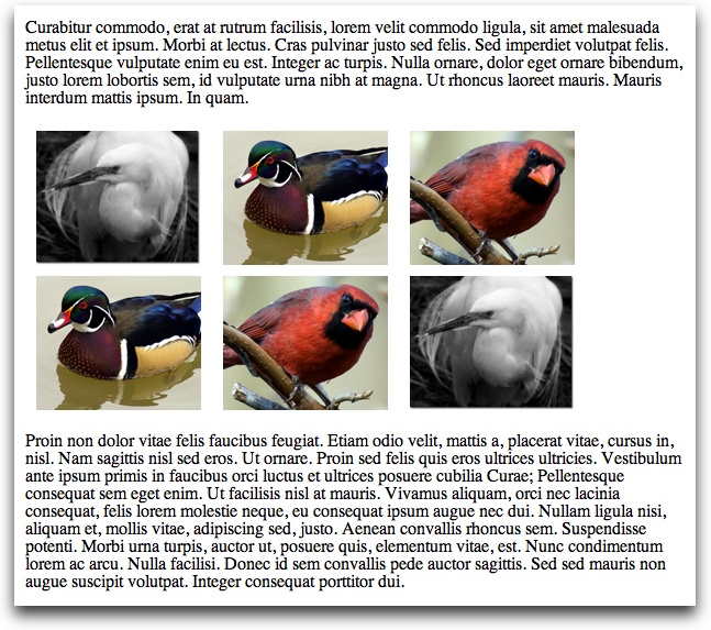
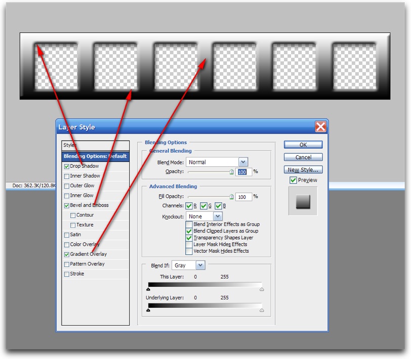
Figure 4-15 shows a series of beveled tiles, all created from one photo, embedded into a web page. The distance of the photos to each other is true to the original picture, because I use a template to "cut" out the individual items without impacting the layout of the items.
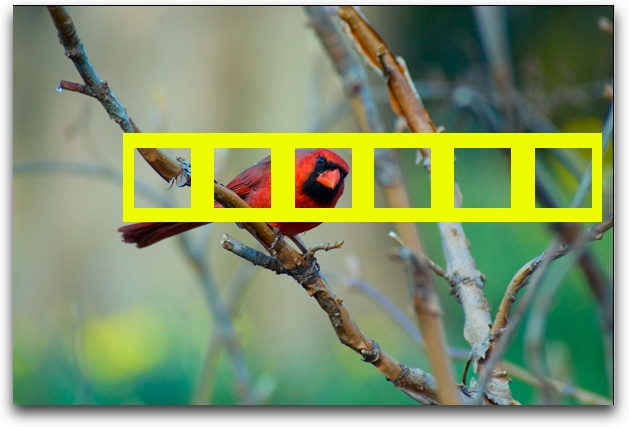
The template is nothing more than a long rectangle with a series of same-sized squares, placed equidistant from one another, that are cut out, leaving a transparent background for each. To use such a template, first transform the background image into a layer. Then, copy the template and paste it into the photograph, first coloring the template in such a way that it doesn't match any nearby color, as shown in Figure 4-16.
At this point, use the Magic Wand (or whatever your photo editor supports) to "select" the template and delete it, leaving behind the isolated squares. You can crop out the rest of the picture, and use the Photoshop Bevel and Emboss layer style to add the beveled effect. The same challenges with alpha channels, PNGs, and IE 6.x relate to this type of effect, so you may want to flatten the image to a JPEG before saving.
Here are the steps to re-create this effect:
Create the template by cutting out the parts of the image that will remain in the final work.
Transform the photo into a layer if it isn't already.
Copy and paste the template into a new layer in the target photo.
Move the template around until the openings are aligned to your preference.
Color the template so that it doesn't match any color in the underlying photo, and then merge the two layers.
Select the template using whatever tool selects items based on color and proximity. I used Photoshop's Magic Wand for the work in this chapter.
Delete the selected item, and then crop the image down so that only the cut-out portions of the photo remain.
Apply an effect, such as the Photoshop Bevel and Emboss.
This makes a good "break" in text because the image is not so tall that the item is overly distracting. Depending on the topic of the text and the photo used, it should add color and a visual enhancement to the story. It can also be resized smaller to create an even subtler visual break.
Tip
Novell provides a great tutorial in how to manually add a bevel effect in GIMP at http://www.novell.com/coolsolutions/feature/17391.html.
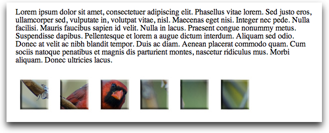
A variation using this pattern doesn't cut the template, but instead modifies it so that it becomes part of the picture. Figure 4-17 shows another example with the same template but a different underlying photo. In this version, a metal effect is added to the template by selecting the Drop Shadow, Bevel and Emboss, and Gradient layer styles, as shown in Figure 4-18. The underlying photo is trimmed down to fit within the frame, and then the two layers are merged into one.
These examples provide alternatives to plain horizontal breaks, and are more for adding visual stops than focusing attention on the subject. The next few effects are used more for creating an editorial context with images.
One popular effect for both photos and other graphics, such as screenshots, is a torn-edge effect. A torn edge can add a nice flourish to the image, but can also be used to add a more three-dimensional feel, as well as context, to the picture. There are numerous ways of accomplishing a torn edge, but the one I'm going to demonstrate is one of the simplest.
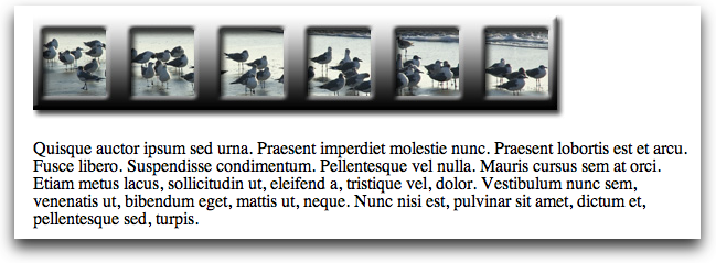
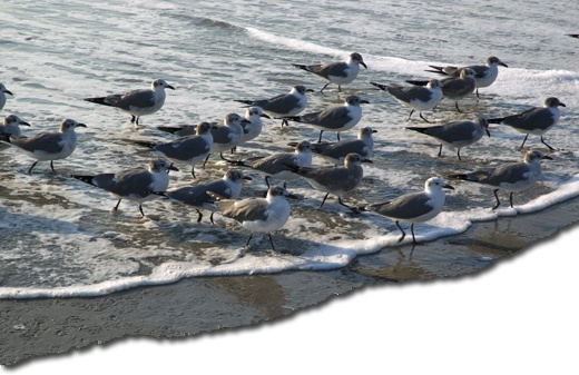
For this example, I'm taking a group seagull photo shot in Florida and giving it a torn edge, just below the beach line but without following the line exactly. The end result is shown in Figure 4-19.
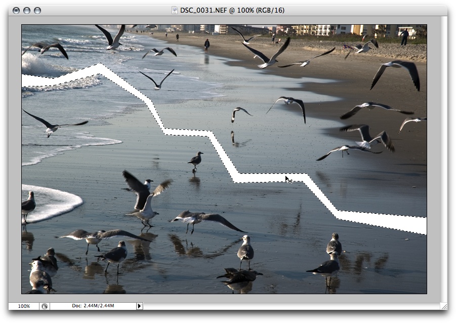
For the effect, create a "tear" line along the sand using the Polygonal Lasso Tool, continuing around the bottom and back to select the entire bottom half of the picture. Delete the bottom part of the image.
Once the bottom part of the image is deleted, use the same Lasso tool to select along the torn edge, about 10 pixels in from the edge, and then follow the photo around the outside until the rest is selected. Invert the selection so that the edge is the only part of the image selected, as shown in Figure 4-20.
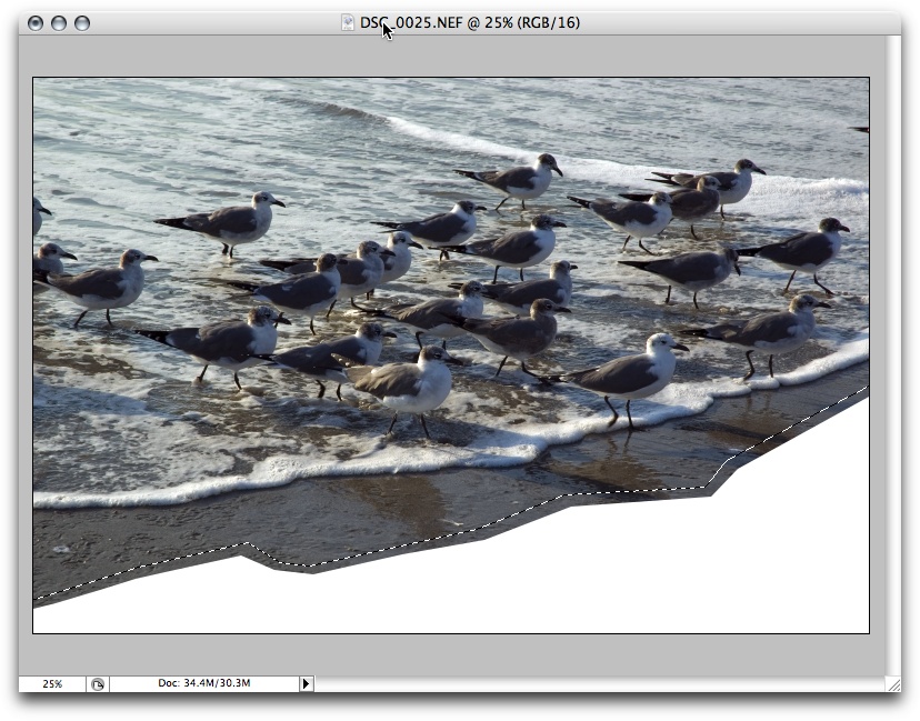
Figure 4-20. Using the Lasso Tool to "tear" a chunk off the bottom of the photo and then select the edge
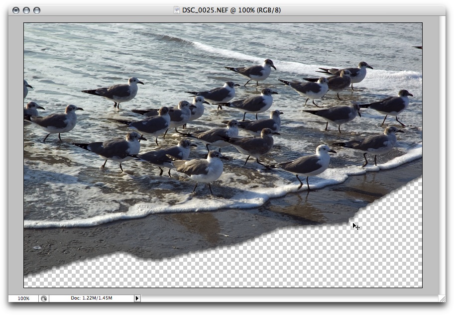
Select the Filter → Distort → Ripple filter and use a medium distortion size, setting the amount to 100%. You might want to experiment with these values, or even use different filters, such as the Ocean Ripple.
Once the edge has been distorted, convert the photo to a layer, use the Magic Wand to select the bottom single-color portion of the picture, and delete it. This leaves a nice irregular edge to the picture. Accessing the Layer Style, add a Drop Shadow that is 5 pixels wide, with a light source set to 90 degrees, as shown in Figure 4-21. Flatten the image to convert to a JPEG, or you can leave the bottom transparent if you want to save the photo as a PNG.
To recap the steps:
Set the background color to white.
Use the Polygonal Lasso Tool, or any other tool, to create an irregular shape where you want the torn edge effect to be applied.
Select the edge about 10 pixels in or so.
Using the Filter → Distort → Ripple effect, distort the edge the amount you wish.
Convert the image to a layer, use the Magic Wand to select the bottom, white portion of the image, and delete it.
Add a Drop Shadow Layer Style set to 90 degrees, 5 pixels in size.
Flatten the image if you want to save as a JPEG.
Effects don't have to be restricted just to the edges of a photo. You can also create a broken effect directly through a photo, covered next.
Another effect that's quite simple to create is a broken photo effect, with a jagged but clean-edged break through the photo itself. This could be used to visually enhance a picture or to make an editorial statement, such as creating a broken photo from a political rally or of an old building that was recently taken down.
This how-to uses a second seagull photo, this one of birds on the beach and birds just taking off. There's a nice, clear area of sand that marks the boundary between walking and flying birds, which forms a perfect break point for the picture, as can be seen in Figure 4-22.
To start, draw break lines using the Polygonal Lasso tool without making both sides completely parallel, because we want the effect to look not only like a break, but one that's pulled away a bit at one end, as shown in Figure 4-23.
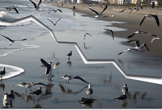
Next, duplicate the layer, and in the top layer, use the Lasso tool to select the bottom part of the "broken" photo and delete it. You don't have to be too careful selecting around the break, because once you've deleted the bottom part of the tool, you use the Magic Wand to select the rest of the white area from the break and delete it, too.
The next step is to add a shadow to the top piece of the photo, again using a 90-degree light source, a shadow width of 10 pixels, and a distance setting of 10 pixels. Once that's finished, merge the two layers.
I don't modify pictures just for the sake of modifying them, though I enjoy trying out new effects. To return to the analogy of plating, I add the presentation effects to the photos so that they enhance the writings in which they're incorporated. This can be even more effective if you use a sequence of photos in the same page, each modified with a different but complementary effect.
The two seagull photos and a third are used to annotate a story on community. They're a natural subject, because seagulls are known to be both communal and competitive, and we have pictures that show gulls grouped tightly together, walking in lockstep, and then a picture with half the birds flown away and the rest either continuing to walk or thinking about flying away.
The pictures are color matched, first, using the techniques described in Chapter 3. Next, the first picture is modified with a Drop Shadow, the second with the broken photo effect, and the last with the torn edge. The torn edge picture is last because the diagonal of the tear leaves considerable white space below, which will look odd within text. However, at the bottom of an article, it creates an "arrowed" effect, which can be a nice finishing touch.
Consistency is key and goes beyond color matching when you're grouping photos using effects. If a light source is implied in the effect, such as the Drop Shadow, it needs to be in the same direction and intensity in all pictures—or, at a minimum, adjusted so that the position where the photo is in the page might account for light differences.
In the three grouped photos, shown in Figure 4-24, and without text, the Drop Shadow is applied to the bottom of all three pictures (set to the same light source angle and amount), and the photos are the same width as well as the same color, cast, and brightness, as mentioned earlier.
Any one of the photos can be fine by itself, but as a group they can be striking, and as annotation, very effective.
Another effect is to cut a picture into pieces, breaking the picture along natural lines—such as a horizon, or around an object—and then using each piece in sequence in the page. In fact, when you think outside the photo box and consider the concept of photo plating, there's a world of possibilities.
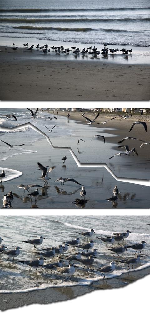
Photo and effect grouping can also be applied to galleries, in order to create something out of the ordinary. Of course, the simplest galleries are those that are generated for us, which I'll cover next.
There are also any number of plug-ins and tutorials, as well as applications, to create effects within the photos themselves, such as adding a motion trail to a dog running in a picture, or distorting the eyes and head of a cat so that it appears to be coming out of the page and staring at you. All you have to do is search on "photo effects," and be prepared to spend the next several weeks exploring all the possibilities.
The only thing you'll want to be careful of is making sure the effect doesn't overshadow both the purpose and the page. Mad twirls and other distortions might be fun to create, but if they don't add to the message or to the page, we're back to the Hamster on the Color Wheel and animated unicorns that I discussed in Chapter 1.
Know why you're applying an effect, and what you hope to accomplish with it before you start playing.
Get Painting the Web now with the O’Reilly learning platform.
O’Reilly members experience books, live events, courses curated by job role, and more from O’Reilly and nearly 200 top publishers.

