Chapter 1. Getting to an Effective Visualization
Choosing or designing a good visualization is rarely a straightforward process. It is tempting to believe that there is one beautiful visualization that will show all the critical aspects of a dataset. That the right visual representation will reveal hidden insights. That a perfect, simple, and elegant visualization—perhaps just a line chart or a well-chosen scatterplot—will show precisely what the important variable was and how it varied in precisely the way to illustrate a critical lesson.
This is often the impression that we, at least, are left with after reading data science case studies. But in our experience, this does not match the reality of visual data analysis. It takes hard work, and trial and error, to get to an insightful visualization. We start by thinking about what we want to know, and we refine fuzzy questions into actionable, concrete tasks. We clean, reshape, and restructure the data into forms that we can put into a visualization. We work around limitations in the data, and we try to understand what the user wants to learn. We have to consider which visual representations to use and what interaction mechanisms to support. Along the way, we find other variables that tell us more about the dataset and that help clarify our thinking. And no single visualization is ever quite able to show all of the important aspects of our data at once—there just are not enough visual encoding channels.
Designing effective visualizations presents a paradox. On the one hand, visualizations are intended to help users learn about parts of their data that they don’t know about. On the other hand, the more we know about the users’ needs and the context of their data, the better we can design a visualization to serve them. The process described in this book embraces this paradox: it leverages the knowledge users have of their datasets, the context the data lives in, and the ways it was collected—including its likely flaws, challenges, and errors—in order to figure out the aspects of it that matter.
Put another way, this book is about the path from “I have some data…” to “We know this because of these clear, concise, and insightful visualizations.” We believe that creating effective visualizations is itself a process of exploration and discovery. A good visualization design requires a deep understanding of the problem, data, and users.
Getting to Insight
We most often work with other people that have a dataset they are trying to make sense of. The process of designing a visualization usually starts when people walk into our office.
CLIENT: I have some data that I’d like to visualize. How should I draw it?
The client seems to expect us to pull a visualization off the shelf, to sculpt that perfect visualization. We almost always frustrate them by asking what they hope to see.
Q: What is it about the data that you would like to visualize?
CLIENT: I want to see how profitable our stores are.
Q: What in your data indicates a store being profitable?
CLIENT: It means that the store has lots of sales of high-profit items.
Q: How does profit vary by store?
And so on.
By the end of this process, we often find that the clients do not have a visualization problem, but an operationalization one. Their struggles to choose a visualization stem from a lack of clarity about which attributes of the data are most important and how those attributes relate to one another. Once they can describe how the data attributes relate to the question they are trying to answer, finding an appropriate visualization becomes much easier.
We have learned over the years that designing effective visualizations to make sense of data is not an art—it is a systematic and repeatable process. We have systematized this process into what we believe are reproducible and clear steps.
This process tracks our understanding of four components:
- Data
-
What data is available, and what does it mean? What does the data look like, and what are its important aspects? Where did it come from, and why was it originally collected?
- Tasks
-
What needs to happen with the data? What are the low-level questions and tasks that will support high-level goals?
- Stakeholders
-
Who is involved with the data, the problem, and the goals? What can they say about the problem to help design an effective visualization? Who will view the final visualization, and what sorts of things do we expect them to learn from it? What domain knowledge do they bring to the table? What answers would they find satisfying?
- Visualization
-
How does the understanding of data, tasks, and stakeholders come together? What representations of this data will fulfill the tasks for the users?
Regardless of the visualization outcome, this process will almost certainly lead to new discoveries and insights. These discoveries help to inform the operationalization, but they will also likely steer the process down new and unexpected paths. The guidance and framework in this book are meant to help identify opportunities for discovering new knowledge and to make an otherwise messy process a bit more structured.
Hotmap: Making Decisions with Data
As an example of how visualizations can help you to better understand a problem, and help an organization make decisions, we can look back to 2006. Microsoft was rolling out its new mapping tool, Virtual Earth, a zoomable world map. The team behind Virtual Earth had lots of questions about how their users were using this new tool, so they collected usage data.
The usage data was based on traditional telemetry: it had great information on what cities were most viewed, how many viewers were in “street” mode versus “photograph” mode, and even information about viewers’ displays. They instrumented search and navigation, and they collected counts for the number of times that users looked at certain sentinel regions. And because Virtual Earth was built on top of a set of progressively higher-resolution image tiles, the team was also archiving server logs that tracked how often individual tiles were downloaded.
Interviews with team members suggested that they did not have an intuitive notion of how their tool was being used. In conversation, one team member argued that people were likely to look at their own homes; another thought that the overhead photography would mostly be used over mountains. The goals were varied: they included seeing whether the user experience was well balanced across user needs and deciding how and where to invest in future rounds of photography.
We addressed these questions with a visualization tool called Hotmap. Figure 1-1 shows a screen capture from the visualization tool, focusing on the central United States. Hotmap uses a heatmap encoding of the tile access values. This is a visualization technique that uses a colormap to encode the access values at the geospatial locations of the tiles. Colored spots on the map are places where more users have accessed image tiles. The colormap is a logarithmic color scale, so bright spots have many more accesses than dim ones.
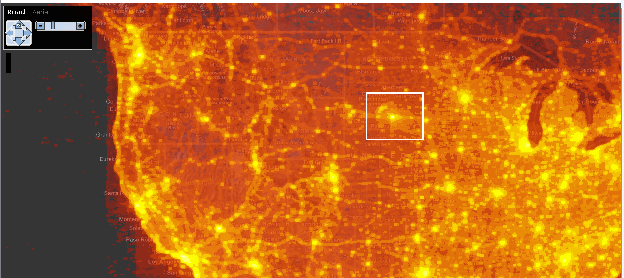
Figure 1-1. Hotmap, looking at the central United States. The white box surrounds an anomaly in South Dakota.
Some of the brightest areas correspond to major population centers—Chicago and Minneapolis on the right, Denver and Salt Lake City in the middle, and West Coast cities on the left. Near the center, though, is an anomalous shape: a bright spot where no big city exists. There is a star shape around the bright spot, and an arc of bright colors nearby. The spot is in a sparsely populated bit of South Dakota—there was no obvious reason to the team why users might zoom in there.
That point is, however, very close to the center of a map of the continental US. In fact, the team learned that the center of the star corresponds to the center of the default placement of the map in many browsers. The bright spot with the star most likely corresponds to users sliding around after inadvertently zooming in, trying to figure out where they’ve landed; the arc seems to correspond to variations in monitor proportions.
As a result of this usability challenge, many mapping tools—including Bing Maps (the successor product to Virtual Earth)—no longer offer a zoom slider, which keeps users from accidentally zooming all the way in on a single click.
A second screen capture, shown in Figure 1-2, reveals a bright spot off the coast of Ghana. This spot exhibits the same star pattern created by users scrolling around to try to figure out what part of the map they are viewing. This spot is likely only bright because it is at 0 degrees latitude, 0 degrees longitude, a point that GIS tools run into often. While computers might find (0,0) appealing, it is unlikely that there is much there for the typical Virtual Earth user to find interesting.1
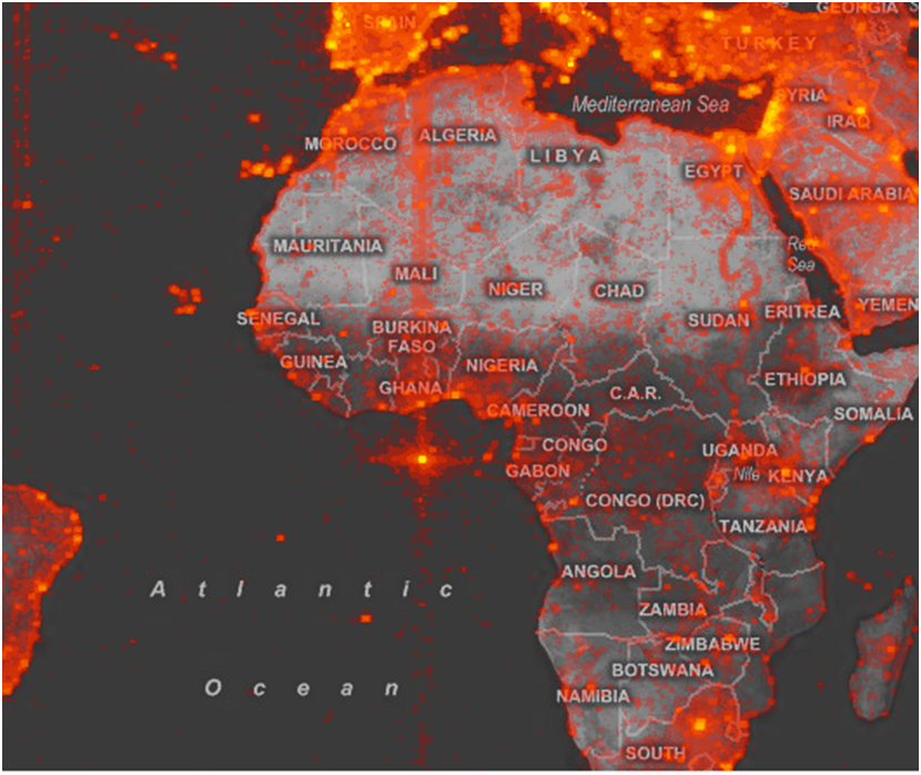
Figure 1-2. Hotmap, looking at the map origin (0,0).
This second bright spot inspired a hunt for bugs. The team rapidly learned that Virtual Earth’s search facility would sometimes fail, and instead of returning an error message, typos and erroneous searches would sometimes redirect the user to (0,0). Interestingly, the bug had been on the backlog for some time because the team had decided that it was not likely to surface often. Seeing this image made it clear that some users really were being confused by the error, so the team prioritized the bug.
Although the Virtual Earth team started out using the Hotmap visualization expecting to find out about how users interacted with maps, they gleaned much more than just a characterization of usage patterns. Like many—dare we say most?—new visualizations, the most interesting insights were those that the viewers were not anticipating to find.2
Where Visualization Is Useful
Is visualization the silver bullet to help us make sense of data? Not always. There are two questions to consider to help you decide if your data analysis problem is a good candidate for a visualization solution.
First, could the analysis tasks be supported with an algorithm? A crisp task such as “I want to know the total number of users who looked at Seattle” suggests that an algorithm, statistical test, or even a table of numbers might be the best way to answer the question. On the other hand, “How do users explore the map?” is much fuzzier. Fuzzy tasks are great candidates for a visualization solution because they require you to look at the data from different angles and perspectives, and to be able to make decisions and inferences based on your own knowledge and understanding.
The second question to consider is “Is all the necessary information contained in the dataset?” If there is information about the problem that is not in the dataset which requires an expert to interpret the data that is there, then visualization is a great solution. Going back to our fuzzy question about exploring a map, we can imagine that it is unlikely that there will be an explicit attribute in the data that classifies a user’s exploration style. Instead, answering this question requires someone to interpret other aspects of the data to bring knowledge to bear about what aspects of the data imply an exploration style. Again, visualization enables this sort of flexible and user-centric analysis.
For all but the crispest questions about explicitly measured phenomena, visualization is probably a good tool to throw at a problem. In our experience, we have almost never come up against a problem that cannot benefit from some amount of visualization.
Further Reading
The Hotmap project is discussed in:
-
Fisher, Danyel. "Hotmap: Looking at Geographic Attention.” IEEE Transactions on Visualization and Computer Graphics 13 (2007): 1184–1191.
-
Fisher, Danyel. "The Impact of Hotmap.” The Infovis 2009 Discovery Exhibition. Redmond, WA: Microsoft, 2009.
1 So many datasets have references to (0,0) that GIS practitioners refer to that location as “null island.”
2 See “Further Reading” for other stories of how Hotmap has been used.
Get Making Data Visual now with the O’Reilly learning platform.
O’Reilly members experience books, live events, courses curated by job role, and more from O’Reilly and nearly 200 top publishers.

