Chapter 4. Hick’s Law
The time it takes to make a decision increases with the number and complexity of choices available.

Overview
One of the primary functions we have as designers is to synthesize information and present it in a way that doesn’t overwhelm the people who use the products and services we design. We do this because we understand, almost instinctively, that redundancy and excessiveness create confusion. This confusion is problematic when it comes to creating products and services that feel intuitive. Instead we should enable people to quickly and easily accomplish their goals. We risk causing confusion when we don’t completely understand the goals and constraints of the people using the product or service. Ultimately, our objective is to understand what the user seeks to accomplish so that we can reduce or eliminate anything that doesn’t contribute to them successfully achieving their goal(s). We, in essence, strive to simplify complexity through efficiency and elegance.
What is neither efficient nor elegant is when an interface provides too many options. This is a clear indication that those who created the product or service do not entirely understand the needs of the user. Complexity extends beyond just the user interface; it can be applied to processes as well. The absence of a distinctive and clear call to action, unclear information architecture, unnecessary steps, too many choices or too much information—all of these can be obstacles to users seeking to perform a specific task.
This observation directly relates to Hick’s law, which predicts that the time it takes to make a decision increases with the number and complexity of choices available. Not only is this principle fundamental to decision making, but it’s also critical to how people perceive and process the user interfaces we create. We’ll look at some examples of how this principle relates to design, but first let’s look at its origins.
Origins
Hick’s law was formulated in 1952 by psychologists William Edmund Hick and Ray Hyman, who were examining the relationship between the number of stimuli present and an individual’s reaction time to any given stimulus. What they found was that increasing the number of choices available logarithmically increases decision time. In other words, people take longer to make a decision when given more options to choose from. It turns out there is an actual formula to represent this relationship: RT = a + b log2 (n) (Figure 4-1). This formula calculates response time (RT) based on the number of stimuli present (n) and two arbitrary measurable constants that depend on the task (a, b).
Fortunately, we don’t need to understand the math behind this formula to grasp what it means. The concept is straightforward when applied to design: the time it takes for users to interact with an interface directly correlates to the number of options available to interact with. This implies that complex or busy interfaces result in longer decision times for users, because the users must first process the options that are available to them and then choose which is most relevant in relation to their goal. When an interface is too busy, actions are unclear or difficult to identify, and critical information is hard to find, the mental effort required to find what we are looking for increases. This increase in mental effort is commonly referred to as cognitive load, which we covered in Chapter 3, “Miller’s Law”.
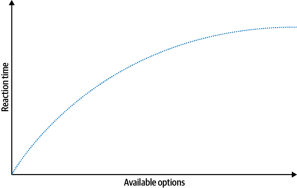
Figure 4-1. Diagram representing Hick’s law
Examples
Now that we have an understanding of Hick’s law, let’s take a look at some examples that demonstrate this principle. There are examples of Hick’s law in action everywhere, but we’ll start with a common one: remote controls.
As the number of features available in TVs increased over the decades, so did the options available on their corresponding remotes. Eventually, we ended up with remotes so complex that using them required either muscle memory from repeated use or a significant amount of mental processing. This led to the phenomenon known as “grandparent-friendly remotes.” By taping off everything except for the essential buttons, grandkids were able to improve the usability of remotes for their loved ones, and they also did us all the favor of sharing the modified remotes online (Figure 4-2).
In contrast, today we have smart TV remotes: the streamlined cousins of the previous examples, with the controls simplified to only those that are absolutely necessary (Figure 4-3). The result is a remote that doesn’t require a substantial amount of mental energy. The complexity is transferred to the TV interface itself, where information can be effectively organized and progressively disclosed within menus.

Figure 4-2. Modified TV remotes that simplify the “interface” (sources: Sam Weller via Twitter, 2015 [left]; Luke Hannon via Twitter, 2016 [right])

Figure 4-3. A smart TV remote, which simplifies the controls to only those absolutely necessary (source: Apple, 2023)
Now that we’ve looked at some examples of Hick’s law at work in the physical world, let’s shift our focus to the digital. As we’ve seen already, the number of choices available can have a direct impact on the time it takes to make a decision. We can ensure better user experiences by providing the right choices at the right time rather than presenting all the possible choices all the time. An excellent example of this can be found with Google Search, which provides the varying means of filtering results by type (all, images, videos, news, etc.) only after you’ve begun your search (Figure 4-4). This helps to keep people focused on the more meaningful task at hand, rather than being overwhelmed with decisions at the outset.
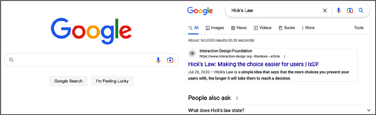
Figure 4-4. Google simplifies the initial task of searching (left) and provides the ability to filter results only after the search has begun (right) (source: Google, 2023)
Let’s look at another example of Hick’s law. Onboarding is a crucial but risky process for new users, and few applications nail it as well as Notion (Figure 4-5). Notion helps beginners learn the basics of its product by providing an easy-to-follow checklist for getting started. This is an effective way to onboard users because it mimics the way we actually learn: we often learn best by doing and building upon what we already know. By providing steps in a risk-free environment, we can enable new users to start interacting with an app without them feeling overwhelmed by an endless amount of possibilities for getting started.
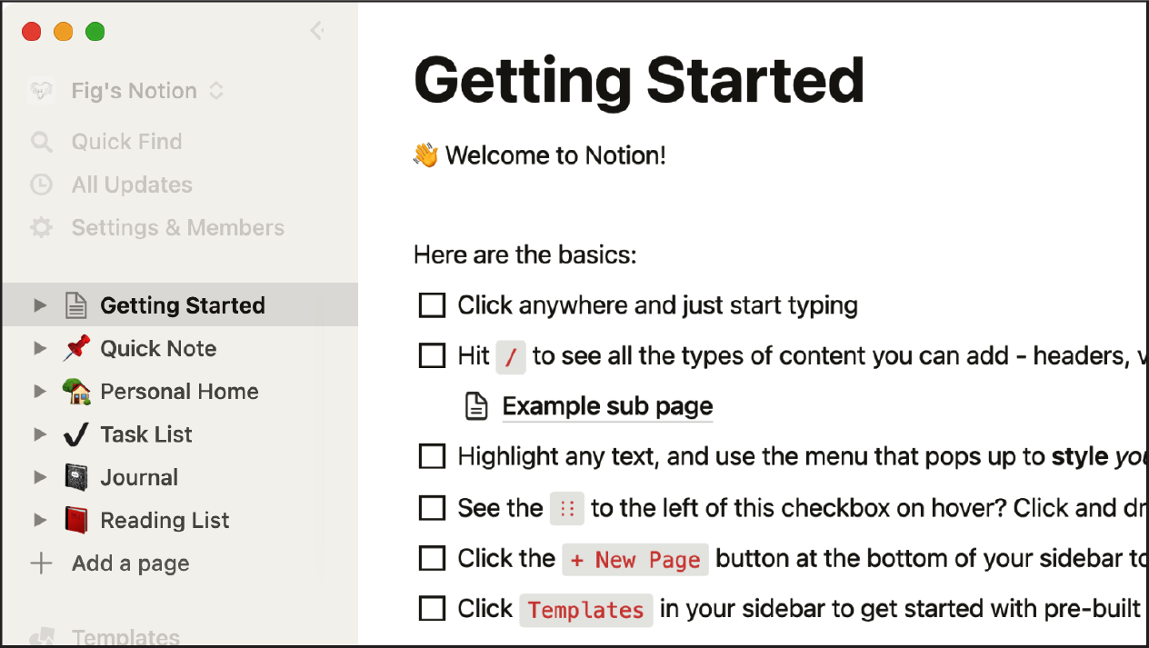
Figure 4-5. Screenshot from Notion’s progressive onboarding experience (source: Notion, 2023)
Another common example of Hick’s law in action can be found with streaming services and the choices we’re presented when deciding on what to watch. Take, for example, Netflix, which found that its customers took an average of 18 minutes to find a show or movie. The reason for this was they were often paralyzed with indecision when it came to selecting a show or movie based on the quantity of options in front of them. To help remedy this, Netflix introduced various features such as “Trending Now” and “Popular on Netflix” (Figure 4-6) as ways to provide more weight to specific options through the social proof that others have enjoyed them.

Figure 4-6. Netflix’s “Trending Now” and “Popular on Netflix” sections provide more weight to specific options via social proof (source: Netflix, 2023)
Conclusion
Hick’s law is a key concept in user experience design because it’s an underlying factor in everything we do. When an interface is too busy, actions are unclear or difficult to identify, and critical information is hard to find, a higher cognitive load is placed on users. Simplifying an interface or process helps to reduce the mental strain, but we must be sure to add contextual clues to help users identify the options available and determine the relevance of the information available to the tasks they wish to perform. It’s important to remember that each user has a goal, whether it’s to buy a product, understand something, or simply learn more about the content. I find the process of reduction, or eliminating any element that isn’t helping the user achieve their goal, a critical part of the design process. The less they have to think about what they need to do to reach their goal, the more likely it is they will achieve it.
1 “Why Do We Have a Harder Time Choosing When We Have More Options?,” The Decision Lab, August 16, 2018, https://oreil.ly/mmpYT.
2 Barry Schwartz, The Paradox of Choice: Why More Is Less (New York: HarperCollins, 2004).
3 Sheena S. Iyengar and Mark R. Lepper, “When Choice Is Demotivating: Can One Desire Too Much of a Good Thing?,” Journal of Personality and Social Psychology 79, no. 6 (2000): 995–1006.
4 In a closed exercise, the groups are predefined by the researcher.
5 Jakob Nielsen, “Card Sorting: Pushing Users Beyond Terminology Matches,” Nielsen Norman Group, August 23, 2009, https://oreil.ly/bxhNN.
Get Laws of UX, 2nd Edition now with the O’Reilly learning platform.
O’Reilly members experience books, live events, courses curated by job role, and more from O’Reilly and nearly 200 top publishers.

