Chapter 4. Web Forms, Refined
HTML forms are simple HTML controls you use to collect information from website visitors. They include text boxes people can type into, list boxes they can pick from, checkboxes they can switch on or off, and so on. There are countless ways to use HTML forms, and if you’ve kicked around the Web for more than a week, you’ve used them to do everything from getting a stock quote to signing up for an email account.
HTML forms have existed almost since the dawn of HTML, and they haven’t changed a wink since last century, despite some serious efforts. Web standards-makers spent years cooking up a successor called XForms, which fell as flat as XHTML 2 (see XHTML 1.0: Getting Strict). Although XForms solved some problems easily and elegantly, it also had its own headaches—for example, XForms code was verbose and assumed that web designers were intimately familiar with XML. But the biggest hurdle was the fact that XForms wasn’t compatible with HTML forms in any way, meaning that developers would need to close their eyes and jump to a new model with nothing but a whole lot of nerve and hope. But because mainstream web browsers never bothered to implement XForms—it was too complex and little used—web developers never ended up taking that leap.
HTML5 takes a different approach. It introduces refinements to the existing HTML forms model, which means HTML5-enhanced forms can keep working on older browsers, just without all the bells and whistles. (This is good, because Internet Explorer won’t start supporting the new form features until IE 10.) HTML5 forms also focus on adding features that developers are already using today. The difference is that HTML5 makes them easily accessible, without requiring a tangle of JavaScript code or a JavaScript toolkit from another company.
In this chapter, you’ll tour all the new features of HTML5 forms. You’ll see which ones are supported, which ones aren’t, and which workarounds can help you smooth over the differences. You’ll also consider a feature that isn’t technically part of the HTML5 forms standard but is all about interactivity—putting a rich HTML editor in an ordinary web page.
Understanding Forms
Odds are that you’ve worked with forms before. But if you’re a bit sketchy on the details, the following recap will refresh your memory.
A web form is a collection of text boxes, lists, buttons, and other clickable widgets that a web surfer uses to supply some sort of information to a website. Forms are all over the Web—they allow you to sign up for email accounts, review products, and make bank transactions. The simplest possible form is the single text box that adorns search engines like Google (see Figure 4-1).
All basic web forms work in the same way. The user fills in some information and then clicks a button. At that point, the server collects all the data that the user has entered and sends it back to the web server. On the web server, some sort of application digests the information and takes the appropriate next step. The server-side program might consult a database (either to read or to store some information), before sending a new page back to the web browser.
The tricky part of this discussion is that there are hundreds of ways to build the server-side part of the equation (that’s the application that processes the information that’s submitted from the form). Some developers may use stripped-down scripts that let them manipulate the raw form data, while others may work with higher-level models that package the form details in neat programming objects. But either way, the task is basically the same—examine the form data, do something with it, and then send back a new page.
Revamping a Traditional HTML Form
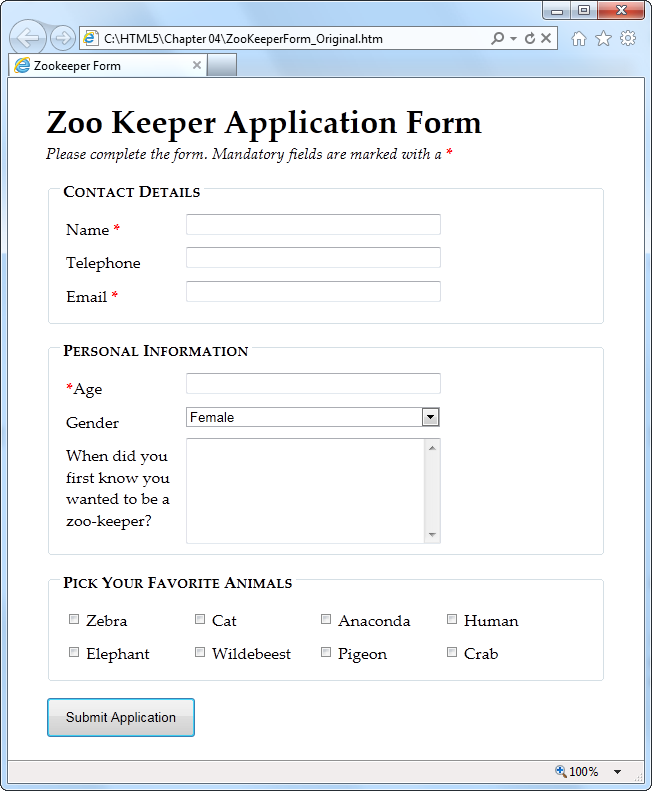
The best way to learn about HTML5 forms is to take a typical example from today and enhance it. Figure 4-2 shows the example you’ll start out with.
The markup is dishwater-dull. If you’ve worked with forms before, you won’t see anything new here. First, the entire form is wrapped in a <form> element:
<formid="zooKeeperForm"action="processApplication.cgi"><p><i>Please complete the form. Mandatory fields are marked with a</i><em>*</em></p>...
The <form> element bundles together all the form widgets (also known as controls or fields). It also tells the browser where to post the page when it’s submitted, by providing a URL in the action attribute. If you plan to do all the work in client-side JavaScript code, you can simply use a number sign (#) for the action attribute.
Note
HTML5 adds a mechanism for placing form controls outside of the form to which they belong. The trick is to use the new form attribute to refer to the form by its id value (as in form=“zooForm”). However, browsers that don’t support this feature will completely overlook your data when the form is submitted, which means this minor feature is still too risky to use in a real web page.
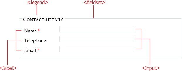
A well-designed form, like the zookeeper application, divides itself into logical chunks using the <fieldset> element. Each chunk gets a title, courtesy of the <legend> element. Here’s the <fieldset> for the Contact Details section (which is dissected in Figure 4-3):
...<fieldset><legend>Contact Details</legend><labelfor="name">Name<em>*</em></label><inputid="name"><br><labelfor="telephone">Telephone</label><inputid="telephone"><br><labelfor="email">Email<em>*</em></label><inputid="email"><br></fieldset>...
As in all forms, the bulk of the work is handled by the all-purpose <input> element, which collects text and creates checkboxes, radio buttons, and list buttons. Along with <input>, the <textarea> element gives people a way to enter multiple lines of text, and the <select> element creates a list. If you need a refresher, Table 4-1 will fill you in.
Here’s the rest of the zookeeper form markup, with a few new details (a <select> list, checkboxes, and the button that submits the form):
...<fieldset><legend>Personal Information</legend><labelfor="age"><em>*</em>Age</label><inputid="age"><br><labelfor="gender">Gender</label><selectid="gender"><optionvalue="female">Female</option><optionvalue="male">Male</option></select><br><labelfor="comments">When did you first know you wanted to be a zoo-keeper?</label><textareaid="comments"></textarea></fieldset><fieldset><legend>Pick Your Favorite Animals</legend><labelfor="zebra"><inputid="zebra"type="checkbox">Zebra</label><labelfor="cat"><inputid="cat"type="checkbox">Cat</label><labelfor="anaconda"><inputid="anaconda"type="checkbox">Anaconda</label><labelfor="human"><inputid="human"type="checkbox">Human</label><labelfor="elephant"><inputid="elephant"type="checkbox">Elephant</label><labelfor="wildebeest"><inputid="wildebeest"type="checkbox">Wildebeest</label><labelfor="pigeon"><inputid="pigeon"type="checkbox">Pigeon</label><labelfor="crab"><inputid="crab"type="checkbox">Crab</label></fieldset><p><inputtype="submit"value="Submit Application"></p></form>
You can find the full example, along with the relatively simple style sheet that formats it, on the try-out site (www.prosetech.com/html5). Look for the ZookeperForm_Original.html file to play around with traditional, unenhanced version of the form, and ZookeperForm_Revised.html to get all the HTML5 goodies.
Note
One limit of HTML forms is that you can’t change how the browser draws controls. For example, if you want to replace the standard dull gray checkbox with a big black-and-white box with a fat red checkmark image, you can’t. (The alternative is to create a normal element that has checkbox-like behavior using JavaScript—in other words, it changes its appearance back and forth when someone clicks it.)
HTML5 keeps this no-customization limit in place, and extends it to the new controls you’ll learn about in this chapter. That means forms won’t suit people who need highly stylized widgets and complete control over the look of their pages.
Now that you’ve got a form to work with, it’s time to start improving it with HTML5. In the following sections, you’ll start small, with placeholder text and an autofocus field.
Adding Hints with Placeholders
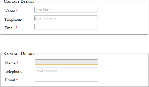
Forms usually start out empty. But a column of blank text boxes can be a bit intimidating, especially if it’s not absolutely clear what belongs inside each text box. That’s why you commonly see some sort of sample text inside otherwise-empty text boxes. This placeholder text is also called a watermark, because it’s often given a light gray color to distinguish it from real, typed-in content. Figure 4-4 shows a placeholder in action.
To create a placeholder, simply use the placeholder attribute:
<labelfor="name">Name<em>*</em></label><inputid="name"placeholder="Jane Smith"><br><labelfor="telephone">Telephone</label><inputid="telephone"placeholder="(xxx) xxx-xxxx"><br>
Browsers that don’t support placeholder text just ignore the placeholder attribute; Internet Explorer is the main culprit. Fortunately, it’s not a big deal, since placeholders are just nice form frills, not essential to your form’s functioning. If it really bothers you, there are plenty of JavaScript patches that can bring IE up to speed, painlessly, at http://tinyurl.com/polyfills.
Right now, there’s no standard, consistent way to change the appearance of placeholder text (for example, to italicize it or to change the text color). Eventually, browser makers will create the CSS styling hooks that you need—in fact, they’re hashing out the details even as you read this. But for now, you’ll either need to fiddle with browser-specific pseudoclasses (namely, -webkit-input-placeholder and -mozplaceholder) or leave it alone. (Pseudoclass Selectors explains pseudoclasses.)
However, you can use the better-supported focus pseudoclass to change the way a text box looks when it gets the focus. For example, you might want to assign a darker background color to make it stand out:
input:focus{background:#eaeaea;}
Focus: Starting in the Right Spot
After loading up your form, the first thing your visitors want to do is start typing. Unfortunately, they can’t—at least not until they tab over to the first control, or click it with the mouse, thereby giving it focus.
You can make this happen with JavaScript, by calling the focus() method of the appropriate <input> element. But this involves an extra line of code and can sometimes cause annoying quirks. For example, it’s sometimes possible for the user to click somewhere else and start typing before the focus() method gets called, at which point focus is rudely transferred back to the first control. But if the browser were able to control the focus, it could be a bit smarter, and transfer focus only if the user hasn’t already dived into another control.
That’s the idea behind HTML5’s new autofocus attribute, which you can add to a single <input> or <textarea> element, like this:
<labelfor="name">Name<em>*</em></label><inputid="name"placeholder="Jane Smith"autofocus><br>
The autofocus has similar support as the placeholder attribute, which means basically every browser recognizes it except Internet Explorer. Once again, it’s easy enough to plug the hole. You can check for autofocus support using Modernizr (Feature Detection with Modernizr) and then run your own autofocus code if needed. Or, you can use a ready-made JavaScript polyfill that adds autofocus support (http://tinyurl.com/polyfills). However, it hardly seems worth it for such a minor frill, unless you’re also aiming to give IE support for other form features, like the validation system discussed next.
Validation: Stopping Errors
The fields in a form are there to gather information from web page visitors. But no matter how politely you ask, you might not get what you want. Impatient or confused visitors can skip over important sections, enter partial information, or just hit the wrong keys. The end result? They click Submit, and your website gets a whackload of scrambled data.
What a respectable web page needs is validation—a way to catch mistakes when they happen (or even better, to prevent them from happening at all). For years, developers have done that by writing their own JavaScript routines or using professional JavaScript libraries. And, truthfully, these approaches work perfectly well. But seeing as validation is so common (just about everyone needs to do error-checking), and seeing as validation generally revolves around a few key themes (for example, spotting invalid email addresses or dates), and seeing as validation is boring (no one really wants to write the same code for every form, not to mention test it), there’s clearly room for a better way.
The creators of HTML5 spotted this low-hanging fruit and invented a way for browsers to help out, by getting them to do the validation work instead of web developers. They devised a client-side validation system (see the box on Validating in Two Places) that lets you embed common error-checking rules into any <input> field. Best of all, this system is easy—all you need to do is insert the right attribute.
How HTML5 Validation Works
The basic idea behind HTML5 form validation is that you indicate where validation should happen, but you don’t actually implement the tedious details. It’s a bit like being promoted into a management job, just without the pay raise.
For example, imagine you decide a certain field cannot be left blank—the form filler needs to supply some sort of information. In HTML5, you can make this demand by adding the required attribute:
<labelfor="name">Name<em>*</em></label><inputid="name"placeholder="Jane Smith"autofocusrequired><br>
Initially, there’s no visual detail to indicate that a field is required. For that reason, you might want to use some other visual clue, such as giving the text box a different border color or placing an asterisk next to the field (as in the zookeeper form).
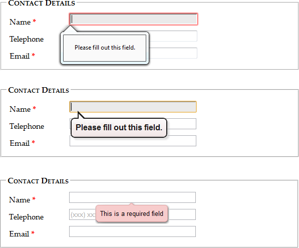
Validation kicks in only when the form filler clicks a button to submit the form. If the browser implements HTML5 forms, then it will notice that a required field is blank, intercept the form submission attempt, and show a pop-up message that flags the invalid field (Figure 4-5).
As you’ll see in the following sections, different attributes let you apply different error-checking rules. You can apply more than one rule to the same input box, and you can apply the same rule to as many <input> elements as you want (and to the <textarea> element). All the validation conditions must be met before the form can be submitted.
This raises a good question: What happens if form data breaks more than one rule—for example, it has multiple required fields that aren’t filled in?
Once again, nothing happens until the person filling out the form clicks the submit button. Then, the browser begins examining the fields from top to bottom. When it finds the first invalid value, it stops checking any further. It cancels the form submission and pops up an error message next to this value. (Additionally, if the offending text box isn’t currently visible, the browser scrolls up just enough that it appears at the top of the page.) If the visitor corrects the problem and clicks the submit button again, the browser will stop and highlight the next invalid value.
Note
Web browsers hold off on validation until a submit button is clicked. This ensures that the validation system is efficient and restrained, so it works for everyone.
Some web developers prefer to alert people as soon as they leave an invalid field (by tabbing away or clicking somewhere else with the mouse). This sort of validation is handy in long forms, especially if there’s a chance that someone may make a similar mistake in several different fields. Unfortunately, HTML5 doesn’t have a way for you to dictate when the web browser does its validation, although it’s possible that it might add one in the future. For now, if you want immediate validation messages, it’s best to write the JavaScript yourself or to use a good JavaScript library.
Turning Validation Off
In some cases, you may need to disable the validation feature. For example, you might need to turn it off for testing to verify that your server-side code deals appropriately with invalid data. To turn validation off for an entire form, you add the novalidate attribute to the containing <form> element:
<formid="zooKeeperForm"action="processApplication.cgi"novalidate>
The other option is to provide a submit button that bypasses validation. This technique is sometimes useful in a web page. For example, you may want to enforce strict validation for the official submit button, but provide another button that does something else (like storing half-completed data for later use). To allow this, add the formnovalidate attribute to the <input> element that represents your button:
<inputtype="submit"value="Save for Later"formnovalidate>
You’ve now seen how to use validation to catch missing information. Next, you’ll learn to search for errors in different types of data.
Note
Planning to validate numbers? There’s no validation rule that forces text to contain digits, but there is a new number data type, which you’ll examine on Telephone Numbers. Unfortunately, its support is still sketchy.
Validation Styling Hooks
Although you can’t style validation messages, you can change the appearance of the input fields based on their validation state. For example, you can give invalid values a different background color, which will appear in the text box as soon as the browser detects the problem.
To use this technique, you simply need to add a few new pseudoclasses (Pseudoclass Selectors). Your options include:
required and optional, which apply styles to fields based on whether they use the required attribute.
valid and invalid, which apply styles to controls based on whether they contain mistakes. But remember that most browsers won’t actually discover invalid values until the visitor tries to submit the form, so you won’t see the invalid formatting right away.
in-range and out-of-range, which apply formatting to controls that use the min and max attributes to limit numbers to a range (Telephone Numbers).
For example, if you want to give required <input> fields a light yellow background, you could use a style rule with the required pseudoclass:
input:required{background-color:lightyellow;}
Or, you might want to highlight only those fields that are required and currently hold invalid values by combining the required and invalid pseudoclasses like this:
input:required:invalid{background-color:lightyellow;}
With this setting, blank fields are automatically highlighted, because they break the required-field rule.
You can use all sorts of other tricks, like combining the validation pseudoclasses with the focus pseudoclass, or using an offset background that includes an error icon to flag invalid values. Of course, a hefty disclaimer applies: You can use these pseudoclasses to improve your pages, but make sure your form still looks good without them, because support lags in older browsers.
Validating with Regular Expressions
The most powerful (and complex) type of validation that HTML5 supports is based on regular expressions. Seeing as JavaScript already supports regular expression, adding this feature to HTML forms makes perfect sense.
A regular expression is a pattern written using the regular expression language. Regular expressions are designed to match patterned text—for example, a regular expression can make sure that a postal code has the right sequence of letters and digits, or that an email address has an @ symbol and a domain extension that’s at least two characters long. For example, consider this expression:
[A-Z]{3}-[0-9]{3}The square brackets at the beginning define a range of allowed characters. In other words, [A-Z] allows any uppercase letter from A to Z. The curly brackets that follow multiply this effect, so {3} means you need three uppercase letters. The dash that follows doesn’t have a special meaning, so it indicates that a dash must follow the three-letter sequence. Finally, [0-9] allows a digit from 0 to 9, and {3} requires three of them.
Regular expression matching is useful for searching (finding pattern matches in a long document) and validation (verifying that a value matches a pattern). HTML5 forms use regular expressions for validation.
Note
Regular expression geeks take note: You don’t need the magic ^ and $ characters to match the beginning or end of a value in a field. HTML5 assumes both details automatically, which means a regular expression must match the entire value in a field in order to be deemed valid.
These values are valid, because they match the pattern shown above:
QRB-001
TTT-952
LAA-000
But these values are not:
qrb-001
TTT-0952
LA5-000
Regular expressions quickly get much more complex than this example. Writing a regular expression can be quite a chore, which is why most developers simply search for a ready-made regular expression that validates the type of data they want to check. Or they get help.
Tip
To learn just enough about the regular expression language to make your own super-simple expressions, check out the concise tutorials at www.w3schools.com/js/js_obj_regexp.asp or http://tinyurl.com/jsregex. To find ready-made regular expressions that you can use with your forms, visit http://regexlib.com. And to become a regular expression guru, read Mastering Regular Expressions, Third Edition by Jeffrey Friedl (O’Reilly).
Once you have a regular expression, you can enforce it in any <input> or <textarea> element by adding the pattern attribute:
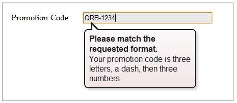
<labelfor="promoCode">Promotion Code</label><inputid="promoCode"placeholder="QRB-001"title="Your promotion code is three uppercase letters, a dash, then three numbers"pattern="[A-Z]{3}-[0-9]{3}">
Figure 4-6 shows what happens if you break the regular expression rule.
Tip
Browsers don’t validate blank values. In this example, a blank promotion code passes muster. If this isn’t what you want, then combine the pattern attribute with the required attribute.
Note
Regular expressions seem like a perfect match for email addresses (and they are). However, hold off on using them this way, because HTML5 already has a dedicated input type for email addresses that has the right regular expression baked in (Email Addresses).
Custom Validation
The HTML5 specification also outlines a set of JavaScript properties that let you find out if fields are valid (or force the browser to validate them). The most useful of these is the setCustomValidity() method, which lets you write custom validation logic for specific fields and have it work with the HTML5 validation system.
Here’s how it works. First, you need to check the appropriate field for errors. You do this by handling the onInput event, which is nothing new:
<labelfor="comments">When did you first know you wanted to be a zookeeper?</label><textareaid="comments"oninput="validateComments(this)"></textarea>
In this example, the onInput event triggers a function named validateComments(). It’s up to you to write this function, check the current value of the <input> element, and then call setCustomValidity().
If the current value has problems, you need to supply an error message when you call setCustomValidity(). Or, if the current value checks out, you need to call setCustomValidity() with an empty string. This clears any error custom messages that you may set earlier.
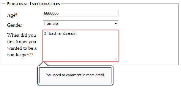
Here’s an example that forces the text in the comment box to be at least 20 characters long:
functionvalidateComments(input){if(input.value.length<20){input.setCustomValidity("You need to comment in more detail.");}else{// There's no error. Clear any error message.input.setCustomValidity("");}}
Figure 4-7 shows what happens if someone breaks this rule and then tries to submit the form.
Of course, you could solve this problem more neatly with a regular expression that requires long strings. But while regular expressions are great for validating some data types, custom validation logic can do anything, from complex algebra to contacting the web server.
Note
Remember, your web page visitors can see anything you put in JavaScript, so it’s no place for secret algorithms. For example, you might know that in a valid promotional code, the digits always add up to 12. But you probably don’t want to betray that detail in a custom validation routine, because it will help shifty people cook up fake codes. Instead, keep this sort of validation in the web server.
Browser Support for Validation
Browser makers added support for validation in pieces. That means some browser builds support some validation features while ignoring others. Table 4-2 indicates the minimum browser versions you need to use to get solid support for all the validation tricks you’ve learned so far.
Because HTML5 validation doesn’t replace the validation you do on your web server, you may see it as a frill, in which case you can accept this uneven support. Browsers that don’t implement validation, like IE 9, let people submit forms with invalid dates, but you can then catch these problems on the web server and return the same page, but with error details.
On the other hand, your website might include complex forms with lots of potential for confusion, and you might not be ready to accept a world of frustrated IE users. In this case, you have two basic choices: Fall back on your own validation system, or use a JavaScript library that adds the missing smarts. Your choice depends on the extent and complexity of your validation.
If all your form needs is a smattering of simple validation, it’s probably worth adding your own checks. Using Modernizr (Feature Detection with Modernizr), you can check for a variety of HTML5 web forms features. For example, use the Modernizr.input.pattern property to check whether the current browser recognizes the pattern attribute:
if(!Modernizr.input.pattern){// The current browser doesn't perform regular expression validation.// You can use the regular expression features in JavaScript instead....}
Note
The pattern property is just one of the properties exposed by Modernizr.input object. Other properties that are useful for testing web form support include placeholder, autofocus, required, max, min, and step.
Of course, this example doesn’t tell you when to perform this check or how to react. If you want your validation to mimic the HTML5 validation system, it makes sense to perform your validation when the person viewing the form attempts to submit it. You do this by handling the form’s onSubmit event, and then returning either true (which means the form is valid and the browser can submit it) or false (which means the form has a problem and the browser should cancel the operation):
<formid="zooKeeperForm"action="processApplication.cgi"onsubmit="return validateForm()">
Here’s an example of a very simple custom validation routine that enforces required fields:
functionvalidateForm(){if(!Modernizr.input.required){// The required attribute is not supported, so you need to check the// required fields yourself.// First, get an array that holds all the elements.varinputElements=document.getElementById("zooKeeperForm").elements;// Next, move through that array, checking each element.for(vari=0;i<inputElements.length;i++){// Check if this element is required.if(inputElements[i].hasAttribute("required")){// If this element is required, check if it has a value.// If not, the form fails validation, and this function returns false.if(inputElements[i].value=="")returnfalse;}}// If you reach this point, everything worked out and the browser// can submit the form.returntrue;}}
Tip
This block of code relies on a number of basic JavaScript techniques, including element lookup, a loop, and conditional logic. To learn more about all these details, check out Appendix B.
If you have a complex form and you want to save some effort (while at the same time preparing for the future), you may prefer to use a JavaScript patch to solve all your problems. Technically, the approach is the same—your page will check for validation support and then perform validation manually if necessary. The difference is that the JavaScript library already has all the tedious code you need.
At http://tinyurl.com/polyfills, you can find a long, intimidating list of JavaScript libraries that all attempt to do more or less the same thing. One of the best ones is simply called webforms2, and is available from https://github.com/westonruter/webforms2 (to get a copy, look for the easy-to-miss Download button).
The webforms2 library implements all the attributes you’ve seen so far. To make it work, you download all the files to your website folder (or, more commonly, a subfolder of your website folder), and add a single reference to the library in your web page:
<head><title>...</title><scriptsrc="webforms2.js"></script>...<head>
The webforms2 library integrates nicely with another JavaScript patch, called html5Widgets, which adds support for the form features you’ll learn about next, like the slider, date picker, and color chooser. To learn more about this all-in-one patch, visit www.useragentman.com/tests/html5Widgets. Both of these libraries offer good all-around web forms support, but there are inevitable gaps and minor bugs buried in the code. Only time will tell if these already-impressive libraries are properly maintained and gradually improved.
New Types of Input
One of the quirks of HTML forms is that one ingredient—the vaguely named <input> element—is used to create a variety of controls, from checkboxes to text boxes to buttons. The type attribute is the master switch that determines what each <input> element really is.
If a browser runs into an <input> element with a type that it doesn’t recognize, the browser treats it like an ordinary text box. That means these three elements get exactly the same treatment in every browser:
<inputtype="text"><inputtype="super-strange-wonky-input-type"><input>
HTML5 uses this default to its benefit. It adds a few new data types to the <input> element, secure in the knowledge that browsers will treat them as ordinary text boxes if they don’t recognize them. For example, if you need to create a text box that holds an email address, you can use the new input type email:
<labelfor="email">Email<em>*</em></label><inputid="email"type="email"><br>
If you view this page in a browser that doesn’t directly support the email input type (like Internet Explorer 9), you’ll get an ordinary text box, which is perfectly acceptable. But browsers that support HTML5 forms are a bit smarter. Here’s what they can do:
Offer editing conveniences. For example, an intelligent browser might give you a way to get an email from your address book and pop it into an email field.
Restrict potential errors. For example, browsers can ignore letters when you type in a number text box. Or, they can reject invalid dates (or just force you to pick one from a mini calendar, which is easier and safer).
Perform validation. Browsers can perform more sophisticated checks when you click a submit button. For example, an intelligent browser will spot an obviously incorrect email address in an email box and refuse to continue.
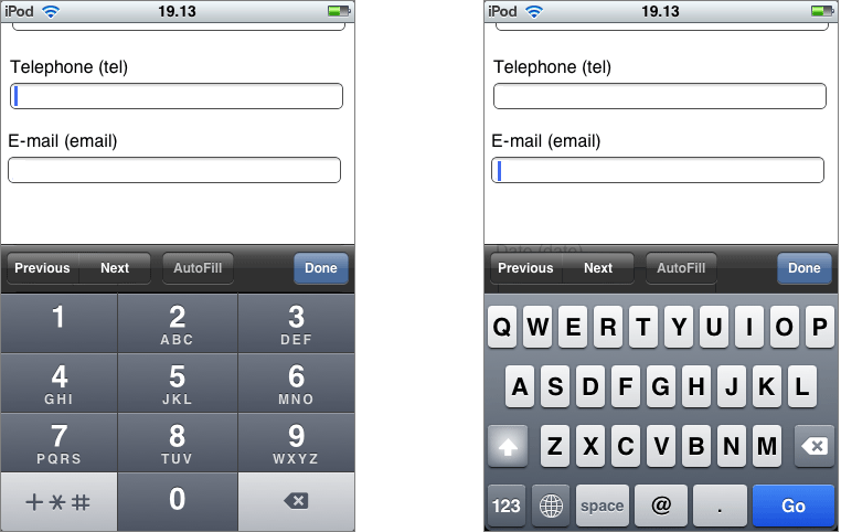
The HTML5 specification doesn’t give browser makers any guidance on the first point. Browsers are free to manage the display and editing of different data types in any way that makes sense, and different browser can add different little luxuries. For example, mobile browsers take advantage of this information to customize the virtual keyboard that they show, hiding keys that don’t apply (see Figure 4-8).
The error-prevention and error-checking features are more important. At a bare minimum, a browser that supports HTML5 web forms must prevent a form from being submitted if it contains data that breaks the data type rules. So if the browser doesn’t prevent errors (according to the second point in this list), it must validate them when the user submits the data (that’s the third point).
Unfortunately, not all current browsers live up to this requirement. Some recognize the new data types and provide some sort of editing niceties but no validation. Many understand one data type but not another. Mobile browsers are particularly problematic—they provide some editing conveniences but currently have none of the validation.
Table 4-3 lists the new data types and the browsers that support them completely—meaning that they prevent forms from being submitted when the data type rules are broken.
IE | Firefox | Chrome | Safari | Opera | Safari iOS[a] | Android | |
- | 4 | 10 | 5 (Windows only) | 10.6 | - | - | |
url | - | 4 | 10 | 5 (Windows only) | 10.6 | - | - |
search[b] | n/a | n/a | n/a | n/a | n/a | n/a | n/a |
tel[c] | n/a | n/a | n/a | n/a | n/a | n/a | n/a |
number | - | - | 10 | 5 (Windows only) | - | - | - |
range | - | - | 6 | 5 | 11 | - | - |
datetime, date, month, week, time | - | - | 10 | - | 11 | - | - |
color | - | - | - | - | 11 | - | - |
[a] Although the iOS browser doesn’t provide validation, its virtual keyboard customization (see Figure 4-8 ) is a significant convenience, so it’s still worth using specialized data types. [b] The HTML5 standard does not require validation for this data type. [c] The HTML5 standard does not require validation for this data type. | |||||||
Tip
Incidentally, you can test for data type support in Modernizr using the properties of the Modernizr.inputtypes object. For example, Modernizr.inputtypes.range returns true if the browser supports the range data type.
Email Addresses
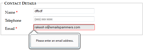
Email addresses use the email type. Generally, a valid email address is a string of characters (with certain symbols not allowed). An email address must contain the @ symbol and a period, and there needs to be at least one character between them and two characters after the period. These are, more or less, the rules that govern email addresses. However, writing the right validation logic or regular expression for email addresses is a surprisingly subtle task that has tripped up many a well-intentioned developer. Which is why it’s great to find web browsers that support the email data type and perform validation automatically (see Figure 4-9).
Email attributes support the multiple attribute, which allows the field to hold multiple email addresses. However, these multiple email addresses still look like a single piece of text—you just separate each one with a comma.
Note
Remember, blank values bypass validation. If you want to force someone to enter a valid email address, you need the email data type combined with the required attribute (Validation: Stopping Errors).
URLs
URLs use the url type. What constitutes a valid URL is still a matter of hot debate. But most browsers use a relatively lax validation algorithm. It requires a URL prefix (which could be legitimate, like http://, or made up, like bonk://), and accepts spaces and most special characters other than the colon (:).
Some browsers also show a drop-down list of URL suggestions, which is typically taken from the browser’s history of recently visited pages.
Search Boxes
Search boxes use the search type. A search box is generally meant to contain keywords that are then used to perform some sort of search. It could be a search of the entire Web (as with Google, in Figure 4-1), a search of a single page, or a custom-built search routine that examines your own catalog of information. Either way, a search box looks and behaves almost exactly like a normal text box.
On some browsers, like Safari, search boxes are styled slightly differently, with rounded corners. Also, as soon as you start typing in a search box in Safari or Chrome, a small X icon appears on the right side that you can click to clear the box. Other than these very minor differences, search boxes are text boxes. The value is in the semantics. In other words, you use the search data type to make the purpose of the box clear to browsers and assistive software. They can then guide visitors to the right spot or offer other smart features—maybe, someday.
Telephone Numbers
Telephone numbers use the tel type. Telephone numbers come in a variety of patterns. Some use only numbers, while others incorporate spaces, dashes, plus signs, and parentheses. Perhaps it’s because of these complications that the HTML5 standard doesn’t ask browsers to perform any telephone number validation at all. However, it’s hard to ignore the feeling that a tel field should at least reject letters (which it doesn’t).
Right now, the only value in using the tel type is to get a customized virtual keyboard on mobile browsers, which focuses on numbers and leaves out letters.
Numbers
HTML5 defines two numeric data types. The number type is the one to use for ordinary numbers.
The number data type has obvious potential. Ordinary text boxes accept anything: numbers, letters, spaces, punctuation, and the symbols usually reserved for cartoon character swearing. For this reason, one of the most common validation tasks is to check that a given value is numeric and falls in the right range. But use the number data type, and the browser automatically ignores all non-numeric keystrokes. Here’s an example:
<labelfor="age">Age<em>*</em></label><input id="age"type="number"><br>
Of course, there are plenty of numbers, and they aren’t all appropriate for every kind of data. The markup shown above allows ages like 43,000 and -6. To fix this, you need to use the min and max attributes. Here’s an example that limits ages to the reasonable range of 0 to 120:
<inputid="age"type="number"min="0" max="120"><br>
Ordinarily, the number data type accepts only whole numbers, so a fractional age like 30.5 isn’t accepted. (In fact, some browsers won’t even let you type the decimal point.) However, you can change this too by setting the step attribute, which indicates the acceptable intervals for the number. For example, a step minimum value of 0 and a step of 0.1 means you can use values like 0, 0.1, 0.2, and 0.3. Try to submit a form with 0.15, however, and you’ll get the familiar pop-up error message. The default step is 1.
<labelfor="weight">Weight (in pounds)</label><inputid="weight"type="number"min="50" max="1000" step="0.1"value="160"><br>
The step attribute also affects how the spin buttons work in the number box, as shown in Figure 4-10.
Sliders
The range type is HTML5’s other numeric data type. Like the number type, it can represent whole numbers or fractional values. It also supports the same attributes for setting the range of allowed values (min and max). Here’s an example:
<labelfor="weight">Weight (in pounds)</label><inputid="weight"type="range"min="50" max="1000" value="160"><br>
The difference is the way the range type presents its information. Instead of asking you to type the value you want in a text box, intelligent browsers show a slider control (Figure 4-11).
To set a range type, you simply pull the tab to the position you want, somewhere between the minimum and maximum values at either end of the slider. Browsers that support the range type don’t give any feedback about the specific value that’s set. If you want that piece of information, you need to add a scrap of JavaScript that reacts when the slider changes (perhaps by handling the onChange event) and then displays the value nearby. Of course, you’d also want to check if the current browser supports the range type (using a tool like Modernizr). If the browser doesn’t support the range type, there’s no need to take any extra steps, because the value will show up in an ordinary text box.
Dates and Times
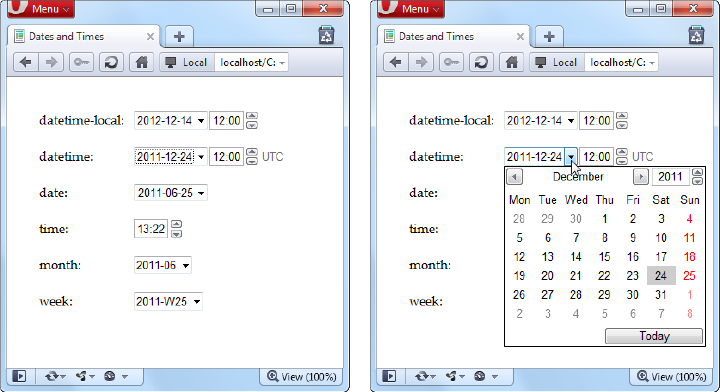
HTML5 defines several date-related types. Browsers that understand the date types can provide handy drop-down calendars for people to pick from. Not only does this clear away confusion about the right way to format the date, it also prevents people from accidentally (or deliberately) picking a date that doesn’t exist. And smart browsers can go even further—for example, adding integration with a personal calendar.
Right now, the date types are poorly supported, despite their obvious usefulness. Opera is the only browser that provides the drop-down calendars (see Figure 4-12). Chrome provides the bare minimum in support: It uses a text box with spin buttons, like the number type, and refuses bad dates.
Tip
If you decide to use one of the date types, you may want to use a polyfill for browsers that don’t understand it, like html5Widgets library described earlier (www.useragentman.com/tests/html5Widgets). That’s because it’s easy for people on non-supporting browsers to enter dates in the wrong format, and it’s tedious for you to validate date data and provide the appropriate guidance. (That’s also why custom Java-Script date controls already exist—and why they’re all over the Web.)
Table 4-4 explains the six date formats.
Description | Example | |
date | A date in the format YYYY-MM-DD. | January 25, 2012, is: 2012-01-25 |
A 24-hour time with an optional seconds portion, in the format HH:mm:ss.ss. | 2:35 p.m. (and 50.2 seconds) is: 14:35 or 14:35:50.2 | |
datetimelocal | A date and a time, separated by a capital T (so the format is YYYY-MM-DDTHH:mm:ss). | January 25, 2012, 2:35 p.m: 2012-01-15T14:35 |
datetime | A date and a time, like the datetime-local data type, but with a time-zone offset. This uses the same format (YYYY-MM-DDTHH:mm:ss-HH:mm) as the <time> element you considered on Dates and Times with <time>. | January 25, 2012, 2:35 p.m., in New York: 2012-01-15T14:35-05:00 |
A year and month number, in the format YYYY-MM. | First month in 2012: 2012-01 | |
A year and week number, in the format YYYY-Www. Note that there can be 52 or 53 weeks, depending on the year. | Second week in 2012: 2012-W02 |
Tip
Browsers that support the date types also support the min and max attributes with them. That means you can set maximum and minimum dates, as long as you use the right date format. So, to restrict a date field to dates in the year 2012, you would write: <input type=“date” min=“2012-01-01” max=“2012-12-31”>.
Colors
Colors use the color type. The color data type is an interesting, albeit little-used, frill that lets a web page visitor pick a color from a drop-down color picker, which looks like what you might see in a desktop paint program. Currently, Opera is the only browser to add one. In other browsers, you need to type a hexadecimal color code on your own (or use the html5Widgets library, from www.useragentman.com/tests/html5Widgets).
New Elements
So far, you’ve learned how HTML5 extends forms with new validation features, and how it gets smarter about data by adding more input types. These are the most practical and the most widely supported new features, but they aren’t the end of the HTML5 forms story.
HTML5 also introduces a few entirely new elements to fill gaps and add features. Using these nifty new elements, you can add a drop-down list of suggestions, a progress bar, a toolbar, and more. The problem with new elements is that old browsers are guaranteed not to support them, and even new browsers are slow to wade in when the specification is still changing. As a result, these details include some of the least supported features covered in this chapter. You may want to see how they work, but you’ll probably wait to use them, unless you’re comfortable inching your way out even further into the world of browser quirks and incompatibilities.
Input Suggestions with <datalist>
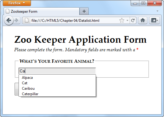
The <datalist> element gives you a way to fuse a drop-down list of suggestions to an ordinary text box. It gives people filling out a form the convenience to pick an option from the list, or the freedom to type exactly what they want (see Figure 4-13).
To use a datalist, you must first start with a standard text box. For example, imagine you have an ordinary <input> element like this:
<legend>What's Your Favorite Animal?</legend><inputid="favoriteAnimal">
To add a drop-down list of suggestions, you need to create a datalist. Technically, you can place that <datalist> element anywhere you want. That’s because the datalist can’t display itself—instead, it simply provides data that an input box will use. However, it makes logical sense to place the <datalist> element just after or just before the <input> element that uses it. Here’s an example:
<datalistid="animalChoices"><optionlabel="Alpaca"value="alpaca"><optionlabel="Zebra"value="zebra"><optionlabel="Cat"value="cat"><optionlabel="Caribou"value="caribou"><optionlabel="Caterpillar"value="caterpillar"><optionlabel="Anaconda"value="anaconda"><optionlabel="Human"value="human"><optionlabel="Elephant"value="elephant"><optionlabel="Wildebeest"value="wildebeest"><optionlabel="Pigeon"value="pigeon"><optionlabel="Crab"value="crab"></datalist>
The datalist uses <option> elements, just like the traditional <select> element. Each <option> element represents a separate suggestion that may be offered to the form filler. The label shows the text that appears in the text box, while the value tracks the text that will be sent back to the web server, if the user chooses that option. On its own, a datalist is invisible. To hook it up to a text box so it can start providing suggestions, you need to set the list attribute to match the ID of the corresponding datalist:
<input id="favoriteAnimal"list="animalChoices">
On browsers that supports the datalist—and right now, that’s only Opera 10 and Firefox 4 (or later)—visitors will see the result shown in Figure 4-13. Other browsers will ignore the list attribute and the datalist markup, rendering your suggestions useless.
However, there’s a clever fallback trick that makes other browsers behave properly. The trick is to put other content inside the datalist. This works because browsers that support the datalist pay attention to <option> elements only, and ignore all other content. Here’s a revised example that exploits this behavior. (The bold parts are the markup that datalist-supporting browsers will ignore.)
<legend>What's Your Favorite Animal?</legend><datalistid="animalChoices"><spanclass="Label">Pick an option:</span><selectid="favoriteAnimalPreset"><optionlabel="Alpaca"value="alpaca"><optionlabel="Zebra"value="zebra"><optionlabel="Cat"value="cat"><optionlabel="Caribou"value="caribou"><optionlabel="Caterpillar"value="caterpillar"><optionlabel="Anaconda"value="anaconda"><optionlabel="Human"value="human"><optionlabel="Elephant"value="elephant"><optionlabel="Wildebeest"value="wildebeest"><optionlabel="Pigeon"value="pigeon"><optionlabel="Crab"value="crab"></select><br><spanclass="Label">Or type it in:</span></datalist><inputlist="animalChoices"name="list">
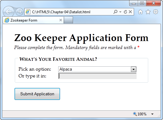
If you remove the bold markup, you end up with the same markup you had before. That means browsers that recognize the datalist still show the single input box and the drop-down suggestion list, as shown in Figure 4-13. But on other browsers, the additional details wrap the datalist suggestion in a traditional select list, giving users the option of typing in what they want or picking it from a list (Figure 4-14).
This effect isn’t completely seamless. When you receive the form data on the web server, you need to check for data from the list (in this example, that’s favoriteAnimalPreset) and from the text box (that’s favoriteAnimal). But other than this minor wrinkle, you’ve got a solid way to add new conveniences without leaving anyone behind.
Note
When the datalist was first created, it had a feature that it let it fetch suggestions from somewhere else—for example, it could call a web server, which could then pull a list of suggestions out of a database. This feature might still be added in a future version of the HTML standard, but for now it’s possible only if you write JavaScript code to handle the fetching, with the help of the XMLHttpRequest object (The XMLHttpRequest Object).
Progress Bars and Meters
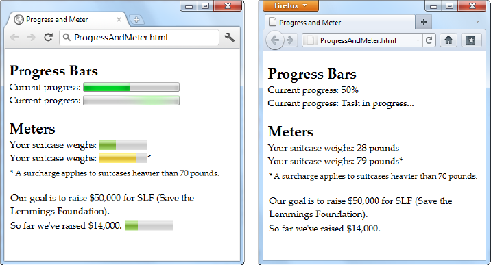
The <progress> and <meter> element are two new graphical widgets that look similar but serve different purposes (Figure 4-15).
The <progress> element indicates how far a task has progressed. It uses a gray background that’s partially filled in with a pulsating green bar. The <progress> element resembles the progress bars you’ve probably seen before (for example, when the Windows operating system is copying files), although its exact appearance depends on the browser being used to view the page.
The <meter> element indicates a value within a known range. It looks similar to the <progress> element, but the green bar is a slightly different shade, and it doesn’t pulse. Depending on the browser, the meter bar may change color when a value is classified as “too low” or “too high”—for example, in the latter case Chrome changes the bar from green to yellow. But the most important difference between <progress> and <meter> is the semantic meaning that the markup conveys.
Note
Technically, the new <meter> and <progress> elements don’t need to be in a form. In fact, they aren’t even real controls (because they don’t collect input from the web page visitor). However, the official HTML5 standard lumps them all together, because in some respects the <progress> and <meter> elements feel like form widgets, probably because they display bits of data in a graphical way.
Currently, the <progress> and <meter> elements work in Chrome (version 9 or later), Opera (version 11 or later), and Safari (version 5.1 or later). Firefox and Internet Explorer don’t support them yet.
Using the <progress> and <meter> elements is easy. First, consider the <progress> element. It takes a value attribute, which sets the percentage of progress (and thus the width of the green fill) as a fractional value from 0 to 1. For example, you could set the value to 0.25 to represent a task that’s 25 percent complete:
<progressvalue="0.25"></progress>
Alternatively, you can use the max attribute to set an upper maximum and change the scale of the progress bar. For example, if max is 200, your value needs to fall between 0 and 200. If you set it to 50, you’d get the same 25 percent fill as in the previous example:
<progressvalue="50"max="200"></progress>
The scale is simply a matter of convenience. The web page viewer doesn’t see the actual value in the progress bar.
Note
The <progress> element is simply a way to display a nicely shaded progress bar. It doesn’t actually do anything. For example, if you’re using the progress bar to show the progress of a background task (say, using web workers, as demonstrated on Doing Work in the Background), it’s up to you to write the JavaScript code that grabs hold of the <progress> element and changes its value.
Browsers that don’t recognize the <progress> element simply ignore it. To deal with this problem, you can put some fallback content inside the <progress> element, like this:
<progressvalue="0.25">25%</progress>
Just remember that the fallback content won’t appear in browsers that do support the <progress> element.
There’s one other progress bar option. You can show an indeterminate progress bar, which indicates that a task is under way, but you aren’t sure how close it is to completion. (Think of an indeterminate progress bar as a fancy “in progress” message.) An indeterminate progress bar looks like an empty gray bar but has a periodic green flash travel across it, from left to right. To create one, just leave out the value attribute, like this:
<progress>Task in progress ...</progress>
The <meter> element has a similar model, but it indicates any sort of measurement. The <meter> element is sometimes described as a gauge. Often, the specific meter value you use will correspond to something in the real world (for example, an amount of money, a number of days, an amount of weight, and so on). To control how the <meter> element displays this information, you’re able to set both a minimum and maximum value (using the min and max attributes):
Your suitcase weighs:<metermin="5"max="70"value="28">28 pounds</meter>
Once again, the content inside the <meter> element is shown only if the browser doesn’t know how to display a meter bar. Of course, sometimes it’s important to show the specific number that the <meter> element uses. In this case, you’ll need to add it to the page yourself, and you don’t need the fallback content. The following example uses this approach. It provides all the information up-front and adds an optional <meter> element on browsers that support it:
<p>Our goal is to raise $50,000 for SLF (Save the Lemmings Foundation).</p><p>So far we've raised $14,000.<metermax="50000"value="14000"></meter>
The <meter> element also has the smarts to indicate that certain values are too high or too low, while still displaying them properly. To do this, you use the low and high attributes. For example, a value that’s above high (but still below max) is higher than it should be, but still allowed. Similarly, a value that’s below low (but still above min) is lower than it should be:
Your suitcase weighs:<metermin="5"max="100"high="70"value="79">79 pounds</meter>*<p><small>* A surcharge applies to suitcases heavier than 70 pounds.</small></p>
Browsers may or may not use this information. For example, Chrome shows a yellow bar for overly high values (like the one in the previous example). It doesn’t do anything to indicate low values. Finally, you can flag a certain value as being an optimal value using the optimum attribute, but it won’t change the way it shows up in today’s browsers.
All in all, <progress> and <scale> are minor conveniences that will be useful once their browser support improves just a bit.
Toolbars and Menus with <command> and <menu>
Count this as the greatest feature that’s not yet implemented. The idea is to have an element that represents actions the user can trigger (that’s <command>) and another one to hold a group of them (that’s <menu>). Depending on how you put it together and what styling tricks you use, the <menu> element could become anything from a toolbar docked to the side of the browser window to a pop-up menu that appears when you click somewhere on the page. But right now, no browser supports these elements, and so you’ll have to wait to find out if they’re really as cool as web developers hope.
An HTML Editor in a Web Page
As you learned in Chapter 1, HTML5 believes in paving cowpaths—in other words, taking the unstandardized features that developers use today, and making them part of the official HTML5 standard. One of the single best examples is its inclusion of two odd attributes, named contentEditable and design-Mode, which let you turn an ordinary browser into a basic HTML editor.
These two attributes are nothing new. In fact, they were originally added to Internet Explorer 5 in the dark ages of the Internet. At the time, most developers dismissed them as more Windows-only extensions to the Web. But as the years wore on, more browsers began to copy IE’s practical but quirky approach to rich HTML editing. Today, every desktop browser supports these attributes, even though they have never been part of an official standard.
Using contentEditable to Edit an Element
The first tool you have for HTML editing is the contentEditable attribute. Add it to any element to make the content of that element editable:
<divid="editableElement"contentEditable>You can edit this text, if you'd like.</div>
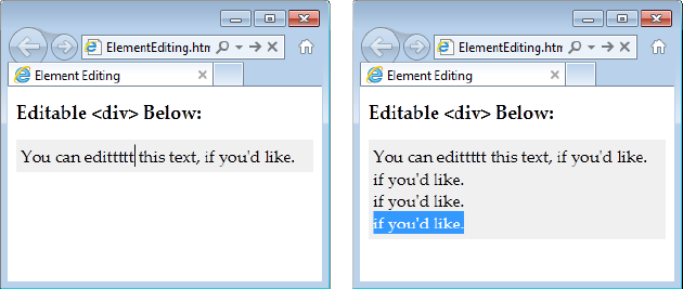
You probably won’t notice the difference at first. But if you load your page in a browser and click inside that <div>, a text-editing cursor (called a caret) will appear (Figure 4-16).
In this example, the editable <div> contains nothing but text. However, you could just as easily put other elements inside. In fact, this <div> element could wrap your entire page, making the whole thing editable. Similarly, you could use contentEditable on multiple elements to make several sections of a page editable.
Tip
Some browsers support a few built-in commands. For example, you can get bold, italic, and underline formatting in IE using the shortcut keys Ctrl+B, Ctrl+I, and Ctrl+U. Similarly, you can reverse your last action in Firefox by pressing Ctrl+Z, and you can use all of these shortcuts in Chrome. To learn more about these editing commands, and how you can create a custom toolbar that triggers them, see Opera’s two-part article series at http://tinyurl.com/htmlEdit1 and http://tinyurl.com/htmlEdit2.)
Usually, you won’t set contentEditable in your markup. Instead, you’ll turn it on using a bit of JavaScript, and you’ll turn it off when you want to finish editing. Here are two functions that do exactly that:
functionstartEdit(){// Make the element editable.varelement=document.getElementById("editableElement");element.contentEditable=true;}functionstopEdit(){// Return the element to normal.varelement=document.getElementById("editableElement");element.contentEditable=false;// Show the markup in a message box.alert("Your edited content: "+element.innerHTML);}
And here are two buttons that use them:
<buttononclick="startEdit()">Start Editing</button><buttononclick="stopEdit()">Stop Editing</button>
Just make sure you don’t place the buttons in the editable region of your page, because when a page is being edited, its elements stop firing events and won’t trigger your code.
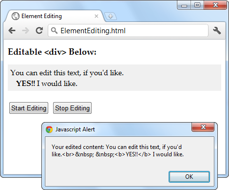
Figure 4-17 shows the result after the element has been edited and some formatting has been applied (courtesy of the Ctrl+B shortcut command).
Note
There are subtle differences in the way rich HTML editing works in different browsers. For example, pressing Ctrl+B in Chrome adds a <b> element, while pressing it in IE adds the <strong> element. Similar variations occur when you hit the Enter key to add a new line or Backspace to delete a tag. One of the reasons that it makes sense for HTML5 to standardize the rich HTML editing feature is the ability to enforce better consistency.
Using designMode to Edit a Page
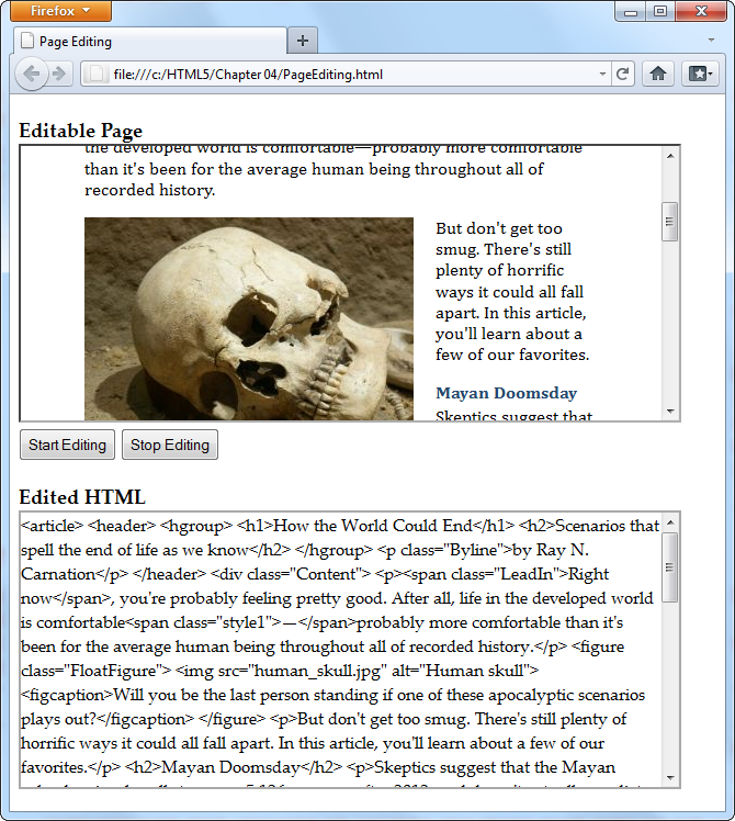
The designMode property is similar to contentEditable, except it allows you to edit an entire web page. This may seem like a bit of a problem—after all, if the whole page is editable, how will the user click buttons and control the editing process? The solution is to put the editable document inside an <iframe> element, which then acts as a super-powered editing box (Figure 4-18).
The markup in this page is refreshingly simple. Here are the complete contents of the <body> element in the page:
<h1>Editable Page</h1><iframeid="pageEditor"src="ApocalypsePage_Revised.html"></iframe><div><buttononclick="startEdit()">Start Editing</button><buttononclick="stopEdit()">Stop Editing</button></div><h1>Edited HTML</h1><divid="editedHTML"></div>
As you can see, this example relies on the startEdit() and stopEdit() methods, much like the previous example. However, the code is tweaked so that it sets the designMode attribute rather than the contentEditable attribute:
functionstartEdit(){// Turn on design mode in the <iframe>.vareditor=document.getElementById("pageEditor");editor.contentWindow.document.designMode="on";}functionstopEdit(){// Turn off design mode in the <iframe>.vareditor=document.getElementById("pageEditor");editor.contentWindow.document.designMode="off";// Display the edited HTML (just to prove it's there).varhtmlDisplay=document.getElementById("editedHTML");htmlDisplay.textContent=editor.contentWindow.document.body.innerHTML;}
This example gives you a better idea of the scope of the rich editing feature. For example, click on a picture and you’ll see how the browser lets you manipulate it. You can resize it, drag it to a new place, or delete it completely with a single click of the Delete button. You’ll have similar power over form controls, if they’re in the page you’re editing.
Of course, there’s still a significant gap you’ll need to cross if you want to turn this example into something practical. First, you’ll probably want to add better editing controls. Once again, the helpful folks at Opera have your back if you’re ready to make a deeper exploration into the command model, which is beyond the scope of this chapter (see http://tinyurl.com/htmlEdit1 and http://tinyurl.com/htmlEdit2). Second, you’ll need to do something useful with your edited markup, like sending it to your web server via XMLHttpRequest (The XMLHttpRequest Object).
There’s one more caveat to note. If you run this example locally from your hard drive, it won’t work in all browsers. (Internet Explorer and Chrome run into security restrictions, while Firefox sails ahead without a problem.) To avoid the problem, you can run it from the try-out site at www.prosetech.com/html5.
Get HTML5: The Missing Manual now with the O’Reilly learning platform.
O’Reilly members experience books, live events, courses curated by job role, and more from O’Reilly and nearly 200 top publishers.

