Chapter 1. Start Building with C#: Build something cool, fast!
Want to build great apps really fast?
With C#, you’ve got a great programming language and a valuable tool at your fingertips. With the Visual Studio IDE, you’ll never have to spend hours writing obscure code to get a button working again. Even better, you’ll be able to build really cool software, rather than remembering which bit of code was for the name of a button, and which one was for its label. Sound appealing? Turn the page, and let’s get programming.
Why you should learn C#
C# and the Visual Studio IDE make it easy for you to get to the business of writing code, and writing it fast. When you’re working with C#, the IDE is your best friend and constant companion.
Note
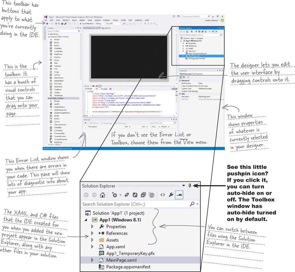
The IDE—or Visual Studio Integrated Development Environment—is an important part of working in C#. It’s a program that helps you edit your code, manage your files, and submit your apps to the Windows Store.
Here’s what the IDE automates for you...
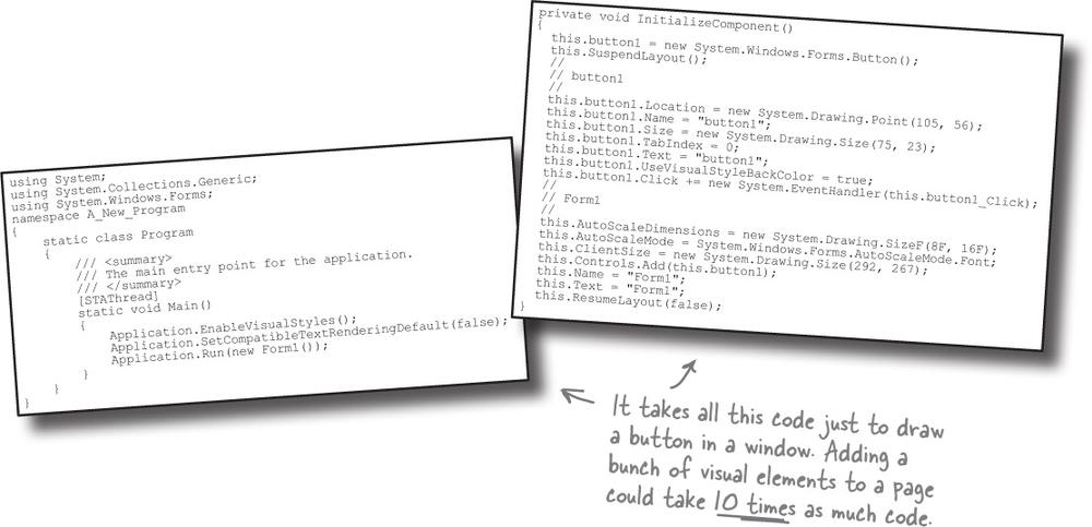
Every time you want to get started writing a program, or just putting a button on a page, your program needs a whole bunch of repetitive code.
C# and the Visual Studio IDE make lots of things easy
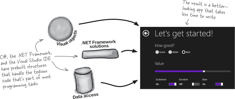
When you use C# and Visual Studio, you get all of these great features, without having to do any extra work. Together, they let you:
➊ Build an application, FAST. Creating programs in C# is a snap. The language is flexible and easy to learn, and the Visual Studio IDE does a lot of work for you automatically. You can leave mundane coding tasks to the IDE and focus on what your code should accomplish.
➋ Design a great-looking user interface. The Visual Designer in the Visual Studio IDE is one of the easiest-to-use design tools out there. It does so much for you that you’ll find that creating user interfaces for your programs is one of the most satisfying parts of developing a C# application. You can build full-featured professional programs without having to spend hours writing a graphical user interface entirely from scratch.
➌ Build visually stunning programs. When you combine C# with XAML, the visual markup language for designing user interfaces, you’re using one of the most effective tools around for creating visual programs... and you’ll use it to build software that looks as great as it acts.
➍ Focus on solving your REAL problems. The IDE does a lot for you, but you are still in control of what you build with C#. The IDE lets you just focus on your program, your work (or fun!), and your users. It handles all the grunt work for you:
Keeping track of all your project files
Making it easy to edit your project’s code
Keeping track of your project’s graphics, audio, icons, and other resources
Helping you manage and interact with your data
All this means you’ll have all the time you would’ve spent doing this routine programming to put into building and sharing killer apps.
What you do in Visual Studio...
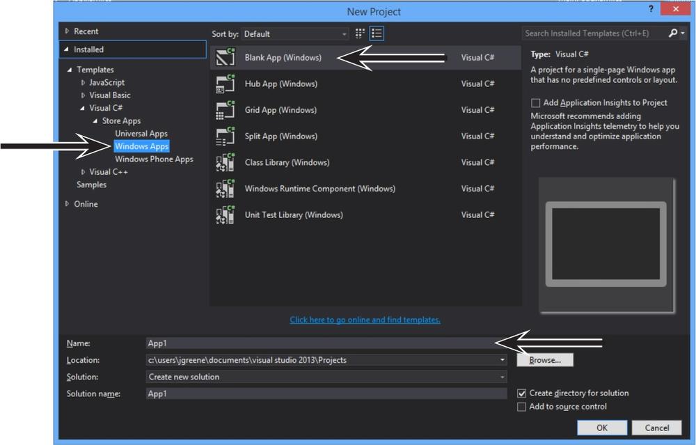
Go ahead and start up Visual Studio 2013 for Windows, if you haven’t already. Skip over the start page and select New Project from the File menu. There are several project types to choose from. Expand Visual C#→Windows Store→Windows App, and select Blank App (Windows). The IDE will create a folder called Visual Studio 2013 in your Documents folder, and put your applications in a Projects folder under it (you can use the Location box to change this).
What Visual Studio does for you...
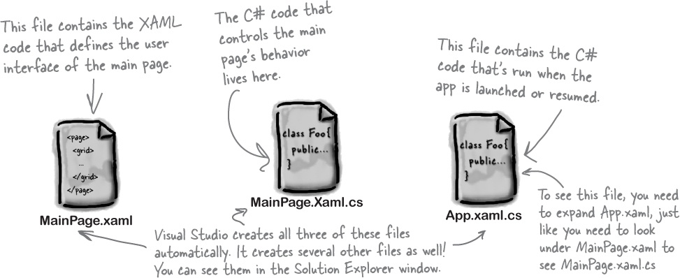
As soon as you save the project, the IDE creates a bunch of files, including MainPage.xaml, MainPage.Xaml.cs, and App.xaml.cs, when you create a new project. It adds these to the Solution Explorer window, and by default, puts those files in the Projects\App1\App1 folder.
Aliens attack!
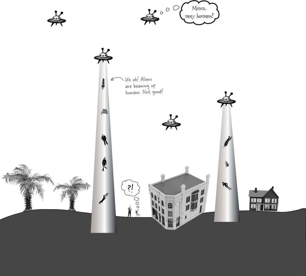
Well, there’s a surprise: vicious aliens have launched a full-scale attack on planet Earth, abducting humans for their nefarious and unspeakable gastronomical experiments. Didn’t see that coming!
Only you can help save the Earth
The last hopes of humanity rest on your shoulders! The people of planet Earth need you to build an awesome C# app to coordinate their escape from the alien menace. Are you up to the challenge?
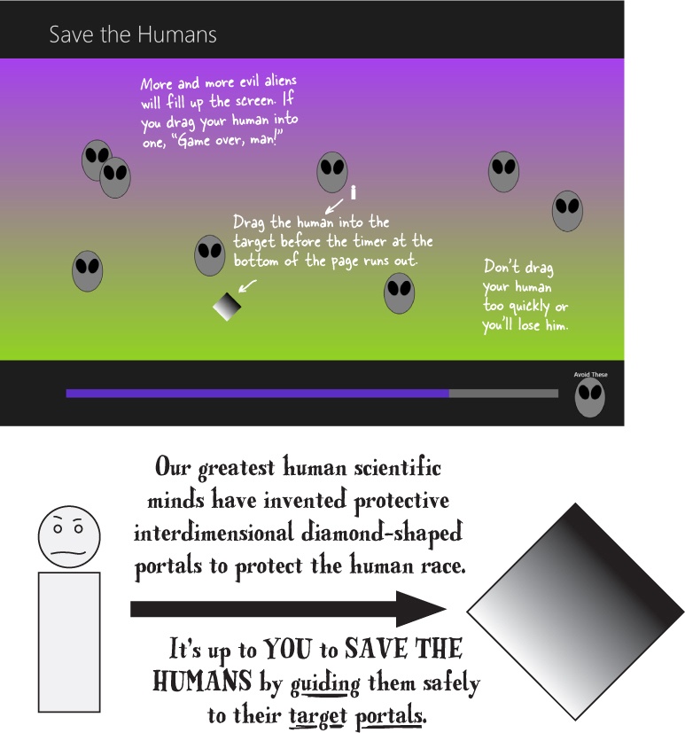
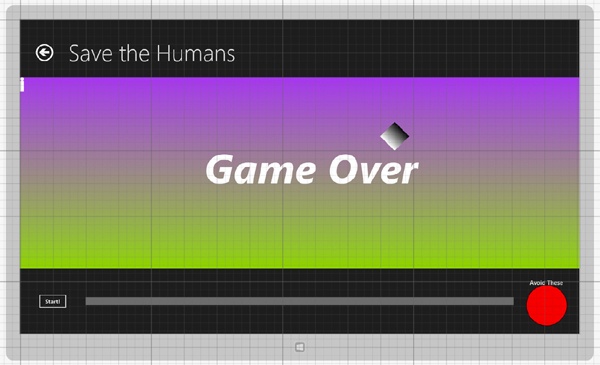
Here’s what you’re going to build
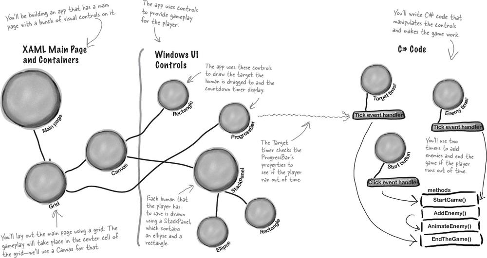
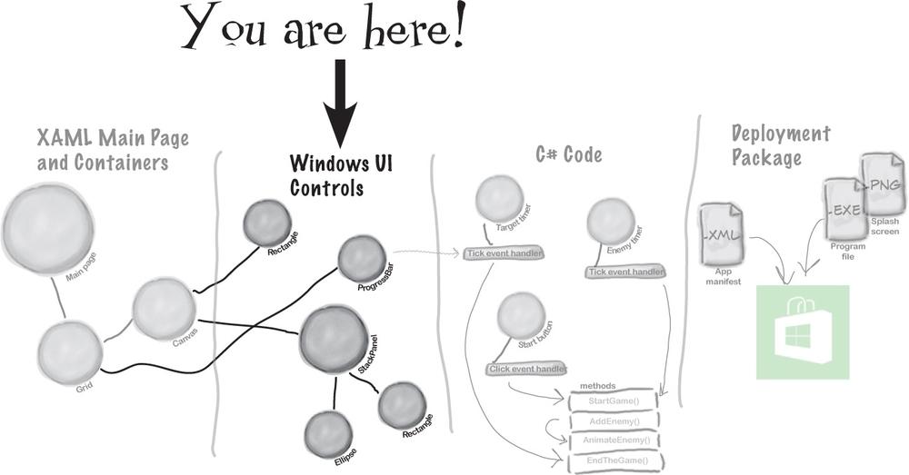
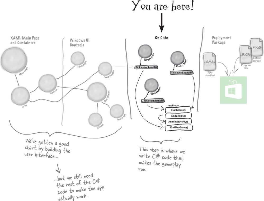
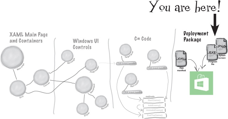
You’re going to need an application with a graphical user interface, objects to make the game work, and an executable to run. It sounds like a lot of work, but you’ll build all of this over the rest of the chapter, and by the end you’ll have a pretty good handle on how to use the IDE to design a page and add C# code.
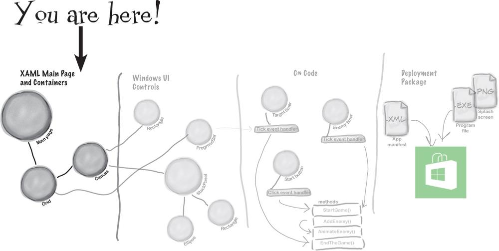
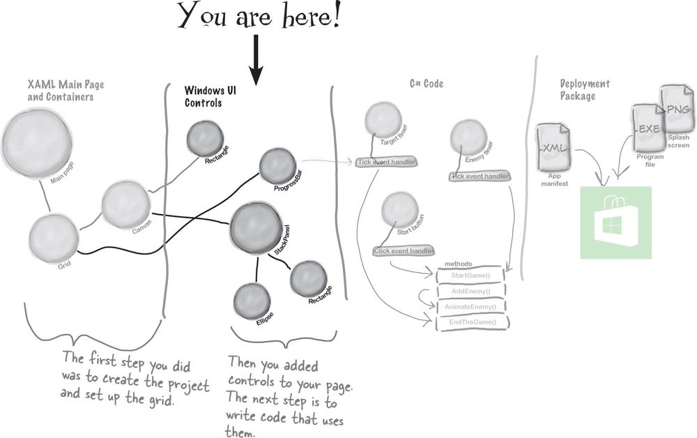
Here’s the structure of the app we’re going to create:
Save the Humans is a Windows Store app—you need Windows 8 to build and run it. Don’t have Windows 8? The WPF Learner’s Guide to Head First C# appendix at the end of this book shows you how to build this project as a desktop app.
Note
It’s not unusual for computers in an office to be running an operating system as old as Windows 2003, and may have an old version of Visual Studio. With WPF you can still do the projects in the book.
Relax
No Windows 8? No problem.
The first two chapters and the last half of this book have many projects that are built with Visual Studio 2013 for Windows, but many readers aren’t running Windows 8 yet. Luckily, almost all of the Windows Store apps in this book can also be built as desktop apps using Windows Presentation Foundation (WPF), which is compatible with earlier operating systems. Flip back to the last few pages of the Introduction, to the section called “What version of Windows are you using?” to learn more.
Note
The WPF Guide appendix contains complete replacement pages for the rest of this chapter, and then just five replacement pages for Chapter 2. After that, you won’t need to use the WPF Learner’s Guide appendix again until Chapter 10.
We worked really hard to build the WPF Learner’s Guide appendix so that you keep page flipping to a minimum, while still letting you use an earlier version of Windows and even a previous edition of Visual Studio to learn all of the same important C# concepts.
Start with a blank application
Every great app starts with a new project. Choose New Project from the File menu. Make sure you have Visual C#→Window Store selected and choose Blank App (XAML) as the project type. Type Save the Humans as the project name.
Note
If your code filenames don’t end in “.cs” you may have accidentally created a JavaScript, Visual Basic, or Visual C++ program. You can fix this by closing the solution and starting over. If you want to keep the project name “Save the Humans,” then you’ll need to delete the previous project folder.
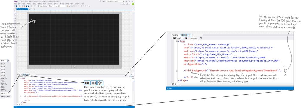
➊ Your starting point is the Designer window. Double-click on MainPage.xaml in the Solution Explorer to bring it up. Find the zoom drop-down in the lower-left corner of the designer and choose “Fit all” to zoom it out.
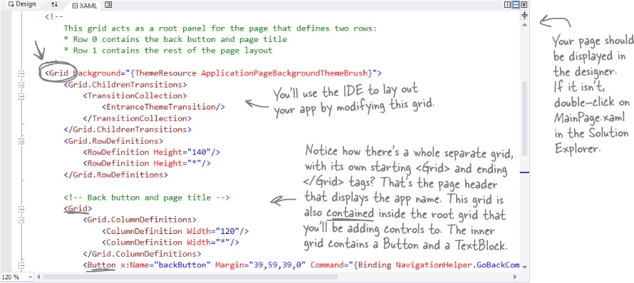
The bottom half of the Designer window shows you the XAML code. It turns out your “blank” page isn’t blank at all—it contains a XAML grid. The grid works a lot like a table in an HTML page or Word document. We’ll use it to lay out our pages in a way that lets them grow or shrink to different screen sizes and shapes.
Looking to learn WPF? Look no further!
Most of the Windows Store apps in this book can be built with WPF (Windows Presentation Foundation), which is compatible with Windows 7 and earlier operating systems and Visual Studio versions. Flip back to the last few pages of the Introduction, to the section called “What version of Windows are you using?” to learn more.
This part of the project has steps numbered
 to
to  . Flip the page to keep going!
➋ Your page is going to need a title, right? And it’ll need margins, too. You can do this all by hand with XAML, but there’s an easier way to get your app to look like a normal Windows Store app.
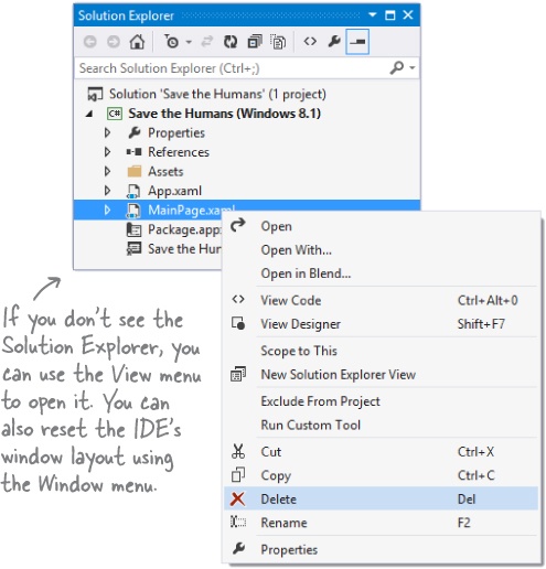
Go to the Solution Explorer window and find
 . Right-click on it and choose Delete to delete the MainPage.xaml page:
When you start a Windows Store app, you’ll often replace the main page with one of the templates that Visual Studio provides.
➌ Now you’ll need to replace the main page. Go back to the Solution Explorer and right-click on
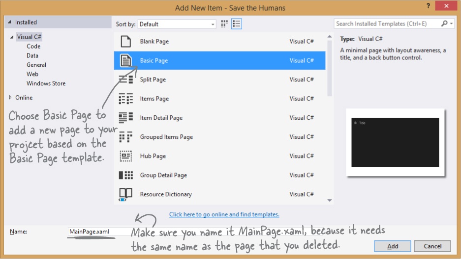
 (it should be the second item in the Solution Explorer) to select the project. Then choose Add→New Item... from the menu:
Note
If you chose a different name when you created your project, you’ll see that name instead of “Save the Humans” in the Solution Explorer.
If you really get stuck, you can download all of the code for this project from the book’s website: http://www.headfirstlabs.com/hfcsharp — all of the code in this chapter was copied and pasted from the downloadable source!
The IDE will pop up the Add New Item window for your project. Choose Basic Page and give it the name MainPage.xaml. Then click the Add button to add the replacement page to your project.
The IDE will prompt you to add missing files—choose Yes to add them. Wait for the designer to finish loading. It might display either
 or
or  . Choose Rebuild Solution from the Build menu to bring the IDE’s Designer window up to date. Now you’re ready to roll!
Note
When you replace MainPage.xaml with the new Basic Page item, the IDE needs to add additional files. Rebuilding the solution brings everything up to date so it can display the page in the designer.
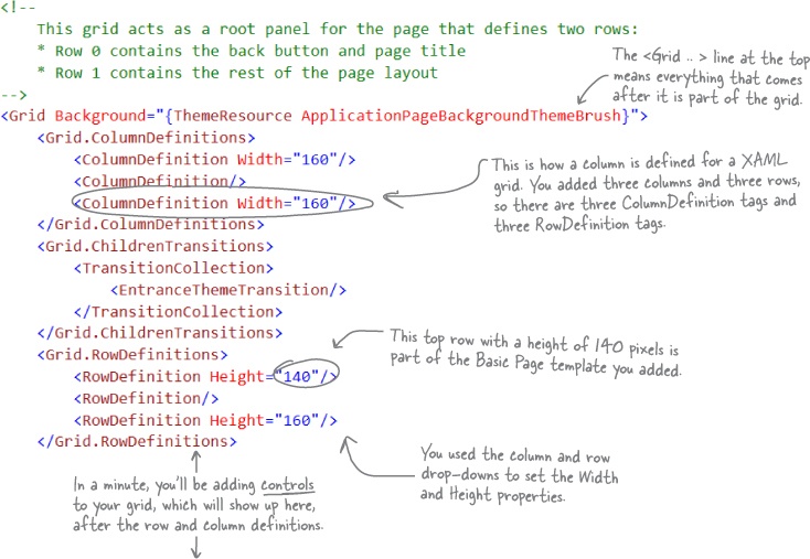
Let’s explore your newly added MainPage.xaml file. Scroll through the XAML pane in the designer window until you find this XAML code. This is the grid you’ll use as the basis for your program:
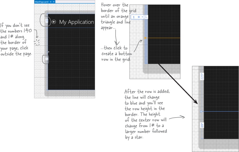
➍ Your app will be a grid with two rows and three columns (plus the header row that came with the blank page template), with one big cell in the middle that will contain the play area. Start defining rows by hovering over the border until a line and triangle appear:
Windows Store apps need to look right on any screen, from tablets to laptops to giant monitors, in portrait or landscape.
Laying out the page using a grid’s columns and rows allows your app to automatically adjust to the display.
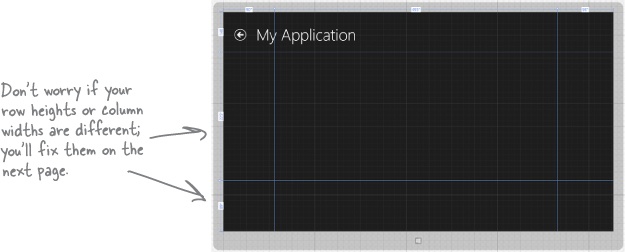
➎ Do the same thing along the top border of the page—except this time create two columns, a small one on the lefthand side and another small one on the righthand side. Don’t worry about the row heights or column widths—they’ll vary depending on where you click. We’ll fix them in a minute.
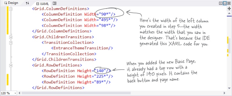
When you’re done, look in the XAML window and go back to the same grid from the previous page. Now the column widths and row heights match the numbers on the top and side of your page.
Your grid rows and columns are now added!
XAML grids are container controls, which means they hold other controls. Grids consist of rows and columns that define cells, and each cell can hold other XAML controls that show buttons, text, and shapes. A grid is a great way to lay out a page, because you can set its rows and columns to resize themselves based on the size of the screen.
Set up the grid for your page
Your app needs to be able to work on a wide range of devices, and using a grid is a great way to do that. You can set the rows and columns of a grid to a specific pixel height. But you can also use the Star setting, which keeps them the same size proportionally—to each other and also to the page—no matter how big the display or what its orientation is.
➊ SET THE WIDTH OF THE LEFT COLUMN.
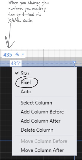
Hover over the number above the first column until a drop-down menu appears. Choose Pixel to change the star to a lock, then click on the number to change it to
160. Your column’s number should now look like this:➋ REPEAT FOR THE RIGHT COLUMN AND THE BOTTOM ROW.
Make the right column and the bottom row 160 by choosing Pixel and typing
160into the box.Set your columns or rows to Pixel to give them a fixed width or height. The Star setting lets a row or column grow or shrink proportionally to the rest of the grid. Use this setting in the designer to alter the Width or Height property in the XAML. If you remove the Width or Height property, it’s the same as setting the property to 1*.
➌ MAKE THE CENTER COLUMN AND CENTER ROW THE DEFAULT SIZE 1* (IF THEY AREN’T ALREADY).
Click on the number above the center column and enter 1. Don’t use the drop-down (leave it Star) so it looks like the picture below. Then make sure to look back at the other columns to make sure the IDE didn’t resize them. If it did, just change them back to
160.XAML and C# are case sensitive! Make sure your uppercase and lowercase letters match example code.
➍ LOOK AT YOUR XAML CODE!
Click on the grid to make sure it’s selected, then look in the XAML window to see the code that you built.
Add controls to your grid
Ever notice how apps are full of buttons, text, pictures, progress bars, sliders, drop-downs, and menus? Those are called controls, and it’s time to add some of them to your app—inside the cells defined by your grid’s rows and columns.
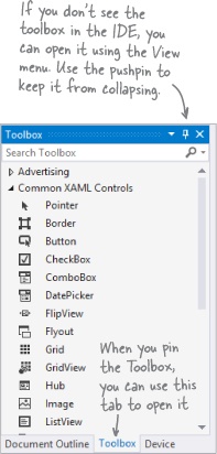
➊ Expand the
 section of the toolbox and drag a
  into the bottom-left cell of the grid.
Then look at the bottom of the Designer window and have a look at the XAML tag that the IDE generated for you. You’ll see something like this—your margin numbers will be different depending on where in the cell you dragged it, and the properties might be in a different order.
➋ Drag a
 into the lower-right cell of the grid. Your XAML will look something like this. See if you can figure out how it determines which row and column the controls are placed in.
➌ Next, expand the
 section of the toolbox. Drag a
  into the bottom-center cell, a
  into the bottom-right cell (make sure it’s below the TextBlock you already put in that cell), and a
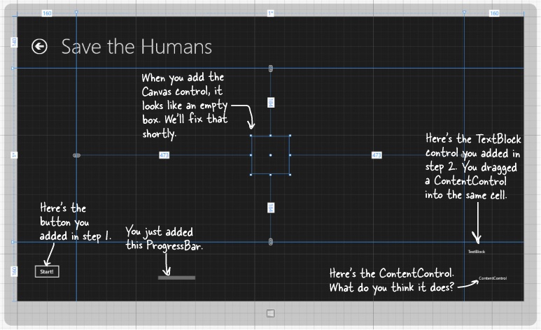
  into the center cell. Your page should now have controls on it (don’t worry if they’re placed differently than the picture below; we’ll fix that in a minute):
➍ You’ve got the Canvas control currently selected, since you just added it. (If not, use the pointer to select it again.) Look in the XAML window:
It’s showing you the XAML tag for the Canvas control. It starts with
<Canvasand ends with/>, and between them it has properties likeGrid.Column="1"(to put the Canvas in the center column) andGrid.Row="1"(to put it in the center row). Try clicking in both the grid and the XAML window to select different controls.When you drag a control out of the toolbox and onto your page, the IDE automatically generates XAML to put it where you dragged it.
Use properties to change how the controls look
The Visual Studio IDE gives you fine control over your controls. The Properties window in the IDE lets you change the look and even the behavior of the controls on your page.
➊ Change the text of the button.
Right-click on the button control that you dragged onto the grid and choose Edit Text from the menu. Change the text to:
Start!and see what you did to the button’s XAML:➋ Use the Properties window to modify the button.
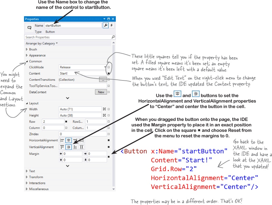
Make sure the button is selected in the IDE, then look at the Properties window in the lower-right corner of the IDE. Use it to change the name of the control to
startButtonand center the control in the cell. Once you’ve got the button looking right, right-click on it and choose View Source to jump straight to the<Button>tag in the XAML window.➌ Change the page header text.
Right-click on the page header (“My Application”) and choose View Source to jump to the XAML for the text block. Scroll in the XAML window until you find the
Textproperty:Wait a minute! That’s not text that says “My Application”—what’s going on here?
The Blank Page template uses a static resource called
AppNamefor the name that it displays at the top of the page. Scroll to the top of the XAML code until you find a<Page.Resources>section that has this XAML code in it:Replace “My Application” with the name of your application:
Now you should see the correct text at the top of the page:
➍ Update the TextBlock to change its text and its style.
Use the Edit Text right-mouse menu option to change the TextBlock so it says
Avoid These(hit Escape to finish editing the text). Then right-click on it, choose the menu item, and then choose the
  submenu and select
 SubheaderTextBlockStyleto make its text bigger.➎ Use a StackPanel to group the TextBlock and ContentControl.
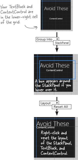
Make sure that the TextBlock is near the top of the cell, and the ContentControl is near the bottom. Click and drag to select both the TextBlock and ContentControl, and then right-click. Choose
 from the pop-up menu, then choose
  . This adds a new control to your page: a StackPanel control. You can select the StackPanel by clicking between the two controls.
The StackPanel is a lot like the Grid and Canvas: its job is to hold other controls (it’s called a “container”), so it’s not visible on the page. But since you dragged the TextBlock to the top of the cell and the ContentControl to the bottom, the IDE created the StackPanel so it fills up most of the cell. Click in the middle of the StackPanel to select it, then right-click and choose
 and
and  to quickly reset its properties, which will set its vertical and horizontal alignment to Stretch. Finally, right-click on the TextBox and ContentControl to reset their layouts as well. While you have the ContentControl selected, set its vertical and horizontal alignments to Center.
Controls make the game work
Controls aren’t just for decorative touches like titles and captions. They’re central to the way your game works. Let’s add the controls that players will interact with when they play your game. Here’s what you’ll build next:
➊ Update the ProgressBar.
Right-click on the ProgressBar in the bottom-center cell of the grid, choose the Layout menu option, and then choose Reset All to reset all of the properties to their default values. Use the Height box in the Layout section of the Properties window to set the
Heightto20. The IDE stripped all of the layout-related properties from the XAML, and then added the newHeight:➋ Turn the Canvas control into the gameplay area.
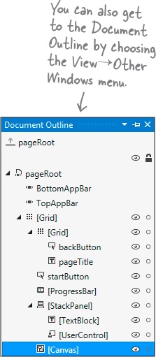
Remember that Canvas control that you dragged into the center square? It’s hard to see it right now because a Canvas control is invisible when you first drag it out of the toolbox, but there’s an easy way to find it. Click the very small
 button above the XAML window to bring up the Document Outline. Click on
  to select the Canvas control.
Make sure the Canvas control is selected, then use the Name box in the Properties window to set the name to
playArea.Note
Once you change the name, it’ll show up as playArea instead of [Canvas] in the Document Outline window.
After you’ve named the Canvas control, you can close the Document Outline window. Then use the
 and
and  buttons in the Properties window to set its vertical and horizontal alignments to Stretch, reset the margins, and click both
  buttons to set the
 WidthandHeightto Auto. Then set its Column to 0, and its ColumnSpan (next to Column) to 3.Finally, open the Brush section of the Properties window and use the
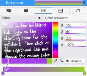
 button to give it a gradient. Choose the starting and ending colors for the gradient by clicking each of the tabs at the bottom of the color editor and then clicking on a color.
Your game will have a lot of enemies bouncing around the screen, and you’re going to want them to all look the same. Luckily, XAML gives us templates, which are an easy way to make a bunch of controls look alike.
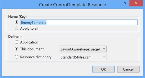
Next, right-click on the ContentControl in the Document Outline window. Choose Edit Template, then choose Create Empty... from the menu. Name it
EnemyTemplate. The IDE will add the template to the XAML.Note
You’re “flying blind” for this next bit—the designer won’t display anything for the template until you add a control and set its height and width so it shows up. Don’t worry; you can always undo and try again if something goes wrong.
Your newly created template is currently selected in the IDE. Collapse the Document Outline window so it doesn’t overlap the Toolbox. Your template is still invisible, but you’ll change that in the next step. If you accidentally click out of the control template, you can always get back to it by opening the Document Outline, right-clicking on the Content Control, and choosing Edit Template→Edit Current.
➍ Edit the enemy template.
Add a red circle to the template:
Set the ellipse’s
HeightandWidthproperties to100, which will cause the ellipse to be displayed in the cell.Reset the
HorizontalAlignment,VerticalAlignment, andMarginproperties by clicking on their squares and choosing Reset.Go to the Brush section of the Properties window and click on
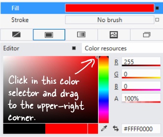
 to select a solid-color brush.
Color your ellipse red by clicking in the color bar and dragging to the top, then clicking in the color sector and dragging to the upper-right corner.
The XAML for your ContentControl now looks like this:
➎ Use the Document Outline to modify the StackPanel and TextBlock controls.
Go back to the Document Outline (if you see
 at the top of the Document Outline window, just click
  to get back to the Page outline). Select the StackPanel control, make sure its vertical and horizontal alignments are set to center, and clear the margins. Then do the same for the TextBlock.
You’re almost done laying out the page! Flip the page for the last steps...

➏ Add the human to the Canvas.
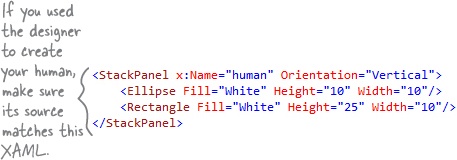
You’ve got two options for adding the human. The first option is to follow the next three paragraphs. The second, quicker option is to just type the four lines of XAML into the IDE. It’s your choice!
Select the Canvas control, then open the All XAML Controls section of the toolbox and double-click on Ellipse to add an Ellipse control to the Canvas. Select the Canvas control again and double-click on Rectangle. The Rectangle will be added right on top of the Ellipse, so drag the Rectangle below it.
Hold down the Shift key and click on the Ellipse so both controls are selected. Right-click on the Ellipse, choose Group Into, and then StackPanel. Select the Ellipse, use the solid brush property to change its color to white, and set its
WidthandHeightproperties to 10. Then select the Rectangle, make it white as well, and change itsWidthto 10 and itsHeightto 25.Use the Document Outline window to select the Stack Panel (make sure you see
 at the top of the Properties window). Click both
  buttons to set the
 WidthandHeightto Auto. Then use the Name box at the top of the window to set its name tohuman. Here’s the XAML you generated:Note
If you choose to type this into the XAML window of the IDE, make sure you do it directly above the </Canvas> tag. That’s how you indicate that the human is contained in the Canvas.
You might also see a Stroke property on the Ellipse and Rectangle set to
"Black". (If you don’t see one, try adding it. What happens?)Go back to the Document Outline window to see how your new controls appear:
If
humanisn’t indented underneathplayArea, click and draghumanonto it.➐ Add the Game Over text.
When your player’s game is over, the game will need to display a Game Over message. You’ll do it by adding a TextBlock, setting its font, and giving it a name:
Select the Canvas, then drag a TextBlock out of the toolbox and onto it.
Use the Name box in the Properties window to change the TextBlock’s name to
gameOverText.Use the Text section of the Properties window to change the font to Arial Black, change the size to 100 px, and make it Bold and Italic.
Click on the TextBlock and drag it to the middle of the Canvas.
Edit the text so it says
Game Over.
When you drag a control around a Canvas, its Left and Top properties are changed to set its position. If you change the Left and Top properties, you move the control.
➑ Add the target portal that the player will drag the human onto.
There’s one last control to add to the Canvas: the target portal that your player will drag the human into. (It doesn’t matter where in the Canvas you drag it.)
Select the Canvas control, then drag a Rectangle control onto it. Use the
 button in the Brushes section of the Properties window to give it a gradient. Set its
 HeightandWidthproperties to50.Turn your rectangle into a diamond by rotating it 45 degrees. Open the Transform section of the Properties window to rotate the Rectangle 45 degrees by clicking on
 and setting the angle to
 45.Finally, use the Name box in the Properties window to give it the name
target.➒ Take a minute and double-check a few things.
Open the Document Outline window and make sure that the
humanStackPanel,gameOverTextTextBlock, andtargetRectangle are indented underneath theplayAreaCanvas control, which is indented under the second [Grid]. (If you see at the top of the Document Outline window, just click
  to get back to the Page outline, which has pageRoot at the top.) Select the
 playAreaCanvas control and make sure its Height and Width are set to Auto. These are all things that could cause bugs in your game that will be difficult to track down.Congratulations—you’ve finished building the main page for your app!
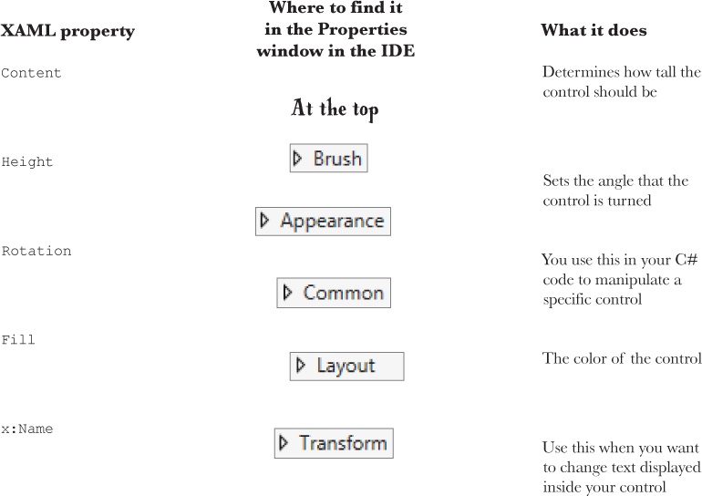
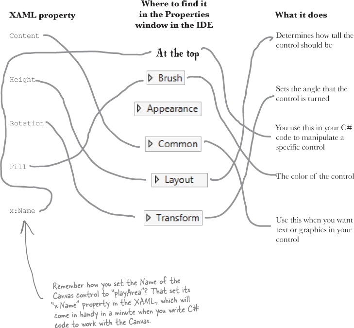
Solution in Who Does What? Solution ![]()
Here’s a hint: you can use the Search box in the Properties window to find properties—but some of these properties aren’t on every type of control. |
You’ve set the stage for the game
Your page is now all set for coding. You set up the grid that will serve as the basis of your page, and you added controls that will make up the elements of the game.
Visual Studio gave you useful tools for laying out your page, but all it really did was help you create XAML code. You’re the one in charge!
What you’ll do next
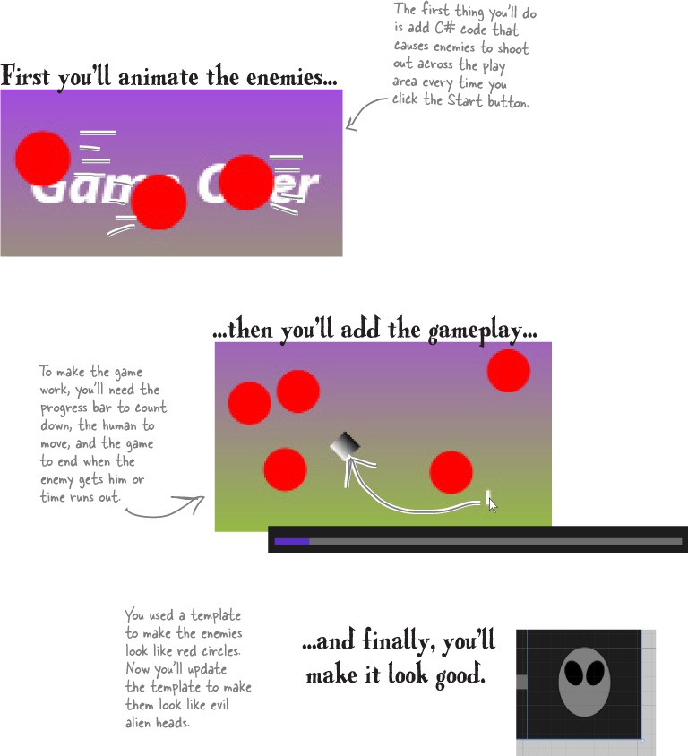
Now comes the fun part: adding the code that makes your game work. You’ll do it in three stages: first you’ll animate your enemies, then you’ll let your player interact with the game, and finally you’ll add polish to make the game look better.
Add a method that does something
It’s time to start writing some C# code, and the first thing you’ll do is add a method—and the IDE can give you a great starting point by generating code.
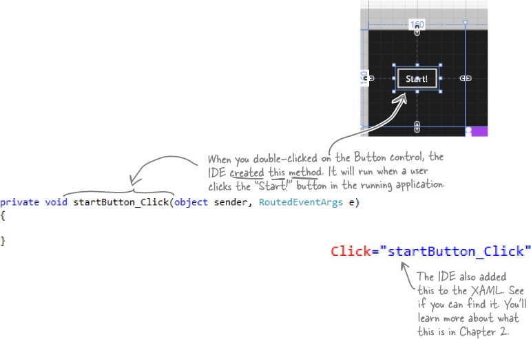
When you’re editing a page in the IDE, double-clicking on any of the controls on the page causes the IDE to automatically add code to your project. Make sure you’ve got the page designer showing in the IDE, and then double-click on the Start button. The IDE will add code to your project that gets run any time a user clicks on the button. You should see some code pop up that looks like this:
Use the IDE to create your own method
Click between the { } brackets and type this, including the parentheses and semicolon:
Notice the red squiggly line underneath the text you just typed? That’s the IDE telling you that something’s wrong. If you click on the squiggly line, a blue box appears, which is the IDE’s way of telling you that it might be able to help you fix the error.
Hover over the blue box and click the ![]() icon that pops up. You’ll see a box asking you to generate a method stub. What do you think will happen if you click it? Go ahead and click it to find out!
icon that pops up. You’ll see a box asking you to generate a method stub. What do you think will happen if you click it? Go ahead and click it to find out!
Fill in the code for your method
It’s time to make your program do something, and you’ve got a good starting point. The IDE generated a method stub for you: the starting point for a method that you can fill in with code.
➊ Delete the contents of the method stub that the IDE generated for you.
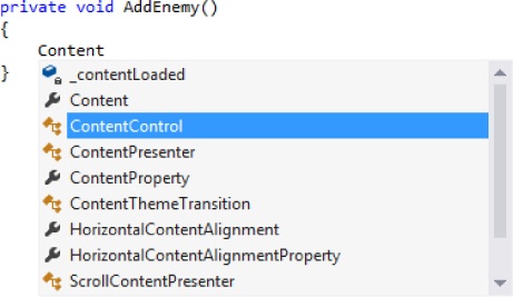
➋ Start adding code. Type the word Content into the method body. The IDE will pop up a window called an IntelliSense Window with suggestions. Choose
ContentControlfrom the list.➌ Finish adding the first line of code. You’ll get another IntelliSense window after you type
new.Make sure each XAML control has the right name, and all properties (like Width and Height) are correct! If not, your program might crash.
➍ Before you fill in the
AddEnemy()method, you’ll need to add a line of code near the top of the file. Find the line that starts withpublic sealed partial class MainPageand add this line after the bracket ({) and before the first line of code ( ):
):➎ Finish adding the method. You’ll see some squiggly red underlines. The ones under
AnimateEnemy()will go away when you generate its method stub.➏ Use the blue box and the
 button to generate a method stub for
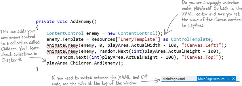
 AnimateEnemy(), just like you did forAddEnemy(). This time it added four parameters calledenemy,p1,p2, andp3. Edit the top line of the method to change the last three parameters. Change the parameterp1tofrom, the parameterp2toto, and the parameterp3topropertyToAnimate. Then change anyinttypes todouble.
Finish the method and run your program
Your program is almost ready to run! All you need to do is finish your AnimateEnemy() method. Don’t panic if things don’t quite work yet. You may have missed a comma or some parentheses—when you’re programming, you need to be really careful about those things!
Relax
Still seeing red? The IDE helps you track down problems.
If you still have some of those red squiggly lines, don’t worry! You probably just need to track down a typo or two. If you’re still seeing squiggly red underlines, it just means you didn’t type in some of the code correctly. We’ve tested this chapter with a lot of different people, and we didn’t leave anything out. All of the code you need to get your program working is in these pages.
➊ Add a using statement to the top of the file.
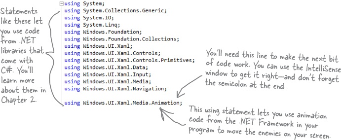
Scroll all the way to the top of the file. The IDE generated several lines that start with
using. Add one more to the bottom of the list:➋ Add code that creates an enemy bouncing animation.
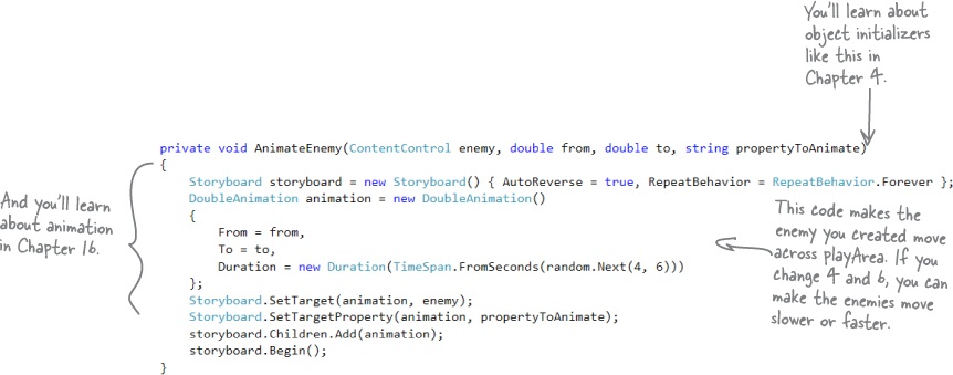
You generated the method stub for the
AnimateEnemy()method on the previous page. Now you’ll add its code. It makes an enemy start bouncing across the screen.➌ Look over your code.
You shouldn’t see any errors, and your Error List window should be empty. If not, double-click on the error in the Error List. The IDE will jump your cursor to the right place to help you track down the problem.
Note
If you can’t see the Error List window, choose Error List from the View menu to show it. You’ll learn more about using the error window and debugging your code in Chapter 2.
➍ Start your program.
Find the
 button at the top of the IDE. This starts your program running.
➎ Now your program is running!
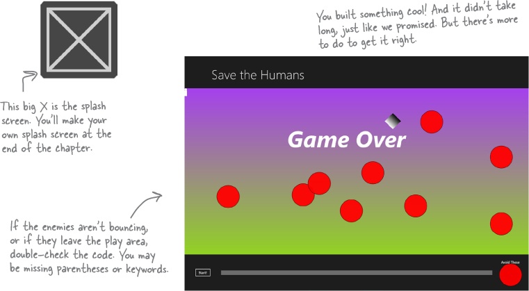
First, a big X will be displayed for a few seconds, and then your main page will be displayed. Click the “Start!” button a few times. Each time you click it, a circle is launched across your canvas.
➏ Stop your program.
Press Alt-Tab to switch back to the IDE. The
 button in the toolbar has been replaced with
  to break, stop, and restart your program. Click the square to stop the program running.
Do you see numbers in the upper corners of the page? Those are frame rate counters.
Note
You’ll learn more about them in Chapter 10.
Here’s what you’ve done so far
Congratulations! You’ve built a program that actually does something. It’s not quite a playable game, but it’s definitely a start. Let’s look back and see what you built.
Visual Studio can generate code for you, but you need to know what you want to build BEFORE you start building it. It won’t do that for you!
Here’s the solution for the “Who Does What” exercise in Who Does What?. We’ll give you the answers to the pencil-and-paper puzzles and exercises, but they won’t always be on the next page. |
Add timers to manage the gameplay
Let’s build on that great start by adding working gameplay elements. This game adds more and more enemies, and the progress bar slowly fills up while the player drags the human to the target. You’ll use timers to manage both of those things.
➊ ADD MORE LINES TO THE TOP OF YOUR C# CODE.
Note
The MainPage.Xaml.cs file you’ve been editing contains the code for a class called MainPage. You’ll learn about classes in Chapter 3.
Go up to the top of the file where you added that
Randomline. Add three more lines:➋ ADD A METHOD FOR ONE OF YOUR TIMERS.
Find this code that the IDE generated:
Put your cursor right after the last semicolon, hit Enter two times, and type
enemyTimer.(including the period). As soon as you type the dot, an IntelliSense window will pop up. ChooseTickfrom the IntelliSense window and type the following text. As soon as you enter += the IDE pops up a box:Press the Tab key. The IDE will pop up another box:
Press Tab one more time. Here’s the code the IDE generated for you:
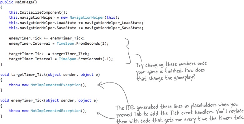
Timers “tick” every time interval by calling methods over and over again. You’ll use one timer to add enemies every few seconds, and the other to end the game when time expires.
➌ FINISH THE MAINPAGE() METHOD.
You’ll add another
Tickevent handler for the other timer, and you’ll add two more lines of code. Here’s what your finishedMainPage()method and the two methods the IDE generated for you should look like:➍ ADD THE ENDTHEGAME() METHOD.
Go to the new
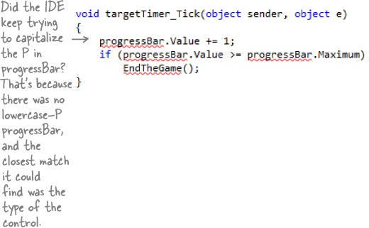
targetTimer_Tick()method, delete the line that the IDE generated, and add the following code. The IntelliSense window might not seem quite right:Notice how
progressBarhas an error? That’s OK. We did this on purpose (and we’re not even sorry about it!) to show you what it looks like when you try to use a control that doesn’t have a name, or has a typo in the name. Go back to the XAML code (it’s in the other tab in the IDE), find the ProgressBar control that you added to the bottom row, and change its name toprogressBar.Note
If you closed the Designer tab that had the XAML code, double-click on MainPage. xaml in the Solution Explorer window to bring it up.
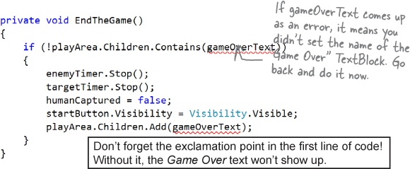
Next, go back to the code window and generate a method stub for
EndTheGame(), just like you did a few pages ago forAddEnemy(). Here’s the code for the new method:This method ends the game by stopping the timers, making the Start button visible again, and adding the GAME OVER text to the play area.
Make the Start button work
Remember how you made the Start button fire circles into the Canvas? Now you’ll fix it so it actually starts the game.
➊ Make the Start button start the game.
Find the code you added earlier to make the Start button add an enemy. Change it so it looks like this:
➋ Add the StartGame() method.
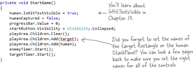
Generate a method stub for the
StartGame()method. Here’s the code to fill into the stub method that the IDE added:➌ Make the enemy timer add the enemies.
Find the
enemyTimer_Tick()method that the IDE added for you and replace its contents with this:
Note
Once you’re used to working with code, you’ll be good at spotting those missing parentheses, semicolons, etc.
Are you seeing errors in the Error List window that don’t make sense? One misplaced comma or semicolon can cause two, three, four, or more errors to show up. Don’t waste your time trying to track down every typo! Just go to the Head First Labs web page—we made it really easy for you to copy and paste all the code in this program.
There’s also a link to the Head First C# forum, which you can check for tips to get this game working!
Run the program to see your progress
Your game is coming along. Run it again to see how it’s shaping up.
Add code to make your controls interact with the player
Make sure you switch back to the IDE and stop the app before you make more changes to the code.
You’ve got a human that the player needs to drag to the target, and a target that has to sense when the human’s been dragged to it. It’s time to add code to make those things work.
➊ Go to the XAML designer and use the Document Outline window to select
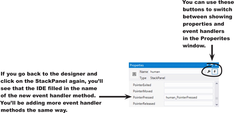
human(remember, it’s the StackPanel that contains a Circle and a Rectangle). Then go to the Properties window and press the button to switch it to show event handlers. Find the PointerPressed row and double-click in the empty box.
Note
You’ll learn more about the event handlers in the Properties window in Chapter 4.
The Document Outline may have collapsed [Grid], playArea, and other lines. If it did, just expand them to find the human control.
Now go back and check out what the IDE added to your XAML for the StackPanel:
It also generated a method stub for you. Right-click on
human_PointerPressedin the XAML and choose “Navigate to Event Handler” to jump straight to the C# code:➋ Fill in the C# code:
➌ Use the Document Outline window to select the Rectangle named
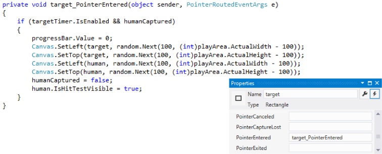
target, then use the event handlers view of the Properties window to add aPointerEnteredevent handler. Here’s the code for the method:Note
Make sure you add the right event handler! You added a PointerPressed event handler to the human, but now you’re adding a PointerEntered event handler to the target.
When the Properties window is in the mode where it displays event handlers, double-clicking on an empty event handler box causes the IDE to add a method stub for it.
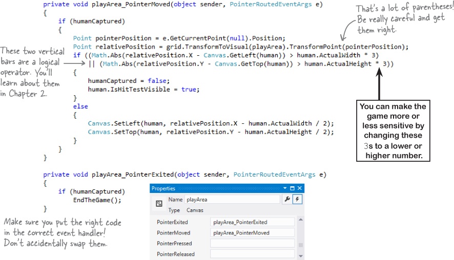
➍ Now you’ll add two more event handlers, this time to the
playAreaCanvas control. You’ll need to find the right[Grid]in the Document Outline (there are two of them—use the child grid that’s indented under the main grid for the page) and set its name togrid. Then you can add these event handlers to playArea:
Dragging humans onto enemies ends the game
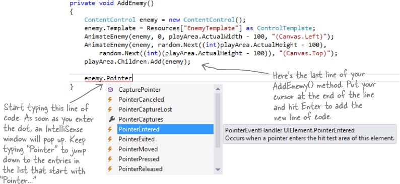
When the player drags the human into an enemy, the game should end. Let’s add the code to do that. Go to your AddEnemy() method and add one more line of code to the end. Use the IntelliSense window to fill in enemy.PointerEntered from the list:
Choose PointerEntered from the list. (If you choose the wrong one, don’t worry—just backspace over it to delete everything past the dot. Then enter the dot again to bring up the IntelliSense window.)
Next, add an event handler, just like you did before. Type += and then press Tab:
Then press Tab again to generate the stub for your event handler:
Now you can go to the new method that the IDE generated for you and fill in the code:
Your game is now playable
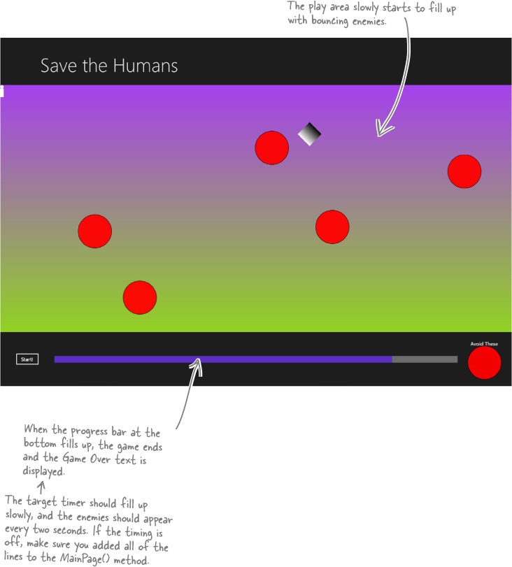
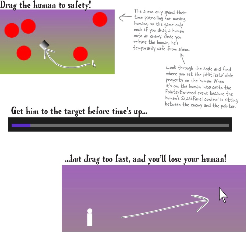
Run your game—it’s almost done! When you click the Start button, your play area is cleared of any enemies, and only the human and target remain. You have to get the human to the target before the progress bar fills up. Simple at first, but it gets harder as the screen fills with dangerous alien enemies!
Make your enemies look like aliens
Watch it!
Seeing events instead of properties?
You can toggle the Properties window between displaying properties or events for the selected control by clicking the wrench or lightning bolt icons.
Red circles aren’t exactly menacing. Luckily, you used a template. All you need to do is update it.
➊ Go to the Document Outline, right-click on the ContentControl, choose Edit Template, and then Edit Current to edit the template. You’ll see the template in the XAML window. Edit the XAML code for the ellipse to set the width to
75and the fill toGray. Then add to add a black outline (if it’s not already there), and reset its vertical and horizontal alignments. Here’s what it should look like (you can delete any additional properties that may have inadvertently been added while you worked on it):
➋ Drag another Ellipse control out of the toolbox on top of the existing ellipse. Change its Fill to black, set its width to
25, and its height to35. Set the alignment and margins like this:➌ Use the
 button in the Transforms section of the Properties window to add a Skew transform:
➍ Drag one more Ellipse control out of the toolbox on top of the existing ellipse. Change its fill to
Black, set its width to25, and set its height to35. Set the alignment and margins like this:and add a skew like this:
Add a splash screen and a tile
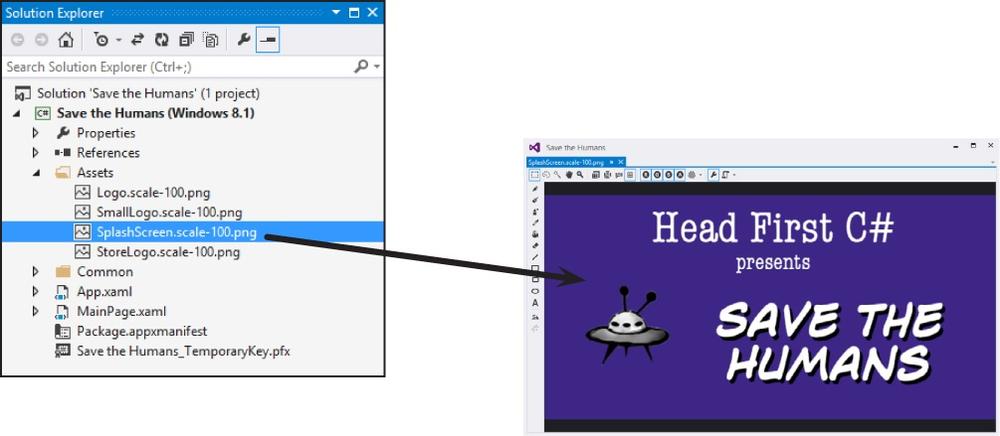
That big X that appears when you start your program is a splash screen. And when you go back to the Windows Start page, there it is again in the tile. Let’s change these things.
Don’t feel like making your own splash screen or logos? You can download ours: http://www.headfirstlabs.com/hfcsharp |
Expand the ![]() folder in the Solution Explorer window and you’ll see four files. Double-click each of them to edit them in the Visual Studio graphics editor. Edit SplashScreen.scale-100.png to create a splash screen that’s displayed when the game starts. Logo.scale-100.png and SmallLogo.scale-100.png are displayed in the Start screen. And when your app is displayed in the search results (or in the Windows Store!), it displays StoreLogo.scale-100.png.
folder in the Solution Explorer window and you’ll see four files. Double-click each of them to edit them in the Visual Studio graphics editor. Edit SplashScreen.scale-100.png to create a splash screen that’s displayed when the game starts. Logo.scale-100.png and SmallLogo.scale-100.png are displayed in the Start screen. And when your app is displayed in the search results (or in the Windows Store!), it displays StoreLogo.scale-100.png.
Publish your app
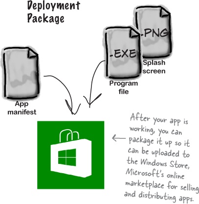
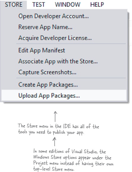
You should be pretty pleased with your app! Now it’s time to deploy it. When you publish your app to the Windows Store, you make it available to millions of potential users. The IDE can help guide you through the steps to publish your app to the Windows Store.
Here’s what it takes to get your app out there:
➊ Open a Windows Store developer account.
➋ Choose your app’s name, set an age rating, write a description, and choose a business model to determine if your app is free, ad-supported, or has a price.
➌ Test your app using the Windows App Certification Kit to identify and fix any problems.
➍ Submit your app to the Store! Once it’s accepted, millions of people around the world can find and download it.
Note
Throughout the book we’ll show you where to find more information from MSDN, the Microsoft Developer Network. This is a really valuable resource that helps you keep expanding your knowledge.
You can learn more about how to publish apps to the Windows Store here: http://msdn.microsoft.com/en-us/library/windows/apps/jj657972.aspx |
Use the Remote Debugger to sideload your app
Sometimes you want to run your app on a remote machine without publishing it to the Windows Store. When you install your app on a machine without going through the Windows Store it’s called sideloading, and one of the easiest ways to do it is to install the Visual Studio Remote Debugger on another computer.
Here’s how to get your app loaded using the Remote Debugger:
Make sure the remote machine is running Windows 8.
Go to the Microsoft Download Center (http://www.microsoft.com/en-hk/download/default.aspx) on the remote machine and search for “Remote Tools for Visual Studio” to find the download page.
Download the installer for your machine’s architecture (x86, x64, ARM) and run it to install the remote tools.
Go to the Start page and launch the Remote Debugger. (You may need to search for the app if there’s no icon.)
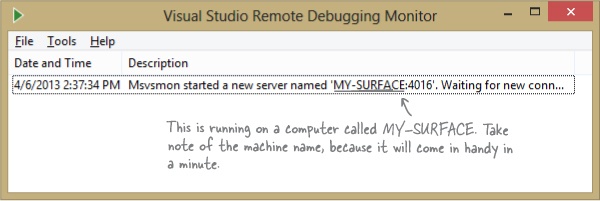
If your computer’s network configuration needs to change, it may pop up a wizard to help with that. Once it’s running, you’ll see the Visual Studio Remote Debugging Monitor window:
Your remote computer is now running the Visual Studio Remote Debugging Monitor and waiting for incoming connections from Visual Studio on your development machine.
If you have an odd network setup, you may have trouble running the remote debugger. This MDSN page can help you get it set up: http://msdn.microsoft.com/en-us/library/vstudio/bt727f1t.aspx |
Start remote debugging
Once you’ve got a remote computer running the remote debugging monitor, you can launch the app from Visual Studio to install and run it. This will automatically sideload your app on the computer, and you’ll be able to run it again from the Start page any time you want.
➊ CHOOSE “REMOTE MACHINE” FROM THE DEBUG DROP-DOWN.
You can use the Debug drop-down to tell the IDE to run your program on a remote machine. Take a close look at the
 button you’ve been using to run your program—you’ll see a drop-down (
 ). Click it to show the drop-down and choose Remote Machine:
➋ RUN YOUR PROGRAM ON THE REMOTE MACHINE.
Now run your program by clicking the
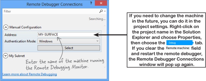
 button. The IDE will pop up a window asking for the machine to run on. If it doesn’t detect it in your subnet, you can enter the machine name manually:
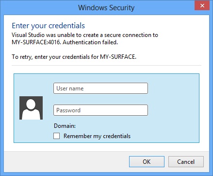
You’ll be prompted to enter the username and password of the user on the remote machine. You can turn off authentication in the Remote Debugging Monitor if you want to avoid this (but that’s not a great idea, because then anyone can run programs on your machine remotely!).
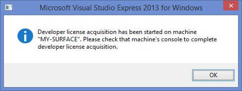
➍ GET YOUR DEVELOPER LICENSE.
You already obtained a free developer license from Microsoft when you installed Visual Studio. You need that license in order to sideload apps onto a machine. Luckily, the Remote Debugging Monitor will pop up a wizard to get it automatically.
➎ NOW...SAVE SOME HUMANS!
Once you get through that setup, your program will start running on the remote machine. Since it’s sideloaded, if you want to run it again you can just run it from the Windows Start page. Congratulations, you’ve built your first Windows Store app and loaded it onto another computer!
Get Head First C#, 3rd Edition now with the O’Reilly learning platform.
O’Reilly members experience books, live events, courses curated by job role, and more from O’Reilly and nearly 200 top publishers.

