Google+ Profile
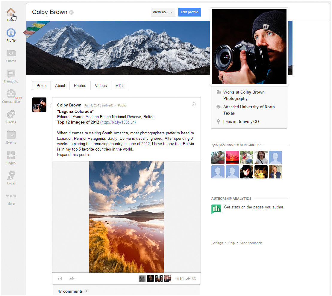
A considerable change has been made to the layout of your Google+ profile. Your cover image is no longer five separate thumbnails with your profile off to the side. Now, the cover image is a 940 px by 180 px panorama with a large profile thumbnail overlaid on top of the image (Figure 7). In an attempt to give you the ability to share information about yourself, your current place of employment, the last university/school you attended, and your current city are visible in their own area just below your profile thumbnail.

Figure 7. Your new Google+ profile.
The sidebar that used to be on the left now rests to the right of your content ...
Get Google+ for Photographers – January 2013 Update now with the O’Reilly learning platform.
O’Reilly members experience books, live events, courses curated by job role, and more from O’Reilly and nearly 200 top publishers.

