One of the best uses for Cascading Style Sheets is to convert the drab appearance of HTML text into lavishly designed prose. Or, if you like a somber, corporate style, CSS can help with that, too. Whatever your design inclination, you can improve the look of your web text using CSS.

Figure 4-9. The Duplicate CSS Rule dialog box looks and acts just like the New CSS Rule box (Figure 4-2). You can select a new style type, name it, and then add it to an external or internal style sheet. The only difference is that the duplicated style retains all the original style’s CSS properties.
You can define six text-related CSS properties using the CSS mode of the Property inspector (see Figure 4-4), or use the full-blown CSS Rule Definition window to deploy more than 64 CSS properties. The most commonly used properties for text are stored in the Type (Figure 4-14) and Block categories, while the List category offers several options for formatting bulleted and numbered lists.
Note
You can apply nearly every CSS property to text. For example, you can use the border property to underline text, and the margin property to remove space between paragraphs. You’ll find those properties and others not listed in the Type or Block categories introduced later in this book (you don’t want to blow your circuits too quickly). For now, you’ll learn the most type-centric properties.
Formatting fonts for the Web is very much like using fonts in a word processor. Sadly, it carries some of the same drawbacks. For example, if you create a beautiful document in Microsoft Word, using fancy fonts you just bought from a small font company in Nome, Alaska, you’re in for a rude surprise when you email the document to your boss. He won’t see anything resembling the memo on your screen. That’s because he doesn’t own the same fonts. He’ll see some default font on his computer—Times, perhaps. Fonts show up in a distributed document only if each recipient has the same fonts installed.
On the Web, you’re in the same predicament. You’re free, as a web designer, to specify any font you want in a web page, but it doesn’t show up on a viewer’s computer unless she’s installed the same font on her system. If she hasn’t, your visitor’s web browser shows your text in a default font, which is usually some version of Times, Arial, or Courier.
You can deal with this dilemma several ways. One is to convert your text into graphic images—unfortunately that process takes time and forces your web visitors to download byte-hogging images just to read your web page. Another is to specify the font you’d like to use; if your viewer’s computer has the specified font installed, that’s what she’ll see. You can specify secondary or tertiary font choices, too, if the preferred font isn’t available. In fact, Dreamweaver offers prepackaged lists of such “first choice, second choice, third choice” fonts, as you’ll find out in the following section.
Note
Recently, some web designers have started using what are called “web fonts”— downloadable fonts you can use on your site using special CSS. Basically, you put the font on your web server, and add CSS to your site that lets visitors download and use that font while they view your site. Astonishingly, it works in all major browsers (and even in IE 5 and up)! There are a few tricks to the process, including using a special IE-only font format. You can read more about web fonts at http://webfonts.info/ and download ready-to-go, free web fonts (which include the required CSS to make them work) from www.fontsquirrel.com/fontface. Unfortunately, Dreamweaver CS5 doesn’t provide any support for web fonts—you have to hand code the CSS for this—and Design view doesn’t display the web fonts.
You can use either the Font menu in the Property inspector’s CSS mode (Figure 4-3) or the CSS Rule Definition window’s Font-family menu (Figure 4-12). In either case, you’re actually either creating a new style as described on Creating Styles or updating an existing style.
You’ll soon discover that Dreamweaver’s font menus aren’t quite what you’re used to. When you apply a font to text, you have to choose from one of the prepackaged lists just described; a typical choice is something like “Arial, Helvetica, sans-serif”. In other words, you can’t just choose a single font, such as Helvetica.
If the first font isn’t installed on your visitor’s computer, the browser looks down the list until it finds a font that is. Different operating systems use different fonts, so these lists include one font that’s common on Windows and another, similar-looking font that’s common on the Mac. Arial, for instance, is found on all Windows machines, while Helvetica is a similar font for Macs.
That’s it. You’ve just selected one of Dreamweaver’s preinstalled fonts, and any text the CSS style formats will use the font you selected. If you’d like a greater degree of control over the fonts your page displays, read on.
Dreamweaver CS5 comes with 13 preset font lists, which incorporate fonts common to both Windows and Macs. But you can easily stray from the pack and create your own lists. If you proceed with the custom approach, make sure you know what fonts your visitors have—easily done if you’re designing a corporate intranet and know what computers your company uses—and always specify one font that you know is installed. This way, while your page may not look exactly as you intended, it’ll at least be readable.
Note
Technically, you can specify any number of fallback fonts in one of these lists, not just first, second, and third choices. Your list can range anywhere from just a single font to a long list arranged in order of preference.
Here’s how you create a new “first choice, second choice, third choice” font list.
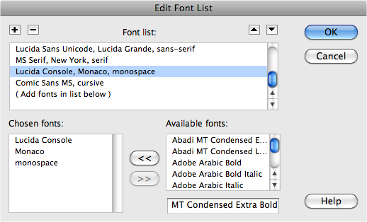
Open the Edit Font List dialog box.
From the Property inspector’s Font menu (visible only in CSS mode), choose Edit Font List, or choose Format→Font→Edit Font List. Either way, the Edit Font List dialog box appears (Figure 4-10).
Marker Felt Wide, Comic Sans MS, fantasy
Century Gothic, Gill Sans, Arial, sans-serif
Franklin Gothic Medium, Arial Narrow, sans-serif
Optima, Segoe UI, Arial, sans-serif
Select a first-choice font from the “Available fonts” list, or type in the font name.
Dreamweaver lists all the fonts installed on your computer in the “Available fonts” menu. Simply click to select the font you wish to add.
Alternatively, you can type a font’s name into the box that appears directly below the list of available fonts—a handy trick if you want to include a font that isn’t installed on your computer (a Windows font when you’re working on a Mac, for example).
Add the font you just highlighted to your new, custom font list by clicking the << button (or just double-clicking the font name).
Your first-choice font appears in the “Chosen fonts” list.
Repeat steps 2 and 3 for each font you want to include in your custom list.
The order in which you add the fonts is the order in which they appear on the list. These become the “first choice, second choice, third choice” fonts.
Unfortunately, there’s no way to change the order of the fonts once you add them. So if you accidentally put the fonts in the wrong order, you must delete the list by clicking the minus (–) button (at the upper-left corner of the dialog box) and start over.
Figure 4-10. In the Edit Font dialog box, you can not only create your own font lists, but you can edit, remove, or reorder the predefined lists. When you click a list in the “Font list” menu, the “first choice, second choice, third choice” fonts appear in the lower-left corner. To remove a font from that list, click the font name, and then click the >> button. To add a font to the list, select a font in the “Available fonts” menu, and then click the << button. Finally, to reorder the font lists as they appear in the Property inspector, the CSS Rule Definition window’s Font menu, or Format→Font menu, and then click the arrow keys near the upper-right corner of the dialog box.
Add a generic font family.
This last step isn’t strictly necessary, but it’s a good idea. If your web page visitor is some kind of anti-font radical whose PC doesn’t have any of the fonts you chose, his browser will substitute the generic font family you specify here.
Generic fonts are listed at the bottom of the list of “Available fonts” and include “cursive”, “fantasy”, “monospace”, “sans-serif”, and “serif”. On most systems, the monospaced font is Courier, the serif font is Times, and the sans-serif font is Arial or Helvetica. Select a generic font that’s similar in appearance to the fonts in your list. For instance, choose “sans-serif” if your list consists of sans-serif fonts like Helvetica or Arial; choose “serif” if you specified fonts like Times or Georgia; or choose “monospace” for a font like Courier.
Click OK.
Your new font package appears in the Property inspector’s Font menu, ready to apply.
Varying the sizes of fonts on a web page is one way to direct a viewer’s attention. Large type screams “Read Me!”—excellent for attention-grabbing headlines—while small type fades into the background—perfect for necessary but unexciting legal mumbo-jumbo like copyright notices.
Unless you specifically define its size, text in a regular paragraph appears at the default size specified by your visitor’s web browser: In most browsers today, that’s 16 pixels. However, not only can people change that default size (much to the eternal frustration of web designers), but different operating systems have been known to display text at different sizes. Bottom line: You can’t really assume that text will appear the same size on all your guests’ monitors.
You can use either the Size menu in the Property inspector’s CSS mode (Figure 4-11) or the CSS Rule Definition window’s Font-size menu (Figure 4-12). In either case you’re either creating a new style as described on Creating Styles or updating an existing style. The choices available from the Size menu break down into four groups:
The None option removes any size information applied to the text. The text returns to its default size.
Figure 4-11. You can set a dizzying array of font sizes using CSS. When you use the Property inspector’s CSS mode to set the size of text, you either create a new style—in which case you see <New CSS Rule> listed in the Targeted Rule field (circled)—or you edit an already existing style, as shown here. In this case, the class style, .product, is listed, so picking a font size edits that CSS style.
The numeric choices—9 through 36—indicate how tall you wish to make the text, measured in pixels. Nine-pixel-tall text is nearly unreadable, while 36 pixels makes a bold statement. One benefit of pixel sizes is that text appears nearly the same across different browsers and different operating systems, overcoming the problems mentioned above.
The options xx-small through xx-large indicate fixed sizes, replacing the sizes 1 through 7 used with the old HTML <font> tag. The medium size is usually the same as the default size.
The last two choices—smaller and larger—are relative sizes, meaning that they shrink or enlarge the selected text based on the default size in your page. These choices come in handy when you define a base font size for the entire page using the Page Properties window (see Figure 1-20).
Suppose you set the default size of text on a page at 12 pixels. If you apply a “larger” size to a selection of text, then it gets bigger (the exact amount varies by web browser). If, later, you change the base size to 14 pixels (in Page Properties), all of that “larger” text will also increase proportionally.
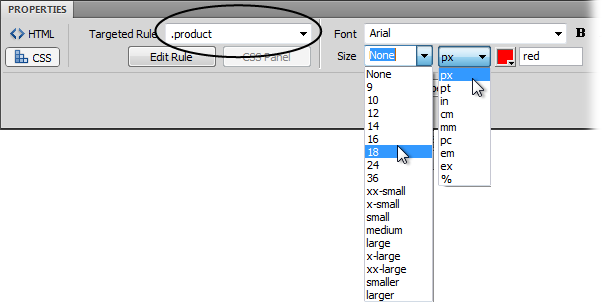
To change the size of text, simply select it, and then, from the Property inspector, choose a new size (Figure 4-11), or edit the appropriate CSS style as described on Manipulating Styles. If you applied a number (that is, a pixel value), you have an additional option: If you don’t like any of the sizes listed, you can type in any number you wish. In fact, unlike HTML, browsers can handle humongous text—hundreds of pixels tall, if that’s what you’re into.
You’re not limited to pixels, either. The Units pop-up menu (to the right of the Size menu, shown in Figure 4-11) lets you use as the unit of measure pixels, points, inches, centimeters, millimeters, picas, ems, percentages, or exes (an ex is the width of the letter X in the current font). Most of these measurement systems aren’t intended for onscreen display. The most popular options are:
Pixels are great for ensuring that text looks the same size across different browsers and operating systems. The downside, however, is that Internet Explorer 6 doesn’t let web surfers adjust the pixel size. So people who can’t see well, or whose monitors are set to very high resolutions, are stuck with your choice of pixel size. Make it too small, and they won’t be able to read your text. (Fortunately, all other browsers don’t have this problem.)
Ems are a relative measurement, meaning that the actual point size varies.
One em is equal to the default font size. So suppose a web browser’s default font size is 14 pixels tall. In that case, 1 em would mean 14 pixels tall, 2 ems would be twice that (28 pixels), and 1.5 ems would be 21 pixels.
The advantage of ems is that they let web visitors using Internet Explorer 6 (a dwindling minority) control the size of onscreen text. If it’s too small, they can increase the base font size. In Internet Explorer, you make this adjustment by choosing an option from the View→Text Size menu. Any text measured in ems then changes according to the web browser’s new setting.
Note
You don’t need to use ems to allow non-IE 6 browsers (in other words, the vast majority of the world) to resize text. In fact, all current browsers have a “Zoom” command that enlarges not only text but all other page elements (pictures, page layouts, and so on).
You can use pixels and ems together. You could, for instance, set the base font size of your page to 16 pixels, and then use ems for other parts of the page. For example, you could set headlines to 2 ems, making them 32 pixels tall. If you later thought the overall text size of the page was too small or too large, you could simply change the base font size for the page, and the headlines and all other text would resize proportionally.
Note
As you get more advanced with CSS, you’ll probably run into some weird problems with em or percentage text sizes due to an advanced concept known as the cascade. The gruesome details begin on Editing Styles.
Percentages (%) are another relative size measurement. When applied to text size, they’re functionally equivalent to ems—100% is the same as 1 em, 200% is 2 ems, and 75% is .75 ems. If you’re more comfortable with the notion of percentages than the typography-inspired ems, use percentage values instead.
The other measurement options, like inches and millimeters, don’t make as much sense as pixels, ems, and percentages because you can’t consistently measure them on monitors. For example, Windows is set to 96 pixels to the inch, whereas Mac OS X is set to 72 pixels per inch—but people can change even these settings, so there’s no reliable way to measure an “inch” on a computer screen. The upshot is that if you’re not worried about IE 6’s inability to resize text, you’re safe using pixel values—they’re easier to understand, more consistent across browsers, and work fine with the zoom feature of all currently shipping browsers.
Most color formatting in Dreamweaver, whether for text or a table cell, makes use of its color box.
To set the color of text, use the CSS Color property. You can choose a color in the Property inspector’s CSS mode, or assign a text color in the Text category of the CSS Rule Definition window (Figure 4-12). In both cases, you encounter Dreamweaver’s color box as described on Phase 4: Adding Images and Text. You can pick a color by clicking the color well and, from the pop-up color palette, selecting a color, or you can type in a hexadecimal number (see Phase 4: Adding Images and Text) of the color you want. (Clearly, the latter is the option for hardcore HTML geeks. After all, surely you’ve memorized the hex number of that light shade of blue you always use—#6699FF, isn’t it?)
You can use the Property inspector to make text bold or italic. Depending on which mode the inspector is in—HTML or CSS—clicking the B or I button does different things. In HTML mode, the B button wraps selected text with the <strong> HTML tag, while the I button wraps text with the <em> (for emphasis) tag. However, in CSS mode, the B button sets the CSS font-weight property to bold, while the I button sets the CSS font-style property to italic. In other words, those two buttons either insert HTML tags or add CSS properties to a style.
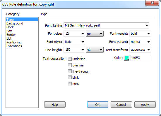
Figure 4-12. While you can set some text formatting using the Property inspector, the CSS Rule Definition window’s Type category offers additional formatting options. For example, you get the ability to control the space between lines of text, and an option to change the case of text—to make text upper- or lowercase.
If you want to just change the appearance of text, use CSS mode, but if you actually want to emphasize some text because it’s important for the sentence’s meaning, use HTML mode. For example, if you want the word “Monday” to stand out on a page, use CSS. But for a sentence like “He never makes mistakes” the emphasis on “never” is important to understanding the sentence; in that case, use HTML mode. The people viewing your site might not notice the difference, but Google, other search engines, and screen reading software will.
Note
If you use the Property inspector’s CSS mode, the B button only makes type bold or removes bold formatting you previously applied. In the case of headlines, which browsers automatically display as bold, clicking the B button has no effect. To remove the bold formatting from headlines, you have to use the CSS Style Definition window, and, from the font-weight menu, select normal (see Figure 4-12).
The alignment buttons in the Property inspector’s CSS mode (Figure 4-3) set the CSS text-align property to either left, right, center, or justify. These same options are available under the Block category of the CSS Rule Definition window (Figure 4-17).
As its name implies, the Rule Definition window’s Type category lets you set formatting options that affect text (see Figure 4-12). Several of these settings are the same as those available from the Property inspector in CSS mode and you learned about them in depth starting on Duplicating a Style. To summarize, this category of CSS properties includes:
Font. You choose a font for the style from the Font menu. As discussed on Choosing a Font, you choose from groups of fonts rather than the specific one you have your heart set on. Dreamweaver also lets you create your own “first-choice, second-choice…” font choices from this menu, exactly as described on Creating custom font lists.
Size. As described on Changing the Font Size, you can choose from among many different systems for sizing text, but the most common are pixels, ems, and percentages.
Weight. Weight refers to the thickness of the font. The Weight menu offers 13 choices. Normal and bold are the most common, and they work in all browsers that understand CSS. See Figure 4-13 for details.
Figure 4-13. CSS was designed so that each of the nine numeric weight values between 100 and 900 would tweak the thickness of fonts that have many different weights (ultrathin, thin, light, extra bold, and so on). 400 is normal; 700 is the same as bold. However, given the limitations of today’s browsers, you’ll notice no difference between the values 100 and 500 (top text in right column). Similarly, choosing any of the values from 600 to 900 just gets you bold text (bottom text in right column). You’re better off keeping things simple and choosing either “normal” or “bold” when picking a font weight.
Style. In this peculiar instance, Style means italic, oblique, or normal text. Technically, italic is a custom-designed, emphatic version of a typeface, like this. Oblique, on the other hand, is just a computerized adaptation of a normal font, in which each letter is inclined a certain number of degrees to the right. In practical application, there’s no visible difference between italic and oblique in web browsers.
Variant. This pop-up menu simply lets you specify small-caps type, if you like—a slightly formal, fancy-looking type style much favored by attorneys’ offices.
Line Height. Line height, otherwise known as leading (pronounced “LEDing”), refers to the space between lines of text in a paragraph (see Figure 4-14). To create more space between lines, set the line height greater than the font size. (If you type a number without a % sign, Dreamweaver assumes you’re specifying a line height in pixels. You can change the units of measure using the pop-up menu to the right of the Line Height field.)

Tip
A good approach for line height is to type in a percentage measurement, such as 120%, which is relative to the size of the text; so if your text were 10 pixels tall, the space from the base of one line of text to the next would be 12 pixels (120% of 10). Now, if you change the size of the text, the relative space between lines remains the same.
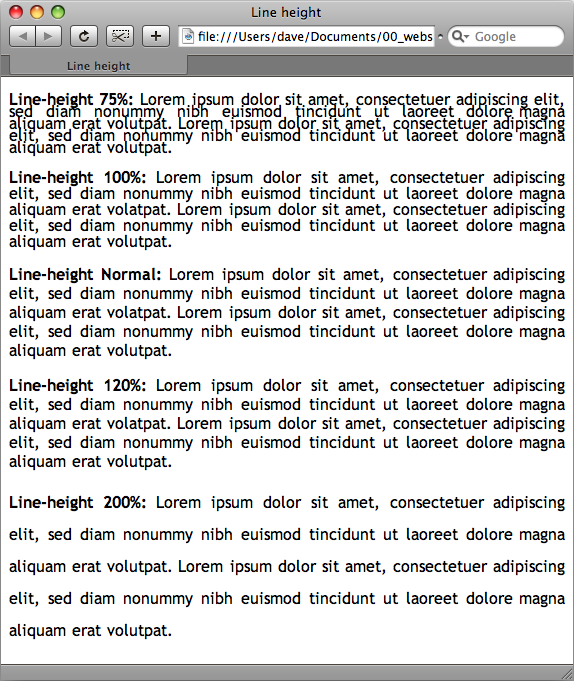
Figure 4-14. Control the space between lines with the Line Height property in the CSS Rule Definition dialog box. In this example, each paragraph’s text is set in 16-pixel Trebuchet MS. With CSS, you can make lines bump into each other by setting a low line-height value (top paragraph), or spread them far apart by using a larger value (bottom paragraph).
“Normal”, the default setting (third paragraph in Figure 4-14), uses a line height that’s slightly larger than the height of the text. You don’t get access to the pop-up menu of measurement units (pixels, points, %, and so on) unless you type a number in this box.
Case. From this menu, you can automatically capitalize text. To capitalize the first letter of each word, choose “capitalize”. The “uppercase” option gives you all capital letters, while “lowercase” makes all the letters lowercase. The factory setting is “none”, which has no effect on the text.
Decoration. This strange assortment of five checkboxes lets you dress up your text, mostly in unattractive ways. “Underline”, “overline”, and “line-through” add horizontal lines below, above, or directly through the affected text, respectively. Turning on “blink” makes affected text blink on and off (but only in a few browsers); unless you want to appear on one of those “worst website of the week” lists, avoid it. You can apply any number of decorative types per style, except with “none”, which, obviously, you can’t choose along with any of the other options. The “none” setting is useful for hiding the underlines that normally appear below links.
Color. Set the color of the style’s text using Dreamweaver’s color box, described on Phase 4: Adding Images and Text.
The Block Properties panel is a hodgepodge of CSS settings that affect how browsers display letters and words (see Figure 4-15).
Tip
To completely remove the space between paragraphs, set the Top and Bottom margin for paragraphs to 0 in the CSS Rule Definition window’s Box category. This setting also helps remove space before and after headlines. To indent paragraphs, set the Left and Right margin properties.
Despite this category’s name, these properties don’t just apply to block-level elements (paragraphs, headlines, and so on). You can apply a style with these properties to even a single word or two. (The one exception is the Text Align property, which applies only to paragraphs and other block-level elements.) Here are your choices:
Word spacing. This property helps you clean up text by adding or removing space between words. The default value, “normal”, leaves a normal, single space between words. If you want words in a sentence to be spaced apart like this, then type a value of about 10 pixels. (Choose Value from the first pop-up menu and then the units you want from the second one.) The bigger the number, the larger the gap between words. You can also remove space between words by using a negative number—a great choice when you want to make your pages difficult to read.
Letter spacing. This property works just like word spacing, but governs the space between letters. To add space l i k e t h i s, type a value of about 5 pixels. The result can make long passages hard to read, but a little space between letters can add a dramatic flair to short headlines and movie titles.
Vertical alignment. With this property, you can change the vertical placement of an object—such as an image or text—relative to the items around it. For example, you could move text above or below surrounding text to format a trademark character, copyright symbol, or footnote reference using the options “super” and “sub”. If you wanted to add the trademark symbol to, say, Chia Pet™, then you’d select the letters TM and set the vertical alignment to “super”. In addition, for more accurate control, you can type a value (like 10%) to raise an object above its normal baseline, or a negative value (like –10% or –5 pixels) to move an object down.
Vertical alignment also works with graphics, and designers often use the options Top, Bottom, and Middle with HTML table cells to position content within a cell.
Text align. This property controls the alignment of a block-level element like a paragraph or table. You can choose from among the usual suspects—“left”, “center”, “right”, or even “justify”. (Like the text in this paragraph, justified text has both the left and right edges of the text aligned.)
Use the “justify” option with care, however. Because web browsers don’t have the advanced controls that page-layout software does, they usually do an awful job of justifying text on a computer screen. The results can be difficult to read, and ugly.
Text indent. This useful option lets you indent the first line of a paragraph. If you enter 15 pixels, each paragraph gets an attractive first-line indent, exactly as in a real word processor.
You can also use a negative number, which makes the first line extend past the left margin of the paragraph, creating a hanging indent (or outdent)—a nice effect for a sentence that introduces a bulleted lists or for glossary pages. If you use a negative number, it’s a good idea to set a left-margin (Understanding the Box Model) for the paragraph that equals the value of the negative text indent, otherwise the first line might extend too far to the left, off the screen!
Whitespace. This property controls how the browser displays extra white space (spaces, tabs, returns, and so on). Web browsers normally ignore extra spaces in the HTML of a page, reducing them to a single space character between words and other elements as described on Nonbreaking Spaces. The “pre” option functions just like the HTML <pre> tag: Extra white space (like tabs, multiple spaces, and hard returns) that you put in the HTML code appear in the document window (see Editing Styles for more on this option). The “nowrap” option prevents lines from breaking (and wrapping to the next line) when they reach the end of the browser window.
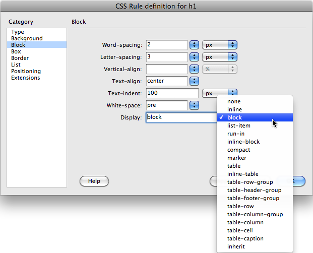
Display. This property defines how a browser should display a particular element, like a paragraph or link. The range of choices for this property may overwhelm you—and you may be underwhelmed when you find out that browsers don’t support most of these options.
The only three options that work reliably across browsers are “none”, “inline”, and “block”. The “block” option treats any item styled with this property as a block—separated from other content by space above and below it. Paragraphs and headings normally appear this way. But you can apply this value to a link (which normally appears inside a block-level element like a paragraph) to turn it into its own block. Usually, you have to click directly on the text or image inside a link to jump to the linked page. But when you set a link’s display to “block”, its entire width—even areas where no text appears—is clickable.
The “inline” option treats the item as though it’s part of the current block or paragraph, so that any item styled with this property (like a picture) flows together with other items around it, as if it were part of the same paragraph. People frequently use this property to take a bulleted list of links and turn it into a horizontal navigation bar. The Spry Menu bar, discussed on Creating a Navigation Menu, uses this technique to create a horizontal menu. For a good tutorial on this topic, visit http://css.maxdesign.com.au/listutorial/horizontal_introduction.htm.
The “none” option is the most fun: It turns off the display of an item. In other words, any text or item styled with this option doesn’t appear on the page. You can use JavaScript programming to switch this property on and off, making items seem to appear and disappear. In fact, Dreamweaver’s Change Property behavior gives you one simple way to do this (see Call JavaScript).
To exercise greater control over bulleted and numbered lists, use the CSS options in the CSS Rule Definition window’s List category (see Figure 4-16).
Type. Select the type of bullet you want to use in front of a list item. Options include: “disc”, “circle”, “square”, “decimal” (1., 2., 3.), “lower-roman” (i, ii, iii), “upper-roman” (I, II, III), “lower-alpha” (a, b, c), “upper-alpha” (A, B, C), and “none” (no bullet at all).
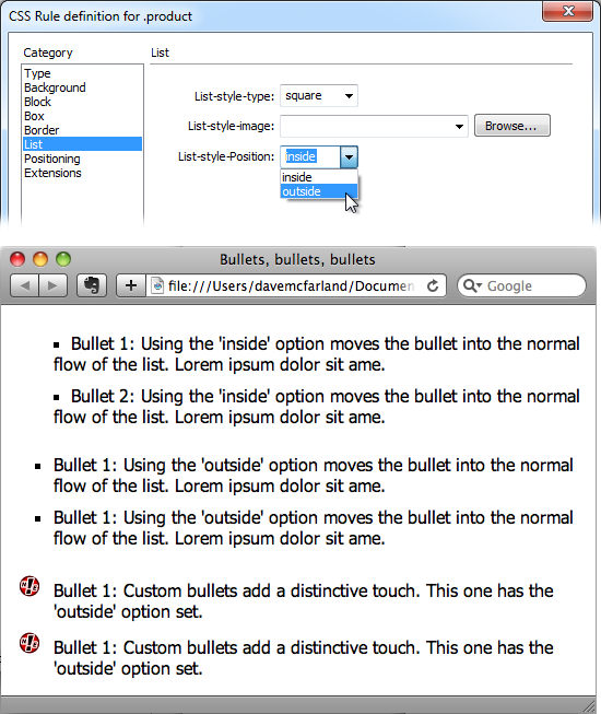
Figure 4-16. Top: Take control of your bulleted and numbered lists using the CSS Rule Definition window’s List category. With Cascading Style Sheets, you can even supply your own graphic bullets. Bottom: A bullet-crazed web page, for illustration purposes. Parading down the screen, you can see “inside” bullets, “outside” bullets, and bullets made from graphics.
Bullet image. For the ultimate control of your bullet icon, skip the boring options preprogrammed into a web browser (like disc, circle, square, or decimal) and supply your own. Click the Browse button, and then, from your site folder, select a graphics file. Make sure the graphic is appropriate bullet material—in other words, small.
Tip
The Background Image property, which you’ll learn about on Background Images, is a more versatile solution to adding bullet images to a list. Since you can accurately position a background image, you can easily tweak the placement of your bullets. Here’s how to do it: Create a style for the <li> tag (or a class style that you apply to each <li> tag); make sure you set the List property type to “none” (this hides the bullet); set the background image to your graphical bullet; and play with the background position values (Horizontal and vertical position). Playing with the padding values (Understanding the Box Model) helps position the text relative to the image.
Position. This property controls where the bullet is placed relative to the list item’s text. The “outside” option places the bullet outside the margin of the text, exactly the way bulleted lists normally look. “Inside”, on the other hand, displays the bullet within the text margin, so that the left edge of the bullet aligns with the left margin; Figure 4-16 should make the effect clearer.
Note
If you want to adjust the amount of space web browsers normally use to indent lists, set the left padding property (see Understanding the Box Model) to 0, and set the left margin (see Understanding the Box Model) to the amount of indent you’d like. Sometimes you want no indent at all—for example, if you’re creating a list of links that should look like buttons, not bulleted items—set both the left padding and left margin to 0 (while you’re at it, set the bullet type to “none” as described above).
Get Dreamweaver CS5: The Missing Manual now with the O’Reilly learning platform.
O’Reilly members experience books, live events, courses curated by job role, and more from O’Reilly and nearly 200 top publishers.

