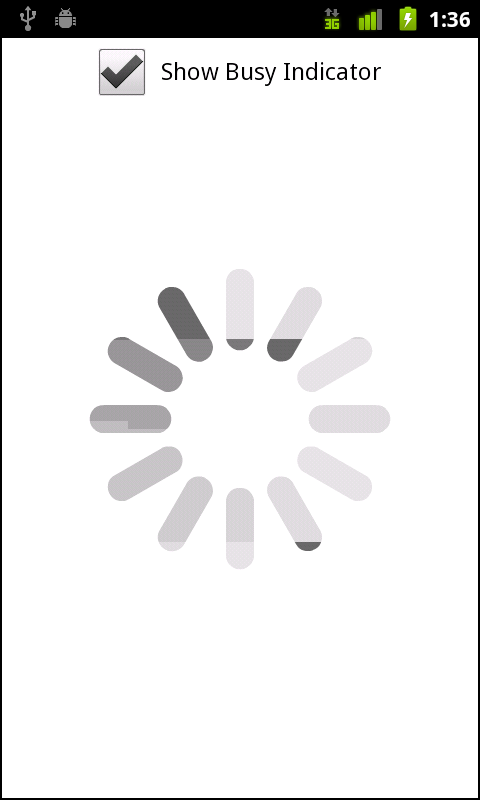
A new component has been added to provide feedback to the users
within your mobile application. While there is no cursor to show busy
status as there is in desktop development, the
BusyIndicator component was added specifically for this
reason. Using this component is extremely simple.
Let’s review the code below. There is a CheckBox
with the label “Show Busy Indicator”, which when
checked, calls the checkbox1_clickHandler method. There
is a BusyIndicator component with an
id of indicator, set to visible (or
false). Within the checkbox1_clickHandler method, the
indicator’s visible property is set to the value of the
CheckBox. This simply shows or hides the
BusyIndicator. Within the
BusyIndicator, you can set the
height, width, and
symbolColor to suit the needs and style of your
application. The results can be seen in Figure 4-15:
<?xml version="1.0" encoding="utf-8"?>
<s:Application xmlns:fx="http://ns.adobe.com/mxml/2009"
                  xmlns:s="library://ns.adobe.com/flex/spark">

    <fx:Script>
          <![CDATA[
               protectedfunction checkbox1_clickHandler(event:MouseEvent):void
               {
                     indicator.visible = event.target.selected;
               }
          ]]>
    </fx:Script>

    <fx:Declarations>
          <!-- Place non-visual elements (e.g., services, value objects) here -->
    </fx:Declarations>

    <s:CheckBox label="Show Busy Indicator"
                     horizontalCenter="0"
                     click="checkbox1_clickHandler(event)" top="10"/>
    <s:BusyIndicator id="indicator" height="300" width="300"
                           verticalCenter="0"
                          horizontalCenter="0"
                           visible="false"
                           symbolColor="black"/>

</s:Application>Get Developing Android Applications with Flex 4.5 now with the O’Reilly learning platform.
O’Reilly members experience books, live events, courses curated by job role, and more from O’Reilly and nearly 200 top publishers.


