Chapter 1. The Four Tenets of UX Strategy
“In war, let your great object be victory, not lengthy campaigns.”
SUN TZU, ART OF WAR1
A STELLAR UX STRATEGY IS A MEANS TO ACHIEVING DISRUPTION IN the marketplace through mental-model innovation. And to keep me from forgetting this, I have the sticker shown in Figure 1-1 on my laptop lid.
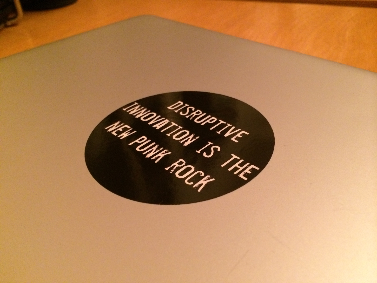
Figure 1-1. The sticker on my laptop lid
Because what’s the point in spending time and energy crafting a digital product that isn’t unique? Or, at the very least, is a much better alternative to current solutions found in the online marketplace?
To achieve that disruption, we need a framework in which to connect all the dots that will build a cohesive UX strategy. In this chapter, I’m going to break down the most important tenets that you need to understand in order to successfully implement the tools and techniques in this book. Think of it as a primer to get you and your team thinking like a UX strategist.
How I Discovered My UX Strategy Framework
In the digital world, strategy usually begins in the discovery phase. This is when teams dig deep into research to reveal key information about the product they want to build. I’ve always liked to think of the discovery phase as similar to the pretrial discovery process used by attorneys in the United States. To avoid a “trial by ambush,” lawyers can request to see the evidence of the opposing counsel in order to prepare sufficient counter-evidence. In this way, the attorneys try to avoid surprises, and you, as a product maker, should also want to strategically do just that.
My first chance to practice UX strategy occurred in 2007. At the time, I was the UX lead at Schematic (now Possible) for the website redesign of Oprah.com. Along with the other team leads, I flew into Chicago to kick off our discovery phase.
Before that moment, my 15 years of professional experience focused on interface design and integrating new technologies (such as Flash) into interfaces to create “cutting-edge” products. Often, I was handed a massive requirements document that listed hundreds of “essential” features. Or, I was given a flimsy project brief with pretty comps that stated what the final product should accomplish. From there, I made a site or application map that catered to a specific set of user scenarios that enabled those interactions. Based on these documents, I could only infer whether my creation solved the problem or not because it was typically too late at that point to challenge the rationale behind the product vision. I was just supposed to design it on time and on budget. But in 2007, it was so fascinating to watch our UX director, Mark Sloan, get a dozen contentious stakeholders—no, Oprah wasn’t there—on the same page. Mark used consensus-building techniques such as affinity maps, dot voting, and forced ranking2 to help us understand all the different parts—content and critical functionality—that would make up the system we had to digitize. This discovery opportunity helped us (the stakeholders and product team) in examining our goals to make a better platform for the millions of devoted Oprah fans in the world.
One week later, after all the workshops, the product team and I presented the discovery brief defining the product vision. The brief contained typical deliverables such as user personas, concept map analyses, and a recommended feature list. Because the stakeholders were anxious to get started, they immediately approved it. Our digital team was off and running on the implementation phase, which took over six months of emotionally fueled hand-offs. There were hundreds of pages of wireframes and functional specifications traded between stakeholders, designers, and developers.
But the discovery brief was never referenced again. The personas and proposed solution were never validated by existing customers. The stakeholders went back to fighting for whatever prime real estate they could grab for their particular business units. Yet, there was something good that came out of that discovery phase for me: I was a UX designer who finally got a taste of what a UX strategy could potentially be. I was ruined. I couldn’t imagine just being a wireframe monkey anymore.
A full year later, the redesigned site launched. I never looked at it because I had moved onto to another interactive agency (HUGE) with other high-profile clients. In my new position, I was able to focus my energy more directly on the discovery phase of projects in which user research and business strategy were given more weight. I also had a seat at the table to help shape the UX strategy and decide how a product vision should be implemented. I no longer had to feel fraudulent for spending so many waking hours building products for which I lacked a deep understanding of the customer segment and the business model. Today, I run my own practice that specializes in UX strategy, and since my first discovery phase, I’ve learned a lot about how to make it an iterative, lightweight, and empirical process of intense collaboration among stakeholders, designers, developers, and so on. Because when everyone shares a product vision, you and your team really have a chance at changing the rules of the game for your product, company, and future customers.
However, I do want to acknowledge that my methodology is my version of UX strategy and might be different from other strategists’. That’s precisely why I included profiles of people I respect who have been practicing UX strategy and design as well. However, you’ll also see that we align on a lot of things. That’s what happens when a new discipline or methodology arises: people will find their own approach, but even within those differences, there are connective tissues that bind them together to make UX strategy identifiable and unique.
So, with all that said, cue the drum roll to introduce my UX strategy framework, as presented in Figure 1-2.
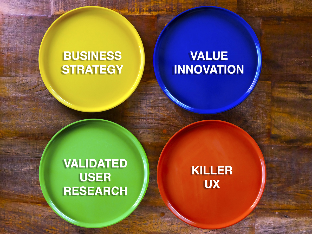
Figure 1-2. The four tenets of UX strategy represented as plates at the dinner table
My formula is this: UX Strategy = Business Strategy + Value Innovation + Validated User Research + Killer UX Design.
These are the four tenets that make up my framework. I have seen them in play every day since my first discovery phase. It’s not enough to understand your marketplace if you don’t talk directly to your customers. It’s not enough to validate that your product works if you’re not creating something unique. Good enough just isn’t good enough, and just identifying these tenets won’t be enough to get your team flying. You’ll need to understand how they interact and affect one another. Then, the real trick will be to keep all four of these tenet “plates” spinning in the air while you move through the techniques and tools in the subsequent chapters.
Tenet 1: Business Strategy
Business strategy is the top-line vision of the company. It is why the company exists. It ensures the long-term growth and sustainability of the organization. It is the basis for the core competencies and offerings, which are the products. In this book, I will use the term “products” to refer to both digital products and digital services.
The business strategy is what gives product makers the direction to grow in the marketplace while beating the competition. The business strategy identifies the company’s guiding principles for how it will position itself and still achieve its objectives. For this to happen, the business must continually identify and utilize a competitive advantage. A competitive advantage is essential to the company’s long-term existence.
In his classic book, Competitive Advantage,3 Michael E. Porter lays out the two most common ways to achieve a competitive advantage: cost leadership and differentiation.
The advantage behind cost leadership comes from offering the lowest price for products in a particular industry. Whether it is the cheapest car, television, or hamburger, this was the traditional way that companies achieved dominance in the marketplace. After all, allowing the private sector to compete without government regulation is what free market economy is all about! I mean, look at the rampant success of stores such as Walmart and Target. They can offer consumers the best prices and widest selection of merchandise. But what happens when prices hit rock bottom? Then, the battle needs to be about what makes the product better.
This brings us to Porter’s second type of competitive advantage: differentiation. Because we are product inventors planning to build disruptive technologies, this is where our actual power lies. With differentiation, the advantage is based on a new or unique product or a unique aspect of the product for which customers will pay a premium because of its perceived value. As consumers, we choose one product over another based on the things we personally value, ranging from the product’s usefulness to how much pleasure we derive from it. That perceived value is what transforms a simple little café and cup o’ joe into the crazy success story of Seattle-based Starbucks. There’s a reason why people pay $5 for a cafe latté—it’s the experience that’s also wrapped into the product. It starts the moment a customer steps into the store and ends when that person tosses his cup and sleeve into the trash.
Today, a UX differentiation is the digital-product game changer. Differentiated user experiences have completely revolutionized the way we communicate with the world. Consider what the world was like before microblogging. When it was released in 2006, Twitter confounded users with its 140-character limit. But the limit turned out to be a valuable perk, especially with respect to updates. Today, users don’t check traditional news outlets for instant updates; they instead check Twitter. When Hurricane Sandy pounded the East Coast in 2012, the power went out, but more than 20 million Tweets occurred among users, residents in the storm, and media and government outlets.4 I know I spent some time on Twitter, tweeting to friends in New York about the hurricane updates I saw on TV from my home on the West Coast.
Another tool that has distinguished itself from the competition with a UX differentiation is the map app Waze. It combines social traffic with GPS navigation, thereby allowing users to find the quickest route of the moment to their destination. By merely driving around with Waze open, users passively contribute traffic and other road data to the network. Users also can take a more active role by sharing road reports on accidents, police traps, or any other hazards along the way, helping to give other users in the area a heads-up about what surprises might ahead of them. In June of 2013, Waze (an Israeli startup) was acquired by Google for $1.1 billion. Now, Waze still offers its distinct UX to its users, but its data is also channeled into Google Maps.5 Clearly, Google recognized the competitive advantage of UX collaboration and chose to adopt Waze for what it could add to its product rather than compete against it.
A UX competitive advantage is important to understand in this brave new world of technology. Traditionally, the purpose of a competitive advantage was to make a product that was self-sufficient through a revenue stream. A revenue stream is how the company gets paid. And when a customer pays more for the product than what it costs to make, value is created for the stakeholders. To many people, this is the heart of a product’s business model. Today, though, a UX differentiation doesn’t necessarily mean big bucks when your product hits the market. Instead, the goal of many entrepreneurs is mass adoption. Products such as Facebook didn’t kick the collective asses of competitors like MySpace or Friendster’s because it was a cheaper alternative. Facebook won the field because, a) it offered a differentiated UX that was perceived by users as more valuable, and b) everyone adopted it. From that point, Facebook innovated a new kind of business model that relied on monetizing its user data for selling targeted advertising.6 In 2013, Waze did a similar thing when Google bought it. Waze made a lot of money by selling access to its devoted users, and Google will make a lot of money because so many users continue to use both the Waze and Google Maps apps. The two companies essentially turned their users into customers because they were able to monetize them, and because of this, from here on out, I am going to use the terms “user” and “customer” interchangeably.
Still, a good business model doesn’t just define the revenue stream of a product. Nor does it just rely on a ridiculous number of users adopting it. This is something often lost on young tech entrepreneurs. Because they grew up in a world in which products like Facebook became solvent and conquered the world without an obvious business model, they don’t realize what an uphill battle they have ahead of them to acquire users. They also forget that the megasuccessful digital products that continue to define our everyday lives didn’t just stumble onto their business models. These game-changing companies experimented, tested, and failed before they hit on and innovated the right one. And if, like me, you worked on the Web when the dot-com bubble burst in the 1990s, you have firsthand experience of all of the risks involved in creating products without proven business models. When the investment money runs out, and there isn’t any more coming in, life is bleak.
The process of business-model construction is foundational to a business strategy. As Steve Blank writes, a business model describes the “flow between key components of the company.”7 This quote comes from Blank’s Customer Development manifesto, in which he challenges product founders to stop writing static business plans. Instead, he encourages them to adopt a flexible business model that requires all of the key components to be validated using empirical, customer-facing discovery methods. To get a sense of these key components, let’s take a look at a tool called the Business Model Canvas.
In their seminal book Business Model Generation,8 authors Alexander Osterwalder and Yves Pigneur deconstruct each of the nine essential building blocks of a business model so that visionaries can systematically think through the logic of how the company will eventually make money. Blank also refers to this tool in his own work on business-model creation. What’s relevant to us in this book is how many of these components align with the UX strategy for a digital product. They are as follows (see also Figure 1-3):
- Customer segments
Who are the customers? What are their behaviors? What are their needs and goals?
- Value propositions
What value (either qualitative or quantitative) do we promise to deliver?
- Channels
How will we reach our customer segment? Is it online or offline?
- Customer relationships
How are we going to acquire and retain our customers?
- Revenue streams
How does the business earn revenue from the value proposition? Are the customers going to pay for it? Or are there other options?
- Key resources
What unique strategic assets must the business have to make the product work? Is it content, capital, or patents? Is this something we must develop?
- Key activities
What uniquely strategic things does the business do to deliver its proposition? Are we optimizing an outdated business process? Are we creating a platform to bring customers together to transact?
- Key partnerships
What partnerships and suppliers do we need in order to deliver our value proposition?
- Cost structure
What are the major costs that will be incurred to make our business model work? Are we trying to cut costs by throwing out the thrills? Are there fixed costs that won’t go away?
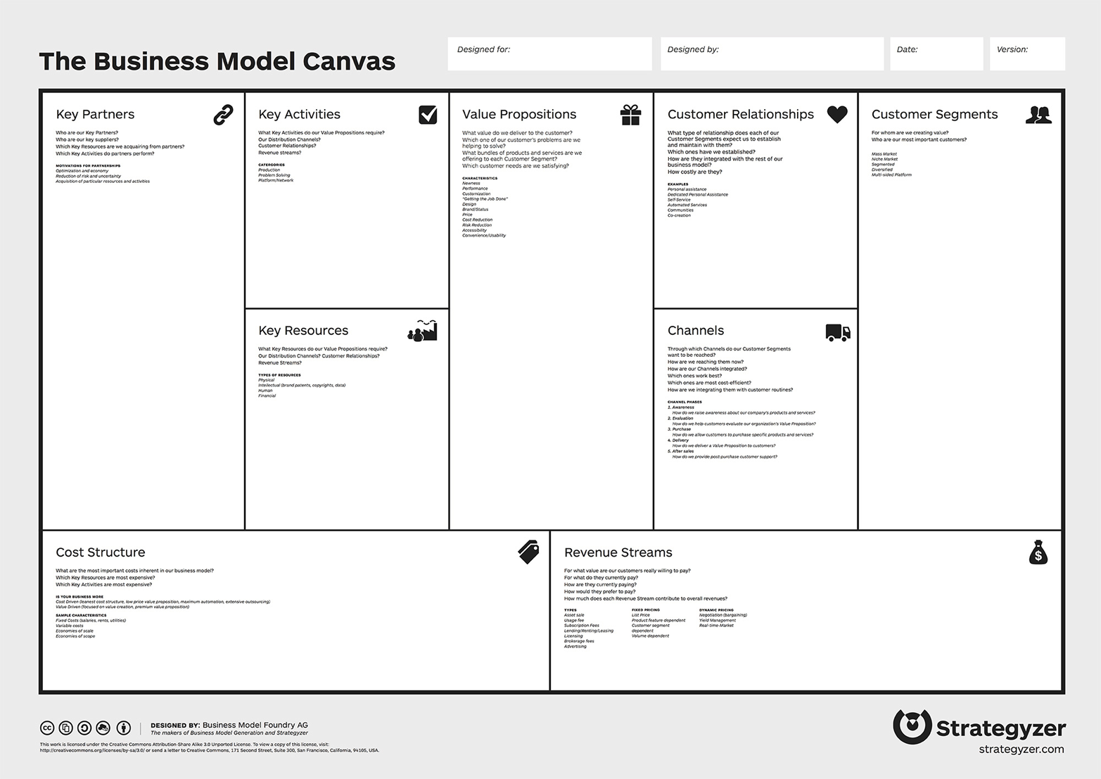
Figure 1-3. Business Model Canvas showing the nine essential building blocks of a business model
By using the canvas, product makers collect all their hypotheses about their product into one place. They then revise it as they move through the discovery phase, and it’s something you’ll see as we develop all the techniques in this book. For this tenet, however, it is another place in which we can see how business strategy and UX strategy really intersect. So many of the concerns of the Business Model Canvas—customer segments, value propositions, revenue streams, and customer acquisition and retention—are elements that are essential to creating a product’s user experience, which as you’ve learned, is key to our competitive advantage.
When you don’t see these connections, you can potentially end up in the same position as our software engineer in [content unavailable]. His business model relied on an affluent customer segment to provide the company’s revenue stream, but he had not correctly identified that segment before he built his product. If he had not come in contact with that user during my team’s customer discovery, he might have pushed ahead with a lengthy and expensive campaign to blitz media and online advertising outlets. This, as my team’s UX strategy proved, would have been very problematic because the campaigns wouldn’t have reached out to the user segment actually interested in the value proposition.
This leads us to how the Business Model Canvas also calls out the importance of collaboration among stakeholders and team members in the discovery phase. Categories such as key resources and partnerships aren’t something that a digital product manager or UX designer should think up in a vacuum. Rather, these categories are where the stakeholders can offer a wealth of information and leads. Other categories, such as key activities, customer segments, and value propositions, will more likely rely on the guidance of the digital team to lead the stakeholders to the best product. But the digital product team must also recognize that these same categories need input from actual users before a hypothesis can be changed to a fact, which is what our UX strategy research demonstrated to the software engineer.
We need to recognize that building a business strategy isn’t about formulating and executing a perfect plan. Instead, it’s about being able to research what’s out there, analyze the opportunities, run structured experiments, fail, learn, and iterate until we devise something of value that people truly want. Also, as the product scales and the market evolves, the business strategy must be nimble. For a new product, a strategy probably revolves around just getting enough product/market fit to raise financing, or grabbing enough market share so that its customer base is the competitive advantage. But, for a more mature company, the strategy is about building out the company’s core value proposition while trying to keep the company’s infrastructure and internal processes in place. It is in this way that what might have been the business model or competitive advantage in the early life cycle of the product might not be the same in later phases. Nevertheless, in chasing this moving target, companies must continue to experiment with varied offerings so that they can scale, remain competitive, and continue to offer value to users in an ever-changing marketplace.
Tenet 2: Value Innovation
As digital product inventors, we must be hyperaware of all the changing digital market dynamics. We must understand how and why people use their digital devices and what defines a successful and a failed UX. This is because a user’s first contact with the interface generally determines success or failure. It provides the user with their first impression of your value innovation, and it is value innovation that disrupts or creates new mental models for people. We definitely want to do that.
Before we dig into value innovation, let’s discuss the word “value.” The word is used everywhere. It’s found in almost all traditional and contemporary business books since the 1970s. In Management: Tasks, Responsibilities, Practices,9 Peter Drucker discusses how customer values shift over time. He gives an example of how a teenage girl will buy a shoe for its fashion, but when she becomes a working mother, she will probably buy a shoe for its comfort and price. In 1984, Michael Lanning first coined the term “value proposition” to explain how a firm proposes to deliver a valuable customer experience. For a business to generate wealth, it needs to offer a superior product to that of its competitors but at a manufacturing cost below what customers pay for it. That same year, Michael Porter defined the term “value chain” as the chain of activities that a firm operating in a specific industry performs in order to deliver a valuable product. Figure 1-4 illustrates a traditional value chain for a physical product manufacturer.

Figure 1-4. The value chain
That is the business process that Toyota uses to make vehicles and that Apple uses to make computers and devices. During each of the activities in this value chain of events, opportunities exist for firms to outperform their competitors. But, all those terms apply to physical products. By contrast, virtual products allow for a value chain to have faster repeat loops and in some cases for the activities to happen in parallel. This is part of why traditional business-strategy principles do not perfectly map to digital product strategy. When producing digital products, we must continuously research, redesign, and remarket to keep up with the rapidly evolving online marketplace, customer values, and value chains that are required to keep our products in production.
This brings us to another challenge of designing digital products: the software, apps, and other things that users find on the Internet and use every day. As mentioned, a product needs to be valuable to customers to entice them use it. It also needs to be valuable to the business so that the business can sustain itself. However, the Internet is full of digital products for which the users don’t have to pay for the privilege of using them. If a business model is supposed to help a company achieve sustainability, how can you do that when the online marketplace is overrun with free products?
Value innovation is the key. In the book Blue Ocean Strategy,10 authors W. Chan Kim and Renée Mauborgne describe value innovation as “the simultaneous pursuit of differentiation and low cost, creating a leap in value for both buyers and the company.” What this means is that value innovation occurs when companies align newness with utility and price (see Figure 1-5). Companies pursue both differentiation and cost leadership to create high-value and low-cost products for the customers and stakeholders. Consider how Waze found a sustainable business model—sharing its crowd-sourced data made it lucrative to other companies such as Google. Yet, to get the data, it had to provide a new kind of value to customers for mass adoption, and that value was based entirely on taking advantage of a disruptive innovation through the UX and business model.
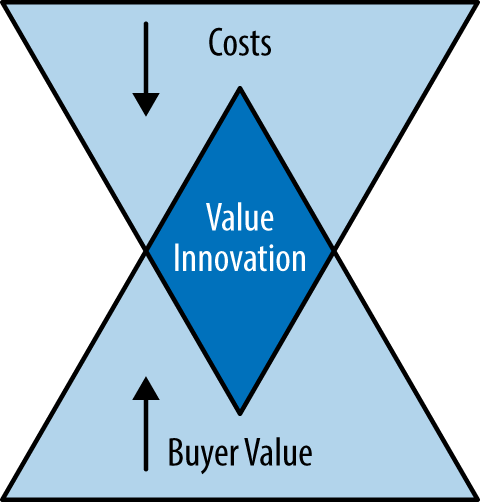
Figure 1-5. Value Innovation = The simultaneous pursuit of differentiation and low cost
Disruptive innovation is a term that was coined by Clayton M. Christensen in the mid-1990s. In his book The Innovator’s Dilemma, he analyzed the value chain of high-tech companies and drew a distinction between those just doing sustaining innovation versus disruptive innovation. A sustaining innovation he described as any innovation that enables industry leaders to do something better for their existing customers.11 A disruptive innovation is a product that a company’s best customer potentially can’t use and therefore has substantially lower profit margins than the business might be willing to support. However, this is where disruptive innovation can blindside established competitors. Christensen says that disruptive innovation usually is “a process by which a product or service takes root initially in simple applications at the bottom of a market and then relentlessly moves up market, eventually displacing established competitors.”12
Innovative means doing something that is new, original, and important enough to shake up a market, and this leads us right back to the book Blue Ocean Strategy. In the book, the authors discuss their studies of 150 strategic moves spanning more than a 100 years and 30 industries. They explain how the companies behind the Ford Model T, Cirque du Soleil, and the iPod won because of how they entered blue-ocean markets instead of red-ocean markets. The sea of other competitors with similar products is known as a red ocean. Red oceans are full of sharks that compete for the same customer by offering lower prices and eventually turning a product into a commodity. In contrast, a blue ocean is uncontested territory; it is free for the taking.
In the corporate world, the impulse to compete by destroying your rivals is rooted in military strategy. In war, the fight typically plays out over a specific terrain. The battle gets bloody when one side wants what the other side has—whether it be oil, land, shelf space, or eyeballs. In a blue ocean, the opportunity is not constrained by traditional boundaries. It’s about breaking a few rules that aren’t quite rules yet or even inventing your own game that creates an uncontested new marketplace and space for users to roam.
When we transpose Blue Ocean Strategy to the world of digital products, we must admit that there are bigger opportunities in unknown market spaces. A perfect example of a company that took advantage of a blue-ocean market is Airbnb. Airbnb is a “community marketplace” for people to list, discover, and book sublets of practically anything from a tree house in Los Angeles to a castle in France. What’s amazing about this is that its value proposition has completely disrupted the travel and housing industry (see Figure 1-6).13 Its value proposition is so addictive that as soon as customers try it, it’s hard to go back to the old way of booking a place to stay or subletting a property.

Figure 1-6. Airbnb in the news
Airbnb achieves this value innovation by coupling a killer UX design with a tantalizing value proposition. And, as I mentioned earlier, true value innovation occurs when the UX and business model intersect. In this case, they intersected in a blue ocean because of how Airbnb broke and reinvented some rules.
For example, Craig’s List was a primary means for users to sublet before Airbnb, but it was a generally creepy endeavor. There were no user profiles. There was no way to verify anything about the host or guest in the transaction. Yet, that was the norm! Airbnb enabled a free-market sub-economy in which quality and trust were given high value in the UX, much like in Amazon, Yelp, and eBay. Airbnb’s entire UX was built around the idea of ensuring that each guest and host was a good customer. It required its users to change their mental models. Formerly unwritten social etiquette now had to come into play if users were to host strangers or stay in a stranger’s home and for both parties to feel good about it.
For instance, I just came back from a weekend in San Francisco with my family. Instead of booking a hotel that would have cost us upward of $1,200 (two rooms for two nights at a 3.5 star hotel), we used Airbnb and spent half of that. For us, though, it wasn’t just about saving money. It was about being in a gorgeous and spacious two-bedroom home closer to the locals and their foodie restaurants. The six percent14 commission fee we paid to Airbnb was negligible. Interestingly, the corporate lawyer who owned this San Francisco home was off in Paris with her family. She was also staying at an Airbnb, which could have been paid for using some of the revenue ($550-plus) from her transaction with us. Everybody won! Except, of course, the hotels that lost our business.
Airbnb’s business strategy is that they cater to both sides of their two-sided market—the people who list their homes and those who book places to stay. They offer incredible value through feature sets like easy calendaring tools, map integration for browsing, and, most crucially, a seamless transactional system that had not been previously offered by other competitiors like VRBO, Homeaway, or Craig’s List. Ultimately Airbnb offered a more usable platform that minimized the risk of dealing with scary people coupled with fair-market value pricing. All of this added up to serious disruption through value innovation for all customers and stakeholders in the online and offline experience. That’s why it is winning so decisively.
There are many other products causing widespread disruption to the status quo through their combined value innovation of cost leadership and differentiation in blue-ocean marketplaces. And through their UX strategies, they are ultimately making people’s lives easier, bringing together customers in new ways and smashing mental models. Companies such as Airbnb, Kickstarter, and Eventbrite have completely upended how people rent homes, fund business ventures, and organize events, respectively. In fact, Eventbrite is how I tested my hypothesis that there were people out there with a thirst for knowledge about UX strategy. Using its interface, I quickly set up a 60-seat lecture at the price of $40 per person, and sold it out. If I didn’t have Eventbrite to experiment with as a promotional platform, there might have been no book for Jaime Levy. Thank you Eventbrite for enabling the one value innovation that other platforms like Meetup failed to offer: the ability to host paid ticketed events.
Tenet 3: Validated User Research
Not realizing a product’s value is one of the primary reasons why that product will fail. Stakeholders are dreamers in that they assume what is valuable to their customers instead of verifying it. Much like Kevin Costner in the movie Field of Dreams, these entrepreneurs believe that if they build it, they [the users] will come. But the truth is that any product is a risk. Remember our software engineer at the beginning of this book? His assumptions about what his customers wanted turned out to be wrong. His heart was in the right place. His idea was timely, different, very innovative, and even had a unique and sustainable business model. Nonetheless, the users didn’t come. And when my team eventually went out and asked his target users, we discovered that they wouldn’t pay for the product as it was being positioned.
User research is how you verify that you’re on the right track with your value proposition. There are lots of ways to do it—ethnographic field studies, contextual inquiries, focus groups, diaries and journals, card sorting, eye-tracking, personas, and more. I don’t want to talk about any of these traditional methods. Instead, I want to talk about Lean Startup.
It’s weird to admit, but before 2011 when Eric Ries’ Lean Startup15 (which you must read) went critical mass, founders didn’t make it their mission to confront customers “early and often.” The empirical, fast-moving, and transparent nature of Lean Startup riffed on ideas from Steve Blank’s customer development methodology16 and the highly theoretical Design Thinking approach. Sure, organizations had UX designers around to do “user-centric” design (as opposed to engineer-centric), but Lean Startup made conducting validated user research a make-or-break aspect of moving forward on a product. Lean Startup forced user research to become measurable.
This leads us to our third tenet—validated user research. “Validation” is the secret sauce of the Lean Startup business approach. Validation is the process of confirming that a specific customer segment finds value in your product. Without validation, you are simply assuming that customers will find use for your product. Validated user research goes beyond just observing and establishing empathy for potential users. It is a process based on a reality-check that focuses on direct feedback from interaction with users. It helps your team to determine if the vision of your product is a dream or a potential nightmare.
Eric Ries popularized the term Minimum Viable Product (MVP). It simply means learning if potential customers want your product by building just the core features of your value proposition. This is far different from traditional product development in which building a prototype was often a simulation to show potential investors the future product. By getting customer buy-in on your value proposition early, you are de-risking your product. And if users don’t like what they see, we need to either “pivot” to a different customer segment or pivot to a different problem that our value proposition can address.
Iterations like the MVP require your team to conduct research and gain validation before developing a solution. It helps verify that your team is targeting the right customer (something our startup in [content unavailable] failed to do) and not just a general persona. When you’ve validated a specific pain point that needs addressing, you can continue to add features and then test those features using the same research methods. This is known as the Lean Startup feedback loop of build-measure-learn. Use your research to validate your decisions and ensure that the product vision is aligned with the end user’s needs.
Validated user research is a collaborative process that should involve as many members of the product team as possible. Collaboration will actually help organically build consensus on the value proposition and any pivots that follow. Now, this might sound naïve, given that we are all working in different environments with a range of folks with dynamic personalities who are in various positions of power. In an enterprise environment, there are typically many stakeholders who each have a say on the product requirements based on their personal agenda or preference. When I work for agencies, the product requirements are typically locked in stone during a requirements-gathering phase that I’m not involved in. For me to suggest doing validated user research or creating an MVP to test during the design phase is blasphemy because it’s counterintuitive to the agency model. The last thing an account executive wants to hear from his UX resources are ways to cut the project fee down for his client.
If you happen to find yourself in this familiar position, that’s the exact moment that you need to become intrapreneurial. Intrapreneurship is the act of behaving like an entrepreneur while working within a large organization. You need to decide to take the fate of the product into your own hands through assertive risk-taking and innovation. Stand up and ask for the extra week or two to conduct validated user research. If you get a “no” or are too afraid to ask, it’s time to start working off-hours. The worst thing that can happen is that you will discover something about yourself and/or start looking for ways to improve your own work process.
The bottom line is that confronting your target customers is nonnegotiable. We must learn as quickly as possible if the idea we are working on is stupid and worthless. We need to have an open mind to experiment and to fail. That’s right, we are betting. And the odds are against us. In the end, though, this approach is more cost-effective and efficient.
Tenet 4: Killer UX Design
In Lean Entrepreneur17 Patrick Vlaskovits and Brant Cooper advocate, “If you are doing best practices, you are not innovating.” This is a provocative statement, because established interaction design patterns help make consistent user experiences. Then again, there is no harm in breaking a rule or two through experimentation to make a killer user experience.
The “user experience” (UX) is how a human feels when using the interface of a digital product while attempting to accomplish a task or goal. Yes, we can say a door handle is an interface and go off the nondigital highway into the world of 100 percent physical products. But in practice, the term “user experience” refers to whether a person has a good or bad time trying to utilize a digital product.
Traditionally (if I dare use that word for a discipline barely two decades old), UX design is associated with deliverables for development and design execution—site maps, wireframes, process/task flows, and functional specifications. Recruiters for enterprises and agencies identify UX design with the job titles that create these deliverables, including interaction designer, information architect, and UX designers. These definitions are used by large enterprises and agencies and are pretty much how UX design is currently practiced. Yet, what ultimately happens in this “traditional” system is that the UX designer and therefore the UX design are often more focused on the issues of user engagement and design rather than customer development and business-model generation.
The common problem that many product makers don’t realize is how much their UX decisions are tied to customer acquisition. Just think about any transactional website or even a simple sign-up process. The UX design should be very concerned with barriers to entry, which can prevent validated leads who have previously engaged with the product from converting to customers. We’ll talk more about this in [content unavailable]. Interfaces and user flows should be geared toward the desired response of the user. It’s all about engagement.
This is what distinguishes a novice UX designer from a killer UX designer. Killer UX designers know now to guide the value innovation of a product in the following ways:
They work collaboratively with stakeholders and teammates at the idea’s inception. Then, the UX designer can be involved in designing structured experiments for validation. These experiments need to be focused on how successful the value proposition can be communicated to the customer from the moment the customer opens the landing page. Using measurable results, design decisions can be made based on real evidence rather than hunches.
They help determine the key moments and features that are absolutely critical to your product. [content unavailable] focuses on tactics for helping you discover value innovations, concentrating on the primary utility of the product. We explore techniques such as storyboarding that will weave key experiences together in simple and elegant ways. We look at ways to poach and cherry-pick features from both competitors and noncompetitors so that we can put them together in new ways.
They learn everything about the existing market space to identify UX opportunities that can be exploited. This allows your team to find ways to create a leap in value by offering something that makes peoples lives more efficient.
They talk directly to potential users or existing power users of the product to discover and validate its primary utility with respect to the problem that must be solved.
They weave the UX through all touch points—online and offline—enabling an experience that is frictionless. This is especially relevant in products such as Airbnb and Uber in which the transaction begins on the Internet, is fulfilled in the real world, but then loops the user back to the interface to write reviews.
You can’t merely “design think” your way to a killer UX design. It’s only when the UX is informed by and affects the other three tenets that mental models are broken. Disruption erupts!
Over the course of the book, I will discuss several case studies of products that have killer user experiences. These are UX designs that didn’t just “happen” through good luck or “genius design.” They’re killer through the manifestation of the tenets. It’s only with practice and mindfulness that we will come to understand the product as a sum of both its tangible and intangible parts. The examples include the following companies.
- Airbnb
The listing service that is disrupting the travel industry (Figure 1-7).
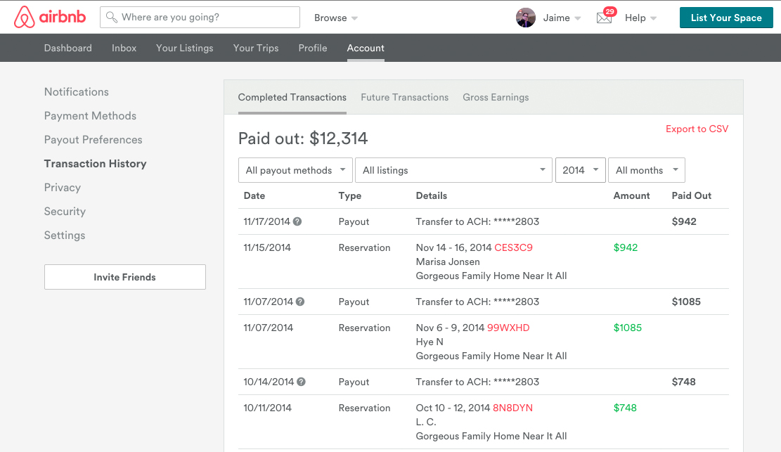
Figure 1-7. Airbnb’s killer UX
- Uber
The ridesharing application that is disrupting the taxi-service industry (Figure 1-8).
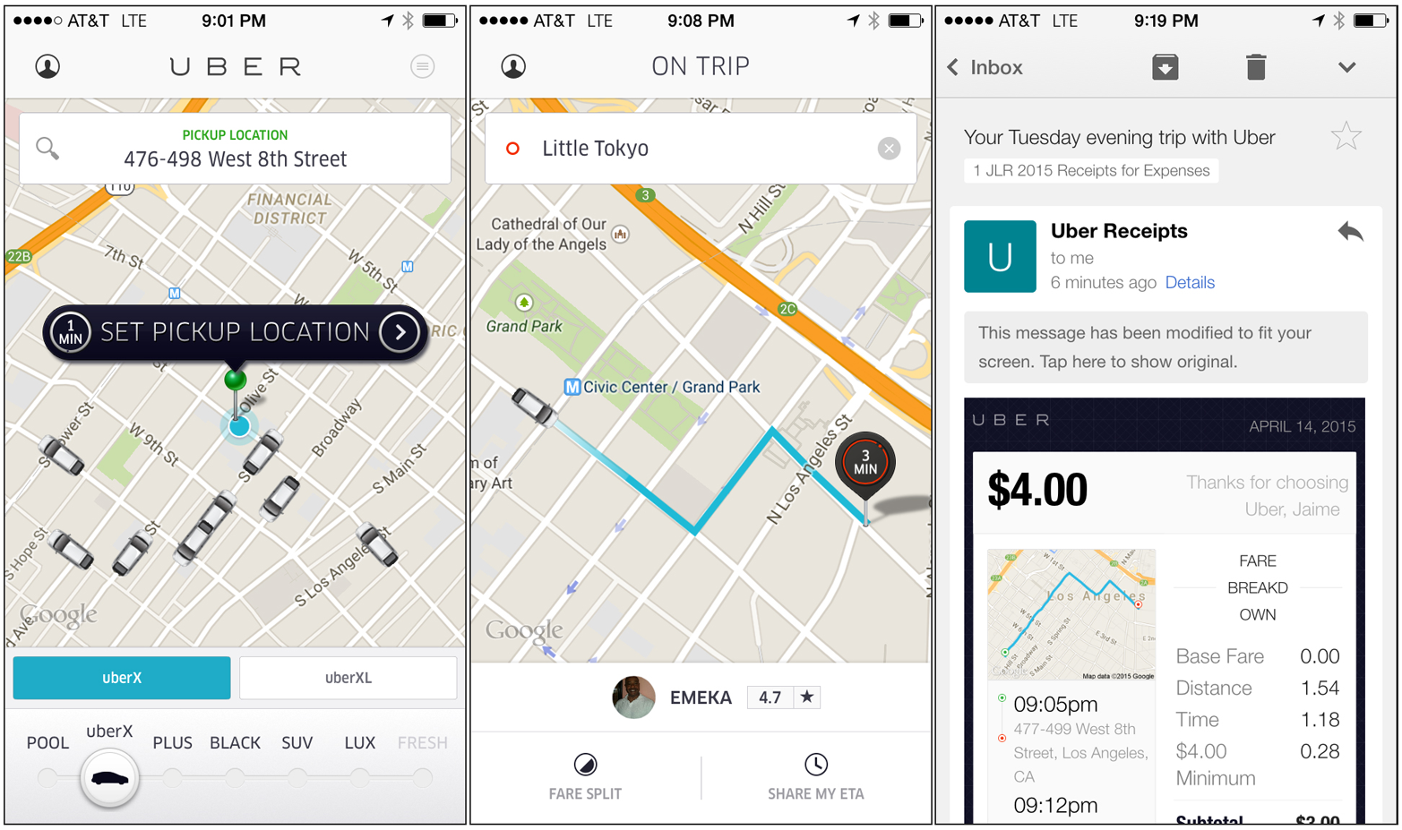
Figure 1-8. Uber’s killer UX
- Waze
The map application that is disrupting how people get from Point A to Point B in their cars (Figure 1-9).
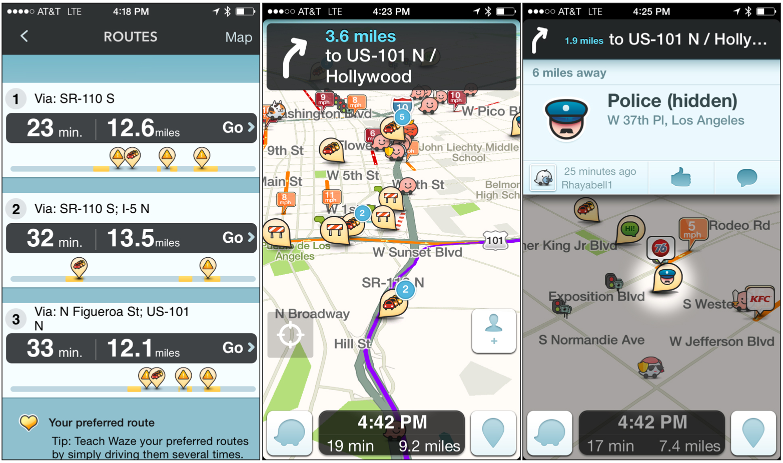
Figure 1-9. Waze’s killer UX
- Tinder
The dating app that is threatening former dating-site disruptors such as OkCupid and Eharmony (Figure 1-10).

Figure 1-10. Tinder’s killer UX
These products all got to where they are not by execution of a static business plan or a two-week UX discovery phase, but through experiments, failure, and iterations over months and sometimes years. It was the insights born out of structured strategic meanderings that blossomed into awe-inspiring product interfaces. It’s how the founders and teams behind-the-scenes took risks while assembling the building blocks of their products’ business models. They fine-tuned their value innovation and acquired fervent customers, which led to a competitive advantage such that they now swim in a blue ocean.
Recap
UX strategy is a way of thinking. It’s not a means of formulating and executing a perfect plan; rather, it’s about being able to research what’s out there, analyze the opportunities, run structured experiments, fail, learn, and iterate until you devise something of value that people truly want. While devising a UX strategy, you will need to take risks and accept failure. You’ll learn how to fail smartly by doing small-structured experiments to validate that your strategy is moving your team in the right direction.
1 Sun Tzu, Art of War. first published by Lionel Giles in 1910.
2 Gray, David, Sunni Brown, Jamews Macanufo. Gamestorming: A Playbook for Innovators, Rulebreakers, and Changemakers. O’Reilly, 2010.
3 Porter, Michael. Competitive Advantage. New York: The Free Press, 1985.
4 http://www.journalism.org/2012/11/06/hurricane-sandy-and-twitter/
5 “New features ahead: Google Maps and Waze apps better than ever.” Google Maps Blog, August 20, 2013, http://tinyurl.com/lx9sq8c.
6 Kirkpatrick, David. The Facebook Effect: The Inside Story of the Company That Is Connecting the World. Simon & Schuster, 2011.
7 Blank, Steve and Bob Dorf. The Startup Owner’s Manual. Wiley, 2012.
8 Oswerwalder, Alexander and Yves Pigneur. Business Model Generation. Wiley, 2010.
9 Drucker, Peter. Management: Tasks, Responsibilities, Practices. HarperBusiness, 1973.
10 Kim, W. Chan and Renée Mauborgne. Blue Ocean Strategy. Harvard Business School Press, 2005.
11 http://www.strategy-business.com/article/14501?pg=all
12 http://www.claytonchristensen.com/key-concepts/#sthash.47B9F4IW.dpuf
13 “NY official: Airbnb stay illegal; host fined $2,400.” C|Net, May 20, 2013. http://tinyurl.com/k7oyx3j.
14 The service fee that guests pay on AirBnb varies from 6 to 18 percent, based on the subtotal.
15 Ries, Eric. Lean Startup. HarperBusiness, 2011.
16 Blank, Steve. The Four Steps to the Epiphany. K&S Ranch Press, 2005.
17 Vlaskovits, Patrick and Brant Cooper. Lean Entrepreneur. Wiley, 2013.
Get Designing for Product Strategy now with the O’Reilly learning platform.
O’Reilly members experience books, live events, courses curated by job role, and more from O’Reilly and nearly 200 top publishers.

