Grids in Wireframing
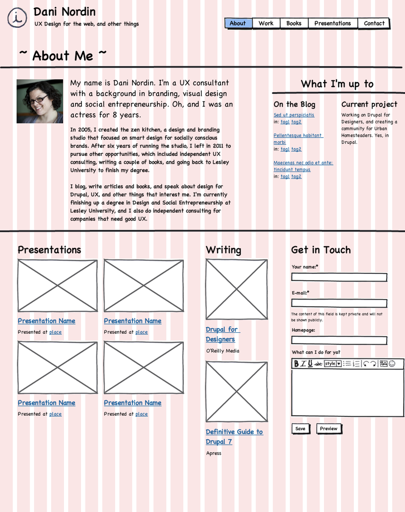
Working with a grid system also makes wireframing more efficient. I find that a well-constructed grid even facilitates sketching ideas; having a grid right there on the page makes it easier to consider issues of hierarchy, proportion and overall layout without second-guessing yourself. The classic 960 grid uses 12 or 16 columns; however, a 24 column grid was recently added, which has been built into the Omega theme. Personally, I prefer the 24-column layout (see Figure 6-4); it has enough columns to be very flexible (for example, you can have either three or four columns of content in a given region), but not so many that itâs hard to figure out how many to use for a given element. Figure 6-3, a very early wireframe for my personal site, uses a 12-column grid. In Figure 6-4, Iâve revised the wireframe to use a 24-column grid.

Figure 6-3. This quick wireframe for the âAboutâ page of my website refresh uses a 12-column grid

Figure 6-4. Switching to a 24-column grid gives me a bit more flexibility; I can fit a bit more on the page, but still keep things organized
Get Design and Prototyping for Drupal now with the O’Reilly learning platform.
O’Reilly members experience books, live events, courses curated by job role, and more from O’Reilly and nearly 200 top publishers.

