Wrap Content with Floating Elements
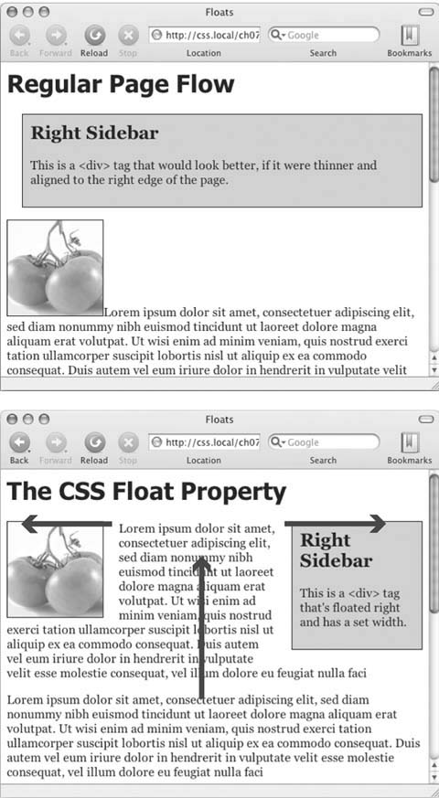
HTML normally flows from the top of the browser window down to the bottom, one headline, paragraph, or block-level element on top of another. This word processor–like display is visually boring (Figure 7-12, top), but with CSS, you're far from stuck with it. You'll learn lots of new methods for arranging items on a Web page in Part 3, but you can spice up your pages plenty with one little CSS property— float.
The float property moves an element to either the left or right. In the process, content below the floated element moves up and wraps around the float (Figure 7-12, bottom). Floating elements are ideal for moving supplemental information out of the way of the main text of a page. Images can move to either edge, letting text wrap elegantly around them. Similarly, you can shuttle a sidebar of related information and links off to one side.

Figure 7-12. The regular flow of HTML is left to right, top to bottom, with one block-level element—headline, paragraph, <div>, and so on—stacked on top of the next. By letting you break up this uniformity, the float property is one of the most powerful and useful tools that CSS offers. Its uses range from simply moving an image to one side of a paragraph to providing complete layout control over banners, sidebars, navigation bars, and other page elements.
While you can use floats in some complex ( and confusing) ...
Get CSS: The Missing Manual now with the O’Reilly learning platform.
O’Reilly members experience books, live events, courses curated by job role, and more from O’Reilly and nearly 200 top publishers.

