| Recipe 23 | Targeting Mobile Devices |
Problem
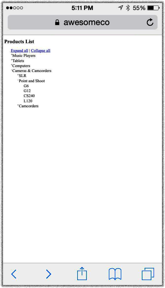
As web developers, we’re used to accounting for a lot of factors when designing a site. Different browsers and different screen resolutions have always affected how our content looks, and making a site look as good on a 13-inch laptop as on a 30-inch monitor takes work. In the past, we may have considered how our sites looked on PDAs, but with the explosion of smartphones and tablets, we need to be aware of how our sites look on screens that not only are smaller but also can change orientation.

Ingredients
-
jQuery
-
CSS media queries
Solution
CSS media queries let us load specific style sheets based on conditions ...
Get Web Development Recipes, 2nd Edition now with the O’Reilly learning platform.
O’Reilly members experience books, live events, courses curated by job role, and more from O’Reilly and nearly 200 top publishers.

