Chapter 10. Workflow Visualization
Whether your workflow is a simple linear process that people follow or a complex and dynamic one that evolves, it helps to know what’s going on with it. A workflow presentation layer should represent the components in terms that are understood by everyone, showing their status and what activity is occurring (see Figure 10-1 for an example). A streaming version of this would represent the activity between components, using movement, style, and size to draw attention to aspects such as volume, frequency, and latency. All of the same techniques for showing context through time for streaming data can help here, such as adding a coordinated timeline.
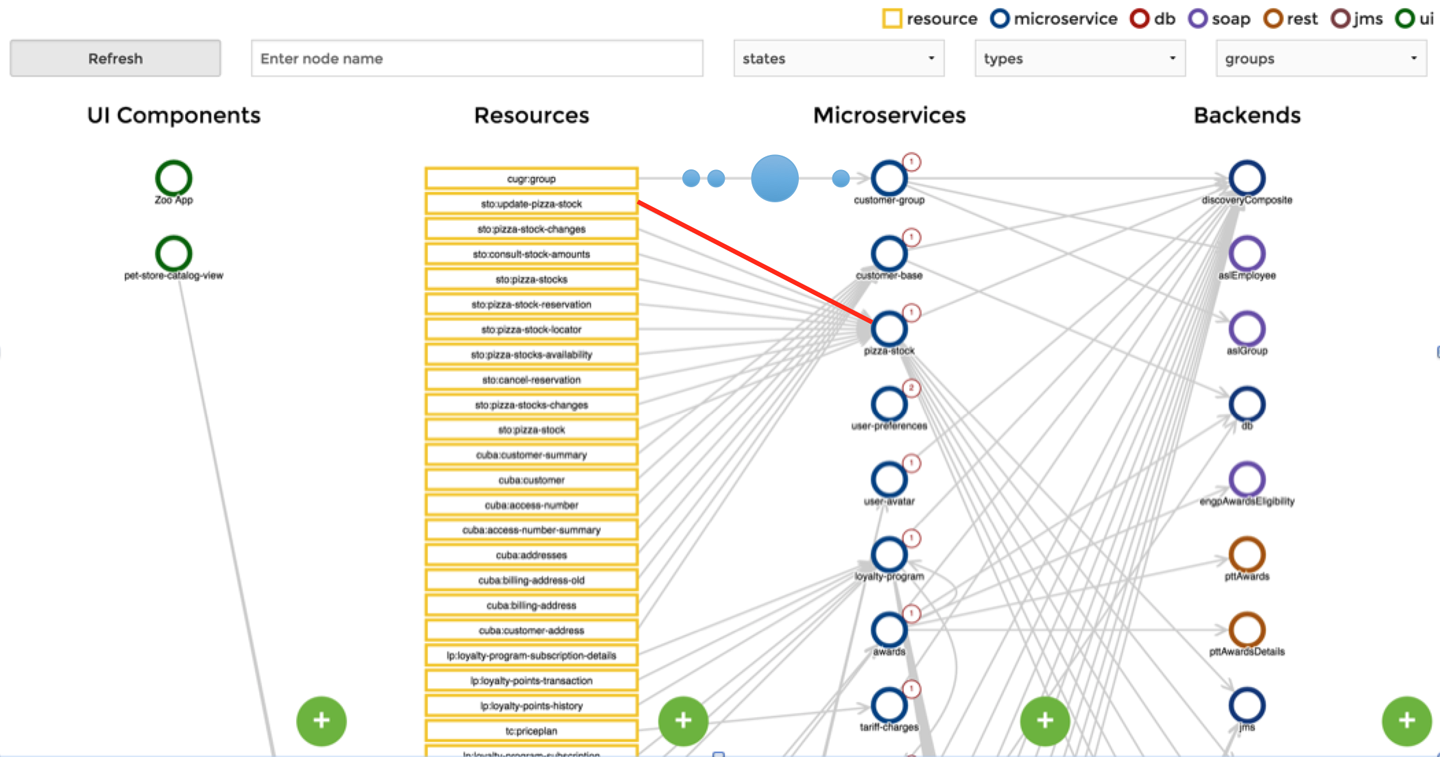
Figure 10-1. A microservices workflow where things can take different paths to various components (source: https://github.com/ordina-jworks/microservices-dashboard)
Updating Processing
One of the immediate side effects of showing the results of data after multiple layers of processing is the observations that lead to a need to adjust the processing logic. If it’s something that can be easily defined with logical comparisons, consider allowing an analyst to update the processing directly (Figure 10-2 shows an example of an interface for doing this). This allows the analyst to get the data they need ...
Get Visualizing Streaming Data now with the O’Reilly learning platform.
O’Reilly members experience books, live events, courses curated by job role, and more from O’Reilly and nearly 200 top publishers.

