Chapter 6. Building Impactful Tables
Quick—without thinking too much, answer the following questions:
What chart type is used the most when displaying data?
What chart type is the hardest to design?
What chart type is the least customizable?
What chart type do data practitioners hate most?
The answer to all these questions is the humble data table. This chapter is all about building tables that are full of information, without sacrificing design.
Like the visual in Figure 6-1, most information is still shared in tables. But when there’s a special point we want to communicate about the data, it’s likely to get lost amid a sea of information.
Analysts and designers complain about tables, but the reality is that people use tables in their decision making. Heck, it’s probably your go-to visualization when trying to validate data. It’s our job as analytics developers and data visualization practitioners to give our users the tools that allow them to do their job. If your audience asks for tables, this means building tables!
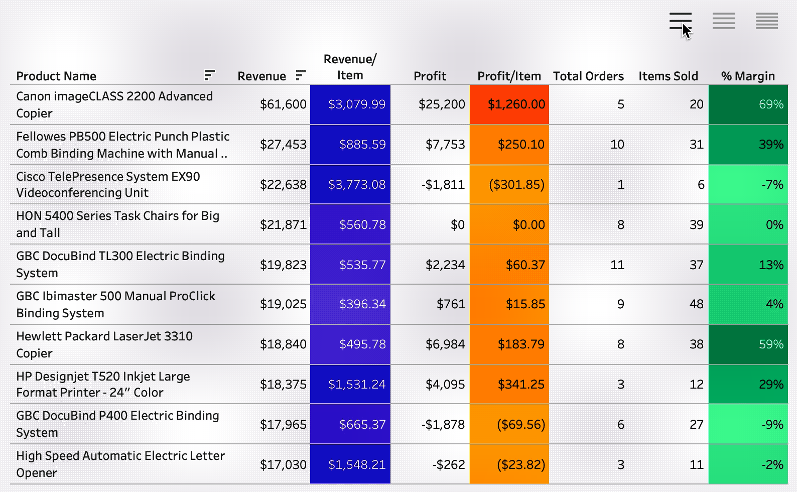
Figure 6-1. A table with some color (but not all color) to highlight some key values
Get Tableau Strategies now with the O’Reilly learning platform.
O’Reilly members experience books, live events, courses curated by job role, and more from O’Reilly and nearly 200 top publishers.

