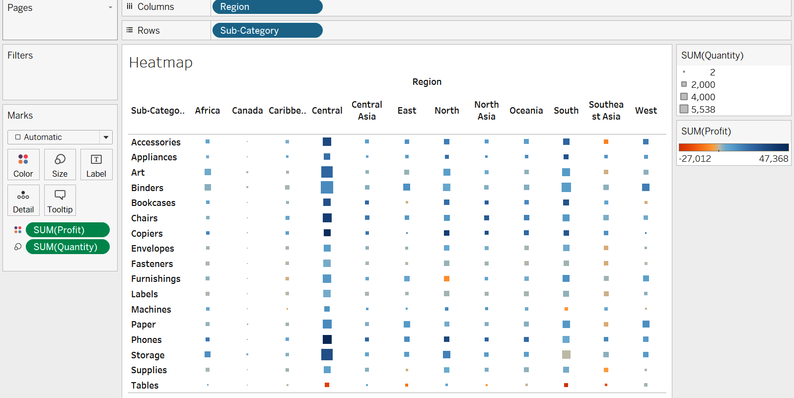
Heat maps and treemaps are useful for when looking for patterns in highly granular and detailed data. Heat maps use a combination of size and color to show trends. For example, which subcategory has the lowest profit in the region that has the highest quantity sold? To answer this question, we create a heat map similar to the following screenshot:

Using the heat map, we can quickly see based on the sizes of the squares that the Central region has the highest quantity sold and the Tables sub-category within it has the least profit.
Treemaps are another type of graph that is useful for looking at broad trends. They allow ...

