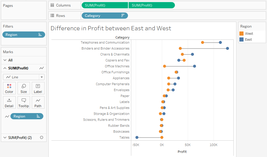
A dumbbell chart is a variation of the circle plot; it compares two values for each slice of data, emphasizing the distance between the two values. Here, for example, is a chart showing the difference in profit between East and West regions for each category of products:

This chart was built using the following features and techniques:
- A synchronized dual axis of SUM(Profit) has been used, with one set to mark a type of Circle and the other set to Line.
- Region has been placed on the Path shelf for the line to tell Tableau to draw a line between the two regions.

