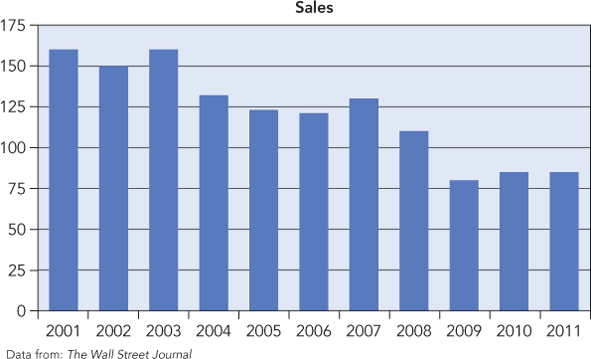
... The figure looks like a bar chart, but it isn’t. This chart instead uses bars to graph a sequence of counts over time. It is fine to use bars in this way to emphasize the changing level of a time series, but these are not displays of a frequency table.2

Figure 3.4 Not every chart with bars shows the distribution of a categorical variable. This chart tracks sales, in thousands of vehicles, at Ford’s Lincoln division.
Pie Chart
Pie charts are another way to draw the distribution of a categorical variable. A pie chart shows the ...
Get Statistics for Business: Decision Making and Analysis, 3rd Edition now with the O’Reilly learning platform.
O’Reilly members experience books, live events, courses curated by job role, and more from O’Reilly and nearly 200 top publishers.

