Chapter 3
Charts and Graphs
IN THIS CHAPTER
![]() Pie charts and bar graphs for categorical data
Pie charts and bar graphs for categorical data
![]() Time charts for time series data
Time charts for time series data
![]() Histograms and boxplots for numerical data
Histograms and boxplots for numerical data
The main purpose of a data display is to organize and display data to make your point clearly, effectively, and correctly. In this chapter, I present the most common data displays used to summarize categorical and numerical data, thoughts and cautions on their interpretation, and tips for evaluating them.
Pie Charts
A pie chart takes categorical data and shows the percentage of individuals that fall into each category. The sum of all the slices of the pie should be 100% or close to it (with a bit of round-off error). Because a pie chart is a circle, categories can easily be compared and contrasted to one another.
The Florida lottery uses a pie chart to report where your money goes when you purchase a lottery ticket (see Figure 3-1). You can see that half of Florida lottery revenues (50 cents of every dollar spent) goes to prizes, and 38 cents of every dollar goes to education.
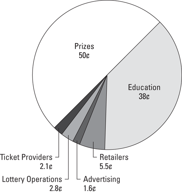
FIGURE 3-1: Florida lottery expenditures ...
Get Statistics Essentials For Dummies now with the O’Reilly learning platform.
O’Reilly members experience books, live events, courses curated by job role, and more from O’Reilly and nearly 200 top publishers.

