Basic trending with line charts

One report that goes some way to determining how things change over time is the line chart. To see how this works, follow these steps:

  1. Navigate to Reports > Create New. Use the following options, and click Save:
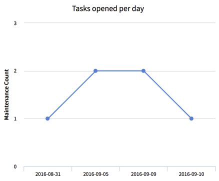
    • Name: Tasks opened per day
    • Data table: Maintenance [x_hotel_maintenance]
    • Type: Line
    • Group by: -- None --
    • Trend by: Opened
    • Per: Date
This report gives a good indication of how demand for your service varies. However, the x-axis is not consistent and will not render zero when there are no Maintenance tasks opened on that day.

Get ServiceNow: Building Powerful Workflows now with the O’Reilly learning platform.

O’Reilly members experience books, live events, courses curated by job role, and more from O’Reilly and nearly 200 top publishers.