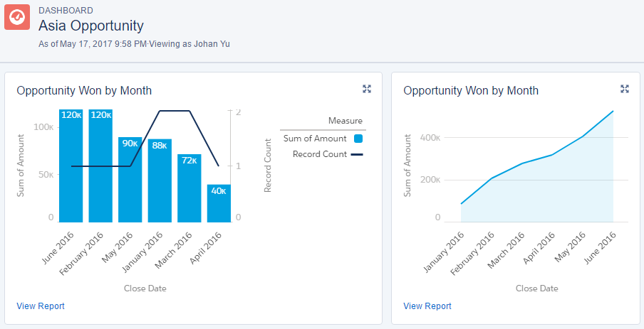
Combination charts plot two or more sets of data on a single chart, making charts multimetric. For example, the bar chart shows the pipeline Amount for each month, while the Line Chart shows the number of the pipeline for each month, adding the second y-axis on the right-hand side for additional measurement. This is shown in the following screenshot:


