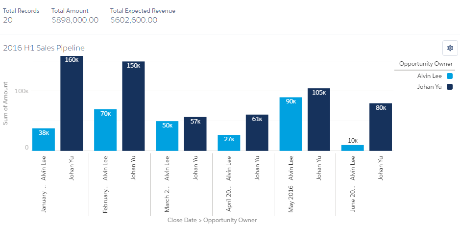
The Vertical Bar chart is similar to the Horizontal Bar chart. This chart is useful when the number of groupings is not too high, such as Calendar Month in a Year. Just like with the Horizontal Bar chart, here too you can add multiple bars based on the summarizing field in the reports. You can hover your mouse to see the details of each bar here too. The following is a sample screenshot taken from a Pipeline report, with Vertical Bar chart grouped by Close Date Month and Opportunity Owner:


