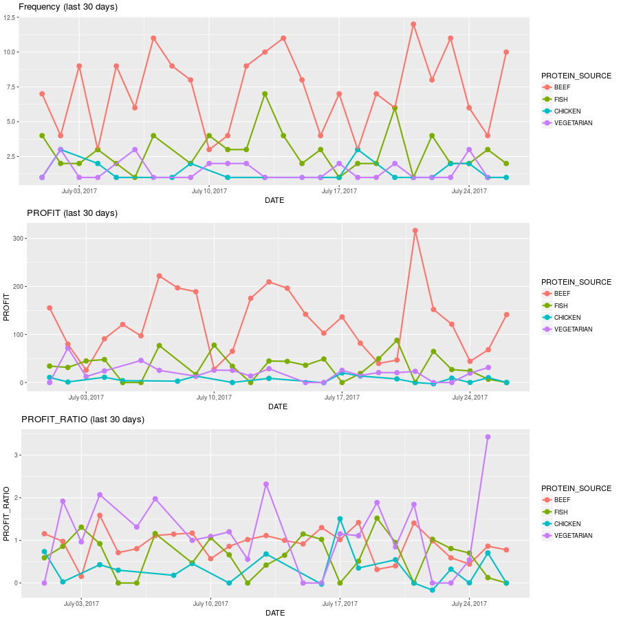
Now we are going to focus on another very common type of graph: time-series. Our objective is to understand how our data is behaving for the last n days, and, as we have done before, we want to further disaggregate using colors, like the graph below shows:

If you have read all the chapter up until this point, you should be able to understand most of what the function is doing. The only new function is scale_x_date(). It allows us to specify date formats for the axis ticks other than the default. In this case, we want to use breaks by day (as we had done in some examples before), but we want the format ...

