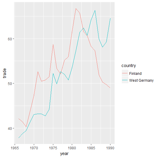
Keep in mind that visualizing fewer lines is much easier than visualizing a bunch of them:
- Load ggplot2 and use geom_line() to get it done:
> library(ggplot2)> ggplot(data = macro, aes(x = year, y = trade, colour = country)) + geom_line()
Outputted graph might be similar to the following figure:

- To make it interactive, one can load ggvis and trust layer_lines() to the quest:
> library(ggvis)> ggvis(data = macro %>% droplevels(), x = ~year, y = ~trade, stroke = ~country) %>% layer_lines()
- Loading plotly, filter the data set and use add_traces() to draw lines for each country:

