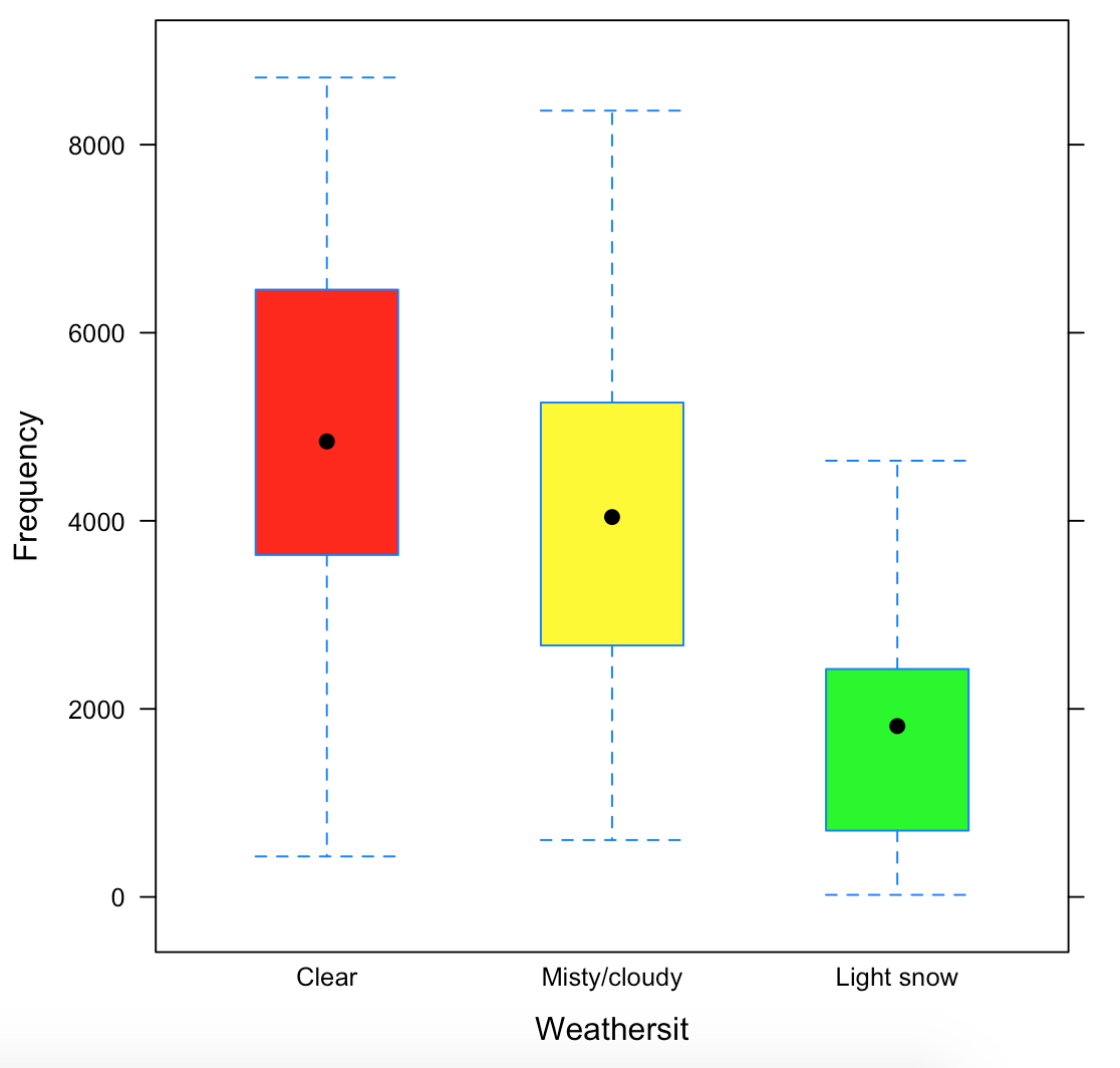
With the bike rentals data, you can show a hypothesized causality between the weather situation and the number of rentals by drawing boxplots of rentals under different weather conditions.
> bwplot(cnt ~ weathersit, data=bike, layout=c(1,1),xlab = "Weathersit", ylab = "Frequency", par.settings = list(box.rectangle = list(fill= rep(c('red','yellow','green'),2))))
The preceding command produces the following output:

We can create other panels alongside our boxplot to have a clearer idea of data dispersion:
> bwplot(cnt ~ weathersit,xlab = "Weathersit", ylab = "Frequency",panel=function(x,y,...){ panel.bwplot(x,y,...) panel.stripplot(x,y,jitter.data ...
