Although the different kinds of WPF application types are useful,
the core of any presentation framework is in the presentation elements
themselves. In presentation systems of old, fundamentally we had "chunks
of look and behavior" (often called controls) and
"containers of chunks of look and behavior." In WPF, this
characterization doesn't really hold up very well. Many elements that
provide their own content and behavior can also be containers of
elements (and so on). As an example, let's take a look at a Button.
The first thing that may surprise you about a WPF Button object is that you don't need to use a
string as the content; it will take any .NET object. You've already seen
a string as a button's content (see Example 1-17).
Example 1-17. A button with string content
<Window ...>
  <Button Width="100" Height="100">Hi</Button>
</Window>
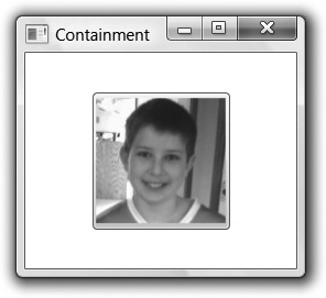
However, as Example 1-18 shows, you can also use an image (see Figure 1-11).
Example 1-18. A button with image content
<Window ...>
  <Button Width="100" Height="100">
        <Image Source="tom.png" />
  </Button>
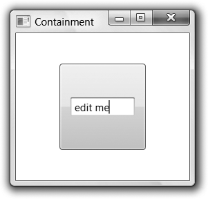
</Window>You can even use an arbitrary control, like a TextBox, as shown in Example 1-19 and Figure 1-12.
Example 1-19. A button with control content
<Window ...>
  <Button Width="100" Height="100">
        <TextBox Width="75">edit me</TextBox>
  </Button>
</Window>Further, as you'll see in Layout and Chapter 6, you can get fancy and show a
collection of nested elements in a Button or even nonvisual objects as the
content of a Button. The Button can take any object as content because
it's derived ultimately from a class called ContentControl, as are many other WPF classes
(e.g., Label, ListBoxItem, ToolTip, CheckBox, RadioButton, and, in fact, Window itself).
A ContentControl knows how to
hold anything that's able to be rendered, not just a string. A ContentControl gets its content from the
Content property, so you could
specify a Button's content like so
(this is the longhand version of Example 1-17):
<Button Width="100" Height="100" Content="Hi" />ContentControls are especially
useful because you get all the behavior of the "thing" (e.g., Button, Window, ListBoxItem), but you can display whatever you
like in it without having to build yourself a special class (e.g.,
ImageButton, TextBoxListBoxItem, etc.).
The content model is not relegated to just the ContentControl. For example, the HeaderedContentControl is like a ContentControl, except it has two spots for
content, the header and the content. The GroupBox and TabItem controls both derive from the HeaderedContentControl and both provide a
header (i.e., the group title and the tab), as well as content (i.e.,
the group contents and the tab contents). By using the content model,
HeaderedContentControls allow any
kind of content in either content spot, allowing for much greater
flexibility still within a simple model.
Although setting the Content
property as an XML attribute works just fine for specifying a string
as a property, it doesn't work at all well for specifying a
subelement, like the image example. For this reason, XAML defines the
property element syntax, which
uses nested Element.Property
elements for specifying objects as property values. For instance,
Example 1-20 shows the
property element syntax for the string setting of a button's
content.
Example 1-20. Property element syntax with a string
<Button Width="100" Height="100"><Button.Content>Hi</Button.Content></Button>
Example 1-21 shows the property element syntax using an image.
Example 1-21. Property element syntax with an image
<Button Width="100" Height="100">
    <Button.Content>
        <Image Source="tom.png" />
    </Button.Content>
</Button>
Because XML attributes can contain only one thing, property element syntax is especially useful when you've got more than one thing to specify. For example, you might imagine a button with a string and an image defined, as in Example 1-22.
Example 1-22. You can't have multiple things in a ContentControl
<Button Width="100" Height="100">
    <!-- WARNING: doesn't work! -->
    <Button.Content>
        <TextBlock>Tom: </TextBlock>
        <Image Source="tom.png" />
    </Button.Content>
</Button>
Although the property element syntax can be useful for this kind
of thing, in this particular case it doesn't work at all. This brings
us to the second thing that may surprise you about content containment
in WPF: many content containers can take only a single piece of
content. For example, whereas a Button can take any old thing as content, it
can take only a single thing which, without additional instructions,
it will center and cause to fill up its entire client area. For more
than one content element or a richer layout policy, you'll need a
panel.
Get Programming WPF, 2nd Edition now with the O’Reilly learning platform.
O’Reilly members experience books, live events, courses curated by job role, and more from O’Reilly and nearly 200 top publishers.


