The adjusted R-square plot is also helpful in selecting a model. Each row of the following plot represents a separate model, with the intercept and all of the variables as columns. The plot function shows how adjusted R-square (y-axis) changes for each of the variables in the model:
plot(out, scale = "adjr2")
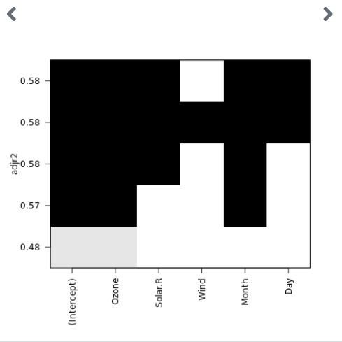
To select an optimal model, look to the point at which variables have black boxes near the top of the y-axis range.
For our example, that would mean using the four-variable model Ozone, Month, Solar.R, and Day. However, as noted previously, the difference between the two and four variable model seems minimal. ...

