Chapter 8. Feedback & Affordance

Feedback Patterns: Errors, Confirmation, System Status
Affordance Patterns: Tap, Flick, Drag
Feedback
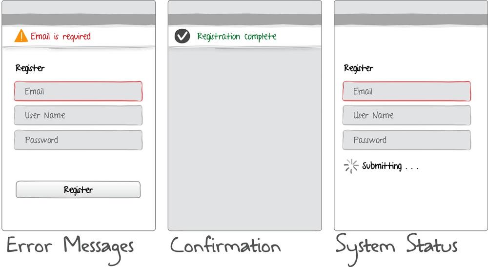
The usability principle of feedback states “Provide appropriate, clear, and timely feedback to the user so that he sees the results of his actions and knows what is going on with the system.” Feedback can vary from simple progress indicators and confirmation messages, to more sophisticated animations and effects. Mobile feedback patterns include:

Figure 8-1. Feedback patterns
Error Messages
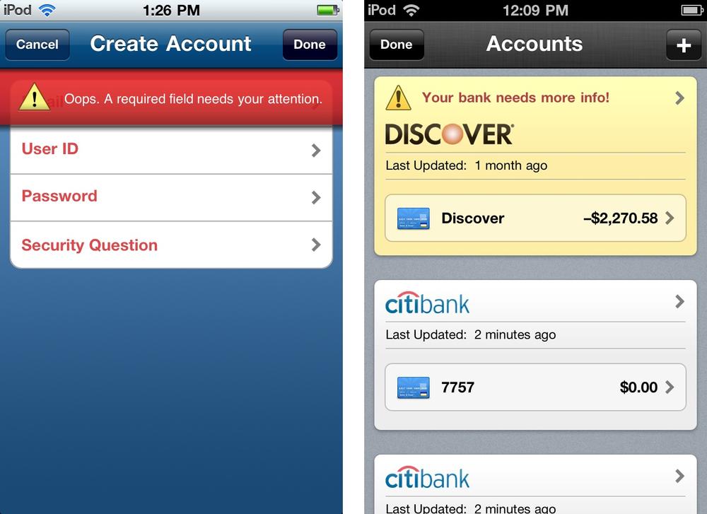
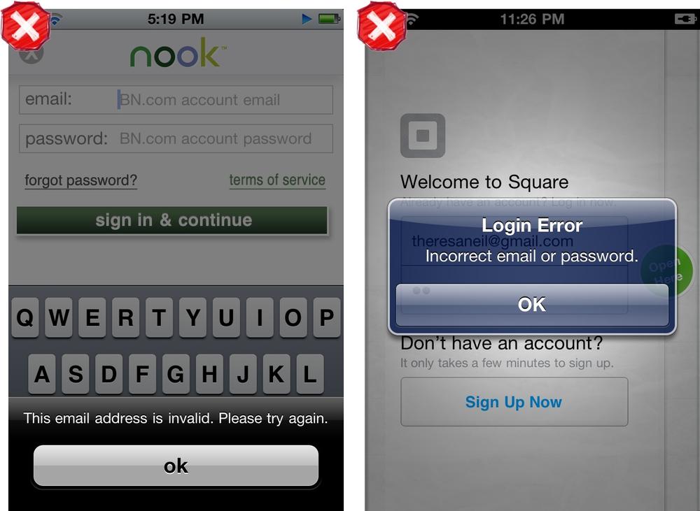
Error messages should be expressed in plain language (no codes), precisely indicate the problem, and constructively suggest a solution. Highly visible error messages on the screen, like TaxCaster and Mint, are preferable to a modal dialog, since a dialog may cover up the issue.

Figure 8-2. TaxCaster and Mint

Figure 8-3. Barnes & Noble Nook, error message in Action Sheet; Square, error message in dialog
Note
Use plain language that offers a solution for resolving the issue. Make the error visible; use in-screen messaging instead of modal dialogs.
Confirmation
Confirmation should be ...
Get Mobile Design Pattern Gallery, Color Edition now with the O’Reilly learning platform.
O’Reilly members experience books, live events, courses curated by job role, and more from O’Reilly and nearly 200 top publishers.

