Chapter 4. Use AutoML to Predict Advertising Media Channel Sales
In this chapter, you build an AutoML model to predict advertising media channel sales. First, you explore your data using Pandas. Then you learn how to use AutoML to build, train, and deploy an ML model to predict sales. You gain an overall understanding of the performance of your model using performance metrics and answer common business questions. Along the way, you’ll learn about regression analysis, a common technique used for prediction use cases.
The Business Use Case: Media Channel Sales Prediction
Businesses use advertising media channels to promote their products, services, or brand. Marketers and media planners create marketing campaigns that may run on digital, TV, radio, or in the newspaper. In this scenario, you work as a media planner in the marketing department for a midsize solar energy company. Your firm has a modest media budget and needs to evaluate which channels offer the greatest number of benefits for the least cost. This is a spend optimization problem.
You have been asked to develop a marketing plan that will increase next year’s product sales. To accomplish this goal, you need to understand the impact of the media channel product advertising budgets on overall sales. The advertising dataset captures the sales revenue generated with respect to advertisement costs across digital, TV, radio, and newspaper media channels.
Typically, this type of ask from the team lead would go to a data scientist or data analyst. But, although you do not have any coding experience, the marketing team lead has asked you to build a sales predictive model using AutoML, something they want to try for the first time on the team. The goal is to build an ML model to predict how much sales volume will be generated based on the money spent in each of the media channels.
Business questions include:
-
Can the model predict how much sales volume will be generated based on the money spent in each media channel?
-
Is there a relationship between advertising budget and sales?
-
Which media channel contributes the most to sales?
-
Can the model be used to forecast future sales based on the media channel’s proposed budget?
-
How accurately can the model predict future sales?
The use case is a simple regression problem with just five variables that you can use to answer the preceding five questions.
Project Workflow
Figure 4-1 shows the high-level overview of the typical AutoML no-code workflow from Chapter 3. This workflow is appropriate for your use case.
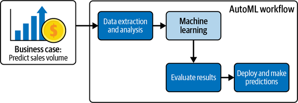
Figure 4-1. AutoML workflow for the business case.
Now that you understand the business use case and objective, you can proceed to data extraction and analysis. Note that this workflow does not include a data preprocessing step. You will get lots of hands-on experience with data preprocessing in later chapters. After data extraction and analysis, you will upload the dataset into the AutoML platform. The advertising budgets of digital, TV, newspaper, and radio data are then fed into the model. You’ll then evaluate the AutoML results and then deploy the model to make predictions. After this chapter’s hands-on exercise, you will be able to create a strategic marketing plan for your team.
Project Dataset
The dataset is composed of historical marketing channel data that can be leveraged to gain insights for spend allocation and to predict sales. The dataset being used for this chapter, the advertising_2023 dataset, is based on data taken from An Introduction to Statistical Learning with Applications in R by Daniela Witten, Gareth M. James, Trevor Hastie, and Robert Tibshirani (Springer, 2021). The advertising dataset captures the sales revenue generated from advertising (in thousands of units) for particular product advertising budgets (in thousands of dollars) for TV, radio, and newspaper media.
For this book, the dataset has been updated to include a digital variable and modified to show the impact of digital budgets on sales. The number of markets has been increased from 200 to 1,200. Thus, the data consists of the advertising budgets for four media channels (digital, TV, radio, and newspapers) and the overall sales in 1,200 different markets. You should feel encouraged to look at other examples of how to work with this dataset to grow your knowledge after completing the exercises in this chapter.
The data is initially supplied in a CSV file, so you will need to spend some time loading the data into Pandas before you can explore it. The dataset contains only numeric variables.
There are five columns in the dataset. Table 4-1 gives the column names, data types, and some information about the possible values for these columns.
Exploring the Dataset Using Pandas, Matplotlib, and Seaborn
Before you begin using AutoML, you follow the workflow discussed in earlier chapters around understanding and preparing data for ML. This section shows you how to load data into a Google Colab notebook using Pandas, an open source Python package that is widely used for data science and data analysis. Once the data is loaded into a DataFrame, you will explore the data. Fortunately, the data has already been cleaned—there are no missing values or strange characters in the dataset. Your exploratory data analysis is to assist you in validating that the data is clean and to explore relationships between the variables to assist you in answering questions posed from the team. As noted in previous chapters, much of the ML work goes into understanding and preparing the training data—not training the model—because you are relying on AutoML to build the model.
All of the code in this section, including some additional examples, is included in a Jupyter notebook titled Chapter4_Media_Channel_Sales_Notebook in the low-code-ai repository on GitHub.
Load Data into a Pandas DataFrame in a Google Colab Notebook
First, go to https://colab.research.google.com and open a new notebook, following the process discussed in Chapter 2. You may rename this notebook to a more meaningful name by clicking on the name as shown in Figure 4-2 and replacing the current name with a new name, say Advertising_Model.ipynb.
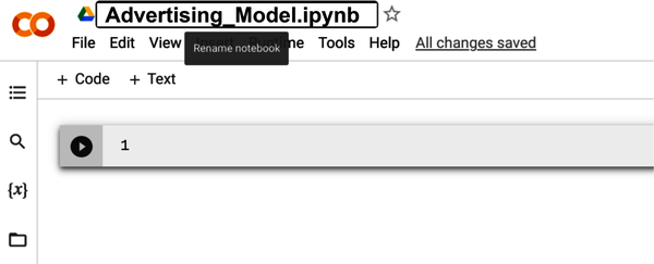
Figure 4-2. Renaming the Google Colab notebook to a more meaningful name.
Now type the following code into the first code block to import the packages needed to analyze and visualize the advertising dataset:
importpandasaspdimportnumpyasnpimportmatplotlib.pyplotaspltfromscipyimportstatsimportseabornassns%matplotlibinline
You saw some of these packages before in Chapter 2 when first exploring the use of Colab notebooks.
Now execute the cell containing the import statements to import the packages. To do this, you click the Run Cell button on the left side of the cell. You can also press Shift + Enter to run the cell.
Now you are ready to import your data. Using Pandas, you can directly import a CSV file into a DataFrame from a location on the internet without having to download the file first. To do this, copy the code from the solution notebook or type in the following code into a new cell and execute the cell:
url="https://github.com/maabel0712/low-code-ai/blob/main/advertising_2023.csv?raw=true"advertising_df=pd.read_csv(url,index_col=0)
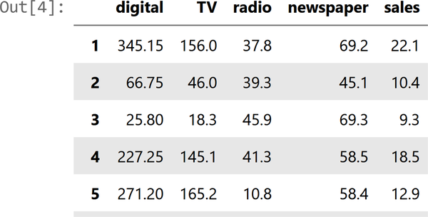
In general, it is a good idea to look at the first few rows of the DataFrame. Use advertising_df.head() to explore the first few rows of the DataFrame. The head Pandas method lets us see the first five rows of our data. By doing this, you can quickly see the features, some of their possible values, and whether they are numerical or not.
An example of a few of the columns is shown in Figure 4-3.
Explore the Advertising Dataset
Now that the data has been loaded into the DataFrame advertising_df, you can begin to explore and understand it. The immediate goal is to get an idea of where there could be issues with the data so that you may resolve those issues before moving forward.
Descriptive analysis: Check the data
First check the data using standard Python methods. To check the data types for your DataFrame, type advertising_df.info() into a new cell and execute the cell. The information contains the number of columns, column labels, column data types, memory usage, range index, and the number of cells in each column (non-null values).
Figure 4-4 shows an example of the info() method output.
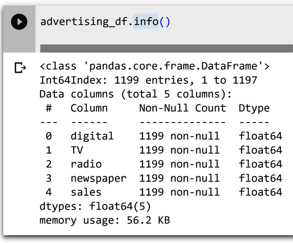
Figure 4-4. Information on the dataset using the info() method.
Note that with information on the data type, you can check to make sure that the types inferred by Pandas match up with what was expected from Table 4-1.
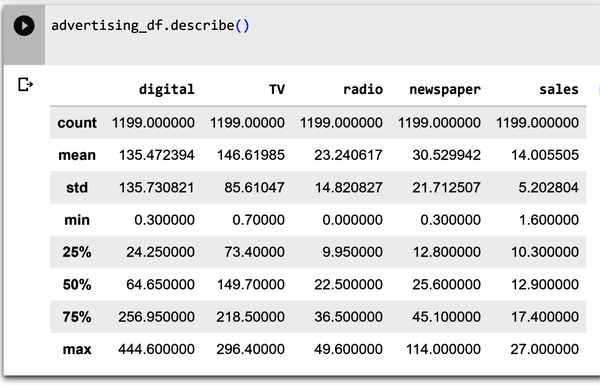
Shown in Figure 4-5 is the describe() method, which computes and displays summary statistics for the dataset. The describe function shows information about the numerical variables of our dataset. You can see the mean, maximum, and minimum values of each of these variables, along with their standard deviation. Type advertising_df.describe() into a new cell and execute the cell.
Shown in Figure 4-6 is the output of the .isnull() method. Type advertising_df.isnull().sum() into a new cell and execute the cell. The output shows all of the columns in the DataFrame with associated zeros. If there were null values, the number of null values for the column would be shown.
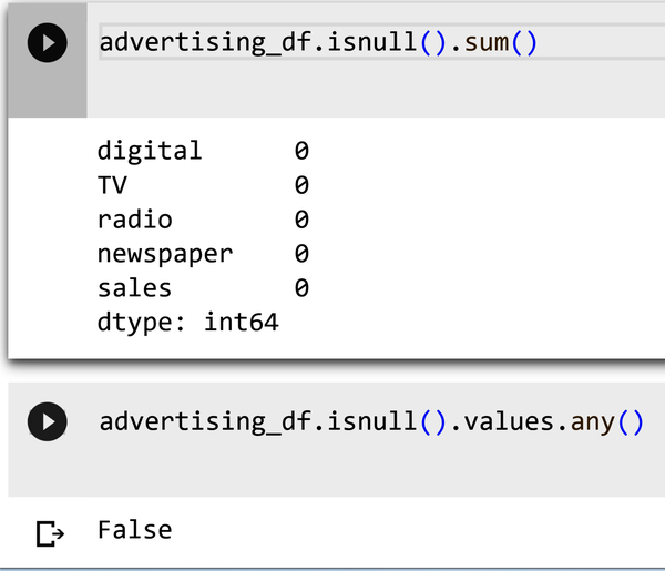
Figure 4-6. Determining null values using the isnull() method.
Explore the data
Exploratory data analysis (EDA) is the first step of any ML project. You need to explore your data before building any ML model. The goal is to take a look at the raw data, explore it, and gather relevant insights from the information derived from the data. Doing this also helps make models better, as you’ll be able to spot any “dirty data” issues—such as missing values, strange characters in a column, etc.—that may impact performance.
Heat maps (correlations)
A heat map is a way of representing the data visually. The data values are represented as colors in the graph. The goal of the heat map is to provide a colored visual summary of information. Heat maps show your relationships (correlations) between variables (features). Correlation is a statistical measure that shows the extent to which two or more variables move together. Shown in Figure 4-7 is the output of a correlation method that plots correlation values on the grid. Type the following code into a new cell and execute the cell:
plt.figure(figsize=(10,5))sns.heatmap(advertising_df.corr(),annot=True,vmin=0,vmax=1,cmap='viridis')
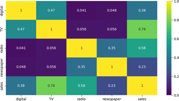
Figure 4-7. Correlation matrix for advertising media channels.
The results from a correlation matrix can be used in a variety of ways, including:
- Identifying relationships between variables
-
The correlation coefficient between two variables can tell you how strongly they are related. A correlation coefficient of 0 means there is no relationship, whereas a correlation coefficient of 1 means there is a perfect positive relationship. A correlation coefficient of –1 means there is a perfect negative relationship. Note that the stronger relationships are between sales and television (0.78), followed by sales and radio (0.58). This information can be used to develop targeted marketing campaigns that are more likely to improve sales.
- Selecting variables for inclusion in a model
-
When you are building a predictive model, you need to select the variables that are most likely to be predictive of the outcome. For example, should you include newspapers (with a 0.23 correlation to sales) as a feature for inclusion in the model to predict sales?
- Detecting multicollinearity
-
Multicollinearity occurs when two or more predictor variables in a regression model are highly correlated. For example, if both TV and radio were highly correlated (meaning that both had a value >0.7 instead of 0.056 as shown in Figure 4-7), it would indicate multicollinearity. Since it is harder to numerically distinguish predictors with a strong collinear relationship from one another, it is more difficult for a regression algorithm to determine the degree of influence or weight one of them should have on sales.
Scatterplots
Scatterplots are used to determine relationships between two numerical variables. They can help you see if there is a direct relationship (positive linear relationship or negative linear relationship, for example) between two variables. Also, they can help you detect if your data has outliers or not. Figure 4-8 shows a scatter of the digital feature and the sales target. Type the following code into a new cell and execute the cell:
advertising_df.plot(kind='scatter',x=['digital'],y='sales')
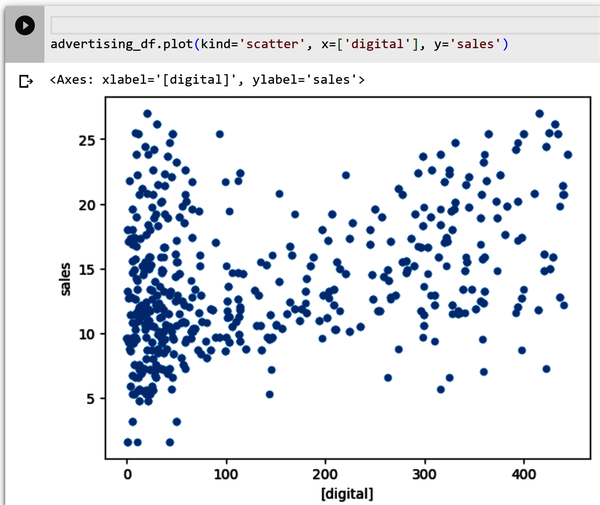
Figure 4-8. Scatterplot of digital and sales.
You want to explore the scatterplots for each variable with the predicted variable sales. You can plot each feature as a scatterplot separately (as you did earlier), or you can plot them so all of the relationships are shown in one plot. Type all of the following code into a new cell and execute the cell (Figure 4-9 shows the output):
plt.figure(figsize=(18,18))fori,colinenumerate(advertising_df.columns[0:13]):plt.subplot(5,3,i+1)# each row three figurex=advertising_df[col]#x-axisy=advertising_df['sales']#y-axisplt.plot(x,y,'o')# Create regression lineplt.plot(np.unique(x),np.poly1d(np.polyfit(x,y,1))(np.unique(x)),color='red')plt.xlabel(col)# x-labelplt.ylabel('sales')# y-label
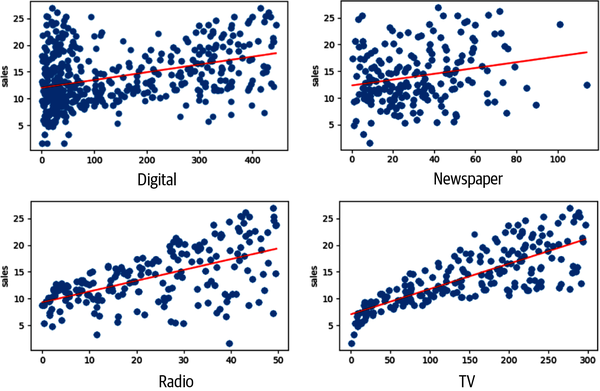
Figure 4-9. Scatterplots of all features and sales targets.
Note that TV and sales have a strong linear relationship—as it appears to show that for an increase in TV budget, there is a positive impact on sales volume. There does not appear to be a strong relationship between newspaper and sales. Recall the correlation values of 0.23 for this relationship. This is very different from the relationship between TV and sales (0.78).
Histogram distribution plot
A common approach to visualizing a distribution is the histogram. A histogram is a bar plot where the axis representing the target variable is divided into a set of discrete bins, and the count of observations falling within each bin is shown using the height of the corresponding bar.
Type this code into a new cell and run the cell:
sns.displot(advertising_df,x="sales")
Figure 4-10 shows the data values from the sales column. The plot looks somewhat like a bell curve that is slightly skewed to the left. The most common sales amount is $11,000 dollars.
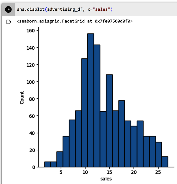
Figure 4-10. Sales histogram that is slightly skewed to the left.
What about the other features—are they skewed left or right or do they have a “normal distribution,” like a bell curve? You can type the preceding code for each individual feature or use the following code to see all of the features together. Type the following code into a new cell and execute the cell (Figure 4-11 shows the output):
lis=['digital','newspaper','radio','TV']plt.subplots(figsize=(15,8))index=1foriinlis:plt.subplot(2,2,index)sns.distplot(advertising_df[i])index+=1
As you saw in Figure 4-10, sales have somewhat of a normal distribution. However, in Figure 4-11, digital appears to be skewed left, and TV, radio, and newspaper are not normally distributed. Standardizing these features so they are normally distributed before feeding them into your ML model would generate better results.
Note
However, your role is not that of a data scientist. Do not worry about understanding these concepts. Discussing each transformation required for the features is beyond the scope of this chapter. Chapter 7 is where you perform transformations on a dataset.
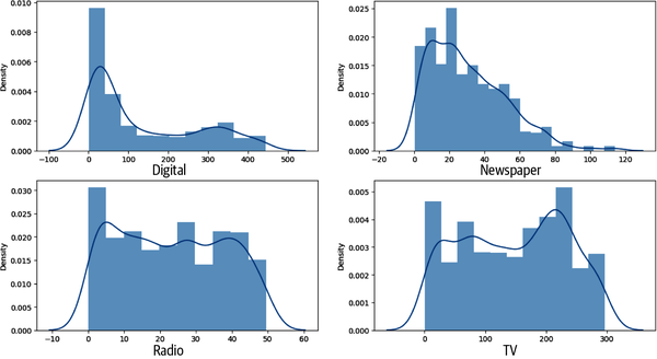
Figure 4-11. Distribution plots for digital, TV, radio, and newspaper.
Export the advertising dataset
After you have checked and explored the dataset, it is time to export the file so that it can be uploaded into your AutoML framework. Type the following code into a new cell and execute the cell. The first line imports the operating system that will allow you to make a directory called data (lines two and three):
importosifnotos.path.isdir("/content/data"):os.makedirs("/content/data")
After the directory has been created, type the following code into a new cell and execute the cell. The first line of code creates a CSV file format of the advertising DataFrame and places it in the content/data directory you made in the previous step:
advertising_df.to_csv('/content/data/advertising.csv',encoding='utf-8',index=False)
Figure 4-12 shows the newly created directory called data with the file advertising.csv.

Figure 4-12. Newly created data directory with advertising.csv file.
As a best practice, validate that you can see the contents of the newly exported file in the newly created directory. Type !head /content/data/advertising.csv into a new cell and execute the cell. Check that the output shown in Figure 4-13 is the same as yours.
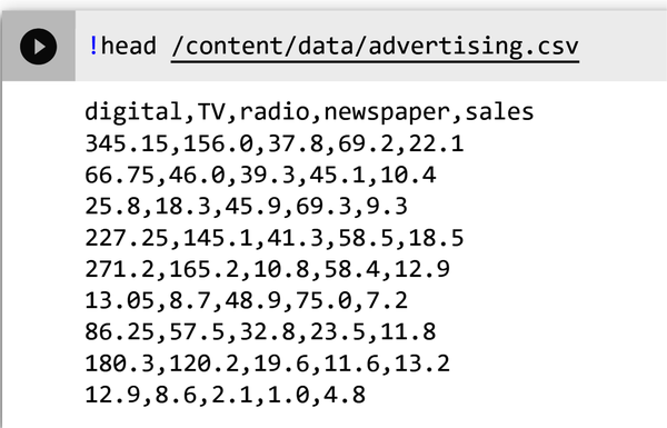
Figure 4-13. Output of the advertising.csv file.
Now that you have verified that the file has been properly exported, you can download it to your computer.
Right-click the advertising.csv file in the newly created data directory and select Download as shown in Figure 4-14. The file will download to your desktop. You are now ready to upload the file for AutoML use.
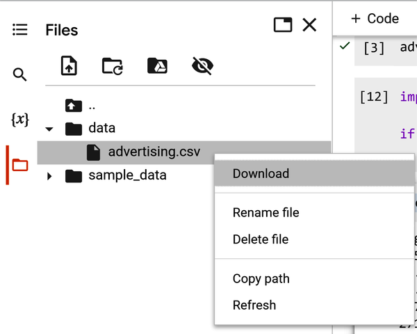
Figure 4-14. Validate advertising.csv in data directory.
In the next section, you build a code-free model based on the training data file you just exported.
Use AutoML to Train a Linear Regression Model
The AutoML projects for this book will be implemented using Google’s Vertex AI, the GUI-based AutoML and custom training framework the authors are most familiar with. Note that the top three major cloud vendors (Google, Microsoft, and AWS) all offer AutoML tutorials. Each of these three major cloud vendor’s guides can be found in their documentation. Many cloud vendors offer a trial period to explore their products without cost.
Given that Google offers a step-by-step tutorial on AutoML, some introductory steps are excluded.
Figure 4-15 shows a high-level overview of the AutoML no-code workflow for your business use case.

Figure 4-15. AutoML no-code workflow for your use case.
No-Code Using Vertex AI
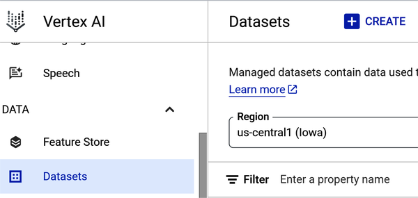
Figure 4-16 shows the Vertex AI Dashboard. To create an AutoML model, turn on the Vertex AI API by clicking the Enable All Recommended APIs button. From the left-hand navigation menu, scroll down from Dashboard and select Datasets.
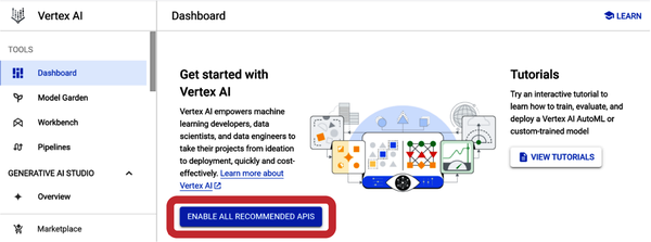
Figure 4-16. Vertex AI Dashboard showing the Enable All Recommended APIs button.
Create a Managed Dataset in Vertex AI
Vertex AI offers different AutoML models depending on data type and the objective you want to achieve with your model. When you create a dataset you pick an initial objective, but after a dataset is created you can use it to train models with different objectives. Keep the default region (us-central1), as shown in Figure 4-17.
Select the Create button at the top of the page and then enter a name for the dataset. For example, you can name the dataset advertising_automl.
Select the Model Objective
Figure 4-18 shows Regression/classification selected as the model objective under the Tabular tab. Given that you want to predict a target column’s value (sales), this is the appropriate selection.
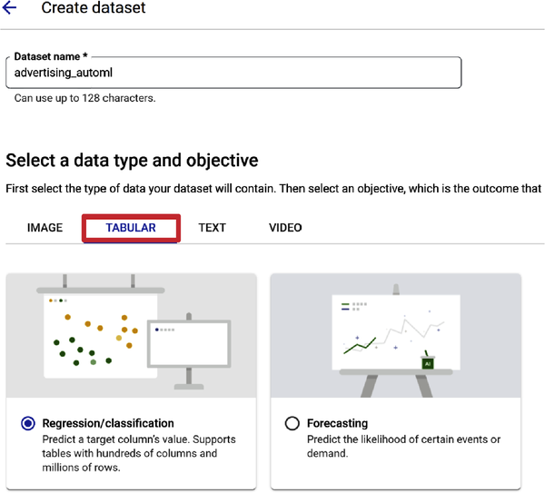
Figure 4-18. Regression/classification selection for model objective.
You selected Regression/classification as your objective. Let’s cover some basic concepts to help you with future use cases. Regression is a supervised ML process. It is similar to classification, but rather than predicting a label for a classification, such as classifying spam from your email inbox, you try to predict a continuous value. Linear regression defines the relationship between a target variable (y) and a set of predictive features (x). If you need to predict a number, then use regression. In your use case, linear regression predicts a real value (sales) using some independent variables given in the dataset (digital, TV, radio, and newspaper).
Essentially, linear regression assumes a linear relationship with each feature. The predicted values are the data points on the line, and the true values are in the scatterplot. The goal is to find the best fitting line so that when new data is input the model can predict where the new data point will be in relation to the line. The “evaluation” of how good that fit is includes an evaluation criteria—which is covered in “Evaluate Model Performance”.
Figure 4-19 shows a “best-fit” line based on your dataset, where the model tries to fit the line to your data points, which are the dark scatters.
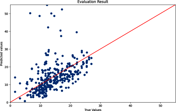
Figure 4-19. True and predicted values with a best-fitted line.
After making the Regression/classification selection, scroll down and click the Create button. You are now ready to add data to your dataset. Vertex AI–managed datasets are available for a variety of data types, including tabular, image, text, and video data.
Figure 4-20 shows the data source upload options—upload CSV from your computer, select CSV files from Cloud Storage, or select a table or view from BigQuery (Google’s data warehouse).
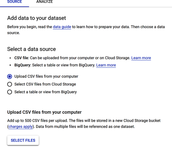
Figure 4-20. Data source upload options for your dataset file.
To upload your advertising dataset, select “Upload CSV files from your computer.” Find the file on your local computer and load it.
Scroll down the page and review the Select a Cloud Storage Path section, which requires that you store the file in a cloud storage bucket. Why do you need to store the file in a cloud storage bucket? Two reasons: (1) when training a large-scale ML model, you may need to store terabytes or even petabytes of data; and (2) cloud storage buckets are scalable, reliable, and secure.
Figure 4-21 shows that the file Advertising_automl.csv has been uploaded and a cloud storage bucket has been created to store the uploaded file. To see the step-by-step process of creating the storage bucket and the entire exercise, see the PDF entitled Chapter 4 AutoML Sales Prediction in the repository.
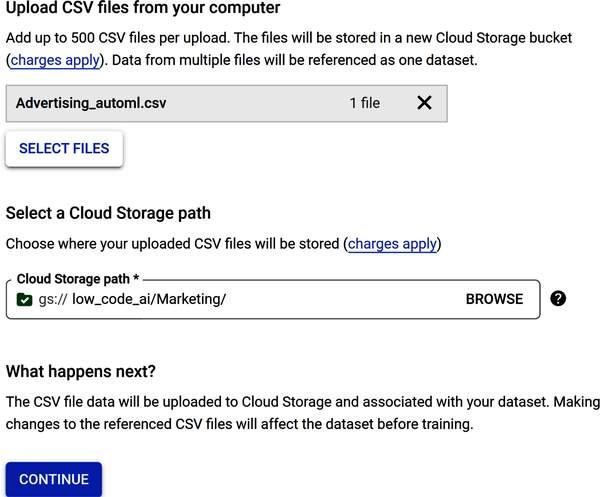
Figure 4-21. Data source options to load a CSV file and store it in a cloud storage bucket.
Some frameworks will generate statistics after the data loads. Other frameworks help minimize the need to manually clean data by automatically detecting and cleaning missing values, anomalous values, and duplicate rows and columns. Note that there are a few additional steps that you can employ, such as to review the data after it has loaded to check for missing values and view data statistics.
Figure 4-22 shows the output of the Generate Statistics window. Note there are no missing values and the number of distinct values for each column is shown.
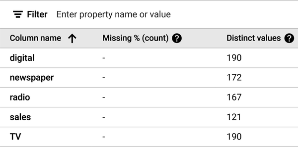
Figure 4-22. The output of the Generate Statistics window.
AutoML presents a data profile of each feature. To analyze a feature, click the name of the feature. A page shows the feature distribution histograms for that feature.
Figure 4-23 shows the data profile for sales. Note that the mean is 14.014, which is very close to the numeric value you received when you typed in the advertising_df.describe() code earlier in the chapter as you were exploring the dataset.
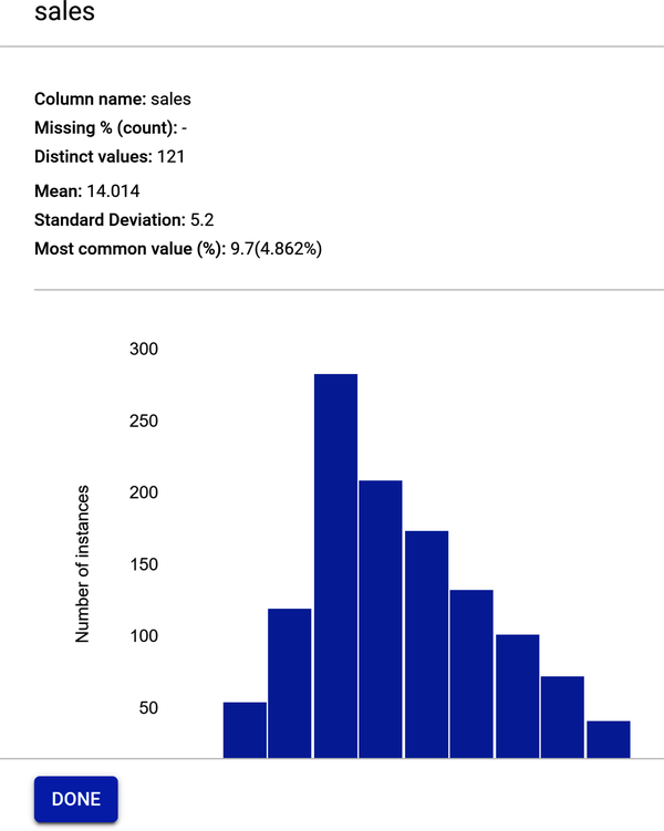
Figure 4-23. Feature profile for sales.
Build the Training Model
Figure 4-24 shows that the model is now ready to train. Select Train New Model under the “Training jobs and models” section. Select Other and not AutoML on Pipelines. AutoML on Pipelines is a feature that allows you to specify the type of ML model you want to build and other parameters. It is beyond the scope of the book.
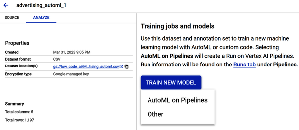
Figure 4-24. Model now ready for training.
The “Train new model” window appears. There are four steps:
-
Select the training method
-
Configure model details
-
Determine training options
-
Select compute and pricing
In Step 1, under the Objective, select the drop-down and choose Regression. Under “Model training method,” select AutoML (as shown in Figure 4-25). Click Continue.
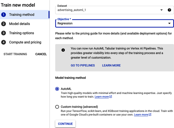
Figure 4-25. Configure the training method in Step 1.
In Step 2, under “Model details,” name your model and give it a description. Under “Target column,” select sales from the drop-down (as shown in Figure 4-26). Click Continue.
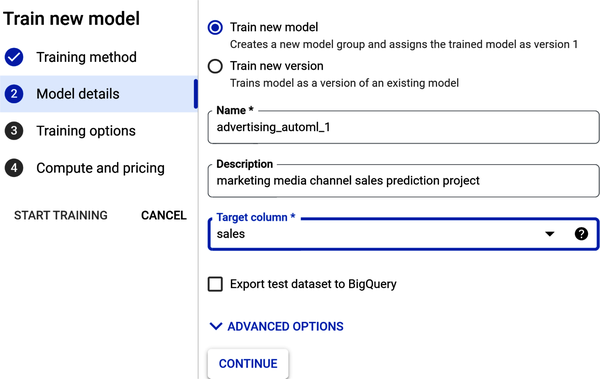
Figure 4-26. Add model details in Step 2.
In Step 3, review the training options. Note that any data transformations (or data processing) such as standardization are handled automatically (as shown in Figure 4-27). Click Continue.
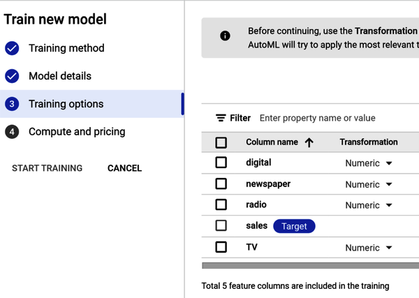
Figure 4-27. Add training options in Step 3.
In Step 4, you see “Compute and pricing” (as shown in Figure 4-28). The time required to train your model depends on the size and complexity of your training data. A node hour is one hour’s usage of one node (think virtual machine) in the cloud, spread across all nodes. Enter the value 3 in the Budget field for maximum number of node hours—this is just an estimate. You pay only for compute hours used; if training fails for any reason other than a user-initiated cancellation, you are not billed for the time. You are charged for training time if you cancel the operation.
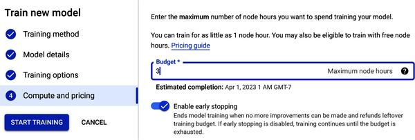
Figure 4-28. Select compute and pricing in Step 4.
Also under “Compute and pricing” is early stopping. When you enable this option, this means that training will end when AutoML determines that no more model improvements can be made. If you disable early stopping, AutoML will train the model until the budget hours are exhausted.
Once all the parameters are entered, you start the training job. Click Start Training.
After model training, the model is registered in the model registry (as shown in Figure 4-29).
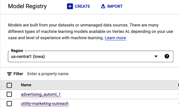
Figure 4-29. Advertising_automl model showing in model registry.
Note
As previously mentioned, training can take up to several hours, depending on the size of your data and type of model objective you choose. Image and video data types may take much longer to process than a structured data type such as a CSV file. The number of training samples also impacts training time.
Also, AutoML is time intensive. AutoML algorithms need to train a variety of models, and this training process can be computationally expensive. This is because AutoML algorithms typically try a large number of different models and hyperparameters, and each model needs to be trained on the entire dataset. AutoML algorithms then need to select the best model from the set of trained models, and this selection process can also be time-consuming. This is because AutoML algorithms typically need to evaluate the performance of each model on a holdout dataset, and this evaluation process can be computationally expensive.
Evaluate Model Performance
Figure 4-30 shows the model training results.

Figure 4-30. Model training results with five evaluation metrics.
There are a few factors that a practitioner should consider when weighing the importance of different linear regression evaluation metrics:
- The purpose of the model
-
The purpose of the model will determine which evaluation metrics are most important. For example, if the model is being used to make predictions, then the practitioner may want to focus on metrics such as mean squared error (MSE) or root mean squared error (RMSE). However, if the model is being used to understand the relationship between variables, then the practitioner may want to focus on metrics such as R-squared or adjusted R-squared.
- The characteristics of the data
-
The characteristics of the data will also affect the importance of different evaluation metrics. For example, if the data is noisy (e.g., contains unwanted information or errors), then the practitioner may want to focus on metrics that are robust to noise, such as mean absolute error (MAE). However, if the data is not noisy, then the practitioner may be able to focus on metrics that are more sensitive to changes in the model, such as MSE.
- The practitioner’s preferences
-
Ultimately, the practitioner’s preferences will also play a role in determining the importance of different evaluation metrics. Some practitioners may prefer metrics that are easy to understand, while others may prefer metrics that are more accurate. There is no right or wrong answer, and the practitioner should choose the metrics that are most important to them.
Here are common linear regression evaluation metrics:
- R-squared
-
R-squared is a measure of how well the model fits the data. It is the square of the Pearson correlation coefficient between the observed and predicted values. It is calculated by dividing the sum of squared residuals (the difference between the predicted and the actual values) by the total sum of squares. A higher R-squared value indicates a better fit. R-squared ranges from 0 to 1, where a higher value indicates a higher-quality model. Your R2 should be around 0.997.
- Adjusted R-squared
-
Adjusted R-squared is a modified version of R-squared that takes into account the number of independent variables in the model. It is calculated by dividing the sum of squared residuals by the total sum of squares minus the degrees of freedom. A higher adjusted R-squared value indicates a better fit, but it is less sensitive to the number of independent variables than R-squared.
- Mean squared error (MSE)
-
MSE is a measure of the average squared error between the predicted values and the actual values. A lower MSE value indicates a better fit. Figure 4-31 shows the loss visualized in a table and graph.
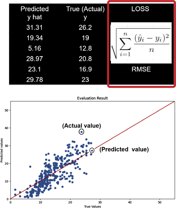
Figure 4-31. Loss formula for RMSE of true and predicted values.
- Root mean squared error (RMSE)
-
RMSE is the square root of MSE. It is a more interpretable version of MSE. A lower RMSE value indicates a better fit and a higher-quality model, where 0 means the model made no errors. Interpreting RMSE depends on the range of values in the series. Your RMSE should be around 0.345.
- Root mean squared log error (RMSLE)
-
Interpreting RMSLE depends on the range of values in the series. RMSLE is less responsive to outliers than RMSE, and it tends to penalize underestimations slightly more than overestimations. Your RMSLE should be around 0.026.
- Mean absolute error (MAE)
-
MAE is a measure of the average absolute error between the predicted values and the actual values. A lower MAE value indicates a better fit. Your MAE should be around 0.304.
- Mean absolute percentage error (MAPE)
-
MAPE ranges from 0% to 100%, where a lower value indicates a higher-quality model. MAPE is the average of absolute percentage errors. Your MAPE should be around 2.28.
Model Feature Importance (Attribution)
Model feature importance tells you how much each feature impacted model training. Figure 4-32 shows attribution values expressed as a percentage; the higher the percentage, the more strongly the correlation—that is, the more strongly that feature impacted model training. Feature attribution allows you to see which features contributed most strongly to the resulting model training shown in Figure 4-32.
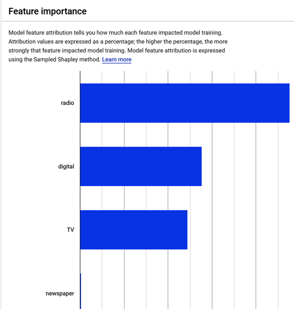
Figure 4-32. Advertising dataset feature importance results.
If you were to hover over the newspaper feature shown in Figure 4-32, you would see that its contribution to model training is 0.2%. This supports what you discovered during the EDA phase you completed earlier—the relationship between sales and newspaper advertising spend is the weakest. These results mean that advertising on radio, digital, and TV contribute the most in sales, and newspaper advertisements have little effect on sales.
Get Predictions from Your Model
To deploy your model, you will need to test it. You can deploy to your environment to test your model without building an application you would need to deploy to the cloud. After you train an ML model, you need to deploy the model so that others can use it to do inferencing. Inferencing in machine learning is the process of using a trained ML model to make predictions on new data.
There are four steps, but for this chapter you’ll only need the first two. For this exercise, it is not necessary to configure model monitoring or model objectives. Model monitoring adds an additional charge for logging, while model objectives require you to choose from a variety of model objectives, depending on the type of model you are training and the application you are using it for. Here are the four steps:
-
Define your endpoint.
-
Configure model settings.
-
Configure model monitoring.
-
Configure model objectives.
Note
What are endpoints and deployments? In ML, an endpoint is a service that exposes a model for online prediction. A deployment is the process of making a model available as an endpoint. An endpoint is an HTTPS path that provides an interface for clients to send requests (input data) and receive the inferencing (scoring) output of a trained model. Endpoints are typically used to make predictions in real time. For example, you could use an endpoint to predict the likelihood of a customer clicking on an ad or the risk of a loan defaulting.
Deployments are typically used to make a model available to a larger audience. For example, you could deploy a model to a production environment so that it can be used by your customers or employees.
Figure 4-33 shows the deploy and test page. To deploy your model, go to Model Registry, select Deploy and Test, and select your model.
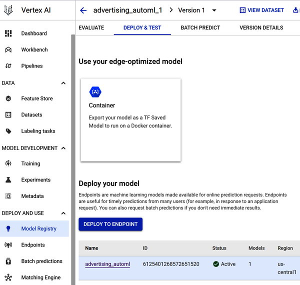
Figure 4-33. Deploy your model to an endpoint page.
In Step 1, you define your endpoint. You select a region and determine how your endpoint will be accessed.
In Step 2, you add the model and add traffic split. A traffic split in Vertex AI is a way to distribute traffic between multiple models that are deployed to the same endpoint. This can be useful for a variety of purposes, such as:
- A/B testing
-
Traffic splitting can be used to A/B test different models to see which one performs better.
- Canary deployments
-
Traffic splitting can be used to deploy a new model to a small percentage of users before deploying it to a larger audience. This can help to catch any problems with the new model before they affect too many users.
- Rollouts
-
Traffic splitting can be used to roll out a new model to users gradually. This can help to mitigate the impact of any problems with the new model.
In Step 3, you choose how compute resources will serve the predictions to your model (shown in Figure 4-34). For this exercise, use the minimum number of compute nodes (virtual machine servers). Under “Machine type,” select Standard.
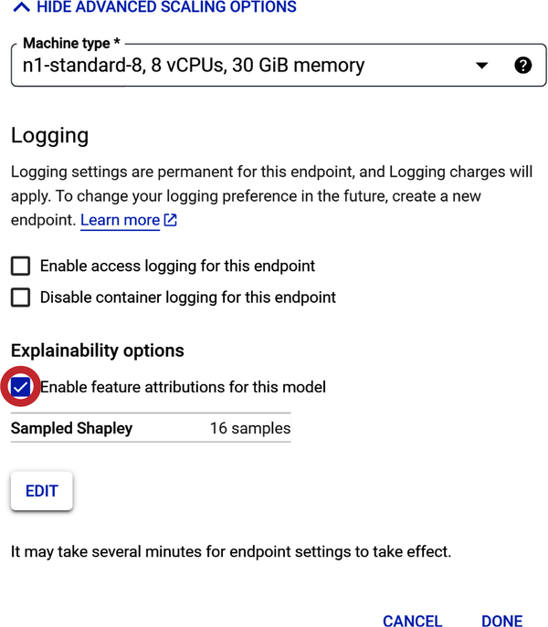
Figure 4-34. Select compute resources to train the model.
Note: “Machine types” differ in a few ways: (1) number of virtual central processing units (vCPUs) per node, (2) amount of memory per node, and (3) pricing.
There are a few factors to consider when choosing compute resources for a prediction model:
- Size and complexity of the model
-
The larger and more complex the model, the more compute resources it will need. (This is more applicable to custom coding neural networks.)
- Number of predictions that will be made
-
If you expect to make a large number of predictions, you will need to choose a compute resource that can handle the load.
- Latency requirements
-
If you need to make predictions in real time or with very low latency, you will need to choose a compute resource that can provide the necessary performance. Note: low latency in machine learning refers to the time it takes for an ML model to make a prediction once it receives a new data point.
- Cost
-
Compute resources can vary in price, so you will need to choose one that fits your budget.
Once you have considered these factors, you can start to narrow down your choices. Here are a few examples of compute resources that can be used to serve prediction models:
- CPUs
-
Central processing units (CPUs) are the most common type of compute resource and are a good choice for models that are not too large or complex.
- GPUs
-
Graphics processing units (GPUs) are more powerful than CPUs and can be used to speed up the training and inference of large and complex models.
- TPUs
-
Tensor processing units (TPUs) are specialized hardware accelerators that are designed for ML workloads. They are the most powerful option and can be used to train and serve the most demanding models.
As part of Step 2 under “Model settings,” there is a Logging setting. If you enable endpoint logging, charges will apply. Thus, for this exercise, please do not enable it.
The next setting is Explainability options, which do not carry a charge. Check “Enable feature attributions for this model.”
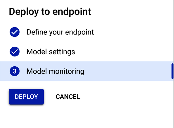
Step 3 is “Model monitoring.” Do not enable it for this project (as shown in Figure 4-35).
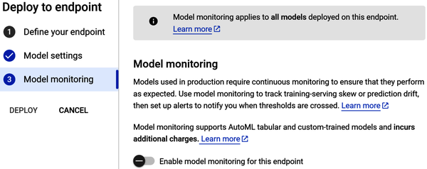
Figure 4-35. “Model monitoring” configuration window.
Now that all configurations are made, the Deploy button should be highlighted. Click Deploy to deploy your model to the endpoint (as shown in Figure 4-36).
After the endpoint is created and the model deployed to the endpoint, you should receive an email regarding the endpoint deployment status. If deployment was successful, you can start making predictions. There are four steps:
-
Go to Model Registry.
-
Select your model.
-
Select the model’s version.
-
Scroll down until you see the “Test your model” page.
Figure 4-37 shows the “Test your model” page. Note, this page could be an app or web page that looks like this—where you and your team input media channel values and predict sales volume.
Click the Predict button.
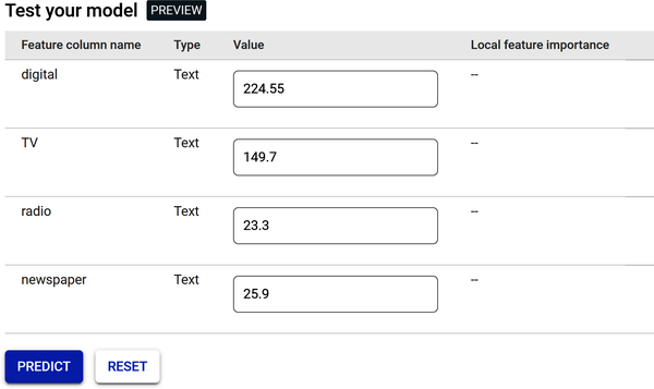
Figure 4-37. Testing page for online predictions.
After clicking the Predict button, you will get a prediction for your label (sales), as shown in Figure 4-38.
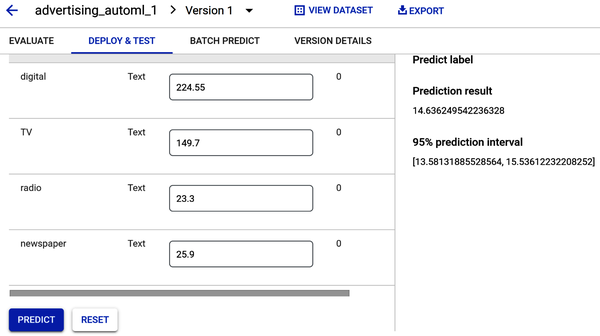
Figure 4-38. Prediction of sales volume based on initial values.
Regression models return a prediction value. Figure 4-38 shows a sales prediction result value of 14.63—which is very close to the mean from the sales histogram (shown in Figures 4-10 and 4-23). The prediction interval provides a range of values that the model has 95% confidence to contain the actual result. So, since the sales prediction result is 14.63, and the prediction interval is a range between 13.58 and 15.53, you can be 95% certain that any prediction result will fall within this range.
Now, let’s answer those business questions.
The goal was to build an ML model to predict how much sales volume will be generated based on the money spent in each of the media channels.
- Can the model predict how much sales volume will be generated based on the money spent in each media channel?
-
Yes. Since Vertex AI allows you to input values for each media channel, you can now make decisions about future budget allocation. For example, your company’s strategic media plan may now include increasing the digital channel budget based upon the results obtained from a prediction.
- Is there a relationship between advertising spend and sales?
-
Yes. There is a positive linear relationship between advertising spend and sales for digital, TV, and radio. Newspaper spend has a weak relationship to sales.
- Which media channel contributes the most to sales?
-
TV contributes more to sales than the other media channels. How? The scatterplot you built during the EDA section, and your review of the Vertex AI feature’s attribution bar chart after the model was trained, show the contribution of TV to sales.
- How accurately can the model predict future sales?
-
The regression model returns a prediction value when media channel values are input into the Predict window to predict sales volume. The prediction results showed a sales prediction value and prediction interval. Prediction intervals can be used to make decisions about future observations, so you can be 95% certain that any future sales prediction result will fall within that range.
Warning
Do not forget to undeploy your model once you are finished with this chapter. Deployed models incur cost even when they are not being used so that they are always available to return quick predictions. To undeploy the model, go to Vertex AI Endpoints, click the endpoint name, then click the “More actions” three-dot menu, and finally click “Undeploy model from endpoint.”
Summary
In this chapter, you built an AutoML model to predict advertising media channel sales. You explored your data using Pandas, creating heat maps, scatterplots, and histograms. After you exported the data file, you uploaded it into Google’s Vertex AI framework. Then you learned how to use Google Cloud’s AutoML to build, train, and deploy an ML model to predict sales. You gained an overall understanding of the performance of your model using performance metrics and answered common business questions. You used the model to make online predictions and do a bit of budget forecasting. You are now ready to present to your team!
Get Low-Code AI now with the O’Reilly learning platform.
O’Reilly members experience books, live events, courses curated by job role, and more from O’Reilly and nearly 200 top publishers.
