Creating a simple three-column layout
Let's assume that we are building a simple responsive website and we need a three-column layout for our template. Here's what your markup should look like:
<div class="container">
   <div class="row">
      <div class="col-md-4">
         <!-- column 1 //-->
      </div>
      <div class="col-md-4">
         <!-- column 2 //-->
      </div>
      <div class="col-md-4">
         <!-- column 3 //-->
      </div>
   </div>
</div>
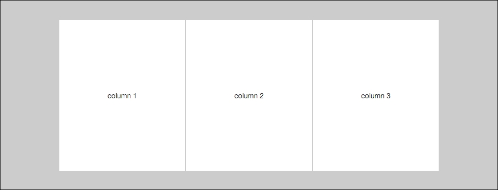
As you can see, I've inserted three <div>s inside my row <div>, each with a class of .col-md-4. For devices that have a resolution of 768 pixels or greater, you'll see a three-column layout like this:

Now, if you were to view this same layout on a device ...
Get Learning Bootstrap 4 - Second Edition now with the O’Reilly learning platform.
O’Reilly members experience books, live events, courses curated by job role, and more from O’Reilly and nearly 200 top publishers.

