Chapter 4. View Essentials
Views are an essential piece of what makes Airtable effective as a collaboration platform. Airtable Views offer more options for how data can be viewed than what you see in a spreadsheet. For example, you can put a filter on a spreadsheet column to see the tasks that occurred within the last year. But let’s assume that your colleague opens the file a few hours later, clears your filter, and creates a different filter on a column. When you return to the file, the filtered rows you see are different, and the resulting rows of their filter is now in place. With Airtable, instead of just a single snapshot of the data, you and each of your collaborators have multiple customized views from the different Airtable view types (e.g., Grid, Calendar), each of which can have its own filter (and more).
Airtable gives you six kinds of views to configure for visualizing your data. For example, you might want to understand your data over a period of time. You can create a Calendar view, a Timeline view, or a Gantt view. Or you may need to see a more visual representation of your records, where an image from each record is enlarged on a movable card. This is possible with the Gallery and Kanban views. Views can serve these needs, and countless others, without changing the underlying data in your base. Among these six types, you can create multiple views of the same type.
When you first create an Airtable base, you are presented with a Grid view. This is the view in Airtable in which you’ll lay the groundwork for configuring your base. After we cover the fundamentals of views with the Grid, we’ll move on to the other views in Chapter 6.
It’s critical to understand that each view always presents a table’s data, but you can frame that data in many different ways depending on how a view is configured. And conversely, any changes to records in the table affect the data of all views.
Just like how a photo filter in Photoshop can transform the look and feel of a photo without necessarily altering the original image, Airtable views give you different ways to visualize your data without changing the underlying data itself.
And just as applying a filter to a photo doesn’t actually modify the original image file, creating a view in Airtable doesn’t affect the underlying data in your base. It simply presents the data in a different format or arrangement. You can toggle between views and explore your data from various angles without making permanent changes.
Configuring Views
Users can configure the data that a view displays. Some of these controls are available in every view, such as the ability to filter records. However, some apply to only one or two views, such as the ability to change the height of rows in the Grid view. Of the seven views in Airtable, Table 4-1 notes which configuration option is present in each.
| Name | Hide fields | Filter | Group | Sort | Color | Height | Share view | Customize | Summary bar |
|---|---|---|---|---|---|---|---|---|---|
| Grid | ✓ | ✓ | ✓ | ✓ | ✓ | ✓ | ✓ | ✓ | |
| Calendar | ✓ | ✓ | ✓ | ✓ | ✓ | ✓ | |||
| Gallery | ✓ | ✓ | ✓ | ✓ | ✓ | ✓ | |||
| Kanban | ✓ | ✓ | ✓ | ✓ | ✓ | ✓ | ✓ | ||
| Timeline | ✓ | ✓ | ✓ | ✓ | ✓ | ✓ | ✓ | ✓ | ✓ |
| Gantt | ✓ | ✓ | ✓ | ✓ |
Getting Started with the Grid View
The Grid view is the default view for a new Airtable base and where most data entry happens in the Data section of Airtable (however, the increasing robustness of Interfaces is increasingly moving manual data entry/modification away from the Data section). Plus, it’s usually where you will do the initial configuration of fields on your base.
You can customize the information presented in a given view via controls in the toolbar. Above the names of fields in a table is a horizontal toolbar with icons for Hide fields, Filter, Group, Sort, and other configuration options, as shown in Figure 4-1.

Figure 4-1. The various options for customizing the Grid view via a toolbar of controls.
Let’s create another base we can reference as we move through these different views. This time, let’s set up a base to organize a band’s concert tour and call it “tour tracker.”
Planning and scheduling a concert tour is a complicated endeavor. You need to book concert venues, find lodging, plan a route across the country that’s efficient, and, of course, make sure that tour will be profitable. Airtable is great for planning projects of all kinds, and we’ll be able to see how to leverage dates and times by working from a project-oriented base. To get started, we will have a base with just information about the band’s small summer tour in 2022, as shown in Figure 4-2.

Figure 4-2. A simple base with one table that keeps track of our summer tour.
The Grid View’s Configuration Options
Airtable provides a handful of ways to control which of our records are visible for practically every view. For instance, most views have the option to Filter, Sort, Color, Hide fields, and Share your data. (The Share option isn’t really a configuration option because it doesn’t change what data it presents in a view, similar to how a Button field isn’t really a field because it doesn’t store data that can be accessed.)
Filtering
Filtering allows us to customize which records are displayed in a view. A condition is the atomic unit of filtering, and it has three pieces, including 1) the field that you’re filtering with that condition; 2) the operator, which is how you filter; and 3) the value, which is what you compare your records against with the operator. So the structure of an Airtable filtering condition is:
-
Field
-
Operator
-
Value
For example, as shown in Figure 4-3, if we set up a condition for a numerical field, we can use conditions like “equal to” or “less than.” These two options would not be available to filter a text field.

Figure 4-3. Filtering a set of records using a value from a Number field.
In the previous example, the field we chose is Capacity, the amount of people a venue holds, and we want to use Filter to show us only the venues that can hold 900 or more attendees (900 is the value of the condition).
Now let’s filter a text field. We can search to see which records contain certain text in a field. For example, we may want to know how many times we’ll be staying in a Fairmont hotel. We can search the “Lodging” text field to see if it contains the word “Fairmont,” then we can choose the operator “contains” to find records with that word in the Lodging field value (see Figure 4-4).

Figure 4-4. Searching a text field with a fragment of text using the “contains” operator.
As we’ve seen, fields holding text or numerical data can be filtered with operators unique to those types of data. Filtering a Multiple select field shows us another example of unique operators based on the field type we’re filtering. Since a Multiple select field has a defined set of options, we can use conditions like “has any of” to specify that we want to filter records with one or more of the options. Or we can use “has none of,” which ensures that none of the resulting records have any of the options we specify.
For instance, in our Instruments field, we can note whether the instruments the band will perform with at a show are either their own (Band), from the venue (Venue), or rented from an instrument rental company (Rental). In Figure 4-5, we can choose to filter out the shows where we are using rental equipment by using the “has none of” operator.
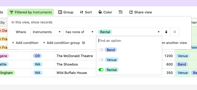
Figure 4-5. Using the “has none of” operator on a Multiple select field.
Both “is empty” and “is not empty” are powerful tools to filter records. Since these two operators only check whether a field has a value or not, there is no value to specify in the third component of the condition—the condition only has two components instead of three. Filtering for whether a field is empty or not can be used on any field type. For example, if we want to check for missing phone numbers in the “Venue number” field, then we can specify that phone number field and choose “is empty” for the operator. As we can see in Figure 4-6, this condition will show every record missing a value in the Venue number field.

Figure 4-6. The “is empty” and “is not empty” operators are available for any field type.
Conjunctions and condition groups
Using a single condition in a filter helps you understand what your records contain. But Airtable also unlocks considerably more powerful data analysis with the ability to specify multiple conditions using the conjunctions “and” and “or.”
For example, while looking for records without a venue phone number, we might be especially concerned about the venues in California where the tour begins. Using a conjunction to combine two conditions into a condition group makes this task easy.
Let’s use the “and” conjunction to find records in our table of California venues without a phone number. Our first condition for the venue phone number field is “is empty,” and then we create a new condition connected with an “and” conjunction. The second condition begins by choosing the State field along with the operator “is” and our value of “CA” (one of the options in our Single select field State). The result, which we can see in Figure 4-7, highlights the fields where we’ve applied conditions, and it shows we are missing a phone number for three California venues. We see the result in Figure 4-8.

Figure 4-7. The conjunctions “and” and “or” allow us to combine multiple conditions as a condition group.

Figure 4-8. The result of combining two filter conditions.
Let’s look at one more simple example before we combine a condition group with another condition. Instead of using the conjunction “and,” let’s try using “or.”
We need to account for extra time getting to some of our performances early. For example, if a venue is large or the band is using rental equipment, those conditions require the band to arrive a few hours earlier. So we can simply set up an “or” conjunction to show us the records that meet the condition of either a capacity over 900 or the Equipment field, including the selection “Rental.”
As we see in Figure 4-9, we have five records that meet the criteria. Four of them have a capacity of over 900, while one venue is smaller but does have instruments from a rental company. Using the “or” conjunction in this condition allowed us to ensure we understood every venue where we needed to be early.

Figure 4-9. Using the “or” conjunction to show results for two different conditions simultaneously.
But what if we only want to know which venues in California are either large or use rental equipment? If we try to add a third condition using the “and” conjunction to specify “CA” for the state, we cannot do that. We can only add another “or” conjunction. However, using nested filters is where Airtable’s filtering can add layers of “and” plus “or” logic.
Nesting condition groups
Using nested condition groups, we can combine a condition group with another condition or condition group. For example, when we want to understand when the band needs to arrive at a California venue early, nesting these conditions is the answer. First, we can click “Add condition group” to specify either a venue capacity over 900 or instruments from a rental company. Then, as shown in Figure 4-10, we combine that first group using the “and” conjunction with a condition that specifies only records that have venues in California.
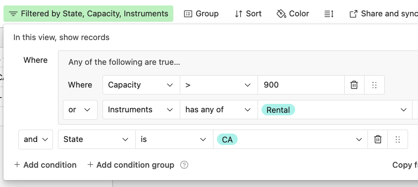
Figure 4-10. Combining a condition group with a condition.
Airtable offers the ability to add yet another level of nesting to a filter. For example, we can create another condition group inside of the condition group from Figure 4-10. In that filter, we have the condition that the state is California. We’ll keep that. In the condition group, we specified that we were looking for records that either had a capacity of more than 900 or where we were using equipment rentals. We can add another qualifier inside of that condition group.
We will continue to filter for records with venues with a capacity of over 900. However, there’s now an option to specify records with rental instruments and records for which we don’t have a venue’s phone number. Figure 4-11 shows that we are alternating “and” operators with “or” operators.
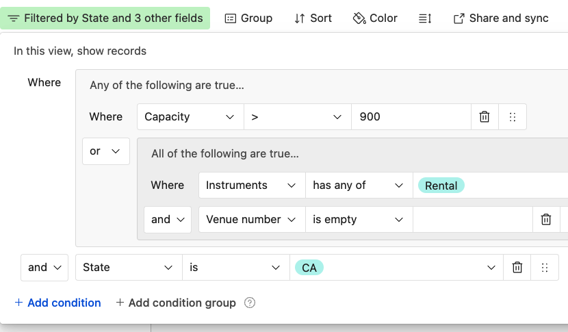
Figure 4-11. A filter with a condition group inside of another condition group.
Like many pieces of the Airtable platform, filtering is a very powerful tool, but it’s easy to get started. Of all the views, filtering is the only control available for every view.
Sorting
Sorting controls the order in which your data is displayed within a view. It’s available in the Grid view and most other views. Just like with filtering (or any other configuration option), when we sort our data in Airtable, sorting is only rearranging the data we see in the particular view we are working in.
In the toolbar of configuration options above our records, you can choose fields to be sorted. Depending on the field type, the sort order has different options. Text fields, date fields, and numerical fields are sorted in ascending or descending order. Figure 4-12 shows an example of sorting our date field in descending order.
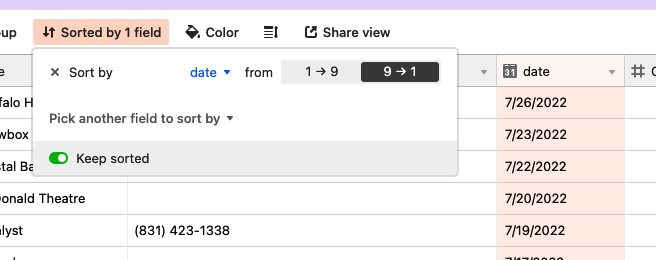
Figure 4-12. Text fields, date fields, and numerical fields can be sorted in ascending or descending order.
As you may remember, the stars in a Rating field are actually numerical values. So records can be sorted in descending or ascending order by their rating value. The Checkbox field can also be sorted beginning with unchecked or checked records.
Single select and Multiple select fields have a unique way of being sorted. The order of options inside the field customization menu determines how they will be ordered in a sort. Airtable offers the options First–Last (meaning starting with the first option listed in the field customization menu) or Last–First.
We can also sort by more than one field at a time and change the hierarchy of how Airtable performs a sort. A larger dataset than the handful of shows in the tour tracker can better demonstrate sorting by more than one field, so let’s return to our base of The Simpsons episodes.
We can start by sorting the episodes by season. Each season has over a dozen episodes. So while the episodes are sorted in the season they occur, as shown in Figure 4-13, within those seasons the records could be in some arbitrary order until we apply a secondary sorting.
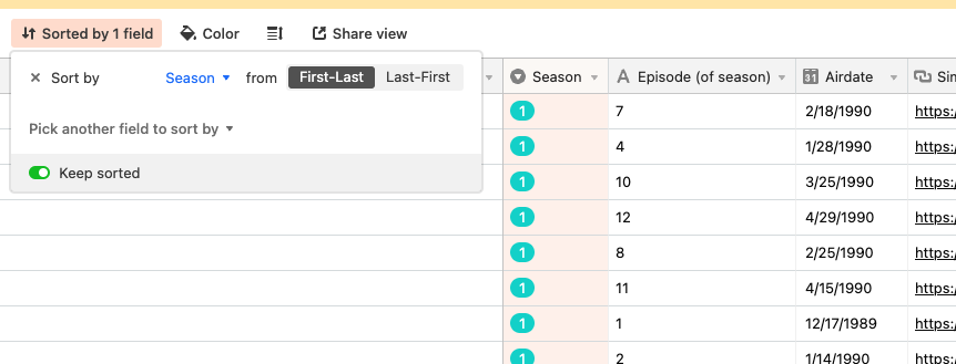
Figure 4-13. Applying the first layer of sorting.
It’s easy to add more sorting. In Figure 4-14, we’ve sorted Episode (of season) in alphabetical order.
You’ll notice that there is a capital A icon next to the title of our episodes field. This represents the Single line text field. Since the number of the episode isn’t a measurement or quantity, we don’t need to use a number field. Since we’ve used a text field, we are sorting it A->Z instead of 1->9.
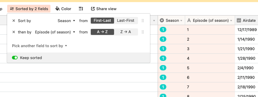
Figure 4-14. Sorting records in a view by two fields, with one having precedence over another.
When we sorted the Season field, you may have noticed it is a Single select field. Single select and Multiple select fields are ideal for working with data that essentially represents a category of your records in a table. In this case, there are a limited number of seasons, and we know that multiple episodes will go into each season. The Single select field is a good choice because each season is a larger container that contains the episodes for that season.
Single select and Multiple select fields are sorted uniquely: based on the order of the options. In Figure 4-15, we can see how the options in our Season field happened to be in numerical order. Because the option “First” is the first option in our field, it’s the first in the sort. If the fifth season was first instead of last, our sort order wouldn’t happen to be in numerical order—it would be 5,1,2,3,4 instead of the 1,2,3,4,5 order we’d instinctively expect.
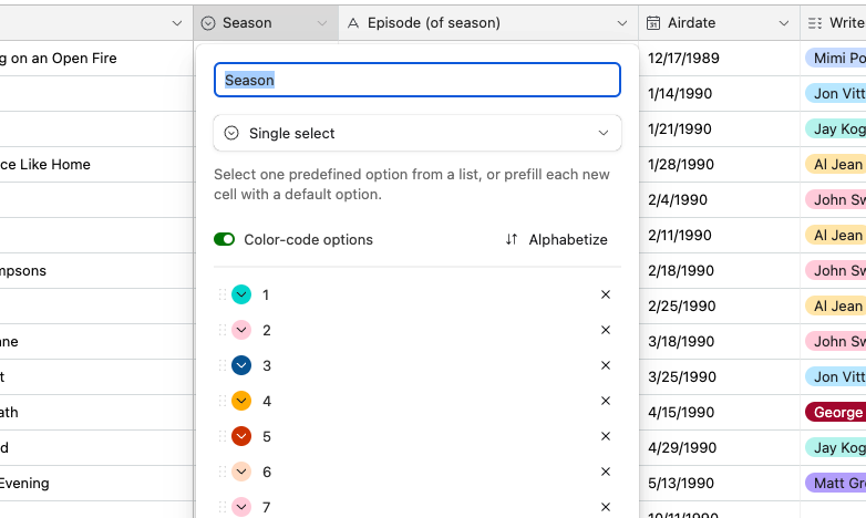
Figure 4-15. In a Single select or Multiple select field, the order the options are listed in the field customization menu determines the order they appear in when sorted.
Hiding Fields
As your bases grow, you will inevitably have more fields that define the attributes of the records of the people, places, and things you’re cataloging. You may quickly find there are many more fields than you can see on your screen at once in the Grid view, and “Hide fields” can narrow down what’s important to see in a given view.
Located on the left side of the toolbar above your field labels, as we can see in Figure 4-16, the Hide fields icon opens up a drop-down list of every field in your table. (As a reminder, it’s not possible to hide the primary field or remove it.)
A toggle switch to the left of every field name can show or hide that field. This drop-down menu is also a convenient place to change the order of the fields by grabbing the small group of dots (sometimes referred to as a “grab handle”) to the right of the field names. The order of the fields in that drop-down menu (from top to bottom) mirrors the order of the fields in the Grid view (from left to right).
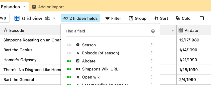
Figure 4-16. The order of the fields in the “Hide fields” drop-down menu, except the primary field, is the same as whichever Grid view you are working on.
We can also change the order of the fields in a view without opening the “Hide fields” drop-down menu. You can click the down arrow icon next to each field’s column and choose “Hide fields” in the field customization menu. Or, if you just want to move a field out of the way but not hide it, the most tactile way is to simply click on the title of the field and drag it to a new position.
“Hide fields” can allow us to scroll through all of the fields in a table in a compact list. But as you get closer to Airtable’s maximum of 500 fields per table, scrolling through the list of fields can be a tedious way to find a field you want to hide or show. You can jump to the field you need by clicking in the “Find a field” dialog box. In Figure 4-17, we’ve started typing the first few letters of the field we want to find, which pulls up relevant potential matches.
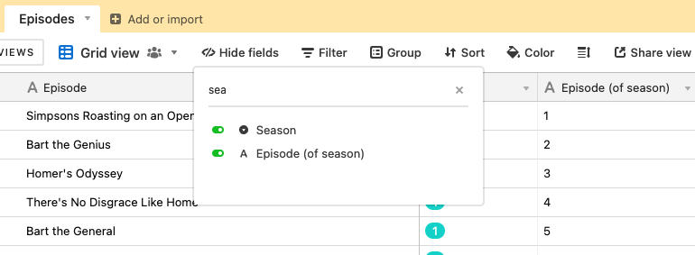
Figure 4-17. Typing a search query into “Find a field” at the top of the “Hide fields” menu.
Though the “Hide fields” functionality exists in the other views, it’s labeled “Hide fields” only in the Grid view. In other views, this function is labeled “Customize fields” and may add one or two extra options, but the functionality to hide fields is otherwise the same between different view types.
Height
In the Grid view, it’s possible to change the height of all rows in a view equally. For example, if we have a large number of items in a Multiple select field, we might want to increase the height so we can see more of those in the Grid view, as shown in Figure 4-18.
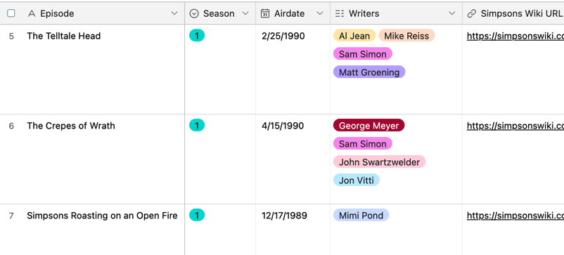
Figure 4-18. Adjusting the row height in the Grid view to see more multiple select options for each record.
Summary Bar
In the Grid view, we see that field names are listed at the top of each column and the rows of records are numbered. At the very bottom of the page, there’s a thin row with small text. It’s easy to miss. This is the summary bar. Let’s use it to understand the contents of records in a Grid view.
The summary bar highlights how using a database like Airtable instead of a spreadsheet does have some trade-offs. For example, because each record in a table is the same type of entity, we can’t add another row in the Grid view just to sum up arbitrary values in a field column. To compensate for this, the summary bar offers a spreadsheet-like functionality to set up some basic analysis of our records by field, as shown in Figure 4-19.
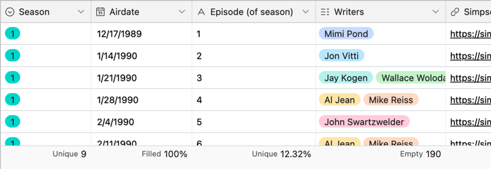
Figure 4-19. The summary bar displays basic calculations of field values for records visible in a given view, such as number of unique records, percent of records filled, percent of unique records, etc.
Four general summary functions in the summary bar offer information on how many records of a field are populated:
- Empty
- Tells us how many records don’t have a value in that field
- Filled
- Tells us how many records have a value in that field
- Percent empty
- Gives a percentage for how many records don’t have a value in that field
- Percent filled
- Gives a percentage for how many records have a value in that field
When we used filtering earlier to analyze the data in our concert tour base, we wanted to understand how many venues lacked a phone number in our records. Even though we could just count the records we see in the small dataset, the summary bar gives us tools to use with bigger datasets. For example, before applying filters, we can set the summary bar to the “Empty” function for the “Venue number” field. As we see in Figure 4-20, the summary bar gives a count of how many records in that view, presently unfiltered, don’t have a value for the venue’s phone number.
The summary bar is configured uniquely for each view in your base, and its calculations reflect any filtering for that view.
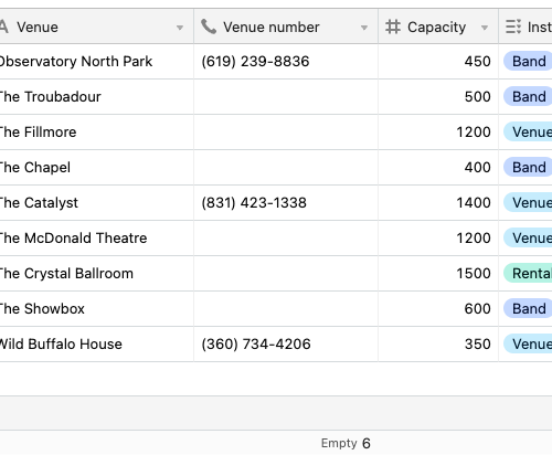
Figure 4-20. Using “Empty” to get a tally of records without a value in a given view.
Especially when working with large sets of data, the Unique and Percent unique functions highlight when we may have unintended duplicates in a field or need a running calculation of unique values.
Let’s use another example from our tour base. If we want to know how many different cities we visited on the tour, we can use the Unique function. In Figure 4-21, we see that eight of our nine records in the City field are unique (i.e., we only played one city twice). In the State field, we can use the Percent unique function to see that, of all the records in the view, about one-third of the different values in that field are unique.
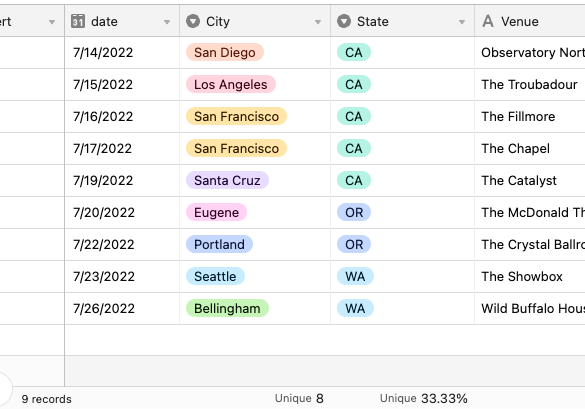
Figure 4-21. Using the “Unique” and “Percent unique” summary bar functions.
Using your cursor to select records in the Grid view will change the output of the summary bar. Only the records selected will be part of the calculation in your summary bar when you have selected some arbitrary group of cells.
Similar to the Empty or Filled options, the summary bar also has an option for checkbox fields. For example, you can summarize the count of checked or unchecked records, or you can calculate the percent unchecked or checked.
There are also summary functions for numeric fields and date fields. When working with numbers, mathematical operators include:
-
Sum
-
Average
-
Min
-
Max
-
Range
-
Standard deviation
You can summarize date fields in the summary bar by choosing between:
-
Earliest date
-
Latest date
-
Date range (in days)
-
Date range (in months)
Histogram is a unique way to visually see the distribution of values in your records with a tiny set of bars instead of a number. Lastly, for an Attachment field, the summary bar allows you to see the total size of all the attachments in records for that view, as shown in Figure 4-22.
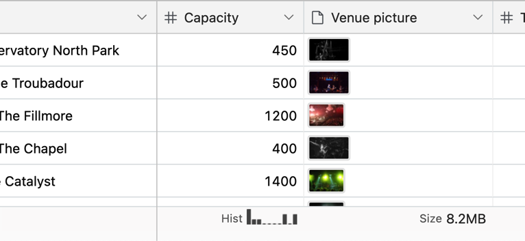
Figure 4-22. Examples of histogram and attachments in the summary bar.
Coloring
Coloring records in an Airtable view is another powerful way to organize and differentiate your data between views. Like other view configuration options such as sorting and grouping, coloring provides a visual representation that enhances your understanding of your data.
Let’s take a look at an example using episodes from our Simpsons base. In Airtable’s Grid view, clicking the Color icon located in the toolbar above your field names will open up a color palette, where you can select a color to apply to your records based on the condition(s) you choose.
We can assign a different color to each season to make distinguishing the episodes from each season easier. For instance, we can assign a red color to the records from the first season and a blue color to the records from the second season, as shown in Figure 4-23.
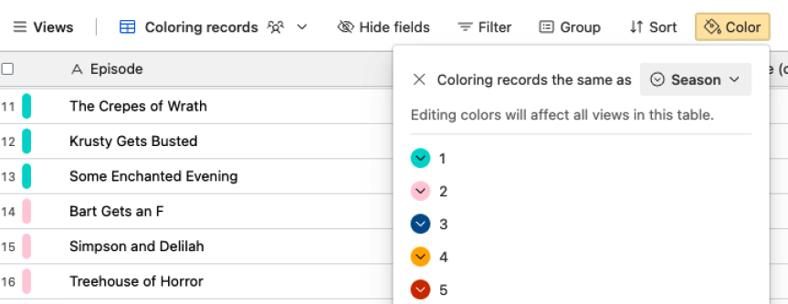
Figure 4-23. By utilizing record coloring, we can quickly identify and group episodes based on their respective seasons.
Coloring records can be helpful when you want to highlight certain types of data or identify specific categories within your dataset. For example, you can use different colors to signify genres, ratings, or any other criteria that are relevant to your specific use case. (Keep in mind that coloring records is specific to the view you are working in and does not change or impact the underlying data in your base.)
Grouping
Grouping records helps us understand how records share characteristics. After clicking the Group button in the toolbar of the Grid view, Airtable will suggest grouping by Single select or Multiple select fields in your table.
Let’s group records using the Season field in the Episodes table of our Simpsons base.
In Figure 4-23, we grouped the records by season, in order of First-Last. When we used sorting on this field, the order of the seasons wasn’t dependent on the title of the Single select option but was based on the order each season is listed in the field customization menu—the same is true for grouping as sorting.
In Figure 4-24, we see that Airtable has moved records into visual groups, but we still don’t have much insight into the characteristics of the groups we just created.
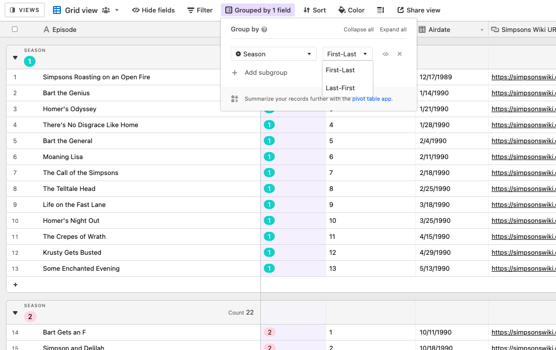
Figure 4-24. Grouping records by a Single select field.
Grouping records gives us tools we can quickly visually reference. For example, in the same menu where we chose the field to group by, we can click the “Collapse all” option to reduce all the records into bundles of groups where we can’t see the individual records themselves, as in Figure 4-25.
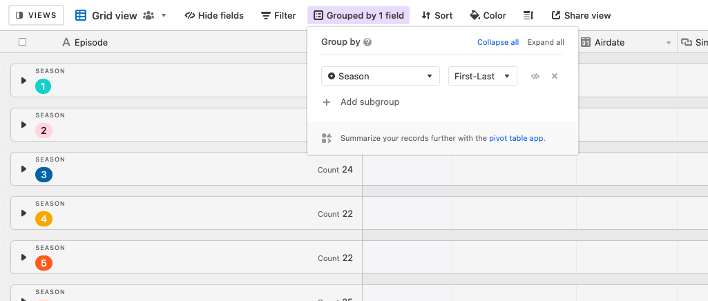
Figure 4-25. Collapsing groups of records.
We can group additional fields into a hierarchy, similar to nesting condition groups in filtering. Airtable refers to grouped fields after the first group field as “subgroups.” For a subgroup to be useful, the subgroup field should have duplicate values among the records in your grouped field. We can look at our Simpsons base for an example of when using a subgroup doesn’t yield much insight.
First, we are grouping the records in the Episodes table by season. Next, let’s add a subgroup for the field “Airdate.” The examples you see in Figure 4-26 illustrate the issue with choosing Airdate as our subgroup. Since the value of the Airdate field is unique for every record, using this as a subgrouping simply puts each episode into its own subgroup. This is effectively the same as grouping them by season only.
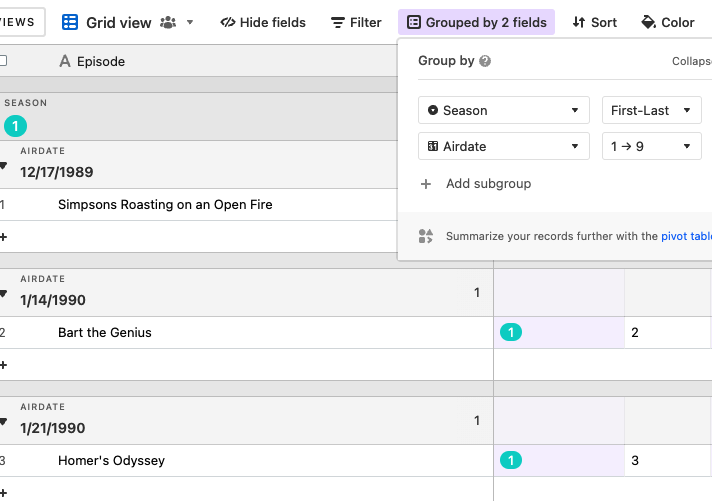
Figure 4-26. Using a subgroup is not insightful if the values for the subgroup field are unique.
Grouping in Airtable has the same sorts of flexibility as we’ve seen with other view configuration options. For example, you can move subgroups around, just as you can reorder different fields you’re sorting by and different conditions you’ve set up in a filter. The “Collapse all” and “Expand all” options can condense or expand, respectively, everything you are grouping. And then you can individually expand or collapse subgroups or sub-subgroups.
Combining the summary bar with grouping offers unique insights. For example, if we use the summary function “Unique” on the Season field, we see the result for all records in that view in the summary bar, but we also see the values of that summary function performed on each group and subgroup.
Let’s look at a more advanced example. In Figure 4-27, records are grouped by season, and the Unique % summary function is applied to the Episode (of season) field. For each group of records grouped by season, there is only one unique value in the Season field, so the Unique % value is 100%. However, the summary bar considers every field value for every record in the table across all seasons. It shows that only 12.32% of the 203 records are unique. Similarly, each group has a count of only one unique value. But in the summary bar, the Unique function returns a count of nine unique values that represents the nine different season choices from the Season field.
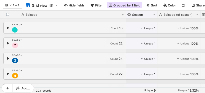
Figure 4-27. Each grouping level displays a unique value for the function we’ve chosen for a given field in the summary bar.
Creating and Organizing Views
It’s worth mentioning again that a view is just a unique way of looking at data; changing a value for a record in any view will change that value for the record in all views. You can have a section of views just for yourself, views for a specific purpose that a team may share, or views with a subset of data you may want to share outside your organization.
Creating a View
Clicking on the “Views” icon in the left sidebar opens a list of the views present in a table and a menu at the bottom of the sidebar with many options. In this “Create…” section, you can choose any of the six types discussed in this chapter.
We can choose to create a new Grid view, Calendar view, Gallery view, Kanban view, Timeline view, or Gantt view, as shown in Figure 4-28.
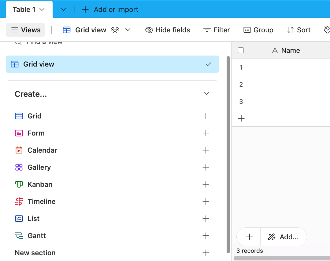
Figure 4-28. The different options for creating a new view.
Let’s start with an example. In our tour tracker base, our first table is “2022 summer tour.” We’ve added two new fields to this table: “Venue picture,” which has an image of the venue, and “Contract status,” which is a “Single select field” with several options to categorize the contract progress for each performance date. But let’s assume we have too many fields in a Grid view to see everything without a lot of scrolling from side to side. Let’s create a new view that displays only certain data.
If we click “+” next to “Grid” in the sidebar, a small dialog box appears that suggests a generic name for the view (such as “Grid 2”). It also has three radio buttons with options for “Who can edit.” Let’s leave the default option, “Collaborative,” toggled on. But before we click “Create new view,” let’s change the name from the default Airtable suggests to “Venue information,” as shown in Figure 4-29.
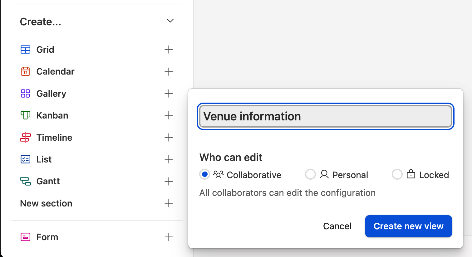
Figure 4-29. Naming a view.
Let’s do one more thing with this view. If we hover over the name of the view in the sidebar, the Grid icon displays as a light-gray star. When we click that star, Airtable creates a section in the sidebar labeled “My favorites.” As a result, any views we star in the same way will now be in the “My favorites” section.
We can also create a “New section.” Sections are essentially folders of views.
Next, we can begin customizing this view, while our original view will keep its current layout. Since each of our records has a unique identifier, as we added in the sidebar, let’s start by removing some fields from the view. We can toggle off Date, City, State, and Lodging. Now we have a more condensed set of fields, as shown in Figure 4-30, where we can see the venue’s name, phone number, capacity, where to source instruments, a picture of the venue, and the status of the contract.

Figure 4-30. A customized view, after removing some fields.
View Permissions
When we created our view, we had the option of making it either Collaborative (the default), a Personal view, or a Locked view. We’ve made Collaborative views in this chapter. Let’s look at the other two options for defining who can access your views.
Personal views
Personal views can be seen by everyone in a base, but only the owner of the Personal view can customize it using filters, grouping, sorting, etc.
By default, Airtable hides Personal views from your collaborators. However, the gear icon in the sidebar’s upper right corner has an option to toggle on or off “Show everyone’s personal views.” When this is toggled on, you can see a subsection inside “All views” called “Personal views,” which is a collection of the personal use of your collaborators in the base for that table.
Personal views are useful for having your own unique ways of viewing data in a table without creating lots of clutter in the “All views” section for everyone else in your team. It can also be useful to create a Personal view, which you solely have the ability to change, to share a particular analysis or vantage point with your colleagues.
Locked views
The third type of view is the Locked view. Essentially, a Locked view is in a frozen state. Once you lock a view, no one—including the creator—can change that view until it is unlocked. As a reminder, just because we lock a view doesn’t mean any of that data is prevented from being changed in another view.
Airtable gives you the option to put a small description on a locked view so your team understands why it is locked.
So why would we want to lock a view? You might use that view as a shared reference with your collaborators, and you don’t want any changes made to its configuration. For example, you might have a Calendar view that is filtering for certain events applicable to your team. There isn’t a need for anyone to change the data displayed for that purpose, so locking the view means that it will always have the same configuration until it is unlocked.
A Locked view is also useful when you’re sharing data in a table using “Share view.” We’ll look at this functionality in the next chapter, but the use case is similar to automations. If you’re publicly going to share some data in a given view, then you want to make sure no one inadvertently changes what data is in that view. Locking the view is a simple and effective solution.
Now that we know the different ways we can organize our data using views, we want to understand how to get data into our bases. In the next chapter, we will look at how we can import static files like CSVs, connect to other Airtable bases, and also make connections to third-party services to get that data syncing into Airtable.
Get Learning Airtable now with the O’Reilly learning platform.
O’Reilly members experience books, live events, courses curated by job role, and more from O’Reilly and nearly 200 top publishers.

