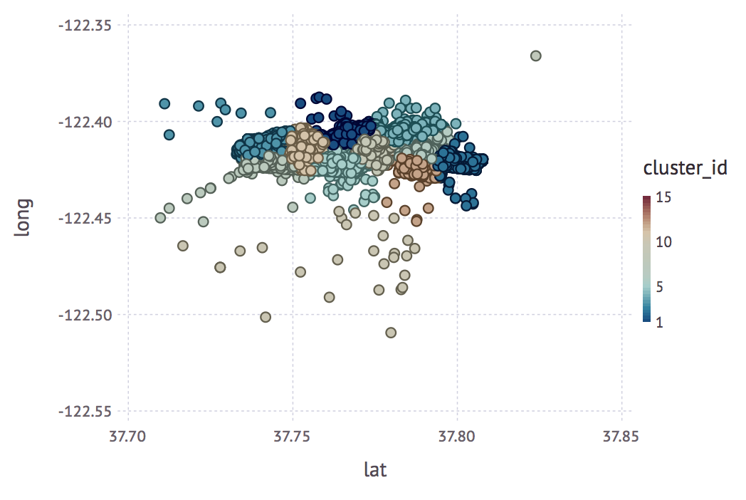
To get a better understanding of our data, in terms of points density and location proximity, we can render a plot with Gadfly:
julia> plot(companies_in_top_areas, color=:cluster_id, x=:lat, y=:long)
The output is as follows:

We can see a pretty good cluster distribution, so our approach worked!
However, it would be even better if we could display the clusters on a map. Unfortunately, at the moment, there's no easy way to do this in Julia, so we'll use a third-party tool.

