Chapter 25. 3 Ways to Make Splendid Slope Graphs: Tip 1
I always say that one specific chart type per analytics scenario will help you capture roughly half the insight. Comparing categorical data? I always start with a bar chart. Want to analyze many data points at the same time and look for correlations? A scatter plot is your best bet. Trending something over time? A line graph will certainly help. This is not to say that you should use only these three charts. Alternatives can help keep your audience engaged, add context to your analyses, and reveal new insights.
Slope graphs, which keep only the first and last marks on a line graph, are one of my favorite alternatives for visualizing time. The next three chapters show you how to make slope graphs in Tableau and provide three tricks to improve their formatting and user experience.
How to Make Slope Graphs in Tableau
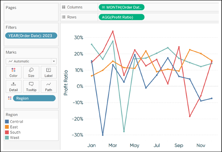
First, let me explain what a slope graph is and show you a manual way to create them. A slope graph is a line graph that connects dimension members across just two points. To illustrate, consider the following line graph looking at Profit Ratio by Region in the Sample â Superstore dataset (filtered to 2023):

Even though line graphs are my second favorite chart (after bar chart) because of their strengths in analyzing trends over time, there are certain insights that are challenging to determine with this chart ...
Get Innovative Tableau now with the O’Reilly learning platform.
O’Reilly members experience books, live events, courses curated by job role, and more from O’Reilly and nearly 200 top publishers.

