Chapter 18. The Gantt Chart
One of our clients had an overnight batch problem. They would kick off a big job every midnight to summarize the prior day’s data and prepare the system for business at 8:00 a.m. But the job had been taking longer and longer, and now it was running until 8:30, through the end of its window. They were paying fines to their own customers, for not having their system ready by 8:00 sharp.
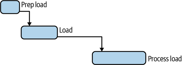
To understand how this complex collection of overnight processes was spending our client’s time, we used a type of bar chart called a Gantt chart. Gantt charts help you see where you’re wasting time. They are another tool for helping you look at the right it. On a Gantt chart, time flows from left to right. The bars of a Gantt chart represent work being done, and the connector lines represent dependencies.
In our Gantt chart, we tracked where the database had spent its time overnight. It contained several occurrences of a pattern that looked like this:

Seeing the process flow illustrated this way led several of us to ask, all at the same time, “What’s happening in the time gap between loading and then processing that load? Why is the database not busy there?!” There was plenty of work to be done; why was the database not doing it? It’s the question that cracked the case.
It turned out to be a performance improvement opportunity in the application, not the database. The ...
Get How to Make Things Faster now with the O’Reilly learning platform.
O’Reilly members experience books, live events, courses curated by job role, and more from O’Reilly and nearly 200 top publishers.

