Chapter 17. The Sequence Diagram
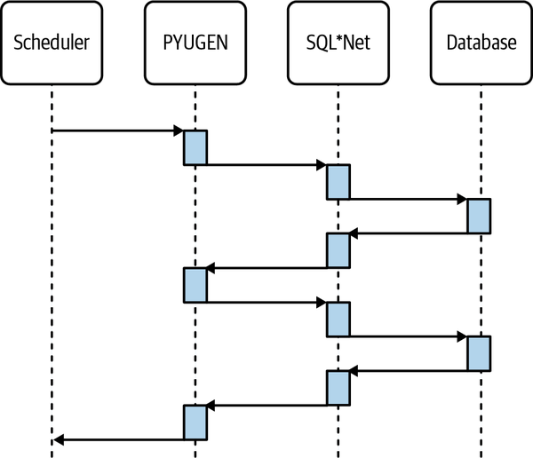
A sequence diagram is a type of graph used to show the interactions between objects in the sequential order that those interactions occur. It’s a picture that makes it easier to visualize response time. Here is a sequence diagram for the Payroll problem:

The vertical lines in a sequence diagram are timelines. A timeline typically represents a hardware or software tier. A rectangle on a timeline represents a time-consuming sequence of instructions being executed on that timeline’s tier. Demand flows from left to right, and supply flows from right to left.
So, on my sequence diagram, the scheduler starts PYUGEN, which makes calls via Oracle network software called SQL*Net to its database. The diagram shows PYUGEN making only two database calls through SQL*Net, but the picture is meant to represent the roughly 100,000 round trips that we saw in our trace data.
A quick sketch of a sequence diagram like the one I’ve shown here can help you envision how a system spends your time. Being a little more careful—for example, scaling the heights of a diagram’s rectangles in proportion to the time consumptions they represent—can provide additional insight about where your time is going. The information that allows you to do that comes from tracing.
Get How to Make Things Faster now with the O’Reilly learning platform.
O’Reilly members experience books, live events, courses curated by job role, and more from O’Reilly and nearly 200 top publishers.

