Chapter 4. Dot Charts
Basic Dot Chart
The dot chart (sometimes called “dot plot”) is quite similar to the strip chart in that it shows how spread out or clumped together points are. But the dot chart goes beyond this and gives us the opportunity to glean even more information from our data. You might consider the next dataset a bit gruesome, but consider that some readers of this book might indeed deal with this kind of data on a regular basis. Because the methods introduced in this book can be applied to a wide range of subjects, for readers with varying needs, diverse types of data have been chosen to illustrate the use of graphs. So, let’s look at the USArrests dataset, which gives arrest rates per 100,000 population for serious crimes in each of the US states in 1973:
> attach(USArrests)
> head(USArrests) #shows first 6 rows, can get all with:
     USArrests

           Murder Assault UrbanPop Rape
Alabama      13.2     236       58 21.2
Alaska       10.0     263       48 44.5
Arizona       8.1     294       80 31.0
Arkansas      8.8     190       50 19.5
California    9.0     276       91 40.6
Colorado      7.9     204       78 38.7
This dataset includes values for four named variables. There is also one column without a variable name in the top row. The values in the lefthand column are row.names—in this particular case, the names of states. Many times, the row name is simply a number.
Let’s explore this dataset. First, see what a strip chart can tell you about murder arrests. Try it and ponder what you have learned about murder arrests from the strip chart. Are the arrest rates nearly the same or very different? Are they clustered together or spread out? What would you have expected? Although you might have arrived at some interesting insights, consider the further capabilities of the dot chart:
> dotchart(Murder)
The graph in Figure 4-1 is similar to the strip chart in that it shows the location (along the x-axis) of each state. It is different, however, in that each state has its own “row,” or horizontal line. Therefore, there is no overprinting and no need for jittering.
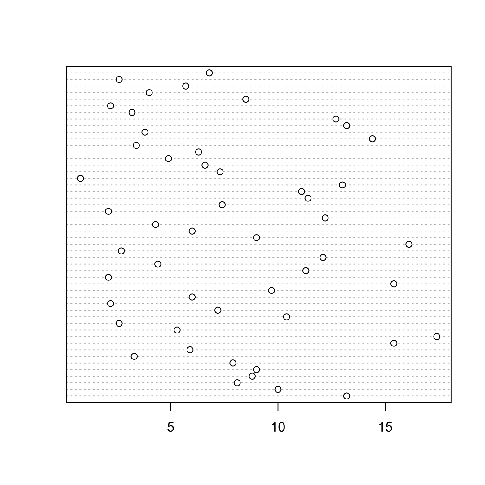
Figure 4-1. Dot chart of murder arrest rates in each of the states.
Another useful refinement is possible. All data frames include a character vector containing a row identifier that is recognized by the name row.names. Notice that each row in the data frame has a state name. You can label each row in the dot chart with its state name by adding the argument labels = row.names(USArrests). The labels could also be the values of any other variable, if we wanted that:
# Figure 4-2
dotchart(Murder, labels = row.names(USArrests), cex = .5)
Figure 4-2 demonstrates that it is easy to identify exactly which states had the lowest and highest murder arrest rates and to find some that are typical or nearly average rates. The labels argument placed the state names on the plot; the cex argument changed the character size. The default value of cex is 1, so any smaller value makes the characters smaller.
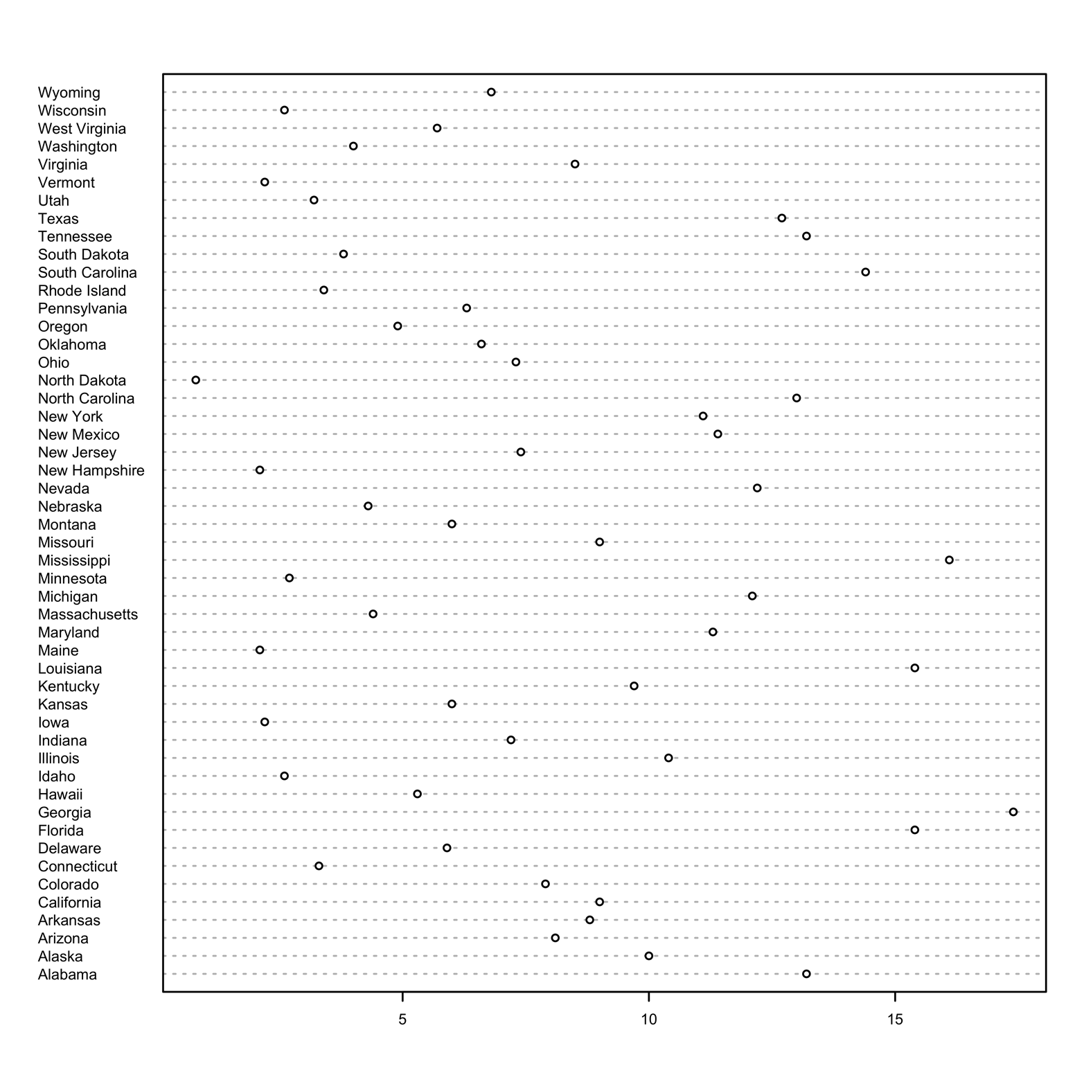
Figure 4-2. Dot chart of murder rate, identified by state.
A more interesting view of this data might be to see the murder arrest rates arranged by size. To do that, the data must first be sorted by Murder. This means that the dataset’s rows will be rearranged in order of their murder arrest rates. You can create a new dataset sorted this way by using the order() function. The name of the sorted dataset could be just about anything. This one is arbitrarily called data2 (no awards for originality here):
> data2 = USArrests[order(USArrests$Murder),]
Next, redraw the graph (see Figure 4-3) using this newly sorted data and add a title and label:
> dotchart(data2$Murder, labels = row.names(data2),
    cex = .5, main = "Murder arrests by state, 1973",
    xlab = "Murder arrests per 100,000 population")
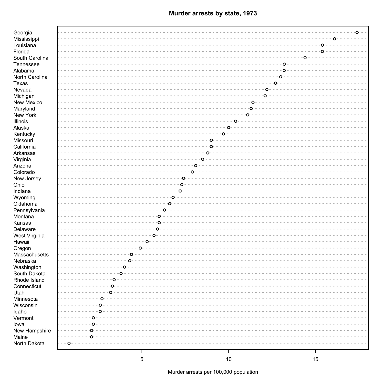
Figure 4-3. Dot chart of states sorted by murder rate.
Now, it is easy to see which states are the leaders and the laggards in murder arrest rates. Of course, you could see that information in a table of numbers, but with this chart you can see at a glance the relative differences among the states. Are the results what you would have expected? Remember that the rates in our data are rates of arrests, not rates of murders.
The plot could be made a little more attractive with a few small adjustments. The plot character would stand out more if it were solid, so add pch = 19. Color would catch the viewer’s attention, so make the points and labels a different color by using the col argument. The lines are quite close together, too, so try using color to facilitate reading by alternating colors, line by line. To do this, use the argument col = c("darkblue","dodgerblue"). Make the horizontal reference lines a different color by using lcolor = "gray90".
You can see what colors are available by using the following command:
> demo(colors)
Here’s how you can get a list of the color names:
> colors()
Appendix B contains a color chart. The R code that created the chart is also there, so you can print one out if you want. A couple of nice R color charts are also available on the Internet at http://www.stat.columbia.edu/~tzheng/files/Rcolor.pdf and http://research.stowers-institute.org/efg/R/Color/Chart/.
The title of the graph would stand out more if it were larger, so add cex.main = 2; that is, make the main title twice its size. The complete command looks like this:
> dotchart(data2$Murder, labels = row.names(data2),
    cex = .6, main = "Murder arrests by state, 1973",
    xlab = "Murder arrests per 100,000 population",
    pch = 19, col = c("darkblue","dodgerblue"),
    lcolor = "gray90",
    cex.main = 2, cex.lab = 1.5)
Figure 4-4 presents the results.
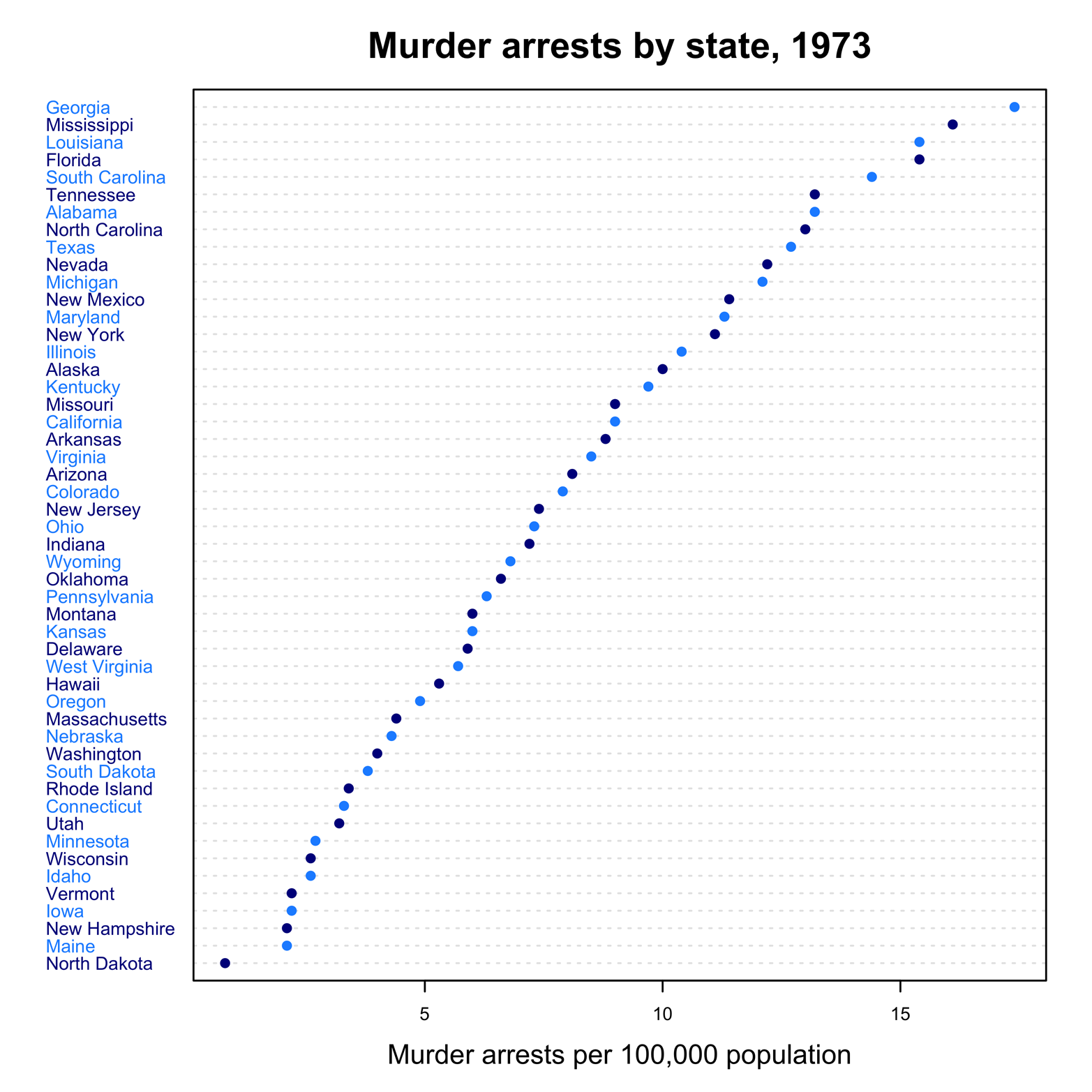
Figure 4-4. Dot chart of states by murder arrest rates with added color.
Exercise 4-1
To understand why cex was added to the plot in Figure 4-2, try the dotchart() command without this parameter and see what happens.
Exercise 4-2
Make a dot chart of the variable time from the Nimrod dataset. Remember that you will first need to use the load() command to retrieve the data.
Get Graphing Data with R now with the O’Reilly learning platform.
O’Reilly members experience books, live events, courses curated by job role, and more from O’Reilly and nearly 200 top publishers.

